


 Arguments


Lessons from Past Predictions: Vinnikov on Arctic Sea Ice
Posted on 27 April 2012 by dana1981
 We previously did a Lessons from Past Predictions entry on year-to-year Arctic sea ice extent predictions. However, we were recently alerted to an interesting longer-term Arctic sea ice prediction published in Science by Vinnikov et al. (1999). This study used climate models from the Geophysical Fluid Dynamics Laboratory (GFDL) and Hadley Centre, forced by greenhouse gases and sulfate aerosols. The authors used these models to hindcast past Arctic sea ice extent measurements and predict future changes. Regarding observational data up to 1999, Vinnikov et al. noted:
"the observed decrease in Northern Hemisphere sea ice extent agrees with the transient simulations, and both trends are much larger than would be expected from natural climate variations."
This post will focus primarily on the projections of future Arctic sea ice extent decline in Vinnikov et al. (Figure 1). As we'll see, Vinnikov significantly under-predicted the Arctic sea ice death spiral, which is over 99.9% likely to be influenced by human-caused global warming.
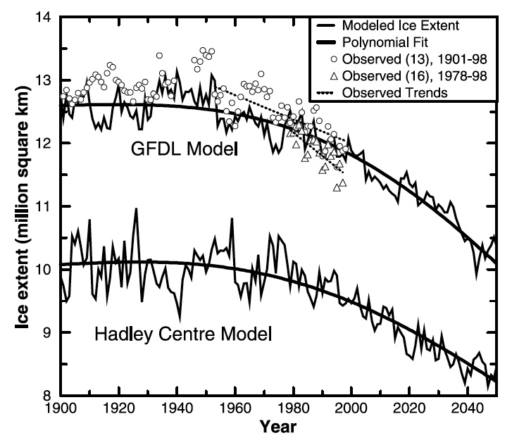
Figure 1: Observed and modeled variations of annual averages of northern hemisphere (NH) sea ice extent. The modeled sea ice extents are from the GFDL and Hadley Centre climate model runs forced by observed CO2 and aerosols. Modeled data for ~250 years are smoothed by polynomials of degree 10 to estimate nonlinear trends caused by a change of external radiative forcing. From Vinnikov et al. (1999)
Vinnikov Predictions vs. Observations
We obtained Arctic sea ice extent data from the National Snow and Ice Data Center (NSIDC) and digitized the GFDL model run from Figure 1 above. Vinnikov et al. applied a polynomial fit to the GFDL model, and we did the same for the NSIDC data. The comparison of average annual Arctic sea ice extent is provided in Figure 2.
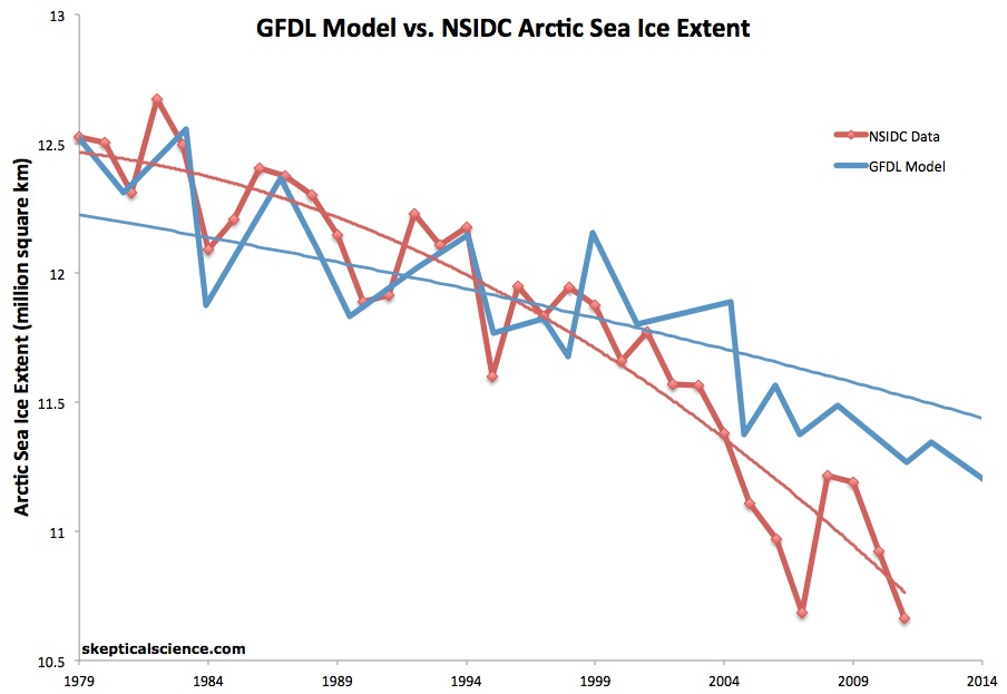
Figure 2: NSIDC annual NH sea ice extent and polynomial fit (red) vs. the GFDL annual NH sea ice extent model and polynomial fit (blue) from 1979 through 2011.
As is clear from Figure 2, the GFDL model in Vinnikov et al. substantially under-predicted the subsequent decline in Arctic sea ice extent.
By How Much Did the Model Under-Predict the Arctic Sea Ice Decline?
The GFDL model in Vinnikov et al. predicted an approximately 670 thousand square kilometer (km2) per decade decline in Arctic sea ice extent from 1999 to 2011, whereas the actual decline was approximately 910 thousand km2 per decade. If we compare the quadratic fits the difference is even larger, at about 170 thousand km2 vs. 750 thousand km2 per decade decline for the model and observations, respectively.
In 2011, the annual Arctic sea ice extent was 10.7 million km2, which was quite close to where the polynomial fit predicted it would be based on the 1979 to 2010 decline. According to the GFDL model in Vinnikov et al., Arctic sea ice extent should not have declined this much until 2038. This means the Arctic sea ice decline is about 27 years ahead of the Vinnikov model predictions.
Probability that the Arctic Sea Ice Decline is Natural
Vinnikov et al. also estimated the probability that the Arctic sea ice decline could simply be natural. The authors used very long control runs of both GFDL and Hadley models (5,000 years for the GFDL model) to assess the probability that the observed and model-predicted trends in Arctic sea ice extent occur by chance as the result of natural climate variability. They then calculated the fraction of occurrence of linear trends of different amplitudes and lengths from the control run - the longer the time interval, the less likely a large sea ice trend will emerge. They found that large trends only appeared over short time intervals in the control run.
Figure 3 shows the probability that a trend of a given length of a certain amplitude would occur by natural climate variability, as simulated by the GFDL model.

Figure 3: Estimated probabilities of observed or larger trend occurrence in NH sea ice extent for specified time intervals. Estimates are based on the GFDL climate model's 5000-year control run. Circle corresponds to the observed 46-year (1953-1998) trend of -190 thousand km2 per decade. Square corresponds to the observed 19.4-year (1978-1998) trend of -370 thousand km2 per decade. From Vinnikov et al. (1999)
For 1953 to 1998, Vinnikov et al. found a linear trend of about -130 thousand km2 per decade using the GFDL model, with a probability of 1% that this Arctic sea ice decline could be due solely to natural variability. For 1972 and 1978 to 1998, they found trends of -120 and -340 thousand km2 per decade, respectively, with natural variability probabilities of 16% and 2%, respectively. Using a smoothed GFDL model output, the natural variability probabilities ranged from 0.4% for the 46-year period to 13% for the 20-year period.
Using observational Arctic sea ice data, Vinnikov et al. found that the observed declines of -190 thousand km2 per decade (1953-1998) and -370 thousand km2 per decade (1978-1998) had less than 0.1% and 2% probability of being solely attributed to natural variability, respectively.
We can now update this analysis using the NSIDC data through 2011. The 32-year trend (1979-2011) is -530 thousand km2 per decade and the 20-year trend is -700 thousand km2 per decade. Using Figure 3 above, these trends both correspond to probabilities of well under 0.1% of being due solely to natural variability.
Poor Pielke Analysis
One of the five characteristics of scientific denial is cherry picking. Cherry picking allows us to deny the full body of scientific evidence by only considering the juicy bits which appear to support our desired conclusions.
We first came across Vinnikov et al. on Dr. Roger Pielke Sr.'s blog. Unfortunately, Dr. Pielke's analysis was quite poor. For example, rather than perform a serious statistical analysis, Dr. Pielke chose to rely on his Eyecrometer, claiming:
"Until later in 2007, the sea ice areal extent continued to decrease in a manner which, at least visually, is consistent with the Vinnikov et al 1999 predictions"
As noted above, the observed sea ice decline has been much more rapid than the model predictions, both up to 2007 and through 2011. In making this incorrect assertion, Pielke relied on a sea ice graphic showing noisy monthly data, which covered a different time span than the Vinnikov model run figure, and chose to do this analysis during a month which significantly under-represents the loss in mean annual sea ice extent. All three of these factors served to fool his Eyecrometer and lead him to an incorrect conclusion.
Additionally, rather than examine the concerning long-term Arctic sea ice "death spiral," Dr. Pielke chose to instead focus on short-term noise.
"However, since 2006, the reduction has stopped and even reversed. Perhaps this is a short term event and the reduction of sea ice extent will resume. Nonetheless, the reason for the turn around, even if short term...needs an explanation."
The explanation is that Dr. Pielke's Eyecrometer has failed him. An actual statistical analysis of the NSIDC data tells a different story (Figure 4).
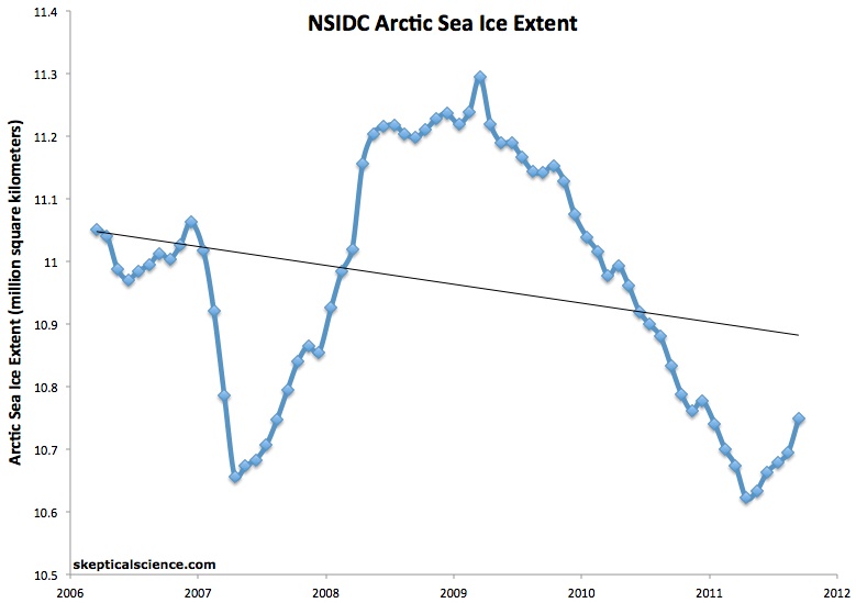
Figure 4: NSIDC NH sea ice extent with a 12-month running average (blue) and linear trend (black) from mid-2006 through late-2011.
The linear trend in annual Arctic sea ice extent data from 2006 through 2011 is -250 thousand km2 per decade. Thus contrary to the Pielke Eyecrometer, the decline has neither stopped nor reversed. The data over such a short timeframe are of course too noisy to say anything useful, but that's exactly the point. This analysis fundamentally confuses short-term noise with long-term signal, as illustrated by The Escalator.
As tamino has noted, the choice of 2006 as a starting point is a glaring cherry pick, and as noted above, one of the characteristics of scientific denial. Starting at 2006 gives the smallest Arctic sea ice decline trend in recent years, but it still falls between the trends predicted by the GFDL and Hadley models, and the error bars are too large to say anything of significance. As tamino notes,
"when you start “since 2006″ or later, the error bars on the estimated rates are rather large. The trend for such short time spans is so uncertain, it really doesn’t give much information."
While there is a human influence in the Arctic sea ice decline, there is still a natural variability component contributing to that short-term noise, which makes Pielke's choice of 2006 a poor one.
In addition to this cherry pick, Dr. Pielke also introduced the Antarctic sea ice red herring which is not at all relevant to Vinnikov et al. The slight Antarctic sea ice increase is overwhelmed by the Arctic sea ice death spiral (Figure 5).
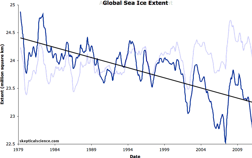
Figure 5: NSIDC Antarctic, Arctic, and global (sum of the two) sea ice extents with linear trends. The data are smoothed with a 12-month running average.
Summary
Ultimately the decline in Arctic sea ice extent has actually occurred much faster than climate models were predicting 13 years ago. Based on the Vinnikov et al. GFDL prediction, the decline is 27 years ahead of predictions. Although we did not analyze the Hadley Centre model predictions, as Figure 1 shows, they actually predicted a slower decline than the GFDL prediction. This rapid rate is precisely why the Arctic sea ice decline is described as a death spiral. Moreover, updating the Vinnikov et al. analysis with current NSIDC Arctic sea ice data, we find less than a 0.1% probability that the Arctic sea ice death spiral can be explained by natural variaiblity alone.


 0
0  0
0


Comments