


 Arguments


Republicans' favorite climate chart has some serious problems
Posted on 19 February 2016 by dana1981
Note: the animated GIF in this post has been uploaded to the SkS Graphics Page, and used in the rebuttal to the myth Models are unreliable
There’s a chart that’s become the favorite, go-to among those who distort climate science in order to justify opposition to climate policies. It’s shown up in many conservative media outlets like The Wall Street Journal and The Australian. It’s been presented by congressional Republicans’ favorite climate witness, John Christy, in recent hearings called by Ted Cruz and Lamar Smith.
The chart, which tries to compare estimates of the temperature of the Earth’s atmosphere to model simulations, is full of problems. Its purpose is clear – to make it appear that climate models are unreliable, and thus cast doubt on all of climate science and the tremendous risks posed by human-caused global warming. In other words, its purpose is to undermine climate policy efforts to reduce those risks by slowing global warming.
But as with all charts of such singular, unscientific purposes, it’s simply another example of cherry picked data being presented in a multiply misleading way, as the annotated version below illustrates.
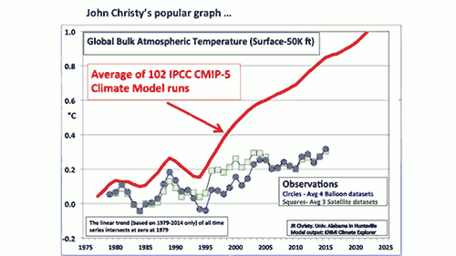
1) The data are misleadingly misaligned
To start, the observational and simulated model data are aligned at a single point at the start of the graph, in 1979. That choice serves to visually exaggerate any difference between the models and data. When doing this sort of comparison properly, climate scientists will average the data over a period called the “baseline,” usually between 10 and 30 years, so that any abnormally hot or cold single years in the data or model runs don’t throw off the alignment.
In fact, there was recently a paper published by Hawkins & Sutton showing that the choice of baseline can significantly impact how accurate the models appear in this sort of comparison, and thus it’s important to carefully choose an appropriate baseline period and perhaps test the comparison with multiple different periods. Christy didn’t even use a baseline period to begin with! NASA Goddard director Gavin Schmidt did the comparison using a baseline period of 1979–1988, and as you can see, the result looks quite different.
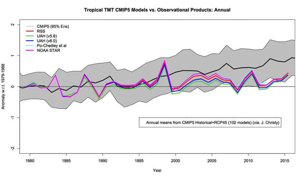
Temperature of the atmosphere to the mid-troposphere in the tropics, comparing model simulations (gray envelope) to observational estimates from satellites (colored lines). Illustration: Gavin Schmidt
2) The uncertainty is ignored!
Normally, climate contrarians love to harp on uncertainties. In fact, the whole argument against implementing climate policies to slow global warming hinges upon the backwards logic that we don’t know enough to take action.
However, in Christy’s chart, no uncertainty ranges are shown whatsoever. The difference this makes is clear in Schmidt’s version above, which shows the spread of individual climate model simulation runs (in grey), although doesn’t show the significant uncertainty in the observational data. When both are taken into account, the observations are consistent with the range of model projections.
3) Observational data disagreements are hidden
Christy’s graph also averages together multiple different observational data sets, which aren’t in terribly close agreement. Gavin Schmidt shows some of these in his version of the chart. Christy’s version also somehow glosses over the fact that atmospheric temperature estimates from satellites and weather balloons diverge in recent years.
4) The chart isn’t peer-reviewed or easily reproducible
Another problem is that Christy doesn’t say which observational data sets he’s averaging together, but there are more than three groups that use satellite data to estimate the temperature of the atmosphere (Schmidt shows four of them in his chart). So he could be omitting some of the data that shows larger warming trends.
We don’t know because this is “blog science.” The analysis hasn’t been vetted by other experts, or published in a scientific journal after being subjected to peer-review. We don’t even know if Christy is accurately representing the climate models, because they don’t produce a simple “bulk atmosphere temperature” output. As such, Christy’s chart should be taken with a grain of salt.
5) We don’t live on Mount Everest
The average elevation of the “bulk atmosphere” shown in Christy’s graph is 25,000 feet, which is just below the peak of Mount Everest, and not far below the elevation at which commercial aircraft generally fly. The temperature at such high elevations isn’t very relevant to humans.
We live on the Earth’s surface, so we care about the global surface temperature. And because we live at the surface, we have an easier time measuring the temperature here, so we know average global surface temperatures with more certainty than the atmospheric temperatures that Christy focuses on.
6) The rest of the global warming data show climate models are accurate
Atmospheric temperatures are just one of the many climate changes simulated by climate models. For example, climate models have done an excellent job predicting how much temperatures at the Earth’s surface would warm.
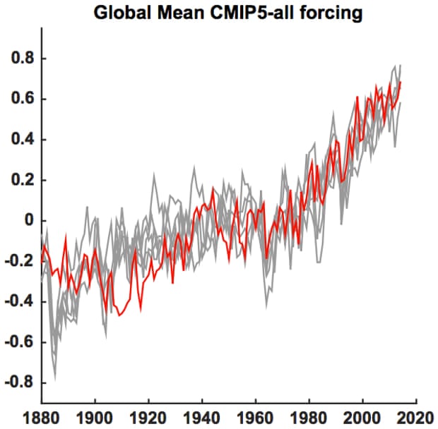
Global mean surface temperature series (red) along with five different Monte Carlo surrogates based on forced signal + ARMA noise realizations (gray) using CMIP5 all-forcing experiments. Illustration: Mann et al. (2015)
They’ve also done well predicting the rate of sea level rise.
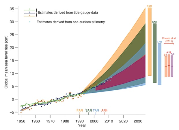
Estimated changes in the observed global annual mean sea level (GMSL) since 1950 relative to 1961–1990. Estimated changes in global annual sea level anomalies are presented based on tide gauge data and based on sea surface altimetry. The shading shows the largest model projected range of global annual sea level rise from 1950 to 2035 for the IPCC First Assessment Report (FAR), Second (SAR), Third (TAR), and for Church et al. (2011) based on the CMIP3 model results. Illustration: IPCC AR5
Arctic sea ice is actually declining a bit faster than models predicted.
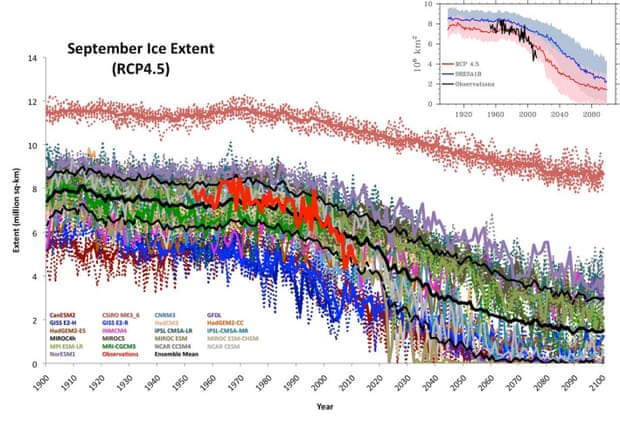
Projected vs. observed September Arctic sea ice extent. Illustration: Stroeve et al. (2012)
And then there’s ocean heating. Only about 1–2% of the energy imbalance causing global warming goes into warming the atmosphere, and only about 3% is used up melting ice. Over 90% of that energy goes into warming the oceans. And climate models are doing a very good job predicting the rate at which the oceans are heating up.
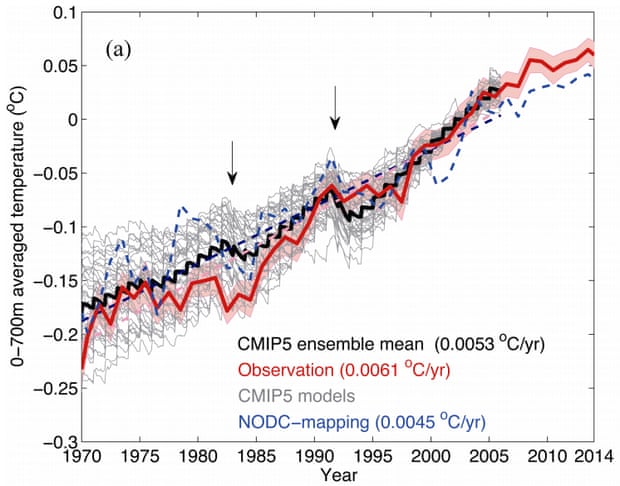
Observed (red) vs. CMIP5 model simulated (gray and black) ocean heat content. Illustration: Cheng et al. (2015)
Proven reliable: climate models and contrarian cherry picking
As the statistician George Box said, “all models are wrong, but some are useful.” Climate models are certainly useful, and are doing a pretty darn good job predicting global warming. Their predictions have been far more accurate than those made by climate contrarians, who keep telling us that the Earth will start to cool any day now, as we keep breaking heat records.


Thanks Dana! Not mentioned is what I think is the biggest misrepresentation: Christy's four balloon indices are questionable, given that RATPAC-A seems to be the only gridded, global balloon dataset that is up to date.
This is a great presentation explaining how a 'supposed expert witness' has failed to most accurately and fully present what they are almost certain to be aware of. It does however explain why particular politically people would like such presentations.
It is more difficult to raise public awareness about, and build public support for, understanding the unacceptability of a person who would choose to mislead. It is especially difficult to 'reach' a person and help them better understand what is going on when that person is willing to be misled, because they sense that better understanding the issue would be contrary to their personal interests.
That type of common sense, sensing when to deliberately not pursue a better understanding, is a serious problem for the future of humanity. And the science of deliberately misleading marketing has developed significant understanding of how to exploit the many reasons people would be inclined to not 'better understand things in pursuit of the development of a lasting better future for all'.
Thank you for an informative post. However, it does not seem very convincing to use CMIP5 (that appears to have been published in 2014) to support the claim that "climate models have done an excellent job *predicting* how much temperatures at the Earth’s surface would warm". CMIP5 may provide excellent *retrospective* modelling, but that is not prediction - or am I missing something? [Note also that Mann (2015) was formally published on 25 Jan 2016.]
Here a graph by Zeke Hausfather, Climate/Energy Scientist, U.C. Berkeley, @hausfath:
I would like to know from Christy why he changed his graph over the year from "Global Mid-Tropospheric Temperature" to "Global Bulk Atmosphere." He's clearly using exactly the same data and calling it two different things. Here's what happens when you overlay the same graph Christy made a year earlier.
Here is another one of his you might like to add to the comparison Rob
This one just says it is the Tropics/TMT.
FrankShann @3, in logical terms, a set of propositions, x, predicts another set of propositions, y, if and only if y can be logically deduced from x. This is the fundamental relationship that underlies all explanation. Of course, sometimes we are not able to predict events from a set of propositions, but only the statistical distribution in which the event lies, or in other words, the probability of its occurence. Being human, we will often claim that something "explains" something else, when it only explains why the event is highly probable - but that does not alter the fact that fundamentally, explanation is logical deduction.
The sole difference between prediction and retrodiction is that the former is explanation before the event, and the later is explanation after the event. Logically, this is irrelevant to how impressive the explanation is. One explanation is superior to the other based on simplicity (ie, the number of entities and relationships invoked), the preciseness of the conclusion of the successful deduction, and a priori probability of the premises. Nothing else, including the time it was made, enters into the fact. We are not less impressed by Newton's deduction of Galilean kinematics from his laws of motion, nor of Keppler's laws of planetary motion from his laws of motion plus the law of universal gravitation because they were after the event - and nor should we be.
The reason we are suspicious of retrodiction is the suspicion that they are ad hoc, ie, that they relly on premises added after the event to make the prediction fit, and at the cost of the simplicity of the premises used. However, the inclussion of ad hoc premises can be tested for either before or after the event. Therefore, provided we exclude ad hoc premises, prediction is no better in a scientific theory than retrodiction. Indeed, that is necessarilly the case in science. Otherwise we would need to preffer a theory that made correct predictions into the future but entirely failed to retrodict past observations over a theory that both predicted and retrodicted past and future observations with a very high degree of accuracy but occasional failures. Indeed, as we cannot know in advance future success, science is built on the principle that successful retrodiction in the best guide to successful prediction.
Given the above, your suspicions of CMIP5 models is based on an assumption that the change between them and earlier models is from the addition of ad hoc premises. That is in fact contrary to the case. The earliest climate models, due to lacking perfect resolution, needed ad hoc adjustments to close the energy budget. They needed ad hoc values for the rate of heat absorption by the ocean because they did not model the ocean. The very earliest models required ad hoc assumptions about the ratio of increase of different GHG because they did not have the capacity to model all GHG. As computer power has been improved, these ad hoc assumptions have been progressively removed. In terms of the elegance of prediction, CMIP5 models are vastly preferrable to the older models - but that is the crucial criteria.
If we prefer the predictions of Hansen (88) as a test of the validity of climate science - we are being unscientific. The model used in Hansen (88) did not include aerosols, did not include all GHGs, used a swamp ocean, did not include a stratosphere, and was not able to be run enough to generate an ensemble of predictions (a necessary feature for generating the probabilistic predictions of climate). In short, it was a massively ad hoc model, especially when compared to its modern incarnation. Therefore, if we are interested in science rather than rhetoric, the successful retrodiction by CMIP 5 models should impress us more than successful (or unsuccessful) predictions of Hansen (88).
Nor is the development from more use of ad hoc premises to less either unusual or a problem in science. In fact it is typical. Newton started predicting the motion of planets using the ad hoc premise that planets were point masses. Later that was improved upon by the ad hoc premise that planets were empty shells with all their mass distributed evenly at their surface. Only as computational power and mathematical techniques have improved has it become possible to model planets as genuine 3-D objects with variable mass concentrations in Newton's theory. This was not a basis of rational criticism of Newton's theory, and nor is the primitive nature of the model used in Hansen (88) a valid criticism of climate science. But just as we would not prefer continuing to use point masses in prediction in gravitation, nor should we preffer the predictions of Hansen (88) over the retrodictions of CMIP5.
While agreeing in general with Dana's post, I do not think Christie's graph is improperly alligned. Specifically, it is alligned so that the trend of all series passes through zero at 1979. Like the mean, a trend aggregates a large body of data, and reproduces it with fewer numbers. The mean reproduces it with just one number, while a trend reproduces it with two - the trend itself, and a reference point (the intersect) on the y-axis. That intersect is similar to a mean in the sort of information it reproduces (though differing in exact value just as modes, medians, harmonic means, and geometric means differ). In fact, given a flat timeseries with white noise, as the number of data points increases, the y-intercept will tend to approach the mean.
That being the case, the use of a y-intercept of a trend line is not the same as arbitrarilly aligning single years. Rather, it compresses the data from (in this case 36 data points) for each time-series and uses that compressed information to align the time-series.
What can be criticized on this point is that Christie, having alligned by trend, does not show the trend lines. By excluding them, the graph gives the appearance of a comparison of absolute displacement of different data points rather than a comparison of the difference in trend. He also does not show the relevant uncertainty in the trend (not the uncertainty in the anomaly value).
Tom Curtis @7, thank you for taking the trouble to reply to my post. Dana raised the issue of "predicting", not me. He presented a graph of CMIP5 against global mean surface temperature as evidence that "climate models have done an excellent job predicting how much temperatures at the Earth’s surface would warm". I question whether that particular graph provides evidence for Dana's assertion that climate models have made accurate predictions. I would have no argument with Dana using that graph if he had said that "climate models do an excellent job describing how much temperatures at the Earth’s surface have warmed". I am trying to make a constructive contribution.
I did not challenge the statement that climate models have accurately predicted (or described) global warming, and I was not discussing the relative merits of prediction versus post hoc analysis. However, in response to your post, a scientific theory is greatly strengthened if it makes falsifiable predictions (e.g. relativity and gravitational waves), and Newton's equations are respected more because they make reliable predictions (in most circumstances) than for their post hoc deduction of Galilean kinematics.
Glenn... That one does seem to be different. After I scaled it correctly the red modeled mean line rises faster than the ones in my previous chart. I'd guess he did limit it to the tropics.
FrankShann:
The way you have worded both your comments still leaves me with the impression that you are using an overly-restrictive definition of "prediction". In science, a "prediction" includes any output of a model or theory that relates to data that was not given to the model before-hand (either explicitly as input, or implicitly as data used to derive a relationship included in the model). As Tom Curtis describes in detail, a retrodiction of data that was not used in the model is still a valid test, regardless of whether it is from the past or the future.
As a crude example (pun intended), a model that predicts where to find oil is still a good model even though the oil has been sitting in that place for millions of years. If the model only tells you where to look for oil you've already found and built into the model, it's not much use. If it helps you find oil nobody ever knew about before, then the model is good. [Even if finding an burning more oil is not good climatologically-speaking!] If you test the model by seeing if it correctly predicts the presence of oil that you know about but never told the model about, then it's still a useful test.
Tom Curtis, I respectfully disagree with your approval of Christy's graph intersecting at a single year. I agree that looking only at trends avoids the issue of baseline choice affecting perception, but to really do that the trends should be presented alone, without the temperatures at individual times--either simply numerically, or graphically of just those trend numbers. Lots of folks have done that for quite a while.
The fact that Christy presents those temperatures at individual times means he is opening the possibility of multiple interpretations of a different sort. That would be true even if he presented trend lines only and none of the individual temperature dots. He has created the perception that the models overprojected always. If instead he had baselined more "fairly" (representatively), the models would be perceived to have underprojected early and overprojected later. That matters, because again the models do not produce trends as primary products. There is some amount of independence among the temperature projections at individual times.
Another problem with the chart:
The "bulk atmosphere" is defined as extending all the way up to 50,000 feet (15,240 m). In most of the world this includes the lower parts of the stratosphere, and as we all know, one of the primary fingerprints of warming caused by greenhouse gases is stratospheric cooling. Comparing a climate model of the surface with observations that is partly made in the stratosphere seems quite dishonest to me, or is it just one more example of the deniers’ incompetence?
Observations made with weather balloons show the stratospheric cooling in the right part of this chart. Even the black curve in the left part of the chart (10,400 m) and to some degree the pink curve (9,200 m) show signs of slower warming than the lower part of the troposphere.
An honest comparison with CMIP-5 should exclude all observations from the 9,200 m level and higher.
Warming from surface level up to 7,200 meters vs. 15,800 meters:
Am I overly suspicious if I believe that the "bulk atmosphere" was defined as going from sea level to 50,000 feet on purpose?
RATPAC-A data is here.
Tom Dayton @12, I certainly agree that having baselined by trends intersecting at the first year in which all data sources provide data, Christy should have shown the actual trend lines (a point I made previously). I would go further and say the trend lines should have been the most prominent feature of the graph, and the uncertainty of the trend lines the second most prominent feature of the graph. I do not agree that the actual values should not have been shown at all. The variability of the data matters, as does the tendency to different trends in different periods, both of which can be approximately estimated from trendlines. (On this point, Christy can also be criticized for showing five year rather than annual means, and for showing the mean of model runs for models with multiple runs in the CMIP5 database, both of which reduce the variability in the data, ie, the reason for showing the data in addition to the trend lines.)
I certainly do not agree that you must baseline by the mean of a multidecade interval (as opposed to the intersect of trends). The appearance of the models having "underprojected early and overprojected later" that you consider a virtue is in that case entirely an artifact of the greater model trend plus the baselining method. Because of the higher trend over the baseline period, of necessity the early values are below the mean and the later values above the mean. But that tells us nothing about the performance of the models, only that they had a high trend in the baseline period. If observations have a low trend in that period, that does not show the models to be more accurate than would be the case from simply showing trends - and to the extent that it appears to do so, it is a false appearance.
Of course, I am not wedded to ordinary least squares linnear trends. If you think some other statistical model shows the variability in trends overtime better, and can be statistically justified, by all means show the data using that other method.
@7 and @11. Predict means to state what will happen in the *future* (Latin prae- "beforehand" + dicare "say"), or to state the existence of something that is *undiscovered* (such as my example of gravitational waves, or Bob's crude oil).
I am well aware of the sloppy use of "predictor variables" in statistical modelling (I am a regular user of Stata), but the correct term is independent variables and *not* predictor variables. The latter term is used (incorrectly) by some scientists because once a model has been developed the (known) independent variables are sometimes used to predict the (unknown) dependent variable.
Bob says that prediction includes "any output of a model or theory that relates to data that was not given to the model before-hand (either explicitly as input, or implicitly as data used to derive a relationship included in the model)". Taylor (2012) says CMIP5 includes near-term "simulations focusing on recent decades and the future to year 2035. These 'decadal predictions' are initialized based on observations and will be used to explore the predictability of climate and to assess the forecast system's predictive skill." Global mean surface temperature observatons to (about) 2014 were available before CMIP5, and were used to develop the model. The model has had direct or indirect input from the independent variable (GMST) during its development - this is completely different to the prediction of gravitational waves or the location of new deposits of cude oil.
The graph presented by Dana is "based on observations" up to about 2014, so it models or describes these observations but it does not predict them (either in the future or as unknowns) . As the Taylor (2012) CMIP5 paper says, the model's predictive skills will be tested in the period from now up to 2035 and beyond.
So I think Dana's usage is incorrct both technically and in terms of the common meaning of "predicting". Even if the usage were technically correct, if "the goal of Skeptical Science is to explain what peer reviewed science has to say about global warming" to the general public, then then it should use words in the same sense as the general public, or make it very clear that jargon is being used.
The post should say that the graph shows that (CMIP5) "climate models have done an excellent job describing [or modeling] how much temperatures at the Earth’s surface would warm" - not predicting.
Frank, if some says, "if variable x changes 10 in the future, then y will change to between 45 and 50", is that a prediction? Climate models are always about saying "if net forcings are x, then climate will be y".
scaddenp @17, yes of course it's a prediction - but we won't know whether the prediction is "excellent" until we've seen what happens to y when x changes. If I have a model that suggets that Brazil will win the next world cup, it's a prediction - but we won't know if my model has done "an excellent job" until 2018. The fact that my model suggests Germany as the likely winner of the 2014 world cup is poor evidence I have "an excellent model", and it's not prediction because the information was given to the model beforehand.
@11: "In science, a 'prediction' includes any output of a model or theory that relates to data that was not given to the model before-hand (either explicitly as input, or implicitly as data used to derive a relationship included in the model)." Global mean surface temperature (GMST) information *was* given to CMIP5 beforehand, so the graph is description and not prediction.
There are two separate issues. First, what constitutes a prediction (as a minimum, the output must not be part of the input; in common usage, it states something we do not already know). Second, what constitutes evidence that a prediction is "excellent".
John Christy's misleading graph purports to show that CMIP5 does not model past temperatures well (and so cannot be trusted to predict future temperatures). Dana's graph provides good evidence that CMIP5 does model past GMST well (which suggests it may be good at predicting future GMST), but it does not provide evidence that CLIP5 actually does predict GMST well.
Public perception of the basis of climate science is immensely important, as Sceptical Science has repeatedly stressed. It is important that the evidence be presented in a clear and understandable way with no hint of hyperbole. It will damage public perception to claim that the graph that Dana used is evidence that "climate models have done an excellent job predicting how much temperatures at the Earth’s surface would warm" (they have, but that's not shown by this graph). All that is needed to refute Christy's graph is to say that "climate models do an excellent job describing how much temperatures at the Earth’s surface have warmed".
FrankShann @18, GMST was not data fed into the climate models. It is a dependent variable. This can be seen by the variability of model retrodictions over the historical period (in this case for CMIP3):
Given the other things you say, your claim that "Global mean surface temperature (GMST) information *was* given to CMIP5 beforehand, so the graph is description and not prediction" is quite bizarre. I assume your claim was just poorly worded, and ask for clarrification.
FrankShann @various, CMIP5 uses historical data to 2005 inclusive, but scenario data thereafter. The equivalent model experiments for the IPCC TAR and AR4 used historical data to 2000, and scenario data thereafter. I am not aware of the dates for the FAR and SAR, but clearly they predated the reports themselves (1990 and 1995 respectively). Hansen 88 used historical data only up to 1983 (from memory).
This is important because Dana wrote:
In doing so he links to an article discussing the predictions of all five IPCC reports, plus other 'warmist' predictions, along with those few predictions made by AGW 'skeptics'. He was not referring to just CMIP5 predictions as you suppose, and all of the predictions include several years after the last historical forcing data, including CMIP5.
The article summarizes some of the results from a number of articles discussing the predictions of just one individual or organization in any article. The results of the comparisons are summarized in this graph:
So, leaving aside all the technical points about predictions and retrodictions, and predictions and projections; your criticism of Dana is wrong. The worst that can be said of his claim is that it is fleshed out in this article, but another. That, however, is a necessity of communication. Even in the world of the internet, there is still no royal path to knowledge. And links are not just decorations.
And for what it is worth, the HadCRUT4 trend since 2005 is 0.127 +/- 0.22 C/decade, compared to a CMIP5 prediction of about 0.2 C/decade. As the difference between scenarios is inconsequential over that time period, the distinction between projection and prediction is nugatory. Ergo, the CMIP5 prediction still fairs fairly well, and certainly outperforms any 'skeptical' prediction over the same period.
The core issue here is merely semantic. Modellers use "predict" to mean how well their model performs on past data, even when the model has been adjusted (tweaked) in the light of knowledge of the dependent variable. This meaning of "predict" is jargon. The general meaning (well over the 97% consensus mark) is that predict means to make a statement about something that is unknown (such as GMST in 2030-2040, or the presence of gravity waves). For example, I take information about the results of football matches over the last 10 seasons and make a model that "predicts" the winners. Then I try different variables or transformations and get better "prediction". But the vast majority of people do not regard this as prediction - for prediction, they require my model to say which teams will win *next* season. That is, GMST after 2015, not 1880-2015. I was suggesting (and still suggest) avoiding jargon and using the widely accepted meaning of "predict" (as defined in the Oxford Dictionary) - which means that CMIP5 describes rather than predicts GMST for the vast majority of 1880 to 2015.
Tom Curtis @19. I did not say global mean surface temperature (GMST) was "fed into" CMIP5, but I agree that I should have made it clear that I am not suggesting that global mean surface temperature (GMST) is an independent variable in the CMIP models. I *am* suggesting that the models have been adjusted in the light of how well they predict GMST (and other variables) over some or all of the period from 1880 to 2014 (the period shown in the graph). Knowledge of GMST during the period has influenced the development of the models.
Tom Curtis @20. I am not atacking Dana's post - it is very helpful indeed (as I said @3). Also, I heartily agree that climate models are remarkably useful predictors of future climate, and vastly superior to the denialist attempts. I merely suggest that Dana consider altering one word (predict to describe) so the post is more plausible to readers who are not statistical modelers (the vast majority of the population) so it reads "Climate models have done an excellent job describing [instead of predicting] how much temperatures at the Earth’s surface would warm" because this statement is supported by a graph plotting CMIP5 against GMST from 1980-2015 (and it still refutes John Chrisy's misleading implication that climate models do not describe past GMST well). The link you mention to the excellent Comparing Global Temperature Predictions article (which I printed and gave to my friends in 2011) occurs at the end of the post, far removed from the predict/describe statement.
I am disappointed at the response to my efforts to help. I am not a climate scientist, but I have have extensive experience with statistical modeling and scientific publication (I'm a member of the International Advisory Board of The Lancet). I tried to help because I think climate change is extremely important and that Sceptical Science is a very useful resource - and that it might benefit from advice from a non-climate scientist about how a post could be misinterpreted by other people who are not climate scientists. Perhaps I won't bother in future.
I would strongly suggest that these discussions of models, reliability, and the semantics of "predict", "project", etc be moved to the models are unreliable thread where these issues have been extensively discussed, as this thread concerns issues with Dr Christy's chart and the (odd) choices made in creating it.
FrankShann - I have responded to your model discussion in the appropriate thread.
HK@14,
I would say you are justifiably skeptical of the motives of informed and knowledgable people like Dr. Christy and those who choose work like his as their preferred presentation of what is going on.
I am almost certain that Dr. Christy is well aware of the difference between the trend of the lower and higher atmosphere and 'abuses' that understanding to misrepresent what he actually better understands. Others like him also try to focus only on satellite data that they understand to be potentially unreliable (highly uncertain compared to other measures of what is going on), and which would require many more years of gathered data to undeniably show how wrong their preferred presentations are.
I am also quite certain that there are some people among us who only care about enjoying and winning as much as they can get away with in their lifetime. And they understand that they can obtain a competetive advantage by deliberately trying to get away with activity they actually understand is contrary to the advancement of humanity to a lasting better future for all. They have almost no interest in the consequences of their actions, and are particularly callous about the consequences in 'a future they will not be alive in'. And some are even worse, having a short-term focus on getting away with winning just 'one more year (or one more fiscal quarter) of getting away with what they understand they should not be allowed to get away with'.
And I am equally certain that the politicians and media pundits who choose to use the deliberately deceptive abuses developed by the likes of Christy understand the unacceptability of their preferences, including fully understanding how unacceptable it is for a more fortunate member of current day humanity to contiune to obtain more personsal pleasure and profit from the known to be damaging and actually ultimately unsustainable burning of fossil fuels.
Hopefully one of the better understandings that grows from this climate change challenge is that popularity and profitability (in business or politics) cannot be relied upon or trusted to develop a lasting better future for humanity, because of the power of the science of deliberately deceptive marketing.
History is full of examples of understood to be damaging activity developing and being prolonged by unjustified drumming up of popular support for known to be unacceptable things. This climate change challenge is an obvious example of how some people are encouraged to behave as unacceptably as they can get away with by the competetive capitalism system and the fatally flawed rules of the game made-up by those among humanity who only care about themselves in their region of the planet in their lifetime (or worse yet just caring about getting away with stuff for one more, 4 year election cycle, or even worse focused only on a 3 month period of time).
Well said, OPOF!
Like you, I’m fundamentally critical to the capitalist system too. I’m a little hesitant to call myself a socialist as they also have said and done a lot of stupid things, but an economic system that depends on non-stop growth on a limited planet can’t be sustainable in the long run. It seems that most politicians believe that the Earth is bigger now than it was 100 years age, while everyone with some scientific knowledge know that its surface area of 510 million km² hasn’t changed much for 4.5 billion years.
But let’s get back to the Christy chart:
In my opinion the chart isn’t directly lying about anything, it’s just misleading and therefore lying in an indirect way. And the most misleading part of it is what I’ve already highlighted, namely comparing estimates by a climate model for the surface with observations of the "bulk atmosphere" reaching up to 50,000 feet.
The blue curve in my graph is the average of all the RATPAC-A data sets from the surface to the 100 millibar level (close to 50,000 feet) and indicates a warming of roughly 0.3 °C since the late 1970’s. That’s pretty similar to the balloon data presented in the Christy chart. No direct lies there!
The red curve in my graph is the average of the data sets from the surface to the 400 millibar level and indicates a warming of roughly 0.6 °C since the late 1970’s (the trends given in the graph cover the whole period from 1960). If we insert that curve into the Christy chart, we will see a far better agreement with the climate model, especially if we consider the uncertainty!
So, no direct lies, but the Christy chart is more or less like comparing a climate model estimate from Norway (there I live) with observations from Africa!
FrankShann @21, dictionary definitons are descriptive lexicography (see comment here), not presciptive lexicography. It follows that they can only guide usage, not prescribe it. In using the Oxford defintion, you are prescribing that Dana drop a less confusing term ('predict') for a more confusing term ('describe'). Specifically, many people would interpret 'CMIP5 models desribe GMST' as indicating that GMST was prescribed for CMIP5 models in much the same way as forcings are. It would certainly leave them confused as to whether it was a dependant or independant variable. Nor would it be particularly useful to describe the CMIP5 GMST output as a dependant variable, for that certainly is jargon. In fact, short of expanding the article by a carefull discussion of prediction, retrodiction and projection, and how it applies to CMIP5, I cannot think of a better word (in terms of avoiding misunderstanding) than the term used by Dana in this context.
I don't particularly care about your statistical experience, given that you are making a linguistic point. Nor, so far as I can see do you have any justification for complaint about the response to your suggestion. I have made suggestions for improvements in the past on SkS articles. Some have been ignored. Some have been hotly debated, and a few have been accepted. That is what I would expect from a group of independently minded people who make up their own minds about the validity of arguments.
HK,
The real problem is not Capitalism, Competition, Free Markets, or Marketing (or Communism or Socialism). The real problem is the tendency for some people to want to personally get away with something they can understand is unacceptable.
When people choose to pursue personal interest without responsible conscientious regard for the consequences of their chosen desires and actions, they can have a competitive advantage in any game (Those economic and political things are all games made-up by humans. And the problem gets worse when those callously self-interested types win the right to make-up the rules or make-up how the rules will be enforced).
And the misuse of the powerful science of Marketing can allow those type of people to get more undeserved advantage through the drumming up of undeserved popular support from others who are easily impressed, willing to believe unjustifiable claims in support of unacceptable actions.
That is what is going on, and not just in the US.
KR @13 Your RATPAC data for 11,000m is the "Goldilocks Layer"!
Interpolation between the upward slope at the Surface, and the downward slope in the stratosphere, we should expect such a "Goldilocks Layer" with a trend of zero. That is why Christy, Curry, and Cruz cherry-pick the middle troposphere, to claim "not much warming".