


 Arguments


Of Averages and Anomalies - Part 1A. A Primer on how to measure surface temperature change
Posted on 29 May 2011 by Glenn Tamblyn
In recent years a number of claims have been made about ‘problems’ with the surface temperature record: that it is faulty, biased, or even ‘being manipulated’. Many of the criticisms often seem to revolve around misunderstandings of how the calculations are done and thus exaggerated ideas of how vulnerable to error the analysis of the record is. In this series I intend to look at how the temperature records are built and why they are actually quite robust. In this first post (Part 1A) I am going to discuss the basic principles of how a reasonable surface temperature record should be assembled, Then in Part 1B I will look at how the major temperature products are built. Finally in Parts 2A and 2B I will then look at a number of the claims of ‘faults’ against this to see if they hold water or are exaggerated based on misconceptions.
How NOT to calculate the Surface Temperature
So, we have records from a whole bunch of meteorological stations from all around the world. They have measurements of daily maximum and minimum temperatures for various parts of the last century and beyond. And we want to know how much the world has warmed or not.
Sounds simple enough. Each day we add up all these station’s daily average temperatures together, divide by the number of stations and, voilá, we have the average temperature for the world that day. Then do that for the next day and the next and…. Now we know the world’s average temperature, each day, for all that measurement period. Then compare the first and last days and we know how much warming has happened – how big the ‘Temperature Anomaly’ is - between the two days. We are calculating the ‘Anomaly of the Averages’. Sounds fairly simple doesn’t it? What could go wrong?
Absolutely everything.
So what is wrong with the method I described above?
1. Every station may not have data for the entire period covered by the record. They have come and gone over the years for all sorts of reasons. Or a station may not have a continuous record. It may not be measured on weekends because there wasn’t the budget for someone to read the station then. Or it couldn’t be reached in the dead of winter.
Imagine we have 5 measuring stations, A to E that have the following temperatures on a Friday:
A = 15, B = 10, C = 5, D = 20 & E = 25
The average of these is (15+10+5+20+25)/5 = 15
Then on Saturday, the temperature at each station is 2 °C colder because a weather system is passing over. But nobody reads station C because it is high in the mountains and there is no budget for someone to go up there at the weekend. So the average we calculate from the data we have available on Saturday is:
(13+8+18+23)/4 = 15.5.
But if station C had been read as well it would have been:
(13+8+3+18+23)/5 = 13
This is what we should be calculating! So our missing reading has distorted the result.
We can’t just average stations together! If we do, every time a station from a warmer climate drops off the record, our average drops. Every time a station from a colder climate drops off, our average rises. And the reverse for adding stations. If stations report erratically then our record bounces erratically. We can’t have a consistent temperature record if our station list fluctuates and we are just averaging them. We need another answer!
2. Our temperature measurements aren’t from locations spaced evenly around the world. Much of the world isn’t covered at all – the 70% that is oceans. And even on land our stations are not evenly spread. How many stations are there in the roughly 1000 km between Maine and Washington DC, compared to the number in the roughly 4000 km between Perth & Darwin?
We need to allow for the fact that each station may represent the temperature of very different size regions. Just doing a simple average of all of them will mean that readings from areas with a higher station density will bias the result. Again, we can’t just average stations together!
We need to use what is called an Area Weighted Average. Do something like: take each station's value, multiply it by the area it is covering, add all these together, and then divide by the total area. Now the world isn’t colder just because the New England states are having a bad winter!
3. And how good an indicator of its region is each station anyway? A station might be in a wind or rain shadow. It might be on a warm plain or higher in adjacent mountains, or in a deep valley that cools quicker as the Sun sets. It might get a lot more cloud cover at night or be prone to fogs that cause night-time insulation. So don’t we need a lot of stations to sample all these micro-climates to get a good reliable average? How small does each station’s ‘region’ need to be before its readings are a good indicator of that region? If we are averaging stations together we need a lot of stations!
4. Many sources of bias and errors can exist in the records. Were the samples always taken at the same time of day? If Daylight Savings Time was introduced, was the sampling time adjusted for this? Where log sheets for a station (in the good old days before new fangled electronic recording gizmos) written by someone with bad handwriting – is that a 7 or a 9? Did the measurement technology or their calibrations change? Has the station moved, or changed altitude? Are there local sources of biasing around the station? And do these biases cause one-off changes or a time-varying bias?
We can’t take the reading from a station at face-value. We need to check for problems. And if we find them we need to decide whether we can correct for the problem or need to throw that reading or maybe all that station’s data away. But each reading is a precious resource – we don’t have a time-machine to go back and take another reading. We shouldn’t reject it unless there is no alternative.
So, we have a Big Problem. If we just average the temperatures of stations together, even with the Area Weighting answer to problem #2, this doesn’t solve problems #1, #3 or #4. It seems we need a very large detailed network, which has existed for all of the history of the network, with no variations in stations, measurement instruments etc, and without any measurement problems or biases.
And we just don’t have that. Our station record is what it is. We don’t have that time machine. So do we give up? No!
How do stations' climates change?
Let’s consider a few key questions. If we look at just one location over its entire measurement history, say down on the plains, what will the numbers look like? Seasons come and go; there are colder and warmer years. But what is the longer term average for this location? What is meant by ‘long term’? The World Meteorological Organisation (WMO) defines Climate as the average of Weather over a 30 year period. So if we look at a location averaged over something like a 30 year period and compare the same location averaged over a different 30 year period, the difference between the two is how much the average temperature for that location has changed. And what we find is that they don’t change by very much at all. Short term changes may be huge but the long term average is actually pretty stable.
And if we then look at a nearby location, say up in the mountains, we see the same thing: lots of variation but a fairly stable average with only a small long term change. But their averages are very different from each other. So although a station’s average change over time is quite small, an adjacent station can have a very different average even though its change is small as well. Something like this:
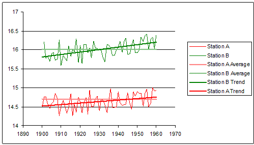
Next question: if each of our two nearby stations averages only change by a small amount, how similar are the changes in their averages? This is not an idle question. It can be investigated, and the answer is: mostly very similar. Nearby locations will tend to have similar variations in their long term averages. If the plains warm long term by 0.5°C, it is likely that the nearby mountains will warm by say 0.4–0.6°C in the long term. Not by 1.5 or -1.5°C.
It is easy to see why this would tend to be the case. Adjacent stations will tend to have the same weather systems passing over them. So their individual weather patterns will tend to change in lockstep. And thus their long term averages will tend to be in lock-step as well. Santiago in Chile is down near sea level while the Andes right at its doorstep are huge mountains. But the same weather systems pass over both. The weather that Adelaide, Australia gets today, Melbourne will tend to get tomorrow.
 Final question. If nearby locations have similar variations in their climate, irrespective of each station's local climate, what do we mean by ‘nearby’? This too isn’t an idle question; it can be investigated, and the answer is many 100’s of kilometres at low latitudes, up to 1000 kilometres or more at high latitudes. In Climatology this is the concept of ‘Teleconnection’ – that the climates of different locations are correlated to each other over long distances.
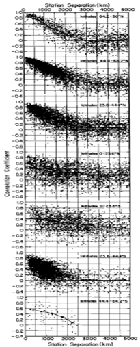
Figure 3, from Hansen & Lebedeff 1987 (apologies for the poor quality, this is an older paper) plots the correlation coefficients versus separation for the annual mean temperature changes between randomly selected pairs of stations with at least 50 common years in their records. Each dot represents one station pair. They are plotted according to latitude zones: 64.2-90N, 44.4-64.2N, 23.6-44.4N, 0-23.6N, 0-23,6S, 23.6-44.4S, 44.4-64.2S.
Notice how the correlation coefficients are highest for stations closer together and less so as they stretch farther apart. These relationships are most clearly defined at mid to high northern latitudes and mid southern latitudes – the regions of the Earth with higher proportions of land to ocean.
This makes intuitive sense since surface air temperatures of the oceanic regions are influenced also by water temperatures, ocean currents etc instead of just air masses passing over them, while land temperatures don’t have this other factor. So land temperatures would be expected to have better correlation since movement of weather systems over them is a stronger factor in their local weather.
This is direct observational evidence of Teleconnection. Not just climatological theory but observation.
A better answer
So what if we do the following? Rather than averaging all our stations together, instead we start out by looking at each station separately. We calculate its long term average over some suitable reference period. Then we recalculate every reading for that station as a difference from that reference period average. We are comparing every reading from that station against its own long term average. Instead of a series of temperatures for a station, we now have a series of ‘Temperature Anomalies’ for that station. And then we repeat this for each individual station, using the same reference period to produce the long term average for each separate station.
Then, and only then, do we start calculating the Area Weighted Average of these Anomalies. We are now calculating the ‘Area Average of the Anomalies’ rather than the ‘Anomaly of the Area Averages’ – now there’s a mouthful. Think about this. We are averaging the changes, not averaging the absolute temperatures.
Does this give us a better result? In our imaginary ideal world where we have lots of stations, always reporting all the time, no missing readings, etc., then these two methods will give the same result.
The difference arises when we work in an imperfect world. Here is an example (for simplicity I am only doing simple averages here rather than area weighted averages):
Let's look at stations A to E. Let's say their individual long term reference average temperatures are:
A = 15, B = 10, C = 5, D = 20 & E = 25
Then for one day's data their individual readings are:
A = 15.8, B = 10.4, C = 5.7, D = 20.4 & E = 25.3
Using the simple Anomaly of Averages method from earlier we have:
(15.8+10.4+5.7+20.9+25.3)/5 - (15+10+5+20+25)/5 = 0.52
While using our Average of Anomalies method we get:
((15.8-15) + (10.4-10) + (5.7-5) + (20.4-20) + (25.3-25))/5 = 0.52
Exactly the same!
However, if we remove station C as in our earlier example, things look very different. Anomaly of Averages gives us:
(15.8+10.4+20.4+25.3)/4 - (15+10+5+20+25)/5 = 2.975 !!
While Average of Anomalies gives us:
((15.8-15) + (10.4-10) + (20.4-20) + (25.3-25))/4 = 0.475
Obviously both values don’t match what the correct value would be if station C were included, but the second method is much closer to the correct value. Bearing in mind that Teleconnection means that adjacent stations will have similar changes in anomaly anyway, this ‘Average of Anomalies’ method is much less sensitive to variations in station availability.
Now let’s consider how this approach could be used when looking at station histories over long periods of time. Consider 3 stations in ‘adjacent’ locations. A has readings from 1900 to 1960. B has reading from 1930 to 2000 and C has readings from 1970 to today. A overlaps with B, B overlaps with C. But C doesn’t overlap with A. If our reference period is say 1930 – 1960, we can use the readings from A & B. But C doesn’t have any readings from our reference period. So how can we splice together A, B, & C to give a continuous record for this location?
Doesn’t this mean we can’t use C since we can’t reference it to out 1930-1960 baseline? And if we use a more recent reference period we lose A. Do we have to ignore C’s readings entirely? Surely that means that as the years roll by and the old stations disappear, eventually we will have no continuity to our record at all? That’s not good enough.
However there is a way we can ‘splice’ them together.
A & B have a common period from 1930-1960. And B & C have a common period from 1970-2000. So if we take the average of B from 1930 to 1960 and compare it to the same average from A for the same period we know how much their averages differ. Similarly we can compare the average of B from 1930-1960 to the average for B from 1970-2000 to see how much B has changed over the intervening period. Then we can compare B vs C over the 1970-2000 period to relate them together. Knowing these three differences, we can build a chain of relationships that links C1970-2000 to B1970-2000 to B1930-1960 to A1930-1960
Something like this:
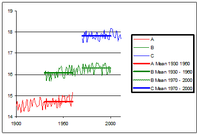
If we have this sort of overlap we can ‘stitch together’ a time series stretching beyond more than one station’s data. We have the means to carry forward our data series beyond the life (and death) of any one station, as long as there is enough time overlap between them. But we can only do this if we are using our Average of Anomalies method. The Anomaly of Averages method doesn’t allow us to do this.
So where has this got us in looking at our problems? The Average of Anomalies approach directly addresses problem #1. Area Weighted Averaging addresses problem #2. Teleconnection and comparing a station to itself helps us hugely with problem #3 – if fog provides local insulation, it probably always had, so any changes are less related to the local conditions and more to underlying climate changes. Local station bias issues still need to be investigated but if they don’t change over time, then they don’t introduce ongoing problems. For example, if a station is too close to an artificial heat source, then this biases that station's temperature. But if this heat source has been a constant bias over the life of the station, then it cancels out when calculate the anomaly for the station. So this method also helps us with (although doesn’t completely solve) problem #4. In contrast, using the Anomaly of Averages method, local station biases and erratic station availability will compound each other making things worse.
So this looks like a better method.
Which is why all the surface temperature analyses use it!
The Average of Anomalies approach is used precisely because it avoids many of the problems and pitfalls.
In Part 1B I will look at how the main temperature records actually compile their trends.


[DB] Glenn was using a specific simple example to illustrate the principles underlying the measurements of the temperature records. If you were thanking him for the clarity of the illustration and the sense it made, then you're welcome.
If, on the other hand, your had other, ideological, meanings for making your comment, then those ideological meanings and intimations have no place in the science-based dialogues here.
[DB] This may help with some of your questions.
Tristan, yes. If you have a measurement of the minimum and maximum temperature, they are simply averaged to get the daily mean.
In the time before minimum-maximum thermometers were invented other averaging schemes have been developed where temperature measuremens were made at 2, 3 or 4 fixed hours and then averaged to get the daily temperature. For example, in Germany it was costum to measure at 7, 14 und 21 hours. And then compute the average temperature from Tm = (T7+T14+2*T21)/4.
Nowadays we have automatic weather stations that measure frequently and the average temperature is computed from 24 hourly measurements or even measurements every 10 minutes.
Changes from one method of computing the mean temperature to another can produce biases. How large such biases are can be computed from high frequency measuremens, for example from automatic weather stations.
Okay, I read the explanation that averaged anomalies at nearby locations will typically show less change than will average measured temperatures. That sort of makes sense. I am not sure how less change means more correct.
And I understand the idea of teleconnection. What I don't understand is how you can generalize, or interpolate, in areas where you don't have any measurements.
It seems to me that you won't be able to determine the correlation coefficients resulting from teleconnection unless you have all of the temperature measurements in the first place.
How can you determine the error in your averaging if you don't have all of the measurements to determine that error? The average of anomalies approach may intuitively feel better, but how is it mathematically justified?
Sorry, this does not make sense to me.
PaulG - the way you do it, it take lots of thermometers at varying distances from each other and see how exactly the correlation of anomalies vary with distance. That would be the Hansen and Lebedeff 1987 paper referenced in the main articles.
Is Paul G asking for thermometers to cover the face of the earth? What about the depths of the ocean??
PaulG
Read part 1B for more on the distances over which one can interpolate. And as scaddenp said, Hansen & Lebedeff 1987 is important to read.
Let me address why anomalies give better accuracy mathematically. This article at wikipedia on Accuracy & Precision is worth reading, particularly for the difference beteen the two terms.
For any reading from an instrument, a thermomemeter for example, we know that the reading will consist of the true value of what we are interested in and some error in the measurement. In turn this eror is made up of the accuracy of the reading and the prcision of the reading. What is the difference between the two ideas.
Accuracy is the intrinsic, built in error of the instrument. For example a thermometer might be mis-calibrated and read 1 degree warmer than the real value. In many situations the accuracy of a device is constant - built into the device
Precision is how precisely we cane take the reading. So by eye we might only be able to read a mercury thermometer to 1/4 of a degree. A digital thermometer might report temperature to 1/100th of a degree.
So if we take many readings with our instrument each reading will be:
Reading = True Value + Accuracy + Precision.

This image might illustrate that:
So if we take the sum of many readings we will get:
ΣReadings = ΣTrue Values + ΣAccuracy + ΣPrecision.
And the Average of the Readings is the Average of the True values + the Average of the Accuracy + the Average of the precisions.
But the more readings we take, the more the average of the precisions will tend towards zero. The average of a random set of values centered around zero is zero. So the more readings we take, the better the precision of the average. Mathematically, the precision of an average is the precision of a single reading divided by the square root of the number of readings.
So if an instrument has a precision of +/- 0.1, an average of 100 readings has a precision of
0.1 / sqrt(100) = 0.01
10 times more precise.
And the average of the accuracy (for an instrument with a fixed accuracy) is just equal to the accuracy.
So the more readings we have, the more the average tends towards being:
Average of Readings = Average of True Values + Accuracy.
Now if we take an anomaly. When we take the difference between 1 reading and the average we get:
Single Anomaly = (Single True Value + Accuracy + Precision) - (Average True Value + Accuracy)
which gives us:
Single Anomaly = (Single True Value - Average True Value) + Precision.
So by taking an anomaly against its average we have cancelled out the fixed part of the error - the accuracy. We have effectively been able to removed the influence of built in errors in our instrument from our measurement.
But we still have the precision from our single reading left.
So if we now take the average of many anomalies we will get
Average of Read Anomalies = Average of True Anomalies.
Accuracy has already been removed and now the average of the precisions will tend towards zero the more anomaliess we have.
So an average of the anomalies gives us a much better measure. And the remaining error in the result is a function of the precision of the instruments, not their accuracy. Manufacturers of instruments can usually give us standardised values for their instrument's precision. So we can then calculate the precision of the final result.
But we have to abandon using absolute temperatures. They would be much less accurate. Since the topic is climate Change, not climate, anomalies let us measure the change more accurately than measuring the static value.
There is one remaining issue which is the topic of parts 2A and 2B. What if our accuracy isn't constant? What if it changes? One thermometer might read 1 degree warm. But if that themometer is later replaced by another one that reads 1 degree colder, then our calculation is thrown out, the accuracies don't cancel out.
Detecting these changes in bias (accuracy) is what the temperature adjustment process is all about. Without detecting them our temperature anomaly record contains undetected errors.
This page is very useful to an educator like me, but the following will throw my students for a loop: "...Next question: if each of our two stations['] averages only change[s] by a small amount, how similar are the changes in their averages? This is not an idle question. It can be investigated, and the answer is: mostly by very little...."
Question: "How similar are the changes...?"
Answer: "...mostly by very little?"
declan
Thanks for the catch, it wasn't clear enough - even after 4 years proof reading never ends.
I have alrered the text to clarify the point.