Climate Science Glossary

Term Lookup

Enter a term in the search box to find its definition.

Settings

Use the controls in the far right panel to increase or decrease the number of terms automatically displayed (or to completely turn that feature off).

Term Lookup

Settings


All IPCC definitions taken from Climate Change 2007: The Physical Science Basis. Working Group I Contribution to the Fourth Assessment Report of the Intergovernmental Panel on Climate Change, Annex I, Glossary, pp. 941-954. Cambridge University Press.

Home Arguments Software Resources Comments The Consensus Project Translations About Support

Bluesky Facebook LinkedIn Mastodon MeWe

Twitter YouTube RSS Posts RSS Comments Email Subscribe


Climate's changed before
It's the sun
It's not bad
There is no consensus
It's cooling
Models are unreliable
Temp record is unreliable
Animals and plants can adapt
It hasn't warmed since 1998
Antarctica is gaining ice
View All Arguments...


Username
Password
New? Register here
Forgot your password?

Latest Posts

Archives

The physical realities of global warming

Posted on 26 November 2009 by John Cook

Global warming is happening before our very eyes. All over the world, from the Arctic to Antarctica, scientists are observing the impacts of climate change. In the three years since the IPCC Fourth Assessment Report (AR4) was drafted, hundreds of peer reviewed papers studying climate change have been published. A summary of the latest research has been compiled in The Copenhagen Diagnosis, released by the University of NSW and authored by 26 climate scientists. It's a resource heavy report, referencing hundreds of papers. Here are some of the highlights:

At a time when we need to be lowering our carbon footprint, global CO2 emissions have been sharply rising. In fact, the acceleration in fossil fuel CO2 emissions is tracking the worst case scenarios used by the IPCC AR4. Consequently, atmospheric CO2 is increasing ten times faster than any rate detected in ice core data over the last 22,000 years.


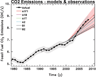
Figure 1: Observed global CO2 emissions from fossil fuel burning and cement production compared with IPCC emissions scenarios. The coloured area covers all scenarios used to project climate change by the IPCC.

Over the past 25 years, global temperature has warmed at a rate of ~0.2°C per decade. Superimposed over this long term trend is short term variability. Most of these short-term variations are due to internal oscillations like El Niño Southern Oscillation, the 11-year solar cycle and volcanic eruptions. Over periods less than a decade, such short-term variations can outweigh the anthropogenic global warming trend. For example, El Niño events can change global temperature by up to 0.2°C over a few years. The solar cycle imposes warming or cooling of 0.1°C over five years. However, neither El Niño, solar activity or volcanic eruptions make a significant contribution to long-term climate trends. Consequently, over the past decade (1999-2008), the warming trend is 0.19°C per decade. consistent with the long term trend.


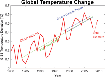
Figure 2: Global temperature according to NASA GISS data since 1980. The red line shows annual data, the red square shows the preliminary value for 2009, based on January-August. The green line shows the 25-year linear trend (0.19 °C per decade). The blue lines show the two most recent ten-year trends (0.18 °C per decade for 1998-2007, 0.19 per decade for 1999-2008).

Satellite and tide-gauge measurements show that sea level rise is accelerating faster than expected. The average rate of rise for 1993-2008 as measured from satellite is 3.4 millimeters per year while the IPCC Third Assessment Report (TAR) projected a best estimate of 1.9 millimeters per year for the same period. Actual sea level rise is 80% higher than the median projection. Sea level is likely to rise much more by 2100 than the often-cited range of 18-59 centimeters from the IPCC AR4.


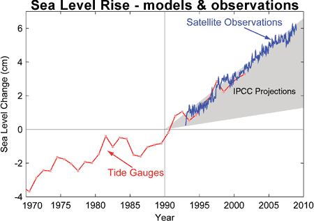
Figure 3: Sea level change. Tide gauge data are indicated in red and satellite data in blue. The grey band shows the projections of the IPCC Third Assessment report.

Summer-time melting of Arctic sea-ice has accelerated far beyond the expectations of climate models. The area of sea-ice melt during 2007-2009 was about 40% greater than the average prediction from IPCC AR4 climate models. The thickness of Arctic sea ice has also been on a steady decline over the last several decades. September sea ice thickness has been decreasing at a rate of 57 centimeters per decade since 1987.


Figure 4: Observed (red line) and modeled September Arctic sea ice extent in millions of square kilometers. Solid black line gives the average of 13 IPCC AR4 models while dashed black lines represent their range. The 2009 minimum has recently been calculated at 5.10 million km2, the third lowest year on record and still well below the IPCC worst case scenario.

Some more observations from the latest research:

  • Recent studies have confirmed the observed trends of more hot extremes and fewer cold extremes.
  • Rains have become more intense in already-rainy areas as atmospheric water vapor content increases. Recent changes have occurred faster than predicted by some climate models, raising the possibility that future changes will be more severe than predicted.
  • Conversely, there have been observed increases in drought in some latitude bands. The intensification of the global hydrological cycle is expected to lead to further increases in very heavy precipitation in wet areas and increased drought in dry areas.
  • Several studies since the IPCC AR4 have found more evidence for an increase in hurricane intensity over the past decades.
  • There have been recent increases in the frequency and intensity of wildfires in regions with Mediterranean climates (e.g. Spain, Greece, southern California, south-east Australia) and further marked increases are expected.
  • Rapid degradation and upward movement of the permafrost lower limit has continued on the Tibetan plateau. Observations in Europe have noted permafrost thawing and a substantial increase in the depth of the overlying layer.
  • The contribution from shrinking glaciers to sea level rise in 2000 was about 0.8 millimeters per year. New estimates show that glacier mass loss has increased 50% and now contributes about 1.2 millimeters per year to global sea levels.
  • There have been a number of recent studies reinforcing the conclusion that the rate of ice mass loss from the Greenland and Antarctic ice sheets are increasing. Recent observations have shown that changes in the rate of ice discharge can occur far more rapidly than previously suspected. Dynamic ice sheet uncertainties are largely one-sided. They can lead to a faster rate of sea-level rise but are unlikely to significantly slow the rate of rise.
  • Observations also show deep-ocean warming is much more widespread in the Atlantic and Southern Oceans than previously appreciated.

There is a common theme emerging from the most recent peer reviewed research. When uncertainties expressed in the IPCC AR4 report are subsequently resolved, they point to a more rapidly changing and more sensitive climate than previously believed. Skeptics tend to characterise the IPCC as imposing an alarmist bias in their conclusions. The latest empirical data indicates the opposite is the case.

0 0

Printable Version  |  Link to this page

Comments

Comments 1 to 42:

  1. Climate skeptics usually make a big deal about how bad IPCC-models are, but for some reason the situation with Arctic sea ice extent doesn't seem to be interesting to them, and yet there seems to be a real gap between the models and the observations. Strange.
    0 0
  2. Taking a page out of the recent political event, I have to note it's quite a devious "trick" those scientists pulled in adding satellite observations to the tide gauge data. Such blatant data manipulation! Ari, Skeptics tell us Arctic sea ice is growing (starting in 2007 of course). Models and alarmists are wrong again. That graph above, therefore, is propaganda.
    0 0
  3. John Appreciate this summary. Most folks would find the latest IPCC release a bit of a challenge. Great to have a link to help with that. All the best.
    0 0
  4. Appreciate this summary. Most folks would find the latest IPCC release a bit of a challenge.
    Again, for the sake of accuracy, this report is not an official IPCC document, though many of the authors are significant authors of AR4.
    0 0
  5. dhogaza, Many thanks for that clarification. It is well noted and I will be sure to mention that when linking to the report.
    0 0
  6. I find it interesting that most signs of trouble are advancing faster than expected, but the one metric showing the expected rate of change is global temperature. This may not be the right interpretation, but perhaps the IPCC report was most certain regarding temperature response and, when uncertainties were greater the authors tended to forecast toward the lower range of projections. Another observation: the tide gauge estimate of sea level rise in Fig 3 above stops years ago. The same is true here in the figure from Church 2008: http://www.skepticalscience.com/sea-level-rise.htm Why? Have the tide gauge data not been processed yet?
    0 0
  7. I have a small question about the CO2 section. 1)They show the rate of CO2 emissions have increased since 2003. 2) They also say that the ability of the natural carbon sinks to absorb CO2 has dropped (by 5%) 3) Yet in the measurement of the atmospheric CO2 in ppm for the last 50 years they show a linear rise. If human CO2 is the main source of the increases in atmosphreic CO2 and if the first two points are correct then surely we should see an increasing rate of CO2 accumulation in the atmosphere. What am I missing?
    0 0
  8. HumanityRules, you are missing that the CO2 concentration trend is not linear. It would be linear only if the emissions were constant. In math words, concentration is the integral of emissions, scaled by the roughly constant factor of the ocean sink.
    0 0
  9. SteveL, maybe they "hid" the red trace under the blue line. Seriously though, good point. Perhaps an oversight? This document was not subjected to as intense a review as AR4 ways, for example. PS: I provided a reference for you on the other thread concerning temperature records that you might be interested in.
    0 0
  10. John - You ought to add the temperature graphs from this previous post here. They do a good job of answering the skeptic assertion that "observations don't match models' predictions."
    0 0
    Response: Thanks for reminding me of that post. Here's the observed versus modelled temperature (I'll keep it here in the comment as the post above is focused on the Copenhagen Diagnosis report):
     
    Courtesy of Tamino: Solid blue and red lines are trends from GISS and HadCRU data, dashed lines are IPCC projections included in the TAR.
  11. Also, I'd add that skeptics have two neat cognitive tricks for dismissing claims that "global warming is happening faster than expected." First, they say, "well this means the models were wrong, so we shouldn't believe them." Second, they say, "well this just proves scientists are altering data to make it sound scarier." It's cognitive dissonance times 1000
    0 0
  12. This may not be the right interpretation, but perhaps the IPCC report was most certain regarding temperature response and, when uncertainties were greater the authors tended to forecast toward the lower range of projections.
    I think that interpretation is totally reasonable, since the IPCC stuff has to be vetted by every country involved, and there's tremendous pressure to stick to the "what we know almost absolutely" stuff since, despite what denialists claim, government (especially in the US), isn't receptive to the scientific claims. So the less solid the data and the science investigating it, the more likely the IPCC report downplays it. So you see the recent copenhagen climate report put forward by 26 leading climate scientists pointing out how conservative AR4 was ...
    0 0
  13. #8 that is the record for Mauna Loa which I see does have an upward curve but the document shows a global average for CO2 in ppm which really does look linear. So when they say in the bullet points that they see an almost threefold acceleration in emissions in the last 18years we shouldn't expect a three fold acceleration in the rate of increase of CO2 in the atmosphere (a little more given the carbon sink issue)?
    0 0
  14. About the temp record, the people responsible for the graph may be accused of cherry-picking. I don't, but in the present situation, i would never have shown something like that. Other selections give entirely different results. Remember that except for GHG, forcings would have implied cooling the last decade. Here you can look at updated 12month running means (I think that was what I got) of GISTEMP and UAH over a realistic observational period (glossing over any inherent data problems in these time series) And to explore updated trend, look at HADCRUT3, variance-adjusted, with trendline of last 10 years To me, the _lack_ of a huge temperature rise during the last 10 years, together with the "business even better than usual" changes in the real important parameters, like rainfall, deglaciation and sea level, is what really bothers me: I think this gives strong indications that the 2 oC target may not be acceptable at all.
    0 0
  15. I´ve never seen here that Science paper with the specific comparision between IPCC projections and observations (maybe I missed it somewhere). Anyway, I´ve been looking for an excuse to post it, so here it is: Rahmstorf et al. 2007 "Recent Climate Observations Compared to Projections"
    0 0
    Response: Actually, that paper was covered in Comparing IPCC projections to observations.
  16. SNRatio, "To me, the _lack_ of a huge temperature rise during the last 10 years, together with the "business even better than usual" changes in the real important parameters, like rainfall, deglaciation and sea level, is what really bothers me: I think this gives strong indications that the 2 oC target may not be acceptable at all." What 2 oC target are you referring to?
    0 0
  17. re #14 Just to add to your post SNRatio: I guess there's a simple physics answer to the point about the rather significant warming consequences (sea level rise, Arctic sea ice and polar ice loss and glacier retreat, precipitation patterns) and the absence of large warming during the last decade: i.e. there actually has been quite a bit of warming during the last decade! Many of the warming consequences are likely the response to persistent high temperatures. That's particularly the case with ice (melt) and sea (rise)-related consequences to warming which have rather long response times. So the single short anomalous spike in the temperature trend in 1998, didn't have strong consequences in terms of ice melt and sea level rise, and it is the fact that the global temperatures are persistently around 0.2 oC warmer globally in the "noughties" compared to the 1990's that's likely responsible for the significant consequences. That ~0.2 oC global average rise is "amplified" over land and additionally "focussed" in the high Northern latitudes, and so it's pretty significant. I guess it's pretty obvious, but it's always worth repeating that the fact that global temperatures haven't signficantly surpassed the 1998 level doesn't mean that the world hasn't warmed significantly....
    0 0
  18. HumanityRules, "3) Yet in the measurement of the atmospheric CO2 in ppm for the last 50 years they show a linear rise." you quoted fifty years so i though you were referring to Mauna Loa, the only marine instrumental record i know of going back so far. Anyways, the difference between Mauna Loa and global average are minor. In the report, instead, the graph starts in 1980 and I understand it may appear linear, the shorter the trend the more whatever curve can be approximated by a straight line. But this is not even the case. Instead of eyeballing, plot the data and fit a straight line, you'll notice that the data will be higher than the straight line on the two sides and lower in the middle (you might want to do better and calculate the residual); this means that the trend is not linear.
    0 0
  19. Here is the quote I was referring to but since has been deleted. " the people responsible for the graph may be accused of cherry-picking. I don't, but in the present situation, i would never have shown something like that. Other selections give entirely different results. " See, SNRatio suggested that they could be accused of cherry picking and that other selections give entirely different results.
    0 0
  20. Also, what is wrong with asking for another source to support the data that the HADCRU provides. The whole accusation is that they are biased and fix the data to fit their hypothesis, they fight the freedom of information act and deny access to their data, and that independents don't support their conclusions. I could be convinced that their evidence is accurate if an independent part could replicate the data. Now, I would still like someone to explain to me that, if it is currently increasing, this trend isn't driven by the sun, as the thread on that subject is woefully lacking.
    0 0
    Response: There are various independent studies that confirm the HADCRU data - coincidentally I'm working on a post on that very subject (hopefully later today).

    How do we know the sun isn't driving the warming trend? Because over the past 30 years, the sun has shown a slight cooling trend. Because of this, there is a long list of peer reviewed studies concluding the sun has played a very minor role in global warming.
  21. That is the whole point. According to the IPCC TAR 12.2.3 etl. the arrived at reason for AGW and CO2 is because they can't find another explanation for the warming through 1998.
    Roughly 98% of the raw data used for HadCRU temp reconstructions is in the public domain, and that data forms the basis of the GISSTemp reconstruction. The algorithms are different, the results almost identical. The extra 2% of data that's proprietary apparently make little difference in the end product.
    0 0
  22. @TruthSeeker If you look at the first graph I linked to, you will see that the two 'extremes' in temperature, GISS & UAH, follow each other quite closely - and they don't measure exactly the same (if I have understood it right) after all. And if you you use reasonably long periods for looking at the trends, the differences in most cases become very small. Short term, the differences may be bigger, but talking about 'trends' in such cases is mostly nonsense to me, whoever talks about it. You are in your full right as a layman to make up an opinion built on the impressions you get from media, but I would advice against drawing any sort of strong conclusions without looking closely into the matters. As dhogaza points out, the majority of HadCRU temp data are alreasy in the public domain. What I think could be a good idea, based on your opinion, is to organize 2-3 independent data sets, with somewhat different methodologies and philosophies behind etc. But we must be prepared for the argument that it would cost more than it would benefit. Using independent methodologies on the same (or overlapping) data is already carried out in many cases, but to counter all the (unfounded in most cases, as far as I can see) accusations of bias, it could be done systematically.
    0 0
  23. Comparing CO2 Emissions values of (5.3 & 8.0 GtC/y) above for the years 1980 and 2005 gives a relative increase ratio of 1.51. Then going to: http://www.google.com/publicdata?ds=wb-wdi&met=sp_pop_totl&tdim=true&q=population+of+the+world ...and consider world population for the same years, we get 4.4 & 6.4 billion, which gives a ratio of 1.45, which is "coincidentally" very close to 1.51. Apparently, the per capita consumption of oil has remained relatively constant in this period, while the most significant growth in population has occurred in China and India (as per Google site). Somehow I have a hard time not seeing a direct correlation between population growth and CO2 emissions. PS I still havent seen a proposal of how the world is to feed itself while reducing CO2 emissions as world population increases.
    0 0
  24. RSVP, if we kill half of the world population we will surely need less energy and emit less CO2, even more so if we actually chose people from the developed world. Does this mean that that population is the key point? Should be this our goal? In the last decades global per capita emissions has been almost flat globally. Developed world has reduced and developing world increase, but stil the former is 4-5 times higher (much more if you compare to the poorest countries). This and the historical responsability are the very reson why most of the burden of the reductions is on the shoulder of the developed world. The devolping world should take the responsability of not following our disastrous path.
    0 0
  25. RSVP, "PS I still havent seen a proposal of how the world is to feed itself while reducing CO2 emissions as world population increases." Part of the answer lies in the answer to this question, "How much of the world's CO2 emissions are related to food production?"
    0 0
  26. Riccardo Population is not the key point. Population is the ONLY point when no realistic energy alternatives are on the table. I suspect no one is proposing these as each has it own forms of thermal pollution. pdt I wish I could believe you, but have to disagree. There is a very long chain of requirements for sustaining human life other than food production, such as building dikes.
    0 0
  27. RSVP, Fine, then how much CO2 is generated for things absolutely necessary to sustain human life? For example, in the United States, ~60% of the primary energy sources we consume are ejected as heat. The only reason this is true is because of the incredibly low price we pay for these primary energy sources.
    0 0
  28. RSVP, "Population is the ONLY point when no realistic energy alternatives are on the table" then yes, you're right. Before the fossils era (carbon included) energy came mostly from burning trees; in the then developed world forests were cut down. If "no realistic energy alternatives [came to] the table" we could not be where we are now. Definitely. For sure. Absolutely. In other words, if you do not allow for energy alternatives there's no solution. But not just for global warming, it would be impossible any development of the human race.
    0 0
  29. pdt Its not about CO2. Its about global warming. And the solution is to control population growth. We are in a bind like an animal trapped in quicksand. The more you try to move the deeper you sink. There is no technological solution, because no matter what you do, you will always be generating more heat. The only solution is to control population into the future with the realization that the Earth can house only so many people. End of story.
    0 0
  30. I hate to have to keep repeating this, but it is ridiculously simple to assert that population is the only factor that matters. Environmental degradation = population x units of consumption per capita x degradation per unit of consumption. Pretend that you could reduce population by 35% in 10 years and keep everything else the same. That's actually less effective than keeping population level and reducing each of the other two factors by 20%. What is more plausible? India has a population of about a billion, and this billion people imports very little per capita. The ecological footprint (see wikipedia) of the United States is much greater than that of India. Look here: http://tinyurl.com/yjo54rc (from the wikipedia article). See how flat the line is beyond 4 hectares per capita? That means with current technology and infrastructure, much of the developed world could scale back greatly without giving up hardly anything. Development of better policies and technology and, yes, inclusion of reasonable incentives wrt reproduction will have to get us the rest of the way to a sustainable future. Population isn't the only factor that matters.
    0 0
  31. I'm not sure I even want to pretend you could reduce population by 35%. No doubt if we ever got a green government it would be a possible 'policy option'. The basic misanthropy of the green movement shouldn't be ignored. I'd fear a government that had an ingrained belief that humanity was a disease on this planet. The Malthusian ideas that we will reach limits have had a long and varied history and you would have lost money if you bet on any of them. The fact that they are appealing today says more about the pessimism in political and social life than it does about any real natural limits. India in the 21st century will not follow the same development path that the US followed in the 20th. We need policies of boundless development to encourage the best future for all. Not fear that these countries we drag us all down in their pursuit of what we have.
    0 0
  32. Okay, HR, don't pretend -- but they're only numbers. Pick some other numbers if you like. The point is that the numbers are multiplicative. As to the misanthropy and pessimism of the green movement -- note that I'm the greenie in the above conversation and RSVP is the skeptic. The greenie is the one who's optimistic about our chances of meeting the challenges of the future, and the greenie is the one who doesn't support focusing on population reduction. In fact, the whole point of my comment was to correct the skeptic assertion that striving for sustainability involves reducing quality (and quantity) of human life. Who is the fear monger here?
    0 0
  33. SNRatio I appreciate your suggestions, they are quality. I intend to take action on them. Along those lines, what are your thoughts that the CRU destroyed the raw data, it tends to undermine my or anyone else ability to really check into this?
    0 0
  34. TruthSeeker, the raw data are safe and sound, and available, from the UK Meteorological Office that compiled the data set in the first place. CRU is merely one consumer of those data, and is prohibited by the Met Office from distributing the raw data anyway. That's the restriction that the Met Office places on all people/organizations to whom it gives those data. The Met Office's agreement is posted somewhere in the comments on one of the RealClimate threads, but I can't find it right now.
    0 0
  35. Or maybe CRU got their data from NOAA; I can't remember. Anyway, the organization from which CRU got their data still has those data, and anybody wanting those data need to ask those originators. You'd think skeptics would want to go to the original sources anyway, since apparently they don't trust CRU.
    0 0
  36. Tom, Look at the last 10 years. There is no increase.
    0 0
  37. That's an odd interpretation TS. It looks like the maximum temperature is 2005. Obviously we aren't so ill-informed that we don't understand that 1998 was lifted around 0.2 oC above the long term trend by the strongest El Nino of the last century! Come December, every year of the "noughties" will be warmer than every year of the 90's bar the well understood anomalous 1998. So yes the earth's surface temperature hasn't warmed since 2005. That's probably not surprising given that the solar output has decreased a tad during the last 20 years and the glaringly obvious fact that we're smack at the bottom of the solar cycle. We expect all the greenhouse warming of the last 5 years to be (temporarily) opposed by the solar cyle, since we all know rather well that the solar cycle has an effect on the surface temperature near 0.1 oC max-min (and min to max!). That's pretty straightforward, wouldn't you say?
    0 0
  38. TrueSeeker, adding to what chris just said, it's not even true that there has been no warming in the last 10 years. The decade 1999-2008 (annual GISS data) gives a trend of 0.19+-0.09 °C/decade. Would you call this "no increase"? But I know, you (or someone else), will come out with a different and accurately choosen range to show that there has been no warming ... In any case, eyeballing is not enough in science because the eyes can be easily fooled. So please, stick to science; it might not be the "Truth" (it surely isn't) but it definitely is the best that we can do.
    0 0
  39. 24 Riccardo: In the last decades global per capita emissions has been almost flat globally.(...) According to a recent article in Nature Geoscience (17th Nov) "Trends in the sources and sinks of carbon dioxide" (Corinne le Quéré, et al.), the per capita emissions has actually risen the last decade: "The growth in emissions since 2000 was also accompanied by an increase in the world per-capita emissions from 1.1 metric tons of carbon in 2000 (Fig. 1d) to an all-time high of 1.3 metric tons of carbon in 2008" (...).
    0 0
  40. Berry, you're definitely right and it is exactly what i said should be avoided in that comment. I said "almost flat" because i was going to compare with the developed nations numbers, of the order of 10 or more tons.
    0 0
  41. The graph posted in response to #10.WAG (26 November, 2009) is one of the best Global Warming Trend graph I ever seen. Now, how will be the graph INCLUDING 2009, that will surely be warmer than 2007 and 1998? As 2009 data would be the final piece in the grave of the "Global Cooling" nonsense, it should be e-mailed to all deniers inmediately after the December GISS and hadCRU are published. By by, Global Cooling!
    0 0
  42. Hi John. Would it be possible to update the second figure to include the 2010 value, perhaps in a separate colour? I think that it would demonstrate a point...
    0 0

You need to be logged in to post a comment. Login via the left margin or if you're new, register here.


The Consensus Project Website

THE ESCALATOR

(free to republish)


© Copyright 2024 John Cook
Home | Translations | About Us | Privacy | Contact Us