Climate Science Glossary

Term Lookup

Enter a term in the search box to find its definition.

Settings

Use the controls in the far right panel to increase or decrease the number of terms automatically displayed (or to completely turn that feature off).

Term Lookup

Settings


All IPCC definitions taken from Climate Change 2007: The Physical Science Basis. Working Group I Contribution to the Fourth Assessment Report of the Intergovernmental Panel on Climate Change, Annex I, Glossary, pp. 941-954. Cambridge University Press.

Home Arguments Software Resources Comments The Consensus Project Translations About Support

Bluesky Facebook LinkedIn Mastodon MeWe

Twitter YouTube RSS Posts RSS Comments Email Subscribe


Climate's changed before
It's the sun
It's not bad
There is no consensus
It's cooling
Models are unreliable
Temp record is unreliable
Animals and plants can adapt
It hasn't warmed since 1998
Antarctica is gaining ice
View All Arguments...


Username
Password
New? Register here
Forgot your password?

Latest Posts

Archives

Is the CRU the 'principal source' of climate change projections?

Posted on 16 May 2011 by Robin2

In the wake of the illegal hacking of emails from the University of East Anglia, climate skeptics criticised the global temperature records jointly held by the Climate Research Unit (CRU) at UEA with the UK Met Office – arguing that the evidence that temperatures are rising is therefore unreliable.

As has been profiled both on Skeptical Science and at Carbon Brief, there are three principal surface temperature datasets, of which the CRU/Met Office hold just one. Temperature datasets are just one (important) part of our scientific understanding of climate change.

Despite this, some climate skeptics claim that scientists at the CRU or Met Office are responsible for the majority of projections about what climate change will look like in the future.

This is typified by this quote from the founder of the UK climate sceptic think-tank the GWPF, Lord Nigel Lawson:

“Moreover, the scientific basis for global warming projections is now under scrutiny as never before. The principal source of these projections is produced by a small group of scientists at the Climatic Research Unit (CRU), affiliated to the University of East Anglia.” 

Skeptics like to suggest that climate projections depends entirely on the institution that they’re currently attacking. It’s a technique to allow them to smear the whole of climate science with the failings – real or imagined – of just one group.

For examples, see Christopher Booker’s attack on CRU in the Sunday Telegraph, or skeptic blogger Richard North’s attack on the Met Office in the Daily Mail, where he writes:

“The Met Office seems to have forgotten what it was set up for - to predict weather day by day. Instead, it is devoting its energies to the fantasy that it can predict climate decades ahead when it cannot even tell you whether it is going to snow next week, or whether we might have a barbecue summer.”

In reality, of course, climate projections are not just produced by the Climatic Research Unit or the Met Office. The IPCC fourth assessment report, published in 2007, used climate projections produced by 16 modelling groups, from 11 countries, using 23 models. Even more researchers are involved in the IPCC 5th Assessment Report (due to be published in 2014), with 20 modelling groups from all around the world working on it so far.


The AR4 climate projections were based on greenhouse gas emissions scenarios that depict how the future might unfold, depending on how emissions and their causes change in the future. The scenarios consider changes in population, economics and the development of new technologies. The different scenarios are outlined in the Special Report on Emission Scenarios, developed by the IPCC (see graph below).

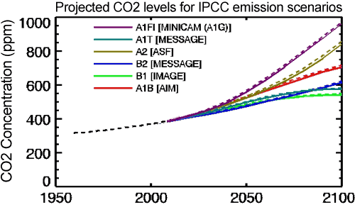
Atmospheric CO2 concentrations as observed at Mauna Loa from 1958 to 2008 (black dashed line) and projected under the 6 IPCC emission scenarios (solid coloured lines). (IPCC Data Distribution Centre)

All of the climate model output used in AR4 is available online, resulting (at the time of writing) in 575 peer-reviewed publications, both using and critiquing the data.


So how much does our understanding of climate change depend on the CRU? They provide climate models and a number of datasets to the climate science community, including records of changes in surface temperature since 1850. These show good agreement with other temperature records such NASA's Goddard Institute of Space Studies (GISS) and NOAA's National Climatic Data Centre (NCDC).


Using a combination of models from many different research groups allows the IPCC scientists to more successfully reproduce features of earth's current climate than by using only a single model.


Comparing the ability of models to reproduce past and current climate change with observational data also allows the uncertainties in climate projections to be assessed.


In summary, it is the combined work of scientists from many different parts of the world which produces projections for the future impacts of climate change. These projections are complicated and time-consuming to produce, as they are dependent on so many unknown factors - how societies and economies will develop, where we will get our energy from, the unknowns in how the earth and atmosphere will respond to rising greenhouse gases, and the limitations of computer models (something we will discuss in a future post). Many scientists around the world - rather from just one or two institutions - are working together to try and reduce these uncertainties and increase our understanding of the future impacts of climate change.

0 0

Printable Version  |  Link to this page

Comments

Comments 1 to 28:

  1. The sceptics would point out that UEA, GISS & NCDC all use the same source of raw data. Indeed a certain Mr Watts has expended a vast amount of effort in recent years to demonstrate that the surface temperature sites are not fit for purpose. (I recall he has even recently been published with some finding from this work.) Such a view does appear a little strange as the satellite data used by UHA & RSS give pretty much the same results as the surface data. Even arch-sceptic Roy Spencer has made this observation that both surface & satellite sourced records giving similar results.
    0 0
  2. The hubris of Christopher Booker never ceases to amaze! The Surface Temperatures project has been set up to look at homogenisation issues and data provision, which addresses many of the criticisms of surface temperature datasets. Their webpage is here
    0 0
  3. when you are showing that forecasts for measured CO2 at the Mauna Lau site, you should point out 1: the CO2 model assumes that increasing CO2 causes the increase in temp ( the basic AGW model ) 2: increase in atmospheric temps will be as the IPCC models state 3: ocean outgassing is affected by the atmospheric temps and OHC 4: Ocrean OHC is assumed to be as IPCC models state I have been watching OHC. It is diverging from the model forecast, pretty badly. Nothing we assumed in AR4 is coming true in that front. Kevin Ternbirth might one day say, "It is a travesty we cannot explain that" and the effect of atmospheric temp on outgassing will be minimal. Most probably that part of the models has to be revisited, in near future when you write articles like this, it makes the sceptics laugh.
    0 0
  4. najo: huh? Why are those four points necessary pretext for a graph showing forecasts of CO2 concentration? And where have you been watching OHC?
    0 0
  5. nanjo - wow, I don't even know where to begin. I guess a good place is to point out that it's "Mauna Loa", not "Lao". By "assumes" I believe you mean "theorizes". Regardless, the figure you're referencing does not depend on temperature changes. Your claim about OHC diverging from the models, aside from being off-topic, is also wrong.
    "when you write articles like this, it makes the sceptics laugh."
    "The sceptics" should probably do a little research before laughing at others. That way they wouldn't look so foolish.
    0 0
  6. Reading between the lines a bit, but I think nanjo seems to be arguing that CO2 won't increase according to the projections because the ocean is cooling. This argument could be (not certain, though) a variation on the Co2 is coming from the ocean meme. That is, the post industrial increase in CO2 is not from humans but from the ocean which is warming for other inscrutable reasons. Wow. Talk about a house of cards.
    0 0
  7. Actually, I think nanjo's comment about OHC not increasing is best explained by this post over at Tamino's blog. In short: AGW denier posts an article at WUWT which cherry picks data to make it seem like OHC predictions are completely wrong, when they're actually pretty good.
    0 0
  8. There is a radiative imbalance between the total energy going into the earth system vs. the total energy leaving the earth system. The forcing from CO2 and various other things end up with a net incoming radiation (mostly shortwave) that is greater than the outgoing radiation (mostly longwave). That results in an increase in the heat content of the earth. About 95% of that increase in the earth's heat content appears in the upper 700 meters of the ocean. We have had fairly accurate measurement of this ocean heat content (OHC) since 2003 with the widespread deployment of the ARGO network. The expected radiative imbalance is around 0.7 * 10^22 joules. (See the SLOPE of the extrapolated line in comment 5, above). The observed rise in OHC since 2003 is about 0.08 * 10^22 joules. That is the missing energy that Trenberth referred to. OHC is a useful metric in that a snapshot of the delta of the OHC over a 3 month or annual period shows the net radiative imbalance of the earth over that period. No further adjustments needed. NOAA OHC page:
    0 0
  9. Just to clarify something in the above post .... The numbers 0.7 x 10^22 joules expected versus 0.08 x 10^22 joules observed are the annual increases in OHC. (These are sometimes expressed in zetajoules or 10^21 joules as 7 zetajoules/year expected vs. 0.08 zetajoules/year observed.) As these are the annual changes, the zero points and the intercepts are not relevant. The change in the earth's heat content each year is a direct measure of the average radiative imbalance over that year. All the different ways of adjusting intercept points are not relevant to the annual radiative imbalance. If you prefer to use units related back to the watts/meter-squared forcings, the conversion is 1 x 10^22 joules/year (or 10 zetajoules/year) of heat content increase results from a forcing of 0.62 watts/meter-squared over the entire globe.
    0 0
  10. Charlie A: why pick 2003 as the start date for your comparison? Is it because 2003 was an abnormally high data point for OHC, perhaps? Suggest you look at the link in my post #7. And the manuscript that goes along with the chart of OHC, on the NOAA page you linked? It says this: "Here we update these estimates for the upper 700 m of the world ocean (OHC700) with additional historical and modern data [Levitus et al., 2005b; Boyer et al., 2006] including Argo profiling float data that have been corrected for systematic errors." Note: the upper 700m of the world ocean - that's the top 20% or so. There's another 2,500 metres of water below that, and recent work suggests there's a lot more deep mixing going on that previously thought. Actually, a quick search reveals this nice SkS article about the energy balance problem. You should read that, and comment there, as this is getting seriously off-topic.
    0 0
  11. 2003 is the first year that we had truly global coverage of ocean heat content measurement. The Argo network was started in early 2000's and expanded dramatically in 2003. If you look at the ocean heat content plots, you will see a very large discontinuity as the main measurement method changed over from XBTs to Argo floats. The recent adjustment of data reduced this non-physical step change, but it is still quite evident.
    0 0
    Response:

    [DB] Tamino shows clearly the nature of the "Cherry-pick" that is 2003:

    OHC

    Looking at the totality of the data:

    Smoothed (5-year averages), one gets this:

  12. Charlie A #11 Have a look here for an explanation of the XBT-Argo transition: http://www.skepticalscience.com/news.php?p=2&t=78&&n=202
    0 0
  13. DB inline comments: "Tamino shows clearly the nature of the "Cherry-pick" that is 2003". and "Smoothed (simple 5-year averages), one gets this:" When Roger Pielke started posting the OHC graphs, 2004, not 2003, was the highest point. At that time, several years ago he explain his choice of 2003 as being the point where the Argo data dominated the record. It is only in the 2010 revisions that 2003 became the highest point. Splicing together datasets of different types of measurements is difficult, and when a newer system has much better coverage and accuracy than an older system it is quite common to do analysis starting from the introduction of the new system. Some common examples: Sea Ice measurements from beginning of satellite coverage, ignoring earlier surface based observations. GRACE mass loss measurements. Lower tropospheric temperatures from satellites vs earlier radiosonde measurements. In post #12 Ken Lambert refers to an article on XBT-Argo transition. A key element of that explanation is Schuckmann 2009, "Global hydrographic variability patterns during 2003–2008" Was Schuckmann cherry picking when he started his analysis in 2003? Much more likely is that he chose 2003 because that is when the reliable, comprehensive dataset started. Regarding the 5 year smoothed plot: The beauty of OHC content is that one does not need to average over a long period. The change in ocean heat content over a 3 month period is a direct integration of the radiative imbalance over that 3 month period. It reflects variations (over that 3 month period) of such things as the average albedo due to variations in cloud cover or aerosols.
    0 0
  14. Another small question about the graph you posted. It is labeled "Smoothed (simple 5-year averages", but it is unlike any such graph that I can calculate. How did you manage to plot a simple 5 year average for 2011? Normally, when I plot a "simple 5-year average" I plot a 5 year moving average for every year. (with the last 2 years not being plotted). When I do the simple moving average plot, there is a very obvious flattening in 2003. That doesn't appear in your graph, hence my question as to how you calculated it. If I use the IPCC recommended 5 year gaussian filter, the flattening is even more pronounced.
    0 0
    Response:

    [DB] Apologies for not being more clear.  Being tired (and no doubt lazy) at that moment, I wrote the descriptive verbiage from memory.  The 5-year graphic is from this post by Tamino.  He clarifies the graphics here:

    Tom Curtis

    Tamino, could you be clearer about how you construct the graphs. It looks like the data points are successive non-overlapping five year means. Is that right? And what is the smoothing function plotted by the red line?

    [Response: Yes, the data points are successive non-overlapping 5-year means -- about as simple as it gets. The smoothed curves are a lowess smooth of the original data.]

  15. dana1981 at 06:44 AM on 17 May, 2011 My profound apologies for transposing "o" and "a". If I have offended anybody by my unforgivable typo..... I AM VERY VERY SORRY. The graph you have shown was published in 2005. It uses data up until 2003. all the graph BEFORE 2003 is is not a forecast by any model. They were the data used in coming up with model(s) in that Hansen paper. So, that part of the graph DOES NOT speak about the quality of the model. You don't get a gold star for matching the past. SO, look at the graph again, how wonderfully the model performs, After 2003. particularly after 2005. Nothing to do with any cherry picking. If you have used a data for creating a model, you don't get to use it crow about how great your model is. Linear extrapolation shown is not based on any model based on scientific inquiry. That is the kind of thing you can have a 9th grader do with a graph paper, a ruler and a NO.2 Pencil. How good that linear extrapolation fits is so irrelevant and Dana, I beg you to forgive me for any other typos. As for "theorizes..... i guess if that is the word you want you use, you should go for it.
    0 0
    Response:

    [DB] Please, no all-caps.  And you really ought to learn more about models.

  16. nanjo - actually you called it "Lau". Funny, I had a typo in typing your typo. As for the rest of your comment, as DB suggests, you really ought to learn more about models. First of all, hindcasting is an important part of gauging the accuracy of a model (if it can't match the past, then it's not accurate). Secondly, the data matches the linear extrapolation of the model after 2003 pretty darn well, on average. As for "theorizes", that's the word I want to use because it's the correct term ("assume" is wrong).
    0 0
  17. 'all the data BEFORE 2003 is not forecast by any model' Wrong. There were climate models before 2003. The earliest climate models that ran on computers that I have heard about were around in the late 70s. They predicted roughly the same sensitivity to Co2 as the models today do. Not sure when the first model runs with ocean heat content were, but I doubt it was in 2003.
    0 0
  18. DB -- even your further explanation about the plots you posted is incorrect. How does one compute a 5 year average centered on 2010? Even a casual glance at the graph just above that, Tamino's version of annual OHC shows that the 5 year smooth graph is bogus. The most current data is available at NODC. Annual Global OHC Quarterly Global OHC Looking at the quarterly data you can see the change in standard deviation of the measurements around 2003, as the Argo network came online in force. Also on the graph below is a 21 quarter (63 month or 5.25 year smooth.) It doesn't look like the Tamino graph, does it. Doing a 5 year moving average on the annual graph results in essentially the same graph. Perhaps you need to be more skeptical about what Tamino posts.
    0 0
    Response:

    [DB] If you have the temerity and feel the need to tell a world-class professional time-series analyst that you know better than he...well, I'm hardly of a mind to talk you out of what will be an interesting learning experience for all.  You have the proper thread over at Open Mind to post your correction on, so I expect to read said corrective effort there forthwith.

    In the meantime I'm placing my confidence in that same professional who has already proven his knowledge and understanding of climate science beyond that posted by the majority here (and yes, that includes myself).

  19. Charlie A > How does one compute a 5 year average centered on 2010? He didn't, read the post: "And for some of these data the latest 5-year period is incomplete, which will make the noise even bigger and increase the chance of accidentally contradicting the trend."
    0 0
  20. "Perhaps you need to be more skeptical about what Tamino posts." Perhaps you should address him yourself before casting aspersions in public, indirect though they be. That would be the collegial thing to do...
    0 0
  21. Tamino charted averages over a 5 year period. To get a flat spot within a rising trend on such a graph you need more than 10 years of flat data so that two complete 5 year periods give the same average. Using a 5 year moving average is a different calculation and requires more than 5 years of flat data to get a flat spot in a rising trend. You use a charting method that is twice as sensitive to noise as the chart that Tamino uses, and then accuse Tamino's chart of being bogus. The chart you use which is more sensitive to noise also picks up a flat spot just after 1990. The trend then resumed its upward climb. Why would we expect the current flat spot to be any different?
    0 0
  22. dana1981 at 04:51 AM on 18 May, 2011 dana, Hindcasting is the way you develop/perfect/tailor a model. the R**2 value and deviation events ( eg. when the model is hopelessly off for a period indicates a large influence is not included in the model ) tells you how good the model is in fitting the past. but, because you do not ever know if all independent variables have been included in the model and you never know if the domain covered in the past is similar to the domain that is going to follow, you have no idea what you are going to see in the future. you have to be a bit humble when you are modeling. George E. Box is purported to have said "All models are wrong. Some are Useful". When I met the man, It was a breath of fresh air to see his humility. When pointed out of a small error, he said he will look into it. A few months later, my advisor got a letter thanking us!!! ( -Snip- ).
    0 0
    Response:

    [DB] Inflammatory snipped.  Please keep it clean.  And no all-caps.

  23. Michael Hauber at 09:41 AM on 18 May, 2011 My apologies. This is what i wrote: The graph you have shown was published in 2005. It uses data up until 2003. all the graph before 2003 is is not a forecast by any model. They were the data used in coming up with model(s) in that Hansen paper. This what I meant: The graph you have shown was published in 2005. It uses data up until 2003. all the graph before 2003 is is not a forecast by any model in that graph. They were the data used in coming up with model(s) in that Hansen paper. Remember a model includes not just the concepts and terms. but also the parameter values generated using the data that was incorporated in that study.
    0 0
    Response:

    [DB] Please, no more all-caps.

  24. Nando is now taking us down the Models are unreliable path. I don't see how a discussion of the difference between curve fitting and hindcasting as validation is relevant here.
    0 0
    Moderator Response: Concur. Further discussion of that topic must be on that other, relevant, thread.
  25. In comment #10, Bern asks "why pick 2003 as the start date for your comparison?". To which I replied in #11: "2003 is the first year that we had truly global coverage of ocean heat content measurement. Moderator DB jumped in and added into my comment, "[DB] Tamino shows clearly the nature of the "Cherry-pick" that is 2003:" Let's see what NOAA says about this. The Climate Prediction Center has a useful page on Data distribution of OHC measurements. Below I've abstracted a couple of representative plots. If you think I'm cherry picking, click on the link above and compare. It is particularly informative to look at monthly plots. Plot of 500m-1000m temp profiles in the South Pacific vs. year. Animated GIF showing temp profile coverage over an entire year. The plot starts with 2010, then backwards 2003/2003/2001, then for comparison, 1995. Note that the coverage in the South Pacific before 2003 is virtually non-existent. Go to the NOAA website if you want to look at other depths, or other years, but the evolution of sampling density is very similar. Note that a reasonable argument could be made that truly global coverage started in 2004, rather than 2003. But there is a qualitative change in both the type of system used to gather OHC content and in the spatial coverage, in the 2003/2004 timeframe.
    0 0
    Response:

    [DB] Please see Stephen Baines' response to you on the Oceans Are Cooling thread.  Keep your responses there, which is a much more appropriate thread than here.  Thanks!

  26. Charlie A You're seriously off topic on thos thread, which is about the number of databases related to warming. I would post your discussion to a more relevant thread. I have a short response to you there.
    0 0
    Response:

    [DB] Fixed link.

  27. (Apologies if this continues a thread that went off-topic early on. Redirection of enquiry would be a suitable outcome.) At comment #9 - The equating of OHC to global radiative imbalance is presumably a simple piece of arithmatic. Intriguingly it converts OHC into the same units as radiative forcing. At a very simplistic but very understandable level, would not (Average annual OHC converted to W/sqM) + (Global dimming in W/sqM) + ((Global Temp rise over period) / (Sensitivity)) lead to a very rough value for the warming component of Anthopogenic Forcing (assuming natural forcing as constant)?
    0 0
  28. #27. A very reasonable model for hindcasting global average temperature is to simply multiply the net forcings by a constant, plus a lag term with time constant of about 4 years. The sensitivity that results from that fit (95% plus correlation coefficient) is about 1.5C/doubling of CO2. But that is the transient response, not the equilibrium sensitivity, and a transient response our 1 or 1.5C for a doubling of CO2 is not inconsistent with an equilibrium sensitivity of 3 or 4C/doubling CO2. The conversion from OHC to global radiative imbalance is not controversial. The conversion constant is straightforward going from watts (or joules per second) over number of seconds per year and roughly 511 million sq km of global surface area. There is some variance on the estimates of what fraction of the earth's heat capacity is in the ocean, with the lowest estimates being 80%, and the highest >95%. The Argo network has the same sort of importance to our understanding as the satellite network that we use to monitor the atmosphere. Now we can get serious about closing the energy and heat budgets. Aerosols still remain a major unknown, as is the net radiative effect of clouds, and how the net radiative effect of clouds changes with time. What we need next is a Glory satellite in orbit.
    0 0

You need to be logged in to post a comment. Login via the left margin or if you're new, register here.


The Consensus Project Website

THE ESCALATOR

(free to republish)


© Copyright 2024 John Cook
Home | Translations | About Us | Privacy | Contact Us