Comparing past climate change to recent global warming
What the science says...
Climate Myth...
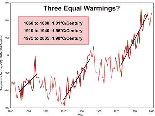
It warmed just as fast in 1860-1880 and 1910-1940
“In fact, the rate of warming from 1975-2001, at 0.16 °C per decade, was the fastest rate to be sustained for more than a decade in the 160-year record, but exactly the same rate occurred from 1860-1880 and again from 1910-1940, when we could not possibly have had anything to do with it.” (Christopher Monckton)Let’s have a look at some warming rates of the periods of interest from several different temperature records:

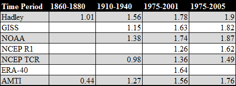
Table 1: Rate of warming for given indices in °C/century.
First we can conclude that Monckton's statement that 1975-2001 was the fastest warming rate for longer than a decade is absolutely wrong as a much higher rate is demonstrated for 1975-2005 in row 5. Secondly, to compare the three periods in Table 2, the only index which covers that period is Hadley, making his 1.6°C per century number wrong for 1975-2001 as it is actually much higher at 1.78°C per century.

Based upon the evidence presented here, he cannot support his statement that 1860-1880 had a similar warming rate as it was demonstratively lower than the 1975-2001 warming rate and nearly half the 1975-2005 rate. Finally, regarding the 1910 to 1940 warm period, evidence presented here suggests that only 1 out of the 4 major indices indicates a rate of warming within 0.25°C per century and none within 0.2°C. His claim that the rates are similar is dubious at best.
Last updated on 31 January 2011 by robert way.


 Arguments


Muoncounter, Maybe Adam is Poptech ;)
[DB] No.
If you want to compare the satelite and surface data, then try using plots for the same period on the same axes, woodfortrees is an excellent resource for that. Here is a comparison of UAH and HADCRUT datasets:
Click the image for the source. Looks pretty similar to me. The slight displacement of one relative to the other is small, and due to (i) they use different baseline periods and (ii) they don't actually measure quite the same thing, so some difference is to be expected. The trends for this period are very similar 0.14 per decade for UAH and 0.15 per decade for HADCRUT. Play with the other dataset on woodfortrees for yourself - it is an excellent resource for checking up on claims about trends etc.
I've just noticed that Woodfortrees already has a pre-prepared plot where they have adjusted for the difference in baseline periods used to define the anomalies for each products, there is no clear difference between the satellite products and the surface station data. The satellite products do have slightly lower trends, but that isn't unduly surprising, they are not measuring surface temperature, but a weighted average temperature of a thick slab of the lower troposphere.
p.s. please use width=400 when posting images so they don't mess up the formatting on the site. I have inserted them for you on this occasion.
The point about UAH not having significant warming from 1979-1997 by GISSTEMP showing warming from 1970-1997, is as laughable bit of cherry picking as you could want to see. I wonder why the GISSTEMP trend isn't measured from 1979-1997 like the UAH one. It couldn't be because trends pass test of statistical significance more easily over longer timeframes, that would be just disingenuous (of whichever blog you borrowed it from). ROFL.