Climate Science Glossary

Term Lookup

Enter a term in the search box to find its definition.

Settings

Use the controls in the far right panel to increase or decrease the number of terms automatically displayed (or to completely turn that feature off).

Term Lookup

Settings


All IPCC definitions taken from Climate Change 2007: The Physical Science Basis. Working Group I Contribution to the Fourth Assessment Report of the Intergovernmental Panel on Climate Change, Annex I, Glossary, pp. 941-954. Cambridge University Press.

Home Arguments Software Resources Comments The Consensus Project Translations About Support

Bluesky Facebook LinkedIn Mastodon MeWe

Twitter YouTube RSS Posts RSS Comments Email Subscribe


Climate's changed before
It's the sun
It's not bad
There is no consensus
It's cooling
Models are unreliable
Temp record is unreliable
Animals and plants can adapt
It hasn't warmed since 1998
Antarctica is gaining ice
View All Arguments...


Username
Password
New? Register here
Forgot your password?

Latest Posts

Archives

Global warming and the El Niño Southern Oscillation

What the science says...

Select a level... Basic Intermediate

El Nino has no trend and so is not responsible for the trend of global warming.

Climate Myth...

It's El Niño

"Three Australasian researchers have shown that natural forces are the dominant influence on climate, in a study just published in the highly-regarded Journal of Geophysical Research. According to this study little or none of the late 20th century global warming and cooling can be attributed to human activity. The close relationship between ENSO and global temperature, as described in the paper, leaves little room for any warming driven by human carbon dioxide emissions. The available data indicate that future global temperatures will continue to change primarily in response to ENSO cycling, volcanic activity and solar changes." (Climate Depot)

At a glance

This particular myth is distinguished by the online storm that it stirred up back in 2009. So what happened?

Three people got a paper published in the Journal of Geophysical Research. It was all about ENSO - the El Nino Southern Oscillation in the Pacific Ocean. ENSO has three modes, El Nino, neutral and La Nina. In El Nino, heat is transferred from the ocean to the atmosphere. In La Nina, the opposite happens. So within ENSO's different modes, energy is variously moved around through the planet's climate system, but heat is neither added nor subtracted from the whole. As such, in the long term, ENSO is climate-neutral but in the short term it makes a lot of noise.

The paper (link in further details) looked at aspects of ENSO and concluded that the oscillation is a "major contributor to variability and perhaps recent trends in global temperature". First point, sure. Second point, nope, if you accept climate trends are multidecadal things, which they are.

That might have been the end of it had the authors not gone full-megaphone on the media circuit, promoting the paper widely in a certain way. "No scientific justification exists for emissions regulation", they loudly crowed. "No global warming", the denizens of the echo-chamber automatically responded, all around the internet. This is how climate science denial works.

Conversely, the way that science itself works is that studies are submitted to journals, peer-reviewed, then some of them get published. Peer review is not infallible - some poor material can get through on occasion - but science is self-correcting. So other scientists active in that field will read the paper. They may either agree with its methods, data presentation and conclusions or they may disagree. If they disagree enough - such as finding a major error, they respond. That response goes to peer-review too and in this case that's exactly what happened. An error so fundamental was found that the response was published by the same journal. The error concerned one of the statistical methods that had been used, called linear detrending. If you apply this method to temperature data for six months of the Austral year from winter to summer (July-December), it cannot tell you that during that period there has been a seasonal warming trend. So what happens if you apply it to any other dataset? No warming! Bingo!

A response to the response, from the original authors, followed but was not accepted for publication, having failed peer-review. At this point, the authors of the rejected response-to-the-response started to screech, "CENSORSHIP" - and the usual blogosphere battles duly erupted.

It was not censorship. Dodgy statistical techniques were picked up by the paper's highly knowledgeable readership, some of whom joined forces to prepare a rebuttal that corrected the errors. The response of the original paper's authors to having their errors pointed out was so badly written that it was rejected. That's not censorship. It's about keeping garbage out of the scientific literature.

Quality control is what it's all about.

Please use this form to provide feedback about this new "At a glance" section. Read a more technical version below or dig deeper via the tabs above!


Further details

ENSO, the El Nino Southern Oscillation, is an irregular but well-understood phenomenon that affects the Eastern and Central Pacific Oceans. It is important both on a local and global basis, since it not only causes changes in sea-surface temperatures. It also affects the thermal profile of the ocean and both coastal and upwelling ocean currents.

Such changes can and do affect the diversity and abundance of important edible seafood species. Cold and warm-water forms are forced to migrate to where they find the conditions more to their liking. El Nino events in particular, where warm waters prevail close to the sea surface, can inflict a temporary loss of commercially important species of fish and squid from where they are traditionally fished. Some coastal communities along the Pacific seaboard of South America have a strong dependency on such fisheries. As such, prolonged El Nino conditions can be seriously problematic.

The warm El Nino mode of ENSO also affects global temperatures, as heat energy is transferred from ocean surface to the atmosphere. A strong El Nino is easily capable of raising temperatures above the upward slope that represents the change in radiative forcing caused by our increasingly vast greenhouse gas emissions - global warming, in other words. Conversely, the opposite to El Nino, La Nina, suppresses global temperatures. When several La Nina years occur in a row, climate science deniers are given the opportunity to insist that the world is cooling. This has happened before, most notably in the post-1998 period.

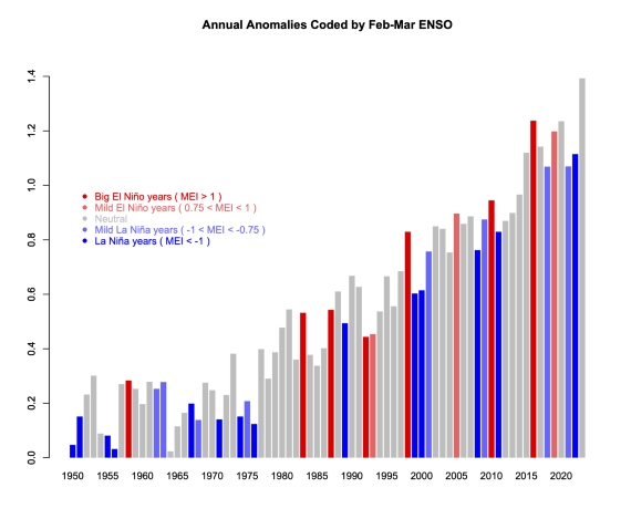
However, as fig. 1 shows, global temperature is rising independently of the short-term ENSO noise. Fig. 1 also shows that 2022 was the warmest La Nina year in the observational record. In fact, El Nino, La Nina and neutral years are all getting warmer.

Variations in ENSO in a warming world.

Fig. 1: variations in ENSO in a warming world. This plot therefore shows two independent phenomena that affect climate: the noisy ENSO and the underlying relentless upward climb in temperatures caused by our rapidly-increasing emissions of CO2 and other greenhouse gases. Temperature records typically get broken in El Nino years because the temperature is given an extra boost. 2016, a major El Nino year, held the global temperature record for a few years, but 2023 saw that record fall again. 2023 is in grey because that El Nino did not develop until later in the year. Graphic: Reaclimate.

The reader should by now be in no doubt about the difference between the long term global temperature trend caused by increased greenhouse gas forcing and the noise that shorter-term wobbles like ENSO provide. You would have seen something similar during the descents into and climbs out of ice-ages too. That's because ENSO has likely been with us for a very long time indeed. Ever since the Pacific Ocean came close to its present day geography, millions of years ago, it has likely been there.

The reader should by now be in no doubt about the difference between the long term global temperature trend caused by increased greenhouse gas forcing and the noise that shorter-term wobbles like ENSO provide. You would have seen something similar during the descents into and climbs out of ice-ages too. That's because ENSO has likely been with us for a very long time indeed. Ever since the Pacific Ocean came close to its present day geography, millions of years ago, it has likely been there.

Nevertheless, here we have something that warms the planet, even if that's on a temporary basis. As a consequence, some people with ulterior motives might just become interested. Over a decade ago now, that's what happened. A paper, 'Influence of the Southern Oscillation on tropospheric temperature' (Mclean et al. 2009) was published in the Journal of Geophysical Research. One of its co-authors, a well-known climate contrarian, commented:

"The close relationship between ENSO and global temperature, as described in the paper, leaves little room for any warming driven by human carbon dioxide emissions."

If you enter the above quote, complete with its quotation marks, into a search engine, you will get lots of exact matches. Strange? Not really, if you have studied the techniques of climate science denial.

  1. a paper is published that barely mentions global warming.
  2. its authors go on to distribute slogans implying that they have put yet another Final Nail in the global warming coffin.
  3. right-wing media of all sorts from newspapers to blogs ensure wide distribution of the talking-points.
  4. individuals serve to fill in the circulation-gaps.

This is how it works, time and again. However, glaring errors were soon noticed in the paper, leading a group of specialists to offer a rebuttal, published in the same journal a year later (Foster et al. 2010).

Statistics is not everyone's cup of tea, but a very straightforward explanation of the key error was provided by Stephen Lewandowsky, writing at ABC (archived):

"This is best explained by an analogy involving daily temperature readings between, say, July and December anywhere in Australia. Suppose temperature is recorded twice daily, at midday and at midnight, for those 6 months. It is obvious what we would find: Most days would be hotter than nights and temperature would rise from winter to summer. Now suppose we change all monthly readings by subtracting them from those of the following month—we subtract July from August, August from September, and so on. This process is called "linear detrending" and it eliminates all equal increments. Days will still be hotter than nights, but the effects of season have been removed. No matter how hot it gets in summer, this detrended analysis would not and could not detect any linear change in monthly temperature."

Anyone can do this in Excel. First input a series of representative temperatures for the transition from Austral winter into summer:
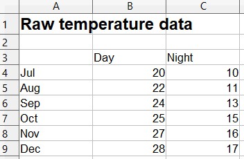
Series of representative temperatures for the transition from Austral winter into summer.

Reasonable? OK, then let's plot them. Still looks like what we'd expect. It gets warmer in Australia from July to December and nights are usually colder than days, right?
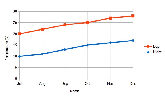
Plot of temperatures

Now, let's do that detrending. This is what you get:
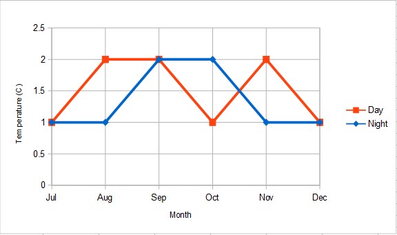
Detrended temperatures

As Lewandowsky pointed out in his ABC article:

"Astonishingly, McLean and colleagues applied precisely this detrending to their temperature data. Their public statements are thus equivalent to denying the existence of summer and winter because days are hotter than nights."

In other words: Fail.

Last updated on 24 March 2024 by John Mason. View Archives

Printable Version  |  Offline PDF Version  |  Link to this page

Argument Feedback

Please use this form to let us know about suggested updates to this rebuttal.

Further reading

NOAA have a very useful resource ENSO Cycle: Recent Evolution, Current Status and Predictions which features recent ENSO activity as well as model predictions of ENSO activity in the near future.

Denial101x video

Comments

Prev  1  2  3  4  5  6  Next

Comments 26 to 50 out of 144:

  1. Tristan - Tisdale replied basically insisting La Nina is responsible for ocean warming. Colour me unimpressed. La Nina is an interval when the Earth sees a net gain in energy, and El Nino a net loss, but this isn't some novel observation, I've discussed this, for instance, in this SkS post: Search For 'Missing Heat' Confirms More Global Warming 'In The Pipeline'. See Figure 3 and the associated heading discussion. More importantly The ENSO-related energy fluxes balance out to zero in the long-term. If they didn't (as Tisdale seems to think) the planet would go on warming indefinitely. It's the same problem those Scafetta climastrology papers have - not only do they have to match recent observations, they also have to match with older observations - and that's where they quickly run aground. Increased levels of greenhouse gases heat the ocean, by lowering the thermal gradient in the thin cool skin layer of the surface. This reduces the amount of heat lost (from sunlight) to the (typically) cooler atmosphere, and the oceans warm as a consequence. That's why there is such a striking correlation between atmospheric carbon dioxide and temperature (aka ocean heat content) in the ice core reconstructions. Vostok ice core records for carbon dioxide concentration (Petit 2000) and temperature change (Barnola 2003) However, ocean heat can indeed vary dramatically in the short-term due to changes in aerosols, and especially cloud cover, in the atmosphere (which alters the amount of sunlight heating the surface ocean). So if you just look at the data, without a proper statistical analysis (as Tisdale is prone to), you can convince yourself of anything. If Tisdale's misunderstandings gain any traction, we'll get around to debunking it, but it's not a priority at the moment.
  2. I find it strange behaviour to insist anything that has no established science behind it. The thing I took from his video was merely how certain of his conclusion he was.
  3. As other have noted above it's been directly pointed out to Tisdale by many people (including me) that his argument breaks the first law of thermodynamics. He always blathers around the point but never addresses it properly. Although most would dismiss his pseudoscience as preposterous, at some point it may actually be worth a coda to formalise rebuttal of his nonsense. It's a sad state of affairs though that it might have to go to that extent... but then, that describes just about all denialism.
  4. Tisdale has now stated that "No one from SkS will never be able to find any flaws, because they very obviously can’t fathom the subject matter." Hmmm - claims that nobody can fathom your understated brilliance? Regarding a blog theory contradicted by historic observations (long term neutral average of ENSO), current observations (TOA spectral changes in GHG absorption that demonstrate GHG causation, not ENSO), and basic thermodynamics (claiming atmospheric warming comes from recent excess of El Nino's over La Nina's, yet the oceans are warming too - where does all that energy come from)? All of which has never been discussed or examined in the peer-reviewed literature, by those who study this data? Let alone the issues with his "evidence" lacking any connection to statistical significance... I was actually rather surprised to find that claims of "nobody can fathom my subject matter" isn't part of the Crackpot Index; it really belongs there. Ad hominem fallacies aside - if you cannot explain your theories well enough to be understood, you probably don't understand them yourself. --- Kayell / Kristian - In answer to your original question, 'theories' such as Tisdale's have no place in a scientific discussion - beyond noting that they don't hold up to examination.
  5. KR: I believe there is only one appropriate response to Tisdale's claim with respect to Skeptical Science & its contributors' ability to "fathom the subject matter" regarding his confusion surrounding ENSO and climate forcings.
  6. I'm still waiting for someone to cogently present Tisdale's case (without charging for it).
  7. What an excellent chance for Bob Tisdale to argue a specific point and potentially advance the science. Come on, Bob. I'd like to hear your ENSO argument without the heavy sauce of rhetoric. Surely there are at least a few people here who can understand the dynamics as well as you. Surely you're capable of explaining it to the less gifted of us, no? You can preach to the choir all day long at WUWT, and all you'll get is blank-eyed head nodding. Here you have the chance to convince the unconvinced, to put your argument to the test of fire, and to engage in the perfectly healthy behavior of getting feedback from the community. Surely SkS can set up a forum for extended dialogue on a specific issue or two (say ENSO and SST in general or OHC?). I really respect Pielke Sr. more now for wading into the thornbush and having his say. It's refreshing when the discussion isn't rhetorical cruise missiles lobbed from thousands of km away but is instead look-me-in-the-eye-and-tell-me-I'm-not-human dialogue, and I think SkS is the best place for a rhetorically toned-down discussion of the issue: wide reach (continually referenced across the mainstream news network) and a relatively effective comments policy.
  8. As an addendum, Tisdale should also look at John Nielsen-Gammon's analysis, which clearly shows grouped El Nino, La Nina, and ENSO-neutral years all trending upwards in temperatures over the last 50 years. This can hardly be the result of (as Tisdale claims) one or two decades of El Nino heavy ENSO activity.
  9. It is said that it is only in the act of teaching that an educator can truly become the master of what he teaches. Mastery awaits Mr. Tisdale...
  10. Here is PART 1: Like I said, Tisdale's version of the ENSO argument is pretty straightforward. It is NOT based on some foregone conclusion about the cause of global warming. It is a direct result of an inevitable conclusion arrived at AFTER looking at the real-world observational data at hand, an explanation derived from what we actually see happening in the Earth system as time passes, AND on what we know about the ENSO process and how it is observed to work, both in the Pacific and globally, rather than from a theoretical construct of assumed physical net effects on the complex planetary climate system as a whole. The argument follows the scientific method thus: I (or Bob) start out by observing a curious and, quite frankly, striking similarity between the NINO3.4 and the global SSTA curves over the last 30+ years (well, even much further back than this, but Tisdale's argument was always mainly based on data from the satellite era). This is certainly no new discovery. I think we can all agree on that the primary global temperature swings up and down, the large short-term variations in global temperature, are driven by the ENSO's mighty oceanic fluctuations in the East Pacific (where the NINO3.4 resides) and their worldwide impact being propagated partly by ocean currents, partly by atmospheric teleconnections. The global temperature goes up when NINO3.4 goes up (El Niño). And the global temperature goes down when the NINO3.4 goes down (La Niña). What happens then if we 'detrend' the global SSTA since 1981 and scale it against the NINO3.4? That is, we take away the obvious upward trend in the global to see how close the fit with NINO really is. This is only out of curiosity. Scientific curiosity. No one is yet suggesting or claiming anything. We just want to take a closer look at how the different data relates to one another. So yes, I'm 'manipulating' the global curve, no need to remind me. Here is the result: Quite an astounding fit. And it will surprise no one. We know why the fit is so good. You will notice the global imprints in 1982-83/84 of the El Chichón eruption and especially in the wake of the powerful Pinatubo eruption, ~1992-95. Other than that you will see some 'extra' global heat (extra, that is, relative to a 'normal' (proportional) global response to the NINO signal) piling up during the first directly following La Niña year after a few of the El Niño's along the composite plot. But this extra heat always seems to be dissipated again shortly after this first following La Niña - the global soon after back on level with NINO. So far, so good. What's next? Yup, that significant global upward trend that I got rid of. It's there, after all. But where does it come from? How do we follow its progression? Where do we look? What do we look for? I will let you in on a little secret. When I 'detrended' the global SSTA curve in the graph above, I didn't use a statistical tool to remove a general upward trend. All I did was to pull it down at two (2) short sections: two datapoints in the last half of 1987 (July and November) and one datapoint in the beginning of 1999 (January). Why those two intervals specifically? This will become apparent as we move along (in Part 2). Bear this in mind ... There is another way of showing the exact same thing, only WITHOUT removing the long term trend from the global SSTA: (The NINO3.4 is here alligned with the global curve between 1981 and 1987/88.) (The NINO3.4 is here alligned with the global curve between 1988 and 1997/98.) (The NINO3.4 is here alligned with the global curve between 1998 and 2012.) Here is a more detailed look at the last 'level', the stretch since 1996, without volcanic impact, across the global upward shift occuring through 1998, and all the way down past the El Niño of 2009/10 and the following La Niña 2010/11: (The two red squares mark the conspicuous piling up of extra heat globally during the transitions between the particular ENSO events of El Niño 1997/98 and La Niña 1998/99 and El Niño 2009/10 and La Niña 2010/11. The first is followed by a raised global level in mean SSTA relative to the NINO3.4 curve. The second one isn't. At least, not yet.) What can we conclude from all this? Not much as of yet. Except this: Global SSTA follow and mimic the major up and down temperature swings (El Niños and La Niñas) of the East Tropical Pacific on interannual time scales. AND, they also seem to follow the TREND in NINO3.4 rather slavishly over the last 30-31 years, that is, barring two (2) specific instances of marked and sudden global upward shifts relative to NINO. That is, along virtually the entire record there is no need for an explanation of the evolution of the global curve besides the well-known relationship between it and the East Tropical Pacific - the already mentioned short-term variations, the primary ups and downs. Here there simply is no extra global warming trend outside of this close relationship, no increasing divergence between the two. But then there are the upward shifts. The only places where the global curve diverge permanently from the NINO curve. There are only (and by that I mean ONLY) two cases between 1981 and 2012 where the extra heat piled up globally after an El Niño and during the transition to the first following La Niña is never fully made up for before the ENSO pendulum turns and the heat comes in again, both in the NINO3.4 region and globally. This is during and after the second and final peak of the 1986/87/88 El Niño, on the NINO way down towards the bottom of the very deep La Niña of 1988/89, and during and especially after the peak of the 1997/98 El Niño, on the NINO way down towards the bottom of the deep La Niña of 1998/99. This can be illustrated like this: (Bear with me on the Norwegian labelling. 'Trinn' is simply 'Level'. 'Ekstra varme globalt' means 'Extra heat globally'. Notice that here the pink curve is NINO3.4 and the black one is the global.) Just give this a moment's thought. All we're doing is looking at the data. I'm just stating what the data at hand is telling us. There simply IS no steadily increasing divergence between NINO3.4 and global SSTA between late 1981 and late summer/early autumn of 2012. The ENTIRE global rise above the NINO3.4 occurs at two specific instances. Not at any other time. In my world, then these two 'specific instances' are the ones up for closer inspection. THEY need an explanation. Not the rest of the graph. We've found something interesting at specific points in the data record and we want to check them out a bit more closely. We follow the scientific method and ask ourselves: How do these sudden and marked global upward shifts come to be? Seeing how extremely influential the ENSO processes are on the regular global temperature amplitudes, it would be a strange scientific approach to all of a sudden exclude ENSO from any further involvement in the ensuing investigation, as a possible factor also in the distinct upward shifts. By all means, it hasn't yet been shown to be the case. But it would be wise to at least follow that lead. To see if something out of the ordinary might have occured in those two particular cases.
    Response: [Dikran Marsupial] Images inserted for readability, hopefully without mistakes. It would be best if the subsequent parts have the images in-line (there is advice on HTML formatting for SkS posts here). However I would recommend that you do not proceed onto part 2 until we have had a chance to digest part 1 and for relevant questions to be answered. Please can everybody respond to this post in a calm and scientific manner.
  11. Kayell, Well, you got me to thinking, and I realized that Tisdale is so close to being right, but he got the most important parts wrong. See, El Niño events confuse everyone because they raise observed atmospheric temperatures, so people think that means "ah ha! warming!" But in reality, the planet sheds more heat during El Niño events, because the warmer atmosphere emits more radiation. It's sort of like a bathtub overflowing. What matters more is La Niña events, where the atmosphere is cool, but this means that the planet doesn't radiate heat well (it's basically trapped in the ocean), so this must be what is really causing global warming (or, rather, a lack of global cooling, as Jo Nova likes to say). So I broke the temperatures up at large La Niña events, and used that to "detrend" the global temperatures. Let's take a look (I helped you out by adding blue vertical bars where I broke the temperature record... the original temperature record is in green, while red is the "detrended" temperatures): Of course I didn't rescale the ENSO and Global Temperatures to match, a step you performed but seemingly failed to mention. Still... Hmmm. My graph looks closer than yours, using Tisdale's method. So I must be right!!! La Niña is causing global warming!!!! Or is it pirates? Hang on. If I can find a graph of pirate populations, I'm sure I can make pirates the cause of global warming. [This climate science stuff is so easy! Anyone can do it!]
  12. Kayell, FIrst off, I should say I appreciate you putting together the summary. I have a few questions regarding the data. 1) Do you have a link to the specific dataset(s)? 2) Is the NINO3.4 data processed in anyway? and if so, how?
  13. Do we get to see where all our extra energy is coming from in Kayell's Part 2, or will that be left as an exercise for the reader? Put another way, how is ENSO creating all the extra energy we're seeing? How long can ENSO continue raising the global temperature? If as we've seen the ocean stubbornly continues to warm during the period Kayell is describing, where's the energy source? Or is there a disproportionate increasingly refrigerated cool patch in the E. Pacific we've missed? A simple question with an answer readily to hand, surely?
  14. Oh, that's an interesting analysis Sphaerica. The next step would be to take the difference between NINO and SST, and do an automated breakpoint analysis on it. That might give an objective test of whether Nina breakpoints are better than Nino breakpoints, and whether either is really reflected by the data. A more rudimentary test would be to compare the AIC between a linear detrend and both sets of piecewise constant offsets. Tamino's post 'Steps' covers the methods.
  15. KR, Philippe Chantreau, Rob Painting, Sphaerica, et al.: The basis of this discussion appears to have been this video that appeared on the WUWT-TV webcast. Since some of you have not watched the video, you would have missed the bases for it. Therefore, let’s start with satellite-era sea surface temperature data and let me then ask you to explain the following:

    The East Pacific Ocean (90S-90N, 180-80W) has not warmed since the start of the satellite-based Reynolds OI.v2 sea surface temperature dataset, yet the multi-model mean of the CMIP3 (IPCC AR4) and CMIP5 (IPCC AR5) simulations of sea surface temperatures say, if they were warmed by anthropogenic forcings, they should have warmed approximately 0.42 to 0.44 deg C. Why hasn’t the East Pacific warmed?

    The detrended sea surface temperature anomalies for the Rest of the World (90S-90N, 80W-180) diverge significantly from scaled NINO3.4 sea surface temperature anomalies in 4 places. Other than those four-multiyear periods, the detrended sea surface temperature anomalies for the Rest of the World mimic the scaled ENSO index. The first and third divergences are caused by the eruptions or El Chichon and Mount Pinatubo. Why does the detrended data diverge from the ENSO index during the 1988/89 and 1998/99/00/01 La Niñas? According to numerous peer-reviewed papers, surface temperatures respond proportionally to El Niño and La Niña events, but it’s obvious they do not.

    I’ve answered those two questions in the video. Can you answer those questions? The data is available in an easy to use form through the KNMI Climate Explorer. Feel free to confirm my results in the above graphs.

    Response:

    [DB] To reiterate Ian's questions, so the dialogue can proceed:

    1) Do you have a link to the specific dataset(s)?

    2) Is the NINO3.4 data processed in anyway? and if so, how?

  16. Bob, 1) Regarding your first point: The sea surface temperature is of course strongly influenced by ENSO and interdecadal variability. Now when you are taking the ensemble mean of CMIP3/5 models, you are effectively averaging out all the internal variability, so the ensemble mean is just the expected response due to external forcing (e.g. solar, GHG, aerosol etc). You are comparing data with a particular realization of internal variability to data with internal variability filtered out. You are effectively comparing apples to oranges, so of course they look different. To actually make a sensible analysis, you will at the very least have to look into internal variability of each model run, which entail comparing a large number individual model runs. To answer your question, a far more plausible explanation is internal variability (e.g. PDO). 2) Regarding your second point, (i) What scaling and time shifting have you applied to the NINO3.4 data? (ii) You said " According to numerous peer-reviewed papers, surface temperatures respond proportionally to El Niño and La Niña events, but it’s obvious they do not." Can you provide references?
  17. IanC: Excuse the delay. 

    You replied, “You are comparing data with a particular realization of internal variability to data with internal variability filtered out. You are effectively comparing apples to oranges, so of course they look different.”

    I assume this is a discussion of the East Pacific data. The appearances are not in question. The trends are.

    You replied, “To actually make a sensible analysis, you will at the very least have to look into internal variability of each model run, which entail comparing a large number individual model runs.”

    Not me. I’m done with my analysis. It is the responsibility of the party wishing to dispute my results to show the effects of the point that party wants to introduce to the discussion. With that in mind, the models do such a poor job of simulating ENSO you’d be better off trying to remove the effects of ENSO from the East Pacific sea surface temperature data. Then you won’t have to analyze each of the dozens and dozens of model runs. If you don’t want to do that, that’s okay, because the “Rest of the World” data still needs to be explored.

    You replied, “To answer your question, a far more plausible explanation is internal variability (e.g. PDO).”

    Unfortunately, that explanation doesn’t work for a number of reasons. (a) The PDO represents the standardized leading Principal Component of the sea surface temperature anomalies of the North Pacific north of 20N after the global temperatures have been removed, not the sea surface temperature anomalies. (b) The standardization of the PDO exaggerates its actual variability by a factor of about 5.6, if memory serves. In other words, the standardization exaggerates the importance of the PDO. (c) The PDO is actually inversely related to the sea surface temperature anomalies of that portion of the North Pacific on decadal timescales. (d) The PDO is an aftereffect of ENSO and the sea level pressure of the North Pacific. The sea level pressure of the North Pacific causes the difference between the PDO and ENSO. (e) The dominant component of the PDO is the sea surface temperature of the Kuroshio-Oyashio Extension, in the western North Pacific, not the East Pacific.

    You asked, “What scaling and time shifting have you applied to the NINO3.4 data?”

    The scaling factor is 0.12 and there’s a 6-month lag.

    You asked, “Can you provide references?”

    Yup. Every study that attempts to remove the effects of ENSO from the surface temperature record by scaling an ENSO index and by subtracting the scaled and lagged ENSO index from surface temperatures assumes surface temperatures respond proportionally to El Niño and La Niña events. Examples in alphabetical order:

    Foster and Rahmstorf (2011) “Global Temperature Evolution 1979–2010

    And:

    Lean and Rind (2009) How Will Earth’s Surface Temperature Change in Future Decades?

    And:

    Lean and Rind (2008) How Natural and Anthropogenic Influences Alter Global and Regional Surface Temperatures: 1889 to 2006

    And:

    Santer et al (2001), Accounting for the effects of volcanoes and ENSO in comparisons of modeled and observed temperature trends

    And:

    Thompson et al (2008), Identifying signatures of natural climate variability in time series of global-mean surface temperature: Methodology and Insights

    And:

    Trenberth et al (2002) Evolution of El Nino–Southern Oscillation and global atmospheric surface temperatures (See note 1)

    And:

    Wigley, T. M. L. (2000), ENSO, volcanoes, and record-breaking temperatures

    Note 1: Trenberth et al (2002) included the following caveat (my boldface):

    “The main tool used in this study is correlation and regression analysis that, through least squares fitting, tends to emphasize the larger events. This seems appropriate as it is in those events that the signal is clearly larger than the noise. Moreover, the method properly weights each event (unlike many composite analyses). Although it is possible to use regression to eliminate the linear portion of the global mean temperature signal associated with ENSO, the processes that contribute regionally to the global mean differ considerably, and the linear approach likely leaves an ENSO residual.”

    The divergences shown in brown are those ENSO residuals.

    Moderator DB asked, “Do you have a link to the specific dataset(s)?”

    The Reynolds OI.v2 data is available on a gridded basis through the KNMI Climate Explorer:

    http://climexp.knmi.nl/selectfield_obs.cgi?someone@somewhere

    And through the NOAA NOMADS website:

    http://nomad3.ncep.noaa.gov/cgi-bin/pdisp_sst.sh?ctlfile=monoiv2.ctl&varlist=on&new_window=on&lite=&ptype=ts&dir=

    The coordinates of the NINO3.4 region are 5S-5N, 170W-120W. The coordinates for the East Pacific is 90S-90N, 180-80W. And the coordinates for the Rest of the World are 90S-90N, 80W-180. I provided a brief introduction to the KNMI Climate Explorer here:

    http://bobtisdale.wordpress.com/2010/12/30/very-basic-introduction-to-the-knmi-climate-explorer/

    And DB asked, “Is the NINO3.4 data processed in anyway? and if so, how?”

    The NINO3.4 sea surface temperature anomalies were scaled by a factor is 0.12, lagged 6 months, and both datasets in the graph of the detrended Rest of the World data were smoothed with 13-month running-mean filters.

    Regards

  18. Bob Tisdale, you wrote, "The East Pacific Ocean (90S-90N, 180-80W) has not warmed since the start of the satellite-based Reynolds OI.v2 sea surface temperature dataset". The Reynolds OI.v2 data set is normalized to the period 1971-2000. The NOAA website you link to above plots data from Nov 1, 1982. To what date do you refer when you mention "the start of the satellite-based" dataset?
  19. Tom Curtis asked, "To what date do you refer when you mention 'the start of the satellite-based' dataset?" Since we're discussing the monthly Reynolds OI.v2 data, the first month is November 1981.
  20. Thankyou. I notice that the strongest correlation between Nino 3.4 and global SST is when global SST lag Nino 3.4 by nine weeks. In your comparison, you say you used a 6 month (equivalent to a 26 week) lag. Why did you use a lag 17 weeks longer than that indicated by the data?
  21. Not to Distract too much from Tom Curtis' points above, but I would be interested if Bob Tisdale could answer KR's three underlined points in post #29 on this thread. Frankly, I feel that until he works out and demonstrates to the world: 1: why ENSO should suddenly be involved with warming the world despite a long-term (multicentury) neutral average) 2: why the demonstrated TOA spectral changes in IR emission/absorption that have CO2's fingerprints all over it are unimportant. 3: (perhaps most importantly) what is the energy source that allows the oceans to drive atmospheric temperature changes while themselves warming on a global scale? Where is the energy coming from, Bob? Until then, selective examination of partial regions of ocean basin data are, to me, the oceanographic equivalent of suggesting that a cold winter's day in Reykjavik disproves global warming. Just a more fancy cherry-pick, but a cherry-pick, nonetheless.
  22. PART 2 We continue to explore the satellite-based SST data from Reynolds OI.v2 (Nov'81-Oct'12) and see what patterns it might reveal. This graph, global SSTA: is the area weighted sum of the two following subsets: (left: The World Ocean Outside the East Pacific - 90N-90S, 80W-180E; 2/3rds of the global ocean right: The East Pacific Ocean - 90N-90S, 180-80W; 1/3rd of the global ocean) It was when looking at these two SSTA graphs, together producing the global graph above, that Tisdale had his eureka moment. If we superimpose the two global subset graphs above on each other, we see quite clearly specifically where the discrepancy between the East Pacific and the global SSTA curve (recalling Part 1) primarily arises: The NINO3.4 region is located in the East Pacific Ocean. Its signal totally dominates the SSTA evolution of that basin. According to the graph above, there is no upward trend in SSTA in the East Pacific Ocean since at least 1981. That's 1/3rd of the global ocean. Look at this map (from GISTEMP): It shows the global distribution of temperature change between 1982 and 2011. Please disregard the continental parts at this point. The oceanic change (its size and distribution) is calculated using Reynolds OI.v2. I've defined the East Pacific Ocean (65N-60S, 180-80W) and the NINO3.4 region (5N-5S, 170-120W), the latter making up ~5,7% (!) of the former. There's a distinct pattern manifesting itself here. Peculiarly, the West Pacific is one of two sectors of the world ocean (the other being the North Atlantic) displaying a particularly large positive change over the period in question. It has experienced a pronounced warming. And this even while sitting just next to (and being intimately oceanically linked to) the one major region of the world ocean that hasn't warmed at all. In fact, barring those two sub- to extratropical warm tongues coming in from the West Pacific, the East Pacific Ocean (and specifically the equatorial NINO3.4 region) has actually cooled since 1982. This striking contrast between two neighboring, tightly interconnected sectors of the same ocean basin alone should tell us something. What is going on? Let's get back to the SSTA graph for the world ocean outside the East Pacific: A staircase if ever there was one. This is how the change in SSTs outside the East Pacific in the GISTEMP map above actually progressed through time. If we were to draw a straight trendline from 1981/82 to 2011/12, we would only see the total upward change. We would miss (obscure) all that which happened in between, what led to that total, how (and specifically at what times) the change in temperature took place. Blessed with a natural scientific curiosity, we're of course interested in the how and when. We want to investigate the total change a bit closer. There are two definite upward shifts to be found along the curve above - one in 1987-88 and one in 1998-99. Do these years sound familiar in any way? In addition, there's one, albeit much smaller, in 2010. Outside of these two (three) pretty eye-catching sudden thrusts, there is no traceable upward trend in the dataset. If anything, there's a hint of the opposite. The entire rise in SST for this vast region from 1981/82 to 2011/12 is to be found in these two (three) particular instances of abrupt elevation of the mean level of anomalies. Without these instances, no general warming. Note how the specific shift events (particularly the first two) put all other up and down fluctuations along the curve to shame. They shoot up like towering pinnacles at the front of each new step. I've adapted the graph to visualize the steps: The red squares down by the x axis denote the great El Niños that directly preceded the shifts: The double Niño of 1986/87/88, the Super-El Niño of 1997/98 and the globally influential Niño 2009/10 (I have also included the giant El Niño of 1982/83, almost as powerful as the 1997/98 event, but noticeably suppressed globally by the El Chichón eruption). Ok. We've now looked at how the SSTA evolved in the world ocean outside the East Pacific through time. It basically all happened in two (three) sudden upward shifts, one in 1987-88 and one through 1998 (+ the minor (and still unresolved) one in 2010). Now let's look at how it evolved spatially. We split the world ocean into 7 sectors: (Sector 1: East Pacific Ocean (65N-60S, 180-80W); Sector 2: West Pacific/East Indian Ocean (65N-60S, 80-180E); Sector 3: North Atlantic Ocean (65N-0, 80W-20E); Sector 4: West Indian Ocean (65N-60S, 20-80E); Sector 5: South Atlantic Ocean (0-60S, 80W-20E); Sector 6: Arctic Ocean (90-65N); Sector 7: Southern Ocean (60-90S). The black rectangle in Sector 1 is the NINO3.4 region. The two black ellipses in Sector 2 mark different definitions of the West Pacific Warm Pool (WPWP). Nevermind those for now.) If we area weight the SSTA data for each of these sectors against each other, we come out with something like this: This shows the absolute influence each separate sector has on the final global SSTA graph shown at the top of this post. It is quite revealing. The Pacific reigns supreme. Not really big news. But still. There is something in particular one should note about these graphs. The (NINO) amplitudes of the East Pacific completely overwhelms the amplitudes of all other sectors of the world ocean. No wonder the global graph looks so similar to the East Pacific one, the main difference being the trend. The East Pacific (Sector 1) temperature swings also dwarf those of the West Pacific/East Indian Ocean (Sector 2). Only at two points along the Sector 2 curve above there's a rise that is (nearly) comparable to the amplitudes of Sector 1. These two instances occur in 1987-88 and in 1998-99. Those dates are getting familiar. But why is the SSTA evolution of the East Pacific (Sector 1) and the West Pacific/East Indian (Sector 2) so different from one another? To understand this, one has to understand how the ENSO process works. More on that in Part 3. But first (and rounding off Part 2) let me show you something. What happens if we add the area weighted SSTA data from the other basins outside the East Pacific to the SSTA curve of the West Pacific/East Indian? That is, Sector 2 +3+4+5+6 and 7. This is what happens: (The lower graph, the blue one, is Sector 2 (West Pacific/East Indian Ocean). The middle graph, the orange one, is Sector 2+3 (The North Atlantic). The upper graph, the pale blue one, is the world ocean outside the East Pacific (65N-60S).) Watch how the upward shifts and the steps are simply consolidated going from Sector 2 (West Pacific/East Indian) to global outside Sector 1 (East Pacific).
    Response:

    [DB] If you walk away when a flaw is identified in your analysis then you shouldn't be surprised if others find your argument unconvincing. As you are challenging the mainstream scientific position, the onus is on you to show that your argument is solid. That is the way science works.

    Therefore, you shouldn't ignore the moderator's advice here: "I would recommend that you do not proceed onto part 2 until we have had a chance to digest part 1 and for relevant questions to be answered".

  23. Bob, "I assume this is a discussion of the East Pacific data. The appearances are not in question. The trends are." The trend is going to be affected by the particular realization of internal variability, particularity since you are looking at a 30 year long trend, any inter-decadal variability will affect the trend. Your observation is "the actual trend differs from the ensemble trend", from which you drew the conclusion that "models are wrong". For your assertion to be valid, you have to show that the discrepancy is larger than what internal variability can account for. You haven't done the necessary step. Regarding PDO: PDO (regardless the physical cause) is fundamentally a basin-wide mode of variability over inter-decadal timescale. In the above the left is the positive phase, while the right is the negative phase. You are correct that the most significant change occurs in the northwestern pacific, but there is also a significant component in the eastern pacific as well: the amplitude of the mode is 0.4 degrees for the eastern pacific. Furthermore the PDO index went from positive to negative over 1980-2010 A change of PDO index from 1 to 0 corresponds to a relative cooling of 0.4 degrees over 1982-2010, which is large enough to account of the lack of warming in eastern pacific. Your points (a)-(c) ( which you've written about here ) refer to how PDO index relates to the actual temperature anomaly. I don't see the relevance here. Your point (d): Is this post the basis of your point? If so, your reasoning is fundamentally flawed, as a correlation does not imply causation, it is equally, if not more, likely that SST anomaly causes a change in air pressue. Regarding ENSO: Your references all appear to be linear regression analyses, which assume that surface temperature respond proportionally to El Niño and La Niña, which is very different from your assertion in post 40, where you said: "According to numerous peer-reviewed papers, surface temperatures respond proportionally to El Niño and La Niña events, but it’s obvious they do not."
  24. DB (moderator) says: "If you walk away when a flaw is identified in your analysis then you shouldn't be surprised if others find your argument unconvincing. As you are challenging the mainstream scientific position, the onus is on you to show that your argument is solid. That is the way science works." What did you have in mind? Where's the flaw?
  25. Could I get a point of clarification? Stripping away the forest of verbiage that's sprouted up here and instant treading lightly on brass tacks, is it the claim of Bob Tisdale that there's no trend in global ocean heat content, or if anything that global ocean heat content has in fact decreased as global surface temperature has increased?

Prev  1  2  3  4  5  6  Next

Post a Comment

Political, off-topic or ad hominem comments will be deleted. Comments Policy...

You need to be logged in to post a comment. Login via the left margin or if you're new, register here.

Link to this page


The Consensus Project Website

THE ESCALATOR

(free to republish)


© Copyright 2024 John Cook
Home | Translations | About Us | Privacy | Contact Us