


 Arguments


Global warming and the El Niño Southern Oscillation
What the science says...
| Select a level... |
 Basic
Basic
|
 Intermediate
| |||
|
El Nino has no trend and so is not responsible for the trend of global warming. |
|||||
Climate Myth...
It's El Niño
"Three Australasian researchers have shown that natural forces are the dominant influence on climate, in a study just published in the highly-regarded Journal of Geophysical Research. According to this study little or none of the late 20th century global warming and cooling can be attributed to human activity. The close relationship between ENSO and global temperature, as described in the paper, leaves little room for any warming driven by human carbon dioxide emissions. The available data indicate that future global temperatures will continue to change primarily in response to ENSO cycling, volcanic activity and solar changes." (Climate Depot)
At a glance
This particular myth is distinguished by the online storm that it stirred up back in 2009. So what happened?
Three people got a paper published in the Journal of Geophysical Research. It was all about ENSO - the El Nino Southern Oscillation in the Pacific Ocean. ENSO has three modes, El Nino, neutral and La Nina. In El Nino, heat is transferred from the ocean to the atmosphere. In La Nina, the opposite happens. So within ENSO's different modes, energy is variously moved around through the planet's climate system, but heat is neither added nor subtracted from the whole. As such, in the long term, ENSO is climate-neutral but in the short term it makes a lot of noise.
The paper (link in further details) looked at aspects of ENSO and concluded that the oscillation is a "major contributor to variability and perhaps recent trends in global temperature". First point, sure. Second point, nope, if you accept climate trends are multidecadal things, which they are.
That might have been the end of it had the authors not gone full-megaphone on the media circuit, promoting the paper widely in a certain way. "No scientific justification exists for emissions regulation", they loudly crowed. "No global warming", the denizens of the echo-chamber automatically responded, all around the internet. This is how climate science denial works.
Conversely, the way that science itself works is that studies are submitted to journals, peer-reviewed, then some of them get published. Peer review is not infallible - some poor material can get through on occasion - but science is self-correcting. So other scientists active in that field will read the paper. They may either agree with its methods, data presentation and conclusions or they may disagree. If they disagree enough - such as finding a major error, they respond. That response goes to peer-review too and in this case that's exactly what happened. An error so fundamental was found that the response was published by the same journal. The error concerned one of the statistical methods that had been used, called linear detrending. If you apply this method to temperature data for six months of the Austral year from winter to summer (July-December), it cannot tell you that during that period there has been a seasonal warming trend. So what happens if you apply it to any other dataset? No warming! Bingo!
A response to the response, from the original authors, followed but was not accepted for publication, having failed peer-review. At this point, the authors of the rejected response-to-the-response started to screech, "CENSORSHIP" - and the usual blogosphere battles duly erupted.
It was not censorship. Dodgy statistical techniques were picked up by the paper's highly knowledgeable readership, some of whom joined forces to prepare a rebuttal that corrected the errors. The response of the original paper's authors to having their errors pointed out was so badly written that it was rejected. That's not censorship. It's about keeping garbage out of the scientific literature.
Quality control is what it's all about.
Please use this form to provide feedback about this new "At a glance" section. Read a more technical version below or dig deeper via the tabs above!
Further details
ENSO, the El Nino Southern Oscillation, is an irregular but well-understood phenomenon that affects the Eastern and Central Pacific Oceans. It is important both on a local and global basis, since it not only causes changes in sea-surface temperatures. It also affects the thermal profile of the ocean and both coastal and upwelling ocean currents.
Such changes can and do affect the diversity and abundance of important edible seafood species. Cold and warm-water forms are forced to migrate to where they find the conditions more to their liking. El Nino events in particular, where warm waters prevail close to the sea surface, can inflict a temporary loss of commercially important species of fish and squid from where they are traditionally fished. Some coastal communities along the Pacific seaboard of South America have a strong dependency on such fisheries. As such, prolonged El Nino conditions can be seriously problematic.
The warm El Nino mode of ENSO also affects global temperatures, as heat energy is transferred from ocean surface to the atmosphere. A strong El Nino is easily capable of raising temperatures above the upward slope that represents the change in radiative forcing caused by our increasingly vast greenhouse gas emissions - global warming, in other words. Conversely, the opposite to El Nino, La Nina, suppresses global temperatures. When several La Nina years occur in a row, climate science deniers are given the opportunity to insist that the world is cooling. This has happened before, most notably in the post-1998 period.
However, as fig. 1 shows, global temperature is rising independently of the short-term ENSO noise. Fig. 1 also shows that 2022 was the warmest La Nina year in the observational record. In fact, El Nino, La Nina and neutral years are all getting warmer.
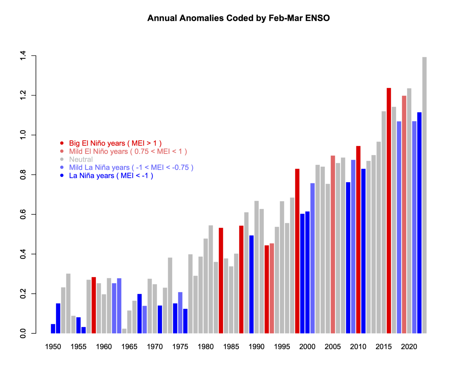
Fig. 1: variations in ENSO in a warming world. This plot therefore shows two independent phenomena that affect climate: the noisy ENSO and the underlying relentless upward climb in temperatures caused by our rapidly-increasing emissions of CO2 and other greenhouse gases. Temperature records typically get broken in El Nino years because the temperature is given an extra boost. 2016, a major El Nino year, held the global temperature record for a few years, but 2023 saw that record fall again. Graphic: Reaclimate.
The reader should by now be in no doubt about the difference between the long term global temperature trend caused by increased greenhouse gas forcing and the noise that shorter-term wobbles like ENSO provide. You would have seen something similar during the descents into and climbs out of ice-ages too. That's because ENSO has likely been with us for a very long time indeed. Ever since the Pacific Ocean came close to its present day geography, millions of years ago, it has likely been there.
The reader should by now be in no doubt about the difference between the long term global temperature trend caused by increased greenhouse gas forcing and the noise that shorter-term wobbles like ENSO provide. You would have seen something similar during the descents into and climbs out of ice-ages too. That's because ENSO has likely been with us for a very long time indeed. Ever since the Pacific Ocean came close to its present day geography, millions of years ago, it has likely been there.
Nevertheless, here we have something that warms the planet, even if that's on a temporary basis. As a consequence, some people with ulterior motives might just become interested. Over a decade ago now, that's what happened. A paper, 'Influence of the Southern Oscillation on tropospheric temperature' (Mclean et al. 2009) was published in the Journal of Geophysical Research. One of its co-authors, a well-known climate contrarian, commented:
"The close relationship between ENSO and global temperature, as described in the paper, leaves little room for any warming driven by human carbon dioxide emissions."
If you enter the above quote, complete with its quotation marks, into a search engine, you will get lots of exact matches. Strange? Not really, if you have studied the techniques of climate science denial.
- a paper is published that barely mentions global warming.
- its authors go on to distribute slogans implying that they have put yet another Final Nail in the global warming coffin.
- right-wing media of all sorts from newspapers to blogs ensure wide distribution of the talking-points.
- individuals serve to fill in the circulation-gaps.
This is how it works, time and again. However, glaring errors were soon noticed in the paper, leading a group of specialists to offer a rebuttal, published in the same journal a year later (Foster et al. 2010).
Statistics is not everyone's cup of tea, but a very straightforward explanation of the key error was provided by Stephen Lewandowsky, writing at ABC (archived):
"This is best explained by an analogy involving daily temperature readings between, say, July and December anywhere in Australia. Suppose temperature is recorded twice daily, at midday and at midnight, for those 6 months. It is obvious what we would find: Most days would be hotter than nights and temperature would rise from winter to summer. Now suppose we change all monthly readings by subtracting them from those of the following month—we subtract July from August, August from September, and so on. This process is called "linear detrending" and it eliminates all equal increments. Days will still be hotter than nights, but the effects of season have been removed. No matter how hot it gets in summer, this detrended analysis would not and could not detect any linear change in monthly temperature."
Anyone can do this in Excel. First input a series of representative temperatures for the transition from Austral winter into summer:
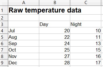
Reasonable? OK, then let's plot them. Still looks like what we'd expect. It gets warmer in Australia from July to December and nights are usually colder than days, right?
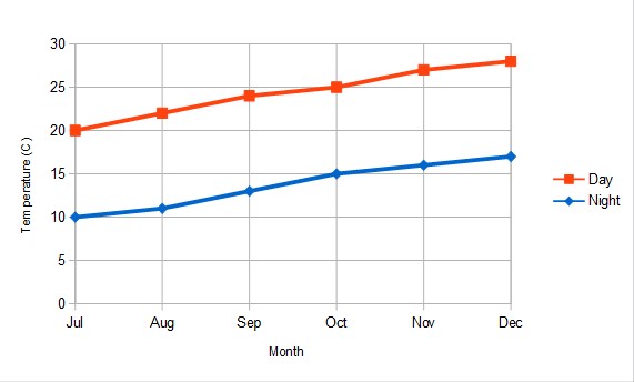
Now, let's do that detrending. This is what you get:
As Lewandowsky pointed out in his ABC article:
"Astonishingly, McLean and colleagues applied precisely this detrending to their temperature data. Their public statements are thus equivalent to denying the existence of summer and winter because days are hotter than nights."
In other words: Fail.
Last updated on 24 March 2024 by John Mason. View Archives


KR, Philippe Chantreau, Rob Painting, Sphaerica, et al.: The basis of this discussion appears to have been this video that appeared on the WUWT-TV webcast. Since some of you have not watched the video, you would have missed the bases for it. Therefore, let’s start with satellite-era sea surface temperature data and let me then ask you to explain the following:
The East Pacific Ocean (90S-90N, 180-80W) has not warmed since the start of the satellite-based Reynolds OI.v2 sea surface temperature dataset, yet the multi-model mean of the CMIP3 (IPCC AR4) and CMIP5 (IPCC AR5) simulations of sea surface temperatures say, if they were warmed by anthropogenic forcings, they should have warmed approximately 0.42 to 0.44 deg C. Why hasn’t the East Pacific warmed?
The detrended sea surface temperature anomalies for the Rest of the World (90S-90N, 80W-180) diverge significantly from scaled NINO3.4 sea surface temperature anomalies in 4 places. Other than those four-multiyear periods, the detrended sea surface temperature anomalies for the Rest of the World mimic the scaled ENSO index. The first and third divergences are caused by the eruptions or El Chichon and Mount Pinatubo. Why does the detrended data diverge from the ENSO index during the 1988/89 and 1998/99/00/01 La Niñas? According to numerous peer-reviewed papers, surface temperatures respond proportionally to El Niño and La Niña events, but it’s obvious they do not.
I’ve answered those two questions in the video. Can you answer those questions? The data is available in an easy to use form through the KNMI Climate Explorer. Feel free to confirm my results in the above graphs.
[DB] To reiterate Ian's questions, so the dialogue can proceed:
1) Do you have a link to the specific dataset(s)?
2) Is the NINO3.4 data processed in anyway? and if so, how?
IanC: Excuse the delay.
You replied, “You are comparing data with a particular realization of internal variability to data with internal variability filtered out. You are effectively comparing apples to oranges, so of course they look different.”
I assume this is a discussion of the East Pacific data. The appearances are not in question. The trends are.
You replied, “To actually make a sensible analysis, you will at the very least have to look into internal variability of each model run, which entail comparing a large number individual model runs.”
Not me. I’m done with my analysis. It is the responsibility of the party wishing to dispute my results to show the effects of the point that party wants to introduce to the discussion. With that in mind, the models do such a poor job of simulating ENSO you’d be better off trying to remove the effects of ENSO from the East Pacific sea surface temperature data. Then you won’t have to analyze each of the dozens and dozens of model runs. If you don’t want to do that, that’s okay, because the “Rest of the World” data still needs to be explored.
You replied, “To answer your question, a far more plausible explanation is internal variability (e.g. PDO).”
Unfortunately, that explanation doesn’t work for a number of reasons. (a) The PDO represents the standardized leading Principal Component of the sea surface temperature anomalies of the North Pacific north of 20N after the global temperatures have been removed, not the sea surface temperature anomalies. (b) The standardization of the PDO exaggerates its actual variability by a factor of about 5.6, if memory serves. In other words, the standardization exaggerates the importance of the PDO. (c) The PDO is actually inversely related to the sea surface temperature anomalies of that portion of the North Pacific on decadal timescales. (d) The PDO is an aftereffect of ENSO and the sea level pressure of the North Pacific. The sea level pressure of the North Pacific causes the difference between the PDO and ENSO. (e) The dominant component of the PDO is the sea surface temperature of the Kuroshio-Oyashio Extension, in the western North Pacific, not the East Pacific.
You asked, “What scaling and time shifting have you applied to the NINO3.4 data?”
The scaling factor is 0.12 and there’s a 6-month lag.
You asked, “Can you provide references?”
Yup. Every study that attempts to remove the effects of ENSO from the surface temperature record by scaling an ENSO index and by subtracting the scaled and lagged ENSO index from surface temperatures assumes surface temperatures respond proportionally to El Niño and La Niña events. Examples in alphabetical order:
Foster and Rahmstorf (2011) “Global Temperature Evolution 1979–2010”
And:
Lean and Rind (2009) How Will Earth’s Surface Temperature Change in Future Decades?
And:
Lean and Rind (2008) How Natural and Anthropogenic Influences Alter Global and Regional Surface Temperatures: 1889 to 2006
And:
Santer et al (2001), Accounting for the effects of volcanoes and ENSO in comparisons of modeled and observed temperature trends
And:
Thompson et al (2008), Identifying signatures of natural climate variability in time series of global-mean surface temperature: Methodology and Insights
And:
Trenberth et al (2002) Evolution of El Nino–Southern Oscillation and global atmospheric surface temperatures (See note 1)
And:
Wigley, T. M. L. (2000), ENSO, volcanoes, and record-breaking temperatures
Note 1: Trenberth et al (2002) included the following caveat (my boldface):
“The main tool used in this study is correlation and regression analysis that, through least squares fitting, tends to emphasize the larger events. This seems appropriate as it is in those events that the signal is clearly larger than the noise. Moreover, the method properly weights each event (unlike many composite analyses). Although it is possible to use regression to eliminate the linear portion of the global mean temperature signal associated with ENSO, the processes that contribute regionally to the global mean differ considerably, and the linear approach likely leaves an ENSO residual.”
The divergences shown in brown are those ENSO residuals.
Moderator DB asked, “Do you have a link to the specific dataset(s)?”
The Reynolds OI.v2 data is available on a gridded basis through the KNMI Climate Explorer:
http://climexp.knmi.nl/selectfield_obs.cgi?someone@somewhere
And through the NOAA NOMADS website:
http://nomad3.ncep.noaa.gov/cgi-bin/pdisp_sst.sh?ctlfile=monoiv2.ctl&varlist=on&new_window=on&lite=&ptype=ts&dir=
The coordinates of the NINO3.4 region are 5S-5N, 170W-120W. The coordinates for the East Pacific is 90S-90N, 180-80W. And the coordinates for the Rest of the World are 90S-90N, 80W-180. I provided a brief introduction to the KNMI Climate Explorer here:
http://bobtisdale.wordpress.com/2010/12/30/very-basic-introduction-to-the-knmi-climate-explorer/
And DB asked, “Is the NINO3.4 data processed in anyway? and if so, how?”
The NINO3.4 sea surface temperature anomalies were scaled by a factor is 0.12, lagged 6 months, and both datasets in the graph of the detrended Rest of the World data were smoothed with 13-month running-mean filters.
Regards
[DB] If you walk away when a flaw is identified in your analysis then you shouldn't be surprised if others find your argument unconvincing. As you are challenging the mainstream scientific position, the onus is on you to show that your argument is solid. That is the way science works.
Therefore, you shouldn't ignore the moderator's advice here: "I would recommend that you do not proceed onto part 2 until we have had a chance to digest part 1 and for relevant questions to be answered".