


 Arguments


Climate Bet for Charity, 2017 update
Posted on 3 March 2017 by Rob Honeycutt
In 2011 a bet was started up between "skeptics" of man-made climate change who follow Pierre Gosselin's "No Tricks Zone" blog, and myself and others here who follow SkS. It's a simple bet asking, "Will the next 2011-2020 decade be warmer than the previous 2001 – 2010 decade?" We're now over half way through this bet and here's where we stand.
 [Click here for a larger image]
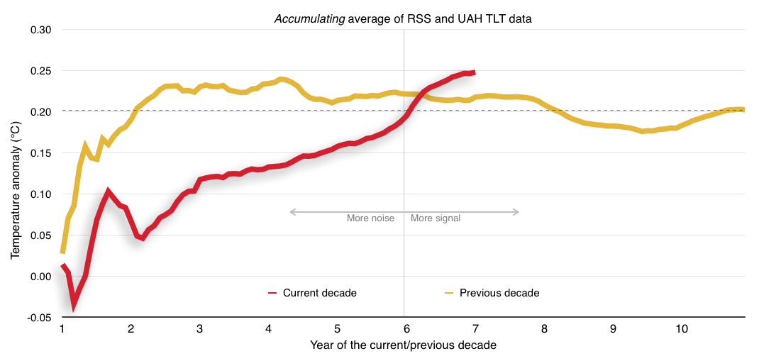
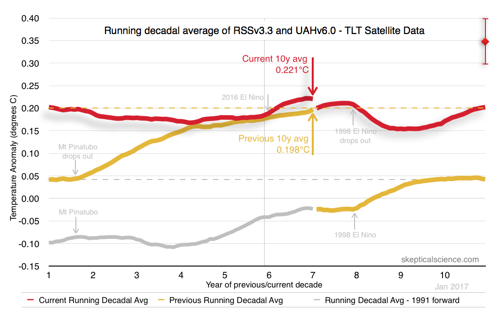
What this graph represents is, what the state of the bet would be if it had been initiated 10 years ago, and ended this month. So, the red line represents the running decadal average to date. The yellow line represents the the running decadal line for the previous decade.
At no point in the past 7 years has the yellow line been above the red line, thus at no point during this bet has the previous decade been warmer than the current decade. In fact, at no point in the past 26 years has the decadal average been lower. The chosen data sets for the bet are an average of the UAH and RSS satellite data, which we now know have some challenges. But even with data that most benefits the cooler side of things, the decadal average temperature of every month of the entire past 6 years has been warmer than the previous decade. It was close 1-2 years ago, but still the current decade remained higher.
Even though there are four years left before this bet is completed I'm maintaining that the end result will be somewhere within that target range I've indicated on the far right. There's nothing technical behind that target. It's just the same amount of warming between the previous two decades (0.15°C) but with +/- 0.05°C included.
When I first went into this bet I had only been researching climate issues for a few years. At that time I was under the (mistaken) impression that satellite data was more reliable than the surface station data. I've learned a lot more since then.
At that time I did not understand how complex the satellite data actually were. I did not realize the data come from a lot of different satellites over this time period. I had not seen the satellite raw data at that time.
But that's water under the bridge. The bet has been made and it must remain as we made it.
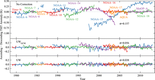
There are other issues about the satellite data that I also didn't understand 6 years ago. We chose the TLT data (Temperature, Lower Troposphere) from the two data sets, but there are issues with this channel in terms of what part of the atmosphere it's measuring.
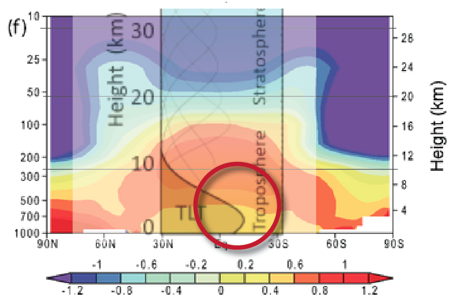
[Click here for larger image.]
Here I've overlaid the TLT channel as shown on the RSS website with an IPCC figure representing the spatial patterns of warming and cooling in the atmosphere (AR4 WG1, chapter 9.2.2). What you see is that the TLT data primarily measures a region about 2-3km in altitude, and well below the area of primary warming in the atmosphere.
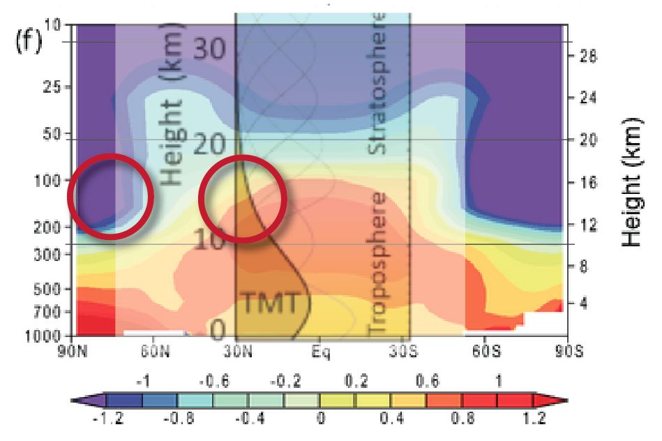
The TMT (Temperature, Middle Troposphere) does a little bit better job of picking up more of the troposphere and more of that warmer region in the mid-troposphere, but still doesn't fully pick up where the warmest region is supposed to occur. The TMT data also has a big challenge in that the tail end of the channel is picking up significant bleed from the cooling stratosphere above 60°N and below 60°S.
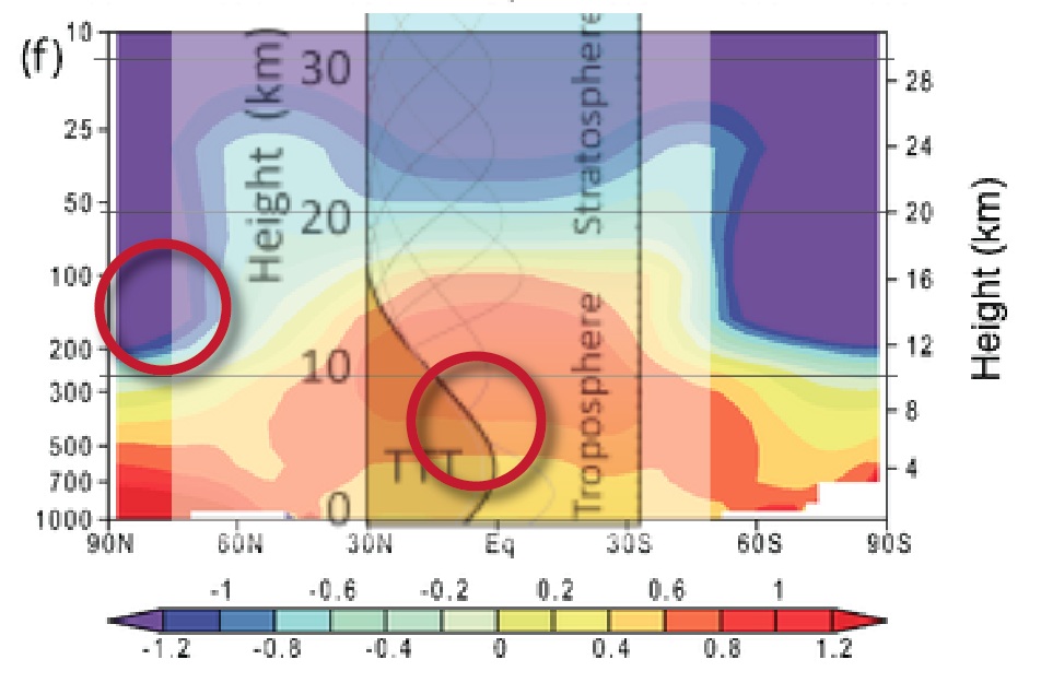
RSS has a different product that is an improvement over both TLT and TMT called TTT (Temperature, Total Troposphere). This channel manages to pick up most of the troposphere in proportions that are probably giving a better indication of the warming of the troposphere.
Measuring the atmosphere with satellites has a key challenge that most people might not think about. Satellites orbit at a fixed altitude from about 700km above the surface. The sensors are reading from a fixed region relative to altitude. But the atmosphere doesn't conform to those fixed altitudes. The tropopause ranges from about 10km at the poles to around 20km at the equator.
I'm not a researcher, so potentially there's something I miss here, but it could be a novel idea to create a satellite product that mixes different channels for different latitudes. Say, TLT for polar regions, TTT for mid-latitudes and TMT for the tropics.
The RSS TTT data, with their latest update, now seems to fully support the data coming from the various surface station groups. There arguments between UAH and RSS about how to treat some of the data as to regards of the reliability. RSS chooses to drop the questionable data. UAH chooses to include it. The net result is UAH data is now an outlier with regards to their representation of global warming. They still show warming, but much less than anyone else.
But we're stuck with an average of UAH and RSS TLT data for the purposes of the bet. And that's fine. RSS TTT and TMT channels are operating on version 4, while TLT is still outputting with version 3.3. I've heard wind that there is an update to TLT data related to a paper that's currently under review. It will be curious to see how the resulting update changes the look of this bet.
While satellite data was probably not the best choice for a bet like this, due to a long list of issues, it's hardly going to matter in the end. The current running decade has been warmer than the previous one for the entire time during this bet. My expectation is that position will be held for the remaining 4 years. In order for the 2011 to 2020 decade to end up lower than the previous decade would require a truly massive amount of cooling for the remaining 4 years. The chances of that happening are extremely low.
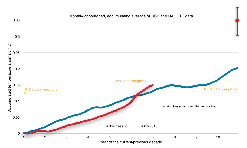
There are two other methods of looking at the state of this bet. One is to run a cumulative average and the other is to look at a weighted or monthly apportioned cumulative average:


Kiwi Thinker's method looked good for the 'sceptics' for a a while there. Doesn't look like that green line has much chance of falling below the red one again between now and 2020.
Colours refer to the lines on the chart at Kiwi Thinker's site, sorry: http://www.kiwithinker.com/wp-content/uploads/2015/08/Climate-Bet-Dec-2016.jpg
My own version of the progress of this bet (here - usually two clicks to 'download your attachment') provides yet a third representation of the bet. It's main benefit, apart from being far more colourful and thus more cheerful, is that it plots the contribution from each month within the decade and shows how much they each assist or not (red or blue) each side in the bet.
The present state of play is shown by the 'pyramid' trace which sets the average required from the remaining months if the outcome were to be a draw. Thus, the 'pyramid' trace being below the 2001-10 average shows the temperature-record-to-date is favoring a warmer 2011-20. And any monthly temperature above the 'pyramid' trace is improving that position. You will note that there has not been a month improving the status of a cooler 2011-20 since April 2015, almost 2 years ago.
We can expect the 'pyramid' trace, bar a big volcano going bang in the coming years, to continue to drop and at an increasingly rapid rate as the period available for reversing the 'hot' lead shrinks to zero. This of course assumes that AGW doesn't also play a role itself by bringing us a significant amount of warming in the next few years. And all that is without the doomsday scenario for the cooler bet (which is surely almost a certainty) of the release of an RSS TLT v4.0. Of course, the change from UAH TLTv5.6 to v6.0beta5 did have an opposite effect. (The 'pyramid' trace presently sits 0.08ºC below the 2001-10 average with v6.0 but it would have been down at 0.12ºC below with v5.6.)
dwr... I'd make a $5 side bet that KW KT (Kiwi Thinker) has to change the scale on his Y-axis before the bet concludes.
You won the side bet in June last year, Rob, And you predicted it all the way back in 2013, when you first posted on this bet:
KT has added 0.1 to the top of his Y axis so far.