


 Arguments


Recent Comments
Prev 1934 1935 1936 1937 1938 1939 1940 1941 1942 1943 1944 1945 1946 1947 1948 1949 Next
Comments 97051 to 97100:
-
Philippe Chantreau at 05:20 AM on 29 January 2011Ten temperature records in a single graphic
I wonder, if these repondents were polled on it ahead of time, if they would say that they will agree to pay to rectify a pathetic financial fiasco generated by careless banking practices? mmmmm... Well, that is off topic and I expect will be deleted but it would be as skillfull a survey question as the ones included in that little poll concocted by pirate. How about a question like this: 3 different oncologists tell you that you have cancer and it's likely to be malignant. Another oncologist, retired 10 years ago and holding a quirky reputation tells you yeah, you might have it, but it'll probably go away and if not it's a good thing anyway. Would you still seek treatment and be ready to pay for it? I wonder, has anyone estimated the price of fossil fuels if they were to completely loose all forms of susbidies? -
apiratelooksat50 at 04:46 AM on 29 January 2011Ten temperature records in a single graphic
Sweet @ 84, Their survey, not mine, was again based on guidance from their textbook. The textbook actually supports your premise of AGW. Pre-human climate change is what it is. It happened and there is no denying it. Providing DB's second graph based on projections would surely bias the results. 60% of the respondees were willing to pay extra for renewable energy to reduce CO2 emissions. Fossil fuel based energy is cheaper and more reliable currently and for some projected time. Other than nuclear, some work is still required to effectively use alternative energy on a large scale. (FWIW, I like alternative energy where applicable.) -
NickD at 04:30 AM on 29 January 2011Trenberth can't account for the lack of warming
Has there been any comments (here or elsewhere) on the paper by Knox & Douglass from 2010 regarding their findings refuting, apparently, Trenberth's analysis? I know there was some discussion on Curry's blog, but I prefer to not dive into the comment section over there. Thanks. -
apiratelooksat50 at 04:15 AM on 29 January 2011Ten temperature records in a single graphic
Alb @85, They went all over the site, but mainly concentrated on the two threads concerning CO2 lagging temperatures, and the natural cycles that were posted here within the last few weeks. -
apiratelooksat50 at 04:11 AM on 29 January 2011Ten temperature records in a single graphic
From the McShane and Wyner paper that DB pulled the graphs from @ 66. Abstract: We find that the proxies do not predict temperature significantly better than random series generated independently of temperature. Furthermore, various model specifications that perform similarly at predicting temperature produce extremely different historical backcasts. Finally, the proxies seem unable to forecast the high levels of and sharp run-up in temperature in the 1990s either in-sample or from contiguous holdout blocks, thus casting doubt on their ability to predict such phenomena if in fact they occurred several hundred years ago. This is the graph as it appears in the paper. Moderator Response: [Daniel Bailey] The graph I used came from here.
 -
Albatross at 04:04 AM on 29 January 2011Ten temperature records in a single graphic
Pirate, "I simply showed them the graphs and articles from this site (yes, SKS only!) and asked their opinions." Which graphics exactly (links please) and what did you say about them? Thanks. -
michael sweet at 04:02 AM on 29 January 2011Ten temperature records in a single graphic
Pirate: Your survey on line provides data that shows historic prehuman climate change and then asks if humans are causing current climate change. That biases the result. If you provided DB's second graph you sould get a completely different result. The deniers current theme is that climate change is normal and we cannot do anything about it. They used to say climate change was not happening, but that has been proven wrong. Additionally you ask if people will pay to reduce CO2. People always say they do not want to pay for changes. It is not clear that renewable energy will be more expensive than fossil fuels once the fossil fuel subsidies are removed. Certainly in 100 years fossil fuels will be more expensive- they will be used up. Students know what your opinions are even if you do not state them. Their friends have your class. Your position was clear from your first post here on SS. The framing of the on line survey is an example of your position. I only needed to read one question to see the point of the survey. Many students are concerned about climate change. Whether or not enough are interested is still to be determined. Right now it looks grim in the USA. My skeptical student tell me that they will not change their position until their house is flooded. It is not enough if Australia (or Texas) is hit. -
Albatross at 03:58 AM on 29 January 2011Animated powerpoint of the Indicators of Warming
Rob @13, "If each of those indicators had a small notation referencing a peer reviewed paper or two." Good idea...I second that. This graphic could be a great teaching tool. -
Rob Honeycutt at 03:56 AM on 29 January 2011Animated powerpoint of the Indicators of Warming
The Ville... I got the file to work with Keynote 5.0. -
Rob Honeycutt at 03:54 AM on 29 January 2011Animated powerpoint of the Indicators of Warming
You know something that would make this a much more powerful presentation? If each of those indicators had a small notation referencing a peer reviewed paper or two. That would change this from an interesting graphic into a powerful graphic. -
apiratelooksat50 at 03:40 AM on 29 January 2011Ten temperature records in a single graphic
DB @ 66, Where did you get the second graph in this comment? It is not the same one labeled Figure 16 in the original paper.Moderator Response: [Daniel Bailey] Pardon for the delay in responding; been a little preoccupied with life, the universe and everything. Inre the graph from #66, I intentionally used the "Skeptic's" darling, the McShane and Wyner graph, adapted by Wag here. See also here, here and here for supporting discussion and sources. -
michael sweet at 03:39 AM on 29 January 20112010: A Year of Record Warmth and Weird Weather
Humanity Rules: If you want to claim that Trenberth is "exaggerating" you need to provide some data and or cite a reference to back up your claim . You saying "I doubt it" is not reasonable. If you want to convice anyone that what you say is worth listening to you need to start citing data. According to the NCDC, 2010 was the wettest year globaly on record (since 1900). Just eyeballing this graph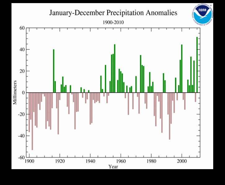 wet is increasing, although there is a lot of noise. AGW theory predicts that the rain will fall more in the wet places and the dry places will get drier. that is what is being observed.
Why do you keep harping on El Nino causing the heat during 2010? All the record years are El Nino years.
wet is increasing, although there is a lot of noise. AGW theory predicts that the rain will fall more in the wet places and the dry places will get drier. that is what is being observed.
Why do you keep harping on El Nino causing the heat during 2010? All the record years are El Nino years.
-
caerbannog at 03:32 AM on 29 January 2011Ten temperature records in a single graphic
Ed Davies at 00:03 AM on 27 January, 2011 @caerbanog #7, are the extra readings the ones differentiated by the "duplicate" field or just the "modifier"? I have to admit that I couldn't understand the description of the duplicate field so my own version of this just ignores it and uses the last data value for each station, but it does take the modifier as part of the station identification. I think that the duplicate number refers to duplicated time-series -- i.e. data with id #'s that vary by only the duplicate number should be identical (or nearly so). Not really clear as to why it's there (but haven't really investigated it). My new procedure simply merges all temperature data associated with a given WMO # (sans modifier and duplicate number) into a single time-series. Since I'm just doing straightforward averages in the merging process, the presence of duplicates will have no impact on my results. After I compute merged temperature time-series (one per WMO id), I then proceed with the anomaly calculations. The new results aren't all that different from the old results, but there is a visibly smaller difference between the "raw" vs. "adjusted" results in the early 20th Century with the corrected approach. If you plot out NASA's "Northern Hemisphere" and "Northern Latitudes" temperature results (data available at: http://data.giss.nasa.gov/gistemp/tabledata/ZonAnn.Ts+dSST.txt), you will find that the "dumb average" approach (with WMO stations merged first) produces a post-1970 warming rate that lands in-between NASA's NH and NL warming rates (which certainly makes sense, intuitively). -
apiratelooksat50 at 03:17 AM on 29 January 2011Ten temperature records in a single graphic
My purpose of posting the comment about the AP Physics students was not to imply any scientific basis to discredit AGW, but to show that public perception of AGW is very different than what you may think. If the AGW hypothesis does bear fruit, and there are true negative effects that might possibly be addressed by proactive reduction of CO2 emissions, then these are the people that must be convinced. They are our future leaders. As far as my influencing these students with my viewpoints, trust me it did not happen. This was the one and only time I've had any contact with them. I simply showed them the graphs and articles from this site (yes, SKS only!) and asked their opinions. It wasn't until the end of the period that I voiced my thoughts. Glenn @ 73 - You make some good points and if we can carve some time out of their curriculum, I will do just that. Here is a link to a survey my Environmental Science students are conducting as a project. They followed a guide in their textbook while developing this survey to minimize any bias. Other than supplying computer access, I was hands-off. Click here to take surveyModerator Response: [Daniel Bailey] You should learn a better differentiation between a hypothesis and a theory. It might also be a good idea to have your students read this as well. -
citizenschallenge at 03:02 AM on 29 January 2011Monckton Myth #8: Rising sea levels
SEA LEVEL ACCELERATION Monckton - "In the 11,400 years since the end of the last Ice Age, sea level has risen at an average of 4 feet/century, though it is now rising much more slowly because very nearly all of the land-based ice that is at low enough latitudes and altitudes to melt has long since gone." Monckton - "It (satellite altimetry data) is a dizzying 1 ft/century – not vastly greater than the 8 inches/century that had previously been inferred from tide-gauges." ~ ~ ~ ~ Sounds to me like the man is saying sea levels have been rising by 8 inches per century, (coming down from 48" per). That this rate of sea level rise ended about 6,7 thousand years ago and that sea levels have remain remarkably stable since then. . . seems not an unimportant distinction to make clear to folks and lurkers. -
Byron Smith at 02:37 AM on 29 January 2011Animated powerpoint of the Indicators of Warming
Another minor suggestion: snow cover --> summer snow cover. -
Joel3937 at 02:08 AM on 29 January 2011Animated powerpoint of the Indicators of Warming
@The Ville, NeoOffice is a build of OpenOffice specifically for Macs. I am running NeoOffice 3.1.2 and the slide show works. -
Yvan Dutil at 01:33 AM on 29 January 2011Rescue Climate Data
Here is a related paper describing the project. http://www.esrl.noaa.gov/psd/people/gilbert.p.compo/20CRv2_Compoetal2010.pdf -
Chris G at 01:30 AM on 29 January 2011Animated powerpoint of the Indicators of Warming
Oops, not a particularly good example. That article does not really support the point I was testing. -
Chris G at 01:25 AM on 29 January 2011Animated powerpoint of the Indicators of Warming
Nice work John. Regarding the earlier Spring, I would hazard a guess that there is also a later Fall. In which case, it might be more accurate to say 'Longer warm seasons', 'Longer summers', or I suppose, 'Shorter winters' . It is a minor difference, but it would more accurately describe the situation. For instance, there is this, Late leaf fall. -
Yvan Dutil at 01:16 AM on 29 January 2011Rescue Climate Data
If you want to know what can be done with these data. I suggest this powerpoint presentation,. www.usclivar.org/Meeting_Files/Reanalysis2010/Monday/Compo.ppt Results are amazing at the end of 19th century. In the future, it is expected that reconstruction could be decent up to 1900. -
muoncounter at 00:46 AM on 29 January 2011Ten temperature records in a single graphic
#68: "bright, educated, college scholarship worthy students" As there is no content in either HS Chemistry or Physics that deals with climate change (even the thermo taught in Physics stops with Carnot cycles), this is neither an issue of 'bright students' having an educated opinion nor one of 'misteaching'. My bet is on parental viewpoint - I recall pirate mentioned the southeastern US - that is politically biased or otherwise non-scientific. Of course, if the same group of students also believes that there is no gravity in space, that would shout 'misteaching'. The experiment that Glenn proposes in #73 would include giving such bright students, who have the pressure of college admits behind them, the opportunity to research the AGW question. Two weeks with groups tackling different pieces of the subject and presenting their results to the class could produce some interesting results. -
Paul D at 00:23 AM on 29 January 2011Animated powerpoint of the Indicators of Warming
I have Open Office 3.2.1 on a Mac. -
Riccardo at 00:15 AM on 29 January 2011Animated powerpoint of the Indicators of Warming
Open Office 3.1.1 running on WinXP does it too. -
Tom Curtis at 00:10 AM on 29 January 20112010: A Year of Record Warmth and Weird Weather
HumanityRules @22, it is undoubtedly true that other factors has an impact on the extreme weather events of 2010. It is also clear that their frequency and intensity would not have been as great without global warming. As this is a blog, not a scholarly analysis, the presumption thta we should list every additional factor is without warrant. With regard to the 2011 floods in Brisbane, several factors are relevant. First, in 2011 there was significantly more rainfall in the Brisbane River catchment than in 1893 (the worst prior floods with a rainfall record. Second, more water flowed down the river in the 2011 floods than in the 1974 floods (despite the lower level), even though more water was held back by Wivenhoe then flowed down the river in 1974. In other words, the total amount of water involved was around twice as much as that which caused the 1974 floods. Third, based on hydrological evidence, the 2011 floods would have been around a meter higher than the highest flood since European settlement in Brisbane (1841) where it not for the effect of Wivenhoe and Somerset dams. On top of this, Wivenhoe was upgraded in 2005 from its ability to hold back a 1 in 400 year flood as a result of predictons of increased flood intensity as a result of global warming. As part of the upgrade, an auxilliary spillway was installed, whose first fuse plug was designed to only be overtopped by a 1 in 3,000 year flood. On the week of the flood, water levels came within 100 mm of overtopping that fuse plug. On this basis, the 2011 flood was at least a 1 in 200 year flood, but probably significantly greater. It was probably not a 1 in 2,000 year flood. Any figure in between at this stage involves significant guess work. But as Wivenhoe's capacity exceded that of the pre-expansion (ie, 1 in 400 year flood level) capacity by around 330 thousand megaliters (or 2/3rds of the size of Sydney Harbour) it seems very probable it was at least a 1 in 400 year event. All these odds assume no global warming. Given Global Warming, I would expect floods of similar or greater intensity at least four or five times over the remainder of the century. -
Ed Davies at 23:50 PM on 28 January 2011Monckton Myth #8: Rising sea levels
Stefan's surname is spelled Rahmstorf. -
Ed Davies at 23:43 PM on 28 January 2011Monckton Myth #8: Rising sea levels
Anthony G. Warming #42: "You would not spread any such irrelevant information concerning those you trust." This makes my head hurt. Either you think such information is irrelevant in which case you would, indeed, have no reason to spread it or you think the information is relevant in which case you wouldn't trust them. -
Rob Painting at 23:15 PM on 28 January 2011Monckton Myth #8: Rising sea levels
Dikran, puncturing a "skeptic" fallacy here and there can't hurt. I disagree with both yourself and KR. Let's leave it at that. -
HumanityRules at 23:13 PM on 28 January 20112010: A Year of Record Warmth and Weird Weather
James includes a quote from Trenberth about extreme weather events and global warming. It's worth considering just how much further he has now gone six months down the line. I know this has got a lot of coverage on WUWT but his planned speech at AMS is laid out here. I'll give you the relevant quote. "It is worth considering whether the odds of the particular event have changed sufficiently that one can make the alternative statement “It is unlikely that this event would have occurred without global warming.” For instance, this probably applies to the extremes that occurred in the summer of 2010: the floods in Pakistan, India, and China and the drought, heat waves and wild fires in Russia. It likely also applies to the flooding in Queensland, Australia In January 2011." He seems to be making rather exaggerated claims about events that happened 2 weeks ago, we probably don't even yet have all the relevant data collated never mind any serious analysis made. Maybe things have progressed so much that the normal course of science is no longer necessary? This is opportunism not science. -
HumanityRules at 22:56 PM on 28 January 20112010: A Year of Record Warmth and Weird Weather
15 Tom Curtis We could argue about the absolute impact of El Nino on the 2010 temperature but that wasn't really my point. In my opinion James has choosen to ignore the impact of El Nino on 2010's temperature record in order to tell a simple story about a warmer world and climate disasters. As highlighted in #21 there are other physical explanations for many of these events which have also been neglected by James. This has the overall effect of telling an unmuddied story about global warming and extreme climate events. I'm sure that soon after the Moscow heatwave the 'frozen' jet stream was also implicated in this event. Did a warming globe contribute 1oC or all 10oC to the Moscow anomoly? It seems unnecessary to contemplate these other physical causes to focus on a consistent story about global warming. Which is what we have here from James. Just on the Brisbane flood. A 1 in 400 year event? Are you sure? -
HumanityRules at 22:30 PM on 28 January 20112010: A Year of Record Warmth and Weird Weather
17 Marcus The unusual nature of the Pakistan floods was indeed the place where the rain fell. From memory the whole process began in the mountainous regions rather than the plains. This lead to fast run off into the river systems and devastating surges as the water made it's way downstream. The explanation for these more northern rains was monsoon rains strengthened in a La Nina region begin allowed to move northward by a 'frozen' jet stream. While it's worth considering how much this may have been exasperated by a warming world it doesn't seem to require that warming world for a plausible explanation of the event. -
Riccardo at 21:48 PM on 28 January 2011Animated powerpoint of the Indicators of Warming
The Ville my Open Office 2.1 on linux does it. Anyways, a cross-platform format would be preferrable. -
Eric (skeptic) at 21:24 PM on 28 January 20112010: A Year of Record Warmth and Weird Weather
#11 villabolo, no irony at all. The 1970's had some strongly negative AO, but lots of sea ice. So lack of sea ice did not cause negative AO in that case. Now we have negative AO again most likely a natural cycle, plus lack of sea ice (unnatural), but both of those are recent. We simply don't know how lack of sea ice affects the patterns like AO or NAO yet, that's the new territory. "Weird" weather (however one might define it) is not new territory. -
Dikran Marsupial at 20:45 PM on 28 January 2011Monckton Myth #8: Rising sea levels
Rob Painting@49 FWIW I agree with KR, even if Monckton's use of Morner was an appeal to authority, that doesn't justify the use of rhetorical devices in a scientific discussion. Better to keep the high ground. -
Paul D at 20:27 PM on 28 January 2011Animated powerpoint of the Indicators of Warming
hmmm, tried it in Open Office and none of the labels appeared when it was run as a slide show. -
Paul D at 20:04 PM on 28 January 20112010: A Year of Record Warmth and Weird Weather
Norman had a look at the link you provided and it has a list of years with floods in Pakistan. I calculated the intervals in years between each flood. I notice that the average interval for the first 6 floods in the list (1928-1976) was 8 years, the average interval for the last 6 floods (1976-2010) is 5.7 years. -
Bart Verheggen at 19:38 PM on 28 January 2011Animated powerpoint of the Indicators of Warming
Cool, just in time for my climate presentation today! I had already featured the 'still' figure, but I'll change it now to the animated version. -
scaddenp at 19:38 PM on 28 January 2011It's albedo
"so is the gain of about 1.6, which represents the amplification at the surface for each 1 W/m^2 of energy from the Sun." Again, this is bogus way to do it. You need a certain amount of energy to get past the threshold of having any water vapour at all. With zero CO2, you would still have same sun, but snowball earth and no water vapour. Above a certain point, the solar minus albedo is strong enough to give water vapour and get that feedback. Note also that albedo feedback becomes more important at lower temperatures too. The 3.7W/m2 is calculation by the way too, but you can the verify the RTEs used to calculate it empirically. I repeat, you have to calculate feedback with a model, not some half-baked "gain" idea. And the actual response of surface temperature to increasing CO2 gives a way to empirically estimate sensitivity (or test the sensitivity of model). 3 looks pretty good, but see the IPCC WG1 for variety of other empirical estimates. -
scaddenp at 19:25 PM on 28 January 2011It's albedo
They do. Water vapour amplifies any surface temperature increase (and vice versa). However, your "Gain" analogy is inadequate to quantify those feedbacks. -
Richo at 19:18 PM on 28 January 2011Understanding the CO2 lag in past climate change
Very good, apologies for the bad link, I must have been delirious with the thought of 1010ppm. -
jyyh at 18:19 PM on 28 January 2011Animated powerpoint of the Indicators of Warming
chemware, rainfall suggestion doesn't work unless one counts in ENSO. I'm expecting droughts to kick in again once the el Niño phase kicks in, add to that the additional kick from the sun 11 yrar cycle some droughts might be pretty quite severely bad or hard, or something like that since the ambiguity of language is somewhat exhilarating in the world of political absolutes. -
Chemware at 17:38 PM on 28 January 2011Animated powerpoint of the Indicators of Warming
Very nice ... and a couple of suggestions: 1. one more indicator: rainfall/precipitation up; 2. and I'd be happy to put together an animated GIF if you want - no PP required, just a web browser. -
Rob Painting at 17:10 PM on 28 January 2011Monckton Myth #8: Rising sea levels
KR @44 - As Tom Curtis points out Monckton's use of Morner was an appeal to authority. CC @ 43 - For the sake of brevity it's prudent not to address every single error. That's the beauty of the Gish Gallop. The essence of Monckton's claim was that sea level rise was much higher early in this interglacial period. Yes, we know that. CC @ 45 - The scale of that graph makes it difficult to discern, but sea levels were higher mid-Holocene. As for juxtaposition, well a matter of interpretation I guess. To the average lurker that seems to justify Monckton's claim that sea level rise was faster earlier in the Holocene. Yes, we know that!. -
SoundOff at 16:18 PM on 28 January 20112010: A Year of Record Warmth and Weird Weather
From this article: “Indeed, when the seasonal cycle is removed March 2010 was the third warmest month of all time …” Doesn’t the use of anomalies automatically eliminate any seasonal cycle? If March 2010 had an anomaly of +0.85°C, my understanding is this means March was +0.85°C higher than the average of all the March anomalies during the anomaly base period, 1951-1980 (in the case of GISTemp). Right? There does not appear to be any consistent seasonal cycle in the years shown in the graph at the end of this article (a great graph, BTW).Moderator Response: That's what I meant. It was just another way of saying March 2010 was the third warmest monthly anomaly of all time. - James -
Marcus at 16:05 PM on 28 January 20112010: A Year of Record Warmth and Weird Weather
Norman, no one said floods don't occur in Pakistan, its just this one was unusual in its strength-due in no small part to the involvement of Monsoon Rain-which is clearly unusual for that part of the Sub-Continent. -
Norman at 15:49 PM on 28 January 20112010: A Year of Record Warmth and Weird Weather
"In a related event, the Asian monsoon occurred further west than usual, creating devastating floods which submerged 20% of Pakistan, killing 1,600 people and displacing millions – more than were affected by the 2004 tsunami." Is flooding in Pakistan unusal? Some recent flood history in Pakistan. -
archiesteel at 15:29 PM on 28 January 2011It's albedo
"Why don't the same feedbacks occur (excluding the surface albedo) on the 239 W/m^2 from the Sun?" What makes you think they don't? There is some water vapor in the air already, is there not? Why is it there in the first place? -
Tom Curtis at 15:08 PM on 28 January 20112010: A Year of Record Warmth and Weird Weather
Humanity Rules @13, comparing 1998 to 2010, I notice that both switched from positive to negative values at approximately the same time of year (aprox April). I also notice 1998 had much stronger positive values than did 2010, while 2010 had appreciably stronger negative values than did 1998. Therefore, absent a long term warming trend, we would expect 1998 to have been warmer than 2010 even with the same lag between the NINO3.4 index and global temperatures. Given that 1998 was several years into a solar cycle, while 2010 was at the start of a new solar cycle following the lowest solar minimum in almost a century, we would again expect 1998 to be warmer than 2010. How strong the trend has been can be seen by comparing 1973 and 2010, both of which had very similar patterns on the NINO3.4 index. That 2010 is 0.69 degrees warmer than 1973 (Hadcrut3 global)shows that there is an ongoing warming trend of about 1.8 degrees C per century, ie, spot on IPCC predictions. As to the analogy, it is very plain nature has been throwing some very strong punches lately. The Moscow heat wave is well known to be a "1 in 1,000" year event in the absence of Global Warming, and the Pakistani floods as a 1 in 100 year event. The recent floods in Brisbane are on various indicators greater than a 1 in 200 year event, and probably at least a 1 in 400 year event. Perhaps we might attribute this to a few lucky punches if they were isolated incidents. But they are not, they are part of a flurry of bone crunching blows. -
jyyh at 14:27 PM on 28 January 20112010: A Year of Record Warmth and Weird Weather
Great graph the last one. Have you done further analysis on that? F.e. checked regular legnth periods to see whether the amount of record temps vs. low temps have been increasing? I planned to do that once for monthly data but I guess there should be some correction for the differing legnhts of prior data that I couldn't figure out, plus it's a process that could be programmed to be automatic and I do not do analyses like that, all too easy to get something wrong. -
Tom Curtis at 14:17 PM on 28 January 2011Monckton Myth #8: Rising sea levels
Anthony @42 and KR @44, letting readers know that Morner has dabbled in dowsing seems to me more of a notice on Morner's well that he has poisoned it himself rather than actually poisoning the well. I would not ever cite as a scientific authority a young earth creationist, a dabbler in astrology, or a dabbler in dowsing. IMO that they are irrational in one area shows that their "rationality" in the area of their expertise is accidental - that they are not making mistakes (if indeed they are not) simply because they were taught which mistakes to avoid rather than because they are capable of correcting their misakes through rational analysis. I know that in the past, some giants of science have dabbled in pursuits now seen as irrational dead ends. Newton's interest in alchemy is the most famous example. The difference is that while Newton could draw on, there is no area of science that has now not been extensively elaborated. Belief in alchemy for Newton was based on inadequate information to demonstrate the error - belief in dowsing today is the deliberate choice of irrationality. Finally, Lord Monckton introduced Morner's claims by specifying that he was a professor with experience studying sea levels. He did not show the basis for those views, he merely apealed to authority. When an opponent argues by simple appeal to authority (and incosistently in that he is denying the more substantial authority of a large number of other experts in the field), it is certainly OK to impeach that authority. As Monckton's argument was no more than that this is a good well to drink from, pointing out that the owner of the well has poisoned it is no falacy.
Prev 1934 1935 1936 1937 1938 1939 1940 1941 1942 1943 1944 1945 1946 1947 1948 1949 Next


