


 Arguments


Recent Comments
Prev 1937 1938 1939 1940 1941 1942 1943 1944 1945 1946 1947 1948 1949 1950 1951 1952 Next
Comments 97201 to 97250:
-
Tom Curtis at 13:00 PM on 27 January 2011Monckton Myth #8: Rising sea levels
Ron Crouch @4, Corals will almost certainly not die of as a result of Global Warming. They are a diverse and reasonably robust class of animal, and it would be astonishing if all examples were driven to extinction. On the other hand, most or all of currently existing reefs are likely to be destroyed, or significantly altered by Global Warming, with surviving corals likely to form new reefs at higher latitudes than currently exist. Although smaller corals are coping better with warming, and multiplying in number, I do not think they good at building reefs, ie, with coping with sea level rise. Further, on BAU scenarios, it is likely that a large number of coral species will go extinct. That is an inevitable consequence of stressed conditions with limitted number of refuges. It should be born in mind that the currently dominant corals supplanted to previously dominant types at the time of the Permian extinction, and that corals have not always been the dominant reef building organisms on Earth. If GMT rises towards the 10 degree mark in the space of a couple of hundred years, there is no guarantee that corals will continue being the dominant reef builders in the future. -
Ron Crouch at 12:57 PM on 27 January 2011Monckton Myth #8: Rising sea levels
Living proof that even here at SkS there is room for a little comic relief, but wasn't that the GOP Caucus Tom? -
MichaelM at 12:57 PM on 27 January 2011Ten temperature records in a single graphic
@65 Matthew Are these ice core, bore hole and tree ring techniques not based and calibrated on the past 150 years of accurate data? So by definition they will match. As a scientific endeavour it would be meaningless. -
Daniel Bailey at 12:54 PM on 27 January 2011Monckton Myth #8: Rising sea levels
Every time I see the usual zombie posting by "skeptics" who haven't done their homework I'm reminded of this MP bit: Not a fair fight, as they don't even realize they've lost the debate before they started... (apologies for being O/T...and yes, I should know better) The Yooper -
Tom Curtis at 12:47 PM on 27 January 2011Monckton Myth #8: Rising sea levels
Ron Crouch @6, perhaps you had in mind a sporting event? -
Daniel Bailey at 12:39 PM on 27 January 2011Ten temperature records in a single graphic
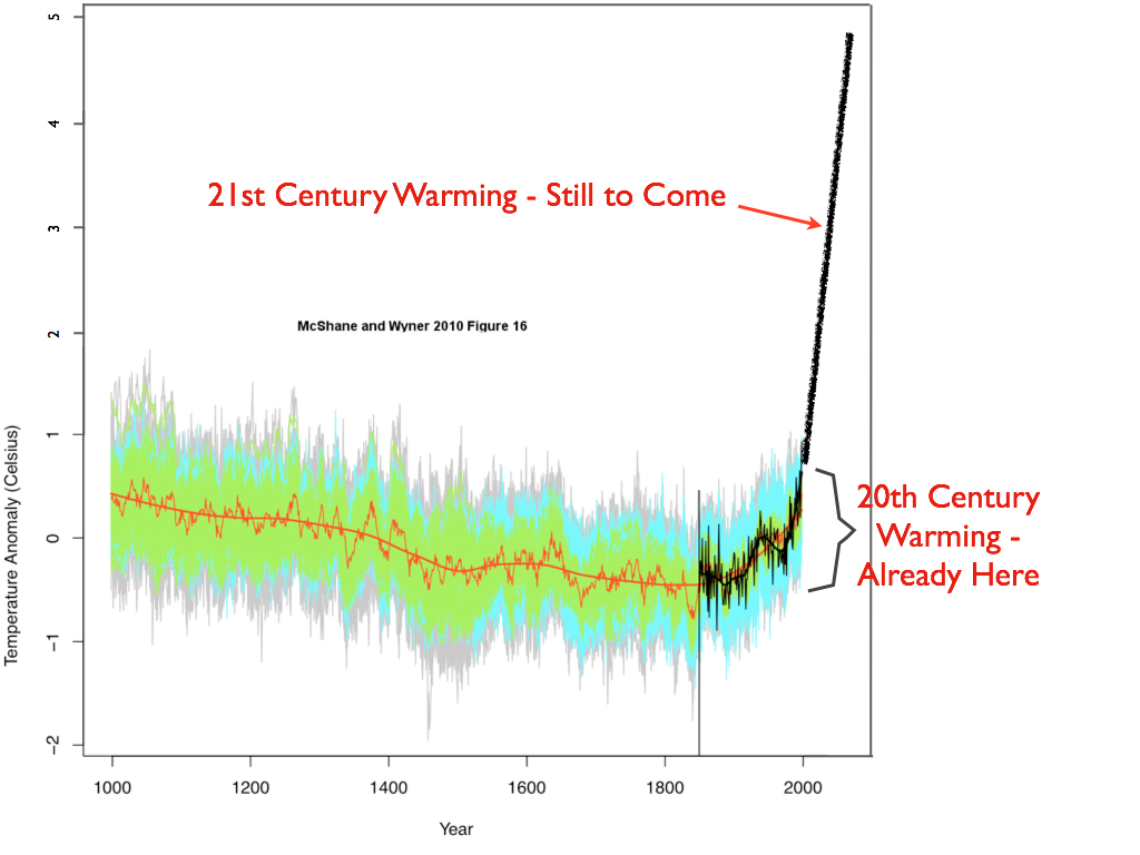
Re: HuggyPopsBear (63) Color me confused, HPB, but I still don't understand your question. Obviously, if we could magically extend the reach of modern instrumentation backwards in time to bring into fine focus various periods in history and keep their context relative to modern times, we would do so. The various proxy reconstructions are what we have. If you are unsure as to the reliabilities of the reconstruction techniques, try the IPCC AR4 for summaries of the various methodologies used. Or try the Search function in the upper left corner of every Skeptical Science page to see what posts are here on whatever topic interests you. Or you can go through the SkS arguments by taxonomy. Your choice. You seem to imply something funky is going on with modern "techniques". I'm a little slow today (unlike yesterday when I was slow-er), so please spell it out for me: What exactly do you mean? Looking at all the data we have, we are now at a temperature point equivalent to that in the Holocene Optimum: With yet more warming in the Business-As-Usual (BAU) pipeline:
 The Yooper
-
RW1 at 12:37 PM on 27 January 2011It's albedo
scaddenp, "Read further down articles - it may be shrinking though CERES says stable. However, Flaner discussed elsewhere here indicates albedo decreasing faster than expected." Do you have a free link to the paper? I'm not paying $18 to read it, and the summary is too vague. "However, to the primary point of your question. Albedo (unless otherwise stated) refers to energy reflected back in visible spectrum. Obviously, this is an important feedback but the source of the energy for warming by GHG is the increase in DLR. The reduction in OLR due to increased GHG is not captured by measurement of albedo." I understand, but it takes over 16 W/m^2 of additional power at the surface for a 3 C rise in temperature. The intrinsic absorption of 2xCO2 is only 3.7 W/m^2, so even assuming all of this is directed toward the surface, it needs to be amplified greater than 4 times over. The average gain of each W/m^2 from the Sun at the surface is about 1.6 - only about one third of that required for a 16 W/m^2 rise. 3.7 W/m^2 x 1.6 = 5.9 W/m^2 - leaving a deficit of over 10 W/m^2. The amount of the albedo from the surface is only about 23 W/m^2 according to Trenberth's diagram. That means the surface albedo would need to decrease by nearly half to get 16+ W/m^2 for a 3 C rise. That doesn't seem possible from just a 1 C global average intrinsic rise from 2xCO2 given we seem to be relatively close to minimum ice. -
Ron Crouch at 12:12 PM on 27 January 2011Monckton Myth #8: Rising sea levels
I don't know why, but every time I see a picture of the dear Lord, the first thing that comes to mind is -- Monty Python. And then when he opens his mouth and begins to speak, it reminds me of that movie that starred Jim Carey and Jeff Daniels. -
Matthew at 12:09 PM on 27 January 2011Ten temperature records in a single graphic
Would using the same ice cores, bore holes, tree rings match the current temperature record going back 130 years? If it did then there is no question it would be right. I feel it would put to sleep alot of skepticism holded by the skeptics. -
scaddenp at 12:05 PM on 27 January 2011It's albedo
Read further down articles - it may be shrinking though CERES says stable. However, Flaner discussed elsewhere here indicates albedo decreasing faster than expected. However, to the primary point of your question. Albedo (unless otherwise stated) refers to energy reflected back in visible spectrum. Obviously, this is an important feedback but the source of the energy for warming by GHG is the increase in DLR. The reduction in OLR due to increased GHG is not captured by measurement of albedo. -
Ron Crouch at 11:58 AM on 27 January 2011Ten temperature records in a single graphic
I'll bet you'll like the interactive graph here Huggy. -
Riduna at 11:47 AM on 27 January 2011Monckton Myth #8: Rising sea levels
In an article entitled Tuvalu - the touchstone of global warming and rising sea level, http://www.onlineopinion.com.au/view.asp?article=11282 Professor Cliff Ollier (UWA) makes claims almost identical to those made by Monckton but goes a step further by claiming that sea levels are actually declining. Both ignore the effects of melting polar ice sheets and glaciers. Ollier even asserts that in the case of the Greenland ice sheet, melting is so slow as to have little or no effect on sea level. Rob Painting shows in this article shows that both are wrong. Melting of the Greenland and West Anatarctic ice sheet (WAIS) have the capacity to raise sea levels by 13-18m. Greenland is expected to reach a tipping point within the next 30 years, http://www.newscientist.com/article/mg20927942.200-last-chance-to-hold-greenland-back-from-tipping-point.html and WAIS, a marine ice sheet, under attack from a warming southern ocean has potential to break-up causing more rapid rise in sea level. That sea level has been rising and continues to rise at an accelerating rate is yet another empirical measure which Monckton and Ollier ignore. But hey! Why let facts stand in the way of a reassuring story which falsely tells us we have nothing to worry about? -
HuggyPopsBear at 11:40 AM on 27 January 2011Ten temperature records in a single graphic
JMurphy #60 I know I am not the all knowing one here scientifically, but the comment is a little ignorant to say the least. Read the question I posed again and see if you come up with a different conclusion. I am not advocating that one should abandon the instruments of the day and the last 150 years, out of interest I am asking what would the graph look like if the same techniques were applied to the last 400,000 years to the last 150. If similar patterns arose as prior to instruments, then surely that data run alongside modern calculation would change the chart for the whole 400,000 years and probably give surprising reading. -
notcynical at 11:27 AM on 27 January 2011Hotties vs Frosties?
If the ballot box is still open, I belatedly agree with Omnologos @#10 that this is the best climate blog of 2010. Unfortunately, I did not discern a change in the tenor of the posts. I also agree that there is room for the "lukewarmies," and as Shawnhet says, the "warmies." That is, it would helpful in the discussion to recognize that there is a spectrum of opinion, not just "them" and "us". -
RW1 at 11:17 AM on 27 January 2011It's albedo
Here's my question: If the albedo doesn't appear to be shrinking, where is all the energy coming from that is supposed to be causing the warming - specifically the 3 C rise in temperature from 2xCO2? -
Ron Crouch at 11:10 AM on 27 January 2011Monckton Myth #8: Rising sea levels
Don't be too quick to make an assumption that corals will die off. Connolly, Sean R., and Andrew H. Baird. 2010 try to demonstrate that corals might have the ability to migrate to cooler waters. This makes perfect sense if we consider that at the end of the last ice age that global sea levels rose by some 300-400 ft. Some of the inputs at the termination of the last ice age consisted of rather huge amounts of fresh water, such as the draining of Lake Agassiz. If these events were that huge then one must consider that corals (shallow and deep water) might have the ability to adapt. #3 The reason there is a perception that sea levels around Scandinavia are lowering is due to crustal uplift, a result of GIA (glacial isostatic adjustment), which is a process that is still ongoing as a result of the end of the previous glaciation.. -
HuggyPopsBear at 10:58 AM on 27 January 2011CO2 is not a pollutant
Isn't the thousands of words spent on explanation missing one fundamental point? Whilst everyone is saying higher CO2 is causing higher temperatures, they are missing the point that CO2 cannot be generated without heat and increases in composting. Charts show CO2 peaks after temperatures start dropping so in a sense is not CO2 a stabilizer of temperature. Talking with a highly respected agronomist the other day about this very thing, explained how much Carbon capture is being forced through agriculture these days. When considering the millions of acres that are agriculture and being given over to this form of farming, then we should be looking in other areas to lay the blame at mans feet. Such as ozone, the affects of this still have not left us and are on going. http://www.climate.org/topics/ozone-depletion.htmlModerator Response: "CO2 cannot be generated without heat and composting"? Say what?
Regarding lag, see "CO2 lags temperature."
Regarding carbon sequestration by agriculture--yes, it has some unrealized potential and most definitely is being considered; see "It’s too hard."
Also, see "It’s ozone." -
rhjames at 10:48 AM on 27 January 2011Monckton Myth #8: Rising sea levels
We need to be careful here. Sea levels have been generally rising for the past 20,000 years. It's not unusual. It changes with ocean temperature, but also shifts in the Earth's plates. Then there's the thousands of underwater volcanos. It's rising in some areas, and lowering in others (eg Scandanavia). It seems there's bigger forces involved than temperature effects.Response: We can use observations to calculate the various causes of sea level change. Tectonic movements are tracked by GPS and satellite altimetry. Ocean heat data is used to calculate the contribution of thermal expansion. Changes in the gravity field as measured by satellites tell us how much mass is being added to the oceans. All these factors indicate thermal expansion and melting ice sheets contribute almost all of sea level rise. -
Albatross at 10:31 AM on 27 January 2011Ten temperature records in a single graphic
Robert @34, Good point. Yes, the RATPAC-A sites don't provide comprehensive coverage (only 85 sites). The sounding data do avoid problems associated with the UHI if one uses those data measured above the planetary boundary layer (say 700 mb and up). Here is a map of the coverage: [sourced here; more information here].
One would have to choose a level or layer. It seems that NCDC uses the 850-300 mb layer.
[sourced here; more information here].
One would have to choose a level or layer. It seems that NCDC uses the 850-300 mb layer.
-
Chris G at 10:23 AM on 27 January 2011Ten temperature records in a single graphic
#56 Marcus, :-) You know, in certain circles, the majority of the people believe that an object twirled in an arc and then released will continue to travel in an arc, just a bigger one, rather than a straight line. It would be a funny world to live in if the laws of physics changed with whatever the majority happened to believe at the time. -
Albatross at 10:21 AM on 27 January 2011Monckton Myth #8: Rising sea levels
Nicely done Rob. Err, how does Monckton's argument (promoted thanks to Anthony Watts) that the oceans are allegedly cooling tally with his concession that sea levels are rising? Oh right, the contradictory nature of arguments made by many "skeptics" is to be expected. Identifying Monckton as a "skeptics" might be too generous though. "coral atolls simply grow to meet the light as the sea rises" Does this claim not totally ignore the negative impacts of bleaching and ocean acidification on the corals' ability to reproduce and grow? -
JMurphy at 10:17 AM on 27 January 2011Ten temperature records in a single graphic
HuggyPopsBear, why do you imagine that we should abandon incredibly accurate instrumental/satellite temperature readings and, instead, rely on proxy records that cannot, by definition, be as accurate ? -
scaddenp at 10:16 AM on 27 January 2011Ten temperature records in a single graphic
apiratelooksat50 - if your best science students are that clueless as to evaluating scientific evidence then your country, wherever it is, has some really serious problems facing the future beside AGW.Moderator Response: [muoncounter] The latest NAEP Science test results help explain the problem: One percent of fourth-graders, 2 percent of eighth-graders, and 1 percent of twelfth-graders performed at the Advanced level. Those 8th graders in 2009 are today's HS students. And this is still off-topic. John, perhaps a thread on science education might be of interest? -
Chris G at 10:14 AM on 27 January 2011Ten temperature records in a single graphic
Well, HuggyPop has taken a beating already, but... "My mind asks if it is the last few percentages that heat quicker,..." 'If' is key here. In fact, rate of energy loss is proportional to the 4th power of the temperature. So, given some constant rate of additional energy inflow, there will be a more rapid rise in temperature rate immediately after the additional energy source is added than there will be from that point forward. A graph of temperature curve would show a decreasing slope over time; that is exactly the opposite of what every global temperature record reveals, which is an increasing slope over time. It doesn't really matter what the forcing is; the only way you can get an increasing slope over time is if you increase the forcing faster than the body can reach an equilibrium. To use Huggy's analogy, the only way to keep a graph with an increasing slope is if you start the recording of the pot's temperature and then gradually crank up the juice. So, other than GHGs, what factor affecting the thermodynamic equilibrium of the planet has been increasing over the last ~150 years? -
HuggyPopsBear at 10:02 AM on 27 January 2011Ten temperature records in a single graphic
Looking again at the graph the moderator put on my comment #5. I am being serious here. We have temperature records for the last 150 years or so tagged onto the end of a string of data taken from core samples and such. If the same technique of research/analysis was done on the last 150 years, would there be a different recording on the end of this graph? -
Nichol at 09:48 AM on 27 January 2011Monckton Myth #8: Rising sea levels
Is it right to use the word 'skeptic' to describe Monkton? How can somebody that always searches for arguments for the same result, less warming, be a 'skeptic'? Especially if the arguments are so consistently weak or invalid? If 'contrarian' and 'denier' are considered words to be avoided, to keep discussion polite .. what descriptive word could one use? Anti-warming advocate? Anti-warming lobbyist? The least one should do is not to honour him with the title of 'skeptic'. -
Marcus at 09:31 AM on 27 January 2011Ten temperature records in a single graphic
Once again Pirate seems under the delusion that scientific fact is determined by a "democratic vote". Unless those 28 out of 30 students can then go on to *prove* what the driver of climate change is (other than CO2, CH4, NO2 & CFC's), then what they *believe* is responsible is totally irrelevant-whether they're accepted into College or not. If all that was required was what the *majority* of people believe, then the US would have to abandon the Theory of Evolution too. -
michael sweet at 09:30 AM on 27 January 2011Ten temperature records in a single graphic
Pirate: In the last interglacials the sea level was up to 6 meters higher than it is now. That would put Miami and 5 million other people under water in Florida alone, not to mention hundreds of millions elsewhere. If that is normal for you OK but where I live that is abnormal. I call anything over what existed in the last 2000 years abnormal and we are well over that now. I teach AP Chemistry and I notice that studetns usually agree with whatever teacher is in the room. What you hear from them reflects what they think you want to hear. -
RickG at 09:28 AM on 27 January 2011Ten temperature records in a single graphic
@46 apiratelooksat50 As someone who has taught middle school Earth Science, I find your comment a bit hard to believe. However, if true I would imagine that their AGW skepticism originated from sources other than a science class. -
SRJ at 08:54 AM on 27 January 2011Ten temperature records in a single graphic
# 53 I should add that my attempt is not working properly. There is something wrong with my way of area weighting. -
SRJ at 08:53 AM on 27 January 2011Ten temperature records in a single graphic
# 34 Robert Way I have looked a little into the japanese data (JMA). The problem is that the data one can download are gridded. To make a global average it must be area weighted. Which is step 4 in the methods of JMA My attempt in Scilab is here: Averaging JMA data -
muoncounter at 08:39 AM on 27 January 2011Ten temperature records in a single graphic
#45: "until "abnormal" is quantified, the question cannot be answered" Interesting. Pirate can state categorically that we are within historical norms for temperature and then turn right around to declare that 'abnormal' isn't known. So how can being within norms have any meaning? Oops, I'm forgetting that logic need not apply. -
muoncounter at 08:34 AM on 27 January 2011Rebuttal to 'Scientist's Can't Even Predict The Weather Right'
#54: "composition of local air is site specific" Within a given band of latitudes, CO2 concentrations are stunningly consistent as a function of longitude all the way around the globe. There's a worldwide network of atmospheric gas measurement stations; the primary variables are time of year and latitude. Even the timing and amplitude of seasonal cycles are consistent by latitude. The only way to see significant local variations is to measure CO2 around an urban center. You find that CO2 concentrations rise and fall with traffic volume, on both daily and weekly cycles. That's a good proof that CO2 is anthropogenic.Moderator Response: A relevant post is "CO2 is not increasing." -
Dikran Marsupial at 08:24 AM on 27 January 2011Rebuttal to 'Scientist's Can't Even Predict The Weather Right'
h pierce The greenhouse effect is not determined by the absorption of IR radiation at the surface, but in the upper atmosphere (upper trophosphere/stratosphere), where the air is dry, pure and CO2 "well mixed". The composition of air my be site specific at the surface, but that doesn't mean it isn't homogeneous where it matters for the greenhouse effect (and therefore for the models). A 30 year animation of the weather around the world would be very pretty, but not very informative. Data is not the same thing as information and statistics is generally a good way of distilling information from data, which is why climatologists use statistics such as global averages or trends. -
Chris G at 08:24 AM on 27 January 2011Ten temperature records in a single graphic
I would certainly agree that combining data sets in order fill in gaps in one or the other is useful and worthwhile, but I maintain that averaging models that treat the same set of missing data differently muddles the meaning you can take from them. From a mathematical standpoint, it's clear what each means on their own, averaged, the meaning is less clear. With respect to GISS versus HadCRUT, I tend to agree with you, but that is a judgment call above my level of expertise. If they have a professional difference of opinion, and that difference is immaterial to me, I'm content to let it be. -
Ron Crouch at 07:57 AM on 27 January 2011Ten temperature records in a single graphic
You can't directly compare temperatures of past inter-glacials such as the Eamian to the Holocene Pirate. The planets celestial alignment to the sun was probably different than today. Eamian You would need to work out all the forcings applicable to the Eamian before trying to make any direct comparison to the Holocene. And I'm afraid that your ancestors knew quite well how to knock two rocks together, even during the Eamian, and quite likely before it. -
Bob Lacatena at 07:56 AM on 27 January 2011Ten temperature records in a single graphic
45, apiratelooksat50, So you think we shouldn't worry because "normal" temperatures for the planet are those which existed in a time without the human race (and probably represent temperatures with which much of the current human race might find difficulty existing)? Could I posit that, for the purposes of human civilization, we would best consider"normal" temperatures to be those in a range within which human civilization has thrived and grown in the past 2,000 years, and anything too far above that represents an extreme danger?Moderator Response: ... as discussed in "It’s not bad." -
Bob Lacatena at 07:53 AM on 27 January 2011Ten temperature records in a single graphic
46, apiratelooksat50, So they have been mistaught and mislead. Why does this not surprise me? Hint: High school students do not have the time or background to research things thoroughly themselves, so they believe what they are told. Who told them? Fox News, and their teachers.Moderator Response: [muoncounter] Let's not forget their parents. Ideally, their science teachers could do some good in opening their eyes to the science; after all, we're supposed to present 'both sides' of the debate. But this is off-topic. -
apiratelooksat50 at 07:40 AM on 27 January 2011Ten temperature records in a single graphic
You can't blame this one on me. I am covering an AP (Advanced Placement) Physics class for another teacher. He is multi-degreed in Chemistry and Physics and happens to support the AGW hypothesis. Of the 30 students in this room, 28 of them are already accepted to college and half of them are going on scholarships. Not one single student supports the AGW theory. They think human activities have effect on the climate and contribute to temperature changes, but they do not think CO2 is the driver. This will probably be deleted - I know. -
apiratelooksat50 at 07:36 AM on 27 January 2011Ten temperature records in a single graphic
Michael @ 40 Before I answer your question, we need to define what is abnormal. We might be hanging around a max temp longer this time and that may be abnormal, but we still have not matched the peaks of the previous 3 interglacial periods. So, until "abnormal" is quantified, the question cannot be answered. Since the previous 3 peaks occurred before humankinds first ancestors knew how to knock 2 rocks together, wouldn't we have to call that normal?Moderator Response: See "It's Not Bad." -
Bibliovermis at 07:29 AM on 27 January 2011It's not bad
I was replying to the irrelevance of Eric's quote, not giving my opinion on where reality (e.g. changes to BAU) will fall in the spectrum. -
apiratelooksat50 at 07:29 AM on 27 January 2011Ten temperature records in a single graphic
Gordon - You might be suprised to hear this from me, but I think the best current explanation for the sustained higher temperature could possibly be the increased CO2 levels. -
Riccardo at 07:26 AM on 27 January 2011Rebuttal to 'Scientist's Can't Even Predict The Weather Right'
Trueofvoice "we do it by direct measurement." and the same site shows, guess what, the Mauna Loa data :) h pierce please do not presume that atmospheric scientists do not know that the air pressure varies and the amount of CO2 will vary accordingly. Didn't you notice that CO2 concentration is usually quoted in ppm rather than in Kg/m3? -
Daniel Bailey at 07:24 AM on 27 January 2011It's not bad
Re: 103 & 104 "If the good news is that the worst of the projections probably won't happen, then the bad news is that the best won't either." "Why do you have optimism that the worst will not happen?" It won't take all of the worst happening. Some will be quite enough. BAU merely guarantees enough of the worst for overkill purposes. We live in interesting times... The Yooper -
michael sweet at 07:19 AM on 27 January 2011It's not bad
Bibliovermis: MIT just updated their forecast and doubled their estimate of temperature rise. The next IPCC report will more than double the sea level rise estimate. The Arctic sea ice and the Great Ice Sheets are melting faster than the worst projections. Why do you have optimism that the worst will not happen? We need to change from BAU in order to be optomistic. -
Albatross at 07:10 AM on 27 January 2011Monckton Myth #6: Global Sea Ice
Please keep us updated Neven. Thanks. -
Bibliovermis at 07:03 AM on 27 January 2011It's not bad
If the good news is that the worst of the projections probably won't happen, then the bad news is that the best won't either. -
Daniel Bailey at 06:57 AM on 27 January 2011Monckton Myth #6: Global Sea Ice
Thanks, Neven! Good to see you here! The Yooper -
Trueofvoice at 06:52 AM on 27 January 2011Rebuttal to 'Scientist's Can't Even Predict The Weather Right'
H pierce, From your link: "On an annual basis, the concentration of carbon dioxide in air rises and falls in a seasonal pattern; with the span between the seasonal high and low values typically being about 6 ppmv; or about one-and-a-half percent of the average annual value." Hardly evidence that CO2 concentrations are much lower than anyone realizes Furthermore, we don't determine CO2 concentrations by modelling, we do it by direct measurement. -
h pierce at 06:22 AM on 27 January 2011Rebuttal to 'Scientist's Can't Even Predict The Weather Right'
Mod at 48 What I want to see a 30 year animation of weather maps for all regions of earth. All climate models are fatally flawed because the concentration of CO2 used for the calculations is only valid for purified dry air which does not occur in the earth's atmosphere. Go to Universal Industrial Gases Inc.'s website at: http://www.uigi.com/air.html and study the tables that show the effects of temperature, pressure and humidity on the properties of air. The data are for air samples that do not include clouds. Note that moist tropical air is much less dense than cold dry air. There is much less CO2 in the air than is indicated by air analysis. In particular the article mentions that composition of local air is site specific and this determines the type of equipment used for processing of real air.
Prev 1937 1938 1939 1940 1941 1942 1943 1944 1945 1946 1947 1948 1949 1950 1951 1952 Next


