


 Arguments


Recent Comments
Prev 1949 1950 1951 1952 1953 1954 1955 1956 1957 1958 1959 1960 1961 1962 1963 1964 Next
Comments 97801 to 97850:
-
Eric (skeptic) at 01:42 AM on 21 January 2011It's Pacific Decadal Oscillation
thepoodlebites, my prediction is that if "30+ years of warming in the satellite record" is wiped out, then we will also see a significant rise in OHC. -
Eric (skeptic) at 01:09 AM on 21 January 2011Infographic on where global warming is going
#22, KL, the oceans will release heat when the SSTs are warmer than the atmosphere. There is no second law argument here since the local SST's in El Nino conditions are much higher than the local atmospheric temperatures. Those large local imbalances are what drives the global net ocean heat release. In ENSO neutral and La Nina, the net balance is for the ocean to absorb more heat. In 1998 there was no "cooling forcings overtaking warming forcings", there was simply a net release of ocean heat and corresponding spike in GAT. -
Anthony G. Warming at 00:58 AM on 21 January 2011Infographic on where global warming is going
I agree with 17 Ed Davies. I find the answer (18), and also the original statement in the top post misleading: "Just as it takes time for a cup of coffee to release heat into the air, so to it takes time for the ocean to release its heat into the atmosphere." The coffee-cup has a higher temperature than the air, and has already a lot of heat to release, thus lowering its temperature. This is not the case with the ocean. Even after reading the article at the underlying link in the above quote, I don't think the situation is correctly described. Before humans started adding CO2 en masse to the atmosphere, the oceans were (roughly) in equilibrium with the rest of the Earth (i.e. air, land).--Then AGW started. More (and more) heat stays within the system due to the greenhouse effect. Temperatures are rising. The oceans absorb most of the increasing heat content. As the process goes on, ocean temperatures will rise, they will absorb gradually less heat, and will release gradually more heat, until another equilibrium is reached (provided that there is an upper limit to the new CO2 content). The article gives the impression of an ocean that is currently building up enormous heat content that will later (suddenly?) be released to the atmosphere. That's not how it works. The ocean is both absorbing and releasing heat, all the time. Right now it's lagging behind a bit in temperature, because it takes time to raise the temperature of a billion cubic kilometers of water. Gradually it will catch up, and asymptotically a new equilibrium will be reached, with higher temperatures, and higher levels of heat transfer--both to and from the oceans. -
Ken Lambert at 00:46 AM on 21 January 2011Infographic on where global warming is going
Original Post and MarkR #16 What is all this about the oceans 'releasing' and 'dumping' heat to warm the atmosphere? Global warming is supposed to be about a positive imbalance in the energy flux at TOA, causing a net energy gain to the biosphere over time. Although there is a small amount of geothermal energy flowing from the ocean bottom upward, surely the predominant flow is from the top down ie. direct radiation and convection from a warmer atmosphere into the oceans where over 90% (93.4% according to above)is absorbed by way of increased temperature via complex circulations. The oceans could only 'release or dump' heat to the atmosphere on a global scale if the positive warming imbalance turned negative which means that cooling forcings overtake warming forcings - which can't happen if CO2GHG forcing and feedbacks do act as claimed by the proponents of AGW. -
thepoodlebites at 00:41 AM on 21 January 2011It's Pacific Decadal Oscillation
#54 Correlation is a necessary but not sufficient condition for causality. If you find strong correlation you should investigate to establish a possible relationship. WhatDoWeKnow is correct, the Sun can not respond to changes in the Earth’s oceans or atmosphere, that would be silly. But there is evidence that the oceans respond to changes in the Sun and the atmosphere responds to changes in the ocean. I see the PDO and other cyclical ocean processes (AO, NAO, AMO, ENSO) as heat redistribution systems. Upwelling brings colder water to the surface. And we know that deep water is very cold. El Nino begins when the trade winds weaken, allowing warm water to flow from the western pacific to the eastern pacific. Kelvin waves develop that reflect and propagate both North and South along the North/South American coasts. Even longer term Rossby waves can propagate westward at higher latitudes back towards Japan. I know that there is debate about the relationship between ENSO and PDO but I think they are connected. I see ENSO and the PDO as a transfer of heat from the tropics to higher latitudes. It’s like two steam generators that are connected through a secondary system. The relationship is dynamic, nonlinear and inherently oscillatory. Currently, with the cool phase of the PDO and La Nina working together, we are seeing a cooling response in the atmosphere. I’m expecting to see the UAH globally averaged satellite-based temperature anomaly for Jan. 2011 to be near or below zero, similar to the beginning of 2009. That would effectively wipe out 30+ years of warming in the satellite record. And the Sun is still unusually quiet. That’s my take, have fun tearing it apart. -
archiesteel at 00:38 AM on 21 January 2011Monckton Myth #3: Linear Warming
@Dikran Marsupial: I think you are being overly generous when you say this is "unintentional" cherry-picking on BP's part. BP, you know very well that you can't derive a trend from such a short period of time - so why do it, if not to present a false impression of reality? Please stop your politics interfere with your view of science. Thanks. -
JMurphy at 00:37 AM on 21 January 2011It's cooling
MJ Liberto, to satisfy your curiosity, and in addition to what has already been posted for you, why not also have a look at this page, where you can find the 'It's the Sun' argument and others that are linked to it. And to see how all possible factors are taken into consideration, why not look at Newcomers Start Here, The Big Picture and Skeptic Arguments and what the Science says. -
Dikran Marsupial at 00:32 AM on 21 January 2011It's cooling
MJ LIberto@108 The effects of the sun *are* taken into account in modelling global climate. However we have measurements that show that changes in solar activity are too small and in the wrong direction to explan the warming of the last 40 years or so. The IPCC WG1 scientific basis report though attributes much of the warming of the first half of the 20th century to solar activity. Note the number 1 skeptic argument is "It's the sun". -
archiesteel at 00:32 AM on 21 January 2011It's cooling
@MJ: In a nutshell, we know it's not the sun because we can measure Total Solar Irradiance, and it's actually decreasing a little right now. The effects of the sun are, in fact, calculated in the Global Climate Models. May I suggest you read a bit more about the subject on this site before commenting? -
Eric (skeptic) at 00:31 AM on 21 January 2011Monckton Myth #4: Climate Sensitivity
#26 MarkR, more generally than clouds, sensitivity will be determined by the water vapor distribution http://wacmos.itc.nl/?q=node/22 WV will determine clouds which will have a large impact on sensitivity, but WV independent of clouds is just as important for determining the net radiative balance. -
Bob Lacatena at 00:31 AM on 21 January 2011Infographic on where global warming is going
1, muoncounter,Less than 2% going into ice (Greenland, Arctic, ice caps) gives us the melt rates we've observed??? I'm stunned.
Realize, I think, that the graphic says that this is the energy that has gone into actual melting, i.e. un-reversed transition of solid ice to liquid water. While the ice melt is dramatic and scary from a human point of view, it doesn't really represent the use of all that much energy to get there. What is more important is that a sizable chunk of the heat from the 93% of heat in the ocean, 2.3% in the atmosphere and 2.1% on the continents is geographically located at the north pole, and is how the heat gets "into position" to eventually melt frightening amounts of ice. I'd love to see this graphic modified to further split the ocean, atmosphere and continent numbers into three for five bands (SH, EQ, NH or else SP, SML, EQ, NML, NP), to show that geographic distribution. -
MJ Liberto at 00:14 AM on 21 January 2011It's cooling
I am very curious to understand why the effects of the sun are not calculated into the global warming scenario. Our sun is already middle aged and will eventually fry the earth if science does not find a way to distance them. Shouldn't all factors be taken into consideration when looking for an accurate analysis and figures on what is causing the earth and its oceans to warm?Moderator Response: In the Search field at the top left of the page, type "It's the sun" without the quote marks. -
MarkR at 23:48 PM on 20 January 2011Monckton Myth #4: Climate Sensitivity
I believe LC09 accepted they made a mistake in the simple climate sensitivity equation, so their actual estimate was 0.82 K. But still most likely wrong, because they used an open domain and seemingly randomly selected time periods (they happened ot randomly select time periods that gave lower sensitivities). As for clouds, I think the article is right. There are many observational estimates. Dessler & Lauer have observations along with their model (they just looked at more complex models than the traditional sensitivity equation LC09 used). That's looking at cloud feedbacks, like LC09 did. The Knutti & Hegerl paper shows many estimates of sensitivity from the reaction of tempereature to forcing, which is an observational estimate of the ENTIRE sensitivity, and not just individual feedback factors. Also, the only way we know of that could make a low sensitivity is clouds. And we've looked hard for a negative cloud feedback for decades and not found one. -
Eric (skeptic) at 23:44 PM on 20 January 2011Infographic on where global warming is going
I think the storage and releasing of heat by the ocean has two components, the long term one is OHC increases to reach equilibrium. However, that rise is smaller than OHC fluctuations due to irregular cycles like ENSO. When ENSO causes large areas of high SSTs, OHC goes down (the ocean is releasing heat) and vice versa. However that idea may be too simplistic. Figure 2 in http://faculty.washington.edu/kessler/abstracts/2002GL015924.pdf shows the SST but also the discharge and recharge measurement which should also affect OHC. -
mspelto at 23:39 PM on 20 January 2011Infographic on where global warming is going
#1 Do not be amazed that the GIS melt is just 0.2%. Recall that the acceleration of the Greenland glaciers is from changes at the terminus due to thinning. The thinning results in reduced friction and increased calving. The most likely candidate for thinning at the terminus is bottom melting from warmer ocean waters. As noted for Petermann and West Greenland, which brings us back to the largest blue ball that is the one to keep your eye at present even for the ice sheets. -
ProfMandia at 23:35 PM on 20 January 2011Infographic on where global warming is going
Ed, The oceans are huge so the total heat content is quite impressive. Heat fluxes are just not able to move this heat out very quickly. All three heat transfers are involved but it appears that latent heat released by condensing water vapor is what provides the air with most of the heat that originated in the ocean. Globally averaged values: Conduction adds 24 watts per square meter to the air Net back radiation warms the air by 66 watts per square meter Heat loss by evaporation is 78 watts per square meter -
Dikran Marsupial at 23:17 PM on 20 January 2011Monckton Myth #3: Linear Warming
BP@69 If you look at the data you plot in post 53, you will find there are several such short periods (e.g. 1980-1990) where there is little or no rise (or even a decrease) in OHC, even though this happens in the context of a long term increase in OHC. You argument is a clear example of unintentional cherry picking, focusing on short periods where the natural variability masks the long term warming. It is essentially the same argument as global warming stopped in 1998 etc. -
Berényi Péter at 22:55 PM on 20 January 2011Monckton Myth #3: Linear Warming
#54 Marcus at 13:22 PM on 20 January, 2011 Since mid-2007, when all 3,000 buoys were deployed, through to mid-2010 we saw consistent warming. Unfortunately that's either untrue or false. In fact there's no heat accumulation in the system even from mid-2007 to mid-2010. Nothing Nada Nicht Nichego. Semmi. It is the pre-2003 era where people have to look for Trenberth's missing heat when it could easily escape the rather sparse & error prone MBT/XBT measurement network. With ARGO in full swing it is no longer the case.
-
jhudsy at 22:39 PM on 20 January 2011Monckton Myth #3: Linear Warming
angusmac@65 You've got better eyes than I do if you can see that from Figure 2. However, a least squares fit from 2000 is showing a trend of between 0.12 and 0.17 per decade (depending on the data set used, and ignoring exogenous factors), which is very different to the "constant CO2 concentrations at year 2000" values that I've been able to find. -
Marcus at 22:34 PM on 20 January 2011Monckton Myth #3: Linear Warming
Also, Angusmac, methane concentrations in the atmosphere actually leveled out for the first part of the 2000-2010 period, so that also probably had some impact on total warming trends. Unfortunately, all the evidence says that methane levels have begun to rise again (we'd also better pray those clathrates don't melt, or else its "all over, red rover"!) -
Marcus at 22:32 PM on 20 January 2011Monckton Myth #3: Linear Warming
angusmac, I've got 3 little words for you-deep solar minimum. For the record, warming was only slightly less for 2000-2010 than it was for 1990-2000, so imagine what it will be like when total solar irradiance starts to trend upwards again. Also, you are aware that the period of 2000-2010 on that graph would be the *tiniest* little blip-where currently all 4 scenarios still overlap? -
angusmac at 22:23 PM on 20 January 2011Monckton Myth #3: Linear Warming
A reasonable argument is posted in this article. However, if you add up-to-date actual measured tempratures to Figure 2, it is evident that they are tracking closer to the orange line (constant CO2 concentrations at year 2000 values)than the other scenarios. It seems that we are not warming as fast as the models predict we should. -
Berényi Péter at 22:06 PM on 20 January 2011Hurricanes aren't linked to global warming
I've taken UAH satellite measured lower troposphere temperatures anomalies and annual global accumulated cyclone energy for the satellite era (1979-2010) and have made a scatter plot. If anything, there's a weak negative correlation between temperature anomaly and ACE. That is, there's no need to be scared about would-be supercanes.
Named storms is crap. Before the satellite era tropical storms not making landfall were seldom named because they could easily go unnoticed.
This is why hurricanes making landfall in the US of A are important for century scale histories. They are extremely well documented. If not by scientists, then by insurance companies for sure.
If anything, there's a weak negative correlation between temperature anomaly and ACE. That is, there's no need to be scared about would-be supercanes.
Named storms is crap. Before the satellite era tropical storms not making landfall were seldom named because they could easily go unnoticed.
This is why hurricanes making landfall in the US of A are important for century scale histories. They are extremely well documented. If not by scientists, then by insurance companies for sure.
-
Ed Davies at 22:02 PM on 20 January 2011Infographic on where global warming is going
...so to it takes time for the ocean to release its heat into the atmosphere. Why would the ocean release heat? I think it's that as equilibrium is reached the ocean stops absorbing heat resulting in it no-longer cooling the surface. -
MarkR at 21:31 PM on 20 January 2011Infographic on where global warming is going
#4 Adrian: UAH only measures the atmosphere, you're particularly looking at the lower troposphere. Part of this cooling is probably related to heat being dumped into the Pacific during a La Nina. Although ENSO does have a radiative forcing associated with it (as a positive feedback related to atmospheric temperatures as well as circulation etc). This happened at the last La Nina and the WUWT crowd did the same thing then: claiming that global warming was being 'wiped out' (they changed focus when we warmed up by more than we'd cooled down again though). Global warming is a sum of all the heat flows including ice and ocean as well as atmosphere. The 2.4% portion in the atmosphere has drastically decreased, but the amount in ice probably hasn't and even if the oceans do dump heat, the last time we had 'ice age cometh' shouts in 2008 the oceans had actually gained heat. Ocean heat content is here. We are confident it's not natural cycles because the oceans have gained so much heat, the mean atmospheric temperature has increased and there has been no noticeable trend in these natural cycles that could explain the warming. The mean solar output for the past decade has been lower than the '90s, and so has the mean ENSO index. Yet the past decade was warmer than the '90s with more heat in the atmosphere, melted ice and oceans. -
Ann at 21:19 PM on 20 January 2011Infographic on where global warming is going
@adrian smits The next step in your reasoning is you will be announcing a new Ice Age every winter and a new Global Warming every summer, since temperatures tend to go a bit up and down during the year. Global temperature is a noisy signal, and if you look at only a short period of time (let’s say a year), you are only seeing the noise. You have to take a step back and look to a longer period (for instance 30 years or more) to see the trend. Anyone who draws conclusions about the earth’s climate based on just one year is … well, wrong (and that applies to both skeptics and AGW proponents). -
Dikran Marsupial at 20:55 PM on 20 January 2011Monckton Myth #3: Linear Warming
NETCDR@58 wrote "If you plot the Ln of the CO2 between 1958 and 2010 it looks like a horizontal asymptote but it does increase very slowly." Nonsense, here is a plot of ln(CO2) for that period from Tamino's analysis: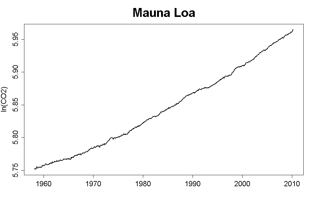 It doesn't look anything like a "horizontal asymptote" (unless you have your own personal definition of "asymptote"), not only is ln(CO2) rising, it is rising at an increasing rate. Your argument doesn't survive first contact with the data.
-
Paul D at 20:42 PM on 20 January 2011Infographic on where global warming is going
If more than 2% was melting ice, we wouldn't have any ice at all. Ice is ice for a very good reason. -
LandyJim at 20:20 PM on 20 January 2011Monckton Myth #4: Climate Sensitivity
From what I have read here there are hazardous assumptions and errors creeping in to this. Cloud cover and localized air temperature rises go hand in hand because the clouds reflect radiation emitted by the local environment back down, this is an obvious positive feedback that has been known for a very long time, however this does not operate on a global level because we do not have global cloud cover. Further, it is a fact that increased cloud cover does in fact reflect more solar radiation back into space, ask any astronomer...you increase a planet's cloud cover, you increase it's albedo because more radiation is reflected back into space. However, and this is important, increased cloud cover may reflect heat back into space, but if you have a heat source below that cloud layer, then any heat emitted by that source will be reflected back to the heat source, in this case the surface of the planet acts as both the emitter and the receiver. Monkton is wrong, but he is also right, as are you Guys and Gals. The situation is not as simple as the article above makes it sound. A good example of BOTH sides of this argument is Venus. Earth has an average Geometric Albedo of 0.386 (Bond Albedo of 0.29) Venus has an average Geometric Albedo of 0.84 (Bond Albedo of 0.75) Earth's varies quite a bit, but that of Venus is reasonably stable. Everyone knows that Venus is much hotter than Earth, even taking into account it's closer position to the Sun than Earth. Venus reflects ~80% of the radiation it receives from the sun, against Earth's ~35%, but because the dense atmosphere acts like a blanket, heat is trapped and the planet has the hottest surface temps in the Solar System. This is a clear example of where both sides of this argument area actually correct. However I accept that way Monkton presented it was clearly wrong, and was an example of very poor science. -
jyyh at 20:03 PM on 20 January 2011Infographic on where global warming is going
And if someone wonders how on earth the ocean gets that much, part of the reason is the radiation gets a bit deeper in the water than in the earth. -
Rob Painting at 19:04 PM on 20 January 2011Monckton Myth #4: Climate Sensitivity
rhjames - it's good to just look at some simple observations and simple logic - if I stand in the sun, it's hotter than when it's cloudy. It will take a lot to convince me that increased cloud cover has a net warming effect. And if you look out the window; is the Earth flat or round?. See the problem with so-called logic? -
adelady at 18:54 PM on 20 January 2011Monckton Myth #4: Climate Sensitivity
Come on rhj. Stand outside on a winter night when there is cloud cover, and another winter night when there's no cloud cover. How likely is frost on each of those occasions? -
rhjames at 18:21 PM on 20 January 2011Monckton Myth #4: Climate Sensitivity
I think we need to be a bit careful with some assumptions here. The IPCC admits that cloud formation and its effects are little understood. What global warming does for cloud cover, and the effect that has on heat reflection and retentions is still unknown. There are plenty of reports giving theoretical predictions in all directions, but it's still a big unknown. I know that if I'm outside on a hot day, and a cloud covers the sun, there's a big reduction in the heal energy reaching me (I feel cooler). Therefore, logic tells me that more cloud cover is more likely result in cooling. Before you start to tell be about shifts in wavelength, heating the air near the clouds etc, sometimes it's good to just look at some simple observations and simple logic - if I stand in the sun, it's hotter than when it's cloudy. It will take a lot to convince me that increased cloud cover has a net warming effect. -
Glenn Tamblyn at 17:28 PM on 20 January 2011Infographic on where global warming is going
Adrian, As John's graph shows, 90%+ of the warming is in the oceans. If you want to talk about 1/2 of that disappearing due to natural variability, then you might be on to something. And in case you may have missed it - we certainly here in Eastern Australia - this is a huge La Nina period. La Nina's cool the atmosphere so no surprise there that the short term result is cooling. That's Weather for you. Now, to talk about Climate, what is the 30 year average value? That is the WMO definition of climate; time scales of 30 years or more. -
jhudsy at 16:54 PM on 20 January 2011Monckton Myth #3: Linear Warming
NETDR - Watching the discussion, it seems that there's a bit of talking past each other going on. In order to understand your claims, could you answer this question: according to you, and your linear, quadratic, exponential and super-exponential fits, if current trends continue, what do you claim CO2 levels will be in 2050? 2100? What would the associated temperature anomaly be? Not percentage differences, but actual numbers. If we speak about numbers, maybe we can disambiguate things and see if we're on the same page, or reading from different books altogether. -
dana1981 at 16:34 PM on 20 January 2011Monckton Myth #3: Linear Warming
BP #53 - see Monckton Myth #1: Cooling Oceans. John debunked your claim less than a week ago. -
Daniel Bailey at 16:22 PM on 20 January 2011Infographic on where global warming is going
Hansen 2011 features the "albedo flip" as a melt mechanism, on P. 10. The Yooper -
dhogaza at 16:04 PM on 20 January 2011Infographic on where global warming is going
adrian smits:According to UAH satellite records the planet has cooled half a degree Celsius since this time last year
Likewise last summer's extreme heat proves that global warming is far worse than you imagine. *snort* Get real. -
muoncounter at 15:49 PM on 20 January 2011Monckton Myth #3: Linear Warming
#59: I like it. Our own Four Horsemen ... -
villabolo at 15:37 PM on 20 January 2011Infographic on where global warming is going
adrian @4: Your comment and my response to it is off topic but I'll bite just this once. I think that basics, such as whether we were headed towards a moderate El Niño a year ago versus a strong cooling La Niña right now, should be taken into consideration before making comparisons to the past 130 years. Take a look at the entire 30 years worth of UAH data as well as 10 years before it with a focus on El Niños and La Niñas as separate weather entities. You will find two jumps in temperatures that rise quickly then level off for a few years only to repeat the same process again. The first jump is in 1976. The second in 1995/1998. And now the apparent beginnings of a third jump in 2010. The UAH chart below should help you visualize the trend after 1979. It doesn't seem like we're losing anything. The cooler La Niñas are also getting warmer.
-
Daniel Bailey at 15:35 PM on 20 January 2011Infographic on where global warming is going
adrian smits (4) Per muoncounter's link above, corrected for El Nino, volcanoes, solar variation and the residual annual cycle: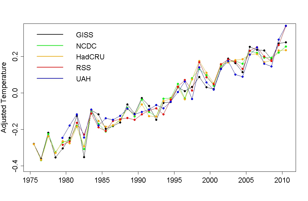 UAH proves you wrong. All the temperature records show significant warming, and that it is indeed global.
The Yooper
UAH proves you wrong. All the temperature records show significant warming, and that it is indeed global.
The Yooper
-
muoncounter at 15:34 PM on 20 January 2011Infographic on where global warming is going
#5: Yooper, And I thought an albedo flip was a refreshing if somewhat frou-frou beverage. -
archiesteel at 15:28 PM on 20 January 2011Monckton Myth #3: Linear Warming
@NETDR: "So from 1958 to 2010 [52] years the increase in CO2 has gone from 1 PPM per year to 2 PPM per year. Big deal. In the next 50 years if it goes from 2 PPM per year to 4 PPM per year that is a very small amount." Actually, no. That *isn't* a very small amount. It's a significative one, and it shows the growth is exponential. In other words, you are wrong. You have been called out on your error, and now instead of owning up to it you are trying to redefine the debate by talking about "insignificant" values and "very small" amounts. Thing is, they aren't. They're quite *significant* numbers. What irks me most about deniers is their incapacity to admitting when they are wrong, and their propensity to change the debate when they feel the heat. At least real skeptics concede when they're proven wrong... -
muoncounter at 15:27 PM on 20 January 2011Infographic on where global warming is going
#4: "the planet has cooled half a degree Celsius since this time last year" Of course, you're aware that a year isn't a significant time period. If you are interested in 'natural cycles', there's a thread for that. If you are interested in sensitivity to doubling CO2, there are several threads for that. You can find them using the Search feature -- and they are free to download. If you are interested in a significant look at warming, there's a great new post for that at Tamino's blog. all trends are statistically significant — strongly so. The conclusion is inescapable: the globe is warming, and shows absolutely no sign whatever of stopping or even slowing its warming. Any talk of “cooling” or even a “levelling off” of global warming over the last decade is absolute nonsense. -- emphasis added -
archiesteel at 15:21 PM on 20 January 2011Monckton Myth #3: Linear Warming
@muoncounter: I developed one back on Digg to keep track of the various contrarian claims flying around. it goes something like this: I) There's no warming II) There's warming, but it's not us/it's cyclical III) There's warming, it may be us but we can't stop it/it's not bad IV) The climate is too complex to know/we can't be sure enough to act I found that this covered almost every case. -
Daniel Bailey at 15:15 PM on 20 January 2011Infographic on where global warming is going
@ muoncounter Once the albedo flip (from Artful Dodger over at Neven's) kicks in, the Arctic will be absorbing a sight more than that. The Yooper -
adrian smits at 14:34 PM on 20 January 2011Infographic on where global warming is going
According to UAH satellite records the planet has cooled half a degree Celsius since this time last year.Now I think that represents close to two thirds of our total warming in 130 years. We can probably all agree that natural variability caused this cooling.So how much of the previous warming was caused by natural but longer term climate cycles? If only half the previous warming was natural doesn't that mean that the doubling of c02 should lead less that 1 degree of warming? -
NETDR at 14:33 PM on 20 January 2011Monckton Myth #3: Linear Warming
neutrino I found 4 % difference in the forcing between linear and the quadratic. This is insignificant in my opinion. If you plot the Ln of the CO2 between 1958 and 2010 it looks like a horizontal asymptote but it does increase very slowly. . The difference is you multiply the Ln by 5.35 to get 21.4 % How do you get the 5.35 ? If the effect were multiplied by 5.35 times the Ln Tamino would have mentioned it. He didn't. Tamino computed the Ln of the growth rate in 2010 was .0055 / year. Was he wrong ? Why didn't he compute 5 times as much it would have served his argument better. You may have a reasonable explanation, but various climate sensitivities using unproven positive feedbacks don't pass the sniff test. That gets into another off topic discussion. Which I keep getting hit with and when I respond I get yelled at ! Not exactly an even playing field ? -
MattJ at 14:16 PM on 20 January 2011Infographic on where global warming is going
That is a good question: if less than 2% is causing this much havoc with melting ice at both poles, what will happen when the oceans release the rest of it? Better yet, what is all that heat doing to the oceans? Perhaps we just aren't seeing the damage. We still do not know the deep oceans that well. -
RW1 at 14:12 PM on 20 January 2011The Physical Chemistry of Carbon Dioxide Absorption
MrAce (RE: 110), "I agree that more CO2 below the cloud has little effect, because all the radiation is absorbed by the cloud anyway. But this is exactly my point. More CO2 means less energy escaping to space, so the surface warms up, radiates more and we will reach an equilibrium with a higher temperature. When the surface warms below the clouds, there will not be any increase in radiation to space, because the clouds absorb it all. To reach equilibrium the surface has to warm even more." No, the whole point is the surface doesn't warm by any significant amount below the clouds with more CO2, because by and large the clouds are determining the surface heat flux - not GHGs (not CO2).
Prev 1949 1950 1951 1952 1953 1954 1955 1956 1957 1958 1959 1960 1961 1962 1963 1964 Next


