


 Arguments


Recent Comments
Prev 2248 2249 2250 2251 2252 2253 2254 2255 2256 2257 2258 2259 2260 2261 2262 2263 Next
Comments 112751 to 112800:
-
johnd at 17:47 PM on 27 August 2010Climate Models: Learning From History Rather Than Repeating It
CBDunkerson at 05:02 AM, calculating CO2 levels is only a small part of the complete picture. That complete picture has to include water vapour. Each degC rise equates to a 6-7.5% increase in water vapour, or about 20% for each doubling of CO2. If those relationships are linear, then during the ice age water vapour would have been about 15,000ppm, currently about 20,000ppm and with a doubling of CO2 about 24,000ppm. How all that extra water vapour transforms back to a liquid or a solid, and what it means in terms of cloud cover is I think the most interesting, and perhaps the most important process that needs to be understood.. -
David Horton at 17:28 PM on 27 August 2010Comparing volcanic CO2 to human CO2
This is nice, especially the graphic. The obvious reply to the Plimer madness is to observe how remarkable it is that the postulated increase in invisible volcanic activity, gradually, decade by decade over the last 40 years, should so precisely match the known increase in CO2 from industrial activity. -
Colorado Bob at 16:36 PM on 27 August 2010Polar bear numbers are increasing
I would add this item about the bears. We stopped shooting the crap out of them in 1973 due to a treaty. -
ScaredAmoeba at 16:07 PM on 27 August 2010Comparing volcanic CO2 to human CO2
A nice and simple explanation, but might the impact of the Terry Gerlach article in Earth Magazine be somewhat diluted by its footnote?Gerlach is an emeritus geologist at the U.S. Geological Survey, Cascades Volcano Observatory, in Vancouver, Wash. E-mail: tgerlach@usgs.gov. The views expressed are his own.
Of course, any that proceed to read the USGS reference will see that essentially the exact same observations are made, but with more references to the science. I'm ambivalent concerning the best approach, because I liked the Gerlach article and it's vitally important to hammer-home that Plimer's factually challenged book is useless as a guide to the science. But I'm glad that you provided the USGS as confirmation. Might a one sentence Gerlach biography might be useful? -
actually thoughtful at 15:40 PM on 27 August 2010Climate Models: Learning From History Rather Than Repeating It
Wow - I feel like a butterfly flapping it's wings along a fractal coastline (said butterfly being blissfully unaware of the complexity it's simple actions represent) - I had no idea how much complexity lived behind "3C/doubling of CO2" - thanks CBDunkerson, KR and Riccardo for the insights. If anyone wanted to try a post fully explaining this bit in layman's term (hint: Guassian and Lorentzian don't qualify ;-)) - I at least would be grateful. I have enough to be happy with "3C/doubling" - but I could not defend an attack on that (although I have never seen an attack that realized how complicated the concept of climate sensitivity was (other than to say "no support for anything more than .75C/doubling - ie no positive feedbacks)). Back to muttering and puttering - perhaps I will awaken tomorrow and suddenly understand that which eludes me today (and too, perhaps all deniers will succumb to logic and facts - both outcomes are highly doubtful). -
John Chapman at 15:13 PM on 27 August 2010Can humans affect global climate?
In answer to #13, the words of David Karoly ... Burning fossil fuels produces carbon dioxide enriched with carbon isotope C12 and reduced C13 and essentially no C14, and it decreases atmospheric oxygen, exactly as observed. -
Can humans affect global climate?
nerndt - To put 2ppm/year into the atmosphere would require an additional years growth of the Amazon burning every year. That's every year for the last 100 or so. It would closely match the observed isotope ratios, but... At that rate we would have lost ~10 Amazons (assuming plant ages ~10yrs on average) in the last century. That simply hasn't happened. And as to natural variation, take a look at the last 425Kyr, from the Vostok ice core data: The current 390ppm of CO2 simply isn't in the range of natural variations for the last half million years.
On the other hand, we know we're currently adding 29Gtn of CO2 to the air every year (enough for 4ppm increase), of which half seems to be sticking around in the air (2ppm yearly increase), the rest going into sinks like the ocean.
So we would have to disregard our CO2 output and believe that a few Amazons we haven't been tracking have burned/decayed? Or perhaps we can conclude that it's our CO2 output?
The current 390ppm of CO2 simply isn't in the range of natural variations for the last half million years.
On the other hand, we know we're currently adding 29Gtn of CO2 to the air every year (enough for 4ppm increase), of which half seems to be sticking around in the air (2ppm yearly increase), the rest going into sinks like the ocean.
So we would have to disregard our CO2 output and believe that a few Amazons we haven't been tracking have burned/decayed? Or perhaps we can conclude that it's our CO2 output?
-
John Chapman at 15:03 PM on 27 August 2010Can humans affect global climate?
Why doesn't the Armagh Observatory have records since 2002?? -
nerndt at 14:24 PM on 27 August 2010Can humans affect global climate?
Can someone truly explain how you can determine when CO2 is produced by humans burning fossil fuels versus natural decomposition of vegetation that would occur naturally as the temperature increases? The signature for all decomposing vegetation is the same (where atmospheric gases are slightly different because of the concentration of the Carbon isotope (C14 vs C15). I can not tell how you could separate the CO2 emitted by just more decomposition of plants when the planet warms up during natural oscillations. -
HumanityRules at 14:20 PM on 27 August 2010Can humans affect global climate?
Isn't H2O the most common GHG? (This is maybe unrelated but I like it so I'll try a tenuous justification) I don't disagree that we can affect many aspects of our planet, your example of atmospheric CO2 is a strong candidate for that argument. But I wonder if in considering that we aren't blinding ourselves to natural variability. Here's the official data from a long temperature record at Armagh Observatory stretching back to 1800. This will take you 5-10 minutes but grab the annual data and graph it. Smooth it with 25 year running mean. What you get is a warming trend stretching back to the start of the record with low frequency oscillations. The most recent 'extreme' warming doesn't even show up as anything out of the ordinary. Tell me how humans have caused this and it is not natural variability?
Humans can change our planet doesn't mean they have changed it in all the ways we think.
What you get is a warming trend stretching back to the start of the record with low frequency oscillations. The most recent 'extreme' warming doesn't even show up as anything out of the ordinary. Tell me how humans have caused this and it is not natural variability?
Humans can change our planet doesn't mean they have changed it in all the ways we think.
-
cruzn246 at 13:52 PM on 27 August 2010How we know global warming is still happening
All these short term charts don't mean squat. go back a few thousand years at least. We have been in a warm period for about the last 10K. Look at all of them rather than just the last 100 or so. How in the world can you call CO2 the dominant forcing when you know that if Water vapor was cut by 10% we would probably go into and ice age.Moderator Response: In the Search field at the top left of this page, type "Climate's Changed Before." Also "Water Vapor is the Most Powerful Greenhouse Gas." -
cruzn246 at 13:46 PM on 27 August 2010NASA-GISS: July 2010-- What global warming looks like
And why would you expect a one to one ratio? Nature seldom does that over thew short haul. Besides that, these records are for the last 100 years. Of course if you come up with couple warm decades you'll see high records fall. These records in a short time set, climatologically speaking. The longer you keep records the more likely you are to see it even out and records decrease in number. -
johnd at 13:04 PM on 27 August 2010Can humans affect global climate?
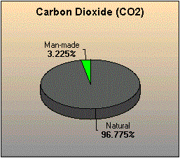
muoncounter at 11:45 AM, the chart below shows that the 440 + 260 +70, total 770 Gigatonnes released by natural means is roughly 30 times the 26 Gtonnes indicated as being released primariliy by fossil fuels.
-
robert way at 12:41 PM on 27 August 2010Medieval Warm Period: rhetoric vs science
I disagree with steve's take on Moberg versus loehle. Loehle was clearly flawed whereas Moberg brought something new to the field with his novel wavelet technique. I think anyone who would give loehle's analysis the same credibility as Moberg's clearly has an agenda as methodologically the difference is clear. -
Chris Colose at 12:07 PM on 27 August 2010Can humans affect global climate?
//"Of course we can’t influence a single weather event, but we can and do have a long term influence on the climate that causes it."// Lorenz would be rolling in his grave... -
Climate Models: Learning From History Rather Than Repeating It
actually thoughtfull - The CO2 absorption band shape is between a Gaussian and a Lorentzian in shape (Riccardo posted about this here). The peak is saturated, but with every doubling the band blocked broadens enough to add an additional 3C. Not intuitive, perhaps, but if you think of it as scaling a clipped Gaussian it kind of makes sense. -
muoncounter at 11:45 AM on 27 August 2010Can humans affect global climate?
#8: "But natural sources far exceed human emissions by a factor of about 30. " Please substantiate that claim. Fossil fuel sources produced 30 Gtons (that's metric tons) CO2 in 2008. Perhaps you found it here? -
actually thoughtful at 11:41 AM on 27 August 2010Climate Models: Learning From History Rather Than Repeating It
Thank you CBDunkerson - I see that it is still 3C per doubling, and I can accept that I don't completely understand why it isn't 3C/280ppm (I kind of do - once you double the CO2 the marginal harm of an additional ppm is lower, but the relationship of 3C/doubling still holds). I am thinking you need a given BTU to bump into twice as many CO2 molecules as the baseline to yield the 3C increase. I think I am proving my (lack of) mental powers here. Thanks again for clarifying the log bit. -
nigelj at 11:30 AM on 27 August 2010Climate Models: Learning From History Rather Than Repeating It
Argus I think its good that as a sceptic you look at long term trends presented as a straight line rather than short term noise. I note the long term temperature trend since around 1880 to 20009 is a straight line pointing up. -
Ian Forrester at 11:24 AM on 27 August 2010Warming causes CO2 rise
johnd, please re-look at the data from Heidelberg you quoted. All of the divergence from natural levels is on the positive side of the curve. This is due to the highly industrialized area. It is not random. It is an excursion above normal levels. In your mind draw a curve at the lowest points in the data, you will see that that curve is very similar to non-industrialize areas. Your large sinks are imaginary. Maybe I was wrong in saying "daily" excursions to >410 ppm but they are, non the less, of very short duration and are due to local production of large quantities of CO2 which is then diluted out by normal air, not absorbed by your "large" sinks. Please do not confuse the issue. -
John Chapman at 11:07 AM on 27 August 2010Climate Models: Learning From History Rather Than Repeating It
Looking at the graph in #9, a quadratic would be a better fit than a linear trend, thus indicating an accelerating rise, which is somewhat consistent with the CO2 rate of increase. -
johnd at 10:33 AM on 27 August 2010Warming causes CO2 rise
Ian Forrester at 09:51 AM, what are you talking about "per day"??? The study tracks the annual cycles!! You've have completely failed to grasp what exactly was being analyzed, perhaps reading it with preconceived notions. As noted in the study, Heidelberg has a fairly strong industrial influence to the East, but it is only one of the 16 stations, all which exhibit the same seasonal variation to varying degrees from a variety of locations across the globe, including some surrounded by your "country air". -
Crazy Bill at 10:19 AM on 27 August 2010The main culprit in mid-century cooling
What about the effects of nuclear testing? I know it's unfashionable to talk about "nuclear winter" but the fact remains that there were multitudes of atmospheric nuclear tests during the period 1945 to 1970s (France 1974, China perhaps even later). Most of these injected quantities of aerosols into the stratosphere where it evidently hung around for a few years. Many Russian tests were in the arctic where the stratosphere is much lower than elsewhere, so even more dust would have been injected there. -
daisym at 10:08 AM on 27 August 2010Station drop-off: How many thermometers do you need to take a temperature?
#17: Tom: Once again thanks for the links. As you said, there's a wealth of information there, and I've broadened my knowledge. I did not know that they has a life expectancy of 150 cycles. At 10 days per cycle, this translates to something like 4 years. Hopefully, they can be retrieved, refurbished, and reused. I was surprised that these buoys don't measure air temperatures when they surface. Perhaps this is an example of "parsimony"? It seems that an opportunity has been missed to gather unique atmospheric temperature data. Once again, thanks for the information. -
Ian Forrester at 09:51 AM on 27 August 2010Warming causes CO2 rise
No johnd, the Heidelberg data do not show a "sink" of 40 ppm per day. You have entirely misinterpreted the data provided and have failed to actually visualize what is happening. As I said, Heidelberg is an industrial city, it produces large quantities of CO2. However, the concentration of CO2 (the data presented in the paper you quote) is a very localized concentration. It may reach 410 or higher ppm in a single day when conditions are right (very little wind) However, the drop back to normal levels (370ppm) is due to unpolluted "country" air being blown in from the surrounding area. It is not due to a natural sink. Note how the levels never go below the global average, that should tell you that there is no local sink which is ten times greater than previously observed as you state in your posts at #6 and #23. Just to repeat, the drop of CO2 concentration from >410 ppm back to normal global levels is due to normal air displacing the highly polluted city air and is not due to some large and previously unknown sink. -
johnd at 09:47 AM on 27 August 2010Can humans affect global climate?
Mike at 09:11 AM Most markedly rising in concentration? Water vapour increases 6-7.5% per degC but being about 2% of the atmosphere in absolute terms it outstrips CO2. .............. Most significant in terms of changing climate? The direct effect of water vapour far exceeds the direct effect of CO2, with water vapour responding to ANY source of additional heating. However clouds are excluded as they are not considered a GHG, but are a major determinant of climate. ............. Most common GHG produced by human activity? Yes. But natural sources far exceed human emissions by a factor of about 30. -
HumanityRules at 09:43 AM on 27 August 2010Arctic sea ice... take 2
16.Dappledwater My understanding is that both your quotes relate to the idea that due to the natural variability wherever you start and end your data set will determine the trend. It's a different way of saying we should look beyond the recent arctic ice trend to the bigger picture. 17.CBDunkerson "There is no evidence of significant discrepancy in those volume calculations." I've shown you evidence! While PIOMAS is in it's own death spiral in 2009 scientists have been out in planes with radars showing that the ice is slightly thicker than it was in 2009. Planes with radars I mentioned in the post there is no good spatial coverage of ice thickness in the arctic. To turn things around where is the evidence that the post-2007 drops in PIOMAS do match reality? I've genuinely looked for them and can't find them. The Haas paper is probably the best actual measure of arctic ice thickness post-2007. I agree Cryosat II will be a big step forward. It should be noted Haas and his radar are part of the consortium generating thickness data in order to calibrate the satellite. -
Mike1637 at 09:11 AM on 27 August 2010Can humans affect global climate?
I think I sort of know what you really meant when you said "most common of greenhouse gases", but yeah, it sure is quite wrong as it's written! ;) Most markedly rising in concentration? Most significant in terms of changing climate? Most common GHG produced by human activity? -
Paul W at 09:04 AM on 27 August 2010CO2 has a short residence time
Doug, Nice article. I like all your points. I do agree with you that the fast removal of CO2 from the air is into the oceans by solution. Just as an additional process that removes CO2 from the atmosphere and eventually into sediments the rock weathering process should be mentioned. The calcium and to a lesser extent magnesium and other metals that form insoluble carbonates have cycles that play a part in CO2 draw down. In brief when rocks (particularly igneous rocks that have had any carbon removed by heat) weather, the soluble metals that can form insoluble carbonates are initially released by a combination of acidic rain water and the action of plants and their organic acids. Rain water is acidic from a combination of dilute sulphuric, nitric and carbonic acids. So the sulphur cycle, nitrogen cycle as well as the carbon cycle it's self are involved in the production of the acids that free the mostly calcium from the rocks. Once in solution the calcium remains soluble until it is either precipitated by high carbonate/ bicarbonate levels at higher pH or it is taken into aragonite and calcite forming marine shell fish and other marine creatures. It is then dropped into sediments at the end of the creatures life. As CO2 levels rise we can expect an increase in the weathering rate due to a drop in the pH of rain water. This rate is however too slow to helps up much. Paleo studies show the usual drop in CO2 takes millions of years. Also with higher CO2 in the oceans the rate of shell formation will slow as first aragonite then calcite forming creatures loose their ability to form shells due to ocean acidification. This is the very deep "do do" point of mass ocean life form extinctions from collapse of the ocean food chain that depends on the aragonite or calcite planktons. There is periods in the Paleo record at the past thermal maximums that ocean sediments show the absence of shell deposition. At the end of the thermal maximum the shells reappear and life slowly rebuilds. -
johnd at 08:37 AM on 27 August 2010Greenhouse effect has been falsified
Will at 21:34 PM , when you say that air is both a good insulator and a top radiator, does it not depend more on the movement of the air rather than it's inherent properties? Still air is indeed a very good insulator of heat, however moving air is a very efficient dispersant of heat. -
mdenison at 08:08 AM on 27 August 2010Climate Models: Learning From History Rather Than Repeating It
Spencer Weart's The discovery of global warming Has interesting sections that provide a background to the models and how climate scientists learnt from them and developed them further by using them to investigate past and present climates. See Simple Models of Climate Change and General Circulation Models of Climate -
Phil at 06:50 AM on 27 August 2010Greenhouse effect has been falsified
Berényi Péter @61 Probably there was heating in the room that was turned off for the night and switched back in the morning just before the experiment started. It developed then maintained a temperature gradient between the positions of jar A and B on the table. Hmm, heating that is turned on about 8.00am, and then is left on all day while he's out at school(as his caption says) and is kept on until at least 8.00pm. I thought the kid said he was worried about global warming ! But at least his experiment is missing some of the glaring errors in Will's version. -
johnd at 06:48 AM on 27 August 2010Warming causes CO2 rise
Ian Forrester at 00:36 AM, regarding the Heidelberg site, yes we know where it is and why the CO2 levels are so high, but you blatantly choose to ignore the most obvious point that the seasonal fluctuations make, that is although the CO2 levels go off the scale, during the "growing season" when the CO2 is being sequestered by plants taking up extra CO2, the levels fall by 50ppm. If you missed that point, please ponder awhile as it indicates that the natural sinks in that region have the capacity to sequester far more CO2 than what occurs elsewhere, and if so, exactly why it is so. -
Rob Painting at 06:45 AM on 27 August 2010Climate Models: Learning From History Rather Than Repeating It
Argus @ 12, wishful thinking may indeed be comforting, but it won't affect sea level rise. Notice the title of the Church & White paper I linked to @ 9?. And the "recent" sea level rise put into context.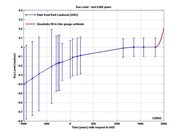 The concern is for that 70 meters of sea level rise locked up in the Greenland and Antarctic ice sheets, the same ice sheets that are exhibiting accelerated melt, and the 1 to 2 meters of sea level rise anticipated for this century.
-
Peter Hogarth at 06:10 AM on 27 August 2010Warming causes CO2 rise
johnd at 22:17 PM on 26 August, 2010 Just to add some detail to the charts Ned and KR posted: (All data from NOAA Paleo site) This curve tracks known and estimated anthropogenic emissions back to pre-industrial times. I think in this case correlation is so high, and process so well understood, that uncertainties about causality are vanishingly small.
-
Peter Hogarth at 05:37 AM on 27 August 2010Greenhouse effect has been falsified
muoncounter at 03:17 AM on 27 August, 2010 For some more updated classic science on the Thermosphere and Mesopause, UV heating, upwelling IR and radiative balance, see States 2000. -
CBDunkerson at 05:02 AM on 27 August 2010Climate Models: Learning From History Rather Than Repeating It
actually thoughtfull, ln(560/280) is 0.693147. If we assume that all feedbacks are logarithmic at the same scale (they aren't) and ignore lag times then that would mean a 3 C rise from a doubling of CO2 would be using a 'temperature forcing factor' (not actually how it works) of 3 / 0.693146 = 4.328085. Multiplying that factor by ln(840/280), the additional +280 ppm you asked about, would then yield TOTAL warming of 4.754888 C... so the first 280 ppm increase would give 3 C warming and the second 280 ppm about 1.75 C... the third would give about 1.25 C more, making the total at 1120 ppm (two 'doublings' over the baseline) 6 C. To get to 9 C you'd need 2240 ppm and so forth. -
Peter Hogarth at 05:00 AM on 27 August 2010Greenhouse effect has been falsified
muoncounter at 03:17 AM on 27 August, 2010 To be fair, some of the relevant information was only declassified in 1971 (if memory serves). -
perseus at 04:31 AM on 27 August 2010It's methane
"Hence the amount of warming methane contributes is calculated at 28% of the warming CO2 contributes" Does the first graph relate to the relative historic influence of each greenhouse gas emission to the radiative forcing we experience today? If so do we really need to know the relative effect of each greenhouse gas we emit today projected forward onto a certain timeframe to establish their real importance? Either way the graph needs to be clarified and referenced -
CBW at 03:49 AM on 27 August 2010Climate Models: Learning From History Rather Than Repeating It
Argus, the planet has been warming since the mid-1800's, so one would expect sea level to rise over that period as well. The fact that it has risen is a proof of global warming -- no matter to what one attributes the cause of the warming. The attempt to connect fossil fuel consumption directly to sea level rise is a straw man. The warming seen up to about 1940 is thought to be caused in part by human activity and in part by solar activity. But solar output has been stable since that time. Initially, global temperatures stabilized for a few decades despite increasing CO2 in the atmosphere, likely due to the dimming effect of industrial particulates in the atmosphere. Since the 1970s, however, the CO2 effect has emerged as the dominant driver of global warming. So drawing a single line from 1850 through 2010 and claiming CO2 can't be the cause is disingenuous at best, and typical of the denialist literature. -
muoncounter at 03:17 AM on 27 August 2010Greenhouse effect has been falsified
#55 "For some historical context see Moe 1977." On the webpage we've been referred to by Will is this statement: The Governments of the world and the various space agencies such as NASA have conspired to stay quiet about the Diurnal Atmospheric Bulge In addition to the reference cited by Peter Hogarth, here's Harris and Priester 1965. Both were NASA scientists at the time. I found that by googling 'diurnal atmospheric bulge'; it was the 4th hit on the 1st search result page. Without opening a can of political worms, how is the existence of this phenomenon being kept secret? Note that I ask how, not why. And also note this reference further down the same search. One of the great things about skepticalscience is that you can quickly find a more reasoned explanation. Note: Any rumors that I have started a 'Ned Fan Club' are categorically false. -
CBW at 03:15 AM on 27 August 2010Can humans affect global climate?
A minor language nitpick. You write: "How can humans influence this? Well, yes, we can." "Yes" is not an answer to "How?". Either drop the "How" entirely and start with "Can", or answer the question: "Well, we do it by influencing the climate." Or some such. -
actually thoughtful at 03:08 AM on 27 August 2010Climate Models: Learning From History Rather Than Repeating It
CBDunkerson - the logarithmic nature of GHG forcings - does that mean we have already done the MOST damage with the CO2 already released. If the temp forcing of the first doubling is 3C - what would you estimate the temp forcing of the next 280PPM increase in CO2 is? (I fight, work, cajole, and live to push CO2 emissions to zero - so no hidden denier agenda here). Thankss. -
Peter Hogarth at 03:03 AM on 27 August 2010Greenhouse effect has been falsified
Will at 21:34 PM on 26 August, 2010 Heating in Thermosphere, as in increased kinetic energy per molecule or atom?, yes. Massive top down?, no, hardly any molecules (or mass) here. Further down, the UV is quite efficiently filtered by Stratospheric components such as Ozone (Ozone level peak around 20-25 km up - where it is cold?) - so that only 1-3% of total UV (mainly longer wavelength UVA) reaches the surface. You state: "as the atmosphere thins it looses more energy via radiation, yet at the same time it still has an insulating effect" How? I'm not sure what physical processes you are trying to communicate here. Approx 99.999% of the atmosphere is below the Thermosphere. Approx 99.9% is in the Troposphere. What substance exactly is providing insulating properties where? I suspect you may be stretching the definition of "air" a little thin... -
muoncounter at 02:50 AM on 27 August 2010Warming causes CO2 rise
#14: "The anthropogenic origin of the observed rise in CO2 is one of the clearest, most obvious physical facts in earth system science." I find it astounding that so many question this; I would love to figure out why the deniers give it so much traction and how to burst that bubble. And then there's the old chestnut: 'correlation is not causality.' Is this a fitting reply? Let me hold a rock over your head; the speed at which it hits your head correlates well with the height of the rock. -
cruzn246 at 02:46 AM on 27 August 2010Can humans affect global climate?
CO2 the most common greenhouse gas? Please. Water vapor is the most common by far. -
CBDunkerson at 02:27 AM on 27 August 2010Climate Models: Learning From History Rather Than Repeating It
Argus #12: Nope, you didn't quite follow it. Warming due to CO2 and other GHGs is logarithmic. Therefor, in order for warming from GHGs to show a linear trend the rate at which these gases are increasing has to continually increase. That does not mean that warming would stop if the rate of GHG increase became constant... rather the rate of warming from GHGs would begin to slow. Now when you factor in feedback warming and factors leading to sea level rise (ice mass balance loss and thermal expansion of water) it gets more complicated. Both of those can go on for years after the GHG warming slows or even ceases. Again, look at your graph. There was a significant build up of CO2 emissions for DECADES prior to the 1940 line they identify. That CO2 increase caused warming, which was magnified by positive feedbacks, which caused sea level rise. The argument that accelerating CO2 emissions after 1940 should have led to a matching acceleration of sea level rise is simply false... there is no reason that the two factors must rise at exactly the same rate and many reasons (explained above) why they would not. Sea level rise IS accelerating... just not as fast as CO2 emissions. Which isn't at all surprising given the logarithmic nature of GHG temperature forcings. -
Ned at 02:06 AM on 27 August 2010Climate Models: Learning From History Rather Than Repeating It
Just off the top of my head, without putting a lot of thought into it, my explanation for the trend shown in the SLR graph is that a relatively slow increase in sea level was associated with the end of the Little Ice Age, and then graded into a slightly steeper (and accelerating) rise caused by anthropogenic global warming. In other words, it's a lot like the global mean temperature graphs -- a century-long rise, but with a different balance of causes in the first vs second halves of the century. In other words, we can't use the existence of SLR as proof of AGW, since it can and does have other causes at other times. But we can say that recent SLR is consistent with AGW. Does that make sense, Argus? -
John Hartz at 01:47 AM on 27 August 2010Climate Models: Learning From History Rather Than Repeating It
"Computer modeling of global climate is perhaps the most complex endeavor ever undertaken by mankind," writes MIT atmospheric scientist Kerry Emanuel in his short book What we know about climate change. This is the first paragraph of the article, "Powerful new climate model unveiled", published in yesterday's (Aug 26) edition of USA Today. Needless to say, this article has attracted anti-AGW bloggers like flies to honey. http://content.usatoday.com/communities/sciencefair/post/2010/08/powerful-new-climate-model-unveiled/1#uslPageReturn -
Greenhouse effect has been falsified
Berényi - On the contrary, changing a single variable is an essential method for conveying the effect of that variable. You could be more realistic in describing end-point conditions by looking at all the parameters, the interactions, feedbacks, etc. - but if what you wish to show (as in The Hoover Incident) is that current conditions could not hold true if that variable was changed, a single-variable approach is more than sufficient as a reductio ad absurdum proof.
Prev 2248 2249 2250 2251 2252 2253 2254 2255 2256 2257 2258 2259 2260 2261 2262 2263 Next


