


 Arguments


Recent Comments
Prev 2359 2360 2361 2362 2363 2364 2365 2366 2367 2368 2369 2370 2371 2372 2373 2374 Next
Comments 118301 to 118350:
-
Berényi Péter at 09:22 AM on 18 June 2010How climate skeptics mislead
#193 kdkd at 05:53 AM on 18 June, 2010 how to deal with uncertainty and poor measureability properly In science the standard practice is to get rid of uncertainty by improvements to your measurement system, postponing your judgment until the job is done. In real life this procedure is not always practicable, because decision is urgent and resources are lacking. In this case you have to make-do with what you have. But do not call that science please. your comments are showing your susceptibility to the Dunning-Kreuger effect So are yours :) -
Berényi Péter at 08:54 AM on 18 June 2010How climate skeptics mislead
#195 doug_bostrom at 07:33 AM on 18 June, 2010 I ought to pull off and check my oil level Except your car is the world economy, already on a bumpy road along the river, on a floodplain with swamp on both sides, water level is rising fast so you have to reach high ground as soon as possible. Make your choice. -
Albatross at 08:38 AM on 18 June 2010Astronomical cycles
JohnD, The question remains why you chose 1998-- a year frequently cited by "skeptics", some erroneously, as the warmest year to date in the instrumented record. The follies of "cherry-picking" start dates, has been discussed ad nauseum. The only reason I chose 1986-1998 is because you chose 1998-present (~12 years), so I selected the 12 years prior to 1998 so that we would at least be comparing trends determined using the same number of data points. To calculate stat sig. trends one needs at least 15 years or so of data in the GISTEMP data. The trend in GISTEMP from 1978 to 1998 (i.e., using the dates that you suggested @24) was +0.123 K/decade, compared to +0.134 K/decade from 1998 to present. The trend from 1978 to preset is +0.168 K/decade. So, the trend between 1998 and present is positive, and even greater than that observed between 1978 and 1998 (although the difference between the two is probably not statistically significant). Anyhow, your suggestion that global temperatures have been stable since 1998 or have even cooled since 1998 is simply not correct. Hansen et al. have a paper (which you can download from his web site) in which they demonstrate that the long term rate of warming in the GISTEMP until present has not showed signs of a (prolonged) slow down in the warming. It is a very interesting paper and well worth reading if you have the time (it is rather long). -
Lon Hocker at 08:15 AM on 18 June 2010Is the long-term trend in CO2 caused by warming of the oceans?
scaddenp: Sorry I don't understand what you are saying. Add a linear trend to what? No need for magic. The equilibrium is between the bottom of the atmosphere and the top of the ocean, and if the ocean needs to add CO2 to the atmosphere to keep equilibrium, it will add it. If it needs to sink it, it will sink it. If you dump CO2 into the atmosphere more quickly than the change in the surface temperature would demand, it sinks it. All: Many thanks for all your contributions to this thread. Clearly, I did not do a good enough job of presenting my model. Time to do a rewrite instead of trying to address your questions one at a time. Keep your eyes on WUWT! -
johnd at 08:05 AM on 18 June 2010How climate skeptics mislead
doug_bostrom at 07:33 AM, doug, perhaps your oil level may be low, but there is no direct correlation between a flickering oil light and the oil level. They may coincide much of the time, and be plotted on a graph, but the mechanism that drives each are separate with only indirect links. PS. Don't trade in the car yet, there is a lot of mileage left in the analogy tank. -
scaddenp at 07:41 AM on 18 June 2010Is the long-term trend in CO2 caused by warming of the oceans?
Lon, my point is that you add a trend to the data so it was even an anti-correlation between temperature and co2, you would still be able to derive your model. ie it makes no statement about trend. On top of this, you still have to explain the magic by which co2 comes from ocean while ocean co2 increases and how to reproduce the atmospheric isotope data with an increase in ocean CO2. -
Doug Bostrom at 07:33 AM on 18 June 2010How climate skeptics mislead
Retracing our footsteps back from the interesting and informative and completely necessary conversation on epistemology, I'm still left with hints about climate behavior that my feeble brain can readily analogize to a more prosaic level. My vehicle's engine is making some unusual clattering noises. The oil pressure light is flickering. I've not checked my oil level recently, I can't really remember how many miles ago. I know my car consumes a certain amount of oil but my notion of exactly how much oil is consumed per mile is hazy. None of these things are a certain indication that my engine is about to burn up. The clattering could be a collapsed lifter, the flickering lamp could be a short. My assumptions about a potentially diminishing quantity of oil are hazy at best. I should add, this is all behavioral information from my actual experience with one of my cars. So none of the indirect information I have about what's going on under the hood is anything like conclusive when I consider each clue in isolation. I've had a clattering lifter before. The engine wiring harness is in poor shape and I've seen the oil pressure light flicker and even light solidly in past only to find a full oil pan. My last measurement of oil level is even more uncertain, I have only the vaguest notion of how much oil ought to be present. Taking all that information together, however, I can form a reasonably useful judgment that my vehicle is about to undergo a drastic change and I ought to pull off and check my oil level. In all probability I'll find the level to be critically low. For me, that's the model of what I'm seeing with regard to climate. We've got all sorts of signs and portents pointing more or less in the same direction. None are perfectly reliable, some are quite imperfect, but it would actually be unreasonable to ignore the overall message. -
Doug Bostrom at 06:12 AM on 18 June 2010How climate skeptics mislead
Berényi Péter while I still cannot seem to arrive at a state of paralysis based on your thoughts and opinions, that was really nicely written post. Thanks also to 'e' and 'KR.' -
kdkd at 05:53 AM on 18 June 2010How climate skeptics mislead
BP #191 This latest comment, and others really does look like your own training has ill equipped you to understand how to deal with uncertainty and poor measureability properly. Which is leading me down the track of thinking that rather than trying to actively mislead, a lot of your comments are showing your susceptibility to the Dunning-Kreuger effect. -
pdjakow at 05:02 AM on 18 June 2010How climate skeptics mislead
Differences in temperature anomaly (10-year running mean) in nearby stations. Base period is 1971-2000. Sniezka is mountain without UHI effect and Wroclaw is city with pop= ~600000.
-
NickD at 04:51 AM on 18 June 2010Podcasts, interviews and Monckton bashing
This is the best site I come to for information and good discussions. I am typically one of the "silent" regulars on this forum, and I imagine there are many more like me. I would like to say a sincere thank you to John Cook, all the commenters (from all sides) and all contributors to this great site. While I find valuable information on other forums, such as RC, Open Mind, etc., this is the clearest and least hostile place I will first link to in discussions elsewhere. -
Riccardo at 03:42 AM on 18 June 2010Astronomical cycles
johnd, from NCDC data the linear trend from 1998 is positive. Same conclusion eyeballing the blue line in your graph. Only if you take the value of the single year 1998 and the single year 2009 you'll get a slightly decreasing temperature. Is this what you mean? -
johnd at 03:33 AM on 18 June 2010Astronomical cycles
Albatross at 02:38 AM, the trends are taken from the chart below. The question really is why did you choose 1986 when it appears the upward trend began about 1978?
-
Albatross at 02:38 AM on 18 June 2010Astronomical cycles
Johnd @22, I'm not sure what the point of your cursory analysis is. That sunspot number explains decadal trends in the global surface air temperature? Anyhow, I disagree with your assessment that (e). The OLS trend in the GISTEMP data between 1998 (~12 years) and now is +.134 K/decade, compared to +.09 K/decade between 1986 and 1998 (~12 years prior to 1998). Stats generated at woodfortrees.org. Why did you choose 1998? -
Lon Hocker at 02:03 AM on 18 June 2010Is the long-term trend in CO2 caused by warming of the oceans?
scaddenp: Challenge response: Pull back to 1850. According to most data, the temperature was pretty much flat at a value about 0.8C less than now. My model would show CO2 would stay constant. Linear Trend response: Add a linear trend to the Mauna Loa CO2 data, and the 0.58 term would change accordingly. Figure 2 would look the same, since the equation would subtract out the revised 0.58 value, and the shape of the Modified Mauna Loa data would be reproduced. Doug: I'm not sure what you mean by that, but if you are suggesting backing off the rhetoric, I all for it. -
Sheila at 02:00 AM on 18 June 2010Climategate CRU emails suggest conspiracy
Obviously the whole point of the hacking was to look for dirt to publish. I'd love to know how many other people got hacked with nothing published, because there was no dirt to find. I know the answer might be "none", but equally, it could be hundreds. -
canbanjo at 01:05 AM on 18 June 2010Andrew Bolt distorts again
JB, not sure why you said 'nice try' regardless of whether this was directed at Canbanjo or Joe Blog. May I suggest that a lot of the controversy surrounding the IPCC reports could be (and could have been) avoided by having a formal IPCC questionaire to be completed by all of the contributors and reviewers following publication of the final report. This would then enable simple statistical analysis to determine eg percentage who endorse the core findings of the report. The survey refered to in post 12 is better than nothing but considering the damage the denialists are causing we need much better amunition (facts) to clearly highlight the consensus. -
Berényi Péter at 00:47 AM on 18 June 2010How climate skeptics mislead
#189 skywatcher at 19:32 PM on 17 June, 2010 we've established there was no evidence for your hypothesis No, you have not. dealing with multiple lines of evidence, none of which may show you exactly what you want to know, but all of which point strongly to some overall conclusion Sounds like the prosecutor's job. -
Berényi Péter at 00:38 AM on 18 June 2010How climate skeptics mislead
#185 e at 15:04 PM on 17 June, 2010 We are not born with this knowledge implanted in our minds, we have no choice but to construct that knowledge from our senses and our ability to apply logic. When that application of logic is used to derive general principles from given observations, that logic is by its very nature inductive, and thus can never give us a truly binary answer. Except it usually does not happen that way. What we actually do is to postulate universal principles very early in the process, based on little observational data. This step can be called inductive if you will, but it goes far beyond what is strictly necessary to explain the set of observations available at the moment. Ancient Greeks postulated circular motion for the Heavenly Bodies this way, because the Circle is the only perfect closed curve (whatever "perfect" means) and the behavior of the Heavens certainly looked like somewhat cyclic even at a first glance. The theory was extremely successful, had considerable predictive power, Ptolemaic cosmology has prevailed for one and a half millennia. As soon as the conceptual framework is given, we can happily rely on deductive reasoning using perfectly binary logic. Observation is still necessary to fine tune model to reality (you still need to determine the number, sizes, positions, orientations, orbits, periods of epicycles), but otherwise all you do is to calculate projections of these motions to the sphere of Heavens (which needs quite a bit of spherical geometry). Even its demise is enlightening. From retrospective analysis we know any quasi-periodic motion can be approximated by a sufficient number of epicycles with arbitrary precision. The proof goes something like the one for Fourier series. Therefore there was no way observation could falsify the theory provided of course the challenge was the accurate description of kinematic behavior of projections of Heavenly Lights to the Celestial Sphere. The model could be refined ad infinitum, with an ever increasing number of epicycles. Unfortunately during this process it became less and less understandable, and that was the real problem with it. With our vast computing power we could do even better on Ptolemaic calculations than medieval thinkers, there would be almost no limit to increasing the number of epicycles recursively. In reality came Nicolaus Copernicus and failed miserably. His model was much more transparent, than Ptolemy's (after all those epicycles added), but he was sill sticking to circular motion (this time around the Sun). Initially his theory was rejected not because of theological objections of the Catholic Church (those came later, preceded by early expression of distaste by Luther), but because it was all too easy to falsify it. Parallax predicted by his theory was unobservable and on top of that, with simple circular orbits its performance was much inferior to improved Ptolemaic predictions. One could of course add epicycles to planetary orbits around the Sun, but in that case what's the point of the whole exercise? Just to leave poor birdies behind in empty Air as Earth orbits the Sun? It was only after Johannes Kepler discovered elliptic orbits that the system got actually simpler. At least in a conceptual sense, if not computationally. By the way, the first two laws of Kepler were derived from a single case (Martian orbit), not from some induction on a wide sample of orbits. The pattern is the same even much later. Albert Einstein in developing his theory On the Electrodynamics of Moving Bodies didn't have to do inductive inferences on vast observational databases. He only used a single experiment (Michelson & Morley, 1887, not even citing them by their name, but just as unsuccessful attempts to discover any motion of the earth relatively to the ``light medium,'') and some symmetry properties of the Maxwell equations discovered earlier by Lorentz. Compared to this the inductive step he took was enormous. Ten years later he repeated the performance with his Geometrodynamics, this time only using the Eötvös experiment, geometrization of Electrodynamics by Minkowski along with some more symmetry speculations. I could go on with this ad nauseam from QM to String Theory. The general pattern is that very little empirical data is used for huge inductive leaps and most of the induction is done at rather high level by introducing some invariance principle, transforming the mathematical form of existing laws or even better, by finding mathematical structures that include the description of several unrelated fields as limit cases. The role of induction is more like a heuristic principle here, rather than a systematic tool working on many instances of observation. The bulk of work goes into derivation of specific cases from general equations obtained this easy and reckless way on the one hand and performing experiments to check these consequences on the other hand. Mathematics seems to play a central role in this process. Already Galileo has noted the great Book of Nature was somehow written in the language of Mathematics. It means even induction can be performed mainly on the symbolic level, as with quantization of certain representations in classical physics that are directly transformed to QM equations. Wigner's fifty years old essay, The Unreasonable Effectiveness of Mathematics in the Natural Sciences still ponders on this question. We can never be sure if these signs give us truth or not. However we have no choice but consider them true until proven false (by experiment or observation). With fuzzy truth-values assigned to propositions, even proper falsification becomes impossible. If something is 95% true, it may take quite a lot of counterexamples to get one convinced it must be false after all. Even then only a lower certainty might be claimed, 90% perhaps - still very likely. If even falsifiability is abandoned, we are left in the outer darkness. Binary logic is not for all. Spouses, not driven by logic, can perfectly well love and hate each other at the same time and one still have to deal with situations like this somehow. But right now we are not doing zen, we are doing science and in this fine tradition you should let your communication be, Yea, yea; Nay, nay: for whatsoever is more than these cometh of evil. -
johnd at 23:42 PM on 17 June 2010Astronomical cycles
Marcus at 21:18 PM, this chart perhaps helps with sunspot numbers. The relevant temperature trends are (a) A small temperature fall 1900 to 1906. (b) An extended temperature rise 1906 to 1940. (c) A steady or very slowly descending temperature period from 1940 to 1978. (d) An extended fairly rapid rise in temperatures from 1978 to 1998. (e) A short steady or slightly descending temperature period from 1998.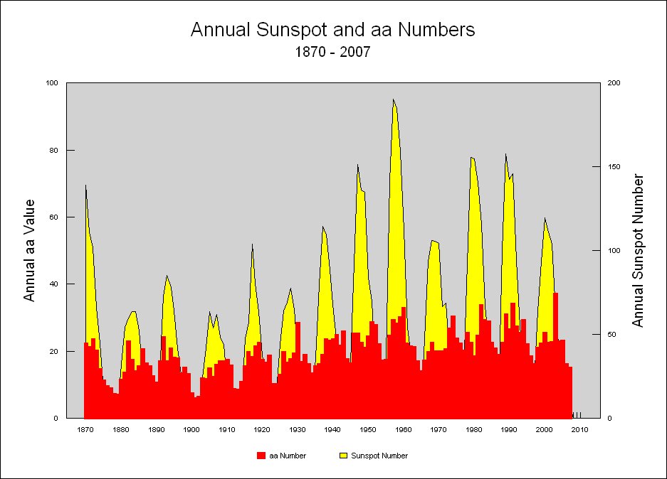 http://www.ngdc.noaa.gov/stp/GEOMAG/image/aassn07.jpg
-
JMurphy at 22:54 PM on 17 June 2010Andrew Bolt distorts again
Why do so-called skeptics find it so easy to believe in and trust (totally, without scepticism) one or two sources or scientists, against thousands of scientists and scientific reports ? -
Riccardo at 22:11 PM on 17 June 2010Astronomical cycles
Arkadiusz Semczyszak, you should have noticed that, although criticizing the analisys shown in the paper I ended the post open to other possibilities and welcoming further studies on decadal variability, which anyone may admit is a bit in its infancy. I can't see where you criticism of underestimation is based on. -
Arkadiusz Semczyszak at 22:09 PM on 17 June 2010Andrew Bolt distorts again
Hans von Storch - exactly -
Arkadiusz Semczyszak at 22:08 PM on 17 June 2010Andrew Bolt distorts again
"The AR4 report was indeed written, edited and reviewed by many thousands of expert scientists including the lead and contributing authors and the expert reviewers." professor Hans von "hot" supporter of AGW theory, the author III raport ICC: "Der eigentliche Sündenfall dabei war, dass sich der Rat entgegen seiner Regeln in seinen Aussagen nicht mehr allein auf wissenschaftlich legitime Quellen verlassen hat. Stattdessen hat er bei manchen Themen auf Zeitungsartikel und Berichte von Interessenverbänden zurückgegriffen. Schlimmer noch: Es ist der Eindruck entstanden, dass Umwelt- und Naturschutzverbände, aber auch wirtschaftliche Interessen direkten Einfluss auf Aussagen des IPCC nehmen konnten." - "The real sin is that the Council [IPCC] in support of their case has benefited not only from reliable sources, peer-reviewed research. Instead, the use of certain newspaper articles and reports of interest groups. Worse, there is a presumption that environmental organizations, but perhaps also economic interests have a direct impact on the IPCC reports. " "... normal scientific procedures are not only rejected by the IPCC, but… this practice is endemic, and was part of the organization from the very beginning. The IPCC is fundamentally corrupt. The only ‘reform’ I could envisage would be its abolition." (Gray, 2007). -
JMurphy at 21:27 PM on 17 June 2010Peer review vs commercials and spam
chriscanaris wrote : However, science has its share of powerful personalities who dominate the scene by their presence (and not always by their integrity). This applies to the sceptical side as much as (in some cases more)to the AWG side. Could you give some names of those on the "AWG side" who are "more" likely (according to you) to "dominate" by their lack of integrity - "not always by their integrity" ? -
Marcus at 21:26 PM on 17 June 2010Peer review vs commercials and spam
Funny, Arkadiusz, but many US scientists complained that the Bush Administration was cutting off Federal Funding to institutions pushing the pro-AGW line. Here in Australia, the former Howard Government did much the same thing. However, wheras politicians, & the press, are happy to act in a partisan fashion-I doubt that Reviewers could long get away with similar behaviour. -
JMurphy at 21:21 PM on 17 June 2010Peer review vs commercials and spam
Arkadiusz Semczyszak, could you give links for those quotes, please ? I don't think anyone should be able to quote others without a link, but maybe that's just me. -
Marcus at 21:18 PM on 17 June 2010Astronomical cycles
Arkadiusz, if planetary alignments were truly having such a strong impact on the sun, then we'd see some kind of outward sign-such as a large increase in solar activity-yet if anything the sun's activity is *declining*. Also, your talk about the supposedly asynchronous nature of the MWP is a complete red herring-because whatever the northern & southern hemispheres were doing during the MWP, we *know* that sunspots were increasing throughout that entire time-the same is *not* true at the moment. Also, the last time sunspot numbers peaked (the 60 years from 1890-to 1949) temperatures rose at a rate of +0.06 degrees per decade. By contrast, the warming of the last 60 years (1950-2009) has been at +0.11 degrees per decade-in *spite* of being dominated by a decline in solar activity. Still, at the end of the day, this article is more about Scaffetta's attempt to squeeze the trend to fit his hypothesis, on extremely flimsy pretexts, as Riccardo eludes to. Still, Arkadiusz, I've got to admire your talent for rejecting perfectly rational explanations of warming-even when based on strong empirical evidence-yet happily cling to the most outlandish explanations the Denialist Club can come up with! -
Arkadiusz Semczyszak at 21:05 PM on 17 June 2010Astronomical cycles
In part, I feel guilty about working Scafetta. In a discussion of his earlier work: Is climate sensitive to solar variability? (2008), pointed out that it may be important not only: "Modeling the TSI variability Earth's atmosphere, landmasses, and oceans absorb and redistribute the total solar irradiance (TSI) ..." The discussion (also) was attended by Richard Mackey ... Agreed. Scafetta papers much simplifies the problem and is "fraught" with considerable range of possible deviations. But I hope that the problem resulting from the fact that: "Schwabe and Hale solar cycles are also visible in the temperature records. A 9.1-year cycle is synchronized to the Moon's orbital cycles."; will be appreciated - clearly explained and "priced". Ricardo: problem can not be underestimated. -
Arkadiusz Semczyszak at 20:19 PM on 17 June 2010Peer review vs commercials and spam
Svensmark: "But for some unknown reason I never could publish our work. We sent it to 4 different letters, but each time met with refusal. No one accused is not anything - do not reproached errors[...]. They said: We are not interested, either: the text is too long. There was no substantive criticism of our work - it gave rise to even greater disappointment. [...]" Eugene Parker, a professor of astronomy and astrophysics at the University of Chicago, commented on this: "Publishers tend to be very naive [!?]. A negative opinion of the reviewer, if you did not put it in her compelling reasons against the publication, should lead to reflection. In such a situation should appoint another reviewer. [...]" "Global warming has become a "hot" and political topic. I have evidence that, for example in the United States, blocked the publication of serious scientific research on warming. People who are convinced that they know the truth, deny others the right to vote. It harms science, the United States and globally. [...] Tying the discussion does not help in solving the problem." -
Riccardo at 19:51 PM on 17 June 2010Astronomical cycles
Arkadiusz Semczyszak, the problem at hand is the validity of Scafetta approach. What I tried to show is that it's weak, at best. -
skywatcher at 19:32 PM on 17 June 2010How climate skeptics mislead
BP: And some firm evidence is better than lots of shaky one. That's fine, but we've established there was no evidence for your hypothesis that led us down this fascinating road. So I guess that leaves us with lots of 'shaky' evidence, although I'd hardly call the multiple independent lines of evidence terribly shaky as they've not been successfully challenged. Each line of evidence is pretty sound, many together is very strong. One line on it's own, perhaps could be questioned... but when several lines, with different measurement strategies converge on one answer, that answer is, ah, robust. From what I can guess you're a software engineer? I think kdkd @177 may have it right that it is your training that is blinding you to the concepts required in environmental science, be they the right kind of inductive reasoning, or the dealing with multiple lines of evidence, none of which may show you exactly what you want to know, but all of which point strongly to some overall conclusion. -
Arkadiusz Semczyszak at 19:08 PM on 17 June 2010Astronomical cycles
sorry "[60 lat]" - 60 years -
Arkadiusz Semczyszak at 18:53 PM on 17 June 2010Astronomical cycles
Note the facts: 1st Maximum solar activity in recent times (1957-1958 - XIX solar cycle) very closely coincide with the maximum: "mass moments of the 4 largest planets" (The cyclic fluctuations of air temperature in Europe in the 19th-21st centuries and their causes, Boryczka, Stopa-Boryczka, 2007). Perhaps this is the impact of increased "gravitational activity," the Sun? Okay, Marcus says: that in 30 years solar activity is falling ..., but our recent discussion about the MWP shows that (asynchrony: NH - SH), Earth's climate system can respond to changes are with considerable delay. 3rd The cycle average of 60 years in long periods of time Millennium fits perfectly such as AMO, CTH ..., but also in a cycles of Millennium. In the latter - only the LNC. (Ledu, Rochon de Vernal, Labrie, 2007. Holocene climate oscillations in the Eastern part of the Northwest Passage: A possible influence of the Lunar nodal cycle: Preliminary results.). The importance of lunar cycles is undeniable. I recommend: - Lunar nodal tide effects on variability of sea level, temperature, and salinity in the Faroe-Shetland Channel and the Barents Sea (Yndestad at al., 2008); - The 18.6-year lunar nodal cycle and surface temperature variability in the northeast Pacific (McKinnell , and Crawford; 2007 ), - The impacts of the Luni-Solar oscillation on the Arctic oscillation (Ramos da Silva and Avissar; 2005), - Trends and anomalies in sea-surface temperature, observed over the last 60 years, within the southeastern Bay of Biscay (Goikoetxea, 2009), - Solar Forcing of Changes in Atmospheric Circulation, Earth's Rotation Solar (Mazzarella, 2008). 2. Effect of LNO-LNC on the extent of THC is proven, to be only measured how big the impact is and how "to translate" the retention of solar energy by the global climate system. I hope that someone will do it, I do not have the appropriate team of "human" and financial resources. 4. And (once again) I recall a diagram: http://www.rni.helsinki.fi/research/info/sizer/fig2big.jpg (unfortunately, my computer software is not able to paste this chart - here - and we would show it off.) The climate of Fennoscandia is a "terminal" for at least two climate circulations, also applies to the polar latitudes; and is therefore highly sensitive climate change. The main noticeable change in the climate of Fennoscandia may thus be important also for the Earth ... In the diagram Finnish scientists, it is clear that we are now at the stage of warming (after rapid cooling) - in a very similar period to circa 4.2 and 8.4 thousand years ago ... There are multiple Millennium cycles. This "same" Rahmstorf says that: "the Millennium cycle is dependent on the cycles of the sun [60 lat ?] - but not directly. So far, created a few theories to explain this relationship." Rahmstorf, Ganopolski, 2005: "We attribute the robust 1,470-year response time to the superposition of the two shorter cycles, together with strongly NONLINEAR DYNAMICS and the long characteristic timescale of the thermohaline circulation." PS Sorry for the big shortcuts (for: gravity Sun) - I hope that this is not from my lack of knowledge, but the lack of "place" on a precise explanation. -
Neven at 18:36 PM on 17 June 2010Websites to monitor the Arctic Sea Ice
I have written and updated a blog post on my Arctic Sea Ice blog that collects more than 25 graphs and maps (satellite images, extent, area, volume, concentration, air and SST temperatures, weather maps, arctic oscillation, buoys, ice displacement) for monitoring the Arctic Sea Ice on a daily basis: Interesting websites for watching the ice -
NewYorkJ at 18:18 PM on 17 June 2010Astronomical cycles
Apparently this is a pattern with Scafetta. http://www.physorg.com/news189845962.html "The first thing we do when we approach a time series with a strong random component is to perform standard statistical analyses like plotting of probability density distributions on different time scales,” Martin Rypdal told PhysOrg.com. “We look at the shape of these rescaled distributions. If the signal is statistically self-similar, it looks almost the same on all time scales. [Here, we’ve shown] that the solar flare signal and the global temperature signal are both self-similar, but their distributions are very different, and so are the exponents used for rescaling. We were very surprised that Scafetta and- West never show such results in their papers. It seems that they have designed all their tests with the purpose of proving a wanted result, and deliberately avoided analysis that points in other directions." "The theory of anthropogenic global warming consists of a set of logically interconnected and consistent hypotheses,” Martin Rypdal said. “This means that if a cornerstone hypothesis is proven to be false, the entire theory fails. A corresponding theory of global warming of solar origin does not exist. What does exist is a set of disconnected, mutually inconsistent, ad hoc hypotheses. If one of these is proven to be false, the typical proponent of solar warming will pull another ad hoc hypothesis out of the hat. This has been the strategy of Scafetta and West over the years, and we have no illusion that our paper will put them to silence. " -
How climate skeptics mislead
BP > And some firm evidence is better than lots of shaky one. Agreed. -
kdkd at 16:30 PM on 17 June 2010How climate skeptics mislead
BP #186 You're now verging into solipsism which is yet another technique that so called climate sceptics use to mislead. This is especially true in that you are demanding reductionist deductive proof in a field of knowledge where such things are not possible. -
Berényi Péter at 16:23 PM on 17 June 2010How climate skeptics mislead
#185 e at 15:04 PM on 17 June, 2010 lots of evidence is better than a little evidence And some firm evidence is better than lots of shaky one. -
Philippe Chantreau at 16:22 PM on 17 June 2010Astronomical cycles
Lies, damn lies and... -
Doug Bostrom at 16:17 PM on 17 June 2010Is the long-term trend in CO2 caused by warming of the oceans?
It may well be that the appropriate moment for a graceful climbdown passed unnoticed while Lon was issuing jibes about "freshman calculus." History analogizes itself again? -
Bern at 16:13 PM on 17 June 2010Astronomical cycles
Donald Lewis - well, yeah, that's the thought I had. The author "detrends" the data, and then goes to great lengths to show there may be a cyclical influence on the Earth's climate by the orbits of the gas giants. Ignoring the issues of choice of underlying trend that Riccardo has pointed out, it might explain some of the ups'n'downs over the years, but the fact that he gets such a neat correlation surely means that it *cannot* explain the underlying trend. I.e. doesn't this paper, when accepted at face value, 'prove' that orbital variations cannot be causing global warming? -
Is the long-term trend in CO2 caused by warming of the oceans?
Lon, I don't think what Ned is saying to you is sinking in. Ned has pointed out that the reason your model is able to recreate the modern CO2 trend from temperature data, is that the background trend of CO2 release has been hard coded into your model as a constant multiplier. You cannot draw any conclusion whatsoever from this as to where that background trend comes from, your model just assumes it exists as a static value. When you are "reconstructing" the CO2 trend from temperature using your model, all you are doing is taking that background trend and combining it with the temperature signal. Basically all this exercise accomplishes is to restate the conlusion that the rate of CO2 accumulation is correlated to temperature. This is the only conclusion you can come to. Attempting to extrapolate this to suggest that the level of CO2 is correlated to temperature to the same degree is logically invalid. I have a counter-challenge for you: try applying your model to some out of sample data, specifically a time period where the rate of CO2 release was significantly different from that of the last 30 years. If Ned is right, your model will fall apart rather quickly. -
Donald Lewis at 15:29 PM on 17 June 2010Astronomical cycles
Bravo NewYorkJ! I am now adjusting my position in the market based on correlations with temp projections (or NOT!). Thanks. On the one hand, correlations point to possible connections, so it is valuable to explore them. On the other hand... explain the cause to me before I endorse a correlation as a cause. I viewed the paper at arxiv. The most striking thing to me is that the author superimposes a periodic temperature variation upon a QUADRATICALLY growing base, and doesn't address (did I miss it) why the base temp at any moment is accelerating in time. Argh! His correlations may "explain" some periodic variability, but only if the base temp is accelerating over time. Good grief! Is the author offering an "astrological" explanation of why the temp of the earth is accelerating, or not? I didn't catch it if the author did. The acceleration is the "trend" that concerns me. Is the author suggesting the quadratic base curve is statistically significant? If not, the whole analysis is suspect. If it is, then the problem is to explain it. I offer a wacky idea... something to involving CO2 emissions. -
How climate skeptics mislead
BP >You seem to believe truth was something to be constructed while I think it is given, it simply is irrespective of our state of ignorance. I pursue discovery, your business seems to be invention. The underlying "truth" of reality and our imperfect knowledge of reality are two very distinct entities. I believe truth may be absolute, but our knowledge of that truth certainly is not. We are not born with this knowledge implanted in our minds, we have no choice but to construct that knowledge from our senses and our ability to apply logic. When that application of logic is used to derive general principles from given observations, that logic is by its very nature inductive, and thus can never give us a truly binary answer. Asking whether these conlusions should be fuzzy is irrelevant, we have no choice in the matter. I won't disagree that your proposition has a binary truth value in the underlying fabric of reality (though that point is philosophically debatable); the problem is that, as we lack omniscience, humans are never privy to the "true" nature of reality. The best we can possibly do is weigh inductive conclusions against one another based on our current limited knowledge of the world, and that's exactly what I was doing when I pointed out the improbability of your specific claim. And yes I do understand you cannot assign hard probabilities to inductive conclusions, that wasn't what I was doing. I was qualitatively judging the likelihood of your claim relative to the competing claim. KR's post above gives a great explanation of the types of probabilistic statements we are making. As for your talk of "modules", this a general post discussing the relevance of the sum of all current evidence on climate change. In the spirit of this post and the theme of this entire blog, I ask a very relevant question, why should this very speculative hypothesis cast doubt on the current state of climate science and its evidence taken as a whole? Your obsession with trying to steer the conversation back to a "narrow piece of the puzzle" does a great job of proving John's point, and highlights your stubborn refusal to admit the simple point that lots of evidence is better than a little evidence. -
Stephen Baines at 14:19 PM on 17 June 2010Astronomical cycles
Warming is good for the economy! -
NewYorkJ at 14:08 PM on 17 June 2010Astronomical cycles
Ok, folks. Global warming theory has been debunked once and for all. I've found a strong correlation between S&P 500 stock index growth and global mean temperature (NCDC) since 1950, using a linear trend with the proper scaling and a 36 month running average. As is obvious, there's very little room left for greenhouse gases.
Ok maybe not the perfect analogy to Scafetta, but you get the idea.
As is obvious, there's very little room left for greenhouse gases.
Ok maybe not the perfect analogy to Scafetta, but you get the idea.
-
KR at 12:41 PM on 17 June 2010Astronomical cycles
We're human - and we're really really good at seeing patterns. There are tons of papers in this; seeing patterns in woodland undercover (nasty critters!), environmental noise (there's somebody behind me!), and even in tea leaves (I have no idea here, I never see anything but leftover tea!). In unmitigated nature this is a huge advantage. The cost of a false positive is a short period of panting and high blood pressure, while the cost of a false negative is much higher - being eaten by something, or clubbed by a competing caveman. However, as a result of a false positive pattern bias, we also see gnomes in Zurich manipulating currency, UFO's in clouds, conspiracies among the neighborhood pets, on and on and on. If you go looking for a pattern, you're likely to find one somewhere. I'm much more impressed (charitable?) when someone finds that a pattern falls out of their data, and then search for and find a corresponding pattern in a reasonably forcing influence. -
KR at 12:27 PM on 17 June 2010How climate skeptics mislead
Berényi - your post on probability is excellent. it is, however, not the same definition as the probabilistic statements I discussed with regard to inductive proofs. An inductive argument cannot, by it's nature, be assigned distinct probabilities. You are generalizing from the specific to the general case, from some set of observations to the 'universe' of possibilities. Since you have not observed all cases in all situations over the entire universe, you don't know the solution space, and can't assign a specific and numeric probability. This is a different domain from an inductive argument. In scientific induction, what you can do is to take multiple inductive arguments, evaluate the deductive and probabilistic premises, and decide based on those which of the inductive arguments carries more weight. This is often a deferred judgement - awaiting the predictions of the various inductive arguments to see which has the most predictive or widely applied generalizations. But it is a judgement call. Initial reviewers of the General Theory of Relativity didn't assign a numeric probability to it's correctness - they looked at its consistency with multiple sets of observed data, parsimony of explanation (no complex system of crystal spheres, no backbending of the theory to explain certain observations), and predictive power in ways that differed from competing hypotheses. Even then, when a few unique predictions were confirmed, it took multiple avenues of independent evidence to raise the General Theory to the state of an accepted consensus. Inductive arguments cannot be assigned hard probabilities - that would be a deductive argument based upon complete knowledge, another creature entirely. An inductive argument can indeed be more probable than alternatives - in the definition of supported by evidence strong enough to establish presumption but not proof (a probable hypothesis)" - Merriam Webster, 1st definition, as opposed to the 2nd definition, "establishing a probability (probable evidence)". It's important not to confuse those, which I feel you have in your most recent post. The 10 numeric alternatives you noted for agreement in the Fourth report are indeed judgement calls, not deterministic probabilities based upon complete knowledge. Perhaps you would be more satisfied with a range of "wholeheartedly agree" to "ambivalent" to "You must be kidding"? A numeric range at least gives readers some weighting on how strong the agreement is! Inductive arguments cannot be proven; they can be better supported than the alternatives, or, eventually, they can be disproven by contradictory evidence. You have to accept some uncertainty in science, or you will never be able to add to your knowledge by generalizing to cases and combinatorics you haven't yet seen. -
scaddenp at 12:13 PM on 17 June 2010Is the long-term trend in CO2 caused by warming of the oceans?
Sigh - the McLean maths issue. Try doing same trick tamino did your data. Add an arbitrary linear trend to the raw data, repeat your analysis. Aside from that. "Make a model that makes sense physically". Yes indeed. In real world oceans are still absorbing CO2 where deep water is created. Sure there is outgassing of CO2 where deepwater rises to surface - that detrended signal you are seeing - but net effect is that oceans are still net sink. Your model is not physically reasonable in this light. It is contradicted by CO2 accounting, by ocean acidification and by isotope measurements.
Prev 2359 2360 2361 2362 2363 2364 2365 2366 2367 2368 2369 2370 2371 2372 2373 2374 Next


