


 Arguments


Recent Comments
Prev 438 439 440 441 442 443 444 445 446 447 448 449 450 451 452 453 Next
Comments 22251 to 22300:
-
curiousd at 02:30 AM on 26 October 2016Welcome to Skeptical Science
I want to back off to something more basic, and if this also is considered too technical for Skeptical Science than I would feel better about contacting someone like Gavin Schmidt. What is the formula that relates the HITRAN tabulated cross section I will call STAB to the corresponding mass absorption coefficient I call SMASS? Here is how I do this.
1. multiply STAB (cm2/molecule) by 10-4 m2/cm2 to give STAB in m2/molecule.
2. PV = NkT where k is Boltzmann's constant. And so N/V = P/kT.
Then multiply equation 1 by P/kT so that (m2/molecule) x (molecules/m3)
gives SLIN, the linear absorption coefficient in reciprocal meters.
3. Now one has SLIN = STAB x 10-4 x P/kT ; units m-1
4. One now needs SMASS = SLIN/mass density of atmosphere
5. PV = nRT where n is the gas constant and n is the number of moles per cubic meter. I next divide by n/V = P/RT to obtain
6. STAB x 10-4 x (P/kT)/(P/RT); the Ps and Ts cancel to yield
7. STAB x 10-4 (R/k) x (1/n) where n is the number of moles per cubic meter.
8. The mass of gas per mole is 0.029 kg.
Then n (moles/cubic meter) x 0.029 (kg/ mole) = kg / cubic meter
9. SMASS = STAB x 10-4 x (R/k) x (1/0.029) (m2 / kg)
The most intense line in the CO2 bending mode part of the IR spectrum is close to
STAB = 3 x 10-19 cm2/ molecule . Inserted into equation 9 above I get something between 600 and 700 m2 / kg. I think this may be somewhat too small looking at Fig. 4.12 in Pierrehumbert.
-
WXheights at 23:08 PM on 25 October 2016'The atmosphere is being radicalized' by climate change
Policy makers who are denying climate science or are indifferent to it while running for office as "leaders" have no business whatsoever as a leader. they are foot draggers politically connected by their doners - which taken 5 minutes can easily follow the money. Therefore, in my humble opinion - there needs to be bite behind this bark of denial. I would propose the next hyper floods should have famouse policy members names on them. Example 2018 Donald Trump Flood kills 16 people as rivers swell and many lose theier homes. There has to be punishment and these followers not leaders need to have equal amounts of money cost to tax payers - we need to get rough — nhow is the time to take it to them with no uncertain terms. I would hope the namby pamby would either grow a pair or find their spine. The rest of us are tired not seeing punishment attached — its time to make them pay a price — God damn it the world is sure paying - lets make it a two way street.
Moderator Response:[JH] While we appreciate your passion on this matter, we also ask you to keep the discussion civil.
-
Tom Curtis at 22:24 PM on 25 October 2016Global warming continues; 2016 will be the hottest year ever recorded
Art Vandelay @4, Scaddenp @7, I did a little analysis and found that, for RCP 8.5 the last year in which one of the 39 ensemble members:
a) Was negative over the preceding 10 years was 2034;
b) Was near zero (defined as having a trend in degrees C/decade of less than 0.1) was 1938; and
c) That the last year in which 5% of ensemble members had a near zero trend over the preceding decade was 2035.
Further, in 2016, 1.3% of trends over the preceding 10 years were negative; while 3.8% were near negative. These percentages fluctuate wildly from year to year. For example, 13.2% are near negative in 2019. The means for the 10 terminal years from 2005-2015 are 5.4% and 20% respectively.
With respect to Art Vandelay's supposition @9 that "It appears hghly unlikely, though possible, that the 2020's will be cooler than the present decade"; that would be correct. Although there are negative decadal trends at that period in the ensemble, in looking at decadal averages we are samply just 10% of the running 10 year trends, which themselves have a low probability of being negative.
-
Tom Curtis at 15:36 PM on 25 October 2016It's the sun
pink @1196, read again my paragraph immediately following the chart. To make it clearer, the difference in TSI between the 2008 solar minimum and the 1958 solar maximum was just 1 W/m^2, or 0.07%. That works out to a solar forcing of just 0.175 W/m^2, or less than a 10th of the change in anthropogenic forcing over the 20th century. Further, arguing that "its the Sun" requires you to believe that the most rapid and longest sustained temperature increase driven by the Sun was the result of the Sun having a slightly cooling trend (from 1951-2008).
-
Tom Curtis at 15:29 PM on 25 October 2016Greenhouse effect has been falsified
While part of me thinks that Eclectic's comment @160 is all the comment that sjab @159 deserves, nevertheless, here is the full fisking:
1) I'm sure I understood it to, but in physics units matter. C. Sheen's cavalier approach to units made it worthwhile pointing out this instance. As we shall see, you are equally cavalier about units (sufficiently so that I suspect you are merely a sock puppet of C. Sheen.) A case in point comes from your response to (2) where you cannot see how TSI/volume/volume leads to units of W/m^8. To spell it out, TSI is measured in W/m^2. Dividing twice by volume is equivalent to multiplying the numerator twice by the units of volume, ie, m^3. Hence W/(m^2 x m^3 x m^3), hence W/m^8. Your claim that, "W can just be switched for Joule without problem" is equally troubling. Watts only become Joules if they are multiplied by a unit of time, or some comlex equation of units that simplifies to a unit of time. This is not just pedantry. It is the bastion against rampant nonsense and pseudoscience. If your units don't work out, your theory is bust (of which more later).
2) Dividing by (4*pi*r^3)/3 only applies when you are determining the ratio relative to the volume of a sphere. As demonstrated at points (5) and (6) @158, the two sphere approach of C Sheen as modified in my point (4) also does not work. It was only introduced to demonstrate the irrelevancy of the result (of which more later). If you want to ressurect it, you need to specify what are the two spheres, and why are they important to the discussion. Absent the clear articulation of the reason for dividing by the volue of two spheres, you have no basis for the theory. Worse (and this should be obvious), if your formula is W/m^2 divided by a volume, your result will be in W/m^5, not in Joules/m^3. I did not think this was necessary to point out in point (4) @158 as that was solely to indicate the irrelevance of the number produced, but as you want to take that formula seriously, you skewered by the same logic that brought C Sheen's original formulation undone.
3) Oh, that's right, you had not response to point (3), and indeed repeat an equivalent mistake as noted above.
4) Before beginning on this, I would like to determine the radiant energy density of the incoming solar radiation at the Earth's surface on the sunlit side of the Earth. To begin with, the TSI is 1370 W/m^2. To bring that into units of J/m^3 we need to multiply by some factor having the units of seconds/meter; ie, the inverse of a velocity. That is, we need to divide by a velocity. The obvious velocity to use is that of light.
So, does that work? Imagine we have an incoming solar radiation 1360.5 W/m^2 striking a one square meter plate perpendicular to the incoming radiation. At any instant, the solar radiation that will fall on that plate over the next second is strung out over a one light second, or a 299792458 meter, column extending from that plate to towards the Sun. The energy density of solar radiation of any cubic meter within that column will then be (1360.5 W/m^2)/(299792458 m/s). (Note, for power density we would simply divide by 299792458 meters.) Hence the energy density of incoming solar radiation is 4.54 x 10^-6 Joules/meter cubed. Because the energy density is uniform it would be the same for all sunlit portions of the Earth, and half that averaged over the whole surface. (That, of course, ignores cloud albedo, and atmospheric absorption.)
Armed with this information, let's march through your "coincidences":
a) "1027.5/4= 256.875W/m^2" - "1027.5" is purported to be the energy density of incoming solar radiation, but is very far from it. Further, treated as an energy density, 1027.5/4 = 256.875 J/m^3, which is entirely irrelevant.
b) "The effective temperature is 279 at a flux density 343W/m^2 using the whole TSI. 1370/4=342.5" -
The effective temperature is the temperature of a black body having the same energy flux, and is consequently irrelevant to your example. The surface flux is actually 398 W/m^2, not 343 W/m^2 (see diagram below), and the TSI is 1360.5 W/m^2 at the last solar minimum, and just less than 1361.5 W/m^2 at the peak of the strongest recent solar maximums. Further, for mean energy density you divide by two, not four. Doing so, we find 680.25 W/m^2 is not coincidental with 398 W/m^2 (nor with the 342 W/m^2 back radiation).
c) "The energy density at the surface is 1027.5J/m^3. 1370-1027.5=342.5(!)" - Again, pay attention to units. 1370 W/m^2 - 1027.5 J/m^3 is gobbeldy-gook. You need to introduce a constant with units of m/s or s/m (depending on which side of the substraction it is used), but then it is entirely ad hoc. That is, ignoring the egregious error in calculating the energy density.
d) "Surface flux density is 385W/m^2". No, a density is a value per unit volume. Ergo the surface flux density is 385 398 W/m^2/c = 1.33 x 10^-6 W/m^3.
Given these massive errors in calculating the "coincidences", the rest of your discussion on point (4) is a baseless diatribe, and requires no further response.
-
Art Vandelay at 15:24 PM on 25 October 2016Global warming continues; 2016 will be the hottest year ever recorded
scaddenp @ 6, agree, that was slightly ambiguous due to over simplification. I did indeed mean multidecadal variability, which includes ocean heat exchange + short term forcings, but excluding volcanism, and assuming current emissions growth.
It appears hghly unlikely, though possible, that the 2020's will be cooler than the present decade, given that every decade since the 1970's has been progressively warmer than the previous.
-
pink at 14:59 PM on 25 October 2016It's the sun
But even chart posted by Tom Curtis shows exceptional solar activity in the period of 1900-2000, definently beating the previous 300 years. And that's the same century where the establishment science claims too much warming due to GHGs. I don't see a big difference between that chart and the chart published in Usoskin et al., 2014.
-
Eclectic at 13:54 PM on 25 October 2016Greenhouse effect has been falsified
sjab @159 , there is much in what you say.
The energy density at the surface flux interface, presents a multi-dimensional challenge to conventional climate science ( as well as to physics as a whole ) .
Difficulties arise at the flux capacitor site positioning - if the capacitors are placed close to Latitude 80 N , then there is a risk polar sea ice drift could bring some flux capacitors to the exact positioning where Earth surface rotational speed is at 88 mph. With catastrophic consequences. Dimensional distortion would permit heat energy to be projected into the future - with unknowable dangerous effects . . . or far worse, projection into the past, thus producing a runaway positive feedback over the past-present temporal loop. Our planet would become completely fluxed.
[ Moderators, please feel very free to delete this post . . . if you should happen to decide to purge all threads of the recent sjabberwocky spam. ]
-
MarcusGibson at 12:35 PM on 25 October 2016A Glimpse at Our Possible Future Climate, Best to Worst Case Scenarios
Dear SkepSci,
I'd like to see some material on actual scenarios, rather than long-term temp trend; a little more Ec and PolSci? More qual less quant.
We've seen drought ignite political instabilities and storms shut down grids and flood cities owing to infrastructure vulnerabilities. The real "worst case scenario" is that well before we hit +1.5-2°C extreme weather hits the worst places at the worst time, politically or economically.
For example, what if a major flood hit the Pearl River Delta displacing 20m pp, crippling 1/4 of China's manufacturing, and triggering a US bond sell-off - combined with recent QE - that collapses the already fragile global banking sector ?
Or, at what point do declines in Himalayan meltwater (cutting inflows to the largest rivers in Asia) escalate the India/Pakistan water conflict to a nuclear engagement?
Where is the worst place now to have another 1-in-500 year drought like the one that crippled Syria?
Where is the next Fukishima? Is it Kudankulam? Turkey Point? Plymouth?
Identifiying vulnerable infrastructure, economies, and political climates would (a) help focus people's attention a little better than "+1.5 vs +2 vs +5" and (b) help allocate resources based on risk?
There are loads of papers around on the above topics. Thoughts?
Moderator Response:[PS] While I can in no way speak for John Cook and other authors on this site, I would note that mission of this site is to address climate myths with published science. There are other sites (eg climatesciencewatch or thinkprogress) with more interest in the Polsci or Ec issues.
-
sjab at 10:26 AM on 25 October 2016Postma disproved the greenhouse effect
In few words this link provides the information about the reason for surface not absorbing low frequency energy.
A surface much hotter than a molecule absorbing a couple of wavelengths and emitting only that same energy, while the surface emission is continous, will not have available energy levels for such low quality energy. Emitting continously across the spectrum from a dense solid matter constantly sharing all energy within by kinetic interaction, will automatically have those energy states populated. It is transparent to those photons.
Reason is quantum mechanics.
http://hyperphysics.phy-astr.gsu.edu/hbase/mod3.html
"The energy levels for all physical processes at the atomic and molecular levels are quantized, and if there are no available quantized energy levels with spacings which match the quantum energy of the incident radiation, then the material will be transparent to that radiation, and it will pass through."
Moderator Response:[PS] If you want to engage with people on science please stick to commenting one or two thread and follow through there please before moving onto another topic. Spamming lots of threads is no way to seek engagement. And if you arent interested in engaging with the science, then please amuse yourself elsewhere.
-
sjab at 10:17 AM on 25 October 2016Postma disproved the greenhouse effect
How does that spectrum show warming?
There are large chunks taken out of the continous spectra by water and co2. A lowered intensity is not heat,
Increased absorption always means a larger temperature difference, as absorption increase with the difference.
That spectrum shows cooling.
-
sjab at 10:07 AM on 25 October 2016Arctic was warmer in 1940
I`ll just leave this here to keep things balanced.
https://www.rmets.org/sites/default/files/qjcallender38.pdf
"In reply to Dr. Brooks, the author agreed that the recent rise in arctic temperatures was far too large to be attributed to change of CO he thought that the latter might act as a promotor to start a series of imminent changes in the northern ice conditions. On account of their large rise he had not included the arctic stations in the world temperature curve"
"Dr. C. E. P. BROOKS said that he had no doubt that there had been a real climatic change during the past thirty or forty years. This was shown not only by the rise of temperature at land stations, but also by the decrease in the amount of ice in arctic and probably also in antarctic regions and by the rise of sea telnperatures. This rise of temperature could however be explained, qualitatively if not quantitatively, by changes in the atnmospheric circulation, and in those regions where a change in the circulation would be expected to cause a fall of temperature, there had actually been a fall ; moreover the rise of temperature was about ten tinnes as great in the arctic regions as in middie or low latitudes, and he did not think that a change in the amount of carbon dioxide could cause such a differential effect. "
-
sjab at 09:04 AM on 25 October 2016Greenhouse effect has been falsified
158. Tom Curtis at 08:12 AM on 18 September, 2016
1. I think you understood what he means. It is all simplification and the surface area is just a sign beside a number of importance.
2.Dividing by 4/3pi*r^3 is used when calculating mass-energy density, mostly used for very large masses on a cosmological scale.
It can also be used for radiant energy density:
https://en.wikipedia.org/wiki/Radiant_energy_density
Unit is J/m^3 remembering that Joule per second is equal to Watt. Since radiation moves at light speed TSI can switch units to J/m^3.
I don´t now how you got the very strange unit of W/m^8, as W can just be switched for Joule without problem. It is r^3 that gives the cubic volume the same way that r^2 gives m^2 when calculating effective temperature.
You just extrude the square metre into a cubic metre and switch to Joule. Or, if you are uncomfortable with Joule there are several other names for W/m^3 like spectral exposure or spectral irradiance.
You can view TSI as the bottom of a cubic metre emitting through a square metre, no doubt there is enough energy in solar radiation to fill a cubic metre with an energy density of the same amount as TSI/m^2 in one second, so there is no problem to use W/m^3.
I think that using spherical geometry volume is just the right way to do it. You point at the shrinking volume compared to a cubic metre, and I think that is what makes it work. A squaremetre at the tropopause is represented by a smaller area at the surface, shrinking to a point on the way down to the core.
4. It apparently should be done like that. It seems to work perfectly when accounting for each layer showing what happens at each absorption, first the dry atmosphere and then solid surface and the watercircuit as one body. The number 513 is double the amount of the energy balance between the surface and atmosphere, which also is the mean temperature of the gradient in the troposphere 1027.5/4= 256.875W/m^2. So that number is traceable as well, but to what use? It is of no apparent use and the reason is you not understanding what you were doing.
Interestingly, as I showed, it is not random.
You claim that it is pure coincidence that he gets 770W for the flux of two square metres of the surface. I have looked into this model a bit deeper and found more "coincidences" among other very interesting details. So I will walk you through it and see if you still think that it is pure coincidence.
The effective temperature is 279 at a flux density 343W/m^2 using the whole TSI. 1370/4=342.5
The energy density at the surface is 1027.5J/m^3. 1370-1027.5=342.5(!)
The energy stored in the solid surface mass is 770J/m^3 and the energy balance between the energy density at the surface(1027J) and the following longwave part of the system including the solid surface and atmosphere is 1027/4=257W/m^2. 1027-770=257(!)
Now when absorbed and diffused from half the sphere throughout the entire solid volume, it is more appropriate to use surface flux because we want the surface temperature and the transfer rates through the atmosphere.
Surface flux density is 385W/m^2. Using the energy balance for the irradiation at the surface, 257W/m^2, we get the rate of heat transfer from surface to the troposhere, 385-257=128W/m^2. Which is equal to a flux density of TOA radiation at the temperature 218K(!).
The heat transfer from the atmosphere using energy balance of 257W/m^2 is 257-128=129W/m^2. The exact energy balance for surface irradiation is 256,875 and the exact surface flux is 385.3125.
Using the exact values we get a transfer to the troposphere mean of 256.875W/m^2 of 128,4375 from the surface, exactly half of the energy balance, which is also the intensity equal to TOA longwave flux density.(!!!)
So, when you said that the result 385W/m^2 of surface flux calculated this way by Mr.Sheen is a pure coincidence, exactly what did you mean?
The way he does it, nails the temperature at all relevant points in the surface-atmosphere system. And it balances perfectly leaving nothing left.
An interesting detail is the connection between what is lost in the process of absorption into a new spherical layer and the energy balance between irradiation and that volume. It implies that energy density can be treated
as opposing forces "the old fashioned newtonian way". The force of incoming radiation seems to be balanced exactly on absorption, only transferring the excess into the next layer. It makes me speculate about the absorption process as a macroscopic quantized mechanism.Now, when presented to a more detailed model, accounting for all of TSI through the process of absorption and emission of both short and longwaves, arriving at values at each layer that is very close to observation and following through all the way out back to the system boundary of TOA, not leaving a single Watt left to be questioned, do you stand by that getting a correct surface flux was "pure coincidence"?
I think this has killed the GH-theory in a single stroke. If using solar radiation as mass-energy and making no distinction between them, treating earth as only a empty spherical multilayer canvas where solar energy is projected, it seems to account for every single watt in the system, putting them in the right places as well. This makes everything above the surface pure solar energy only, which of course is correct since it is the only source of energy present.
Irradiation accounts for both mass and energy at the same time. Making everything above the solid surface a pure product of E=m*c^2. Where all mass above surface is existing in space at squared lightspeed.
The sphere as the only factor explaining the energy inside the system in more detail than the GH-model, accounting for all energy and mass, means that nothing inside the system is acting, it is only reacting. Everything from temperature to albedo or glaciers is a product of energy density in relation to the electromagnetic field. The temperature cannot rise. Unless the sun increase the mass-energy density in the field where earth is positioned.
I think you just lost every bit of credibility and relevance that you imagined that you have in the discussion of climate, climate change and temperature. If you had avoided the aggressive and insulting attitude, and thoughtless throwing of words like "packed with flaws"and "a discussion so jam packed with fundamental errors of geometry", when it actually was you that was incapable of seeing the relationship that I spotted immediately when reading it, you would have spared yourself a lot of shame.
The thing is, the model performed better than GH-theory even when there only was "pure coincidence" that it got the surface flux right. Because that has been the problem all along. Gh-theory don´t even explain anything about the planet, since the effective temperature is the "blackbody", which is an isothermal body with the same temperature throughout, abosrbing and emitting at an infinately thin surface positioned at TOA. That is something that never will exist and the reason for using it as base for the distribution of energy in the system is unclear.
The model of GH-theory is a pure expression of misunderstanding all "science" included. It fails to represent century old concepts of radiation, electromagnetic field, temperature, energy density and heat transfer, claiming to stand on a base of physics.
Next time, remind yourself of carefully analyzing what conclusions that NOT can be drawn from the information you have. That was a big part of physics back when these concepts where discovered. It was probably the key to their great success.
To calculate effective temperature and then discovering the difference to observation, it is a bad idea to use that as a base for new conclusions.
You claimed in bold letters that Mr.Sheen`s formula was in error, but it is you that were in error. Mr.Sheen was exactly right. As you see, that shit is flawless and shiny perfection.
You should have continued to investigate why there was a error in your model instead of assuming that effective temperature is almighty. You only had to read the definition of a blackbody to realise that effective temperature says nothing of how hot the surface should be. It tells you the flux density that would be emitted at the tropopause if the earth had the same temperature through it´s entire volume, absorbing and emitting from a perfectly black infinately thin surface.
A model of what the opposite of earth would emit 10km above the surface was a bad choice for modeling the climate.
The comments about "pure coincidence", the flaws and implying your superior knowledge about geometry and units must seem like a bad idea now. Climate science seems to have kept you in place eating your humbleness and made you blind, leaving you with nothing left but shame.
You should at least have had a second look seeing if there were more "coincidences". I learned a long time ago that I don´t know everything, not even when I know everything.
Moderator Response:[JH] Inflamatory & argumentative statements stricken.
Please note that posting comments here at SkS is a privilege, not a right. This privilege can be rescinded if the posting individual treats adherence to the Comments Policy as optional, rather than the mandatory condition of participating in this online forum.
Please take the time to review the policy and ensure future comments are in full compliance with it. Thanks for your understanding and compliance in this matter.
-
Tom Curtis at 09:03 AM on 25 October 2016Global warming continues; 2016 will be the hottest year ever recorded
scaddenp @7, between c2013 and 2022 there is a dark blue projection lying well above the others (it intersects another about midway, so it may be the continuation is from the other intersecting projection). Regardless, from 2020 it starts a distinctly negative trend, unlike anything we have seen over the supposed "hiatus". It is a little unclear after 2025, but no dark blue line rises above the 2020 level of that projection until after 2030. I would say that is one visually discriminable example. It is, however, a projection of RCP 2.6 forcings.
-
Tom Curtis at 08:13 AM on 25 October 2016Welcome to Skeptical Science
curiosd, my original post @25 was much longer, although probably not much more useful. Essentially, I suggest you plot the weak line fit and formula 63 in addition to the strong line and Malkmus model fits. As I understand the text, all four should be close approximations so that if you have an outlier, you will have identified that you implimentation of the outlier will contain a mathematical error. Failing that, you have to alternatives. If you print a plot of your output, some other of the regular commentators here may be able to identify the error. However, better would be to seek advise directly from one of the three individuals named @22. Finally, here is an alternative version of the text of Principles of Planetary Climate. The page numbers of the relevant section are about 30 less than in the printed version. It may be that some small difference in wording in the alternative may give you a clue. I doubt that this is particularly helpful, but I am afraid it is the best I can do on this topic.
-
Tom Curtis at 08:05 AM on 25 October 2016Welcome to Skeptical Science
curiousd, on page 228, Pierrehumbert gives a formula for a double integration that yields the mean transmission (Formula 4.63), and then writes:
"The argument of the exponential is just the optical thickness of the layer between p1 and p2, and to keep the notation simple we will assume the integral to be taken in the sense that makes it positive. The double integral and the nonlinearity of the exponential make this a hard beast to work with, but there are two limits in which the result becomes simple. When the layer of atmosphere between p1 and p2 is optically thin even at the center of the line, where absorption is strongest, the line is said to be in the weak line regime. All lines are in this regime in the limit p2 → p1, though if the line is very narrow or the intensity is very large, the atmospheric layer might have to be made exceedingly small before the weak line limit is approached. For weak lines the exponential can be approximated as exp(−δτ ) ≈ 1 − δτ, ..."
He then give equation 4.64, which won't copy and paste, so I will leave interested readers to look it up.
He then discusses formulas for the weak line regime, including informing us (just after formula 4.65) that W ≡ S(To)
-
scaddenp at 07:13 AM on 25 October 2016Global warming continues; 2016 will be the hottest year ever recorded
Or another way of looking it, if you looked at individual runs from climate models, (eg look at this figure

can you find lines with little or no warming for 10 years? Not easy to assess on the diagram but I would guess, yes, you could.
-
scaddenp at 07:07 AM on 25 October 2016Global warming continues; 2016 will be the hottest year ever recorded
Art, it very much depends on what you call a natural "forcing". Real natural forcing are changes in solar input, orbitally-forced albedo changes and volcanic aerosols. Anthropogenic forcing certainly overwhelm the first two but a big volcanic eruption near the tropics will still certainly cause short-term cooling. However, when you talk about "natural cycles", I suspect you mean things that are not really forcings but the internal variability as heat is redistributed around a wet planet (eg ENSO). The short-term effects of these on surface temperature (positive and negative) from these easily overwhelm the effect of all climatic forcings - but only on decadal scales.
For looking at climate, you either concentrate on long term trends (which is how climate is defined), or look to indicators that are only slightly affected by ocean-atmosphere heat exchange (eg Ocean heat content, sea level, global glacial volume).
-
nigelj at 07:07 AM on 25 October 2016Global warming continues; 2016 will be the hottest year ever recorded
Art @ 4, the surface still warmed over the last 10 or 15 years, just slowly, so the anthropogenic component was still greater than the other components.
However I think you are basically right, that as the greenhouse effect intensifies it increasingly overwhelms sunspot and ocean cycles.
The last decade had a combination of natural cooling events including sunspot cycles, high aerosols, and a cooling ocean cycle related to the PDO being in a cool phase. This is quite a combination of strong natural cooling events, at one time period, but the most it could do was slow the warming from greenhouse gases, not reverse this. Such a combination of cooling vents may be quite rare.
-
curiousd at 05:22 AM on 25 October 2016Welcome to Skeptical Science
Again a stumble ....Smass is what one obtains by converting from a cross section in cm squared per molecule in HITRAN (times w n) to meter squared per Kg (times w n) . The path Ls is in kg/meter squared. Then the equivalent width has units of wave number and thecombination of equivalent width divided by the band width delta in wave numbers is dimensionless. Since the sum of equivalent widths divided by band width is an exponent it must be dimensionless. And it is.
curiousd
-
sjab at 03:17 AM on 25 October 2016Arctic icemelt is a natural cycle
I was reading this the other day:
https://www.rmets.org/sites/default/files/qjcallender38.pdf
It was published in 1938, written in 1937. In the discussion chapter I found this citation:
"Dr. C. E. P. BROOKS said that he had no doubt that there had been a real climatic change during the past thirty or forty years. This was shown not only by the rise of temperature at land stations, but also by the decrease in the amount of ice in arctic and probably also in antarctic regions and by the rise of sea temperatures."
And:
"In reply to Dr. Brooks, the author agreed that the recent rise in arctic temperatures was far too large to be attributed to change of CO he thought that the latter might act as a promotor to start a series of imminent changes in the northern ice conditions. On account of their large rise he had not included the arctic stations in the world temperature curve "
There seems to have been a large melting during possibly up to 40 years where there was a local warming of both land and sea, melting large amounts of ice. The strange thing is that there seems to have been a 10-fold increase in temperature in the polar area compared to lower latitudes.I thought this was a cool period and I don´t find anything in the graphs for temperature in the 19th century representing that increase which should have started 1900-1910. I´ve never seen it mentioned anywhere but in this article and old newspaper. I thought that the warming started later.
Bu the most interesting detail is that there was such a large difference between the polar region and lower latitudes. We don´t see that now as the ice is melting.
It indicates that we are missing something about polar ice melting. Are there any similar differences today? Are there any areas experiencing 10-fold temperature increase compared to other areas?
I guess that there is no way of investigating the extent of melting back then, but the small bits of information i have found indicates that it was much larger than today. Even if it was smaller or the same extent, it is confusing that there was such large melting during so many years during a period where data says the global mean was low.
Since the polar region doesn´t show a larger increase in temperature than other areas, and certainly not a 10-fold increase, maybe we don´t have that much to worry about, at least when it comes to polar ice?
-
Art Vandelay at 01:02 AM on 25 October 2016Global warming continues; 2016 will be the hottest year ever recorded
On that point, it's worth asking the question, is the anthropogenic forcing now greater than the sum of all cyclical natural forcings over a 10 year interval?
In other words, are we now beyond the point of being able to experience a 10 year pause in the surface temperature datasets?
-
knaugle at 23:45 PM on 24 October 2016Climate scientists published a paper debunking Ted Cruz
Well not all politicians. There are a few, like Vermont's Bernie Sanders who haven't changed their story in 40 years. However, they clearly are not the norm.
-
Alexandre at 22:48 PM on 24 October 2016Global warming continues; 2016 will be the hottest year ever recorded
Prepare for a new argument on the SkS list: Global warming stopped in 2016.
It never stops stopping...
-
Art Vandelay at 11:24 AM on 24 October 2016Global warming continues; 2016 will be the hottest year ever recorded
Shows that surface temperature data is a remarkably good proxy for global warming, in spite of the many factors that act to contaminate the data. Weather stations were never designed to measure long term climate changes of course. Not mentioned but interesting to note is that 2016 is also on course to break the 1998 UAH / RSS satellite records for the LT.
2016 is definitely above the model mean but it's also true that 2015 was below the model mean by a larger amount, so in spite of the records the surface trend remains at the lower end of projections.
-
curiousd at 10:27 AM on 24 October 2016Welcome to Skeptical Science
Thank you Tom Curtis for the helpful response. I used to know how to post graphs here and can learn that again. In the meantime:
1. The equivalent width of a Lorentz line in the strong approximation is given by W = 2 x square root of (Smass gamma Ls) . Gamma is the width of the line at surface pressure. Ls is the "strong path" and is plotted on the horizontal axis in P-H Fig. 4:13. Smass is the intensity one obtains by converting from the moles per cm squared (wn) in HITRAN to kg per meter squared (wn). Since the plot is in terms of Ls the expression used to obtain Ls is not part of the present discussion.
2. Let Wj be the equivalent width of line j. Goody's random overlap approximation states that approximately the total averaged transmission is given by T = e to the power ( - (Sum over j of Wj)/delta) where delta is the band width; this is 25 wave numbers in this problem. Goody's random overlap approximation was subsequently improved by others, especially Malkmus.
On page 232 of P-H it states the following: "...the strong line transmission function in eq. 4.69 fits the calculated transmission in the 575 - 600 wn band almost exactly throughout the range of paths displayed, when used with the random overlap modification in equation 4.7." If I include all the HITRAN lines in this interval and the associated line widths, I get transmittances that are too small. But there is a set of intense lines in the band that really stand out, and can be separated from the weaker lines without one being at all subjective. These have magnitudes of ~ 10 to the minus 21 power as opposed to many more lines of magnitudes of 10 to the minus 23 or 24 power. If I remove all lines less that ten to the minus 21 the fit is really good; keeping also 10 to the minus 22 lines gives a pretty good fit, and there is no fit if all the lines are included.
This theory uses only surface pressures, and assumes a constant temperature equal to the surface temperature. HITRAN uses Voigt lines, but I believe these approach the Lorentz lines assumed by the theory as one approaches the full atmospheric pressure at the earth's surface.
Sincerely,
Curiousd
-
Tom Curtis at 08:40 AM on 24 October 2016Welcome to Skeptical Science
curiousd @20, that question is a tad too technical for me, and (I suspect), most regular commentors on SkS. If we are to help at all, you will need to identify equations used by equation number in the text, and ideally show a plot of your result, with and without the the low intensity lines. As an alternative, contacting Science of Doom or Real Climate, or Gavin Schmidt or Chris Colose, or Raymond Pierrehumbert himself mored directly is likely to be more fruitful.
For those who may want to have a crack at answering the question, the figure can be found in the Google books version of Pierrehumbert's text book (just scroll down), but unfortunately critical discussion from the preceding two pages is missing.
-
curiousd at 02:33 AM on 24 October 2016Welcome to Skeptical Science
Sorry,
I meant ten to the minus 22 not ten to the minus 2 for the cutoff intensity in the above comment.
Curiousd
-
curiousd at 02:28 AM on 24 October 2016Welcome to Skeptical Science
Hello,
Its been a few years since I posted here. I used to teach Physics of the Environment at the University of Connecticut, and upon retirement decided to learn the nuts and bolts of computing the CO2 no feedback climate sensitivity. I did this using Spectral Calc, combined with the Schwartzchild Equations and got good agreement with the U. Chicago Modtran website.
Now I am trying to compute my own transmittances, using the HCG approximationfor computing the transmittance of isolated lines, coupled with the random overlap approximation. I get good agreement with the graph on page 233 of Pierrehumbert's Text on Principles of Planetary Climate for the 575 to 600 wn band but only if I remove the Hitran lines in that band with intensities less than 10 to the minus two molecules per square centimeters. It would seem reasonable to me that the intense bands are far enough apart in that band to allow the assumption that they are approximated by a random distribution, but that this might not hold if one included tha much larger number of weaker lines. But there is nothing about only using the more intense lines includeded in the text.
Can anyone help me with this?
Curiousd
-
Tom Curtis at 01:47 AM on 24 October 2016It's the sun
pink's graph @1194 is Figure 2 from Usoskin et al (2014). Although the abstacts teases about the potential impact of the paper's findings on climate, no actual inferences about climate are drawn. Any inference drawn by pink, therefore, is from his/her own fervid imagination.
The red plot on the graph is the group sunspot number from Hoyt and Schatten (1998). It is shown here (in blue) agains the international sunspot number (red):
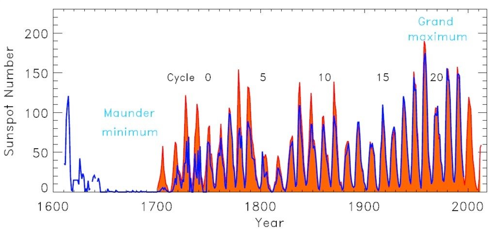
Given the close correlation between group sunspot number, and the international sunspot number, it is reasonable to suppose that the group sunspot number would also have rapidly declined in the early 21st century (indeed, that it may be verging on a Grand Solar Minimum). Regardless, it is clear that there is an increase in solar activity from the late 18th century to about 1950, which may have contributed the rapid increase in temperature in the early 20th century. Since, circa 1950, however, it has been in decline, and since 2000 in rapid decline. Therefore it can only have mitigated, not enhanced the rapid rise in temperature from about 1970 to present, although it may have contributed to the apparent reduction in the rate of increase in temperatures since 2007. Direct observations of the Total Solar Irradiance, however, show the contribution to either must have been minimal.
Pink merely trys to present old information without commentary in the hope that, absent that commentary the visual image may decieve, wheras actually understanding the graph shows it to in no way support the viewpoint pink has pushed in the past.
-
Eclectic at 23:28 PM on 23 October 2016It's the sun
Sorry Pink, but the Notrickszone .com has an abysmal level of accuracy. They'll tell you that black is white, if that's the particular propaganda line they wish to push at the moment.
That site is something like 97% garbage - you can find almost any sort of misleadingly massaged information there. Basically you are wasting your own valuable time by going there.
Please look elsewhere, if you seek more reliable information. And please use your critical facilities. And where better to start, than right here on the SkS website ! It is a very useful entry portal to climate science in general, and to more detailed information sources.
Pink, as a small point, e.g. with your Aanda. org link ( which you haven't yet motivated me to read ) , please show consideration for your readers' own valuable time, by (a) activating the link, and by (b) giving a short description or "thumbnail sketch" of what's in the link, and of why you think it is significant. ( There's so much rubbish out there on the internet, that it's all too easy to waste 60 seconds of irrecoverable time, assessing something that just isn't worthy of attention. )
Moderator Response:[JH] Pink's Aanda. org link was deleted because it violated the SkS Comments Policy which prohibits naked urls.
-
pink at 22:27 PM on 23 October 2016It's the sun
http://notrickszone.com/wp-content/uploads/2016/10/Modern-Grand-Maximum-Usoskin14.jpg
study shows above normal solar activity in the 1900-2000 period.
Moderator Response:[JH] Please do not post a url without an explanation of what it links to and why it is relevant to either the OP or the commentary or both. Posting naked urls is prohibited by the SkS Comments Policy.
-
Glenn Tamblyn at 15:54 PM on 23 October 2016Insight into the scientific credibility of The Guardian climate coverage
OK. Lacrosse it is then.
-
Art Vandelay at 15:54 PM on 23 October 2016Insight into the scientific credibility of The Guardian climate coverage
Done -provided you dont mention the cricket, the league, the netball... :-)
LOL:)
I think NZ is now the no.1 ranked RL team though too, so that leaves us with Cricket and Netball.
Unfortunately, there's no equivalent to underarm bowling in Rugby.
-
scaddenp at 14:48 PM on 23 October 2016Insight into the scientific credibility of The Guardian climate coverage
"And on the subject of football, please don't mention the rugby. :)" Done -provided you dont mention the cricket, the league, the netball... :-)
-
Digby Scorgie at 07:52 AM on 23 October 2016Insight into the scientific credibility of The Guardian climate coverage
nigelj @16
Here's another snippet: I'm a regular reader of the weekly New Zealand Listener. I notice that from time to time they publish articles on climate change that are, as far as I can tell, very accurate and informative. Their letters to the editor include comments that generally support the science (including some from me). Some years ago there were more letters denying the science but these have dwindled significantly since. I find the Listener's coverage of climate change most encouraging.
-
nigelj at 07:34 AM on 23 October 2016Global warming continues; 2016 will be the hottest year ever recorded
I’m at a loss for words. The graph kind of says it all. It’s just astonishing and concerning.
I take your point that a reasonable estimate of 2016 puts things close to the middle of model estimates.
In a way next years temperatures will be more revealing. A shallow la nina would suggest temperatures have jumped to a completely new level.
-
nigelj at 06:47 AM on 23 October 2016Insight into the scientific credibility of The Guardian climate coverage
Art Vanderlay @ 13.
Yes fair enough in the main. I would categorise myself as a political and economic centrist, or moderate. Mildly centre left / liberal by instinct, but I would emphasis mildly. I try to analyse things and see both points of view, rather than going purely with my gut. My philosophy is markets are good, but government is often needed in smaller countries, for what should be self evident reasons.
The huge political division in America seems counterproductive to me, and rather alarming, but things are not that divided in NZ. I get the impression Australia is between the two somewhere.
I think this big huge division on climate science is very clear in America and reflected in polls and a range of evidence. I dont think the division is so large in NZ, - but there is still a clear division.
Regarding climate change and the media.
I think it's well proven that the vast majority of climate scientists agree we are altering the climate. I get bored about arguing whether its 75% of scientists or 90% or 95%. It’s provably a big majority, therefore I would expect the media to give some dominance to mainstream warmist views, and less to sceptical views. I don’t consider this alarmist as such.
However it’s very important to still report on sceptical views, providing they are not barking mad ones. The media can't report every arm chair sceptics views as there are millions, so should be doing their homework and reporting the good sceptical views (although I personally think there are few of these left).
I do think it’s fair that the CO2 and plant growth issue should perhaps have got a mention, however the caveat is that this extra growth includes weeds, and there’s evidence it’s not the desirable sort of growth and is offset by less growth of important crops etc. So any article on it should responsibly include the pros and cons. Often sceptical articles are very one sided, more so than warmist articles in my view.
This is really important to me personally, namely that articles on climate science fairly represent the full range of evidence. I get angry when I read articles that simplistically say "research says climate sensitivity is low" because only a minority of reasearch says this. It's misleading. But obviously theres a place to at least report on such research.
Regarding the NZ media, especially the Herald newspaper, which is dominant in NZ, news articles tend to give prominence to warmist reports on the science. For example "2015 was a hot year". However headlines generally lack too much hype. Sceptical research is not reported much in the news sections.
However the opinion section of the Herald certainly contain a mix of warmist and sceptical views. But we still tend to get a fake balance of a 50 / 50 split of views, which is increasingly not justified given that most climate scientists think we are warming the climate. However I certainly have no problem with at least some sceptical views being published, provided they are in proportion to real opinion of climate scientists and not a fake balance.
There is also a difference in numbers of articles and how headlines are reported and whether they scream out. I just think in NZ that warmist articles generally have more subdued titles these days.
I won't mention the Rugby, but it’s really hard not to. Ha ha.
-
Tom Curtis at 21:51 PM on 22 October 2016Insight into the scientific credibility of The Guardian climate coverage
Glenn @14, I know southerners like to give themselves airs, but even they should recognize that Australia's northern border is not the Murray. For what it is worth, Rugby League is by far the best of the three main winter codes in Australia; although I will readilly concede that arial ping pong slightly amuses.
-
Glenn Tamblyn at 20:35 PM on 22 October 2016Insight into the scientific credibility of The Guardian climate coverage
Art
Of course we wont mention 'the rugby'. As any 'true ozzie' knows, Australian Rules is the only true football code in the enrire Universe. :-) -
Art Vandelay at 12:14 PM on 22 October 2016Insight into the scientific credibility of The Guardian climate coverage
Michael@ 11,
Yes, you're right. I live down under in Australia, not the USA, so my perceptions are obviously shaped by our media which is obviously more balanced, or at least more devoid of extremism.
Our ABC and Fairfax press don't push climate skepticism / denial, and I should add, my use of the word "alarmism" doesn't imply exaggeration. Climate change is obviously something to be alarmed about.
In Australia, it's really only News Corp media that pushes climate skepticism, but in recent times not so much, probably because the global temperature is at an all time high and weather events are increasingly conspiring against the skeptical narrative.
And Nigalj@12, thanks for the assessment of NZ media. I would have thought that NZ was similar to Aus, although the Green movement is probably stronger on this side of the ditch.
Good points re opinion too. Opinion is fine but when it's an uninformed or politically biased opinion it counts for naught, and readers of mainstream media rightly expect and deserve a well researched and considered opinion, and that's often lacking.
Also, media bias is often expressed in what isn't reported as much as what is. An explample of this is a recent news article on a peer reviewed study that showed how the world is getting greener due to CO2. The story was run in the News Corp papers, though not surprisingly they omit most news on important climate research as well as news stories on climate related disasters. Mind you, this can cut both ways too, and news of research that finds isolated benefits of CO2 or temperature is often only to be found in the News Corp media.
Austrralia is no different to other western countries though, exhibiting a growth in support at (both) extreme ends of the political spectrum, and as one who sits more to the centre, I'm increasingly frustrated by this battle of polar opposites, where climate change and many other important issues, including economic and social, are used as political footballs instead of being actually addressed.
And on the subject of football, please don't mention the rugby. :)
-
nigelj at 08:38 AM on 22 October 2016No longer taken seriously, we're seeing the last gasp of climate denial groups
Andy Skuce @6, thanks for the reference. I hadn't read that before, and I agree with the points made.
One thing caught my eye and is worth a comment. Your article quotes Ridley “But what made the bubble of the 2000s so much worse than most was government housing and monetary policy, especially in the United States, which sluiced artificially cheap money towards bad risks as a matter of policy and thus also towards the middlemen of the capital markets. The crisis has at least as much political as economic causation, which is why I also mistrust too much government.”
I have read plenty about causal factors in the GFC. Government housing policy probably didn’t help, but the government is not responsible for monetary policy! That is the privately owned Federal Reserve, which was run by Alan Greenspan. He is a libertarian like Ridley and implemented very low interest rates that caused the housing bubble, and convinced the government to reduce banking regulation, a major factor in the crash. Ridleys own ideology was instrumental in the crash, but he can’t or won’t see it.
Of course business can benefit from “risk taking” and the creative destruction of capitalism. But it’s a fine line. Bank crashes can bring the entire global economy down. Some sections of the business sector benefit from regulation.
Ridley is taking his penchant for risk taking, and concerns about freedom of the individual and applying this ideology to the management or conservation of the planet. In other words leave it to markets.
Markets are brilliant at some things, however the record of markets and the environment is not good. Its a dysfunction that requires regulation of actvity that impacts on the environment, something that overall has a very successful history. Ridley refuses to acknowledge the obvious evidence so cannot call himself "rational" as he tends to do.
Individuals do not have the right to cause reckless harm to their community. This is virtually the basis of western law and order and is a fundamental values decision. Therefore the community as a whole also have rights to ensure business does not get carried away and undermine the foundations of the global environment, provided business has a decent level of freedom, so its a balancing act. Ridley has to accept there have to be boundaries of some sort.
-
nigelj at 07:34 AM on 22 October 2016Insight into the scientific credibility of The Guardian climate coverage
Art Vandealy @10
You said "Out of interest I recently sifted through the mainstream media looking for climate headlines and found that the ratio of alarmism to denial was in the order of nearly 50 to 1.”
What media in what country? Seriously your sample would be unlikely to be representative of the world as a whole.
However America certainly stands out because we all watch their media a bit. I agree with M Sweet. My own observation is Fox news and others is certainly saturated with climate denial, sometimes overt and highly provocative, sometimes subtle.
I live in NZ and the mainstream, dominant media are restrained in their reporting on evidence of climate change, (more so these days, it was somewhat alarmist in the past) but their sceptical leaning articles are somewhat more provocatively worded.
It also depends on what one means by "climate alarmism". Predictions of sea level rise of half to one metre by centuries end are not alarmism. This is just reporting on the mainstream scientific position.
Screaming headlines about two metres might be alarmism, but so is screaming headlines “new study shows sea level rise likely to be insignificant”. I say this as I have seen headlines like this occasionally on both sides of the debate.
I take your point about freedom of speech, which is always just so important and a truly worthwhile value. However with the media it’s complicated. They can’t report everyones opinions because theres not enough space and it would become incoherent. Their job is to select stuff that is fact based and opinions that are at least coherent, even if provocative (if you know what I mean).
Of course it depends on where the information is in the media. If we are talking the news or environment sections, people like the guardian are expected to be fact based and balanced. Therefore if they are reporting on sea level rise they should in my view focus on middle level, sober, IPCC based estimates. On that basis the article above was right to criticise the guardian.
However various media have opinion sections as well. There can be more leeway here for the views of the eccentrics, so more extreme views, as long as we have a “range of views” to give some balance. I agree with you, I personally do like to see a range of views.
I believe the average reader differentiates between the news and opinion sections easily enough. Its very important these sections are kept quite separate!
Sadly with Fox, The Wall St Journal, and some other media theres not much balance and it is skewed somewhat towards climate denial. Any balance is somewhat tokenistic with this crowd.
-
michael sweet at 06:54 AM on 22 October 2016Insight into the scientific credibility of The Guardian climate coverage
Art,
You cannot live in the USA if you see so much Climate Alarmism. The Wall Street Journal, the largest selling newspaper in the USA, has a strong denialist editorial position. Fox News is in complete denial of AGW. You must cite a reference for your absurd claim that "Alarmism" outweighs "denial".
I just checked the news in the USA and I found that Denial outweighed Science 1000 to 1. Why should your numbers count more than mine?
-
Art Vandelay at 15:08 PM on 21 October 2016Insight into the scientific credibility of The Guardian climate coverage
nijelj@9 wrote "And it goes both ways. Some media over emphasise skeptical climate change stories with bold headlines like "new study proves climate change is not happening / over rated / is a scam (etc)."
A few years ago perhaps but not so much now. Out of interest I recently sifted through the mainstream media looking for climate headlines and found that the ratio of alarmism to denial was in the order of nearly 50 to 1.
Actually, unless you really go looking it's very difficult to find news stories that contradict the message that climate change is real and demands urgent attention.
Even the Guardian's interview with Lovelock isn't intended to contradict the prevailing climate change hypothesis and the claim that " CO2 is going up, but nowhere near as fast as they thought it would" is not necessarily a direct quote, and in the context of what followed I suspect that the quote was actually about temperature, not CO2, because Lovelock goes on (supposedly) to say that Singapore is one of the world's most desirable cities, because of, rather than in spite of, the temperature.
Personally, I liked the interview, mostly because I'm interested to hear a diversity of perspectives from a diversity of fine minds, so I wouldn't want the media to remove components of the interview for publication just because it may not be entirely factually correct. And if you start going down that road then where do you stop? For example, should Lovelock be prevented from expressing his views on the consequences of climate change, or the urgency or immediacy of required mitigation or adaptation etc? If what he says contradicts the IPCC or science agencies around the world, some might say yes.
To an extent this is a freedom of speech argument.
-
Andy Skuce at 13:27 PM on 21 October 2016No longer taken seriously, we're seeing the last gasp of climate denial groups
nigelj, we previously covered the debacle of the collapse of Northern Rock and how Ridley's catastrophic risk management was to blame.
-
nigelj at 13:08 PM on 21 October 2016Insight into the scientific credibility of The Guardian climate coverage
Art Vandelay @8, some media do indeed have rather alarmist titles on climate change, or get the facts wrong. No use pretending otherwise.
However The Guardian mostly do a pretty accurate job in my experience and without too much hype. The examples in the article tend to be the exception.
And it goes both ways. Some media over emphasise skeptical climate change stories with bold headlines like "new study proves climate change is not happening / over rated / is a scam (etc)." The new study invariably either says nothing of the sort, or is just some think tanks ridiculous, opinion, as opposed to a peer reviewed study.
The public most likely read between the lines, and know the truth is closer to the sober, measured reports by the IPCC. And this is more than concerning enough.
-
Art Vandelay at 12:36 PM on 21 October 2016Insight into the scientific credibility of The Guardian climate coverage
A bit of alarmism might help to propagate a message, but when it amounts to misinformation there's no doubt that the cause is undermined.
Just as every cold snap isn't proof that the climate isn't warming, every tornado, flood and tropical storm isn't caused by climate change, and nor is a day, month or a year of record high temperature empirical evidence thereof.
Of course, the media wants a climate change story, but unlike most news, climate change is not a 24hr phenomenon. This, I think, is what makes "climate change" difficult for news media to sell as a news story, without introducing misinformation, either deliberately or by unavoidable inference.
And even when climate related news is scientifically factual it's often presented under the banner of an alarmist headline, such as, "Arctic Cities Crumble as Climate Change Thaws Permafrost", and often with a distressing photograph for added visual effect and impact.
What needs to be appreciated is that the media needs to sell stories to make money, and climate change is a very long and mostly boring story.
-
nigelj at 11:16 AM on 21 October 2016Insight into the scientific credibility of The Guardian climate coverage
The Guardian does occasionally highlight worst case scenarios a bit much. The mainstream media can’t help themselves as they know this gets people buying newspapers.
However overall in my experience, all praise for the Guardian for mostly getting it right with good, restrained, reliable, balanced coverage on climate change.
-
nigelj at 11:10 AM on 21 October 2016Insight into the scientific credibility of The Guardian climate coverage
Denisaf @ 5, I dont find the article remotely confusing.
You seem upset the article doesn't deal with how to build sea walls. This is because this particular article is about climate science, if thats ok with you. Climate science is actually quite important, as is how it's reported in the media.
Prev 438 439 440 441 442 443 444 445 446 447 448 449 450 451 452 453 Next


