


 Arguments


Recent Comments
Prev 503 504 505 506 507 508 509 510 511 512 513 514 515 516 517 518 Next
Comments 25501 to 25550:
-
Glenn Tamblyn at 23:37 PM on 6 June 2016Donald Trump wants to build a wall – to save his golf course from global warming
Personally, I think that the sense of how much damage Trump could overtly do is over-stated. The government has a lot of formal checks.
But the informal checks available to the system to stymie a truly bad presient are enormous. 'Yes Mr President, we have the executive order, but SEAL TEAM 5 en-route to the target zone had to abort due to smoke in the cockpit (from some toilet paper they lit because I told them to)"If Trump tried to do many of the things he talks about, the phrase 'It's lonely at the top' may take on a whole new meaning.
Because at the end of the day, Trump isn't Putin. If Trump's behaviour suggested he was a cold-hearted, dead-fish scary bastard like Putin who also could work a crowd, then be very afraid. But he isn't Putin.
The Donald knows how to close the deal. He knows f@c&-All about what to do after that - as his business track-record shows.
The real threat Trump poses is what damage his paralysis, failure, and emotive ineptitude in office might cause.
His overt actions don't count - the intitutions of America, formal and informal are too strong for that.
But the incidental consequences of his floundering around. Oh My God.
Hilary Clinton may be struggling to match The Donald as a cheap carney salesmanperson. But she, and many others, will give him a master-class in how to use systems to rip someones heart out after he is in office. Parts of the Republican machine know how to do this. The Donald is ignoring them. -
erich at 16:26 PM on 6 June 2016In-depth: Experts assess the feasibility of ‘negative emissions’
Soil Biology is our only way to rapidly and massively draw down CO2 from the air to offset our ongoing and past carbon emissions, It Can safely and naturally restore the hydrological cycles by increasing biogenic aerosols and cloud albedo that can readily cool the planet by the 3 watts/m2 needed to offset the now locked in greenhouse warming effects and avoid the Storms of Our Grandchildren.
The French have lead the way recognizing Soil Carbons' value and committing to build Soil Carbon by 0.40% annually. Putting them on the road to Carbon Negativity before any industrialized country. 25 nations have signed on to 4p1000. 100 of the 196 countries in Paris submitted plans to reduce CO2 via agriculture, forestry and replacing soil carbon into their programmes.
http://4p1000.org/understandA combination of Best Management Practices, (BMPs), for Agriculture, Grazing & Forestry with bioenergy systems which build soil carbon can deliver the giga-tons of carbon necessary into the soil sink bank.
Ag BMPs; 1 GtC, New Forest & BMPs; 1 GtC
Pyrolitic Bioenergy, Cooking Stoves; nearly 1/2 GtC
Industrial Pyrolitic Bioenergy; 2 GtC
Holistic Grazing; 2+ GtCOver 6 GtC,
So soils & biota can do more than half the 10 GtC reduction job, feeding carbon to life instead of death.Carbon Sequestration Cascade;
Each Black Carbon gram (biochar & humus) can increase Water Retention by 8 grams, and can support 10 grams of Green Carbon, which each can feed up to 10 more grams of fungal mycelium White Carbon growthCarbon has been fundamental to life since the birth of our planet. It’s the source of all wealth and the conduit of all joy. Carbon cycles among and between billions of interconnected earthlings, whose fates teeter on the element’s return trip to the soil. Only the generous reciprocity inherent to life macrocycles can restore abundance and harmony to the planet of the living. May we celebrate a happy Intended Anthropocene, anointed in water & Soil rather than Oil and Blood.
Soil-C Farming of Oz
"The Cat's Cradle"
Improving Agricultural Productivity and Economic Viability through Improved Understanding of Natural Systems
http://biochar.us.com/584/cats-cradleClean Biomass cooking is no small thing.
The World Bank Study;
Biochar Systems for Smallholders in Developing Countries:
Leveraging Current Knowledge and Exploring Future Potential for Climate-Smart Agriculture
http://fb.me/38njVu2qz -
Haze at 15:23 PM on 6 June 2016Donald Trump wants to build a wall – to save his golf course from global warming
KR @25 Fair enough but if I did that someone could and likely would, accuse me of selective editing. I agree there is a lot there but although it is not climate change orientated it does believable commentary on what is driving many US voters into the arms of a man who is no friend of those who are supporters of action to address climate change.
-
KR at 12:55 PM on 6 June 2016Donald Trump wants to build a wall – to save his golf course from global warming
Haze - You might consider highlighting the important points you see in such articles, rather than block copying entire articles without any interpretation. TL;DR.
Yes, there is considerable dissatisfaction with current US politics; the current Legislature is gridlocked, the Tea Party represents the worst of manufactured movements intended to prevent legislation, and the amount of money going into elections is by itself a corrupting influence. But that doesn't change the fact that the common elementins Trump supporters are liking simplistic authoritarian statements promising no change, with woe to those who disagree.
-
Haze at 11:37 AM on 6 June 2016Donald Trump wants to build a wall – to save his golf course from global warming
My apologies. I have just read a piece in yesterday's Australian Financial Review (paywalled) by T J Pempel Professor of Political Science at University of California Berkeley. In this piece, writtten for an audience in Asia' He does address the question for which I have been trying to elicit answers.
He commences "Virtually every Asian academic, business leader, policymaker or taxi driver I have encountered in the past six months has, within minutes, pummelled me for answers to the Trump question.
They are flabbergasted that a man so bereft of political experience, foreign policy know-how and macroeconomic basics, who radiates disdain for foreigners, women and the disabled, has come to dominate the American political dialogue. Bemused befuddlement at a self-aggrandising buffoon has given way to ripening anxiety that he may well become the next occupant of the Oval Office, unleashing disastrous consequences for economic and security relations across the Asia-Pacific.
There are four points that Asians must understand about the Trump phenomenon."
"First Driving American voters today is a toxic cocktail of anger at what appears to be a rigged economic system serviced by a self-serving political class. Fraudulent financiers crashed the economy in 2008 but got huge bonuses instead of jail cells. Corporations and top executives offshored the manufacturing jobs that once provided stable middle-class lifestyles for swaths of the American public. The social safety net is frayed, infrastructure is collapsing and costly education provides little guarantee of upward mobility. Meanwhile, Washington politicians serve wealthy donors while the government spends trillions of dollars on losing wars in Afghanistan, Syria and Iraq."
"Second, Trump is the logical consequence of decades of Republican Party actions. Richard Nixon's "Southern strategy" drew in white voters upset about programs that enhanced minority electoral and social power or challenged the views of evangelical Christians. Since then, the Republican Party has gained voter support by promising to reverse what many see as the erosion of traditional American values."
"The third point is that Trump could win. America's punditry has not been short of predictions about how the Trump campaign is certain to go down in flames. The Republican establishment is split. The party's support level has plummeted. The Democratic Party has a built-in Electoral College advantage that will be bolstered by bipartisan waves of voters appalled at the prospect of a Trump presidency. Such claims certainly make a powerful case for Trump's defeat.
Yet the pundits now predicting a Trump thumping are the same ones who argued that he could not get more than 10 per cent of the Republican primary vote, that the Republican establishment would not "allow" a Trump nomination or that media exposition of his inconsistencies would doom his candidacy. All such predictions have proven hollow."
"Finally, a Trump presidency would be catastrophic for Asia. His campaign is bereft of foreign policy expertise and numerous experienced Republican operatives have declared their unabashed opposition to him. Would some of them join a Trump administration? Quite possibly, but hardly in the numbers needed to offset Trump's "America first" prioritisation.
Economic relationships from regional trade pacts to multilateral institutions are likely to become fodder for Trump's self-proclaimed expertise as a deal maker. So too are decades-long alliances, America's longstanding commitment to nuclear non-proliferation, its nuanced efforts to balance engagement with hedging in China policy and the determination to balance US military muscularity with diplomatic sensitivity"
The author does not cmment on Climate Change
-
Haze at 11:09 AM on 6 June 2016Donald Trump wants to build a wall – to save his golf course from global warming
I seem not to have communicated what I was hoping to do. The point I was trying to make is not whether commenters here or elsewhere, do or don't like Trump or his supporters but that someone (Albrechtsen) has had the wit to focus on why Americans are voting for Trump. And chriskoz at 18 surely that is entirely germane to this thread.
-
chriskoz at 10:27 AM on 6 June 2016Donald Trump wants to build a wall – to save his golf course from global warming
Mods, I have accidentally downgraded Haze@18 post, for which I'm sorry beacause the interface does not allow me to bring it back to "zero". It'd be good the interface be improved to allow me to correct my mistake. It only allows me to flip my grading back to "thumb up". The post/question is fair but does not add any value to this thread, so does not deserve "thumb up". So I left it "thumb down".
-
ubrew12 at 05:59 AM on 6 June 20162016 SkS Weekly News Roundup #23
Regarding articles like 'Warming could boost carbon storage in Alaska's Forests': I expect, long term, the carbon equation in Northern Forests and permafrost areas would favor their being a net source. Entering an interglacial, when Earth tilts to cast more sunlight on the Northern Hemisphere, we know that global carbon dioxide levels increase after a few centuries. I expect much of this is coming from newly warmed Northern latitudes, like Alaska.
-
pongapundit at 04:36 AM on 6 June 2016Water vapor is the most powerful greenhouse gas
In my view, water vapor is effectively anti-greenhouse. Here is how. In 10k-40k feet height, water vapor in the atmosphere gets converted into tiny ice crystals. These water crystals floating in upper atmosphere reflect the sun rays away from the earth (back to the empty space) in the same way that cirrus clouds do. If the skies were clear, the sun rays in pristine form, falls on the ground and ocean, creating the appropriate differential of pressure and temperature to create conducive condition for precipitation (rain). Absence of a strong sunlight is what preventing timely rains. And this is what probably damaging the world weather systems.
The biggest question is how can water vapor go to upto 40k feet altitude? The culprit is — aviation exhaust (i.e. exhaust made by jet airplanes). The exhaust mainly contain CO2 + water vapor. We must cut down on water vapor emitted by air traffic if we want to save the planet's weather system.
Further reading:
http://phys.org/news/2005-12-probing-commercial-jet-traffic-affect.html#nRlvhttp://phys.org/news/2011-03-airplane-contrails-worse-co2-emissions.html
Moderator Response:[PS] Fixed links: This does not really belong here. Replies to this thread please where the Burkhardt and Karcher paper is already discussed in comments.
-
KR at 04:09 AM on 6 June 2016How do we know CO2 is causing warming?
nodeniro - See the link that John Cook gave in his response to that very comment by WAG, pointing to Empirical evidence that humans are causing global warming. We start from the science that indicates CO2 is a powerful greenhouse gas (spectroscopy, atmospheric structure, thermodynamics), and from there correlations are useful for determining exactly how much of an influence CO2 is relative to other forcings, such as solar changes, aerosols, land use, etc. Correlation without causation (common in climate change denier arguments searching for alternatives) is an empty assertion, but correlation with causation is a valid tool - when, as here, it's backed by physics.
-
nodeniro at 01:49 AM on 6 June 2016How do we know CO2 is causing warming?
The number 2 comment by WAG exhibits a classical mistake of logic. The comment points to a correlation between CO2 and temperature. Then the comment asserts that causation is present, unless somebody proves otherwise.
-
KR at 01:32 AM on 6 June 2016Donald Trump wants to build a wall – to save his golf course from global warming
scaddenp - From the first link I gave above:
Right-wing authoritarianism is characterized by obedience to authority, moral absolutism, racial and ethnic prejudice, and intolerance and punitiveness towards (those perceived as) dissidents and deviants.
That's certainly the attitudes Trump supporters have been showing. I think the appeal is the _simplicity_ and clarity of the leaders claims, regardless of any other value such as being true, or even sane.
-
scaddenp at 17:17 PM on 5 June 2016Donald Trump wants to build a wall – to save his golf course from global warming
Haze, I dont know that imparts a better impression of Trump supporters. It seems that he has made it okay to be a misogynist, racist bigot and violent into bargain. I dont drink latte and could only be considered "leftie" in extreme parts of the world (maybe some midwest States but I dont know the USA), but I would much rather sit down with them then those trapped in history with attitudes that have had only negative impact on humanity. You seriously think political parties should be paying court to such dinosaurs? Concerns about jobs and uneasy about change, I can understand. Racism and tribalism masquerading as christianity, I cannot.
-
One Planet Only Forever at 15:16 PM on 5 June 2016Scientists compare climate change impacts at 1.5C and 2C
GreenHearted@5,
Hopefully you are not expecting climate scientists to 'create a solution'.Climate scientists develop and provide advancements of information and understanding (including clearer understanding of the likely consequences of 1.5C and 2C warming).
All of the world's wealthiest people and political leaders are the ones to demand a solution from.
As a minimum there should be powerful popular demands for all of those wealthy powerful supposed leaders of global humanity to declare that the only legitimate people with wealth or power are the ones who can prove their actions have promoted the advancement of humanity to a lasting better future for all of humanity into the almost eternal future humanity could enjoy on this amazing planet.
The lack of popular demand for that type of leadership is the real problem.
A related problem is that getting away with less acceptable behaviour is almost always more profitable and cheaper (the one getting away with being least acceptable has a temporary competitive advantage, temporary for as long as they can get away with it). That fact makes it easier to drum up popular support for understood to be less acceptable behaviour than it is to gain support for more responsible behaviour that develops a gift of a better future for the benefit of future generations.
One of the most galling evaluations performed by supposed leaders pretending to look like they care about this issue is the comparison of the perceived lost opportunity for the wealthy in the current generation to avoid imposing costs on future generations. The objective of such evaluations is to create the impression that it is OK to impose costs on future generations if the future costs as evaluated by today's generation will be equal to or less than the perceived lost opportunity of today's generation of greedy callous opportunists (which is obviously unacceptable when it is actually thought about - negative impacts on future generations are inexcusable, regardless of temporary developed tastes for regional popular support of such clearly unacceptable actions).
So climate scientists are not responsible for coming up with a solution. Leaders need to be required to prove they are pursuing valid solutions - proven valid based on the constantly improved best understanding of what is going on and how to advance humanty to a lasting better future for all.
-
KR at 12:34 PM on 5 June 2016Donald Trump wants to build a wall – to save his golf course from global warming
Haze - Actually, Trump supporters are best characterized by one common trait, that of the authoritarian mindset; a belief in absolute obedience to authority. Linked with simplistic thinking, intolerance of ambiguity, and racial prejudice, it is the sole statistically significant variable linked to support for Trump. See articles on this link here and here, as well as many others.
Unfortunately, this trait in a leader bodes poorly for issues with shades of gray, adherence to constitutions, and for that matter the rule of law - many of his statements would lead straight to constitutional violations, interference with the judicial branch, and for that matter foreign policies that could be described as war crimes (stating we should just attack the families of those in ISIS, which would be an illegal order to the military). Simplistic absolute statements (particularly those with little relation to reality, such as Trumps - he seems willing to say absolutely anything to appeal to whoever is in front of him) don't do well with the shades of gray and complexities of actual life and politics. While spouting such simplistic statements seems appealing to those who feel disenfranchised, it's no way to run a country.
Seriously, this is a man who in a national debate went on about the size of his genitalia. Perhaps not the best choice to lead the US...
-
william5331 at 07:20 AM on 5 June 2016Greenland’s Melt Season Started Nearly Two Months Early
It is alwas significant when weather events exceed previous records or occur outside previous time boundaries. Incidentally, have you seen the Mana Loa Carbon dioxide results for April. They are 4.16C above the previous April. It remains to be seen if this will continue. We should have the results for May in a day or two.
-
GreenHearted at 03:12 AM on 5 June 2016Scientists compare climate change impacts at 1.5C and 2C
The IPCC assessments have been projecting the impacts of 1ºC to 5ºC since the Third Assessment in 2001 at least. The 2007 AR4 made it totally obvious that impacts above 1ºC will be highly dangerous, >1.5ºC disastrous, and >2ºC catastrophic. The Stern Commission in 2006 also included projected impacts of 1-5ºC. Given that 2ºC was never a scientific limit, and that the most vulnerable nations practically begged for a 1.5ºC limit (and some a 1ºC limit) in Copenhagen in 2009 (ahem, six years ago), why has 1.5ºC come as such a surprise to climate change scientists?
I just read a quote from Slavoj Žižek, a Slovenian philosopher: "Love is what makes sex more than masturbation." I am not feeling the love from scientists these days, if you get my drift. If +2ºC is really super bad, and +1.5ºC is only slightly less bad, why on Earth do scientists need "a comprehensive overview of the differences in climate impacts at these levels" or more "robust" science on 1.5?
What, pray tell, is keeping climate change scientists from declaring their love and getting on with the task of helping us attain zero carbon emissions?
-
Trevor_S at 22:06 PM on 4 June 2016Scientists compare climate change impacts at 1.5C and 2C
Professor Kevin Anderson presentation on this
-
denisaf at 21:16 PM on 4 June 2016Scientists debate experimenting with climate hacking to prevent catastrophe
Irreversible rapid climate change and ocean acidification and warming is under way. Reducing the rate of emission of fossil fuels with only slow down the increase in these processes. Adapting measures to cope with the consequences, such as sea level rise, should be a widely adopted policy.
-
denisaf at 17:24 PM on 4 June 2016Scientists compare climate change impacts at 1.5C and 2C
"Both 2C and 1.5C are explicitly mentioned in the Paris agreement as potential upper limits for global warming since the preindustrial era," is in the article. There can be no limit to global warming (or ocean acidification and warming despite the views freely expressed. The greenhouse emissions have already put in train an irreversible process. Reducing the rate of emissions will only slow down the rate of warning slightly with absorption in the oceans continuing to impact on the atmospheric concentration level.
-
Haze at 17:02 PM on 4 June 2016Donald Trump wants to build a wall – to save his golf course from global warming
In marked contrast to most commentators both here and in the wider community, Janet Albrechtsen in todays Weekend Australian (http://tinyurl.com/j5al372) has looked at the reasons for Trump polling so well across the US. This comment of hers sums up the approach of many to Trump "
"Rather than depicting Trump supporters as angry channel surfing reality TV deadbeats, what about explaining to Australians the genuine concerns of millions of American voters? And when will the regular Sunday morning snickering about Trump on Insiders give way to thoughtful analysis?" Good for Albrechtsen who has considered the reasons for Trumps success an approach to which I referred in my comment @9 made some time ago. There are many in many Western countries, who are sick of the politicsl correctness enforced by the "latte sipping left" and who feel entirely abandoned by their major political parties"
-
Tom Curtis at 14:46 PM on 4 June 2016Most of the last 10,000 years were warmer
A slight ammendment to my preceding post. The version of the Global Warming Art holocene temperature record with more recent times to the right was available from Global Warming Art from as early as July 2007, even if it was not uploaded to wikipedia till 2010. Also, Easterbrook's cut down version appears as early as May 2010. My sentence immediately preceding the graph above is therefore false. It remains the case that he took that graph and modified it to remove all information indicating warmer modern temperatures, and falsely indicated a very low modern temperature on his version of the graph.
In fact, the "present day temperature" shown on Easterbrook's graph, is just the final data point on the Global Warming Art graph, and represents a gaussian smooth of the data with a 300 year resolution, for the year 1950. As such, it is representative of the temperatures in the century prior to 1950, and not representative of the temperatures after 1950.
-
Ken in Oz at 13:38 PM on 4 June 2016Study Helps Explain Sea Ice Differences at Earth's Poles
Whilst this provides some understanding of the dynamics of Antarctic sea ice formation, I'm not clear on how it would explain growth of winter sea ice extent.
I have thought land ice melt and salinity were likely to be playing a significant part; are measurements of salinity of ocean water around Antarctica being taken and are they being related to land ice melt and sea ice? It seems reasonable to me that outflow of fresh water, which is less dense than saline sea water, would tend to concentrate near the surface and, having a warmer freezing point, would freeze more readily but empirical evidence would be very welcome.
-
John Hartz at 13:21 PM on 4 June 2016Donald Trump wants to build a wall – to save his golf course from global warming
Donald Trump makes people across the U.S. political spectrum quite nervous — and with good cause.
For example...
Donald J. Trump’s blustery attacks on the press, complaints about the judicial system and bold claims of presidential power collectively sketch out a constitutional worldview that shows contempt for the First Amendment, the separation of powers and the rule of law, legal experts across the political spectrum say.
Even as much of the Republican political establishment lines up behind its presumptive nominee, many conservative and libertarian legal scholars warn that electing Mr. Trump is a recipe for a constitutional crisis.
“Who knows what Donald Trump with a pen and phone would do?” asked Ilya Shapiro, a lawyer with the libertarian Cato Institute.
With five months to go before Election Day, Mr. Trump has already said he would “loosen” libel laws to make it easier to sue news organizations. He has threatened to sic federal regulators on his critics. He has encouraged rough treatment of demonstrators.
His proposal to bar Muslims from entry into the country tests the Constitution’s guarantees of religious freedom, due process and equal protection.
And, in what was a tipping point for some, he attacked Judge Gonzalo P. Curiel of the Federal District Court in San Diego, who is overseeing two class actions against Trump University.
Mr. Trump accused the judge of bias, falsely said he was Mexican and seemed to issue a threat.
“They ought to look into Judge Curiel, because what Judge Curiel is doing is a total disgrace,” Mr. Trump said. “O.K.? But we will come back in November. Wouldn’t that be wild if I am president and come back and do a civil case?”
Donald Trump Could Threaten U.S. Rule of Law, Scholars Say, Adam Liptak, New York Times, June 3, 2016
-
chriskoz at 10:58 AM on 4 June 2016Scientists debate experimenting with climate hacking to prevent catastrophe
funglestrumpet@7,
Your "sober" approach that considers the "extinction the human species" and ignores everything else is akin to destroying the entire global civilisation - all 7b individuals - leaving just a few thousand hunters-gatherers - all that is required to maintain our species. You probably don't realise the meaning of your post overwise you would not have posted it. Please try to realise next time.
Reading, needless to say arguing with such nonsense is a waste of everybody's time.
-
chriskoz at 09:49 AM on 4 June 2016Donald Trump wants to build a wall – to save his golf course from global warming
John@4
Let's also remember that US president signs all decisions of Congress into law. And he can refuse to sign anything that he does not like. that's a lot of power, even though Congree can subsequently overrule his refusal under some conditions. E.g. let's keep in mind that Obama famouly stopped KXL pipeline using that very power and Congress did not have enough numbers to overrule him. Had Trump been a president at the time, he would hapilly have signed it, and we would have KXL flowing full steam now.
-
Tom Curtis at 09:36 AM on 4 June 2016Donald Trump wants to build a wall – to save his golf course from global warming
John Hartz @14, much as I despise Donald Trump, I do not think he is literally insane. Therefore I do not think he would use the nuclear option.
What he is likely to do, if elected, is to trash the system of alliances that the US has built up since WW2 and which contribute to it being so dominant a global power. He will alienate allies, and trash the USA's chances of significant international cooperation on any point. He may also involve the US in conventional wars on, essentially, a whim.
Of greater concern is what he is likely to do the US economy. The reforms he will push, and which will likely gain support in a Republican dominated congress, will distort the economy in favour of the wealthy at the expense of the middle class, workers, and the poor. He may bring back some manufacturing by trashing NAFTA and bullying Mexico, but the real manufacturing deficit of the US is relative to the Asian giants (particularly China and Japan) who hold a significant portion of US foreign debt. If he pushes too hard, they may decide to retaliate by closing of the easy credit the US currently relies on, forcing a US depression worse than that of 1927. I don't think it will come to that, but if follows that Trump will not revive US manufacturing as he claims he will.
Trump cannot make America great again, as it still is great. He can certainly impoverish and weaken the US relative to Russia and China, and that is the most likely outcome of his policies.
-
Tom Curtis at 09:20 AM on 4 June 2016Most of the last 10,000 years were warmer
Mike Hillis @63, point by point:
1) The quote by Monckton at the head of the article is simply an example of the myth being propogated. It is not, as you suggest, part of an evidentiary chain other than to the point that the myth exists, and is propogated by at least some climate change deniers. What is more, by claiming that it is a fabrication that "the "myth" ... is based on a comment made by Monkton", you imply that Monckton has been misquoted. Following the link for the quote and scrolling down to the second box on page three proves that to not be the case. Monckton was not misquoted. He has used the myth. But the article made no claim that Monckton is the only denier to use the myth, or that he was the primary person to propogate the myth, contrary to your suggestion.
Monckton also explicitly ties his opinion to the GISP 2 record in another document (PDF) where he produces this graph:

He captions it, "Warmer than today: most of the period since the end of the last Ice Age has been
warmer than the present by several degrees Celsius" and writes:"Seen in the geological perspective of the last 17,000 years, the 300 years of recent warming, nearly all of which must have been natural, for we could not have had any significant influence except in the past 25 years, are manifestly insignificant."
The comment about the 300 years shows clearly that he is treating the terminal period of the graph, which actually ends in 1855, as ending in approximately 1995.
As a side note, he (not unusually) mislabels the source of the data, which is Cuffey and Clow (1997).
2) You also dispute that Monckton got the idea from Easterbrook, but Easterbrook propogated the idea in 2008 (PDF), where he produced this graph the below graph, saying:
"The global warming experienced during the past century pales into insignificance when compared to the magnitude of at least ten sudden, profound climate reversals over the past 15,000 years (Figure 5)"

Again, the graph is claimed to depict "global warming during the past century" even though the last data point on the graph in fact occurs in 1855.
Easterbrook even predates Monckton on the "some 9,100 of the past 10,500 years were warmer" meme, with an article on WUWT in December, 2010 claiming that:
"So where do the 1934/1998/2010 warm years rank in the long-term list of warm years? Of the past 10,500 years, 9,100 were warmer than 1934/1998/2010. Thus, regardless of which year ( 1934, 1998, or 2010) turns out to be the warmest of the past century, that year will rank number 9,099 in the long-term list."
As a side note, I am puzzled as to how he determines that ranking. Using the GISP 2 temperature data cached by Alley, from 8,905 to 8,915 of the 10,500 years BP in that record are warmer than the terminal data point. For Easterbrook to gain his ranking, he must conclude that 2010 was significantly cooler than the year he considered to be 1905.
As a further side note, the 2010 article by Easterbrook is the one discusses by Gareth Renowden above.
3) No claim is made in the OP that Easterbrook came to his conclusion as the result of just one study. The claim that he did so is false, but the only fabrication involved is your attribution of that claim to the OP.
4) You claim it is absurd that Easterbrook, as a geologist, did not know that Before Present refers to before 1950 unless otherwise specified, but in the 2010 article, his reproduction of the Alley data clearly labels the x axis "Years before present (2000 AD)", thereby indicating that he took "present" in this data to refer to 2000, not 1950. So far as I am aware, he still does so.
5) Regardless of his reasons, the paper trail clearly shows Easterbrook labeling the data that terminated in 1855 as "present global warming" thereby indicating the tail of that graph to be the warming during the 20th century (see graph above). Later he clearly labelled that data on an axis for years BP, glossed as being 2000 with a final data point at 95 years BP, ie, 1905 according to his axis.
To summarize, the purported fabrications are easilly proved to be true from the paper trail, except for two cases where the "fabrication" consists entirely in your misrepresenting the OP.
Your record on "the facts" is equally poor. It is true that, but entirely irrelevant, that the Holocene was labelled long before Easterbrook was born. The studies of Holocene temperatures that lead to the "spaghetti graphs", however, are all recent (last thirty years or so), and the spaghetti graph you used does not come from a peer reviewed paper, and was originally produced in 2005. Easterbrook has in fact used that graph, as you would know if you followed the links to the original version of the article, and back to prior history. However, he first used the current version of the graph (produced on the 19th of July, 2010, less than a week before he used it, but only after considerable editing to make it look like this:

Compared to the original, you will note that he has removed the "spaghetti". More importantly, he has also removed the indication of the 2004 temperature, the inset showing recent proxies, together with the rapidly rising instrumental record. That is, he has removed any indication that modern temperatures are in fact higher than those shown. He does not note that the zero point on the axis is "mid 20th century average temperature", but instead inserts a line approximately 0.3 C below the mid 20th century average which he deceptively labels "Present day temperature". In all, his treatment of this graph is much worse than his treatment of the Alley 2000 data, and cannot be construed as anything other than a deliberate attempt to deceive his audience.
It is, however, extraordinarily unlikely that Easterbrook, who obtained his graduate degree in 1958, saw any spaghetti graph of Holocene temperatures in highschool (none having existed back then).
Finally, the graph you cite clearly shows even mid 20th century temperatures to have been warmer than the bulk of the Holocene, while late 20th century temperatures were warmer than the multidecadal average over the entire Holocene.
In short, your "facts" are fictions. In some cases ridiculous fictions you invented without basis. In others, fictions you invented in direct contradiction to known evidence - indeed, evidence presented in the OP in one case. Skeptical Science is not a form where you are permited to just spin tissues of fabrication. You are expected to support your claims with facts, something you have signally failed to do at any point in this discussion. It is also hoped (though not required) that you change your views if fae moderators take a dim view of any further unsupported claims, or gish gallops by you.
-
John Hartz at 08:03 AM on 4 June 2016Donald Trump wants to build a wall – to save his golf course from global warming
Glenn Tamblyn:
You wrote: A President alone can actually do diddly-squat!
I repectfully disagree.
First and foremost, the U.S. President can at any time push the button to launch missles with nuclear warheads.
Given Trump's unstable personality, the thought of him having this power should send shivers up and down one's spin.
-
william5331 at 06:16 AM on 4 June 2016Scientists compare climate change impacts at 1.5C and 2C
These predictions ignore mass changes just as early estimates of ice sheet melting ignored the side effects of faster ice flows into the sea and only considered thermodynamics. If the Arctic Ocean becomes an area of prevailing rising air as the ocean warms, it should reverse the Polar Hadley cell and suck climate zones northward rather suddenly. In such an eventuality, all bets are off and we have sudden extensive crop failures in the Northern Hemisphere. Have you noticed that in the Mana Loa Carbon dioxide web site that CO2 from April 2015to April2016 is 4ppm. While this may be an effect of El Nino and the line on the graph will revert to the steady 2 to 2.5 yearly increase, it could also signal that one or more carbon sinks is shutting down. If so, the outlook makes redundant all studies such as this.
-
funglestrumpet at 06:07 AM on 4 June 2016Scientists debate experimenting with climate hacking to prevent catastrophe
Perhaps the moment has come when we (more precisely, those scientists in the relevant disciplines - including Guy McSpherson and Paul Beckwith - should collectively disband the IPCC and tell the world leaders to their face what a useless bunch of tosspots they really are. Having done that I suggest that a sober investigation into just how far away from extinction the human species really is would be really nice to know and if it is avoidable or not.
I cannot think of any other course of action that stands a chance of bringing them to their senses.
-
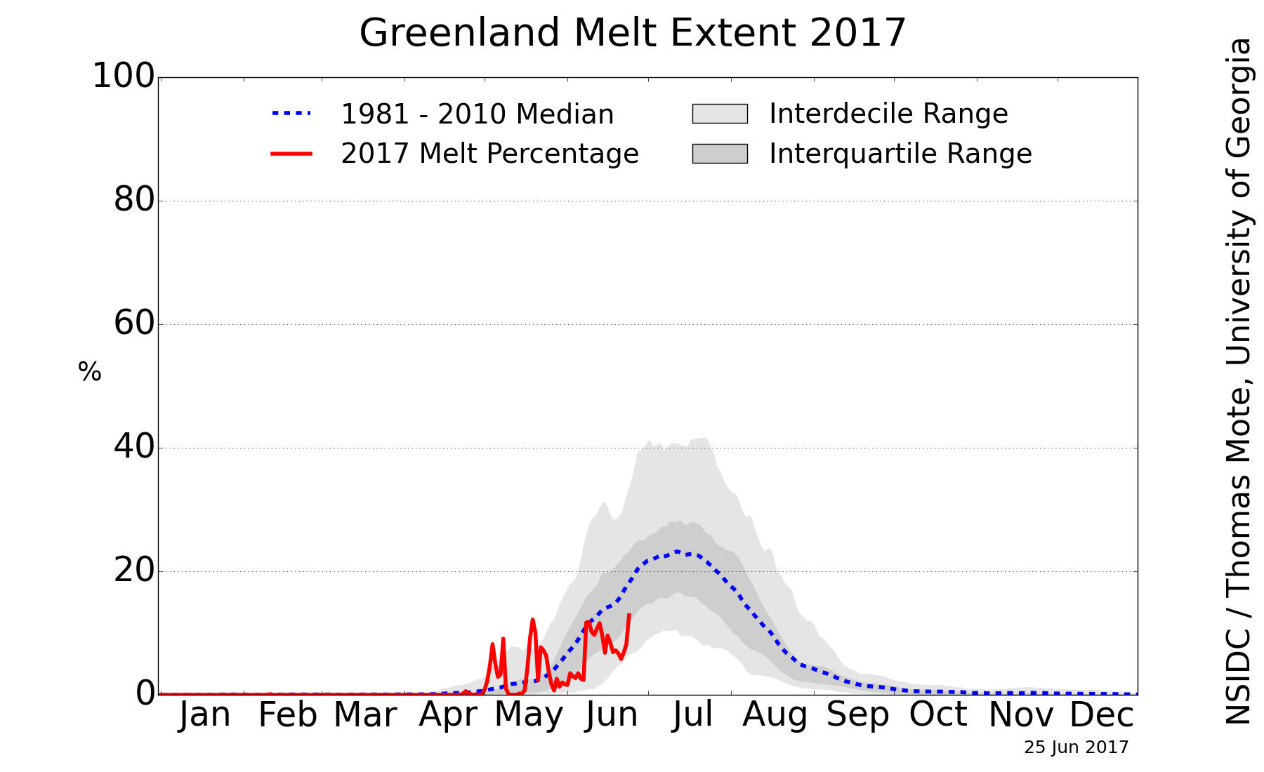
Firgoose at 03:28 AM on 4 June 2016Greenland’s Melt Season Started Nearly Two Months Early
I'm puzzled as to why this article has been posted. This article of Brian Kahn's was posted on April 12th and the Greenland situation since then has been spectacularly underwhelming compared to the drama in the Arctic, where the sea ice is quite likely to show a record-setting decline this year.
The early spike that occured in Greenland dropped to nothing and melting extent remained quiet for a while until another spike occurred in May. But that also dropped to nothing. There's very little story unless June sees the graph shoot way up from the current minimal levels. In fact the story could be how little melting there is, in comparison with the rapid disappeances of Actic snow and sea ice.
-
ClintonCallahan at 22:37 PM on 3 June 2016Scientists compare climate change impacts at 1.5C and 2C
Further distinctions between a 1.5C and 2.0C future are essential, especially regarding the 100x more powerful greenhouse gas methane which has been naively excluded from IPCC prediction models. Thank you.
-
Dcrickett at 08:51 AM on 3 June 2016Scientists debate experimenting with climate hacking to prevent catastrophe
"…we can only solve the [ocean acidification] problem by cutting carbon pollution OR by removing it from the atmosphere."
The "OR" should be "AND" — the task of preserving the oceans calls for far more than "Go thou and sin no more." To preserve the oceans, we must preserve the climate.
-
william5331 at 07:02 AM on 3 June 2016Scientists debate experimenting with climate hacking to prevent catastrophe
I shudder to think of us controling the heating of the atmosphere by some engineering feat while still spewing Carbon dioxide into the atmosphere, The funds run out or some other factor stops the ongoing injection of sulphur into the stratosphere. Mean time we are up at 500 or 600 ppm Carbon dioxide. The longer before the brown stuff hits the wind pusher the worse the situation would be. As fast as the changes are at present that we observe, the rate of change in such a scenario would be devestating.
-
r.pauli at 05:58 AM on 3 June 2016Scientists debate experimenting with climate hacking to prevent catastrophe
Looking back, somewhere in the 1980's, this would have been very exciting. Now it could be ironic epitaph. Kids, you will have great struggles ahead.
-
KR at 05:13 AM on 3 June 2016Donald Trump wants to build a wall – to save his golf course from global warming
dalesmith - Under the current conditions, any third party candidate could only act as a spoiler for the mainstream candidate they are closest to in outlook. And at this point I don't see any possibility of a late third party candidate drumming up enough support to split things enough to have a contested election.
If they somehow did, given the current makeup of the House of Representatives and the outsized influence of Tea-Party Republicans, I would consider that outcome nothing short of disaster for the US.
The only possible third-party candidate I might consider strong enough to invoke that disaster is Sanders - and I suspect he's intelligent enough to know what a mess that would cause.
-
jja at 01:23 AM on 3 June 2016Scientists debate experimenting with climate hacking to prevent catastrophe
I think it is just great that we need to have comic actors do psa's because our political leadership are bought off and will only gently push the envelope from behind the scenes if they are aware of the scientific reality at all. I wish that I could transport back to us today scenes of this planet 30 years from now when the Arctic sea ice melts out in mid August, and perpetual drought, hunger, migrations, sea level rise and mass human and animal die-offs are the norm. It wouldn't be so F_ing funny then.
-
Glenn Tamblyn at 23:24 PM on 2 June 2016Donald Trump wants to build a wall – to save his golf course from global warming
dalesmith
Irrespective of the arcana of the US presidential electoral system (and it does seem to an outsider to be extremely arcane), surely the issue is less the Presidency, and more the make-up of the Congress. A President alone can actually do diddly-squat! -
MA Rodger at 21:16 PM on 2 June 2016Temp record is unreliable
dvaytw @358.
Your 'guy' is quoting from AR5 SPM which does refer you to Sections 2.4 & 5.3 of the full report. His quote also sits cheek-by-jowl with Figure SPM-01a, the lower panel of which does show the confidence intervals for decadal measurements. Figure 2-19 also shows these for HadCRUT & also the differences between temperature series.
However, the main reason for there being doubt as to the interval 1983-2012 being the hottest 30-years in 1,400 years is dealt with in 5.3.5.1 Recent Warming in the Context of New Reconstructions on page 410-11 IPCC AR5 Chaper 5 which states:-
"NH reconstructions covering part or all of the first millennium suggest that some earlier 50-year periods might have been as warm as the 1963–2012 mean instrumental temperature, but the higher temperature of the last 30 years appear to be at least likely the warmest 30-year period in all reconstructions (Table 5.4). However, the confidence in this finding is lower prior to 1200, because the evidence is less reliable and there are fewer independent lines of evidence. There are fewer proxy records, thus yielding less independence among the reconstructions while making them more susceptible to errors in individual proxy records. The published uncertainty ranges do not include all sources of error (Section 5.3.5.2), and some proxy records and uncertainty estimates do not fully represent variations on time scales as short as the 30 years considered in Table 5.4. Considering these caveats, there is medium confidence that the last 30 years were likely the warmest 30-year period of the last 1400 years."
-
dalesmith at 20:22 PM on 2 June 2016Donald Trump wants to build a wall – to save his golf course from global warming
Many are buying in to a false dichotomy. There will be more than two choices for President.
This election may be the best chance for a third-party candidate to win. Hundreds of thousands of Republican voters have registered with the Libertarian Party since Trump became the presumptive nominee. There are hundreds of thousands of Democrats who have stated that they will not vote for Clinton.
If a third-party candidate can win a few states and get a few electoral votes then possibly no candidate will get the required 270 to win election. If that happens, due to an obscure constitutional mandate the House will have to pick the President from amongst the top three electoral vote getters.
With the current political climate, the Republican-controlled House might not pick Trump because most don't like him. They definitely wouldn't pick Clinton. So, they could pick the third choice (Gary Johnson?) as a compromise.
-
BBHY at 20:22 PM on 2 June 2016Scientists debate experimenting with climate hacking to prevent catastrophe
I think what we really need is to hack our political system.
Or rather un-hack it. It has already been hacked by the fossil fuel industries and their friends, preventing us from taking the proper steps to reduce CO2 emissions.
-
scaddenp at 14:05 PM on 2 June 2016Temp record is unreliable
The first thing to note is that this is based on comparing one measurement with another. No measurement is perfect, especially the measurement of NH atmosphere over 1400 years. This results in error bars on the measurement which, depending on methodology, can be expressed in probability terms. ie considering the spread of all sources of error in estimating temperature, we would say temp at time x is Tx and can estimate 66% or 95% error bars on that measurement. The IPCC claim is that error range on the modern 30year temp average is highe than the 66% error limit on past temperature (but not higher than the 95% limit).
Determining error bars is not a simple process. You would need to look in detail at the source papers to determine how that was done. If you look up monte carlo methods to estimating error propogation, you will see one way of doing.
I suspect you are arguing against wilful ignorance however. Good luck on that.
-
sauerj at 13:09 PM on 2 June 2016Ten years on: how Al Gore's An Inconvenient Truth made its mark
chriskoz @1, I thought your comment was extremely profound. Yes, for SkS to be born out of AIT really does make the evolutionary legacy of AIT quite monumental. Thank you for highlighting this point.
-
sauerj at 12:58 PM on 2 June 2016Ten years on: how Al Gore's An Inconvenient Truth made its mark
Thanks Knaugle for clarification. I was just asking to be super clear on the @3 text so that a denialist couldn't undermine credibility and feed doubt. I am in strong agreement (as I said in @4) that we will be ice free at the summer minimum by ~2030 and agree, as you say, that by then (or shortly thereafter, certainly by 2040) we will instead be measuring the duration of being ice free. Thanks again!
-
Glenn Tamblyn at 09:38 AM on 2 June 2016Ten years on: how Al Gore's An Inconvenient Truth made its mark
knaugle
That would be this graph...
Although some error margins on the earlier years estimates would be good. Those early years are coming from limited documentary sources. -
Glenn Tamblyn at 09:09 AM on 2 June 2016Most of the last 10,000 years were warmer
Mike Hills
Yoe perhaps need to look at the graph from Wikipedia more closely. Although the graph doesn't give a citation for its source, and in fact the section in Wikipedia on this notes the need for more citations, the results in the graph are broadly in line with the various studies available.
So look at the black line, presumably the average of the several studies. If that line, at the far right, actually reflected today, now, the 21st century, your point might be valid. But it doesn't! As the creator of the graph clearly shows. They include an arrow indicating the temperature in 2004 - close enoughto now. Clearly showing a temperature higher than most of the black line.
And the inset panel also clearly shows what they label 'recent proxies' showing a steep rise since then.Were temperatures largely falling during the Holocene? Yes, that is only what is expected.
Were temperatures at the start of the Holocene, before that fall somewhere around where they are today? Yes possibly, although this graph doesn't specifiy whether it is showing global temperatures, Northern Hemisphere temperatures or regional.
Were temperatures during the bulk of the Holocene higher than today? No. The very graph you use shows that.
-
villabolo at 02:44 AM on 2 June 2016Scientists debate experimenting with climate hacking to prevent catastrophe
I think that the f bomb was a little overboard. One round would have been enough and that without the child mouthing it.
-
MA Rodger at 02:21 AM on 2 June 2016Most of the last 10,000 years were warmer
Mike Hillis @63.
So you claim that "the bulk of the Holocene was warmer than today" and in evidence present a graph of proxy records from Wikithing that shows the bulk of the Holocene was cooler than 2004. And since 2004, 'today' has been subjected to over a decade of AGW. So we should perhaps add in that 2004 temperature. 2015 was 0.28ºC warmer than 2004 and applying that addition, a very small part of the proxy records in the Wikithing graph are presented as being warmer than today, certainly not in any way "the bulk".
Am I missing something? Or does your claim require a bit more support?
-
dvaytw at 02:01 AM on 2 June 2016Temp record is unreliable
Hi y'all. I'm arguing with this guy who is claiming that AGW is junk-science. Here's one of his points:
"According to the IPCC:
The period from 1983 to 2012 was likely the warmest 30-year period of the last 1400 years in the Northern Hemisphere”
And likely is a 66% to 100% probability.
Well, it either was the warmest or it wasn’t. Probability zero or probability one. Explain to me how a random series of trials could come up as it being the warmest 66% of the time and not the warmest 34% of the time. What is this supposed to mean? How is it falsified?"
Now, I've told him that AGW is historical science, not experimental science, so we aren't talking about "trials", and that temperature averages have uncertainties which means that they are ranges; further that we have even more uncertainties with temperature proxies. I've also said that, although neither he nor I knows how the statistics work to come up with the probability, to state that therefore it is meaningless is just an argument from ignorance.
However, he persists. In my annoyance, I'm reaching out to ask: can anyone actually explain this in sufficient detail or point me to a clear source on it, to show him how dumb his argument is?
Prev 503 504 505 506 507 508 509 510 511 512 513 514 515 516 517 518 Next


