



 Arguments







Plateauing CO2 emissions have slowed atmospheric growth
Posted on 15 June 2026 by Zeke Hausfather
This is a re-post from The Climate Brink
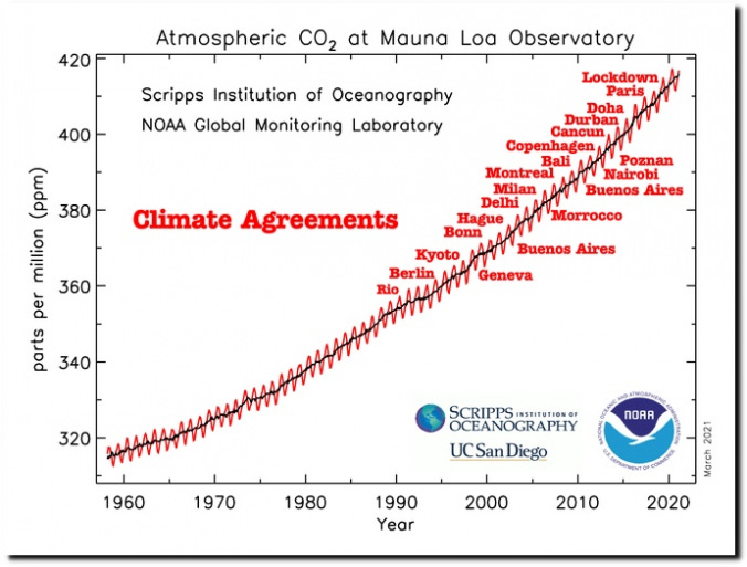
I’ve often come across graphs on social media showing atmospheric CO2 concentrations over time, with various dates of climate agreements highlighted. Shared by doomers and skeptics alike, they are used to argue that the rise of CO2 concentrations is inexorable and has not (or perhaps cannot) be slowed by actions we take.
On the other hand global CO2 emissions – the very precursors to those concentrations – have largely plateaued. After increasing by more than 20% in the 2000s, CO2 emissions today are a mere 3% higher than they were in 2013. This plateau has been driven in part by a rapid expansion of clean energy globally, with spending on clean energy rising from around $600 billion in 2020 to $2.3 trillion in 2025. At the same time we’ve seen notable reductions in land use emissions associated with reduced rates of deforestation in countries like Brazil.
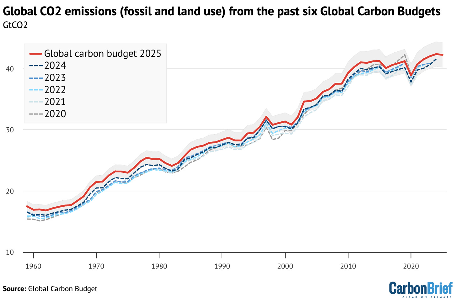
So if global CO2 emissions are flattening, why do atmospheric concentrations appear to be growing unabated? The answer is in the persistent nature of atmospheric CO2.
About half of the CO2 humans emit into the atmosphere remains there for at least a century (and about 20% for more than 10,000 years), with the remainder being absorbed by land (mostly vegetation) and ocean (mostly geochemical) carbon sinks. This means that even with flat CO2 emissions we would expect atmospheric CO2 concentrations to increase – that concentrations are approximately the integral of annual emissions.
This means that, generally speaking, if emissions remain flat concentrations would linearly increase. If emissions increase, concentration growth accelerates, while if emissions fall, concentration growth slows down. Its a bit more complicated in practice – unlike for temperatures we can get atmospheric CO2 concentrations to fall if emissions are reduced enough, where sinks take up more CO2 than we emit. But broadly speaking we expect atmospheric CO2 to keep growing until we cut emissions pretty substantially (e.g. to <50% of current levels).
Either way, atmospheric CO2 is better seen as a lagging rather than leading indicator of changes in emissions, as it is harder to see the effects of emissions reductions on concentrations over shorter time periods.
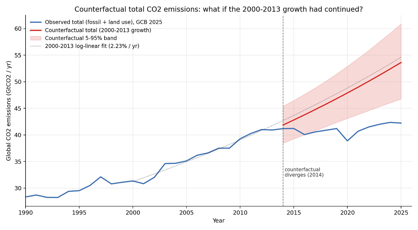
What we can do, however, is use reduced-complexity carbon-cycle models to examine how different atmospheric CO2 concentrations would have been if global emissions had not plateaued. To start with, lets assess what would have happened to global CO2 emissions if they had continued increasing at the ~2.2% per year that we saw in the 2000s. This is shown in the figure below.
Next lets use a reduced complexity carbon cycle model to convert these additional emissions into atmospheric concentrations. Here I am using the Joos et al (2013) impulse response function which describes the fraction of a one-year pulse of CO? that stays in the atmosphere as the ocean and land sinks gradually draw it down. These pulses are then convolved into changes in atmospheric concentrations over time.
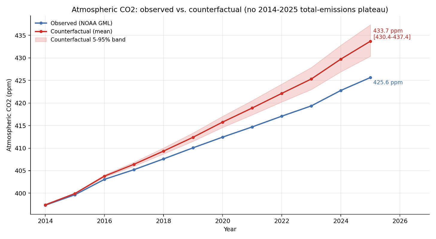
Here we see that atmospheric CO2 concentrations would have been approximately 8 ppm higher if global emissions had not plateaued over the past 13 years.
Finally, lets add in annual variability in atmospheric CO2, both observed (blue line) and modeled (red line).
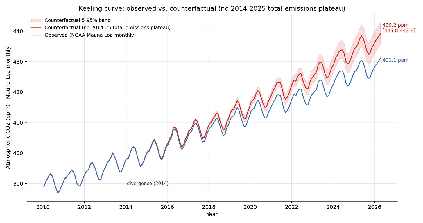
We can also extend this all the way back to the start of the record. As expected, a plateauing of global CO2 emissions transitioned us from an accelerated growth rate to a more linear growth rate. Its not a dramatic swing – global CO2 emissions remain at above 40 billion tons per year! – but its at least some detectable progress away from a much worse emissions future.
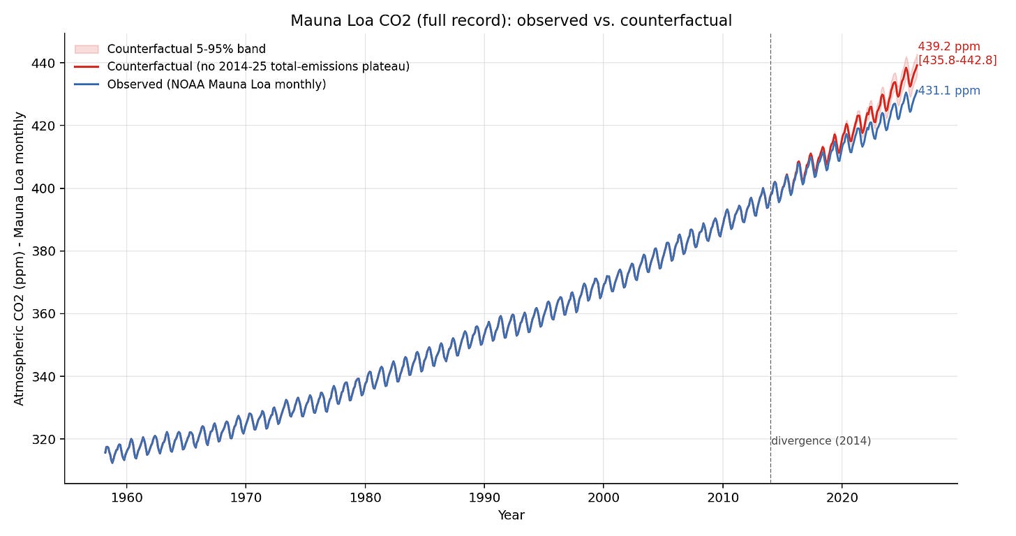
What are the takeaways here? Atmospheric CO2 concentrations are still climbing despite some success in flattening global emissions. But this is generally what we’d expect; if emissions had continued to increase concentrations would be noticeably higher and accelerating rather than exhibiting a more linear increase. Observed increases in atmospheric CO2 are, if anything, a bit on the low end (though still in the uncertainty range) of what the model expects based on observed emissions.1 I’ve included a more detailed writeup and code to reproduce this analysis on my GitHub here.
So next time someone shows you a graph of CO2 concentrations and argues that nothing is changing, you can show them how much worse it would have been had we really done nothing to change our emissions trajectory.
Update
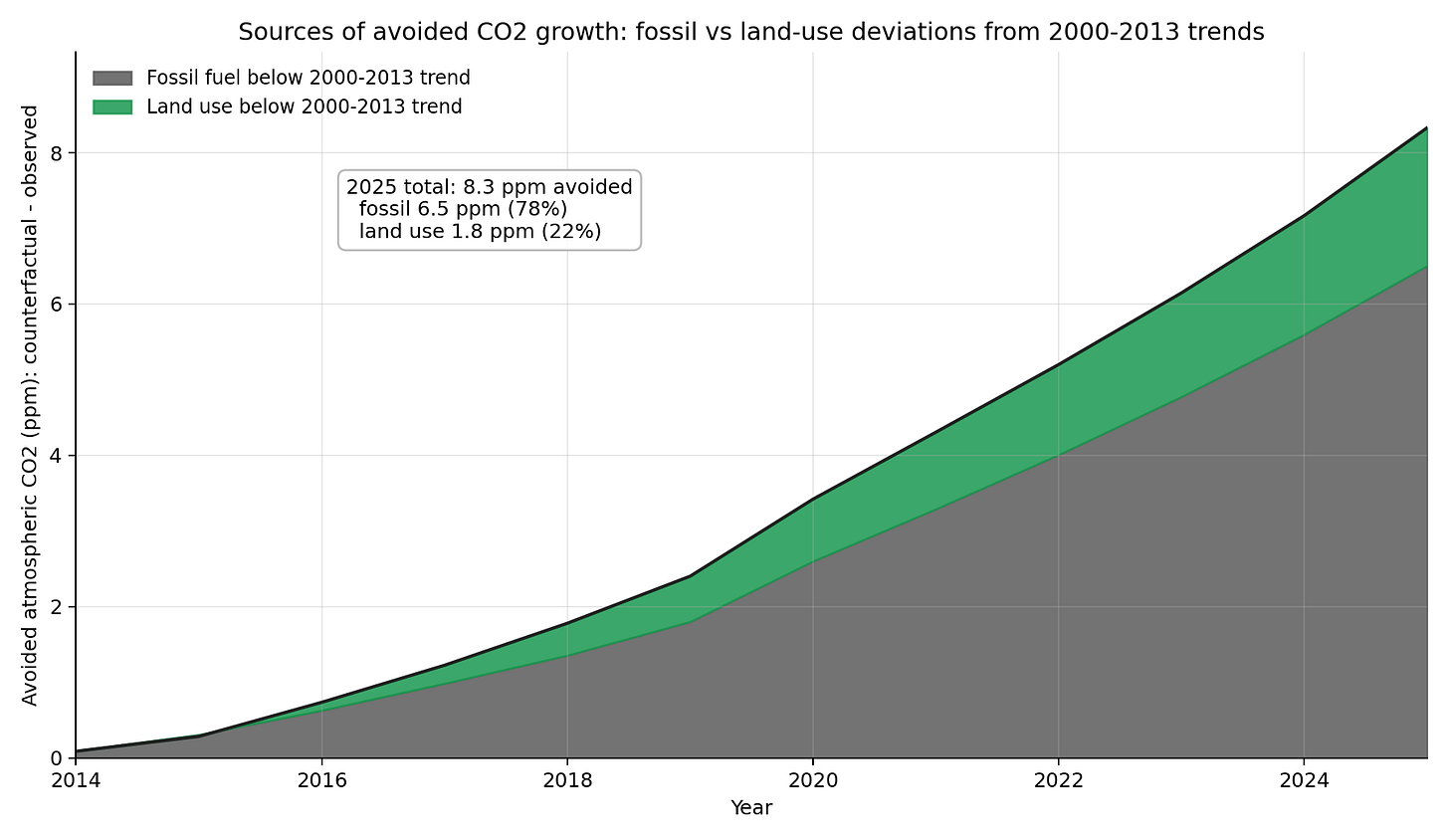
I got a number of questions from folks about the role of slower growth in fossil emissions vs falling land use emissions in driving these changes. It turns out that around 78% of the avoided increase in atmospheric CO2 is attributable to fossil emissions, and 22% to land use. The GitHub repo has more details on this sensitivity test.
1 This suggests that it is our emissions, not recent changes in carbon cycle feedbacks, that are the main driver of growth in atmospheric concentrations. That being said, we still expect some weakening of carbon sinks in a warmer world – something we have started to see in the data.








Terrific article and analyses Zeke about the relationship between emmissions and atmospheric carbon. Just a couple of layperson questions. First, we are confident in the data on atmospheric carbon, validated across multiple sites, however how confident can we be about estimated annual emmissions? How are emmissions from global conflicts included, such as from Ukraine, Gaza, Iran or for example from the increasing frquency of large scale bushfires? Second, the analysis you describe suggests we are turning the corner on emmissions and atmospheric carbon is yet to catch up, so why are atmospheric carbon levels still accelerating in growth? I would have thought that while still increasing, acceleration should be reducing at least? Thanks you for your good efforts Zeke
Johnpead @1 :
Please clarify the thinking behind your questions about rising CO2.
The basic arithmetic is straightforward ~ a world economy is expanding gradually year by year, and the energy supplied for that is still around roughly 83% supplied by fossil fuels. Obviously we (collectively) need to try harder with the "renewables" energy supply.
Also, more technological advance (e.g. the new sodium batteries) will take years to come to fruition. And there is much political foot-dragging going on in Washington and elsewhere.
Bushfires/wildfires are largely part of the short-term natural cycle.
My guess is that the wars/conflicts you mention are minuscule in CO2 production, compared with the usual industrial & domestic CO2.
Johnpead:
When speaking of emissions of CO2 or other carbon gases such as CH4, you need to clarify whether you are asking about anthropogenic emissions or natural emissions. Anthropogenic emissions related to burning fossil fuels are most easily estimated using production numbers for gas, coal, etc. In general, if we pulled it out of the ground, it got burned. (Oil is also used to produce plastics, but we do track how much is used to produce fuel.) As Eclectic says, it's pretty straightforward arithmetic.
Natural emissions are more complex. But you also need to consider natural uptake/absorption, as the contribution to changes in atmospheric CO2 is the result of the net value of emission minus uptake. You can cause an increase in atmospheric CO2 by reducing uptake, not just by increasing emissions.
Estimating natural emissions or uptake is less certain than anthropogenic emissions. There are two ways to try to measure it directly:
What we are left with is point measurements of uptake, emissions, and storage, which we can use to develop global carbon cycle models that allow for global estimates. For short-term events such as forest fires, such models can use estimates of the forest carbon and fire behaviour to estimate the emitted CO2.
There are several blog posts here at SkS that discuss many of these aspects of the global carbon cycle. Here are a few. (Note that some of these have both a "Basic" and an "Intermediate" tab, with different levels of detail.)
What is causing the increase in atmospheric CO2?
The lines of evidence that humans are raising CO2 levels
How do human CO2 emissions compare to natural CO2 emissions?
Murry Salby's Correlation Conundrum
johnpead @1,
You ask - "How confident can we be about estimated annual emmissions?"
The number cited by the OP come from the 'budgets' of the Global Carbon Project (GCP) who evaluate not just the various anthropogenic CO2 emissions but also the ocean & biosphere uptake of CO2. Perhaps as a gauge of the accuracy of their 'budget' numbers, they provide an annual "budget imbalance" which is where the total emissions do not equal the total for uptakes plus atmospheric increase. This annual "budget imbalance" is usually 2% or 3% of the total emissions and this is on average due to more emissions than uptakes/increase.
So I would suggest the estimates annual emissions numbers are accurate enough to be confident that they don't hide some dreadful mis-reporting.
You also ask - "Why are atmospheric carbon levels still accelerating in growth?"
On a different thread here at SkS, I very recently engaged in a to-&-fro as to whether there is "still acceleration." With all the wobbles in the data, it appears difficult to demonstrate either way.
johnpead @1
You ask - "How confident can we be about estimated annual emmissions?"
I was discussing this somewhere else, and include the following studies I found which indicate we can be reasonably sure about the accuracy of estimated emissions and emissions reported by individual countries:
1) Emanuele Solazzo, Robbie M. Andrew, and Greet Janssens-Maenhout. Annual estimates of global and national CO2 emissions from fossil fuels: tracking revisions to the United Nations energy statistics database input energy data. Environmental Data Science (Cambridge University Press). June 2022
2) Brendan Byrne, David F. Baker, Sourish Basu, et alia. National CO2 budgets (2015–2020) inferred from atmospheric CO2 observations in support of the global stocktake. Earth System Science Data (ESSD). March 2023
3) Christopher W. O’Dell, David Crisp, David F. Baker, et al. The Orbiting Carbon Observatory-3 (OCO-3) mission: Early science results from space-based observations of localized CO2 emissions. Remote Sensing of Environment. December 2022
MA Rodger. Many thanks for such impressive responses to my two questions. I so enjoyed reading your thoughtful and respectful conversations about whether atmospheric carbon is not just increasing, but may be accelerating too. Especially appreciate your patience and humility in responding to me and others.
Supplementary question. If global carbon emmissions are presently not rising, but starting to fall, when and how will we see that reflected in the keeling curve and then subsequent effects on global warming. What are your hunches? Presumably, the present rate of increase of atmospheric carbon will first start declining (over say 10years)? Then effects on global warming will only commence much much later, after actual atmospheric carbon starts declining (over say 100-1000 years)?
johnpead @6,
I can't accept that CO2 emissions are 'falling'. They are barely staying flat, and that due to reductions in emissions from Land-Use-Change.
To put some numbers on that from the GCP 'budget':-
Average Annual Global CO2 Emission increases
... ... ... ... ... Fossil Fuel ... ... [LUC emissions]
1990-2000 .... +82Mt(C) ... ... [+4Mt(C)]
2001-2012 ... +215Mt(C) ... .. [+12Mt(C)]
2013-2024 .... +83Mt(C) ... ... [-48Mt(C)]
But to address your question, the additional annual atmospheric CO2 burden is often called the "Airborne Fraction" which very roughly sits a 50% of annual emissions. But this fraction is not a single year thing. The draw-down of our emissions into ocean & biosphere is a multi-year thing. Thus that 50% comprises illustratively 3.00% of year one, 2.90% of year two, 2.75% of year three, etc, this draw-down completed over a millenium when about 75% (or less for high levels of emissions) in total will have been drawn out of the atmosphere. The final tiny-tiny component is absorbed when the last bit of deep ocean water eventually surfaces and absorbs its CO2. The remaining 25% requires geological processes or a helping human hand.
So if emissions level-off, the Keeling Curve will stop bending upwards, accelerating. Identifying that disappeared acceleration amongst the wobbles will take a decade or two. If there were a drop to 50% of our emissions, the Keeling Curve will plateau a while, and if emissions continue to fall below that 50%, the Keeling Curve will dip.
That doesn't sound very encouraging. That is not to say the problem is unnsoilvable. My own view of it is that solar PV is the solution along with its use for hydrogen/ammonia/methane production.
I recall an anecdote from a couple of decades ago. A clever environmentalist tells a dumb climate skeptic that the USA could get all its energy requirements (so all primary energy) from 10,000 sq miles of solar farms in Texas. The skeptic replies that 10,000 sq miles is a massive area - the task is far too great to be delivered. The environmentalist responds that 10,000 sq miles is massive but it is the area of forest/mountain strip-mined for coal in the USA, a far-harder task which didn't prove too great, and that all this mined coal is now burned and gone. With coal you have to keep mining. The solar PV will keep on delivering.
(I won't vouch for the numbers being right.)
So there is a solution to hand (and likely other scaleable technologies as well) and if it (they) were embraced as strongly as then-there tech-bro AI projects (and money-wise it has a far far stronger basis for investment) we could deliver that solution.
What is depressing is the evident denial within the political sphere that we are still not doing anything like enough to reach net-zero (& the net-negative that must follow). The graphic below shows the scale of the problem.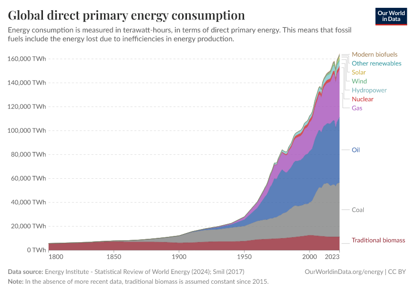
In terms of the warming, things are more encouraging. The delay in warming and the delay in draw-down sort-of cancel each other out. Modelling shows that, very roughly, net-zero also brings zero-warming. The draw-down of CO2 drops the climate forcing providing cooling. And that sort-of matches the delayed in-the-pipeline warming. (The detail of this 'matching' isn't entirely forthcoming. CH4 & N2O have shorter atmospheric residency and are substantial contributors to AGW [respectively 25% & 10% of CO2's forcing] and are surely significant in those 'matching' result.)
MA Rodger:
I do not know the source of your story about Texas. The entire area of Texas is about 269,000 sq mi (according to Wikipedia). So 10,000 sq mi for all energy is not too much. A detailed post on Quora concluded that 10,000 sq mi would generate about the current electriicty use in the USA.
I have recently seen it posted on line that if we covered with solar only the square miles currently used to grow corn for alcohol used in gasoline we could generate all the energy (everything industry, transportation heating/AC etc) used in the USA. (AI claims there would be excess energy from this conversion but I do not trust AI any more than internet posters).
I have seen scientific posts that suggested we use desert land, roof tops and parking lots to generate the needed solar power and rewild the 35 million acres of corn-for-ethanol (about 55,000 sq mi). I doubt American farmers would like that but it is an interesting claim. Recent estimates of the needed energy to provide All Energy in the USA would be consistent with that plan if you got anywhere near all electricity from 10,000 sq mi.
I recently drove across Texas, New Mexico and Arizona and the amount of land that is not really usefull for agriculture is enormous. Not to mention brownfields from coal mining and oil extraction.
As you mention, the issue is political will and not the amount of land and other materials needed. Hopefully the overbuilt Chinese solar panel factories can be put to good use.
michael sweet @8,
Regarding the annecdote, I did mention that "I won't vouch for the numbers being right." Indeed, the numbers could all have been nonsense. In the past I recall attempting to find the area of open-cast coal mining in the US but never got anywhere. As for the 10,000 sq mile number I was actually told for this and thus the required area of solar PV to supply all primary energy for the US, that could well be wrong. 10,000 sq miles, 20,000, even 100,000 sq km (=40,000 sq miles) - all are possible but it was just an annecdote 20 years ago. Maybe I should do a bit of scaling of this requirement when I have a moment, something I likely have done previously but then forgotten the outcome.
The message I'd hope to give with the annecdote is that the area of unproductive land needed to power North America (in Texas), or Europe (in the Sahara), or China (in the Gobi) or India (in the Thar Desert) is entirely doable.
michael sweet @8,
Further to the 'Texas annecdote' @7, the value of 10,000 sq miles as the area of solar PV in Texas to provide all the primary energy used by USA is indeed low. Perhaps 20,000 sq miles would be a better value.
A simplistic calculation would run as follows:-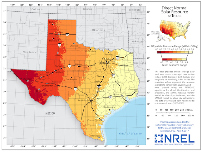
The daily solar irradiance in Texas averages up to 6.6kWh/m^2 = 6.6e3Wh/m^2 = (x 1.6e3^2) 1.7e10Wh/sq mile.
Thus with a 20% PV efficiency, annual output would be (1.7e10 x 0.2 x 365 =) 1.23e12 Wh/sq mile = 1.23e16Wh/10,000 sq mile.
The annual US primary energy use is 2.6e16Wh.
And this result is generally in agreement with this decade-old Fact Check of an Elon Musk statement which was shown correct. This was that 10,000sq km (or 4,000sq miles) of solar PV in Texas would produce the 425GW (= 3,725TWh) of electricity used annually in the US. The calculated output was 500GW (= 4,380TWh). That would equate to (4,380TWh x 2.59 =) 1.13e16Wh, The PV efficiency is put at 24% with the location the slightly-less-sunny NW Texas rather than W Texas.
The other half of the anecdote was the area of US that has been strip-mined for coal. The Ai function on Google offered up a reference that talks of a land area of 4 million hectaes (=10,000 sq miles) in the US that "open-pit mining of 124 billion tons of coal in the United States will destroy." [My Bold] Sadly this is derived from "data released by the National Research Council (NRC) of the United States" but the actual NRC document is not referenced. (The Google-offered reference concerns open-caste coal mining in Mongolia not the USA.)
However, this reference does give a measure of land 'destroyed' by open-caste coal mining. And data on good-old Wikki-thing shows perhaps 30 billions tons of open-caste-mined coal produced in the US since 1945. This suggests the land 'destroyed' by US open-caste coal mining is perhaps 2,500 sq mile.
Mind, there is another comparitor, The electricity that could be generated by that 10,000sq-mile-destroying mining, 124 billion tons would (generously) amount to [2e6Wh/ton x 1.24e11 ton =) 2.48e17Wh, enough to provide all US primary energy for 10 years. As well as the 10,000 sq mile of 'destroyed' land, this coal-use would double global CO2 emissions for that 10 years.
It's a shame the Solar PV required to provide the same annual energy output (and provide it for ever) would be twice the area. Perhaps in the future when the PV efficiencies are improved and if the calorific value of US coal continues to fall, those land areas will be more comparable.
MA Rodger,
It is interesting to hear the different land uses that compare to the solar needed to power the country. My favorite is still the area of corn grown to make ethanol for gasoline is enough to power the entire US economy. If we put only half of the solar on land unusable for farming and parking lots we would greatly benefit.
Where I live in Florida about 650 sq mi has been strip mined for phosphate. Some of that is converted to lakes but the remainder could generate a lot of energy.
We agree that land for renewable energy can be found. Hopefully the US will work harder on electrification in the future since the Iran war demonstrates that fossil energy is undependable. Over 90% of all electrification in the USA was renewable last year, it is the cheapest energy.