


 Arguments


Recent Comments
Prev 503 504 505 506 507 508 509 510 511 512 513 514 515 516 517 518 Next
Comments 25501 to 25550:
-
Pol Knops at 03:11 AM on 15 January 2016The Quest for CCS
Indeed in addition to CCS we have to move to BECCS. But given the enormous amounts required (and thereby the land requirements) even BECCS won't be sufficiently.
As JWRebel noticed there are indeed more ways for Carbon Dioxide Removal:
- enhanced weathering: spreading Olivine and let it react with CO2. The cost are mainly depending on buying the olivine (and therefor the logistics).
- accelerated weathering; making of products with CO2. But this is still in a research phase. Although we want to scale up.
-
Joel_Huberman at 00:43 AM on 15 January 2016The Quest for CCS
Tom Curtis @ 12. What's "LUC"?
-
ryland at 23:43 PM on 14 January 2016The Quest for CCS
Glenn Tamblyn @20. Advertisements from various suppliers of wood pellets state they are from trees. As an example this ad from CPL (see here) states "The wood used for biomass wood pellets either comes from wastes from industries such as sawmilling or from virgin trees that have been specifically grown for the purpose of creating pellets". This extract from a letter from Save americasforests to the Senate shows the concerns expressed about the use of trees for biomass. (reference). The extract states:
"However, this legislation goes even farther in contributing to global climate change. It instructs the Forest Service to take the wood logged from these forests and burn it in wood-energy plants. Nothing could possibly contribute more to global climate change than increasing logging on our national forests and then burning the wood in biomass plants".
I'm sure there are many sources of biomass but at the moment trees appear to figure prominently as a biomass source
-
Tom Curtis at 23:35 PM on 14 January 2016The Quest for CCS
Glenn Tamblyn @20, I don't think the charcoal burning needs to be old fashioned (which is labour intensive). I do agree that CCS can only be a bit player in reducing emissions to zero; and CCS of biofuels is likely to also only be a bit player in generating net negative emissions or compensating for fugitive emissions in a zero net emissions regime. The fun thing is, however, I don't have to make any predictions on the issue. If we get a well established carbon price, the market will sort it out.
-
Kevin C at 23:04 PM on 14 January 2016Surface Temperature or Satellite Brightness?
Olof #18: Nice work.
On the coverage uncertainties, I hadn't really thought that through well enough when I wrote the end of the post. The RSS and HadCRUT4 ensembles don't contain coverage uncertainty, so infilling won't reduce the uncertainty. I'll update the end of the post (and post the changes in a comment) once I've thought it through some more (in fact I'll strike it through now).
If we are interested in global temperature estimates, we have to include the coverage uncertainty, at which point the infilled temperatures have a lower uncertainty than the incomplete coverage temperatures. For the incomplete temperatures, the uncertainty comes from missing out the unobserved region. For the infilled temperatures, the uncertainty comes from the fact that the infilled values contain errors which increase with the size of the infilled region. In practice (and because we are using kriging which does an 'optimal' amount of infilling) the uncertainties in the infilled temperatures are lower than the uncertainties for leaving them out.
-
Glenn Tamblyn at 21:53 PM on 14 January 2016Surface Temperature or Satellite Brightness?
Olof R
Interesting....
There seems to be a fundamental need here. Before proceeding to the adjustments such as for Diurnal Drift etc, there needs to be a resolution of the question: 'does the STAR Synchronous Nadir Overpasses method provide a better or worse method for stitching together multiple satelite records'?
-
Glenn Tamblyn at 21:36 PM on 14 January 2016The Quest for CCS
Yeah Tom, old fashioned charcoal-burner technology is a possibility. It could be done quite locally to the harvest point and reduce the captured carbon to a more concentrated form. And also a form that is less likely to breakdown when sequestered.
But that is adding another processing step with its own costs, losses, inefficiencies etc.
All these things are cost/benefit trade-offs, whether those things are measured in dollars or joules.But ultimately all technologies that involve bulk materials handling of gigatonnes of something may turn out to be too inefficient.
I still think approaches that use nano-technology, natural processes, pre-existing natural matter and energy flows etc. are the more likely to succeed at scale.If we have to build an industrial revolutions worth of kit to do it, it ain't gonna work.
-
Glenn Tamblyn at 21:24 PM on 14 January 2016The Quest for CCS
ryland.
The assumption that BECCS is about trees is perhaps even less valid. The best crops for BECCS are likely fast growing species. Trees don't always fit that bill. Various grasses have been considered. The impressive growth rates of Bamboo for example might recomend them. -
Olof R at 20:59 PM on 14 January 2016Surface Temperature or Satellite Brightness?
Kevin, Good demonstration of the uncertainty in satellite and surface records..
I want to highlight another aspect of uncertainty associated with the new multilayer UAH v6 TLT and similar approaches. UAH v6 TLT is calculated with the following formula (from Spencers site):
LT = 1.538*MT -0.548*TP +0.01*LS
MT, TP, LS is referring to the MSU (and AMSU equivalents) channels 2,3 and 4 respectively.
There are other providers of data for those channels, NOAA STAR and RSS, with the exception that they do not find channel 3 reliable in the early years. STAR has channel 3 data from 1981 and RSS from 1987..
As I understand, each channel from each provider are independent estimates, so it should be possible to choose and combine data from different providers in the UAH v6 TLT formula.
Some examples as follows:
UAH v6 TLT 1979-2015, trend 0.114 C/decade
With STAR data only 1981-2015, trend 0.158 C/dec.
STAR channel 2&4, UAH v6 channel 3, 1979-2015, trend 0.187 C/dec.
UAH v5.6 channel 2&4, STAR channel 3, 1981-2015 trend 0.070 C/dec
So, with different choices of channel data, it is possible to produce trends from 0.070 to 0.187, and interval as large as the 90% CI structural uncertainty in RSS..
Here is a graph with the original UAH v6 and the combination with the largest trend:

If anyone wonders if it is possible to construct a UAH v6 TLT equivalent in this simple way from the individual channel time series, I have checked it and the errors are only minor:
Original trend 0.1137
Trend constructed from the three channels 0.1135
#17 Kevin, If you replace the uncertainty ensemble of Hadcrut4 with that of your own Hadcrut4 kriging, what happens with the spatial uncertainty?
Is there any additional (unexpected) spatial uncertainty in Hadcrut kriging, or is the uncertainty interval of RSS still 5.5 times wider, which it was according to my calculation (0.114 vs 0.021 for 90% CI)?
Moderator Response:[RH] Image width fixed.
-
Tom Curtis at 20:11 PM on 14 January 2016The Quest for CCS
Sorry, not "which is why" but "which is one good reason (among several others related to conservation)".
-
Tom Curtis at 20:10 PM on 14 January 2016The Quest for CCS
wili @16, which is why we should not cut old growth forests for biomass, nor to convert them to plantations or other agricultural use. On the other hand, converting agricultural land to plantations (or some more rapidly growing crop) for biomass mass may be beneficial.
-
wili at 17:31 PM on 14 January 2016The Quest for CCS
"Wild untouched forests store three times more carbon dioxide than previously estimated and 60% more than plantation forests"
-
Tom Curtis at 16:52 PM on 14 January 2016The Quest for CCS
wili @14:
"Second, our findings are similarly compatible with the well-known age-related decline in productivity at the scale of even-aged forest stands. Although a review of mechanisms is beyond the scope of this paper several factors (including the interplay of changing growth efficiency and tree dominance hierarchies) can contribute to declining productivity at the stand scale.We highlight the fact that increasing individual tree growth rate does not automatically result in increasing stand productivity because tree mortality can drive orders-of-magnitude reductions in population density. That is, even though the large trees in older, even-aged stands may be growing more rapidly, such stands have fewer trees. Tree population dynamics, especially mortality, can thus be a significant contributor to declining productivity at the scale of
the forest stand."(Stephenson et al, 2014, "Rate of tree carbon accumulation increases continuously with tree size")
That is, as trees get bigger they crowd out the competition, which fact more than compensates for the increased carbon accumulation per tree.
While this may raise tricky questions as to the best time to reharvest renewably harvested natural forests, it does not void my analysis above.
-
wili at 16:30 PM on 14 January 2016The Quest for CCS
"... for most species mass growth rate increases continuously with tree size. Thus, large, old trees do not act simply as senescent carbon reservoirs but actively fix large amounts of carbon compared to smaller trees; at the extreme, a single big tree can add the same amount of carbon to the forest within a year as is contained in an entire mid-sized tree. "
www.nature.com/nature/journal/v507/n7490/full/nature12914.html
-
wili at 16:17 PM on 14 January 2016The Quest for CCS
Andy, thanks for the thoughtful answer at #6. I found the last bit particularly well put:
"I'm probably not alone in not wanting to live in a valley below a big CCS operation, because might not be as bad and very unlikely to be a catastrophe is not reassuring enough. If CCS is ever to be deployed at the scale that some of the modelers envisage, then among the required tens of thousands of projects, involving who-knows-how-many injection wells, unexpected disasters are certain."
-
Tom Curtis at 14:29 PM on 14 January 2016The Quest for CCS
ryland @11, you get your 'yes' answer only by assuming the wood used will be hardwoods felled from old growth forests. More likely they will be softwoods from plantations.
Further, pulp fiction does not address the issue with biomass and CCS. When biomass is burnt in a CCS facility, 75%+ of the CO2 produced is captured and sequestered. That means the replacement trees need only grow to 25% or less of the mass of a mature tree before additional growth draws down excess CO2 from the atmosphere. With a pine tree, that can be five years or less growth.
Finally, the pulf fiction analysis is mistaken in any event. In a mature biomass industry, there will be plantation timber in all stages of growth. Assuming a time to maturity of 20 years. Then for each km^2 of wood harvested and burnt, there will be 20 km^2 of wood at various stages of growth the annual sequestration by the full industry will equal the annual emissions (without CCS).
The pulp fiction scenario would apply where old growth forest is harvested for biomass on a non-renewable basis. Even there, however, the pulp fiction story gets the accouting wrong. In such a scenario, the full CO2 emissions from clear cutting the forest will be accounted for as LUC. Requiring that it be accounted for again at point of combustion would simply require that it be accounted for twice. Thus, while it would a bad, very unsustainable mitigation policy to burn biomass from old growth forests, the CO2 emissions from such a practice are still accounted for (just not at the power plant).
Further, while I say it would be bad to burn biomass from forestry (as oppossed to plantation) timber, that does not necessarilly apply to wood waste for which no other suitable use (including composting) can be found.
And finally, in my home state (Queensland, Australia) the vast majority of biomass burnt is wast cane from the sugar refinery process which is used to power the crushing and refining operations. The cane takes only a year to grow. Equivalent rapid growth biomass is no doubt found in many locations, and completely undercuts the (faulty) logic of the pulp fiction scenario. Fitting CCS to the cane powered refineries would be a positive benefit to the environment without question (though probably not economic).
-
ryland at 14:03 PM on 14 January 2016The Quest for CCS
Thanks for the replies to my post @5 on the use of living trees as an energy source. I got a "Yes" @7, a qualified "No" @8 and a "No" @9. Intuitively I tended to favour the "yes" as it takes a long time to regenerate forests that, comparatively speaking, are felled in an instant. Thus large mature living trees are felled and replaced by immature trees with a consequent significant fall in carbon sequestration. This is discussed in some detail in John Upton's series "Pulp Fiction" referred to by Andy Skuce @7 and from that it seems "Yes" may well be correct.
From this series it also seems the EU are not being entirely kosher on their emissions, as wood is classed as carbon neutral. Consequently emissions from wood are not counted. In addition power generators burning wood avoid fees levied on carbon polluters and to add insult to injury, receive "hundreds of millions of dollars in climate subsidies"
-
John Salmond at 13:44 PM on 14 January 2016The Quest for CCS
Academic: 'CCS laughable' (13min) https://www.youtube.com/watch?v=S8-85Q46Lw4
-
Bob Loblaw at 12:10 PM on 14 January 2016Medieval Warm Period was warmer
Answering here, as requested by the moderators, rather than the other thread that Tom points to (Angusmac elsewhere).
Angusmac's argument that the MWP was global seems to be akin to using past southern hemisphere summer temperatures as a direct comparison to current global mean temperatures, under the argument that "summer happens everywhere, so it's global"
...all while ignoring that it's pretty hard to find a time when both the southern and northern hemisphere had summer at exactly the same time.
-
Tom Curtis at 11:42 AM on 14 January 2016The Quest for CCS
Ryland @5, no. Trees sequester more carbon per annum when growing to maturity than when mature. If you cut down mature trees to allow regrowth, and bury the carbon so it is not released back to the atmosphere, you will sequester more carbon than by leaving forests undisturbed.
Glenn Tamblyn @8, intuitively better yet would be to cook the wood in a charcoal oven which:
1) Allows you to capture the energy of combustion of the hydrygen in the cellulose as an energy source;
2) Reduces the sequestered mass still further by eliminating nearly all but the carbon from the tree mass.
Whether it is actually better than burning the wood and capturing the CO2, or just burring the tree depends on the specific details of the actual process used, which depends on available technology. It may be that burning the entire tree, capturing the CO2 and burying can actually give a net energy surplus per tonne of Carbon sequestered relative to other methods.
More probably, it may give an economic advantage in that the wood can be burnt in coal fired power stations fitted with CCS and the costs avoided in early write offs of those plants as we move away from coal may make an otherwise less efficient process better cost wise.
-
Tom Curtis at 11:30 AM on 14 January 2016Tracking the 2°C Limit - November 2015
I have responded to Angusmac @37 on a more appropriate thread.
Moderator Response:[PS] thank you for cooperation. Would all other commentators do likewise please.
-
Tom Curtis at 11:28 AM on 14 January 2016Medieval Warm Period was warmer
This is a response to Angusmac elsewhere.
Angusmac, I distinguished between three different meanings of the claim "the MWP was global":
"Was the GMST durring the MWP warm relative to periods before and after? ... Were there significant climate perturbances across the globe durring the MWP? ... Were temperatures elevated in the MWP across most individual regions across the globe?"
In response you have not stated a preference to any of the three, and so have not clarrified your usage at all. In particular, while your citing of the AR5 graphs suggests you accept this first meaning, you then go on to cite the Luning and Varenholt google map app, which suggests you accept also the third, false meaning. Your question as to whether or not I believe the MWP was global remains ambiguous as a result, suggesting you are attempting to play off agreement on the first definition as tacit acceptance of the third, and false position.
With regard to the Luning and Varenholt google map app, KR's response is excellent as it stands and covers most of what I would have said. In particular, as even a brief perusal of Luning and Varenholt's sources shows, the warm periods shown in their sources are not aligned over a set period and include colder spells within their warm periods which may also not align. Because of the possible failure of alignment, any timeseries constructed from their sources proxies will probably regress to a lower mean - and may not be evidence of a warm MWP at all. (The continuing failure of 'skeptic' sources such as Soon and Baliunas, CO2Science and now Luning and Varenholt to produce composite reconstructions from their sources in fact suggest that they are aware that doing so will defeat their case - and have taken a rhetorically safer approach.)
In addition to this fundamental problem, two further issues arise. The first is that Luning and Varenholt do not clarrify what them mean by "warm" on their map legend. One of their examples helps clarrify, however. This is the graph of a temperature reconstruction from Tasmanian tree rings by Cook et al (2000) that appears on Luning and Varenholt's map:
They claim that it shows a "Warm phase 950-1500 AD, followed by Little Ice age cold phase." Looking at that warm phase, it is evident that only two peaks within that "warm phase" rise to approximately match the 1961-1990 mean, with most of the warm phase being significanly cooler. It follows that, if they are not being dishonest, by "warm phase" they do not mean as warm as the mid to late twentieth century, but only warmer than the Little Ice Age. That is, they have set a very low bar for something to be considered warm. So much so that their google map app is useless for determing if the MWP had widespread warmth relative to late 20th century values or not.
As an aside, Cook et al stated "There is little indication for a ''Little Ice Age'' period of unusual cold in the post-1500 period. Rather, the AD 1500-1900 period is mainly characterized by reduced multi-decadal variability." Evidently they would not agree with Luning and Varenholt's summary of the temperature history shown in that graph over the last one thousand years.
The second point is that it amounts to special pleading for you to accept the IPCC global temperature reconstruction that you showed, which is actually that of Mann et al (2008), but to not then also accept the reconstruction of spatial variation on MWP warmth from Mann (2009) which uses the same data as Mann (2008):
Apparently the data counts as good when it appears to support a position you agree with, but as bad when it does not. If you wish to reject Mann (2009), you need also to reject the reconstuction in 2008 and conclude that we have not reliable global temperature reconstruction for the MWP (unless you want to use the PAGES 2000 data). If, on the other hand, you accept Mann (2008), end your special pleading and accept Mann (2009) as our best current indication of the spatial variation of MWP warmth.
-
Glenn Tamblyn at 11:25 AM on 14 January 2016The Quest for CCS
Ryland
In principal no since you grow trees, sequester their carbon and crow more trees. However, there are still lots of issues with BECCS. The land area required that competes with agriculture, nutrient requirements to maintain the growth potential of that land, then the need to transport the biomass to the power stations, then transport the captured CO2 to another site for sequestration.
In one sense BECCS is a misnomer. It should actially BECCRRS - Bioenergy Carbon Capture, Release, Recapture and Sequestration.
When we harvest the plant crop we have already captured the carbon! Then we take it to a power station, release it through combustion, recapture it (but not all of it) from the smoke stack, then sequester it.
Maybe a simpler approach is to simply take the organic matter and directly sequester that! The tonnage required would be lower - by mass organic molecules such as cellulose have a higher proportion of carbon than CO2 does. -
Andy Skuce at 11:23 AM on 14 January 2016The Quest for CCS
ryland:
Yes.
See John Upton's excellent series Pulp Fiction and the UK DECC report on biomass life-cycle impacts.
-
Andy Skuce at 11:17 AM on 14 January 2016The Quest for CCS
wili:
The potential for catastrophic leakage from CCS wells that fail is certainly a serious concern. There are, though, some differences in scale and rate between what is happening at Porter Ranch and the tragedy at Lake Nyos. I understand that the rate of gas release in California is about 1200 tons per day (please forgive the Wiki references), whereas, the Lake Nyos release was a very sudden eruption of 100,000-300,000 tons of CO2, basically three months to a year's worth of the California gas leak in less than a day, as the entire lake catastrophically degassed like a shaken Champagne bottle.
I'm not exactly sure what would happen in the case of a CCS well blowout and I suspect nobody else is either, since it has never happened. There have been CO2 blowouts from mines and wellbores (and some have caused fatalities), but a CCS blowout might be different because the CO2 is likely stored in the form of a super-critical fluid. My understanding is that when such a fluid is subjected to depressurization and changes to the gas phase, it causes a refrigeration effect (the Joule–Thompson effect), which slows the degassing process and forms ice, dry ice and hydrates which may also block or slow the flow. See Bachu (2008). I believe that the expectation is that a failed CCS well will sputter out gas, seal itself and then sputter out more gas in a cycle, as the rock and wellbore cools and warms up again.
In other words, a failed CCS well might not be as bad as Porter Ranch and is very unlikely to be a catastrophe as bad as Lake Nyos. Having said that, I'm probably not alone in not wanting to live in a valley below a big CCS operation, because might not be as bad and very unlikely to be a catastrophe is not reassuring enough. If CCS is ever to be deployed at the scale that some of the modelers envisage, then among the required tens of thousands of projects, involving who-knows-how-many injection wells, unexpected disasters are certain.
-
ryland at 10:45 AM on 14 January 2016The Quest for CCS
Wouldn't the use of biomass be somewhat self defeating as the use of living trees not only has an impact environmentally but also reduces the global carbon sink capacity
-
wili at 10:09 AM on 14 January 2016The Quest for CCS
As current events in California indicate, gas 'stored' in underground wells does not necessarily stay there. If the gas escaping from Porter Ranch had in fact been CO2, and if had been a quiet night, there may have been no need for an evacuation--everyone in the valley below would have been suffocated to death in their sleep. (As happened at Lake Cameroon's Lake Nyos in 1986.)
-
Kevin C at 09:26 AM on 14 January 2016Surface Temperature or Satellite Brightness?
John Kennedy of the UK Met Office raised an interesting issue with my use of the HadCRUT4 ensemble. The ensemble doesn't include all the sources of uncertainty. In particular coverage and uncorrelated/partially correlated uncertainties are not included.
Neither RSS and HadCRUT4 have global coverage, and the largest gaps in both cases are the Antarctic then the Arctic. Neither include coverage uncertainty in the ensemble, so at first glance the ensembles are comparable in this respect.
However there is one wrinkle: The HadCRUT4 coverage changes over time, whereas the RSS coverage is fixed. To estimate the effect of changing coverage I started from the NCEP reanalysis (used for coverage uncertainty in HadCRUT4), and masked every month to match the coverage of HadCRUT4 for one year of the 36 years in the satellite record. This gives 36 temperature series. The standard deviation of the trends is about 0.002C/decade.
Next I looked and the uncorrelated and partially correlated errors. Hadley provide these both for the monthly and annual data. I took they 95% confidence interval and assumed that these correspond to the 4 sigma width of a normal distribution, and then generated 1000 series of normal values for either the months or years. I then calculated the trends for each of the 1000 series and looked at the standard deviations of each sample of trends. The standard deviation for the monthly data was about 0.001C/decade, and for the annual data about 0.002C/decade.
I then created an AR1 model to determine what level of autocorrelation would produce a doubling of trend uncertainty on going from monthly to annual data - the autocorrelation parameter is about 0.7. Then I grouped the data into 24 month blocks and recalculated the standard deviation of the trends - it was essentially unchanged from the annual data. From this I infer that the partially correlated errors become essentially uncorrelated when you go to the annual scale. Which means the spead due to partially correlated errors is about 0.002C/decade.
The original spread in the trends was about 0.007C/decade (1σ). Combining these gives a total spread of (0.0072+0.0022+0.0022)1/2, or about 0.0075 C/decade. That's about a 7% increase in the ensemble spread due to the inclusion of changing coverage and uncorrelated/partially correlated uncertainties. That's insufficient to change the conclusions.
However I did notice that the ensemble spread is not very normal. The ratio of the standard deviations of the trends between the ensembles is a little less than the ratio of the 95% range. So it would be defensible to say that the RSS ensemble spread is only four times the HadCRUT4 ensemble spread.
-
JWRebel at 06:01 AM on 14 January 2016The Quest for CCS
Approaches using natural processes (accelerated olivine weathering, etc) seem to be a lot more promising. Below is a brief (2010) claiming it is possible to capture global annual carbon emissions for B$250/year. The second is using weathering to produce energy and materials using carbon dioxide as a major input.
Moderator Response:[RH] Shortened links.
-
MA Rodger at 05:20 AM on 14 January 2016Surface Temperature or Satellite Brightness?
rocketeer @11.
I've posted a graph here (usually two clicks to 'download your attachment') which plots an average for monthly surface temperatures, an average for TLTs & MEI. As TonyW @13 points out (& the graph shows) there is a few months delay between the ENSO wobbling itself & the resulting global temperature wobble. The relative size of these surface temp & TLT wobbles back in 1997-98 is shown to be 3-to-1. So far there is no reason not to expect the same size of temperature wobble we had back in 1997/8, which would mean the major part of the TLT wobble has not started yet.
-
mitch at 05:12 AM on 14 January 2016The Quest for CCS
My understanding is that Statoil has been injecting CO2 for sequestration from the North Sea Sleipner Gas field into a saline aquifer since 1996, roughly a million tons/yr. They found that it was economic because Norway was charging $100/ton for CO2.
Another problem with CCS is that the CO2 has more mass than the original hydrocarbon/coal. For each ton of coal, one develops 2.7 tons of CO2. Nevertheless, it is worth continuing to investigate how much we can bury and for what price.
-
John Hartz at 04:10 AM on 14 January 2016NASA study fixes error in low contrarian climate sensitivity estimates
Suggested supplementary reading:
How Sensitive Is Global Warming to Carbon Dioxide? by Phil Plait, Bad Astronomy, Slate, Jan 13, 2016
-
PhilippeChantreau at 03:39 AM on 14 January 2016The Quest for CCS
Interesting post Andy. From the big picture point of view, the thermodynamics of CCS seems to be quite a problem. The sheer size of the undertaking is another.
I think it is worth mentioning the CCS potential offered by Hot Dry Rock systems. The MIT report on HDR indicates there is definitely possibility there, in addition to all the other advantages of HDR:
https://mitei.mit.edu/system/files/geothermal-energy-full.pdf
-
Rob Honeycutt at 03:22 AM on 14 January 2016Tracking the 2°C Limit - November 2015
angusmac... The conversation has also veered well off course for this comment thread. You should try to move any MWP over to the proper threads and keep this one restricted to baselining of preindustrial.
-
Tracking the 2°C Limit - November 2015
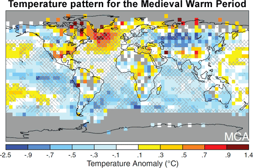
angusmac - While that map (generated by Dr.s Lüning and Vahrenholt, fossil fuel people who appear to have issues understanding fairly basic climate science) an interesting look at the spatial distribution of selected proxies, there is no time-line involved in that map, no indication of what period was used in the selection. No demonstration of synchronicity whatsoever. Unsurprising, because (as in the very recent PAGES 2k reconstruction of global temperature):
There were no globally synchronous multi-decadal warm or cold intervals that define a worldwide Medieval Warm Period or Little Ice Age...
As to IPCC AR5 Chapter 5:
Continental-scale surface temperature reconstructions show, with high confidence, multi-decadal periods during the Medieval Climate Anomaly (950 to 1250) that were in some regions as warm as in the mid-20th century and in others as warm as in the late 20th century. With high confidence, these regional warm periods were not as synchronous across regions as the warming since the mid-20th century. (Emphasis added)
You are again presenting evidence out of context, and your arguments are unsupported.
---
But this entire discussion is nothing but a red herring - again, from IPCC AR5 Ch. 5, we have a fair bit of knowledge regarding the MCA and LIA:
Based on the comparison between reconstructions and simulations, there is high confidence that not only external orbital, solar and volcanic forcing, but also internal variability, contributed substantially to the spatial pattern and timing of surface temperature changes between the Medieval Climate Anomaly and the Little Ice Age (1450 to 1850).
Whereas now we have both external forcings (generally cooling) and anthropogenic forcings, with the latter driving current temperature rise. In the context of the present, a globally very warm MCA and cold LIA would be bad news, as it would indicate quite high climate sensitivity to the forcings of the time, and hence worse news for the ongoing climate response to our emissions. I see no reason to celebrate that possibility, let alone to cherry-pick the evidence in that regard as you appear to have done.
-
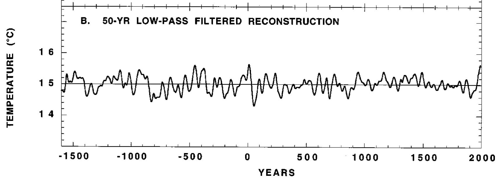
angusmac at 02:14 AM on 14 January 2016Tracking the 2°C Limit - November 2015
Tom Curtis@27 & KR@28
Referring to your request that I clarify the sense in which I mean that the MWP was global, I thought that I had already done this in angusmac@12 & 20 but I will repeat it here for ease of reference.
My definition of the global extent of the MWP was summarised in Section 5.3.5.1 of AR5 which states that, “The timing and spatial structure of the MCA [MWP] and LIA are complex…with different reconstructions exhibiting warm and cold conditions at different times for different regions and seasons.” However, Figure 5.7(c) of AR5 shows that the MWP was global and (a) and (b) show overlapping periods of warmth during the MWP and cold during LIA for the NH and SH.

Additional information on the global extent of the MWP is shown graphically by the paleoclimatic temperature studies highlighted in Figure 1 below.
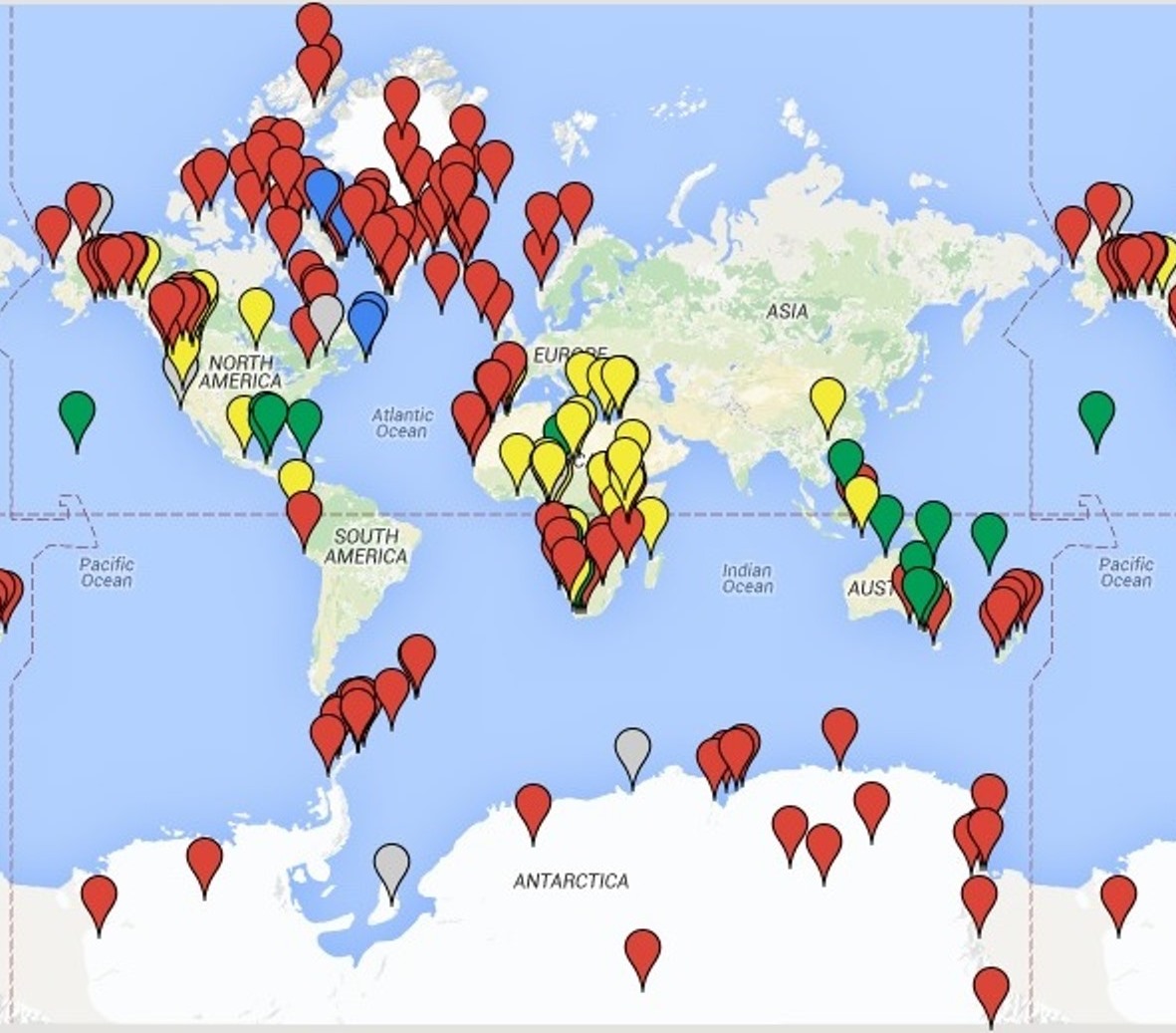
Figure 1: Map showing Paleoclimatic Temperature for the MWP (Source: Google Maps MWP)
The following colour codes are used for the studies highlighted in Figure 1: red – MWP warming; blue – MWP cooling (very rare); yellow – MWP more arid; green – MWP more humid; and grey – no trend or data ambiguous.
The map in Figure 1 was downloaded from this Google Maps website. The website contains links to more than 200 studies that describe the MWP in greater detail. Globally, 99% of the paleoclimatic temperature studies compiled in the map show a prominent warming during the MWP.
Moderator Response:[JH] You have been skating on the thin ice of excessive repetition for quite some time now. Please cease and desist. If you do not, your future posts may be summarily deleted.
-
shoyemore at 00:07 AM on 14 January 2016Surface Temperature or Satellite Brightness?
Kevin c #10,
Many thanks, pictures not required! :)
-
Rob Honeycutt at 23:29 PM on 13 January 2016Tracking the 2°C Limit - November 2015
Absolutely, Tom!
All of these combined also become a big multiplier effect on socio-political stresses.
-
Tom Curtis at 23:25 PM on 13 January 2016Tracking the 2°C Limit - November 2015
Rob Honeycutt @24, there are three "huge differences" between the current warming and the HTM.
First, as you mention, the rate of temperature change is much faster, with temperatures expected to increase in a century or two by the same amount it took 8000 years to increase leading into the HTM (and hence time frames in which species must migrate or evolve to adapt being much smaller).
Second, humans have a much more static, industrialized society making it difficult or impossible for populations to pick up and move to more friendly conditions. The extensive agricultural, road and rail networks place similar restrictions on adaption by migration of land animals and plants.
Third, Global Warming is just one of three or four major stressors of nature by human populations. Because of the additional stresses from overpopulation, over fishing, cooption of net primary productivity, and industrial and chemical waste, the population reserves that are the motor of adaption for nature just do not exist now, as they did in the HTM. AGW may well be the 'straw' (more like tree trunk) that breaks the camel's back.
-
Rob Honeycutt at 23:15 PM on 13 January 2016Tracking the 2°C Limit - November 2015
angusmac @29... Your quote from Ljundqvist is not is disagreement with anything we're saying here. At ~1°C over preindustrial we have brought global mean surface temperature back to about where it was at the peak of the holocene. That statement in Ljundqvist does not in anyway suggest that 2°C is unlikely be a serious problem.
Look back at your PAGES2K chart @20. There's one huge difference between the peak of the holocene and today, and that's the rate at which the changes are occurring. That is the essence of the problem we face. It's less about relative temperature and more about the incredible rate of change and the ability of species to adapt to that change.
Human adaptability is one of the keys to our success as a species. Physiologically, we would have the capacity to survive whatever environment results from our activities. But the species we rely on for our sustenance, not so much.
A change in global mean temperature of >2° is very likely to produce some pretty dramatic climatic changes on this planet right about the time human population is peaking at 9-10 billion people. Feeding that population level with frequent crop failures and any substantive decrease in ocean fish harvests is likely to cause very serious human suffering.
-
Tom Curtis at 23:13 PM on 13 January 2016Tracking the 2°C Limit - November 2015
Further to my preceding post, here are Ljungqvist 2011's land and ocean proxies, annotated to show latitude bands. First land:

Then Ocean:

I have also realized that proxies showing temperatures between -1 to +1 C of the preindustrial average are not shown in Ljungqvist 2011 Fig 3, and are never less than about 20% of proxies. As they are not shown, their impact cannot be quantified even intuitively from that figure suggesting inferences to global temperatures from that figure would be fraught with peril, even if the proxies were geographically representative.
-
Tom Curtis at 23:06 PM on 13 January 2016Tracking the 2°C Limit - November 2015
Angusmac @29 (2), I am disappointed that you drew my attention to Ljungqvist 2011 for I had come to expect higher standards from that scientist. Instead of the standards I have expected, however, I found a shoddy paper reminiscent of Soon and Baliunas (2003) (S&B03). Specifically, like S&B03, Ljungqvist 2011 gathers data from a significant number (60) of proxies, but does not generate a temperature reconstruction from them. Rather, they are each categorized for different time periods as to whether they are more than 1 C below the preindustrial average, withing 1 C of that average, more than 1 C but less than 2 C, or more than 2 C above the preindustrial average. The primary reasoning is then presented by a simple head count of proxies in each category over different periods, shown in Figure 3, with figure 3 a showing land based proxies, and figure 3 b showing marine proxies:

(As an aside, C3 Headlines found the above graph too confronting. They found it necessary to modify the graph by removing Fig 3b, suggesting that the thus truncated graph was "terrestial and marine temperature proxies".)
If the proxies were spatially representative, the above crude method might be suitable to draw interesting conclusions. But they are not spatially representative. Starting at the simplest level, the 70% of the Earth's surface covered by oceans are represented by just 38% (23/60) of the proxie series. As the ocean proxie series, particularly in the tropics, are cooler than the land series, this is a major distortion. Worse, the 6.7% of the Earth's surface North of 60 latitude is represented by 25% of the data (15/60 proxies). The 18.3% of the Earth's surface between 30 and 60 degrees North is represented by another 43% of the data (26/60 proxies). In the meantime the 50% of the Earth's surface between 30 North and 30 South is represented by just 23% of the data (14/60 proxies), and the 50% of the Earth's surface below the equator is represented by just 15% of the data (9/60 proxies).
This extreme mismatch between surface area and number of proxies means no simple eyeballing of Fig 3 will give you any idea as to Global Mean Surface Temperatures in the Holocene Thermal Maximum. Further, there are substantial temperature variations between proxies in similar latitude bands, at least in the NH where that can be checked. That means in the SH, where it cannot be checked due the extremely small number of proxies, it cannot be assumed that the 2 to 4 proxies in each latitude band are in fact representative of that latitude band at all. Put simply, knowing it was warm in NZ tells us nothing about temperatures in Australia, let alone South America or Africa. This problem is exacerbated because (as Ljungqvist notes with regard to Southern Europe, data is absent from some areas known to have been cool HTM.
The upshot is that the only reliable claims that can be made from this data is that it was very warm North of 60 North, and North of 30 North on land in the HTM. The data is too sparse and too poorly presented to draw any conclusions about other latitude bands and about Ocean temperatures, or Land/Ocean temperatures from 30-60 North.
Given the problems with Ljungqvist 2011 outlined above, I see no reason to prefer it to Marcott et al (2013):
More illustrative is his Figure 3:

Note that the statistical distribution of potential holocene temperatures tails out at 1.5 C above the 1961-1990 baseline, or 1.86 C above a 1880-1909 baseline. Unlike the reconstruction, the statistical distribution of realizations does not have a low resolution. Ergo, we can be confident from Marcott et al that it is extremely unlikely that the Earth has faced temperatures exceeding 2 C above the preindustrial average in the last 100 thousand years.
-
Richard Lawson at 23:02 PM on 13 January 2016NASA study fixes error in low contrarian climate sensitivity estimates
This is a critical point in the debate. Science works by refuting false hypotheses. The contrarians' hypothesis is that "Human additions to atmospheric CO2 will not adversely affect the climate". Low climate sensitivity is absolutely crucial to their case. They were relying on Lewis and the 20th century TCR studies to sustain low climate sensitivity, and since the studies have been shown to be flawed, it is surely time for us to say loud and clear that the contrarian hypothesis has no merit.
-
Rob Honeycutt at 22:58 PM on 13 January 2016Tracking the 2°C Limit - November 2015
angusmac @21/22... "I conclude from the above that many parts of the world exceeded the 2 °C limit without any dangerous consequences and that these temperatures occurred when CO2 was at ≈ 280 ppm."
That's not the question at hand, though, is it? Parts of the world today exceed 5°C over preindustrial. The question is whether global means surface temperature will exceed 2°C, which would be inclusive of Arctic amplification having northern regions exceeding 8°-10°C.
-
Tom Curtis at 22:05 PM on 13 January 2016Tracking the 2°C Limit - November 2015
Angusmac @29 (1) Renssen et al (2012) label their figure 3 a as "Simulated maximum positive surface temperature anomaly in OGMELTICE relative to the preindustrial mean, based on monthly mean results." You reduced that to "Thermal Maximum anomalies", thereby falsely indicating that they were the mean anomaly during the Holocene Thermal Maximum. That mislabelling materially helped your position, and materially misprepresented the data shown. In defense you introduce a red herring that I was suggesting you indicated they were "global average temperatures", when "global average temperatures" would of necessity be shown by a timeseries, not a map.
Further, you argued that the map showed that “...many parts of the world exceeded the 2 °C limit”. However, as the map showed mean monthly temperatures (from widely disparate seasons and millenia), they do not show mean annual temperatures for any location and therefore the map cannot show that the 2 C limit for annual averages at any location, let alone that it was exceeded for the Global Mean Surface Temperature. That your conclusion did not follow from your data was significantly disguised by your mislabelling of the data.
Given that you are persisting with the idea that you did not misrepresent the data, now that I have spelled it out I will expect an apology for the misrepresentation. Failing that, the correct conclusion is that the misrepresentation was deliberate.
-
tmbtx at 20:10 PM on 13 January 2016Latest data shows cooling Sun, warming Earth
I would argue this scale is proportional. The dip, for example, from 2000, is oft cited as a contributor to the temperatures coming in on the lower side of the modeling. The scale for the Bloomberg plot makes a good point about long term stability, but the differentials within that noise are on a scale that does affect the climate. This isn't really a major thing to argue about though I guess.
-
JohnMashey at 18:20 PM on 13 January 2016Surface Temperature or Satellite Brightness?
Just so people know ...
Jastrow, Nierenberg and Seitz (the Marshall Institute folks portrayed in Merchants of Doubt) published Scientific Perspeftives on the Greenhosue Problem(1990), one of the earliest climate doubt-creation books. One can find a few of the SkS aerguments there.
pp.95-104 is Spencer and Christy (UAH) on satellites
That starts:
"Passive microwave radiometry from satellites provides more precise atmospheric temperature information than that obtained from the relatively sparse distribution of thermometers over the earth’s surface. … monthly precision of 0.01C … etc, etc.”So, with just the first 10 years of data (19790=-1988), they *knew* they were more precise, 0.01C (!) for monthly, and this claim has been marketed relentlessly for 25 years .. despite changes in insturments and serious bugs often found by others.
Contrast that with the folks at RSS, who actually deal with uncertainties, have often found UAH bugs, and consider ground temperatures more reliable. Carl Mears' discussion is well worth reading in its entirety.
"A similar, but stronger case can be made using surface temperature datasets, which I consider to be more reliable than satellite datasets (they certainly agree with each other better than the various satellite datasets do!).”"
-
angusmac at 18:12 PM on 13 January 2016Tracking the 2°C Limit - November 2015
Tom Curtis@24 Regarding your assertion of my “abuse of data” and being “fraudulent”, regarding the use of the Renssen et al (2012) HTM temperature anomalies, I can only assume that you are stating that I portrayed Renssen et al as global average temperatures. You are incorrect. I did not state that they were global average temperatures; I only stated that, “...many parts of the world exceeded the 2 °C limit” in my comment on Renssen et al. I fail to see anything fraudulent in this statement.
Referring to global average temperatures, I do not know why Renssen et al did not present global averages because they obviously have the data to do so. However, if you wished to obtain an early Holocene global average from Renssen et al, it is a simple matter to inspect one their references, e.g., Ljungqvist (2011) offers the following conclusions on global temperatures:
 Figure 1: Extract from Conclusions by Ljungqvist (2011) [my emphasis]
I agree that with you regarding temperatures during earlier warm periods that it could be, “…plausibly argued that in some areas of the world those conditions were very beneficial” but I will stick to what you call my “faith” that they were beneficial to humanity overall. I will leave it to the proponents of 2°C-is-dangerous scenario to prove that temperatures of 1 °C or “possibly even more” were harmful to humanity as a whole.
Finally, you state that I frequently cite Marcott et al but, once again, you are incorrect. I only cited Kaufman et al (2013) which shows Marcott et al as one of their temperature simulations in their diagram. The Marcott et al Climate Optimum was only mentioned once by me in angusmac@17
-
TonyW at 17:30 PM on 13 January 2016Surface Temperature or Satellite Brightness?
rocketeer,
I've seen comments about the satellite data having a delay (don't know why). Just as the 1997/1998 El Nino shows up clearly in the satellite data only in 1998, we might expect that the 2015/2016 El Nino will spike the satellite data in 2016. So watch out for this year's data. The British Met Office expect 2016 to be warmer than 2015, at the surface, so that tends to support the idea of the satellite data spiking this year.
Tamino analysed various data sets in this post. It did seem to me that the RSS data appeared to deviate markedly from the RATPAC data around 2000, which leads me to guess that something started to go wrong with the data collection or estimations around then. I don't know yet but this article did mention a study into UAH data which suggests they are wrong.
-
davidsanger at 16:20 PM on 13 January 2016Latest data shows cooling Sun, warming Earth
@tmbtx it makes aesthetic sense in that it fills the vertical space, but it also visually implies a proporionality of cause and effect that doesn't exist.
Prev 503 504 505 506 507 508 509 510 511 512 513 514 515 516 517 518 Next


