


 Arguments


Latest data shows cooling Sun, warming Earth
Posted on 5 January 2016 by MarkR
Lots of studies into the Sun-climate link have reported that recent changes in the heat output by the Sun are simply too small to explain much of the recent global warming. Even 5 years ago it was clear that Earth's temperature isn't tracking solar activity very well.
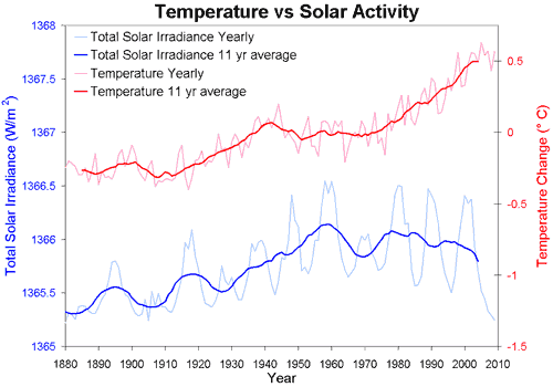
And now including data up to 2015, that pattern is even clearer. In each case the 2015 result is based on slightly incomplete data: up to end-November for temperature and mid-October for solar activity. It shows that in the 5 years since we first published a version of the figure below, Earth's surface has continued to warm despite declining solar activity.
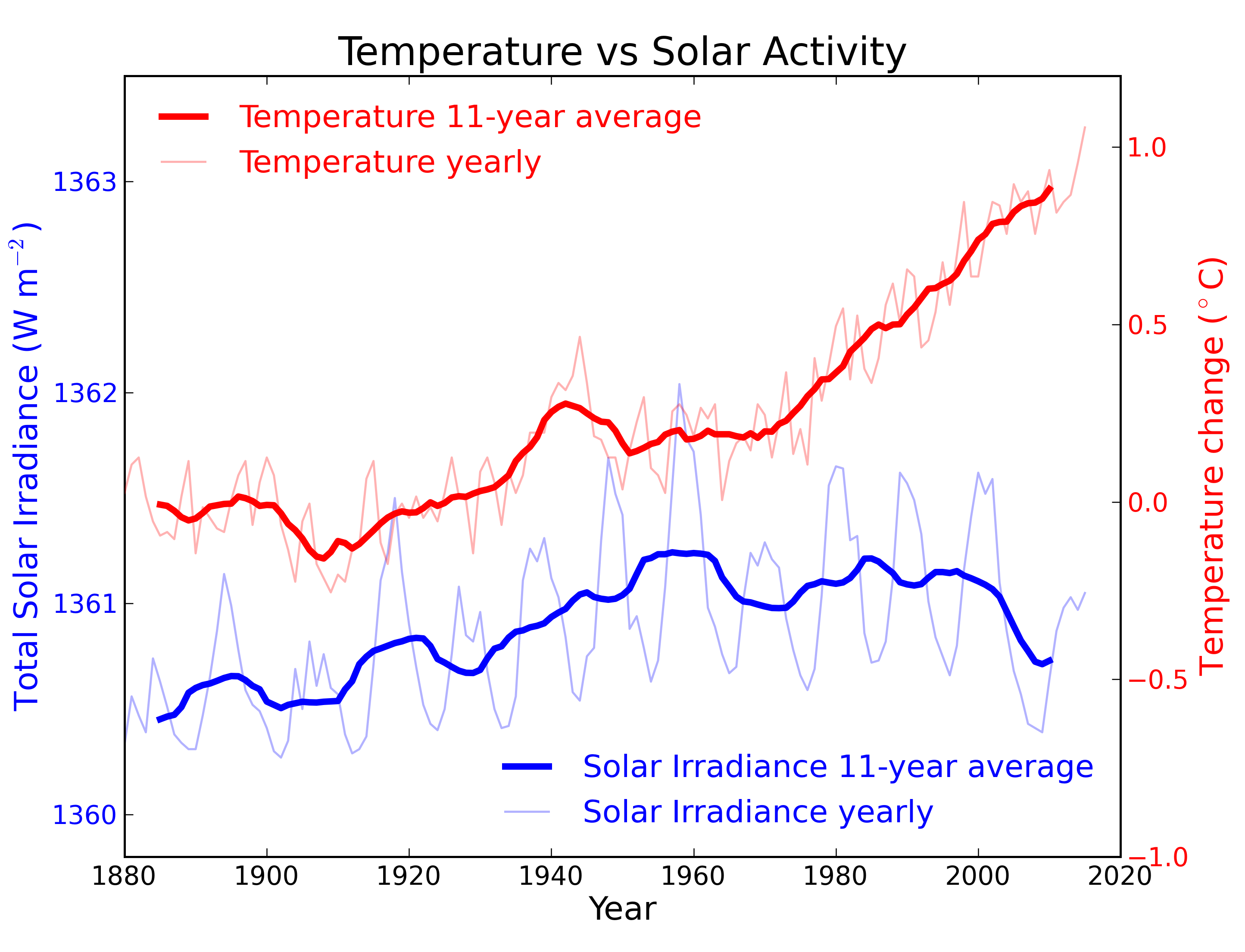
Data sources: temperature, solar activity pre-1978, solar activity 1978-onwards.
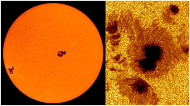
The temperature record is from NASA and the solar heat output arriving at the top of Earth's atmosphere, the "Total Solar Irradiance" comes from two sources. From 1978 we have satellite measurements, in this case from PMOD (data here). Before that, the heat output was not measured directly, but instead it has to be estimated from measurements of sunspots, which look something like this.
Source: NASA
Sunspots happen where the Sun's magnetic field breaks through the surface. The dark areas of sunspots are cooler, but the glowing bits around are hotter, leading to an overall increase in heat output by the Sun. More sunspots are visible when the Sun is more active, and astronomers have been counting and recording sunspot numbers for centuries. Krivova et al. (2010) converted this record of sunspot counts into total heat output from the Sun, and this is where we got the numbers for the solar activity up until satellites began measuring in 1978 (data here).
You might notice some changes from an older version of this figure. The numbers for the amount of heat arriving from the Sun are different: the average is now about 1361 W m-2 instead of 1365 W m-2. This is because scientists identified a problem with older satellite data: their instruments didn't block all the reflected sunlight from Earth, so the older satellites measured a little too much sunlight (Kopp and Lean (2011)). The newer data correct for this, and it also affects the calculations linking sunspots to solar heating. In this figure we've done our own correction on the sunspot data by scaling it to match the newer satellite results during the period they both overlap.
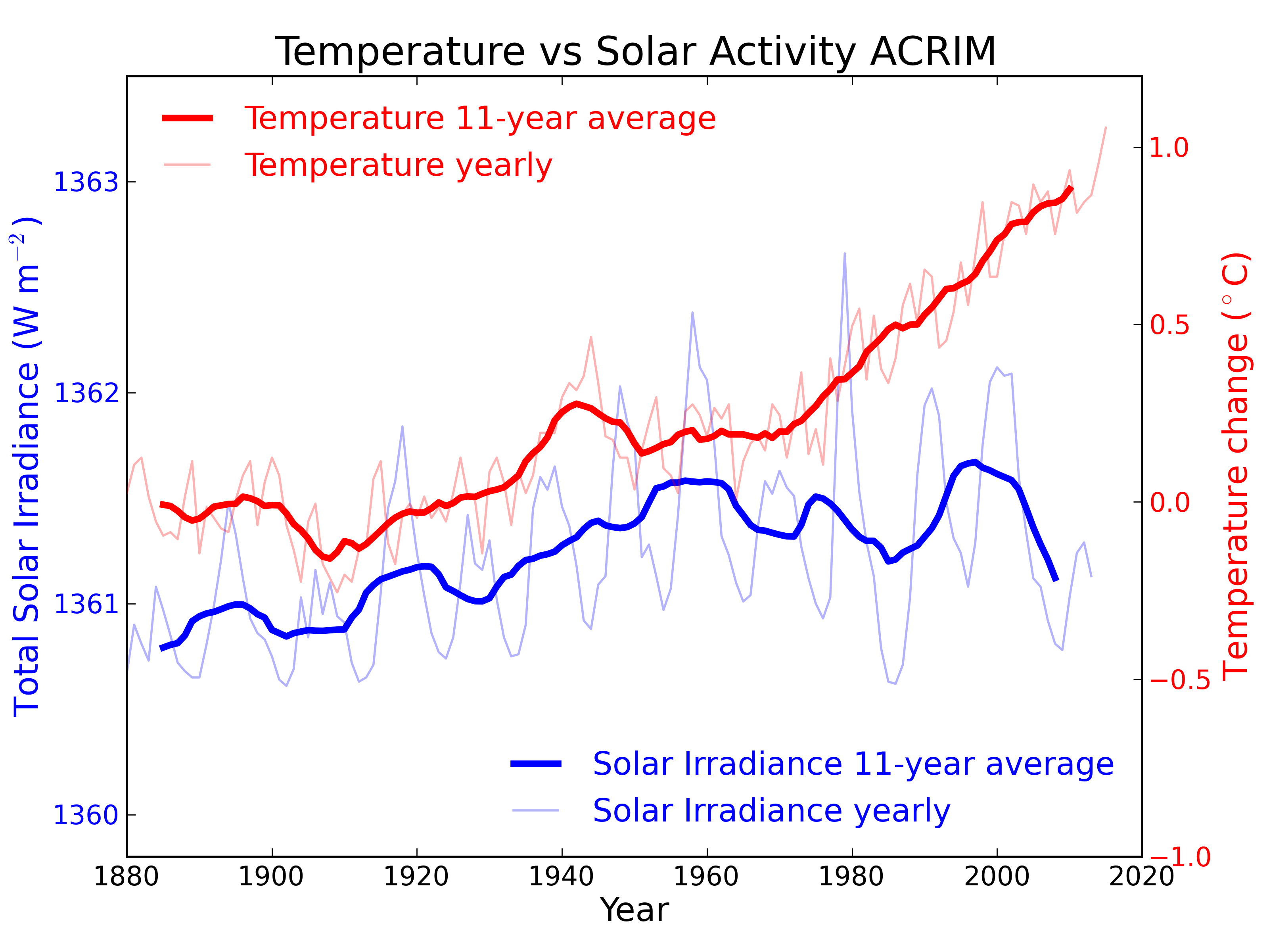
To try and keep the graph clear, we only showed the results using the NASA GISTemp temperature record and the PMOD satellite solar activity record. Other records do exist: for temperature there is BEST, HadCRUT4 and Cowtan & Way's modification, NOAA and JMO. For solar activity there is ACRIM. For the warming since 1970, all of the records agree on the trend to within 5 % so the big picture is not changed by the choice of temperature record.
For solar activity, unfortunately the ACRIM data are only available to 2013. There is some disagreement about the data in the 1980s when different types of satellites have to be combined to fill in the record - although independent data from solar magnetograms and other sources suggest that PMOD is more accurate here. The ACRIM data have previously been favoured by those who link solar activity to a measurable amount of recent climate change (e.g. Scafetta and West (2005)). Although we favour the more up-to-date PMOD for our main figure, the ACRIM data are shown below. The idea that changes in solar activity explain recent temperature change seems to have a bit of a divergence problem.


Thanks, Mark. A very clear summary!
Just to be clear: The SATIRE model of Krivova et al. actually measures magnetograms (records of the Sun's magnetic field) to determine solar irradiance, rather than a direct count of sunspots. It can be (and has been) applied to raw sunspot numbers in older epochs, but is less accurate beyond the late 19th century.
Thanks, Mark. Is there any research which validates the sunspot calculation by comparing those calculations, after 1978, with the sattelite measurements?
By the way, there are other "data" which contrarians pin their hopes on - the UAH and RSS data, not just the data sets you mentioned. I fully realise that the calculations from those measurements are questionable, but how do they fair in the comparison of solar irradiance and lower troposphere estimated temperatures?
Note that the sunspot number and group sunspot number have been completely revised recentely. Accordingly, the XXth century solar maximum is now inexistant.
Although the text of this posts is fine I believe the way the graph is presented can be misleading. The choice of the Y-axis units for total solar irradiance (1360-1363) give the impression that until roughly the 1970's changes in irradiance led ot temperature changes, and that after that there was "divergence." (note the text does say that at all).

If TSI were plotted with Y-axis units from 1350 to 1375 it woudl give a different visual impression. 1300-1400 would be different again.
I know you have to make some choice of units, and making both graphs fill the visual space makes some sort of sense, but it can lead people to make the wrong conclusion about how the two sets of values are related.
Here's another version (scaled to show actual contribution) from a Bloomberg animated graphic :
please correct to: "note the text does not say that at all"
David Sanger - we talk about forcing values of around 2-4 W/m^2. Wouldn't then putting the solar irradiance plot on a scale with that level of variation make sense?
@tmbtx it makes aesthetic sense in that it fills the vertical space, but it also visually implies a proporionality of cause and effect that doesn't exist.
I would argue this scale is proportional. The dip, for example, from 2000, is oft cited as a contributor to the temperatures coming in on the lower side of the modeling. The scale for the Bloomberg plot makes a good point about long term stability, but the differentials within that noise are on a scale that does affect the climate. This isn't really a major thing to argue about though I guess.