


 Arguments


Recent Comments
Prev 628 629 630 631 632 633 634 635 636 637 638 639 640 641 642 643 Next
Comments 31751 to 31800:
-
bozzza at 10:48 AM on 9 April 2015Models are unreliable
" So having a range if sea level rise would not be usefull. You need to know what it is."
There are needs and then there are wants...
Let's compare and contrast this with wind loading: uncertainty abounds and engineers deal with it all the time unlike you suggest!
-
Tom Dayton at 10:46 AM on 9 April 2015Models are unreliable
Rhoowl, you are incorrect that "engineers" in the sense of all engineers, use an acceptable risk of failure of "about 1 in 10,000." Perhaps that is true in the very narrow particular engineering field in which you have spent your career, but that absolutely is not a universal rule; it's not even a general guideline. Risk tolerance depends entirely on the particular situation. In my field of spacecraft design, for example, the risk tolerance differs from one spacecraft to another, from one type of risk to another, on the timeframe and other circumstances, and always depends on costs (money, time, labor) for lowering the risk and for dealing with consequences if the bad thing happens. For example, a nanosatellite usually needs to be cheap and fast to develop and launch, so usually the risk of total failure is higher than for big spacecraft, because the funders are not williing to spend enough resources to lower the risk further. For any spacecraft, tolerance for spacecraft failure is lower before the primary mission is accomplished, and higher after that. Much lower risk is tolerated for spacecraft that put human health and life at risk than for mere property risk.
When engineers chose how high to make a seawall, you are correct that they must design to a particular, target, level of sea level. But that particular level is dictated to them by people who take into account the full range of all I've written about, including the range of probabilities of various levels of sea level rise.
-
Trevor_S at 10:46 AM on 9 April 2015The global warming 'pause' is more politics than science
@ John Hartz The comments are at least as illuminating :)
Another here, a repost from The Conversation, the comments are more illuminating than the article.
Moderator Response:[JH] Link activated.
-
tcflood at 10:36 AM on 9 April 2015The history of emissions and the Great Acceleration
Andy; Thanks for your response. I forgot to mention that I had also checked out the Synthesis Report. I did see this diagram. To correct one comment I made above, the statement I have seen in several places is that we need to limit emissions to 2,900 Gtonnes of CO2 (not 450 ppm).
General audiences want to hear something specific about what percent we need to cut back on, say, use of coal each year to stay under the famous 2C increase. Diagrams such as that above seem to suggest that, given the dominant politics in the U.S. and Australia, for example, we are already way past 2C (assuming that the TCR used turns out to be anywhere near correct). Maybe there is good reason not to be too specific in presentations so as to not discourage people to the point that they choose denial.
-
Rhoowl at 10:00 AM on 9 April 2015Models are unreliable
I need to explain something about design. Engineers use an acceptable risk of failure about 1 in 10,000. That's a high standard. Failures can be catastrophic. We absolutely need to know the design parameters within 20 percent. We have safety factors. they range from 1.5 to 4. Something like a sea wall would have overturning sf of 1.5. there would also be free board distance from top of wall to water. Not more than two feet. If the wall gets breached there's a high risk of failure. Water washes out the toe resulting in loss of stability. This is why getting the parameters correct is so important. So having a range if sea level rise would not be usefull. You need to know what it is.
Moderator Response:[JH] Is English your first language?
-
Rob Honeycutt at 09:30 AM on 9 April 2015Models are unreliable
Rhool... Modelers' time is most certainly valuable, but I think you'd find that many of them would consider explaining their work to be a valuable use of their time. It just requires an open mind and a willingness to learn.
-
Rhoowl at 09:22 AM on 9 April 2015Models are unreliable
I'm typing this on an Ipad please forgive some of the English it's the spell checker messing some of it up
-
Rhoowl at 09:13 AM on 9 April 2015Models are unreliable
JH yes the range of estimates are different scenarios....each scenario had an error. The error equates to a diferrent level of sea level rise.
RH someday an engineer is going to ba asked to design these systems based on the models. when that occurs they they will ask some of the questions I am posing here. I'm not sure that an climate would want to speak me to about these questions. I would respect that their time is valuable.
CBD iposted the graph one of the more extreme scenarios showed 4c warming with 2.4 to 6.4 I believe error. With the way China and India are building coal plants is this implausible scenario? The one post I had which is no longer visible shoe Sea level rise with the worst case bing 11.5m....this probably corresponds to the 6.4 scenario. The 2.3 scenariio should be in the 5m range based on the 2m/degree C value given. That's a pretty big error
Scaddenp I never made any claims about inputs except that I tbought the modellers were entering the best figures. Although the scenarios listed deal with the inputs.....but that's another matter which complicates the design process.
-
Andy Skuce at 09:10 AM on 9 April 2015The history of emissions and the Great Acceleration
tcflood
I can't give you all the info you ask for, but I based that comment on graphs like this. (From here)
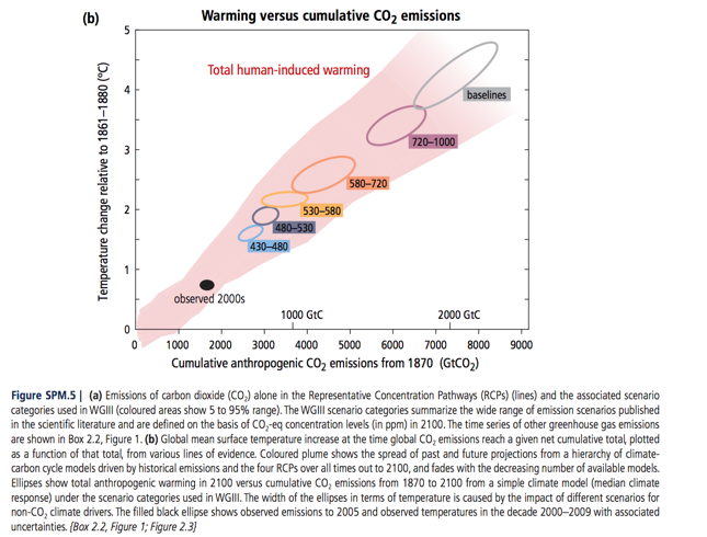
The concentrations are next to the little ellipses.
Of course, the exact amount of CO2 concentration (and note that the IPCC concentrations are CO2eq figures, so they include the other GHGs) that will cause 2 degrees C warming will depend on climate sensitivities, so there's considerable uncertainty. It also depends on the probability of exceeding 2 degrees that we deem acceptable as a risk.
I just meant 450ppm as a rough target. Some scientists far more qualified than me consider 350 to be the safe limit.
-
tcflood at 08:13 AM on 9 April 2015The history of emissions and the Great Acceleration
Andy; In your last paragraph before the summary, you comment that we will need to stay below 450 ppm to stay under a 2 C increase. Where can I find he closest thing to a primary reference that discusses the assumptions (assumed transient climate response, rate of decrease of CO2 emissions needed, etc.) in this widely repeated statement? I've tried to find it in the AR5WGI technical report and it's summaries and the summaries for WG's II and III, but I can't find it there in explicit form. Probably I've just missed it.
I'd like to prepare a nice clean, concise summary for presentations of at least one scenario of exactly what society would need to do to meet the gaol of a 2 C limit, given some explicit assumptions about the science.
-
Rob Honeycutt at 06:37 AM on 9 April 20152015 SkS Weekly Digest #12
william... Damns, whether man-made or erected by industrious little critters [redundant statement?], need water. We've had very little precipitation for several seasons now. More damns can't fix that.
-
william5331 at 06:21 AM on 9 April 20152015 SkS Weekly Digest #12
There is a solution to the decrease in the snow pack that provides California with her water. The Beaver. The beaver does the same thing as a snow pack. It shifts water from when it falls and is not needed (winter) to when it is not falling and is needed (summer). Californians should wake up and get absolutely fanatic about having beavers in the catchments of all their streams.
http://mtkass.blogspot.co.nz/2007/07/canadian-beaver-pest-or-benefactor.html
http://mtkass.blogspot.co.nz/2011/05/erics-beavers.html
http://mtkass.blogspot.co.nz/2014/06/the-tay-beavers-of-scotland.html
-
PluviAL at 05:56 AM on 9 April 2015The history of emissions and the Great Acceleration
@2, JJA: Your link seems to be unsupported, its just a link to a blog, but to be fair I will look at it. My reaction to your post is not good. I feel that this is an exaggeration of data, and thus the interpretation is too dire.
We can fix the problem, but we must look at it realistically, not too rosy, not too bleak.
I'm not certain how bad the extinction factor will be, but we will get a handle on both global warming and cooling, Sea Level Rise, and CO2 concentrations. Extinction damage is just a matter of how long it takes us to take on the problem on scale.My sense is that we in the US are coming around to reality, then we will act. Canada and Australia seemed to be ahead, but they now seem to be headed into the denial tunnel, which we are coming out of, the Brits Euros are already on the other side.
This wonderful summary of the panorama of our use of the ocean/atmosphere/biosphere system fails to acknowledge that the great acceleration in use parallels the acceleration of wealth creation, including the taming of human population growth as a product of increased wealth, health, and knowledge. Thus it obscures the necessary solution: benign energy production to continue the great acceleration.
-
scaddenp at 05:52 AM on 9 April 2015Models are unreliable
"please site some data backing your claim". Certainly, but which claim? That monthly temperature for a station can be estimated accurately? Or that climate model is boundary value model not initial value model. Or that difference between summer and winter is due to differing energy input? Or which claim? As to sealevel - well in your model you should be able to use it to give response to given storm event. Ie the rainfall for a storm event is an input. I would expect that you could use it to give a range of response to different sized storm events. The sealevel estimates you are looking at are just that - range of estimates for different emission scenarios. Each scenario has its own error estimate but dont confuse the range for different scenarios with error. Climate models certainly do not predict what humans will emit in the future.
-
John Hartz at 05:42 AM on 9 April 2015The global warming 'pause' is more politics than science
Recommended supplemental reading:
Global warming hiatus explained and it's not good news by Graham Readfearn, ABC Environment, Apr 8, 2015
-
Andy Skuce at 03:48 AM on 9 April 2015The history of emissions and the Great Acceleration
shaileshrao:
There are some answers to your question in Howard Lee's post of several weeks ago:
-
John Hartz at 03:24 AM on 9 April 2015Models are unreliable
Moderation Request
Please do not respond to future posts by Rhoowl until a Moderator has had a chance to review them. He/she is skating on the thin ice of posting nonsense.
-
michael sweet at 02:22 AM on 9 April 2015Models are unreliable
Rhoowl,
Real Climate is a blog written by climate scientists. The main organizer is Gavin Schmidt who is a climate modeler. They have a lot of background information and old posts that explain all your questions. Perhaps if you read some posts there you would begin to understand how climate models work.
-
Rob Honeycutt at 01:30 AM on 9 April 2015Models are unreliable
Rhoowl... I don't want to dogpile here, but I'd like to renew my first question.
If this is a related area of expertise for you, why would you not attempt to engage with people who are actively working with climate models in order to better understand what they're doing? Why are you engaging on SkS instead of talking with someone who builds climate models?
The best I can tell from your comments here, you have a misguided expectation of what climate models are intended to accomplish. But instead of attempting to better understand the matter you're tossing out the entire field of research, deeming it an impossible task.
Not fully understanding something, even for an expert, is no big deal. Most of us are experts in something, and we are all ignorant of the things which we haven't yet learned. But it's not acceptable to be ignorant of something and refuse to learn what other experts already understand. If you actually have the expertise you claim, there is absolutely no excuse for not contacting a professional climate modeler and asking questions.
[I emphasis "if" here because I have a very hard time fathoming why someone with 40 years experience would not first do exactly what I'm suggesting long before posting on this website.]
-
KR at 01:01 AM on 9 April 2015Sea level rise predictions are exaggerated
Rhoowl - Do you understand the difference between different emissions scenarios and the uncertainties (including modeled natural variation) for a single scenario? Your comment seems to indicate that you do not.
-
CBDunkerson at 23:52 PM on 8 April 2015Sea level rise predictions are exaggerated
Rhoowl, assuming that this is in response to my comment here, given those specific values you are presumably referring to 'table 2' in the basic version of the article above. Of course, that table shows those two values as sea level rise by 2500 for two completely different emissions scenarios at opposite extremes of the uncertainty ranges... do you not have any idea what you are talking about here? Because that's the most charitable explanation I can think of for such a blatantly ridiculous argument.
-
saileshrao at 23:43 PM on 8 April 2015The history of emissions and the Great Acceleration
Thank you for this excellent summary. I have a question:
What is an estimate of the CO2 emissions due to land use changes from the start of the agricultural revolution, say 8000BC to 1750?
The vast desert that extends from the west end of Africa as the Sahara all the way into India as the Thar desert and into China as the Gobi desert filled with the artifacts of the Egyptian, Sumerian, Babylonian, Persian, Indus Valley and Chinese civilizations, to name a few, tells the story of significant land use changes during that period. -
Rhoowl at 23:23 PM on 8 April 2015Sea level rise predictions are exaggerated
http://www.skepticalscience.com/sea-level-rise-predictions.htm
sorry....0.13 meters to 11.5 meters....so 35 feet...
Moderator Response:[JH] Link activated.
-
CBDunkerson at 23:00 PM on 8 April 2015Models are unreliable
Rhoowl, please cite the actual sea level rise estimates you are referring to. Are they for the same timeframes? Do they assume the same future emissions paths?
Your claim that there is "huge error" in the modeled range of sea level rise is a provable position... all you need to do is cite the actual source of the estimates ("from 10 inches ... to 20 ft."). You're right... that'd be a huge uncertainty range for a single set of assumptions. So go ahead, cite the source and prove your point.
-
Rhoowl at 22:37 PM on 8 April 2015Models are unreliable
Scaddenp
please site some data backing your claim.....the program I use are not predicting anything that can not be predicted.....
i will ill give you a real world example of the climate Model
climate models lead to a prediction that sea level will rise from 10 inches to Ive heard some estimates to 20 ft. This is based on the temperature increase. That's a huge error....l
i have to design a sea wall around NYC to prevent losS of the city. Which value to you choose. The 10 inch sea wall will cost about 100million.
20 ft will cost 100 billion....probably not too far off with those figures Loss of the city... 2 trillion.
We we know sea level was about 250 ft higher than now in the past. So the 20 ft is not unreasonable.
Which model do do you choose
Moderator Response:[JH] A range of estimates for differing scenarios do not equate to "error".
-
chriskoz at 20:04 PM on 8 April 20152015 SkS Weekly Digest #14
You certainly have heard about new paper about AMOC slowdown by Stefan Rahmstorf et al. No free full text but plenty of comments on RealClimate.org and in popular press (e.g. linked to from Mike Mann's facebook).
But did you hear about Steve McIntyre's Blunter on the subject? Worth reading, just to haver a good laugh. While trying to critique said paper, Steve confused δ15N, a proxy for water mass movement, with a proxy for temperature. Subsequently, Steve's entire critique turned invalid nonsense.
-
scaddenp at 18:36 PM on 8 April 2015Models are unreliable
Rhoowl, you might also like to consider why there isnt a weather forecast that is going to predict the temperature on say June 25th 2015, let alone Dec 22nd 2015. However, several methods will give you quite accurate predictions for the June average monthly temperature and the December average monthy temperature. Ie. no amount of chaos in weather systems is going to change summer into winter. Summer is different from winter because the energy balance in temperate regions is so different. Adding CO2 is same effect on a global scale.
-
scaddenp at 18:29 PM on 8 April 2015Models are unreliable
Rhoowl, instead of watching some video, try reading the detail. What you are doing is projecting what you know from hydrology model into a supposed knowledge of how climate models work from simplistic information. It seems to me that what your hydrology models have in common with weather models, is that they are both initial value problems. Climate is not. That is the point both I and Glenn are trying to make. Your 4 points are based around a misunderstanding of the models essentially. The IPCC chapters on modelling are a far better starting point then some video. We are doing our best to point you to useful information which is rather more than can stuffed into a comment reply. Now if you are going to stand by your original suppositions rather than learn new information, I dont think there is much point in continuing the discussion.
-
BojanD at 16:51 PM on 8 April 2015A revealing interview with top contrarian climate scientists
@CBDunkerson, I haven't said that Dana's quote was wrong. I was trying to say that Dana missed Christy's misrepresentation when he tried to debunk it. Simple check would suffice. His answer doesn't:
"only 13% of participants described climate science as their field of expertise"
But if you filter out all the participants that are not active climatologist, you still get "only" 78%, which is still quite a long way to oft-quoted 97%. So 150 vs. 50 years is actually very important. -
Rhoowl at 15:34 PM on 8 April 2015Models are unreliable
Tom Curtis......please run a calculation based on the table for the error in the model and present it here
Glenn tamblyn similar is a relative term.....ie those two are a lot more similar than say a models that attempts to predict the behavior of atoms...please direct arguments to the 4 items listed in the original posts. Disprove the statements directly
hydrology has nothing to do with weather. It's purpose is to calculate quantities of water and the ability of a system to convey the water
i was watching a video of how the climate models work By a scientist who uses them. He described the math of the model and basic parameters that are used for the model. He discussed how he arrived at values for the Parameters. His method was no different than anything I do to arrive at parameters for the models I operate.
-
Glenn Tamblyn at 15:08 PM on 8 April 2015Models are unreliable
Rhoowl
"Hydrology is basically a micro climate Model....you go through very similar steps to model the system....you have to use storm data to calculate rainfall"
Nope. It's a micro weather model!
Your hydro model is trying to model how a system responds to a set of external inputs. The best analogy with climate models would be if you were trying to predict what the storm data will be. Modelling the micro detail of behaviour from given inputs is different from modelling what the inputs will be AND broad general behaviour in response to that.
-
One Planet Only Forever at 14:58 PM on 8 April 2015The history of emissions and the Great Acceleration
WRyan,
Thankyou. Now I can appreciate why there is value in research into other materials that will work like cement powder even if they may be more expensive.
-
Glenn Tamblyn at 14:58 PM on 8 April 2015Models are unreliable
Rhoowl
"weather forecast models to climate models....although those two models are very similiar...".
That is the nub of it. They aren't.
Here is a simple analogy.
I have a swimming pool in my backyard. Summer is approaching and the water level is low. So I throw the garden hose in and turn on the tap. Big pool, small hose - it will take quite a while to fill. While it is filing, my family are using the pool, getting in and out, adjusting the water level due to the displacement of their bodiea. Lots of splashing, waves, the dog jumping in after a frisbee.I could build two models. One model attempts to predict the detailed water level across the pool, all those waves and stuff. Pretty complex and it can only be done for short timescales. The other model attempts to predict the slower variation of the average height of the water. Much simpler; pool, hose, tap, flow rate, that's about it. Can't predict short term small scale variations but pretty good at predicting long term changes in averages.
The first model is an initial value problem. It takes the current state of the surface of the pool, in all its messy complexity, and attempts to project it forward for seconds, minutes at best. Because over that timescale th change in total volume of water in the pool is a minor component.
The second model is a boundary value problem. It is looking at those factors that determine the boundaries within which the smaller scale phenomena play out. Essentially in this case, how much water is in the pool.
Although the two models are based on similar basic principals, the goal and methods of the models are very different. At its simplest, weather models are attempting to model the detailed distribution of energy within the climate system to determine local effects, but essentially assuming that the total pool of energy within the entire system is largely constant. Esentially modelling intra-system energy flows.
Climate models are firstly modelling how the total pool of energy for the entire system changes in size over time. Then secondly they attempt broad estimations of general intra-system distributions of energy. But they can't attempt detailed estimations of intra-system distributions, only broad characteristics.
In a simple sense, weather models model the waves, climate models model the water volume. Weather models ignore the change in water volume, climate models ignore the details of each individual wave.
-
scaddenp at 14:20 PM on 8 April 2015Models are unreliable
Rhoowl - you are comparing your hydrology models to climate models. Understanding the differences between weather and climate (initial value versus boundary value) would give you some insight into the difference. While using the pinatuba data to improve aerosols is certainly a way to test and improve models, I am noting that modellers published an essentially correct prediction of what would happen with pinatuba in advance.
The other comments were explaining what are the known issue with limits on temperature prediction (the problem of climate sensitivitiy) which explains some of the spread in model prediction. You claim models cant be trusted but I am trying to point out that
a/ they can be trusted to predict various climate variables within useful limits. You can get your "1000s of tests" by looking at model versus observation on a whooping range of climate variables over various time intervals. AR4 has lengthy chapter on model validation.
b/ they are the best tool we have estimate future climate change. You dont need a model to tell you that if you add extra radiation to a surface is going to warm it up but you do need one to tell you by how much.
-
Tom Curtis at 14:11 PM on 8 April 2015Models are unreliable
Rhoowl @820, so you are going to stick dogmatically to the belief that the possible range of Earth temperatures is restricted to 287 K plus or minus a couple of degrees not matter how conditions at the surface, or astronomically vary? Because the only way a comparison for accuracy matters if you are determining whether the models are any good is by comparing their predictions relative to the possible range. They are skillful if they narrow that range, and not otherwise. Given that the range of possible plantetary surface temperatures is known from observation to be from around 2 to around 600 K, that shows a remarkable level of dogmatism on your part.
-
WRyan at 13:59 PM on 8 April 2015The history of emissions and the Great Acceleration
@One Planet ...
The CO2 associated wiht cement production refers to the amount of CO2 released when limestone (CaCO3) is decomposed to form lime (CaO) and CO2. The lime from this process is used to make cement.
-
Rhoowl at 13:38 PM on 8 April 2015Models are unreliable
scaddenp....i don't know where you see in my posts where i am comparing weather forecast models to climate models....although those two models are very similiar...
as far as pinatubo...
http://earthobservatory.nasa.gov/Features/Volcano/
this explains how they used this eruption to model aerosols and test it against real world effects..it also went on to explain they ran several simulations..this is actually critical in determining the accuracy of the model...without real world test the models mean nothing..but you need many tests to ensure your model is properly working. trouble is the events that they can test are few and far between...it will take a very long time before they can refine the models to get accurate results..
not sure what your other comments are about...never mentioned any of those either.
Moderator Response:[JH] Link activated.
-
One Planet Only Forever at 13:32 PM on 8 April 2015The history of emissions and the Great Acceleration
Andy, what you have presented has more worth than many 'new scientific results of investigation into isolated aspects of what is going on'.
I understand why you restated that what you are presenting is not new science. However, you should not feel any need to provide that type of clarification. Developing better understanding is what matters. And that understanding comes mainly from a more holistic evaluation of the science to date. Better understanding can even develop from efforts to explain observations that are not clinically pure or part of a structured investigation.
So thank you for advancing human understanding of this important issue.
I do have one question. The reference to "Cement" seems odd. I appreciate that a significant amount of burning is associated with the production of cement powder. And cement production may stand out as significant part of fossil fuel burning. However, it seems that burning should just be included in other burning which should include the burning of fossil fuels related to wars. Which raises another question. Do the fossil fuel burning amounts reported include the burning related to war efforts? (that became two questions as I typed it).
-
Rhoowl at 13:30 PM on 8 April 2015Models are unreliable
http://www.ipcc.ch/publications_and_data/ar4/wg1/en/spmsspm-projections-of.html
this give a predicted future temperature...and plus or minus therefrom...errors are in the range +/- 100% for constant to somewhat less as you move down the chart....so 75% is a reasonable figure
these estimates are based on their models
-
One Planet Only Forever at 13:15 PM on 8 April 2015A revealing interview with top contrarian climate scientists
Regarding the quote from Christy copied by BojanD@4, it is important to be aware of the carefully selected misleading terms employed by the likes of Christy and avoid being lured into accepting them as valid ways of describing what is going on.
Human impacts are not "controlling climate". They are affecting it. There is a significant difference and the likes of Christy are highly likely to be aware of the difference. And the likes of Christy will appeal to their target audience by saying things like 'those global warming fools believe humans can control the climate'.
-
Tom Curtis at 13:11 PM on 8 April 2015Models are unreliable
Rhoowl @815, you claim that with respect to temperature, the AR5 models show an error spread of plus or minus 75%. That is completely false. The models is in AR5 show a range of predicted absolute global mean surface temperature (1961-1990) from 285.7 to 288.4 K, with a mean of 286.9 K and a standard deviation of 0.6 K. The observed values are given as 287.1 K, for an error range (minimum to maximum) of -0.49 to +0.45%. You think there is a larger percentage error range, but that is only because values are stated as anomalies of the 1961-1990 mean, ie, they eliminate most of the denominator for convenience. That is approriate for their studies, but if you are going to run the argument that the models are so inaccurate as to be useless, you better compare the models actual ability to reproduce the Earth's climate, not merely the exact measure of its reproduction of minor divergences in that climate.
-
scaddenp at 12:25 PM on 8 April 2015Models are unreliable
Rhowl - I think you should read up on actually how climate models work and particularly make sure you understand the difference between a weather forecast models and climate models.
"When they ran the climate models to test against the piñatuba volcano I guarantee you they massaged the model quite a few iterations to achieve this result."
I am lost to understand how you can conclude that. When Pinatuba erupted, the model prediction was made at the time (published as Hansen et al 1992). The evaluation of model prediction was done with Hansen et al 1996 and Soden 2002. I also notice that the incredibly primitive Manabe model used by Broecker 1975 is doing pretty well.
I am not quite sure what you understand what the predictions of a climate model to mean. As the modellers would happily tell you, models have no skill at sub-decadal or even decadal prediction of surface temperature. That is basically weather not climate. In the short term, large scale, unpredictable internal variability like ENSO dominate. They do have skill at climate prediction - ie 30 year trends. That said, climate sensitivity is difficult to pin down. It is most likely in the range 2-3.5. We would desparately like to be pinned down better than that but perhaps you should look at the recent Ringberg workshop presentations to understand why this is so difficult. Nonetheless, the 2-3.5 is certainly good enough to drive policy. Whatever the shortcomings of climate models, their skill is far better than reading chicken entrails etc.
-
Rhoowl at 11:52 AM on 8 April 2015Models are unreliable
Hydrology is basically a micro climate Model....you go through very similar steps to model the system....you have to use storm data to calculate rainfall. Break them into isoheytals. Quantify drainage areas and land parameters. Calculate stage storage discharge relationships. Understand how the fluid mechanics affects your models.
In in reality the steps you go through in the analysis isnt any different than doing finite element analysis. Even though hydrology isnt anything like finite element analysis in theory....
ive have have worked mostly with other engineers..... I have a degree in civil engineering environmental emphasis.
-
Rob Honeycutt at 11:32 AM on 8 April 2015Models are unreliable
Rhoowl... Have you actually tried engaging with researchers who are actively working on climate models?
-
Rhoowl at 10:43 AM on 8 April 2015Models are unreliable
I would have say say that I am quite an expert when it comes to modeling real world phenomema. I used computers to model hydrology and finite element analysis regular at work. I've been doing this for 40 years. The two applications represent linear mathematics. The most important aspect of modeling is confidence in the model. Confidence is gained by checking the results against the real world applications. I get the luxury of testing this as soon as a month but normally with 6 months.
I know now the mathematics for the finite element analysis is rock solid. It's based on Hardy Cross's Method of Virtual Work. Basically just one equation. Hydrology is based on many equations. If someone else analyses the model it's normal to get results within 15 percent. This has been tested 1000's of times. Getting these results gives you high confidence.
Different results are due to initial conditions of the model, calculation interpretation, etc.
but alas it's not so simple. As model complexity increases the confidence level goes down. You get unexpected results. Small changes in the model seem to produce large changes in the results. It starts to behave non linear.
The he modeller has a preconceived notion as what to expect from the result. When the results are not what you think they should be you will test this by altering the conditions. This is performed in all modeling. When they ran the climate models to test against the piñatuba volcano I guarantee you they massaged the model quite a few iterations to achieve this result. In reality this give you a better understanding of how the model works.
One argument you hear is Gigo. It's my belief this is not accurate And a bad argument. Believe me...the modeller spends a large amont of time to get all the parameters as precise as he can to ensure the best result.
This is my believe that the climate models can not be trusted
1 the results of all the models indicate a wide spread. The ipcc show predicted temperature errors is in the +/- 75 percent range. This would yield a low confidence. If I got results in my work for that spread I would trash the result and use another method. In fact it would be nearly impossible to design anything based on that result.
2. The model has not been tested against enough real world events to judge the reliability of the model. It takes 1000s of tests to ensure model reliability.
3. The non linearity signficantly complicates the model performance.
4 model complexity increases errors through unexpected results.
-
CTG at 08:30 AM on 8 April 2015A revealing interview with top contrarian climate scientists
I always laugh when pseudo-skeptics reject IPCC projections of future climate scenarios because they are based on "GIGO computer models", but then in the next breath claim that UAH is the most reliable temperature series, even though it is also based on a "GIGO computer model". In fact, UAH gives a really good example of the GIGO problem - by not accounting for decline in satellite orbits, they were effectively feeding garbage into the model, so it spat garbage out, in the form of a cooling trend that didn't exist.
-
uncletimrob at 06:42 AM on 8 April 2015The history of emissions and the Great Acceleration
Thanks for the very clear and might I say unusual display of this data. Another "must read" for my students.
-
jja at 06:11 AM on 8 April 2015The history of emissions and the Great Acceleration
Great graphics! I was considering the Anthropocene discussion. It seems to me that the geological record will record a deposit layer of plastic and some suggest that it should be called the plasticene.
However, I believe that the biological extinction record will be clear, we have already embarked upon the 6th great extinction event. There is not a single realistic mitigation scenario that will not lead to catastrophic species declines on land in in the sea.
In view of this, instead of calling this period the Anthropocene, it seems that the short-lived duration of human existence is only a precursor to the apparently intentional decimation of, depending on our mitigation efforts, up to 95% of all life on planet earth through this process of self-consumption and the subsequent immolation of the biosphere.With the real beginning of this extinction event happening near the mid to late 1970s, it seems appropriate to consider the teachings of the Hopi elders who saw the successful inhabitation and subsequent fall of SkyLab in 1979 as the fullest sign of the end of this age of man.
And this is the Ninth and Last Sign: You will hear of a dwelling-place in the heavens, above the earth, that shall fall with a great crash. It will appear as a blue star. Very soon after this, the ceremonies of my people will cease.
http://www.welcomehome.org/rainbow/prophecy/hopi1.html
Future archeologists will know our conscious ability and see how we have destroyed this world.
The new period we have entered isn't the anthropocene, it is the deleocene.The Latin phrase for Wipe Out is deleo. The Latin phrase deleo is defined as (deletum) to destroy, wipe out, erase.
source: http://www.nap.edu/openbook.php?record_id=12501&page=R3]http://www.nap.edu/openbook.php?record_id=12501&page=R3
-
ubrew12 at 05:02 AM on 8 April 2015The history of emissions and the Great Acceleration
If I were a teacher I would definitely direct my students to your clear and fascinating examination of this topic. Thanks!
-
Walla at 02:47 AM on 8 April 2015The Good, The Bad and The Ugly Effects of Climate Change
Dear Skeptical Science... I am not a scientist, but a Musician, wich means I will look more for the romantisized version of the facts :)... that being said:
This is dark, really dark. I realize you only write the facts, but it's still quitte depressing. So my question is: is there a solution to all of this (and no, I do not expect there to be an easy answer), especially considering there are a lot of scientist on this blog, and most can't seem to agree with one another.
Moderator Response:[TD] Not a "solution" in the sense of preventing a global temperature rise of at least 2 degrees. But technologically and economically it is feasible to prevent a rise above that. (Read the Basic, Intermediate, and Advanced tabbed panes there.) The impediments are political.
Prev 628 629 630 631 632 633 634 635 636 637 638 639 640 641 642 643 Next


