


 Arguments


Recent Comments
Prev 780 781 782 783 784 785 786 787 788 789 790 791 792 793 794 795 Next
Comments 39351 to 39400:
-
Tom Dayton at 08:58 AM on 19 January 2014Other planets are warming
mkuske, also see the post "It's the Sun." Be sure to read the Basic tabbed pane, then the Intermediate one, then the Advanced one.
-
Tom Dayton at 08:46 AM on 19 January 2014Other planets are warming
mkuske, the only way your analogy is valid is if the brisket has not yet reached the oven's temperature of 325 when you lower the oven's temperature from 350 to 325. The oven is still warmer than the brisket, so of course the brisket continues to warm toward that temperature of 325. If instead the brisket has reached the equilibrium temperature of 350 before you lower the oven's temperature to 325, then the brisket will start to cool down from 350. (And it will cool slower than the oven does, because the brisket has greater thermal mass than the oven's air.)
But let's skip your analogy and use the real Earth. You are implying there is a lag between the increased incoming energy from the Sun and the Earth's heating. You are quite correct. Assuming the Earth initially was in thermal equilibrium (same energy coming in as going out to space), an increase in the energy coming in from the Sun will cause energy immediately to start accumulating in the Earth (by which I mean the atmosphere, surface land, surface water, deep oceans--the whole shebang). But that extra energy is distributed among all the components of "the Earth," which takes time. So although parts of the Earth immediately start heating, there is a lag before the entire Earth system reaches a new temperature. If the Sun's input stops increasing--flattens out--then the Earth's energy indeed will continue to increase, but only until it reaches equilibrium.
But simultaneously, as the Earth's temperature increases, the Earth emits more energy to space. So as soon as the Sun's input to the Earth flattens, the energy imbalance in the Earth (energy in minus energy out) instantly starts decreasing. That makes the rate of temperature increase slow down. But that is not what has been happening. Instead the energy imbalance has continued to increase, and the rate of temperature increase has not slowed. Also, we have a large amount of empirical evidence of the length of the lag between a change in the Sun's input to the Earth and the resulting temperature change (e.g., the Sun's 11-year cycle and volcanic eruptions of large amounts of reflective aerosols). The lag is not nearly as long as the time in which the Sun's radiance has been flat.
For more details, and for a more proper place to put your comments on this topic, see the post "Climate time lag."
-
nigelj at 08:13 AM on 19 January 2014Australia’s hottest year was no freak event: humans caused it
Topal #4. Regarding your link, what makes you think satellite or ballon data is the full story on temperature trends? There are questions about the accuracy of both. You are better to average all datasets from atmospheric to surface based. I think if you do that, the IPCC predictions have been reasonable.
-
mkuske at 07:42 AM on 19 January 2014Other planets are warming
This defense of position is particularly poor and can be refuted by a simple 5th grade-level experiment. Take a brisket and put it in your oven, setting the oven at 175 degrees Fahrenheit. After an hour check the brisket's temperature. Put it back in the oven and raise the oven's temperature to 350 degrees Fahrenheit for twenty minutes. After twenty minutes, take it out and check the brisket's temperature. It went up right? Now put the brisket back on the oven and lower the oven's temperature slightly to 325 degrees Fahrenhiet for a half hour. Take the brisket out and check it's temperature. The temperature of the brisket will have continued to rise! "How is that?", you seem to say, "How could the temperature of the brisket continue to rise when the temperature of the oven went down by 25 degrees?" Your "defense" is that the oven couldn't be warming the brisket because the brisket didn't cool when the oven's temperature was slightly lowered -- even though the oven's temperature was still well above the brisket's point of stasis. Seriously???
-
grindupBaker at 06:36 AM on 19 January 2014Australia’s hottest year was no freak event: humans caused it
william #5 I see no quantification in the article at your link. Sans quantification it says nothing useful regarding the current ultra-short-term topic of a few decades of big, quantified, warming (maybe bodes even extra badder for Aus over the century). Interesting in its own right of course.
-
william5331 at 04:29 AM on 19 January 2014Australia’s hottest year was no freak event: humans caused it
I'm no climate change denier. I think the climate is changing and the results will be pretty nasty. However a tad of scepticism is in order. A study mentioned in the following link in which isotopes in the rings which occur in stalactites suggested that Aus is going into a natural dry period. (if the past was the wet period, what must the dry look like??). Presumably less rainfall will lead to generally hotter conditions. Aus may be in for a double whammy.
http://www.smh.com.au/environment/climate-change/every-drip-has-a-climate-story-to-tell-20100711-105pv.html
-
George Fleming at 03:37 AM on 19 January 2014Matt Ridley's misguided climate change policy
To understand skeptics such as Matt Ridley, the best aid is Mark Twain:
"...There is something fascinating about science. One gets such wholesale returns of conjecture out of such a trifling investment of fact."
To get the full impact of this statement, see how he prepared the ground at:
http://www.twainquotes.com/Conjecture.html
-
Rob Honeycutt at 03:27 AM on 19 January 20142013 was Australia's Hottest Year, Warm for Much of the World
MoreCarbonOK... What I did above was to crop your image down and then resize it to 550 pixels wide. Anything wider than that breaks the formatting of the entire page.
You can also limit the image width by going to the second tab within the insert image dialog box. That will tell you the current width and you can just change the number to something smaller than 550 px.
-
MoreCarbonOK at 03:04 AM on 19 January 20142013 was Australia's Hottest Year, Warm for Much of the World
wow
I am getting the hang of this
sorry I am such an old fart
-
MoreCarbonOK at 03:03 AM on 19 January 20142013 was Australia's Hottest Year, Warm for Much of the World

I hope this works
Moderator Response:[RH] Fixed image width. I may have accidentally deleted part of your comment while I was fixing the image. If so, sorry about that.
-
MA Rodger at 02:14 AM on 19 January 20142013 was Australia's Hottest Year, Warm for Much of the World
Instruction for Inserting Images into Comments
The image you want to insert has to be already on the web. Even so, some locations are not useful (ie an image on Googlesites will only work for people who are logged into Google. All others see nothing.)
(1) Obtain the URL of the image (Right click on it & 'Copy Image Location')
(2) In SkS text editor, position your cursor where you want the image inserted.
(3) Click the 'Insert/edit image' button on the 'Insert' tool bar.
(4) Paste in the image URL. The text editor also likes an 'Image Description' so type in a short descriptor.
(5) The second page of the 'Insert/Edit image' window - 'Appearance' - allows you to set the image size (amongst other stuff). Ensure the 'constant proportions' box is ticked. The lefthand 'Dimensions' box gives full width at 500px. An image above this width will overflow the thread so adjust accordingly.
(6) Be mindful that the image may be lacking its caption. And crediting the source is a common courtesy.
Thus:-
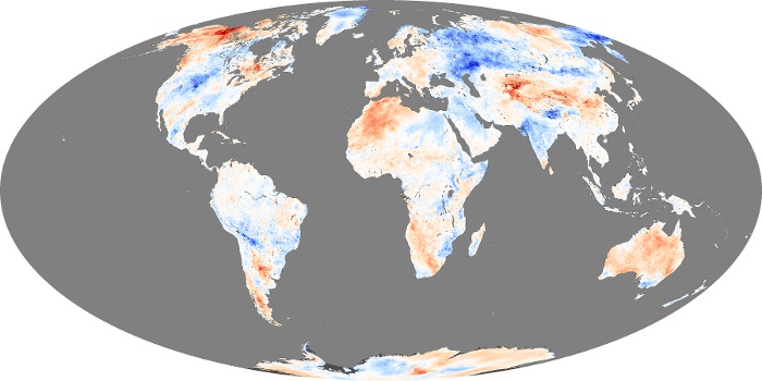 October 2013 temperature anomaly map (2000-8 base) as cherry-picked by Wattsupian Easterbrook. Image source - NASA Earth Observatory.
I think that is all you need to be aware of.
-
MoreCarbonOK at 02:06 AM on 19 January 20142013 was Australia's Hottest Year, Warm for Much of the World
@MA Rodgers
Sorry I did not comment on your post, I am puzzled as to what best is and what it represents. I suspect it is not a global data set? The 2010 cooling looks a bit extraordinary to me as well. Perhaps you can explain this to me, before I make a comment on that graph?
@ composer99
1) I picked all 4 major global data sets (except UAH)
2) Yes, you must know or figure out (preferably use your own method, so that you can be convinced yourself) when earth reached its highest output. To me, it looks like 1995, when looking at energy-in and 1998 when looking at energy-out.
hence, if you look from around that time, most data sets (including my own 3 data sets) will show global cooling from the turn of the millennium
Whatever the case, it is certainly not wrong to say that earth is cooling from around 2000.
In fact, I am saying we should get worried about it.
http://blogs.24.com/henryp/2013/04/29/the-climate-is-changing/
-
Mike3267 at 01:32 AM on 19 January 2014High-stakes climate poker
In 2008 Stern doubled his estimate of mitagation costs to 2% of global GDP. By comparison the world spends about 2.5% of GDP on military.
-
Composer99 at 01:28 AM on 19 January 20142013 was Australia's Hottest Year, Warm for Much of the World
MoreCarbonOK:
Per your comment #29 it is of course the case that if, you pick a temperature dataset, ignore the underlying physics when performing mathematical operations to it, and selectively cherry-pick the dates to start your trend lines, you will see what you want to see. Which in this case appears to be global cooling.
Of course, it is also the case that if you have jettisoned physics and correct dataset analysis in order to see what you want to see, that what you see (global cooling) will be a spurious artifact. As, indeed, it is.
-
MoreCarbonOK at 01:19 AM on 19 January 20142013 was Australia's Hottest Year, Warm for Much of the World
@MA Rodgers
Thanks, it would be nice if you can help me
here is the picture I wanted to show initially
to tell you not to worry about the warming in Australia
but to start getting worried about the cooling in Alaska
but I am not yet sure how to put it up here as an image in the comment
-
MA Rodger at 00:42 AM on 19 January 20142013 was Australia's Hottest Year, Warm for Much of the World
MoreCarbonOK @30.
While I assisted in your desire to link to WoodForTrees, I refrained from commenting about the substance of that linkage. I do so now.
You are indeed "cherry picking" with the graph you present, both in the temperature series you choose and in the time periods chosen for analysis.
Note the plot below where a negative trend is only achievable by creating a significant discontinuity with the past. The analysis 2002-2014 is obviously absurd.
Re your comment @20 - Do you still want instruction on inserting images?
-
MoreCarbonOK at 23:55 PM on 18 January 20142013 was Australia's Hottest Year, Warm for Much of the World
add to 29
sorry, I see there was no title in that display of all the data
it should be: Global cooling since 2000 (Earth Observatory)
The display is a bit more graphical than
-
MoreCarbonOK at 23:45 PM on 18 January 20142013 was Australia's Hottest Year, Warm for Much of the World
Tom Curtis says
the cause of our current warming
but
You can see that Australia is the exception, which, as I have explained before is probably due to it getting drier, i.e. less clouds, and as result more sunshine hours.
If you guys are from BOM I will also bet that if you do trending on rainfall, you will find some increase in rainfall in the lower [latitudes] and some decrease in rainfall at the higher [latitudes].
"a reduction in the Diurnal Temperature Range (DTR):"
this will (also) happen when the maxima are dropping, faster than that the minima are dropping (but they are also dropping)
That this is happening and for you to see that this is happening you have to try and understand
If you set the speed of warming out against time (years) you will see that there is high correlation on binomials for all three maxima, means and minima. Use the 4 reported figures of the speed on the bottom of each table and set those out against time. You then get acceleration, or on this case, deceleration of warming
in degrees C / annum2
Hope this helps.
-
Tom Curtis at 16:58 PM on 18 January 20142013 was Australia's Hottest Year, Warm for Much of the World
MoreCarbonOK @27:
"[I]f more carbon dioxide (CO2) or more water (H2O) or more other GHG’s were to be blamed for extra warming we should see minimum temperatures (minima) rising faster, pushing up the average temperature (means) on earth."
Exactly. If the enhanced greenhouse effect is the cause of our current warming, night time temperatures should warm faster than daytime temperatures, resulting in a reduction in the difference between daytime maximums and nighttime minimums, ie, a reduction in the Diurnal Temperature Range (DTR):

Of course, as can be seen above, or in the original article, that is exactly what we do see.
What I am puzzled by is your treating the successful prediction of an observation by a theory as disproof of the theory.
(Edited to correct error in figure.)
-
MoreCarbonOK at 16:24 PM on 18 January 20142013 was Australia's Hottest Year, Warm for Much of the World
@ Tom Dayton
if you are interested you can read some of my arguments here:
http://blogs.24.com/henryp/2011/08/11/the-greenhouse-effect-and-the-principle-of-re-radiation-11-aug-2011/
I figured that the proposed AGW mechanism implies that more GHG would cause a delay in radiation being able to escape from earth, which then causes a delay in cooling, from earth to space, resulting in a warming effect.
It followed naturally, that if more carbon dioxide (CO2) or more water (H2O) or more other GHG’s were to be blamed for extra warming we should see minimum temperatures (minima) rising faster, pushing up the average temperature (means) on earth.
That is not happening. This was already apparent to me from the 2007 IPPC AR4 report.
-
topal at 15:53 PM on 18 January 2014Australia’s hottest year was no freak event: humans caused it
How well have models performed so far? See IPCC's CMIP5 http://www.drroyspencer.com/wp-content/uploads/CMIP5-73-models-vs-obs-20N-20S-MT-5-yr-means1.png
-
DavidFaubion at 15:35 PM on 18 January 2014Breathing contributes to CO2 buildup
Factor in all the fuel and oxygen spent in agriculture, storage and transport. Then, calculate how deep each of our carbon sink is on average. The more local our food source, such as our back yards, the deeper your carbon sink. Can we dig the treasure of honest living on the beautiful Earth?
-
wili at 15:32 PM on 18 January 2014Australia’s hottest year was no freak event: humans caused it
And now CA seems to be drying up, burning down, and blowing away!
http://www.cnn.com/2014/01/17/us/california-wildfire/
-
chriskoz at 11:44 AM on 18 January 2014Australia’s hottest year was no freak event: humans caused it
smh env editor Peter Hannam has noted in his latest piece Scorchers: the reality of a sunburnt country:
Before the 2009 [...] Black Saturday bushfires, Melbourne had never recorded a day where the temperature averaged above 35 degrees. That event delivered two of them.
This week's heatwave [...] delivered three more such days with average temperatures over 35 - and a record four days with maximums over 41 - in a row.
So, from the climate perspective, the 2014 heatwave is more remarkable than that famous 2009 devastation because it was even more extreme.
People (except few BOM analysts and climatologists) obviously will not think of it as such because there were no "big fires" (as yet, thankfully Black Saturday-like strong winds have been missing us), so we need to trumpet this news throughout: folks, 2014 is even more extreme than 2009! We've beat that famous extreme record in just 5 years and under ENSO neutral conditions!
-
Riduna at 10:42 AM on 18 January 2014Australia’s hottest year was no freak event: humans caused it
Interestingly, 2013 records were set in the presence of an ENSO hiatus. 2014 is likely to see development of an El Niño resulting in surface temperatures exceeding those of 2013.
South Eastern Australia has already had its first heat-wave of 2014 with sustained temperatures exceeding 40°C for >3 consecutive days causing bushfires which have ravaged over 500,000 ha of South Australia and Victoria.
In terms of premature deaths and property loss, it is possible that 2014 will set new records, possibly exacerbated by El Niño induced drought affecting stock and agricultural yields. The immediate future is far from bright.
Unfortunately these outcomes are compunded by public policy which is, nominally, predictaed on recognitiion of anthropogenic global warming but in practice seeks to significantly increase the production, export and use of fossil fuels.
-
Tom Dayton at 09:49 AM on 18 January 2014Global warming stopped in
1998,1995,2002,2007,2010, ????
Andrew Dessler reproduced The SkS Escalater in his U.S. Congressional testimony yesterday.
-
DSL at 07:52 AM on 18 January 2014Global warming stopped in
1998,1995,2002,2007,2010, ????
On a side note, I have to point out that Henry P's analysis should be submitted for publication. It's perfect for a journal like, oh, Pattern Recognition in Physics.
-
Tom Dayton at 06:41 AM on 18 January 20142013 was Australia's Hottest Year, Warm for Much of the World
MoreCarbonOK, why on Earth do you think that only temperature minimum would be affected by human influences?
-
2013 was Australia's Hottest Year, Warm for Much of the World
MoreCarbonOK - I have replied on the appropriate thread (Thanks, DSL). Please read the opening post there.
-
Global warming stopped in
1998,1995,2002,2007,2010, ????
MoreCarbonOK - "yes, I read everything that you said!" And you apparently ignored it - you have considered absolutely nothing about statistical significance.
Your arguments are really just climastrology, curve-fitting, with no understanding of the difference between short term variation and trends, and with absolutely no connection to physics.
-
william5331 at 06:17 AM on 18 January 2014High-stakes climate poker
The only way we will ever defeat fossil fuel is to make it economically unfeasible. Look, for instance, what happened within fossil fuel when cheap gas challenged coal. Within a few short years coal declined in America from 50% of the energy generating mix to 35%. Solar is economically feasible in many areas now but the hold up has to do with the regulations surrounding the relationship between the small generator, the power company and the government. Get these right and solar will expand hugely and fossil fuels will be pushed into a corner. The following links give a sample of the problems involved. We must hit fossil fuel in their underbelly rather than going into a head on attack. They have far too much money for us to win that type of conflict.
http://mtkass.blogspot.co.nz/2013/10/solar-power-and-ratchet.html
http://mtkass.blogspot.co.nz/2009/09/german-fit-system-brilliant.html
-
MoreCarbonOK at 06:10 AM on 18 January 20142013 was Australia's Hottest Year, Warm for Much of the World
@KR
yes, I read everything that you said!
but all of you forgot to look at maxima (to identify natural patterns) and minima (to see if there is any man made influence)
go back to check henry's work
4)
the end results on the bottom of the first table (on maximum temperatures),
http://blogs.24.com/henryp/2013/02/21/henrys-pool-tables-on-global-warmingcooling/
clearly showed a drop in the speed of warming that started around 38 years ago, and continued to drop every other period I looked//…
5)I did a linear fit, on those 4 results for the drop in the speed of global maximum temps,
ended up with y=0.0018x -0.0314, with r2=0.96
At that stage I was sure to know that I had hooked a fish:
I was at least 95% sure (max) temperatures were falling. I had wanted to take at least 50 samples but decided this would not be necessary which such high correlation.
6)On same maxima data, a polynomial fit, of 2nd order, i.e. parabolic, gave me
y= -0.000049×2 + 0.004267x – 0.056745
r2=0.995
That is very high, showing a natural relationship, like the trajectory of somebody throwing a ball…
7)projection on the above parabolic fit backward, ( 5 years) showed a curve:
happening around 40 years ago. You always have to be careful with forward and backward projection, but you can do so with such high correlation (0.995)
8)ergo: the final curve must be a sine wave fit, with another curve happening, somewhere on the bottom…
http://blogs.24.com/henryp/2012/10/02/best-sine-wave-fit-for-the-drop-in-global-maximum-temperatures/chosing one full Schwabe solar cycle (12 years) or multiples (23) is fine, if you know where we are going.
chosing 16 years (as I did with Alaska) and still prove a significant cooling trend is showing you the trouble of the climate change that is coming up ahead
http://blogs.24.com/henryp/2013/04/29/the-climate-is-changing/
-
DSL at 06:01 AM on 18 January 2014Global warming stopped in
1998,1995,2002,2007,2010, ????
It's not cherry-picking? Hrmmm, what were you saying in 2007, when the trend since 1992 was 0.286C per decade? The current trend from 1992 is 0.168C per decade. Pretty warm, despite it covering your period of cooling.
You are cherry-picking, Henry. I didn't even mention your primary cherry-pick, which was to use <4% of the thermal capacity of the climate system to claim "global cooling." That's like reviewing a restaurant based on having had a bit of an appetizer and a glass of water. You've sought ought the periods and surface temp analyses that support your position. You give no methodological justification for choosing the sets/periods (why not GISS, which has better global coverage? Why not account for the findings of Cowtan & Way 2013?). You fail to point out that 6-8 year "cooling trends" have occurred several times over the last forty years, yet the overall trend since 1960 (when solar and surface temp began to part ways, e.g. Pasini et al. 2012) is strongly positive.
Try regressing out the signals from solar, ENSO, and aerosols, and see if your conclusions still hold. Are the oceans cooling? Is global land ice mass growing?
-
2013 was Australia's Hottest Year, Warm for Much of the World
MoreCarbonOK - You did read my previous comment regarding time periods too short to obtain statistical significance? Such as the 'trend' since last Tuesday?
I suggest you take a look at the SkS Trend Calculator and look at the uncertainty statistics for those short time periods. The range of uncertainties includes negative trends, and zero - and they include the long-term trend of about 0.16C/decade. None of those are ruled out with only 12 years of data, as there is simply too much year-to-year variation to detect a slow trend. Tom Curtis, one of the other commenters here, has pointed out that an ordinary least squares (OLS) trend line is a mathematic result also including the uncertainty of that trend - something you have been ignoring. The uncertainties on such a short trend mean that you cannot legitimately state there are significant trend changes.
You should also look over at Tamino's Double Standard post - cherry picking statistically meaningless trends works both ways, and both are meaningless:

To summarize: your claims are meaningless as viewing too short a data set means you are looking at noise, not trend, and you need to learn something about statistical significance. You are just making noise about short term noise.
-
MoreCarbonOK at 05:39 AM on 18 January 20142013 was Australia's Hottest Year, Warm for Much of the World
@Rob Honeycutt
It would be if you had not studied the drop in maximum temperatures first,
to see the natural pattern emerging
best fit for the drop in maximum temps
any other best fit on my collected data, would have us fall into much more (disastrous) global cooling
-
Rob Honeycutt at 05:26 AM on 18 January 20142013 was Australia's Hottest Year, Warm for Much of the World
MoreCarbonOK @13... You selection of 2002 as a break point for the trend lines is, by definition, a cherry pick.
-
MoreCarbonOK at 04:33 AM on 18 January 20142013 was Australia's Hottest Year, Warm for Much of the World
@ KR
All the data for the last 12 years say it is cooling, globally. This includes my own 3 data sets
As the temperature differential between the poles and equator grows larger due to the cooling from the top, very likely something will also change on earth. Predictably, there would be a small (?) shift of cloud formation and precipitation, more towards the equator, on average. (think of the flooding in Indonesia, Brazil, Philipines, etc). At the equator insolation is 684 W/m2 whereas on average it is 342 W/m2. So, if there are more clouds in and around the equator, this will amplify the cooling effect due to less direct natural insolation of earth (clouds deflect a lot of radiation). Furthermore, in a cooling world there is more likely less moisture in the air, but even assuming equal amounts of water vapour available in the air, a lesser amount of clouds and precipitation will be available for spreading to higher latitudes. So, a natural consequence of global cooling is that at the higher latitudes it will become cooler and/or drier.
Hence the warming in places that used to get more rain.
At the higher latitudes, like Alaska, it is getting significantly cooler, as global cooling continues.
@ MA Rodger
how can I show the graph from Excell showing the temp. development of the ten weather stations in Alaska?
Moderator Response:[RH] In order to post a chart you have to first find a place to host the image online. Then you can't create a link to the image.
-
MoreCarbonOK at 03:47 AM on 18 January 20142013 was Australia's Hottest Year, Warm for Much of the World
wow
I got it. Thanks MA
if somebody can just delete my comments 14 and 17
we might get the view back to normal?
I think according to your site policy, you also have to delete a comment that said or implied I was delusional? (=ad hominem comment)
-
MA Rodger at 03:36 AM on 18 January 2014Global warming is being caused by humans, not the sun, and is highly sensitive to CO2, new research shows
As suggested of me @27, armed with a big mug of hot tea, I sat down and read Matthews & Matthews (2014). My low opinion of it remains unaltered. I didn't spot the header on the document until afterwards. "This discussion paper is/has been under review for the journal Ocean Science (OS). Please refer to the corresponding final paper in OS if available." This is not a published document!! It is still under review.
It is a very strange paper. Previous papers that have been published by the authors are more normal (ie their previous 2-parter, Matthew 2012/Matthew & Matthew 2012 ). Perhaps the authors thought that if their previous work failed to make its mark (the previous 2-parter has nothing but self-citation according to Google Scholar), they should pull out all the stops on this latest one (with its unpublished part 1). And they have certainly pulled out stops - far too many.
The very start of the introduction reads like they saw their work as a step towards doing to SST what BEST believed they were doing to land temperature. The (very long) introduction mainly shows they haven't really nailed what they are trying to say or prove. I see no point, for instance, for the tour of sea level, museum & caves they treat us with. Likewise much else - for instance, the tidal topology of the Irish Sea is not germane to the work they actually present.
The analysis that leads to their results in Fig2a/Table 1 are nowhere discribed. Their results here seem more a confirmation and not a proper statistical analysis to determine the timing of the "distinct periods". I'm sure you could get the same confirmational result from HadSST3 or HadCET, so I don't see what their analysis is providing that is new. (The "distinct periods" appear 'consistent' with the mysterious "three phases of Arctic icemelt" referenced to the unpublished Matthews & Matthews (2013).)
The sunspot discussion is just blather with the statistical comment pure nonsense. Quote of the paper "We therefore suggest the 1959 record high surface waters travelled through the Arctic to produce the record cold-water flux in 1963 on the global gyre system." I'm sure that made perfect sense to somebody once upon a time.
I don't see why only two 10-year analyses were made within 3.6. The 3.7 finding appears strangely at odds with the SST data. The daily density data analysis fig 5b is but curve-fitting. While the salinity discussion is perhaps interesting, it and the data is just lobbed in with no proper introduction. (For instance how rare are data sets such as these?)
The "Heat formerly used in the annual ice melt ... (and) now available for additional surface warming" is worryingly negative in value (and not additive - or is that 'not subtractative'?). The 10% increase in the PIOMAS ASIV cycle may be relevant to cold fresh water fluxes reaching Manx but quite how and why Greenland or fresh river water entering the Arctic Ocean aren't also relevant and quantified is a bit of a mystery. And sea ice thickness is but a digression for those with strong opinions about basal ice melting.The "Discussion" (4.1-4.3) is for the most part of dubious relevance and back to featuring the unpublished Matthew & Matthew (2013). It contains quite a few raised eyebrows, while the alleged "Conclusions" end with a reference to Matthews and Matthews (2013b) which isn't a listed reference.
A strange paper indeed.
-
Composer99 at 03:34 AM on 18 January 2014Global warming stopped in
1998,1995,2002,2007,2010, ????
With respect to MoreCarbonOK's comment on the recent Australia thread, I find it interesitng that MoreCarbonOK would assert
All the major global data sets are showing that earth had its maximum heat output around 1998 and that we have made the turn down since then.
but then support it with WoodForTrees graphs in which none of the trend lines (as far as I can see) peak in 1998 - they are set to start in 2002.
I'm no good at statistics, but even that strikes me as fishy support for an argument.
-
MoreCarbonOK at 03:33 AM on 18 January 20142013 was Australia's Hottest Year, Warm for Much of the World
Thanks MA Rodger. I got it from your comment. I am sorry for the mess I made
This is not cherry picking
All the major data sets show it has been cooling for the duration of 2002-2014 = 12 years = 1 Schwabe solar cycle
Moderator Response:[RH] Don't worry about the mess. There's a clean up crew. :-)
-
r.pauli at 02:41 AM on 18 January 2014High-stakes climate poker
The Great Game. Supression of public discussion is the key strategy from the fossil fuel industry. The recent news reports on weather calamities will never mention the cause, global warming, or the root cause of global warming. But half the world sort of knows, even if it is unspoken.
Now we see why http://nyr.kr/KncIVp - the NSA (as quintessential government) must listen to the pulse of the world population - not individuals, but the average messages from mass populations. When foment rises, then much will change. So listening is vital - it is the perfect opinion poll - because it is authentic, it is heard. Proxy democracy by chatter. When the voices speak loudly to an issue, it will be heard
So the goal is to orchestrate that chatter so as to control the <i>vox populi</i> Supressing of information or discussion becomes a battle in the information war. People will learn and talk about it, or not. But many will die out. And the first physical victims will be those without voices - Each tragic decimation acts to distill the surviving population to the actively engaged in strong communication. New warriors step up in the information war.
All this - survival struggle and comminitcation drama, playing out in a closed planetary system with physical systems in increasingly rapid decline. Astoundingly exciting game. But all the cards are visible if we look for them.
-
MA Rodger at 02:13 AM on 18 January 20142013 was Australia's Hottest Year, Warm for Much of the World
MoreCarbonOK @17/18.
To link stuff with this text editor you have to ignore all the HTML stuff.
(1) Type in the text you want folk to see. This is not cherry picking.
(2) Select with your cursor the bit of the text you want the link attached to This is not cherry picking.
(3) Select 'link' button on the 'Insert' menu bar and enter the appropriate URL. This is not cherry picking.
Job done.
-
2013 was Australia's Hottest Year, Warm for Much of the World
MoreCarbonOK - Use the "Insert" tab of the comment editor to put in hyperlinks or images, or if you prefer use the "Source" tab for raw HTML; those codes no longer work in the "Basic" view.
Moderators - It might be worth updating the Comments Policy regarding HTML insertions.
-
2013 was Australia's Hottest Year, Warm for Much of the World
MoreCarbonOK - Your posts display a rather appalling lack of statistical understanding. You've posted trends since 2002 (11 years), trends with uncertainties for HadCRUT4, RSS, UAH (I'll add GISS) of -0.031 ±0.165, -0.079 ±0.292, 0.029 ±0.293, and -0.009 ±0.185 °C/decade respectively. None of those trend estimates rejects the longer term warming trend - you might as well make assertions based on the trends since last Tuesday.
You are making noise about noise. However, you have given a shining example of a bad argument, which might be useful information for readers...
-
MoreCarbonOK at 01:27 AM on 18 January 20142013 was Australia's Hottest Year, Warm for Much of the World
Sorry
I always mess this up,
I was trying to do it like you guys instructed
what did I do wrong?
-
MoreCarbonOK at 01:23 AM on 18 January 20142013 was Australia's Hottest Year, Warm for Much of the World
DSL says
Henry, how's about you avoid cherry-picking start date and region
Henry says
-
YubeDude at 01:14 AM on 18 January 20142013 was Australia's Hottest Year, Warm for Much of the World
Follow the link offered in post #10...
Not since the Onion have I enjoed such a wide ranging and disconnected offering of satire pretending to be science.
This might stand alone as one of the funniest attempts (though completely delusional) at denial on the web. Thank god for blogs and the democratization of opinion; albeit uninformed and non-scientific opinion that is pulled out of the tailpipe.
-
DSL at 00:30 AM on 18 January 20142013 was Australia's Hottest Year, Warm for Much of the World
Henry, how's about you avoid cherry-picking start date and region, and instead show your math for your global analysis and post your response to the appropriate thread (after reading it and the comment stream that follows).
-
MoreCarbonOK at 23:47 PM on 17 January 20142013 was Australia's Hottest Year, Warm for Much of the World
Interesting.
You say Australia is getting warmer.
I am stunned to find how many people still do not believe me when I tell them it is cooling, globally. All the major global data sets are showing that earth had its maximum heat output around 1998 and that we have made the turn down since then. To be fair, I think that I made the prediction that it had started globally cooling, naturally, even before many others had become aware of it. In my final report:
http://blogs.24.com/henryp/2013/04/29/the-climate-is-changing/
one of the things I mentioned on what would happen, as a result of global cooling, was:
"At the higher latitudes >[40] it will become progressively cooler and/or drier, from now onward, ultimately culminating in a big drought period similar to the Dust bowl drought 1932-1939."So how are my predictions concerning this panning out? Well I have not yet started looking at rainfall patterns. I wish I had time for that. Paradoxically, I have noted that one may even expect to see some warming in the areas where it does get drier. This may have happened in Australia as well. What I have done now is to take a sample of ten weather stations in Alaska and look at the change in the average temperature there, over time.
[ I have a picture from excell, alternatively I can send you the file with the results of the ten weather stations)
Alaska is situated between latitudes 60 and 70 degrees. It has a number of good weather stations with reliable results. I took all the average daily data from the stations indicated in the graph from 1998 until 2014, compressed to an average annual temperature. I submit that this sample of weather stations is representative for the whole of Alaska. Note that 9 out of the 10 weather stations are showing a negative trend, i.e. a cooling trend. You can also clearly see that each of the stations’ results correlate sharply with each other in terms of rises and falls. I think it would therefore be fair to take the average of the 10 slopes of the ten linear trends as representative for the whole of Alaska, and indeed, for the whole of earth’s [60-70] latitude (inland only). If we do that, I find that the temperature in Alaska and [60-70] has been dropping at an average rate of 0.55 degrees C per decade, since 1998.
This means that since 1998, average ambient temperatures in Alaska have already dropped by almost 1 degree C. We are not even halfway through the cooling period, which I predict will last until at least 2038 or 2039 (+ 5 years).
Anyone still interested in investing in the Arctic?
Prev 780 781 782 783 784 785 786 787 788 789 790 791 792 793 794 795 Next


