


 Arguments


Recent Comments
Prev 913 914 915 916 917 918 919 920 921 922 923 924 925 926 927 928 Next
Comments 46001 to 46050:
-
Dumb Scientist at 03:50 AM on 19 April 2013The anthropogenic global warming rate: Is it steady for the last 100 years?
Due to my inexperience, I have found it difficult to answer individual questions, mostly of them are technical in nature. I have tried to explain the technical details, but that did not seem to work. [KK Tung]
It didn't work because your technical details didn't address my point, as many have noted above. That's why I distilled my point into two yes/no questions. I look forward to the educational answers you've undoubtedly provided in your second post.
There is no obviously right or wrong answers; this is always the case when the science is unsettled---when the science is settled I will have to move to another field.
Science can be (loosely) defined as the search for answers which are less wrong than previous answers. That slogan is meaningless because all science has uncertainties.
One argues for the reasonableness of the assumption using evidence and physical mechanisms, and then proceeds to deduce what that assumption will lead to as consequences. In scientist publications, one always lists the assumption clearly so that others could refute it. We should argue whether the assumption is supported by the available evidence or not. But claiming that the argument is circular simply based on the technical fact that the consequence arose from the assumption is missing the bulk of the arguments in our paper leading to that assumption.
It's true that all science is based on assumptions, such as conservation of energy. But no study based on the assumption of energy conservation would conclude that energy is conserved. That would be a circular argument.
You regressed global surface temperatures against the AMO in order to determine anthropogenic warming. Because the AMO is simply linearly detrended N. Atlantic SST, this procedure would only be correct if AGW is linear. Otherwise you'd be subtracting AGW signal, sweeping some AGW into a box you've labelled "natural" called the AMO. So you're assuming that AGW is linear, and you're also concluding that AGW is linear.
I suspect a lot of that may have to do with the fact that our paper is behind a "pay wall", so that many posting here may not have read more than the abstract. I have posted a free link to the entire paper in the first few lines of my post. A correction: The link to our PNAS paper was deleted in this first post. I hope it survives in my second post, where it is provided again.
Actually, the first link in my article was a free link to the entire paper Tung and Zhou 2013.
Dr. Tung, I'd also like to thank you for your participation here. Right now I'm also trying to explain Antarctic ice mass balance at Jo Nova's, and the disappointing responses made me appreciate this civilized discussion even more.
-
K.a.r.S.t.e.N at 03:14 AM on 19 April 2013Climate Sensitivity Single Study Syndrome, Nic Lewis Edition
It's not that Nic wouldn't have been aware of the aerosol forcing issue. PaulS and myself, we had an interesting discussion with him over at James Place. His reluctancy to accept the opinion of other (more informed) people on the subject struck me as quite bold. Realizing that he didn't even discuss the uncertainties regarding the aerosol prior in the paper, is something which I consider a huge disappointment. Had he applied a more objective areosol forcing estimate (one may think of an "expert prior"), he wouldn't have come up with such a low ECS (or effective CS for that matter) number. I think he missed the opportunity to demonstrate that his method is superior to Forster et al. 2006 (who were using uniform priors). Too bad ...
-
Albatross at 02:55 AM on 19 April 2013Climate Sensitivity Single Study Syndrome, Nic Lewis Edition
Dana @12,
Agreed. The misrepresentation of Aldrin et al by Lewis is egregious and should have been caught. The journal can still correct the paper (the online version is an "early release" and not necessarily the final version), or failing that Lewis should publish a corrigendum.
-
dana1981 at 02:47 AM on 19 April 2013Climate Sensitivity Single Study Syndrome, Nic Lewis Edition
Interesting point, Karsten. That's an issue with a Bayesian approach - it's important to use accurate informed priors.
It bothers me a bit that the misrepresentation of Aldrin's results and calling this an estimate of equilibrium sensitivity weren't caught during the peer-review process, or at least weren't fixed in the final version. It's possible that the issues were raised in the extensive review comments but Lewis disagreed and the editor allowed the errors to be published. Whatever the reason, those are significant issues with the paper, in my opinion. He should at least have discussed the relationship between effective and equilibrium sensitivity. As it stands, the paper simply says it's estimating equilibrium sensitivity, which isn't accurate. And the Aldrin error being in the abstract is unfortunate too.
-
KK Tung at 02:41 AM on 19 April 2013The anthropogenic global warming rate: Is it steady for the last 100 years?
A correction: The link to our PNAS paper was deleted in this first post. I hope it survives in my second post, where it is provided again.
-
KK Tung at 02:37 AM on 19 April 2013The anthropogenic global warming rate: Is it steady for the last 100 years?
Replying to KR: Thank you for the comments. I appreciated the opportunity to discuss the various issues involved.
Due to my inexperience, I have found it difficult to answer individual questions, mostly of them are technical in nature. I have tried to explain the technical details, but that did not seem to work. Now I appreciate why Gavin Schmidt in Realclimate.org won a prize for communication.
A general comment not related to any post in particular: There is no obviously right or wrong answers; this is always the case when the science is unsettled---when the science is settled I will have to move to another field. One argues for the reasonableness of the assumption using evidence and physical mechanisms, and then proceeds to deduce what that assumption will lead to as consequences. In scientist publications, one always lists the assumption clearly so that others could refute it. We should argue whether the assumption is supported by the available evidence or not. But claiming that the argument is circular simply based on the technical fact that the consequence arose from the assumption is missing the bulk of the arguments in our paper leading to that assumption. I suspect a lot of that may have to do with the fact that our paper is behind a "pay wall", so that many posting here may not have read more than the abstract. I have posted a free link to the entire paper in the first few lines of my post.
-
Albatross at 02:26 AM on 19 April 2013Climate Sensitivity Single Study Syndrome, Nic Lewis Edition
Hi Karsten @ 10,
"Correspondingly, he got a median posterior of -0.3 W/m2 with his method. It is certainly a underestimate, no doubt about that. So I don't put much credibility into his most likely ECS values, as they are an underestimate too (perhaps strongly so)."
You have just raised a huge red flag. His value for aerosol forcing is undoubtably wrong and as such way too small.
Remember, peer review is not perfect. Also, this paper was published in a reputable journal, but even they err from time-to-time. It is my understanding from what Lewis has been saying that two of the reviewers were very tough. They allegedly even brought in a forth reviewer to help settle things.
Regardless, the true test of Lewis starts when it appears in press. Somehow I very much doubt that it will stand the test of time. With that all said, kudos to Lewis for submitting his work for peer review; it also shows that there is no censoring going on in journals as "skeptics" claim.
-
K.a.r.S.t.e.N at 02:16 AM on 19 April 2013The anthropogenic global warming rate: Is it steady for the last 100 years?
Dr Tung, although one might receive my above comment (#30) as destructive (if not offensive), I'd like to stress that I merely expressed my personal opinion ... unfortunately in a rather dismissive and brisk tone for which I humbly apologize. I am just too tired of all these unconvincing attempts to blame the AMO for everything. As I said, I am looking forward to the second post (which is certainly gonna be up soon).
-
K.a.r.S.t.e.N at 01:58 AM on 19 April 2013Climate Sensitivity Single Study Syndrome, Nic Lewis Edition
Thanks for putting this together, Dana! Nic Lewis seems unwilling to accept the current (AR5 SOD) aerosol forcing estimate. The total anthropogenic ARF (all direct + indirect effects in terms of adjusted TOA forcing) is -0.9W/m2 since 1750. The most likely range is –1.5 to –0.3 W/m2. Scaling it to 1860 (Lewis' start year) might reduce the aerosol forcing slightly to -0.7 or -0.8 W/m2. However, his prior for the total ARF distribution lies between +0.5 and -1.5 W/m2. Correspondingly, he got a median posterior of -0.3 W/m2 with his method. It is certainly a underestimate, no doubt about that. So I don't put much credibility into his most likely ECS values, as they are an underestimate too (perhaps strongly so). He put an aerosol forcing which he believed to be true and he got a low ECS which he (apparantly) wishes to be true. What a surprise! I am underwhelmed ...
I really don't understand why no one has bothered to check the assumptions which went into his approach. Why hasn't the unwarrantedly low aerosol forcing prior not been picked up during peer review? I am a bit surprised to see what makes it through peer review as of late. Perhaps just stronger awareness or pure coincidence.
-
Albatross at 01:47 AM on 19 April 2013Climate Sensitivity Single Study Syndrome, Nic Lewis Edition
While recent research has suggested that an equilibrium climate sensitivity (ECS) above +4.5 C is highly unlikely, a meta analysis of all the evidence continues to stubbornly show a best estimate of ECS to be near +3 C.
This is pretty worrisome given that on our current trajectory we will probably quadruple CO2 levels before the end of the century (remember that estimates of ECS are traditionally for "only" a doubling of CO2).
Yet, "skeptics" are trying to reframe the argument by using the Lewis paper (which IMHO looks to have yielded an estimate of transient sensitivity rather than for ECS). "Skeptics" seem to think that a few studies out of literally dozens suggesting a relatively low ECS means that humanity should bargain/bet on ECS being < 2 C so that we can continue on with business as usual. This is both risky and irresponsible. Engineers design components to fail at the upper end of the range, not the most likely value, nevermind the lower range.
I doubt many of us would willingly board an aircraft or spaceship that we have been told meets only the minimum safety criteria. Well, planet earth is our one and only spaceship and we would be prudent to not bet on ECS being < 2 C, especially given the preponderence of evidence to the contrary.
-
Jim Hunt at 00:59 AM on 19 April 2013Global Warming is Accelerating, but it's Still Groundhog Day at the Daily Mail
For further information on how The Mail "con" their readers on climate change please see:
http://econnexus.org/the-strange-tale-of-the-mail-and-the-snow-dragon/
Amongst other things, they "conveniently omit" relevant comments -
Climate Sensitivity Single Study Syndrome, Nic Lewis Edition
Ray - The issues of satellite vs. radiosonde vs. model temperatures have been long and rather complicated; Thorne et al 2011 has a good review.
Radiosondes have limited sampling and poor consistency in instrumentation over time, satellite data has multiple identified (corrected) and suspected (not) biases, and it may well be that models are insufficiently handling ozone or other factors. Satellite and model results are the furthest apart, with radiosondes somewhere in between. Right now, given the uncertainties in each of these, all that can be said is that the various numbers are not far enough apart given uncertainties to distinguish between their values.
From that report: "...a person with one watch always knows what time it is, but with two watches one is never sure."
I would suggest taking further discussion on those topics to the threads on satellite tropospheric measurements or those on the tropospheric 'hot spot'. Given those uncertainties, I would consider sensitivity estimates from tropospheric temperature model comparisons to be far less accurate than other methods right now.
-
dwr at 00:04 AM on 19 April 2013Climate Sensitivity Single Study Syndrome, Nic Lewis Edition
A CS of 1.6C pushes global temperatures >2C above pre-industrial levels in ~100 years at present emission rates.
So even if Lewis (2013) is accepted at face value, it doesn't support a a case for business as usual emissions.
-
Kevin C at 19:25 PM on 18 April 2013Climate Sensitivity Single Study Syndrome, Nic Lewis Edition
Here's another: van Hateren http://link.springer.com/article/10.1007/s00382-012-1375-3
TCR of 1.5. He gives a 'millenium scale' sensitivity of 2.0, but with heavy caveats on it.
The big challenge in comparing these is to work out which forcings they've used, and most importantly how big the aerosol term is.
-
Kevin C at 19:03 PM on 18 April 2013Climate Sensitivity Single Study Syndrome, Nic Lewis Edition
Dana linked Troy Master's paper at the end of the article, along with the new Hansen paper. I haven't digested the content, but it's very well written.
We've got a lot of evidence emerging from three stands of evidence on sensitivity - paleo, GCM and recent climate. A review article trying to collate these and detect any patterns would be really interesting. Publishable if done well.
My impression is that the recent climate results are coming out lower than the other two, even without taking into account the recent black carbon result. The aerosol uncertainty plays a big role too - if Hansen is right about a higher aerosol forcing then some of the discrepancy is resolved, however most sources I've looked at use lower values than Hansen.
My naive 2-box model gives a TCR of 1.7 with Hansen's forcings (in line with GCMs), dropping to 1.4 for the Potsdam forcings (which are missing the 2nd aerosol indirect effect), and 1.0 if I simply double the black carbon term (I don't know how it should evolve over time though - maybe BC grew earlier, causing the early 20thC warming and plateau).
One very interesting result from the 2-box model is that including the last decade increases rather than decreases the TCR. Adding a few more years of high temperatures pulls TCR up because the hotness of those years is more significant than the lack of trend within that period. This contradicts James Annan's comments on the subject. It would be interesting to investigate that discrepancy. -
Jim Hunt at 18:22 PM on 18 April 2013Further Comments on The Economist's Take on Climate Sensitivity
The Economist has now published some letters from their readers on their original article.
They lead with "current climate-change policy is an expensive waste of time" and relegate "Quantum physics and thermodynamics... yield a baseline climate sensitivity of about 3°C" to second place. -
shoyemore at 18:10 PM on 18 April 2013Climate Sensitivity Single Study Syndrome, Nic Lewis Edition
An acquaintance alerted me to a post on Bihop Hill's blog that a forthcoming paper by Troy Masters estimates ECS as
a likely (67 %) range of 1.5–2.9 K for equilibrium climate sensitivity, and a 90 % confidence interval of 1.2–5.1 K.
-
shoyemore at 18:00 PM on 18 April 2013Climate Sensitivity Single Study Syndrome, Nic Lewis Edition
Mod,
Typo in above post - " I think James Annan's point is borne out that values above 4C are increasingly of low probability."
-
shoyemore at 17:55 PM on 18 April 2013Climate Sensitivity Single Study Syndrome, Nic Lewis Edition
dana,
Great post, just what we need. The point about single studies is one that contrarians will ignore of course.
There is some confusion between the Aldrin(2012) paper and the "unpublished Norwegian study". Some commentators seem to think these are the same.
There have been other papers published in the last couple of years, on the transient climate sensitivity (TCS) and the equilibrium climate sensitivity (ECS).
Padilla et al (90% conf 1.3 - 2.6C for TCS)
Gilett et al (1.3 -1.8C for TCS)
Bitz et al (1.72C for TCS)
Schwartz (1.6 to 4.3C for ECS)
Schmittner et al (1.4 to 3.5C likely range for ECS).
Hargreaves et al (2.5C for ECS)
Hansen et al Forthcoming (2 to 4C for ECS)
Putting these with Aldrin (1 - 4C for ECS, PALEOSENS (2.2 to 4.8 for ECS), Lewis (1 - 3C for ECS) is indeed an outlier. However, I think James Annan's point is borne out that values about 4C are increasingly of low probability. How much we should "bet" on that is another matter. A re-drawing of Figure 1 for more recent estimates of ECS would be useful.
Contrarians emphasise the whittling back of the long upper tail in earlier estimates as a reduction in the value of ECS, but this is not so.
PS Does anyone else find the TCS, ECS and now Effective Climate Sensitivity as confusing as I do? I thought I was clear on the TCS and ECS, but now I have to understand another parameter (sigh!). :(
Links to papers:
Padilla et al (90% conf 1.3 - 2.6C for TCS)
http://journals.ametsoc.org/doi/abs/10.1175/2011JCLI3989.1
Gilett et al (1.3 -1.8C for TCS)
http://onlinelibrary.wiley.com/doi/10.1029/2011GL050226/abstract
Bitz et al (1.72C for TCS)
http://journals.ametsoc.org/doi/abs/10.1175/JCLI-D-11-00290.1
Schwartz (1.6 to 4.3C for ECS)
http://www.ecd.bnl.gov/steve/pubs/ObsDetClimSensy.pdf
Schmittner et al (1.4 to 3.5C likely range for ECS).
http://people.oregonstate.edu/~schmita2/pdf/S/schmittner11sci_man.pdf
Hargreaves et al (2.5C for ECS)
http://onlinelibrary.wiley.com/doi/10.1029/2012GL053872/abstract
Hansen et al Forthcoming (2 to 4C for ECS)
http://arxiv.org/vc/arxiv/papers/1211/1211.4846v1.pdf
-
Ray at 16:36 PM on 18 April 2013Climate Sensitivity Single Study Syndrome, Nic Lewis Edition
From comparisons of satellite measurements from 1979-2012 of global temperature with estimates of these temperatures from 1975-2025 by 44 GCMs, Roy Spencer has shown divergence of satellite readings from model readings, with satellite readings indicating weaker warming, than the average from the GCMs. He notes that although the average of the models was higher than the satellite measurements, a few models, usually those with lower climate sensitivity, support weaker warming. These comparisons are in accord with Lewis's suggestion of lower climate sensitivity. Spencer's comparisons are here
-
Tom Curtis at 15:57 PM on 18 April 2013Real Skepticism About the New Marcott 'Hockey Stick'
It appears I owe Brandon Shollenberger an apology. I mistook him as having a legitimate (if overblown) concern that the Romm graph spliced the MIT predictions directly to the Marcott uptick, thereby temporally displacing one or the other by 50 years. That splice misrepresents the data and hence should not have been done. The difference it makes in the graphic is so slight, however, that it is unlikely to decieve anybody.
It turns out that Shollenberger's actual objection to the graph is that when it says it shows Marcott's reconstruction, it actually shows Marcott's reconstruction rather than some truncated version of it. That is not a legitimate criticism. If you say that you show the Marcott reconstrution, then you must show the reconstruction shown by Marcott et al in their paper, ie, the one shown by Romm. Uptick and all. Doing otherwise would be dishonest. You should then note that the uptick in the reconstruction is not robust - but there is no basis for not showing it.
Indeed, the final value in the uptick in the main reconstruction shows a positive anomaly of 0.05 C, compared to the 0.19 C of the 1981-2000 average in the instrumental record. If the vertical component of the uptick is Shollenberger's concern, that fact shows him to be indulging in shere obfustication. The instrumental records shows very robustly that the twentieth century uptick is larger than that shown by Marcott. Marcott's reconstructed uptick is not robust, and is rises too rapidly too soon, but when showing a continuous period through to 2100, it is the displacement on the x-axis, not the y-axis which is the concern.
In any event, I do apologize to Brandon for incorrectly understanding him as making a valid though trivial point rather than, as apparently he now inists, demanding that Romm act unethically in preparing his graph.
I note that Shollenberger says:
"Removing the spurious uptick from Romm's graph creates a glaringly visible gap where the two lines no longer meet. That's a huge change."
Bullshit!

The only way it would have made a "glaringly visible gap" is if all temperatures post 1850 had been excized to create a denier special, ie, by hiding the incline. If the robust uptick (as shown by the RegEM or Tamino's difference method) is shown the gap is visible, and clearly inconsequential. Either that is what Shollenberger tried, or (more likely) he in fact did not check his claim at all prior to making it.
-
Real Skepticism About the New Marcott 'Hockey Stick'
Furthermore, Brandon, if you feel that the Mann 2008 data is significantly different than the last 150 years of the Marcott data (a difficult argument given the scaling in the opening post graph) - show it.
Thou doth protest too much, methinks...
-
Real Skepticism About the New Marcott 'Hockey Stick'
Brandon Shollenberger - You have complained repeatedly about the "uptick". but Marcott et al 2013 does not use the last 150 years of their reconstruction for alignment with instrumental temperatures in any way - they align with 1000 years of overlap with Mann 2008, which is then itself aligned with overlapping instrumental data - three steps, not two, those 150 years are not in play.
So your various complaints about alignment over that 150 year period are nothing but a strawman argument, completely ignoring the interim step. Furthermore, your repeated assertions of that argument indicate that you have indeed not read (or perhaps understood?) the Marcott paper.
And as I pointed out above, the Marcott, Mann, and instrumental data can all be correctly referred to as "Reconstructed" - as stated in the graph. You have, quite frankly, no grounds for your complaints.
-
Brandon Shollenberger at 13:39 PM on 18 April 2013Real Skepticism About the New Marcott 'Hockey Stick'
scaddenp @82, glad to hear it. It looks like that's the all the agreement there'll be here.
Tom Curtis @83, you just created a strawman whereby you claimed the issue I raised deals with the horizontal aspects of the graph when in reality it deals with the vertical. Grossly distorting a person's views is bad enough, but using it to make implicit insults is just pathetic.
That said, I'm happy to take your word when you say Romm's graph is flawed in more ways than I stated. I don't know why you'd say I think the issue "is not even worthy of a note" though. I didn't check the exact length of the line so I wasn't aware of the issue. I don't think anyone should make much of that.
If you want to argue I didn't criticize the graph for as many reasons as I could have, you're welcome to. It's perfectly possible Romm did a worse job than I thought.
KR @84, you can keep saying I should read the paper, but that won't make your claims correct. It probably won't even convince people I haven't read the paper. Removing the spurious uptick from Romm's graph creates a glaringly visible gap where the two lines no longer meet. That's a huge change.
Moderator Response:[JH] You are skating on the thin ice of sloganeering. Please cesase and desist or face the consequences.
-
engineer8516 at 12:47 PM on 18 April 2013Global Warming is Accelerating, but it's Still Groundhog Day at the Daily Mail
@sphaerica
"In a chaotic system, the observed values will wiggle in and out of the range of values from time to time, even in and out of the 95% range." Yes I get that part, but a 5%-95% interval should also have close to the same number of overshoots and undershoots, which is also what the author stated.
"I think you're getting confused by the thickness of the line for observed temperatures."
I figured that was probably the case. I think you guys should probably make that figure 3 chart clearer because the current chart looks like it has a lot more dips outside the interval than peaks outside the interval. Just a suggestion.
-
Global Warming is Accelerating, but it's Still Groundhog Day at the Daily Mail
Kayell - "I'm interested to know what specific thermodynamic mechanism is being utilized by the amounting atmospheric CO2 to restrain the release of the absorbed solar heat from the ocean soas to raise the OHC without warming the troposphere and the surface first ...?"
There's an excellent discussion over at RealClimate titled Why greenhouse gases heat the ocean, and another with rather more detail here at SkS under How Increasing Carbon Dioxide Heats The Ocean. Greenhouse gases slow radiation to space from the atmosphere, (relatively) warmer atmosphere warms the viscous ocean skin layer via downward IR, the decreased thermal gradient slows energy loss from the oceans.
Under La Nina conditions (such as recently) the oceans and atmosphere are both cooler than under neutral conditions, but the gradients are still less, and ocean warming more, than they would be without the increased GHGs. John Nielson-Gammon has a very interesting post showing that El Nino, La Nina, and ENSO-neutral years are all trending upwards at ~0.16 C/decade - due to increased GHGs.
---
I will note that both of these items (ocean skin layer and John N-G's analysis) were discussed in some detail on a previous El Nino thread that you extensively participated in. I am disappointed that you (apparently) did not fully follow that thread.
-
Real Skepticism About the New Marcott 'Hockey Stick'
Relative to Tom Curtis's post, the terminology used in the graph is a split between "Reconstructed" and "Predicted" temperatures.
I would have to say that the Marcott et al 2013 Holocene reconstruction, Mann 2008 paleo work (which as stated in Marcott joins that reconstruction to the present via a 1000 year overlap - not the last 150 years over which there has been some controversy), and recent instrumental records all meet the definition of "Reconstructed" temperatures.
As noted before, Brandon's complaints about "...a graph that relies upon the uptick..." could best be addressed by simply reading the Marcott et al paper, since the graph does not rely on that feature of the Marcott data.
-
The anthropogenic global warming rate: Is it steady for the last 100 years?
Dr. Tung - I would also like to express my appreciation for the very interesting discussion.
-
Tom Curtis at 11:44 AM on 18 April 2013Real Skepticism About the New Marcott 'Hockey Stick'
Brandon Shollenberger @78 & 81,
First, for everybody's convenience, here is the graph in question:
A brief examination shows that there are two flaws in the graph. The first is that, as noted by Brandon, the reconstruction should not lead directly into the projection. That is because the terminal point of the reconstruction is 1940 (or technically, the 1930-1950 mean), whereas the the initial point of the reconstrution is 1990. That time seperation represents about one pixel on the graph. It is an important pixel, however, and the one pixel seperation should be there. Further, the modern instrumental record should probably have been shown.
Personally I am not going to fault Romm for that because, at the date when the graph was created (March 8th) preceded extensive discussion of the cause of the uptick by a week. That missing pixel represents an error of interpretation rather than the misrepresentation of common knowledge Shollenberger presents it to be. In light of that discussion, however, Romm should have included an update pointing out that issue; and his nearest thing, the follow on post has far more problems in the title than in the graph.
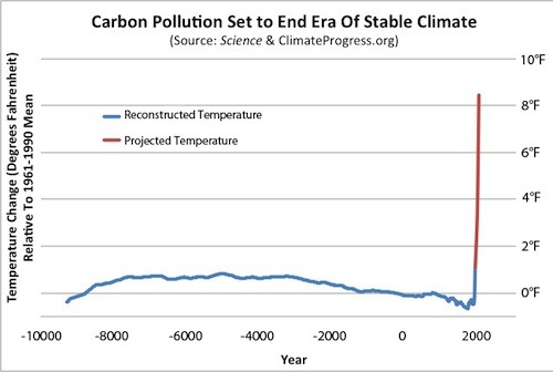
Confining ourselves to the graph, however, the second problem is the projections. Romm identifies the projections as being those of the MIT "No Policy" case. Romm significantly misrepresents that case. Specifically, he shows a projection of 8.5 F increase relative to the 1960-1990 mean temperature. As it happens, the MIT median projection is for a 9.2 F increase relative to 1990. Romm understates the projection by more than 0.7 F. (More, of course, because the "1990" temperature, more accurately the 1981-2000 mean, is higher than the 1960-1990 mean.)
This second error makes a 15 pixel difference to the graph. Now, what I am wondering is what sort of though process was behing Shollenberger's decision that the one pixel difference was worthy of comment and makes a significant difference, whereas the 15 pixel difference is not even worthy of note?
-
Bob Lacatena at 11:10 AM on 18 April 2013Global Warming is Accelerating, but it's Still Groundhog Day at the Daily Mail
engineer,
I think you're getting confused by the thickness of the line for observed temperatures, but you're also missing the point. In a chaotic system, the observed values will wiggle in and out of the range of values from time to time, even in and out of the 95% range.
-
scaddenp at 10:28 AM on 18 April 2013Real Skepticism About the New Marcott 'Hockey Stick'
Okay, Brandon. I see your issue. I was actually confusing Paul's graph with Koomey's graph. I agree that graph at start of the article is better.
-
Brandon Shollenberger at 09:30 AM on 18 April 2013Real Skepticism About the New Marcott 'Hockey Stick'
scaddenp @79, I think the graph John Cook praised is a bad graph. I think comparing it to the lead graph of this post shows it is a bad graph. I think the lead graph of this post is a reasonable depiction of Marcott et al's results. I haven't examined Shakun et al's results, but I assume the same is true for them.
You say "the graph very obviously needs 3 parts." I don't disagree. And like you, I'd have been fine if the graph had a gap rather than relying on the (at least largely) spurious uptick. If John Cook had praised this post's graph instead of the one from Joe Romm, I wouldn't have said anything. But he praised a bad graph that is incongruous with this post's.
The issue I raised wasn't whether or not Marcott et al's results are right (though multiple users argued against that strawman). The only part of their part that matters for what I said is the uptick which pretty much everyone agrees is faulty.
Rob Honeycutt @80, given everything you responded to in your comment @57 addressed total strawman arguments, I can't say I care much about how my comments strike you.
-
engineer8516 at 08:33 AM on 18 April 2013Global Warming is Accelerating, but it's Still Groundhog Day at the Daily Mail
I just noticed that it also looks like it dipped outside near year 1990. Again, it might be just the resolution of the chart, but I was hoping for an explanation. Thanks.
-
engineer8516 at 08:29 AM on 18 April 2013Global Warming is Accelerating, but it's Still Groundhog Day at the Daily Mail
It could be just the resolution of the chart in figure 3, but it looks you circled two dips outside the range with one blue circle, the one between 1970 and 1980. That would make it 3 dips outside.
And it looks like the observed temp dipped outside the 90% confidence interval at year1970 and possibly 1979, which weren't circled. That would make it 4 or 5 dips outside which is at least double the 2 peaks that occured outside the range. If we dip outside in the present that would be 6 dips outside. It might be just the resolution of the chart, but I was hoping for an explanation. Thanks.
-
Bob Loblaw at 08:15 AM on 18 April 2013The anthropogenic global warming rate: Is it steady for the last 100 years?
Dr. Tung:
No problems. It makes sense to spend time preparing the second post, rather than trying to answer questions that people are asking because they haven't yet seen the second post.
Thanks for taking the time to prepare this, and for participating in the discussion.
-
Alexandre at 08:10 AM on 18 April 2013Global Warming is Accelerating, but it's Still Groundhog Day at the Daily Mail
I think I take some issue with the sentence "where the skeptics think it's going". Maybe the verb should be "claim"? Or maybe the whole sentence could be altogether changed to something like "this is the bit 'skeptics' want to confuse you with" or maybe "desperately want to overblow".
It's just nitpicking, I know...
-
Don9000 at 08:01 AM on 18 April 2013Global Warming is Accelerating, but it's Still Groundhog Day at the Daily Mail
It's a bit like not seeing the forest because you are so caught up looking at one interesting tree.
I think we should also note that, when the implications of Chaos Theory are taken into consideration, there may well be some alarming, as yet not understood, implications for the circulation patterns currently seen and documented by scientists in the earth's oceans and atmosphere in the way the oceans are warming. For example, as far as I can see, the current ENSO-neutral conditions were not predicted by most of the models with the expected accuracy or margin of error. At least a year ago, I believe, the projections were fairly consistent in saying we would be in El Nino conditions this year. And yet it looks to me that only two of the models in the graph I found here LINK are predicting an El Nino in the near future--by the end of this year.Yet the heat keeps flowing into the oceans.
The larger point is this: Chaos Theory as I understand it (I'm not a trained scientist) tells us that something like ENSO is quite sensitive to initial conditions. The particular circulation patterns we have labeled El Nino and La Nina may have been around for hundreds or millions of years, though I'd guess they don't persist all the way into the last glaciation, but that is no guarantor that the cycle will continue as it has in the past as any of the important variables change over time. And I'd say the amount of heat in the system is a very important variable which is changing quite dramatically. The worrying thing in my mind is that the oceans may be about to give up their excess heat in new and hence potentially worse ways.
Those ways include, I suppose, the possibility of a long and intense El Nino, of disasterous proportions, but, as the heat is going into all the oceans, they also include many other undesirable possibilities. We are already seeing one arguably show up in this season's predictions for the Atlantic hurricane season. The projections all are pointing to a very active season. Everything, from the ice at the poles to agricultural droughts, comes into play.
I guess I'm simply saying that the unprecented heating of the oceans is likely to be the harbinger of other unprecented events and processes. More severe weather. More chaos.
Moderator Response:[RH] Updated link that was breaking page formatting.
-
KK Tung at 07:59 AM on 18 April 2013The anthropogenic global warming rate: Is it steady for the last 100 years?
So that I don't appear as impolite for not answering questions on the AMO, just want to say that I had submitted my second post on Tuesday, and it is awaiting its turn at SkS.
-
Global Warming is Accelerating, but it's Still Groundhog Day at the Daily Mail
Kayell - "...you should drop the term 'unprecedented' in your first key point. There are absolutely no other historical periods prior to the last ~8 years to compare with when it comes to deep ocean heat content (data coverage)."
That would be incorrect - see Levitus et al 2012, Fig. 1:

The vertical bars show 2x the standard error (SE) of the pentadal mean, working from ARGO and the XBT data that have sufficient metadata for depth corrections, with extrapolation via observed anomaly correlations. The lower section of the chart shows the global percentage of 1-degree squares that have at least four pentadal data points for each year.
The fact that some data is less certain that others does not justify claiming that data doesn't exist. If you feel Levitus et al have made mistakes in their SE calculations, please point them out or give references you feel support such claims - but again, you can't justify claiming that data isn't available.
And note that the deep ocean warming is, indeed, unprecedented in the data we have available.
-
Tom Dayton at 03:57 AM on 18 April 2013Global Warming is Accelerating, but it's Still Groundhog Day at the Daily Mail
Awesome graphic! I will use it often!
In this paragraph Rob made a point that in my opinion is vastly underpublicized and appreciated:
"But why don't observed temperatures follow the centreline of the projections? The darker orange-shaded area represents the (25%-75%) average of the model runs - when they all have been aggregated together. If the Earth was able to run the same year over-and-over-again, like the models, it would probably do the same. But the Earth only gets one shot at this. One roll of the dice. So rather than being smoothed out - like the average of all the climate model runs - actual surface temperatures yoyo up-and-down - exhibiting large year-to-year variability. As they would if only one climate model run was carried out."
When Tamino pointed this out on Dec. 20, 2012, he regraphed the actual temperature trend so its 1990 starting point was vertically at the mean trend as of 1990, instead of at the 1990 point mean. Scroll to the last three graphs of his post. Maybe somebody could combine those graphs into an animated Skeptical Science graph....
-
MarkR at 23:46 PM on 17 April 2013Global Warming is Accelerating, but it's Still Groundhog Day at the Daily Mail
Kayell @ 1,
The total energy balance of the Earth is positive, thanks mostly to humans. The extra CO2 is continuing to heat the atmosphere and the surface as usual, keeping us warmer than we'd be otherwise.
At the same time, we've recently seen much more common La Ninas (Meehl et al 2011) and changing wind patterns (Balmaseda et al 2013) which have shunted heat to the deeper ocean.
This sort of thing happens naturally, but without human CO2 to warm the atmosphere/surface then we can be pretty sure that temperatures would have gone lower without human activity.
-
julesdingle at 23:39 PM on 17 April 2013Global Warming is Accelerating, but it's Still Groundhog Day at the Daily Mail
Is AGW affecting La Nina years? Perhaps someone can be of help- first of all correct me where I am wrong.
La Nina is when the oceans warm and the air cools- switching to a cooling ocean and heat transfering to atmosphere.
The cycle is now in more la Nina or neutral stage.
In a El Nino cycle that heat will be dumped into the atmosphere increasing temperatures back to those predicted [I know models are not predictions just tools!]
Clearly any fool can see that ocean heat is melting arctic ice [except blind fools]
My question- is a warming ocean preventing cooling?
Are there any papers that suggest that the lack of El Nino activity is related to the amount of heat being absorbed?
Outcomes- will the next ocean cooling cycle be big like 1998 or bigger? or are we likely to see atmospheric temperatures 'stabilise' in a slow increase but for the energy to be transfered into weather like storms/drought/ general weather disruption?
thanks J
-
Composer99 at 23:36 PM on 17 April 2013Global Warming is Accelerating, but it's Still Groundhog Day at the Daily Mail
My congratulations to Rob or whomever created the animated gif showing the difference between the reality of global warming and how pseudoskeptics present it. It really highlights the intellectual paucity of the pseudoskeptic case in a clear, visually compelling way.
-
K.a.r.S.t.e.N at 22:22 PM on 17 April 2013The anthropogenic global warming rate: Is it steady for the last 100 years?
Just as a brief addition to what's already been said. As MA Rodger has mentioned, the anthropogenic forcing time serie published in Skeie et al. (2011) shows strong multidecadal variability (Fig.1c). I consider it superior to any other forcing estimate. Given the highly non-variable nature of the imposed forcing, your assumption of internal variability breaks down. To illustrate the temporal coincidence, I plotted the surface temperature of North America, Europe (GISS), and North Atlantic(HadSST2) vs. anthropogenic and volcanic sulfate forcing (plus OHC):

For the chosen domains see here. North America and North Atlantic nicely agree. Note the perfect agreement between sulfate forcing and temperatures. It is certainly not just coincidence, as the same (short term) response can be seen for volcanic forcing. Given the nature of the circulation (jetstream blowing from west to east), the ocean just follows the atmospheric temperatures, as Tamino pointed out at his blog. On top of that, land temperatures seem to lead the AMO as Tamino also pointed out. If you subtract the GISS NH from North Atlantic temperatures, you get this:

This is the true AMO signal which remains.
The one thing I found really surprising in your paper was how easily you rejected Booth et al. (2012). Overestimation of the aerosol forcing (as nicely argued from Zhang et al. (2013)) does not make it go away. If you take the strong volcanic activity around 1815-1840 and 1880-1910 together with the anthropogenic sulfate forcing between 1950-1970, you can explain three distinct cycles. You mentioned another one between 1660-1680. Makes it four cyles. The frequency coincides with the spectral peaks between 60-90 years. No surprise that you just found that (as others did before). May very well be pure pseudo-oscillatory behavior.
Finally, how do we know that the sulfate forcing is real? We have measured it!
(1) The downwelling SW (clear sky) radiation was reduced, known as global dimming and later brightening (see Skeie (2011) or Wild (2012)).
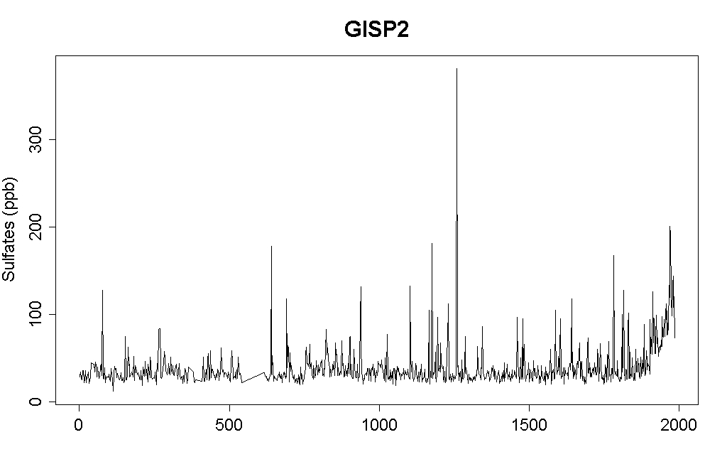
(2) The anthropogenic sulfate aerosols are clearly identifiable even in Arctic ice cores (graph taken from Tamino). It must have affected NH temperatures!
I wonder why you carefully omitted the discussion of these aspects in your paper? To be honest, I personally can't see how your paper contributes in any way to advance our understanding. Given the aforementioned shortcomings, I consider your paper not only a pointless curve-fitting exercise which does not tell me anything about proper attribution, I consider it to be simply wrong. Perhaps you can offer some more compelling evidence in your second post ... which I am looking forward to. I finish with two papers which I found much more convincing: Ottera et al. (2010) and Terray (2012). They both made a nice effort to disentangle the different drivers at play.
-
Tristan at 21:38 PM on 17 April 2013Further Comments on The Economist's Take on Climate Sensitivity
Thanks Doug.
-
CBDunkerson at 21:25 PM on 17 April 2013Antarctica is gaining ice
John, I have to question the logic of that Steig study reported in CSM. Basically, they looked at ice cores from the peninsula and high on the WAIS. The cores from the peninsula showed recent melting at a rate 10 times greater than the highest previous values while the cores from the WAIS showed melting at rates comparable to the highest previous values. From this they concluded that the peninsula is melting due to global warming and the WAIS due to natural variability.
The problem, as I see it, is that the majority of the WAIS ice loss is not occuring at the far inland locations where they gathered the ice cores. The WAIS (and the EAIS for that matter) are losing ice from the edges of the continent. Ice loss far inland may indeed be largely due to natural variability... but that is a tiny percentage of total ice loss. Much more is being lost at the edges of the ice sheet as warmer water (from global warming) causes ice shelves to break up and land ice calves into the oceans at a faster rate.
Essentially, the Steig study seems to be the equivalent of attempting to measure global warming by looking only at mid-day temperatures along the equator... the data which should show the least greenhouse warming signature. They failed to find a global warming signature in the WAIS ice loss because they only looked at the ice which is least likely to be impacted by global warming. If they had looked at ice loss around the edges of the ice sheet, where the vast majority of it is actually occurring, they should have gotten very different results.
-
CBDunkerson at 21:07 PM on 17 April 2013Global Warming is Accelerating, but it's Still Groundhog Day at the Daily Mail
Ray wrote: "This variable reporting..."
I don't see the variation. Both of the following are true;
- Most ocean warming has taken place in the top 700 meters of the ocean.
- There has been unusually high warming of the oceans below 700 meters.
These two findings are in no way contradictory of each other. Warming below 700 meters has gone up significantly... but is still less than warming down to 700 meters.
-
Rob Painting at 20:49 PM on 17 April 2013Global Warming is Accelerating, but it's Still Groundhog Day at the Daily Mail
Ray- as stated on the thread on the Guermas (2013) paper, I have not read that paper. Exactly why they disregard the warming of the deep ocean is not clear. Perhaps worth looking into at some point, but differing opinions on cutting edge research is simply par for the course. They can't both be right, so one idea will fall by the wayside.
Yes, the bulk of the warming occurs in the upper ocean. My apologies if that wasn't clear. The important feature of table 1 is that the very recent deep ocean warming is unprecedented in the admittedly short period of observations (the last 50 years - see Levitus [2012]). This has obvious implications, as discussed in the post, because it is a large part of the reason for the acceleration in ocean heating.
-
Ray at 19:48 PM on 17 April 2013Global Warming is Accelerating, but it's Still Groundhog Day at the Daily Mail
Here you say "A number of scientific publications, (Von Shuckmann & Le Traon [2011], Levitus [2012], Nuccitelli [2012] & Balmaseda [2013]) have shown the oceans, and notably the deep oceans (depths below 700 metres), have warmed." Yet in your post on April 15th you wrote "Interestingly, Guemas et al. find that most of the recent slowed surface warming can be attributed not to the accelerated deep ocean warming, but to the accumulation of heat in the relatively shallow oceans (to 700 meters). They note that their results are consistent with Loeb (2012), in that most of the global energy imbalance is absorbed by the upper 700 meters of oceans, although the deeper ocean heat accumulation cannot be neglected"
Looking at the table from Balmaseda (2013) it looks as if the warming of upper 700 metres is very significantly more than warming below 700 metres
This variable reporting is very confusing and does lead to scepticism that climate scientists really understand what is happeing in the oceans
-
scaddenp at 19:22 PM on 17 April 2013Global Warming is Accelerating, but it's Still Groundhog Day at the Daily Mail
Kayell, if you want the textbook outline of the thermodynamics of GHG heating of ocean, then please see the rather exhaustive series at Science of Doom, that begins with this.
Prev 913 914 915 916 917 918 919 920 921 922 923 924 925 926 927 928 Next


