Climate Science Glossary

Term Lookup

Enter a term in the search box to find its definition.

Settings

Use the controls in the far right panel to increase or decrease the number of terms automatically displayed (or to completely turn that feature off).

Term Lookup

Settings


All IPCC definitions taken from Climate Change 2007: The Physical Science Basis. Working Group I Contribution to the Fourth Assessment Report of the Intergovernmental Panel on Climate Change, Annex I, Glossary, pp. 941-954. Cambridge University Press.

Home Arguments Software Resources Comments The Consensus Project Translations About Support

Bluesky Facebook LinkedIn Mastodon MeWe

Twitter YouTube RSS Posts RSS Comments Email Subscribe


Climate's changed before
It's the sun
It's not bad
There is no consensus
It's cooling
Models are unreliable
Temp record is unreliable
Animals and plants can adapt
It hasn't warmed since 1998
Antarctica is gaining ice
View All Arguments...


Username
Password
New? Register here
Forgot your password?

Latest Posts

Archives

Comparing IPCC projections to observations

Posted on 17 March 2008 by John Cook

The best way to check the reliability of climate models is to compare projections to actual observations. However, this is a catch-22. You need a decent time period to accurately discern climate trends amid the noise of weather fluctuations. Over that time, the climate model would've been superseded by new models running on faster computers at higher resolutions using better understood science. Nevertheless, a paper recently published in Science, Recent Climate Observations Compared to Projections (Rahmstoorf 2007), gives it a shot, comparing 2001 IPCC projections to observations up to 2007.

This is a short period for comparing climate trends. However, the 2001 model projections were essentially independent from the observed climate data since 1990. Sea-level data were not yet available at the time. Plus the climate models used by the IPCC are physics-based and not "tuned" to reproduce the most recent temperatures.

CO2 levels

They start by comparing IPCC projections of CO2 levels to observations at Mauna Loa, Hawaii. Estimating CO2 levels is a complicated business, factoring in economical development, industrial emissions, carbon sinks, etc. The IPCC get it fairly right although you can't credit them too much. A kid with a ruler and some graph paper could've got it fairly right.


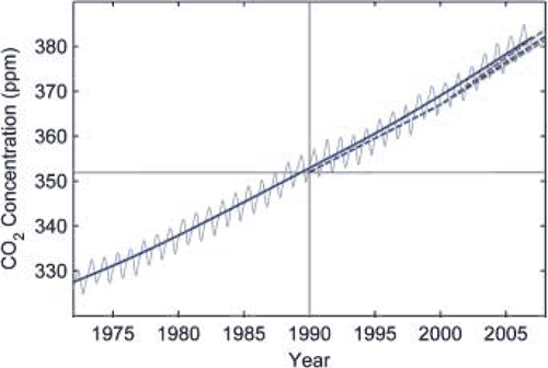
Figure 1: Monthly carbon dioxide concentration (blue thin line) and its long term trend (strong blue line) as measured at Mauna Loa, Hawaii. Dashed line is IPCC's projected carbon dioxide levels.

Temperature

More interesting is the comparison of the various IPCC projections of global temperature change (coloured dotted lines) with observations from HadCRUT (blue) and NASA GISS data (red). The thin lines are the observed yearly average. The solid lines are the long term trends, which filter out short term weather fluctuations.


Figure 2: Global land and ocean surface temperature from GISS (red) and the Hadley Centre/Climatic Research Unit (blue) up to 2006. Thin lines are yearly average, solid lines are long term trends. Dashed lines are IPCC projections. Grey range encompasses IPCC uncertainty in climate sensitivity.

It's immediately apparent the IPCC underestimated temperature rise with observations warmer than all projections. The paper proposes several possible reasons for the difference. One is intrinsic internal variability which is possible over such a short period. Another candidate is climate forcings other than CO2 such as aerosol cooling being smaller than expected.

A third candidate is an underestimation of climate sensitivity. The IPCC assumed a climate sensitivity of 3°C with an uncertainty range between 1.7° to 4.2°C (this is indicated in the grey area of Figure 2). However, there are a number of positive feedbacks in the climate system that are poorly understood and hence not given much influence in IPCC models. Add to this the fact that model uncertainty is inherently skewed towards greater sensitivity. My guess is higher climate sensitivity is part of the story but not all. More on climate sensitivity...

Sea levels

IPCC underestimation is even worse when it comes to sea levels, projecting a best-estimate rise of less than 2 mm/year. Satellite data shows a linear trend of 3.3 ± 0.4 mm/year and the tide gauge reconstruction trend is slightly less. Both sets of observations fall well above the IPCC uncertainty range. Again, internal variability may play a part over such a small period. As the largest contributor is ocean thermal expansion, warmer than expected temperatures would be a significant part of the discrepancy. Rapidly increasing melt from Greenland and Antarctica may also contribute although ice sheet contribution is a small part of sea level rise.

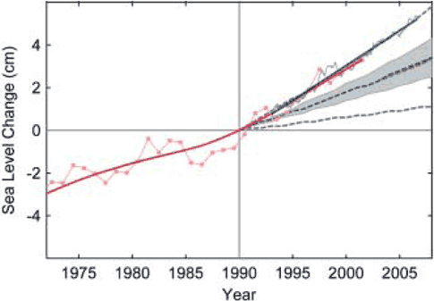
Figure 3: Sea-level data based primarily on tide gauges (annual, red) and from satellite altimeter (3-month data spacing, blue, up to mid-2006) and their trends. Dotted lines are IPCC projections. Grey range encompasses model uncertainty.

Conclusion

A common skeptic characterisation of the IPCC is that they exagerate warming projections and the dangers from global warming. In actuality, IPCC projections tend to underestimate climate change, particularly for sea level. Perhaps a more appropriate characterisation is a middle-of-the-road, conservative approach to science.

Update 27 Mar 2008: Tamino sheds more light on the IPCC projections, contacting Stefan Rahmstorf directly who provided an updated version of his temperature graph:


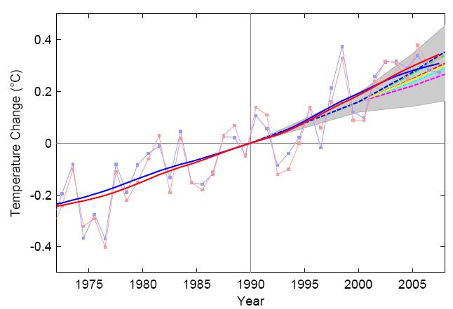
Figure 4 courtesy of Tamino: Solid blue and red lines are trends from GISS and HadCRU data, dashed lines are IPCC projections included in the TAR.

0 0

Printable Version  |  Link to this page

Comments

Comments 1 to 43:

  1. I can't access the paper unfortunately, but anyway I'm curious about one thing: do the authors say why they choose to use Mauna Loa to measure CO2? (I'm aware that any difference in the CO2 concentration measurements won't change the temperature and sea level measurements, and the conclusion that warming projections are being underestimated by the IPCC.)
    0 0
    Response: The paper doesn't say why Mauna Loa but it's probably because it's the longest continuous record of directly measured CO2 levels.
  2. Frankbi, I seem to recall the fact that the location afforded as much distance as one can be away from a high concentration of emitting sources that could have affected the measurements, guaranteeing that the concentration measured is that of well mixed gas. I'm really not sure about this, however, can't reference it.
    0 0
  3. FYI, John, any paper that has a GISS author or co-author will appear very promptly on their pubs page, often as a pre-pub. The full text of this one is here. All U.S. gov't institutions can do this without concern for copyright, meaning that you can safely link to them, but GISS is exceptionally thorough about it. Usually for Science articles they'll link the separate high-res figures file, but unfortunately they missed it in this case.
    0 0
    Response: Steve, great info, very useful to know. From now on, I'll check http://pubs.giss.nasa.gov/ for full access papers - it sucks when the general public only have access to the abstract. I've updated the link in the post to go straight to the full version. I also noticed their graphs were low-rez bitmaps rather than the usual high-rez. A shame, it looks a little fuzzy when I display them at 500px wide.
  4. Also FYI, John, you wrote above "Add to this the fact that model uncertainty is inherently skewed towards *greater* sensitivity." You want lesser, I think.
    0 0
    Response: Hmm, my wording is clumsy, am struggling to think of a clearer way to communicate what I'm trying to say.
  5. The IPCC chose to predict temperatures 1,5 to 2 m above ground, a rather meaningsless measure if predicting global warming is your point. However, even if accepting such unscientific methods, you should also mention the very serious critisism directed to temperature records from GISS and Hadley - and that they haven't effectively responded to that critisism. A far better measure to assess the radiative imbalance is of course the heat budget of our climate system. Here we can say that probably no accumulation of heat has taken place since 1998 and that vertially certainly no heat accumulation has occured the last 4 years. This doesn't square with the IPCC notion of a radiative imbalance in the range of 0,85 W/m2. If a pot of water is on the stove and is not getting warmer (accumulating energy) then you know that the person trying to sell you the second hand stove, insisting that it is fully functional and that the plate is perfectly good, is, well, a hustler? (And I'm not saying that we cannot start to warm again: but the IPCC has not got the relative importance of forcings correct, otherwise we would see an continuing accumulation of Joules in the climate system. This also means that their predictions cannot be trusted.)
    0 0
    Response: It's not practical to address so many skeptic objections in the one post without bloating out to unreadable proportions. Hence I break these topics up into more manageable pieces. Re the criticisms directed to temperature records, that is addressed at Surface Temperature records are unreliable. Re radiative imbalance, I mention that in passing when looking at the empirical evidence for AGW. Specifically, I link to Earth’s Energy Imbalance: Confirmation and Implications (Hansen 2004) which looks at precise measurements of increasing ocean heat content and calculates that Earth is absorbing 0.85 ± 0.15 W/m2 more energy from the Sun than it emits to space. Lastly re warming trends since 1998, that is covered in the global warming stopped in 1998 argument.
  6. The increase of heat in the oceans is likely due to more heat being absorbed rather than less heat is being emmitted. That doesn't jive with GHG global warming theory (where the heat blocking effect would be distributed vertically in the atmosphere--the entire green house effect can't act just at the plane of the ocean surface). Direct light is the primary warmer of oceans (very difficult for the atmosphere to warm the oceans), it would be interesting to see if there are changes in the amount of light reaching the oceans.
    0 0
    Response: You're right, it is due to more heat being absorbed by the ocean from the warming air. This isn't to say the greenhouse effect acts just at the ocean surface, quite the contrary. But this is why the warming trend is higher over land - because over the ocean, the heat from the air is being absorbed by the ocean. Similarly, the Northern Hemisphere is warming faster than the Southern Hemisphere because there's a lot more ocean in the south.
  7. John, You refered a paper by Hansen et al that looks on older data. What I claimed was that we probably have seen no net accumulation of heat since 1998 and that we are vertially certain that we have not seen such an accumulation since 2004. One of the articles supporting this notion is: Willis, J. K., D. P. Chambers and R. Steven Nerem, 2008: Assessing the Globally Averaged Sea Level Budget on Seasonal and Interannual Time Scales. Journal of Geophysical Research-Oceans which reports no ocean warming since 2004. Others are RSS and UAH MSU / AMSU data, ARGO. You also have the Lyman et al paper and others. If we do not accumulate heat we do not have a radiative imbalance; if we do not have a radiative imbalance the IPCC is wrong. You also misunderstood my point on warming since 1998. I was not talking about surface or atmospheric temperatures but heat.
    0 0
    Response: UPDATE: I got in contact with Josh Willis who wrote the paper on Sea Level Budget and he was gracious enough to email his paper as well as some other material. Here's a summary of the ocean heat situation.
  8. The link to "Recent Climate Observations Compared to Projections (Rahmstoorf 2008)" points to http://pubs.giss.nasa.gov/docs/2007/2007_Rahmstorf_etal.pdf Is this a mistake?
    0 0
    Response: I was linking to the correct paper. My mistake was attributing it as Rahmstoorf 2008 (it was published in February 2007). For some reason, I had it in my head that it came out in 2008. The paper makes more sense now, I was wondering why they hadn't included data to the end of 2007! Thanks for the tip.
  9. John, I have a faximile with missing pages, better to wait for the publication, which will come soon. You also have Lyman, 2006, and Smith and Reynolds, 2005 showing the same thing. The point is that the current radiative imbalance cannot be positive if the climate system loses heat. At the same time the IPCC ensures us that the suns impact is a mere 0,15 W/m2, you say that this lack of heat accumulation can be explained by the suns turn from max to min. But then you must fault the IPCC for not allowing a larger role for the sun in the climate puzzle.
    0 0
    Response: I'm not saying it's necessarily the sun causing the ocean's warming trend to slow. Let me read up on those papers and scratch around for other papers on the topic - I'll probably do a post on the topic shortly (thanks for the homework).
  10. What about the fact that the oceans are not warming? http://www.npr.org/templates/story/story.php?storyId=88520025
    0 0
    Response: BTN, that's what we've been discussing in the last couple of comments. It's an interesting question - I contacted Josh Willis, the author of the paper mentioned above (Willis 2008) and although the paper still isn't published for several weeks, he was gracious enough to send me a copy and some background info. It's fascinating stuff. So I'll be posting something hopefully in a week or two (am halfway through another post though - have to finish that one first).

    UPDATE: I address this in The Mystery of the Vanishing Ocean Heat (geez, what a pretentious title).
  11. BTN - From what I have read recently: Parts of the ocean ARE warming, but parts are also cooling from arctic ice melt. Major currents that are considered constants actually change course on a regular basis. Northern Europe is benefitting from the warming Gulf Stream at this time but that was not always the case. - See ScienceDaily, Climate section.
    0 0
  12. It looks to me like the elephant in the room is clearly being ignored in your cited paper. He is using the GISS data and not talking about the time period that is being debated. What you are not saying is that people like Roger Pielke are asking very good questions like what constitutes falsification of the model? http://rankexploits.com/musings/2008/ipcc-projections-overpredict-recent-warming/
    0 0
  13. Wondering Aloud: Pielke's methodology is dubious. Instead of comparing raw data directly with the IPCC models, he decided to create his own model from the data using some super-duper method, and _then_ compare his "model" with the IPCC models. "Falsification" my foot. My question to you (and Pielke) is this: What evidence will you accept as proof that AGW _is_ happening and _is_ serious?
    0 0
  14. Any evidence at all would be nice at this point. I cannot imagine a realistic situation given our current climate when any reasonably expected warming would not have a net positive effect. As I read more and more of the actual research I become less and less convinced of catastrophic claims. Are you sure of this frankbi or is this another of your wild goose chases? According to Pielke he is comparing model predictions to the data there is no model involved from his end, why should I believe you in light of the fact that you have deliberately steered me wrong in the past? Roger Pielke is correct about one thing at least, every time the models fail in a prediction it is arm waved away. Remember the predictions in the past included the poles warming first, the stratosphere warming more, or how about the classic 3 degrees C warming by the year 2000 claimed in congressional testimony? I have that one on video. Pielke has asked what would constitute falsification? If the answer is "nothing" as it appears, it is not science by definition, regardless of whatever problems you have with your foot.
    0 0
  15. You will find an interesting observation or two in the following note from a climatologist: "On the Fundamental Defect in the IPCC’s Approach to Global Warming Research" June 15, 2007, Syun-Ichi Akasofu, International Arctic Research Center, University of Alaska Fairbanks (CLIMATESCI.ORG).
    0 0
  16. "Here's a strange scenario: You move farther away from a fire, getting cooler and cooler, until suddenly you are burning up. That's essentially what happens in the sun: Its outer layer, the corona, is inexplicably hot. A new study may complicate things further by poking holes in a leading theory that aims to account for the puzzling phenomenon." From a new article "New kink in sun’s strange corona" By Clara Moskowitz, at space.com; http://www.msnbc.msn.com/id/23780033/ This fits nicely into the Solar hypothesis.
    0 0
  17. "It's immediately apparent the IPCC underestimated temperature rise with observations warmer than all projections." Is that really apparent from the graph? The IPCC confidence interval appears to encompass all observational data. It would seem that the IPCC got this one right (so far).
    0 0
    Response: You're correct, observations fall within the IPCC uncertainty range, which is a pretty big uncertainty range - a climate uncertainty ranging from 1.7° to 4.2°C. If observations exceeded even the error range, then there would be serious cause for concern! But the IPCC presented a range of projections - the observed data was greater than even the warmest projection.
  18. Wondering Aloud: "Any evidence at all would be nice at this point." And what exactly will you consider as "evidence" that global warming is serious? That's my question. "According to Pielke he is comparing model predictions to the data there is no model involved from his end" Yeah, so what's this "Cochrane-Orcutt fit" thing? It's clearly _not_ the raw data, otherwise it won't need a fancy name will it? "Pielke has asked what would constitute falsification?" How about comparing the IPCC models _directly_ with the raw data, none of that "Cochrane-Orcutt" stuff? I pointed that out already. You ignored it. And I see Quietman simply dodges the above points and throws out another bunch of denialist talking points.
    0 0
  19. "But the IPCC presented a range of projections - the observed data was greater than even the warmest projection." I think you missed my point because you said basically the same thing again. The IPCC projections include the confidence intervals, as far as I'm aware. The observations did not exceed the IPCC projections as portrayed in the graphic. Perhaps you have a different interpretation of "confidence interval" than the one I'm familiar with??
    0 0
  20. frankbi Most posts I have referenced come from legitimate science resources. They may be skeptical but they are not denialists. The only denying literature that I have read has come from the far left and far right extemists, one side says it's all CO2 and the other says it's no CO2. The fact is that there are very few true climate scientists in the world and most of them do not participate in the IPCC, only some, the rest are specialists in other fields, many unrelated to climate. The AGW alarmists are the true deniers, they will not accept skeptisism which is required in order to do true scientific investigation. A skeptic understands that there is some effect from greenhouse gases but realizes that there is a lot more involved, factors that are not being used in the IPCC models. It's a GIGO situation. Only within the past 30 years have true climatologists been able to discern many of the more important factors in climate change but regardless of new data the IPCC keeps using 100 year old theories that do not and can not make proper predictions. The historic cycles have been identified but not fully understood. Hiding your head in the sand will not make the cycles stop no matter how much you would like them to. It will cool down now but more slowly than it got hot. That is what has happened for the past 2 million years and will continue to happen until another extremely violent solar cycle reoccurs like this last one. The TSI charts are basically garbage, Illuminenesence is a minor factor. UV and the ozone layer are much more important apparently. But it would appear that the major forcing is gravimetric tides within the sun, controlled by the interaction of planetary gravity fields, the strongest of which is jupiter. Instead of reading only documents approved by the IPCC consensus, I suggest that you also read the skeptical ones as well. They are written by geologists and climatologists rather than IPCC meteorologists. Sorry, I am not argumentative by nature but I read these blogs to learn and this blog has been mostly regurgitating the IPCC climate cycle denialist points word for word. I have learned more from the skeptics arguments here. Now that that has been said, I will go back to being quiet. No offense meant.
    0 0
  21. I don't know frankbi... maybe you should have read closely enough to know the Cochrane-Orcutt fit" thing is not from Pielke but someone else looking at the data and is a statistical treatment not a model. As I said the evidence for a catastrophic warming simply does not exist, .6 degrees C is a benefit not a catastrophy, and the very physics that is claimed to underlie the entire theory of CO2 caused warming clearly does not support it. Hence all the arguments about feedback on another thread. To me the issue being ignored is the time lag, I don't know how big it really is, either the effect of CO2 is much more delayed then some people think or the C02 warming is much less significant. The supposed temperature response to CO2 increase is a curve and the increase of the last century should already have produced more than half of the total change in temperature. How about a thread on that John? Or here is another idea: If CO2 really is a problem it is a fairly easy one to fix, why not discuss how to fix it? The fact that we get stupid cap and trade schemes instead of actual workable fixes is more evidence of the political agendas invovlved.
    0 0
  22. Quietman simply throws out another bunch of denialist talking points without facts. Wondering Aloud: Oh great, now the "Cochrane-Orcutt fit" is a "statistical treatment", which of course is somehow different from a "model", in the sense that it involves "treating" data... oh, wait. Why couldn't Pielke simply compare the IPCC models directly to the raw data? Why the need to "treat" the data? Tell us, WA.
    0 0
  23. So your saying you dont know the difference between doing a calculation with a statistics technique and making a climate model? You think the two are the same? That explains so much.
    0 0
  24. frankbi Re: "What evidence will you accept as proof that AGW _is_ happening and _is_ serious? " In science it is up to the person or persons presenting the hypothesis to also present proof. The AGW hypothesis has evidence but no proof. If you believe it so strongly it's a matter pf faith. Present actual proof and all of us skeptics will shut up. Why else do you see so much skeptisism? Why don't you see it from prominent figures as much? Because the skeptics are threatened with losing their jobs if they don't fall into line. That is not science, that is ignorance. Science depends on skepticism. No progress would be made without it. If you have proof, please present it.
    0 0
  25. frankbi In the "Solar activity & climate: is the sun causing global warming?" thread you provided the link" http://folk.uio.no/nathan/web/statement.html This was an interesting letter. Most interesting was "Addendum by Eigil Friis-Christensen" which you apparently did not read.
    0 0
  26. Quietman, I asked you what kind of evidence exactly you'd accept as proof of global warming. Apparently the results presented by Hansen, Rahmstorf, Lockwood, Santer, etc. etc. etc. aren't "proof" to you, so I'm just wanting to know what you _would_ consider "proof". What do you consider as actual "proof", and what do you consider as _not_ actual "proof"? You've repeatedly dodged the question.
    0 0
  27. frankbi What I need to see to be convinced is simple. Make a prediction based on the hypothesis. If the prediction matches the actual data then you have proof. Using the climate model that Gore displayed the amount of warming to the increase in CO2 was actually 1/2 of the prediction. This is a large error. It tells me that the model is either using bad data or based on an erroneous concept. When I see a match I will accept the results. I am not a scientist but a retired engineer. I am accustomed to and expect precision.
    0 0
  28. frankbi Also you appear to be under a misconception. I never said that I deny AGW, only that I am skeptical that CO2 is in fact the prime mover. I won't repeat myself here but I explained my concerns in my comments to "Determining the long term solar trend".
    0 0
  29. Oh great, it's Al Gore again. Just imagine, someone sees a post on a paper by Rahmstorf et al., and he starts thinking about how to bash Al Gore. Cleraly a case of Gore Derangement Syndrome.
    0 0
  30. frankbi Your sarcasm simply makes you sound like one of those fanatical short sighted environmentalists from california. Instead why don't you come up with a real solution or at least a way to determine the actual cause of AGW instead of knocking anyone who is actually trying to determine the truth.
    0 0
  31. Yes, Aaron and DSM! (#5, #6, #7) Here we come closer to the key issue of global warming. Is there really an imbalance in earth energy budget? I try to answer these question by searching the web but I'm not satisfied till today. I'm wondering that I couldn't find yet even a poor research pointing out these case. The only paper I found was of Hansen et al 2004, who statued an imbalance based on oceaan heat content compared with modelled radiation budget. This doesn't proof AGW either because greenhouse gases heats both ocean and atmosphere and solar irridiance heats only oceans. Thereby solar irridiance penentrates deeper as longwave radiation and should be stored better. According to the IPCC, solar activity attributes for about 1/7 tot global warming but for ocean heat storage solar effects can be much greater. NOAA satellite measurements shows an increase in outgoing longwave radiation during past decades. According to the fact that greenhouse gases avoid longwave radiation from escaping into space satellite measurements should show a decrease, or at least no trend in OLR but they don't. They show INcrease in OLR! So I'm wondering what other measurements say such as ERBE.
    0 0
  32. #1 & #2.. Mauna Loa 'advantage' was it's altitude, which was assumed to give it a sample of atmospheric CO2 uncontaminated by other emitters ( industry, forests); also the fact that there was a station there helped as did Mr Keeling's personal preferences. One small problem tho'...there's a volcano just over there that outgasses now and then....look at this printout you can see the CO2 spike...we'll just amend the figures to deal with that. No, we don't think there may be a more or less continuous outgassing that is hidden in the datastream. No comment.
    0 0
  33. Victor: There is much evidence that the IR 'blocking' effect of CO2 is limited to around 100m from the radiant source; if I remember rightly around 94% of re-radiation occurs within this zone. Thereafter convection and conduction take over and the heat is lost to the upper atmosphere. There is a limit to how much IR can be blocked which is only partially dependent on the CO2 concentration. The effect is roughly logarithmic ( not linear) so a doubling of CO2 will not necessarily double the amount of re-radiated IR. If the satellite data shows an increase in outgoing IR ( continuously) then this could be an indication that saturation point is being approached.
    0 0
  34. #32 Surely if we're being skeptical, we want to know the whole story and shouldn't be fobbed off with allusions and sly aspersions followed by "No comment". Of course we might question the Mauna Loa atmospheric CO2 data. And so we should. But let's do it properly. There are dozens of stations in remote locations around the world measuring atmospheric CO2 levels. We can examine the atmospheric CO2 measured at the South Pole, at Assekrem in Algeria in the N. Sahara, at Easter Island, and so on... In fact we find that each of these locations, and many more, give atmospheric CO2 readings (averaged globally to account for the N hemispheric plant growth/decay seasonality and atmospheric gas diffusional mixing) that are rather similar atmospheric CO2 readings... ...so your allusions about the Mauna Loa readings are unjustified.... ..let's be skeptical...but let's also be thorough and honest!
    0 0
  35. #32..is there a site giving access to raw data for Mauna Loa rather than the averaged tables?
    0 0
  36. #35 Actually, MLO produces 'raw' data for public access. The tables contain blanks where there are no readings ( eg. instrument failure), data culled from past records to replace 'unacceptable readings', and adjustments when there is an upslope wind from the old plantations at lower levels. So I consider my allusions are justified.
    0 0
  37. re #36 Which data are you looking at Mizimi? You should link to the stuff you are describing when you are in the process of attempting to trash it. That way we can establish whether your assertions/complaints have any validity! From my reading the Mauna Loa collection/analysis method is rather careful and gives confidence that it's a true record of the well-mixed atmospheric CO2 levels especially when averaged on monthly and yearly cycles. The method of analysis is defined here, where the raw monthly can be sourced. What specifically don't you like about it?: http://www.esrl.noaa.gov/gmd/ccgg/about/co2_measurements.html The primary Mauna Loa data can be compared with a completely independent (Scripps group) data set also measured at Mauna Loa. The two sets of data have an average difference of 0.04 ppm and an annual SD of 0.12 ppm. Thus the methods of sample collection, calibrations and analysis seem not to have a significant effect on the local measure of CO2. The Scripps data can be accessed here: http://cdiac.ornl.gov/trends/co2/sio-mlo.html The Manua Loa data can be compared with the CO2 measures averaged over all marine surface sites. These will be slightly out of phase with the Mauna Loa data, but the yearly average is pretty much within ~1 ppm of the Mauna Loa data. That can be accessed here: http://www.esrl.noaa.gov/gmd/ccgg/trends/ and so on... What's your specific problem(s) (no "allusions" please) with these data remembering that our aim to obtain a valid and reliable measure of yearly averaged global CO2 concentrations for understanding our emissions, their accumulation in the atmosphere and their relationships to greenhouse gas forcings and their contribution to the Earth's energy "budget"?
    0 0
  38. Chris: if you go to Wattsupwiththat site, you will find various threads dealing with 'raw' data from MLO including some correspondence between Dr Tans and Andrew Watts which is quite illuminating, especially Tans' comments on funding and equipment age. Note also Tans has taken on board some suggestions from AW which have been common practise in commerce and industry for many, many years. In any event, MLO publishes data which has been mathematically derived since the 'real' data is a voltage output at the instrument sensor, not an actual concentration reading. MLO is at around 3200m altitude, so there has to be a correction for PT no? Another maths fuction dependent on P and T readings concurrent with the CO2 sample. Also worth reading is the 'README' file at the noaa data site, some of which I quoted in #36.
    0 0
  39. Re #38 It's not obvious what your real point is concerning Mauna Loa CO2 measurements. It looks a bit like "error insinuation" to me, in which one thinks of all the possible things that might be a problem and insinuates that these are a problem! Let's look at some of your insinuations: ONE: CO2 isn't measured....it's a voltage that is measured. Welcome to the modern world Mizimi. In my research I use UV, IR (like the Mauna Loa one most likely), fluorescence.... etc. spectrophotometers. The absorption or emission of a substance (e.g. CO2) at a particular wavelength affects the flux of photons that reach a detector (photomultiplier most likely) and this signal is converted into a voltage. Since the relationship between the voltage and the concentration of the substance is known, the concentration of the substance can be determined rather accurately. Mauna Loa supplement their CO2 measurements with a rigorous calibration protocol in which air containing gases (CO2) at known mole fractions is used to continuously re-establish the quantitative relationship between voltage and CO2 concentration. What specifically about these procedures do you consider to be suspect Mizimi? TWO: "MLO is at around 3200m altitude, so there has to be a correction for PT no?" No that's incorrect. You should read the README file at the NOAA site: http://www.esrl.noaa.gov/gmd/ccgg/about/co2_measurements.html You'll see that one of the reasons for using their calibration protocol is that this obviates the need for very careful control of temperature and pressure. So long as the IR spectrophotometer is continuously calibrated with air containing CO2 at a known conentration/mole fraction, any variations in temperature and pressure are internally corrected for. THREE: "The tables contain blanks where there are no readings". Yes data for 5 months out of the past 50 years is missing (Oct 1958, Feb 1964, March 1964, April 1964, April 1984): ftp://ftp.cmdl.noaa.gov/ccg/co2/trends/co2_mm_mlo.txt Please tell us specifically why you consider that this casts doubt on the reliability of Mauna Loa measurements. FOUR: General insinuation of inaccuracy: The Scripps group determine an independent analysis of atmospheric CO2 concentration at Mauna Loa. This group uses a different method of air collection, analysis and calibration. The Scripps and NOAA atmospheric CO2 data sets for Mauna Loa have an average difference of 0.04 ppm and an annual SD of 0.12 ppm. The Scripps data can be accessed here for comparison with the NOAA data set urled above: http://cdiac.ornl.gov/trends/co2/sio-mlo.html That seems rather good evidence that the Mauna Loa data is a reliable measure of atmospheric CO2 at that site. The fact that the yearly averaged Mauna Loa data is rather similar to the yearly averaged CO2 measures from all of the marine surface sites also indicates that the data from Mauna Loa is a reliable measure of atmospheric CO2. http://www.esrl.noaa.gov/gmd/ccgg/trends/ If you've got some specific evidence of inaccuracy why not show us? Likewise if you consider that the Mauna Loa (and by extension all the other CO2 atmospheric CO2 analysis data) is inadequate for a specific purpose, then that would be interesting.
    0 0
  40. Chris: take a look at the latest ARES satellite data on CO2 levels. Mauna Loa stands out as a small red blob on the left of the picture; in other words as an anomaly - high compared to other sea level measurements. Mauna Loa may well be a reliable measure of levels, AT THAT SITE ( your words) but that is not the same as accurate. The satellite data shows ML to be high compared to the global condition and thus any projections using that data are suspect.
    0 0
  41. Not really Mizimi. If one compares the Mauna Loa data with the CO2 data averaged over the marine surface sites, it's pretty clear that we have a pretty reliable measure of monthly averaged, and especially yearly averaged atmospheric CO2 data: both data sets here: http://www.esrl.noaa.gov/gmd/ccgg/trends/ Apart from the the contrived "fishing" for problems that don't exist, are you at some point going to indicate in what respect the Mauna Loa data is inadequate for a specific purpose? and what is the "ARES satellite data"? Link please. and can you give an example of what you mean by "...projections using that data..."? An example of your "projections" please. rather than just saying stuff, why not show us the evidence. Where is the "red blob", and on what satellite data? argumentation by vagueness and insinuation isn't very scientific Mizimi. Be specific. Show us the data ("ARES" ??....."red blobs on the left of the picture" ??).
    0 0
  42. Apologies, that should be AIRES ( like QM I have problems with my eyes when tired) and you can find the maps here: http://www.agu.org/journals/gl/gl0817/2008GL035022/2008gl035022-op03.jpg Also see http://wattsupwiththat.com/2008/07/31/a-encouraging-response-on-satellite-co2-measurement-from-the-airs-team/ "For quite some time it was accepted theory that CO2 in the free troposphere is “well-mixed”, i.e., the difference that might be seen at that altitude would be a fraction of a part per million (ppmv). Models, which ingest surface fluxes from known sources, have long predicted a smooth (small)variation with latitude, with steadily diminishing CO2 as you move farther South..... Since our results are at variance with what is commonly accepted by the scientific community, we must work especially hard to validate them. We have just had a paper accepted by Geophysical Research Letters that will be published in 6-8 weeks, and are preparing a validation paper. We have global CO2 retrievals (day and night, over ocean and land, for clear and cloudy scenes) spanning the time period from Sept 2002 to the present. Those data will be released as we satisfactorily validate them."
    0 0
  43. 1. It's not ARES and it's not AIRES. (try AIRS). I'm not being picky. It's impossible to know what you're talking about if you don't reference your sources properly. 2. That data in your picture isn't "the latest ARES satellite data". It's a snapshot of the AIRS mid-tropospheric CO2 data for July 2003. 3. Mauna Loa isn't the "red blob on the left of the picture". Mauna Loa (latitude: 19o 34' N) lies slightly more southernly than the tip of Baja California (Cabo San Lucas: latitude: 22o 52' N), so if you run your eye across the Figure you linked to you'll see that the "red blob" is a good bit North of Hawaii and Mauna Loa. You can orient yourself better by looking at this similar projection map with the position of Mauna Loa marked: http://www.eoearth.org/article/Mauna_Loa_curve 4. The colour scale in your picture shows that the area of the Hawaiian islands has a CO2 concentration around >374 ppm and < 377.5 ppm (it's difficult to be more specific than this from the small scale of the map). The directly measured atmospheric CO2 at Mauna Loa in July 2003 was 376.7 ppm: ftp://ftp.cmdl.noaa.gov/ccg/co2/trends/co2_mm_mlo.txt So your picture actually supports the accuracy of the Mauna Loa data (at least by comparison with the satellite AIRS data). 5. You can look at the AIRS site and inspect the CO2 data. You'll see that Mauna Loa isn't a spot of high CO2 (no "red blobs"). e.g. try the following AIRS data where the Hawaiian islands are marked on the image: http://photojournal.jpl.nasa.gov/jpegMod/PIA11194_modest.jpg and so on. 6. As for the fact that there is variability in the spatial distribution of atmospheric CO2 on the monthly basis, no one expects otherwise. That's very clear from measuring stations on the ground and from the satellite AIRS data. However averaged on a yearly basis atmospheric CO2 is rather well mixed. That's an inescapable conclusion from the fact that the yearly averaged atmospheric CO2 measures from different and remote surface sites all over the world show very similar yearly averaged atmospheric CO2 values.
    0 0

You need to be logged in to post a comment. Login via the left margin or if you're new, register here.


The Consensus Project Website

THE ESCALATOR

(free to republish)


© Copyright 2024 John Cook
Home | Translations | About Us | Privacy | Contact Us