


 Arguments


The Japan Meteorological Agency temperature record
Posted on 12 February 2013 by Kevin C
The Japan Meteorological Agency (JMA) produce its own version of the instrumental temperature record, which has until recently received little attention. NASA's Climate 365 put together a graphic to illustrate how little difference there is between the four primary global surface temperature datasets (Figure 1), but of course all the climate contrarians took from this was that JMA's data shows the least warming in recent years. Sources with a tendency towards motivated reasoning naturally concluded that it must be right.
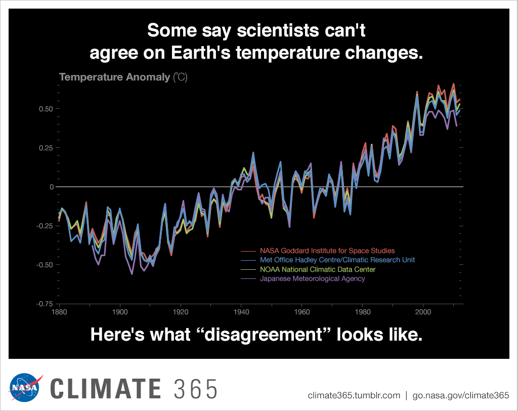
Figure 1: The four main global surface temperature measurement datasets (Source)
Since it is now being more widely quoted, it is time we took a look at JMA data and investigate why they show less recent surface warming than the other three datasets. As we have seen before, an understanding of the coverage of a data set is critical in interpreting the resulting temperature series, so we will start by looking at the maps. The following figure compares the JMA temperature data with three other surface temperature datasets (HadCRUT4, NCDC and GISTEMP), the satellite data from UAH, and the reanalysis (weather model) data from NCEP/NCAR.

Figure 2: Coverage maps for various temperature series. Colors represent mean change in temperature between the periods 1996-2000 and 2006-2010, from +2C (dark red) to -2C (dark blue). Note that the cylindrical projection exaggerates the polar regions of the map.
Note that the coverage of the JMA data is rather limited - only 85% of the planet in December 2010, compared to 86% for HadCRUT4, 93% for NCDC and 99% for GISTEMP. As with HadCRUT4, coverage is very limited at the poles, which according to theory, models and observations have been warming more quickly than the planet as a whole. On top of this, land coverage is also limited in Africa and Asia - regions which have also been warming faster than the global average. On this basis we should expect the JMA data to show a rather lower warming trend than the other data sets. This is the case with a trend on 1997/01-2012/12 calculated from the map data of only 0.028°C/decade, compared to values from 0.043 to 0.080°C/decade for the other surface temperature records.
Given the limited coverage, what does this data set tell us about global surface temperatures? To answer this question we need to make an estimate of what the global temperature distribution would look like. The standard approach to this problem in geophysics is 'kriging', widely used in the oil industry (as well as by BEST) which provides an optimal estimate for values in the unmeasured regions. Unlike the less formal approach adopted by GISTEMP, kriging learns how the temperature varies over the measured region and uses that information to determine how far to extrapolate in the unmeasured region. The method is conservative in that map cells far from any observation revert towards the global mean.
One problem was noted while kriging this data: The calculation was extrapolating temperatures rather more aggressively than when applying the same calculation to the HadCRUT4 data. This is suggestive of some smoothing in the data - also evident in the figure above. The kriging parameters from the HadCRUT4 calculation were therefore used in place of those from the JMA data to produce a more conservative estimate of the global trend. The trends are compared below.
| Dataset | Coverage 2010/12 | Trend 1997/01-2012/12 |
| JMA | 85% | 0.028 °C/decade |
| NOAA | 93% | 0.043 °C/decade |
| HadCRUT4 | 86% | 0.046 °C/decade |
| GISTEMP | 99% | 0.080 °C/decade |
| JMA-krig | 100% | 0.083 °C/decade |
The best estimate of the global temperature trend from 1997/01-2012/12 using the JMA data is in good agreement with the GISTEMP estimate, and substantially higher than the remaining partial-coverage datasets.
Is it all down to coverage?
The agreement between the global JMA and GISTEMP trends is remarkable, suggesting a very good agreement between the data. Unfortunately it's not quite that simple. The final figure of the HadCRUT4 paper shows a comparison of the 4 major temperature record using only co-located observations - i.e. the coverage of all the series is reduced to the cells common to all of them. The Hadley analysis shows that the co-located temperature series still shows JMA as a low outlier. JMA shows significant warming over Asia and Africa where its coverage is worst, and restoring these regions contributes to the large change in the JMA trend. However to fully attribute all of the differences between JMA and the other series will require more detailed study of the map data.
Can we really extrapolate temperatures?
Is extrapolation of temperatures from one map cell to another really valid? This question is best answered using the data themselves. To do this we will have to use the HadCRUT4 data because the smoothing of the JMA data biases the results. We will take the HadCRUT4 data and further reduce the coverage by removing the observations from around the poles. The two possibilities - extrapolation and no extrapolation - are then tested by comparing their temperature estimates with the values obtained by using all of the data. For this test, map coverage is reduced by at least 2 cells in each column of longitude. This is equivalent to a distance of 1100km, comparable to the maximum extrapolation distance used in the NASA/GISTEMP method.
A temperature series is calculated from the reduced coverage maps only (i.e. the JMA approach), and from maps obtained by kriging the data to restore the omitted cells (the approach suggested here). The difference between each of these temperature series and the original HadCRUT4 series is a measure of the skill of each method at predicting monthly temperatures from incomplete data.
A sample month (Dec 2011) is shown for the original, reduced, and reconstructed maps in Figure 4.

he kriging reconstruction is generally more realistic, correctly reconstructing cool areas in central Asia and warm areas in the Arctic, although it does miss a cold feature north of Moscow. The Antarctic reconstruction show little variation from the global mean.
The difference between the monthly mean temperatures from each of the reconstructions and the original temperature is shown in Figure 5. Both the error, and the bias in recent years, are significantly reduced by using kriging over ignoring the missing regions.

The comparative skill of the two methods may be quantified by using the root-mean-square (RMS) difference between each of the reconstructed temperature series and the true temperatures. These are tabulated below:
| Method | RMS error/°C |
| No restoration | 0.033 |
| Kriging | 0.016 |
The RMS error of the kriging temperatures is less than half that obtained when ignoring the omitted regions. When using real data, extrapolating to restore omitted cells give a better estimate of the overall temperature than calculating a temperature estimate from the included cells only. The data themselves support the use of extrapolation.
Note: This analysis was originally performed using the JMA data, however the smoothing of the JMA data invalidated the results. The original material may be seen by viewing the html source of the post below this point.


Conclusions
The JMA temperature data, while it shows some regional differences, tells a very similar global story to NASA's GISTEMP but with substantially reduced coverage. The data themselves tell us that confining a temperature observation to a 5x5° grid cell produces a noisy and biased estimate of global temperatures. When an approriate reconstruction method is used to produce an unbiased estimate of global temperature, the JMA data shows very similar results to NASA's GISTEMP, which is the fastest warming of the offical surface temperature records.


If you keep putting together such articles I'm going to get embarrassed by the amount of compliments I give you.
What a difference in trend the missing 15% of coverage makes.
I guess it shouldn't be surprising given that the missing areas are among the fastest-warming.
Composer: The Arctic is a big issue because of the magnitude of the trend there. Here's a GISTEMP figure from U-Columbia (which I've used before).
The Arctic trend look like around 1C/decade - that's around 6 times the rest of the planet! So yes, leaving it out is a huge deal. And when does the trend really take off? You guessed it - around 1998.
The rest of the missing regions are mostly land, which is in turn warming faster than ocean.
Kevin
thanks. Kriging looks a very interesting technique, I would be tempted to use a cubic spline or other signal processing technique. Might be an interesting comparison. With the absencence of Arctic data it is interesting that it gives such good results as I'm sure a spline or similar technique would underestimate the Arctic trend.
StBarnabas: I've used nearest neighbour, inverse distance and polyharmonic splines as well as kriging. The interesting thing is that, as long as you use a distance cutoff of 1000-1500km, they all give similar results to kriging. The temperature data is pretty well behaved and it doesn't much matter what you do with it. Robert Rhode in his recent BEST memo showed something similar - that the GISTEMP method (which is essentially a kernel smooth) comes close to kriging.
The principle benefit of kriging in this case is that you don't need to set a distance cutoff - you get a global map which naturally reverts towards the global mean if you get too far away from an observation.
In general kriging has some awesome properties. For example it gives you a proper area weighted mean almost by magic, and weights neighbours of a cell according to how much distinct information they add. Unlike BEST I'm losing some of the benefits by starting from the gridded data, but again for this problem it doesn't make much difference.
Glad to see kriging gaining ground in Earth sciences, especially since Matheron was head of a department where I work now and still was able to produce several great geostatistic ideas (several of his notes are available I think)
Just one question : did you try kriging on HadCRU4, to see what happened ?
Kevin
many thanks. I'm constantly amazed by how little I know. Strange that a lot of my students think I know everything! What is possibly more strange that I have found that people who know little or almost nothing seem to think they know almost everything, or at least sufficient to make profound judgements on areas totally outside their often minimal expertise.If only I could think of a relavent example. :-)
"Kriging" should be added to the Glossary.
bratisla: Yes, I've krigged HadCRUT4, and am working on more interesting methods.
Have a look at this article for a start, which used nearest neighbour - but the results are very similar.
DB (Mod) is correct. I double posted my comment by accident by refreshing. There is no facility to delete or edit posts (which I fully understand on this blog given the abuse allowing this could invite). Can this behaviour not be turned off as I'm sure I'm not the only one to waste valuable mod's time?
Oh wow, I like the new comments window - nice job guys
~~~~~~~~~~~~~~~~~~~~~~~~~~~~~~~~~~~~~~~~~~~~~~~~~~
Kevin,
Anthony's kids have been having fun with this and I was wonder if you cared to comment on the "sudden divergece" of the JMA graph around 1990, which WUWTzers seem to think is extremely significant... now they are waiting - soon the other temp sets will be going down too. Oh and if the JMA's data starts returning to the other three, that will be sure sign of the conspiracy.
http://wattsupwiththat.com/2013/01/31/japans-cool-hand-luke-moment-for-surface-temperature/
CC: The trivial answer to the adjustment nonsense is to calculate temperature series from the unadjusted data. NOAA has done it, Zeke has done it, you can do it with the SkS temperature calculator here, you can do it with Caerbannog's software.
Note the update to the post above.
CC or anyone else: Is there any chance you could have a look at the 2001 discontinuity? I'm swamped and don't have the time.
The simple test is to use the temperature calculator here, in CRU mode but using the GHCN data and a baseline of 1981-2010. Run both adjusted and unadjusted data. Then paste the pre-2001 adjusted series onto the post-2001 unadjusted series, and compare the results against JMA?
You may also have to try 900km extrapolation rather than grid box.
I'll take a look at the map series if I can - there may be a contrast visible between land and ocean temps, because the adjustments are land-only.
There seems to be a disconnect between the heavily-interpolated 1º SST records - COBE (used in JMA), HadISST1 and Reynolds OIv2 (not used in any global temperature record) - and the wider-gridded NOAA-ERSST (2º, used in GISS and NOAA global) and HadSST3 (5º, used in HadCRUT4) products.
Looking at 1982-2012 trends, cropped to 50S-50N to hopefully avoid most sampling differences:
1º HadISST1 = 0.08ºC/Dec
1º Reynolds OIv2 = 0.09
2º ERSSTv3 = 0.11
5º HadSST3 = 0.13
It's not easy to track down a time series for the COBE-SST product, but <a href="http://ipcc.ch/publications_and_data/ar4/wg1/en/figure-3-4.html">this plot from AR4</a> indicates a trend around 0.08 to 0.09. Not sure what the issue is here, whether coincidence or methodological factors, but this may be the main reason why JMA produces lower warming than the other records.
Aside from some formatting problems, I made an error: the GISS global record does actually use a combination of HadISST1 and Reynolds OIv2, not ERSSTv3.
pauls,
You are in fact correct about GISTEMP: As of Jan 2013 they've switched over to ERSST for the ocean portion.
Pauls: The higher trend in the HadSST3 data is well understood. It comes down to HadSST3 including a correction for the differing biases of engine intake sensors (warm) and buoys (neutral). There has been a transition from engine intake sensors to buoys over the last decade or so creating a cool bias, detectable when ships and buoys take readings at the same place, which only HadSST corrects. For more details see this article.
I don't know much about the others, although I've recently regridded ERSST into Hadley format for easier comparison.
I've now redone the skill calculation using the HadCRUT4 calculation. The RMSD of the null method is unchanged at 0.033C, the RMSD of the kriging method increases from 0.14 to 0.16. The bias was real but rather small, and the results stand.
IanC - Correct, or wrong twice? :)
Kevin C - Yes, but HadSST2 recent trend is similarly high compared to the interpolated datasets.
OK, I can reproduce that.
Are the baseline periods the same? Changing the baseline period for a map series can change the trends if coverage changes significantly over the trend period. I don't know if that has occured, but the interpolated datasets are likely to have more consistent coverage.