Climate Science Glossary

Term Lookup

Enter a term in the search box to find its definition.

Settings

Use the controls in the far right panel to increase or decrease the number of terms automatically displayed (or to completely turn that feature off).

Term Lookup

Settings


All IPCC definitions taken from Climate Change 2007: The Physical Science Basis. Working Group I Contribution to the Fourth Assessment Report of the Intergovernmental Panel on Climate Change, Annex I, Glossary, pp. 941-954. Cambridge University Press.

Home Arguments Software Resources Comments The Consensus Project Translations About Support

Bluesky Facebook LinkedIn Mastodon MeWe

Twitter YouTube RSS Posts RSS Comments Email Subscribe


Climate's changed before
It's the sun
It's not bad
There is no consensus
It's cooling
Models are unreliable
Temp record is unreliable
Animals and plants can adapt
It hasn't warmed since 1998
Antarctica is gaining ice
View All Arguments...


Username
Password
New? Register here
Forgot your password?

Latest Posts

Archives

A Sunburnt Country

Posted on 7 March 2012 by Glenn Tamblyn

I Love a Sunburnt Country

Sometimes we get important insights from the most unexpected of places. Poets & Insurance Companies. Not what we might always connect together. But you never know what they might be able to offer...

In my home country of Australia, one of the iconic poems in our history is often referred to simply as ‘I Love a Sunburnt Country’. Written by Dorothea MacKellar it was originally published in the London Spectator in 1908 as ‘Core of My Heart’. Later she called it simply ‘My Country’. It is often called ‘I Love a Sunburnt Country’ by Australians because, like most of us, we reduce the world around us to simple images and ideas. We loose the vivid wonderful complexity but we gain ease of comprehension. So too it is with Dorothea’s poem. We remember the bits that grab our soul rather than the whole poem.

Few Australians would have ever heard the first stanza of the poem. But lines from the second stanza can still make the hairs on the back of our neck stand up. Young Dorothea wrote this in England where she was travelling with her father and feeling quite homesick.

The love of field and coppice,
Of green and shaded lanes.
Of ordered woods and gardens
Is running in your veins,
Strong love of grey-blue distance
Brown streams and soft dim skies
I know but cannot share it,
My love is otherwise.

I love a sunburnt country,
A land of sweeping plains,
Of ragged mountain ranges,
Of droughts and flooding rains.
I love her far horizons,
I love her jewel-sea,
Her beauty and her terror -
The wide brown land for me!

Today many Australians would not even know who Dorothea MacKellar was. But ‘I love a sunburnt country’ and ‘Of droughts and flooding rains.’ still resonate, even though few now know their provenance.

So what has a bit of romantic, patriotic poetry from a century ago to do with Climate Change? Dorothea used a single line that was prescient for our times. She only meant it about Australia. But the consequences of this apply around the world.

‘Of droughts and flooding rains’.

One of the predictions that arise from the theory of Global Warming is that as the climate system warms, as more energy accumulates in various parts of the system, weather in various ways will become more intense and also more erratic.

Storms might be stronger, or more frequent, Droughts more severe or frequent. Simply, the weather becomes harsher. Dorothea reveled in this aspect of ‘her’ Australia. And to a reasonable extent we still do. But anything can be taken too far.


Droughts in the Sahel kill people and devastate crops. Flooding rains kill people and devastate crops. We humans can thrive if the climate is benign. And we might thrill to some ‘climatic excitement’ as Dorothea did.

But not too much. Did the citizens of Bangkok thrill to their floods? Did Texans thrill to their drought and wild-fires? Today as I finish this post, citizens in three states in Australia are not quite thrilling to floods as they shelter in school gymnasiums.

So, what can we say about what Global Warming is doing to weather, particularly extreme weather events? We expect that the extremes will become more extreme over time. But what are we seeing so far, as opposed to what might happen in the future?

Because we are still only into the early phases of what Global Warming has in store for us. What evidence can we look at now that might give us an indicator of what the future holds?

It is common for people to try and assess current weather patterns and what they may portend for the future. Unfortunately, looking at any particular extreme weather event and asking ‘was this caused by Global Warming?’ doesn’t make a lot of sense. Global warming changes the likelihood of events, the odds. But it doesn’t definitely determine any single event. As one quote puts it, ‘Climate Change trains the Boxer, Weather throws the punches’.

So can we see specific evidence of changes in weather ‘events’. Have Typhoons in the South China Sea become more-or-less frequent or severe? Tornadoes in the US Mid-West? Floods in Central America? Blizzards in Siberia? Droughts in Africa?

Unfortunately each of these sorts of questions relates to particular measures of particular types of weather events in particular regions; none of these are global measures. In principle studies could amalgamate all these indices to try and produce a global index.

Or we could just use the information that has already been provided by groups who already do this!

The Re-Insurers of the world

We might be familiar with our local insurance company, but how many of us have heard of Re-Insurers? These are the companies that insure the insurance companies. They spread the risk around to try and prevent any single insurance company being wiped out by some major event. These are companies such as Swiss Re, Berkshire Hathaway / General Re, Hannover Re and Munich Re. And since they are dealing with insurance companies from all around the world, and their business is totally based on understanding what is really happening to risk out there in the real world, they are a useful source of information because real data about climate risks is central to their business.

Early this year Munich Re released a short report looking at catastrophic events around the world and their trend here.

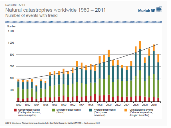
The most interesting graph, that encapsulates a great deal is this one on page 4:

Natural Catastrophes 1980-2011

They have divided the events up into Geophysical, Meterological, Hydrological and Climatalogical. Here Geophysical is events such as Earthquakes, Tsunami's, Volcanic Eruptions. Obviously not related to the weather or climate. But the other three categories are.

And what Munich Re report is that Geophysical events, although they fluctuate from year to year, haven't meaningfully changed on frequency in 31 years. However, the other three categories have increased in frequency over that time. After removing the Geophysical events, the Weather/Climate related events have roughly tripled in 31 years.

It is important to remember here that Munich Re are reporting numbers of events per year that they classify as catastrophic. Another graph on page 5 of the report shows dollar value.

A Re-Insurer has no reason to distort their analysis. If they under-report they are in breach of their responsibilities to their share-holders. So to if they over-report. They are about the most honest source one could find for information on this because they have no motive to distort anything - the bottom-line doesn't lie.

It appears from a very simple data source that weather is becoming more extreme. More Storms, more Droughts and Flooding Rains. Just as expected.

And here they have graphed the trends for each category:

Natural Catastrophes 1980-2011

Dorothea's Droughts and Flooding Rains seen to be topping the list.

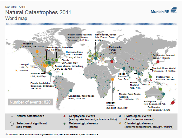
And for general interest here is where all the events happened in 2011:

2011 Natural Catastrophes

No continent is immune from the effects.

Dorothea may have liked them, but we now seem to be getting more Droughts and Flooding Rains (and Storms and Wildfires and Landslides) than we would like. And the trend is rising.

Perhaps a fairly reasonable indicator of the future under Global Warming.

So on a slightly different note, to end with a bit more poetry - I am a sucker for this stuff.

Rudyard Kipling, 'Gunga Din'.

The hero of the poem, the servant Gunga Din, has died and the poem ends with this:

So I'll meet 'im later on
At the place where 'e is gone,
Where it's always double drill and no canteen;


'E'll be squattin' on the coals
Givin' drink to poor damned souls,
An' I'll get a swig in hell from Gunga Din!


    Yes, Din! Din! Din!
  You Lazarushian-leather Gunga Din!


    Though I've belted you and flayed you,
    By the livin' Gawd that made you,
  You're a better man than I am, Gunga Din!


Perhaps we want to avoid needing to get a swig in Hell. Even from someone like Gunga Din. 

0 0

Printable Version  |  Link to this page

Comments

Prev  1  2  

Comments 51 to 72 out of 72:

  1. Re Norman@46 The reinsurance company data is based on well defined insured/insurable events.You expect and demand a granularity it does not necessarily have. yours Frank
    0 0
  2. A factoid worth remembering: "Typically, 1,300 tornadoes strike the U.S. a year. There were nearly 1,700 tornadoes in 2011, falling short of the record 1,817 tornadoes set in 2004." Source: "Warmest Spring in Years to Fuel Active Severe Weather" by Meghan Evans, AccuWeather.com, Mar 9, 2012 To access this timely article, click here.
    0 0
  3. Norman#49: "put the year and the number and generate a graph and select make a linear trend and tell me what you see." Yes indeed, a positive linear trend. With an R^2 of 0.42 "That would be the approach of a scientist to actually enter the data and see what comes out." Actually, a scientist (and perhaps the USGS has a few of them about the place) would be interested in a slightly more sophisticated treatment of these numbers. For starters, this list gives an average annual mag >6 count since 1970 of 135, with a standard deviation of 28. So any increase up to 163 per year is within one stddev. BTW, the max was 205 in 1995. So you have to say it hasn't increased since 1995; therefore this mysterious increase in number of earthquakes has stopped. I believe I asked here if this so-called increase in earthquake frequency been published. If not, why not? Or has an individual with internet access and a spreadsheet found something that no one else has recognized? Odds on that, anyone?
    0 0
  4. muoncounter @53 I have to state I do enjoy your subtle and clever humor you put into your posts (205 in 1995 so earthquake increase has stopped...good one). Since I could not show my Excel sheet here someone has done it. source. There was also 205 6> magnitude quakes in 2011 so the graph will go up a bit from the image I have linked to. Now tell me how this does not show an upward trend from 1980? Regardless of standard deviation the trend is up.
    0 0
    Moderator Response: [JH] Please do not feed this troll.
  5. Norman: Your source is a vanity blog site; the author is someone who has also written on 'the 10 most annoying English phrases.' But he at least poses a sensible question about this apparent trend and concludes: "To answer that, you'll have to ask a seismologist." The seismologists in question work for the USGS - and they say there's no statistically significant increase. "There was also 205 6> magnitude quakes in 2011" My source shows 149. "Regardless of standard deviation the trend is up." No. With as high a standard deviation and as poor a correlation as these data show, the trend is insignificant. This is a debate that has taken place on many threads. Statistical significance is paramount. People who make conclusions based on statistically insignificant data are just making noise out of the noise in the data. Once again, until you have the published research documenting this so-called trend, you have very little credible evidence. And you've pulled this thread into a relatively insignificant tangent. Again.
    0 0
  6. Norman @54, I cannot help but notice that you failed to indicate the annual average number of earthquakes of magnitude 6 or greater on your chart, according to the USGS (noted by the red line below): The annual average is that determined by the USGS from observations since 1900. Indeed, it is quite droll of you to cherry pick a short period which gives the appearance of a rising trend when no such rise can be seen in centenial records: Figure 3 a from Engdahl and Villsenor. The slight upward trend in 6.5 plus earthquakes from the 1900s to the 1940s is probably an artifact due to improved observations as is shown by a lack of such a trend in magnitude 7 and 7.5 plus earthquakes, which being larger can be detected on a sparser network.
    0 0
  7. Sorry, I forgot to include the link to Engdahl and Villsenor in my previous post.
    0 0
  8. muoncounter @55 You did not look at the date on your source, it only goes to August 2011, it is not the full year. Completed list of 6+ earthquakes in 2011. 185+19+1=205
    0 0
    Moderator Response: [JH] Please do not feed this troll.
  9. Tom Curtis @ 56 I do not think you have read my previous posts based upon this comment. "Indeed, it is quite droll of you to cherry pick a short period which gives the appearance of a rising trend when no such rise can be seen in centenial records:" I think you are a very intelligent person but I do not think you have followed my line of thought at all or understand the point I was making with the earthquake data. So to get you in the loop. The Munich Re graph in the OT starts at 1980. I am not trying to make a conclusion that earthquake numbers are overall rising. (note the not). I was pointing out a simple fact that the Munich Re chart was showing a decline or at least a flatline geophysical related catastrophes. But from 1980 to 2011 the frequency of 6+ magnitude (considered strong and will damage populated areas if they strike there) has increased. If you actually read some of my posts you will have seen this. Please read post 41 and you will see me address this very issue you are bringing up.
    0 0
    Moderator Response: [JH] Please do not feed this troll.
  10. Norman @59, you are correct. I have not been following your posts as I find you to be a dishonest time waster. Never-the-less, you have acknowledged that there is no overall trend, so my previous post was beside the point, and the accusation of cherry picking was inaccurate I would say I apologize for that, except the accusation is inaccurate as to its basis, but not wrong. If your point is explicitly to criticize the Munich Re graph, there is no justification for your using a data base of hazards to criticize a data base of catastrophes. This is particularly the case in that the USGS provides several data bases of catastrophes which you could have consulted. You could have, for example, looked at the number of earthquakes causing 1000 or more deaths, which show half decade figures as follows: 1980-84: 6 1985-89: 5 1990-94: 5 1995-99: 9 2000-05: 4 2005-09: 4 2010- April 2011: 3 Hardly evidence of a rising trend. You might also have tabulated the significant earthquakes, not all of which are magnitude 6 plus, but of which there are a lot less than the 6 plus earthquakes. You may find a rising trend there, or you may not. Given that you have so vehemently argued in other threads that the Munich Re data is irrelevant because it measures catastrophes, not hazards, it is inexcusable (and very selective) for you to not make this distinction when you criticize their data now. What is more, and perhaps more important, is the fact that Munich Re show a 50% increase in geophysical catastrophes over the period since 1980. How then, can you by pointing at data which shows a 50% increase in earthquakes over the same period call their data into question? What is your argument here? That the rise in Munich Re's geophysical catastrophes matches the rise in earthquakes and therefore it must be inaccurate? Is that seriously your argument? Finally, Munich Re's data is based on insurance data and newspaper reports. It is known to understate catastrophes in areas with low take up of European (and US) insurance such as Asia, South America, and particularly Africa for that reason. This does not mean the trends they show are not representative, particularly as similar trends are shown in areas with high population density and extensive insurance take up over a prolonged period (such as Germany).
    0 0
  11. Norman#58: Thanks for correcting my error; 2011 does indeed total 205 mag 6 or greater earthquakes. However, the question of statistical significance still stands. In addition, your position is based on half an hour with a spreadsheet and is without any published references. Until you can answer the challenge of finding some literature that supports your position, it remains unsubstantiated. There are factors that might explain your perceived trend: As others have pointed out, the impact on the numbers of improved detection systems worldwide is something professional seismologists are able to quantify. This post is about floods, droughts and impacts of climate change. Geophysical catastrophes are a sidebar. Until you produce suitable references, your excursion into armchair seismology has little weight and can be construed as an attempt to hijack this thread.
    0 0
  12. muoncounter @61, the previously linked (@57) Engdahl and Villsenor indicate that the centennial catalog is complete for magnitude 5.5 plus earthquakes from 1964 forward. Therefore the approximately 50% increase in magnitude 6 plus earthquakes since 1980 as shown by the USGS is almost certainly accurate. It is not statistically significant in that it does not show significant long term deviation from the centenial average of 150 earthquakes per year, but it is a real difference between the (historically low) number of earthquakes in the 1980s. What remains a mystery is why Norman thinks an approximately 50% increase in magnitude 6 plus earthquakes since the 1980s proves the inaccuracy of the 50% increase in geophysical catastrophes as recorded by Munich Re over the same period.
    0 0
  13. JH inline @58 and @59, if a poster is identified as trolling, there should be no question of feeding them as their posting privileges should have been removed. However, while their posting privileges have not been removed, the correct policy for posters who care about truth and our future is to rebut their nonsense when it appears. It is intolerable that we should have a moderation policy that is both unable to silence trolls, but does silence the rebutals of the the myths they spread.
    0 0
    Moderator Response: [JH] The current Comments Policy does not explicitly state that trolling is bannable offense. If you want to chase Norman's tail, that is your perrogative.
  14. Tom C, A different look comes from Figure 3b in Engdahl (your second graph here is Figure 3a). The decadal averages of earthquake number (M>= 6.5) is very flat since 1940. We note a slight increase in the number of earthquakes ... in the 1940-1960 period. Nothing noted about the even slighter bump in the 1990s. If this was a real increase with some sort of underlying physical cause, we would see a corresponding increase in M>= 7 numbers. We do not. I note that Googling 'increasing earthquake numbers since 1980' lead to lots of 'Mayan apocalypse' and 'end-of-times' websites. However, this geology blog is well worth the read: So, if we modify our graph to show an error bar of 2 standard deviations, you’ll notice that every result since 1990 fits inside this model! Simply put, there is absolutely nothing strange happening. In fact, thanks to this normal curve you can basically predict, with a 99.7% chance of success, that an earthquake of equal / greater than M6.0 will occur somewhere around the world within the next 3.5 days. Please, let's end this distraction into armchair seismology.
    0 0
  15. muoncounter @64, I agree with the point you are making. In fact I made the same point rather forcefully in my post 56. Never-the-less, we need to tackle the argument Norman is actually making rather than the one he appears to be making. The facts are simple: 1) The error rate in detecting magnitude 6 plus earthquakes is very low; 2) The number of magnitude 6 plus earthquakes varies from year to year with a long term average of about 150 earthquakes per year; 3) The 1980's where unusually quiet, with an average of 108.5 earthquakes per year; 4) The 1990's where not unusual in any way, with an average of 149.2 earthquakes per year; 5) The 2000's where slightly more active than usual, with an average of 161.1 earthquakes per year; 6) This real change in the number of earthquakes does not represent a statistically significant trend showing there is no reason to expect its continuation or apocalyptic climax in 2012 (your point); but 7) It is, however, a real change in the number of earthquakes between the 1980s and the most recent decade (Norman's point). However, where it gets bizarre is that Norman argues that this fact (7) proves the Munich Re data is unreliable. As it is a crucial point, I will quote his argument verbatum:
    "Earthquake numbers are critical to the discussion as they are used (assumed to be relatively flat which is not the case) to prove that population growth and property values are not the reason Munich Re shows increasing catastrophes caused by Climate and weather related effects. My point is that large (prone to cause damage if near population centers and unless the greater number of quakes in the 2000 decade just all happened to occur outside the bounds of civilization as compared to 1980 decade or even the 1990 decade, but the number of deaths does not support this conclusion as they have increased at a dramatic rate). If whatever system Munich Re is using to determine a catastrophe can't pick up a noticeable increase in large earthquake number, it should be evident that this system is not valid in determining event numbers but I keep seeing the same graph used as evidence of increasing bad weather related events. If it can't match earthquake number to reality (provided by the USGS) why would I believe it is a valid portrayal of increasing bad climate or weather related phenomena. "
    What is bizarre is that the system used by Munich Re did pick up a large increase in earthquake numbers. Specifically, the graph in the OP showing the increase in relative trends shows an increase in geophysical events from 1980 to 2011 of about 50%, closely approximating to the 54% increase in magnitude 6 plus earthquakes over the same period. Having pinned his argument on this point, having it so clearly refuted we should now be able to expect Norman to conclude that the Munich Re data does indeed show an increase in damaging weather related events. Of course, we both know from long experience that no such change of believe will occur.
    0 0
  16. Tom Curtis @65 Thank you for understanding my point. I do greatly appreciate that effort. I would concede to your point except it does not seem to be established in the data provided. I can't link to my excel sheet but I did enlarge the Munic Re graph to the point where 2" = 200 counts on the Munich Re chart. Then to the nearest 16th it determined the actual Munich Re count. Here is my data. Left column is earthquake number (from USGS web page) starting at 1980 and ending at 2011. The right column is a close approximation of actual Munich Re numbers given in the OT chart of natural catastrophes. 119.... 83.3 103.... 66.64 95.... 74.97 140.... 108.29 99.... 66.64 124.... 83.3 95.... 99.96 123.... 91.63 101.... 99.96 86.... 116.62 127.... 141.61 112.... 108.29 179.... 116.62 149.... 124.95 159.... 116.62 203.... 133.28 164.... 133.28 136.... 166.6 129.... 141.61 134.... 141.61 173.... 166.6 142.... 99.96 143.... 116.62 155.... 99.96 159.... 108.29 151.... 108.29 153.... 124.95 196.... 124.95 180.... 116.62 161.... 99.96 175.... 108.29 205.... 91.63 When I make a line graph of the two number sets in Excel I do not see a correlation between the two lines. It is not a change in belief that is needed. It is a change in information source. One that has no basis in populaton or property values. An indepentdent variable. Actual tornado counts, actual earthaquake numbers, actual counted numbers of hurricanes, actual floods, actual droughts. I am mainly requesting information that has no bias and let the information determine the reality without any potential for bias. I still do not understand why this request is met with hostility or accusations of dishonesty or intentional misleading of potential visitors to this web site. The Munich Re report uses property and population in their determination of catastrophe. It seems possible that they are lumping all catastrophe categories together in this graph, from the smallest to largest so it is possible that a person killed by a lightning strike is given the same weight as a massive flood, hurricane or earthquake. All are equally counted as one catastrophe. This approach does not seem logical, reasonable or informative. The only acceptable scientific approach to see if events are increasing is to give actual numbers and then determine if those numbers are indeed increasing. I do not see why this request is considered "trolling" bad or inappropriate for this scientifically based web site. If it is can anyone provide an explanation as to why this constitutes unacceptable behavior?
    0 0
    Moderator Response: [JH] You raise issues, those issues are responded to, and you ignore those repsonses. You are either playing a game with us, or you have blinders on. Either way, you are exhausting our patience.
  17. Norman, "It is not a change in belief that is needed. It is a change in information source." As usual, you've focused your laser-like approach on a single information source. You're forgetting all of the other information that shows conclusively that weather/climate events, not geophysical events, form the basis for increasing catastrophe counts. What you're doing (again) is to presume you are right (based on 'I made a graph') and those who study these data for a living are wrong or somehow biased. That's the common theme: 'I can't see what they see in the data, so I am right and they are wrong.' Why are we expected to accept that you aren't similarly biased? "The only acceptable scientific approach to see if events are increasing is to give actual numbers and then determine if those numbers are indeed increasing." No, the scientific approach is to first understand that scatter in data obscures trends. Second, look for a trend if there is some underlying mechanism that warrants a trend. Third, look to those who knows something about the question and see if there's some agreement with your findings. Fourth, put it all in context, which is change in climate. The fact that you refuse to do those things and continue to pound the table with 'I am right and they are wrong' is why people to lose patience and suspect your motive.
    0 0
  18. @ muoncounter All those points and then this one: In a comment long-since deleted, Norman also strongly (and with crude language) challenged the integrity of Munich Re itself. Those of us with memories beyond yesterday read that comment and remember. And that is but one brick in the wall of doubt against himself that Norman has self-erected. His agenda: Categorically ignoring anything that differs from his predetermined supposition, fie the evidence to the contrary.
    0 0
  19. Norman @66, I am not interested in playing your game of erecting arbitrary standards such that, no matter how compelling the information, you will not accept if if it does not meet your arbitrary standard. That is particularly the case as you have been proven in the past that you are quite willing to simply change the standard when it is shown the information meet it after all. Indeed, you have done just exactly that. Your claim was clearly that Munich Re unreliable because its geophysical catastrophes where "relatively flat" whereas the actual number of earthquakes as determined by the USGS had increased significantly. But when it turns out that they had both increased by the same amount, you suddenly shift the goal posts. Now the argument is that the Munich Re data can't be reliable because when you eyeball the data you can't detect a correlation. Well, as it happens, I didn't eyeball the data. I just used the spreadsheet function to determine the Pearson's Correlation Coefficient (r), which turns out to be 0.384, indicating a moderate positive correlation. No doubt the target will now shift again from correlation, to at least 90% correlation, or some such. The simple fact of the matter is we are looking at areas in which there is very little coordinated high quality data. Therefore you use the data which is available. You don't just throw up your hands and make ignorance your profession. Sorry, reasonable people make use of the data available. In contrast, you do throw up your hands and make ignorance your profession. Indeed, it is very noticable that when clear cut data is available on the topic of extreme weather events (which normally draws you like a fly) you go completely missing. Apparently you are not interested in discussion when there is something to learn, only when you have an opportunity to spread your brand of fud.
    0 0
  20. JR @ 66 I do not mean to ignore issues brought up. If you are talking about the tornado issue you brought up in earlier posts, I have not ignored it, I am working on a database using the NOAA web page, but it takes awhile to get the data. The other posters I have responded to them.
    0 0
    Moderator Response: [JH] With all due repsect, you have not responded to all of the questions that have been posed to you.
  21. @Norman #70 Before you get too carried away with your analysis of NOAA tornado data, please ponder the following. “First, the existing record of tornado events is seriously problematic, even here in the US - it's much, much worse outside the US, unfortunately. The existing record of tornado occurrences simply will not support any speculation about trends in the observed events, in large part because the existing record is overwhelmingly dominated by non-meteorological artifacts in the data. I've spent the last 40 years exploring that record (along with several colleagues, including Dr. Harold Brooks). I have a number of peer-reviewed publications related to the topic of severe storm and tornado climatology. Those data simply don't allow us to make any statement whatsoever about long-term trends.” Source: “Sandboxes” by Chuck Doswell, Chuck’s Corner, March 8, 2012 To access this blog post, click here.
    0 0
  22. *Entirely* off topic, but at least closely related to Glenn's wonderful recitation of MacKeller's wonderful poem, I hope the mods will allow me this small conceit of a post, if only to lighten the "mood"... As some here may not know, I was married to an Australian, who introduced me to an Aussie singer/songwriter, John Williamson. It was, in the end, the greatest gift that the marriage gave to me. Given the majority of my world-view, from political to cultural, to socio-economically, is largely informed by my being a singer and guitarist, this was a huge turning point for me: John's music 'grabbed my soul' in a way few other singer/songwriters have, outside of my fellow countryman, John Denver. Benefiting from my "graduate seminar" of learning Aussie lingo during the short duration of my marriage, coupled with my insatiable thirst for music that not only conveys a person's soul, but represents the soul of the country that the singer sings from, Williamson has been an invaluable aid to me understanding your "Sunburnt Country." John uses imagery from MacKellar, Banjo Paterson, and Henry Lawson, and a host of other 'true blue' Aussies, all of whom do a masterful job of summing up the Aussie spirit and life force, of which I've been a lifelong fan. In my relatively recent 'role' of scientist, my knowledge of the "aussie glossie' has been of extreme importance, for I view Australia as the country we Americans most identify with, and whose force to do good in this rapidly-changing world is second-to-none. I now incorporate a number of Williamson's songs in my band's act: though some take a bit of 'interpretation' before performance, this one always seems to get 'across,' despite the wide gap in language. Glenn, thank you for the method in which you presented the science, in a lyrical and soulful way. I strive to do the same, in my journey as a musician and a geologist, trying to get folks to wake up. The song that so vividly gets through to folks, the "truth" about your country, was one of the first my countrymen were exposed to, when he performed it for Steve Irwin's memorial in 2006. Let us hope we ALL are not disappearing......
    0 0

Prev  1  2  

You need to be logged in to post a comment. Login via the left margin or if you're new, register here.


The Consensus Project Website

THE ESCALATOR

(free to republish)


© Copyright 2024 John Cook
Home | Translations | About Us | Privacy | Contact Us