


 Arguments


Hotspot Found Again: Warming of the Tropical Troposphere Confirms Climate Model Prediction
Posted on 20 May 2015 by Rob Painting
- As the Earth warms, the lower atmosphere (troposphere) in the tropics is expected to warm at a faster rate than at the surface. The development of this so-called 'hotspot' is an expectation based on principles of atmospheric physics and is therefore also predicted by climate model simulations.
- This hotspot in the tropical troposphere is not specific to the increased greenhouse effect resulting from industrial carbon dioxide emissions. It would, for example, also be expected in a hypothetical scenario where warming was due to increased solar output.
- Despite obvious warming of the atmosphere, it had been difficult to confirm the existence of this hotspot primarily due to analytical deficiencies in accounting for temperature data quality and sampling, i.e. it's suspected to have been a 'measurement problem'.
- Sherwood & Nishant (2015) is the latest scientific paper published in recent years to resolve this issue. By employing an improved analysis method to remove inherent biases in the data, these researchers have once again confirmed the existence of the tropical tropospheric hotspot.
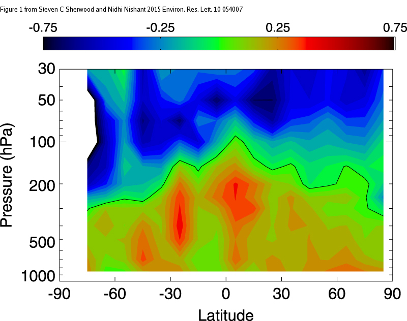
Figure 1 - Temperature of the atmosphere, by latitude and atmospheric pressure, from 1959-2012. Units are in degrees C per decade. Lower pressure corresponds to greater height in the atmosphere. Note the 'hotspot' above the equator centred about 300 hPa (about 9 km from the surface). The blue region at the top is the cooling stratosphere - confirmation of another prediction of the increased greenhouse effect. Image from Sherwood & Nishant (2015).
Why should there be a 'hotspot' in the atmosphere above the tropics?
Because most of Earth's incoming energy from the sun is received in the tropics, strong evaporation there removes a lot of heat from the ocean surface. This heat is hidden (latent) as it is used to convert water from a liquid to a gaseous form. Readers are probably familiar with this process as it is the same one in which we are cooled when sweat evaporates off our bodies during strenuous exercise. Our skin cools as heat is used up in the act of evaporating away the sweat.
Strong evaporative uplift occurs near the equator due to the intense solar heating of the ocean there, and this forces the evaporated water (water vapour) to ascend up through the atmosphere. Because the temperature in the atmosphere decreases with increasing height (known as the lapse rate), this has the effect of cooling water vapor until it reaches a point where it condenses back into a liquid form (forming clouds and rainfall) - liberating the hidden (latent) heat into the upper atmosphere. With the great bulk of atmospheric moisture being concentrated in the tropics, this ongoing process should lead to greater warming in the tropical troposphere than at the surface.
Mark Richardson has a nice video animation of this process at about the 3 minute mark in his University of Queensland Massive Open Online Course (MOOC) Denial 101 lecture on the structure of the atmosphere.
How to measure a hotspot?
So how does one go about measuring the temperature of the atmosphere? Although modern satellite-based instruments such as infra-red, microwave sounding, and GPS radio occultation are capable of measuring temperature and moisture in the upper atmosphere, they are not without their own issues. For instance, the microwave sounding units, the same ones that have been used to build a time series of atmospheric temperatures by the University of Alabama (UAH) and Remote Sensing Systems (RSS) research teams, offer only coarse resolution because they 'peer down' through the atmosphere. This results in the signal received at the satellite being contaminated by both the Earth's surface and the stratosphere (Fu et al [2004]), the layer above the troposphere.
The measurement technique which offers the longest record - stretching back to 1958 - is the use of weather balloons (radiosondes). These helium-filled balloons carry instruments into the lower atmosphere which measure qualities such as temperature, moisture and pressure. Unfortunately, as the name suggests, these were originally designed to gather weather data, so there is a great deal of variation in the methods and instruments used, and sampling in space and time is very patchy - especially so in the tropics. Extracting a useful temperature signal from the data has, therefore, proved to be very challenging.
A temperature signal from the data
Sherwood & Nishant managed to extract useful information from the weather balloon data by using a combination of statistical methods that account and corrects for bias. In their words:
"The methodology statistically corrects for incomplete sampling and step changes in bias arising from changed instrumentation or observing practises. It does this by, in effect, performing a multiple regression of the available data onto a structural model that allows simultaneously for natural and artificial changes.This preserves trends and slow variations at individual stations in an unbiased way given the structural model...."
In effect the analysis enabled Sherwood & Nishant to identify spurious trends introduced by changes in instruments and collection procedures. The authors also carried out a number of other steps to improve their results, such as rejecting stations found to be unreliable from the dataset, and the inclusion of wind vector data, but I won't bore you with the details. Perhaps the most surprising results were that the tropical troposphere was still warming robustly from 2000-2012 despite a standstill in ocean surface temperatures in the tropics (see bottom panel of Figure 2 below), and that stratospheric cooling (a signature of the increased greenhouse effect) in the tropics and northern hemisphere leveled off during 2000-2012 (not shown).
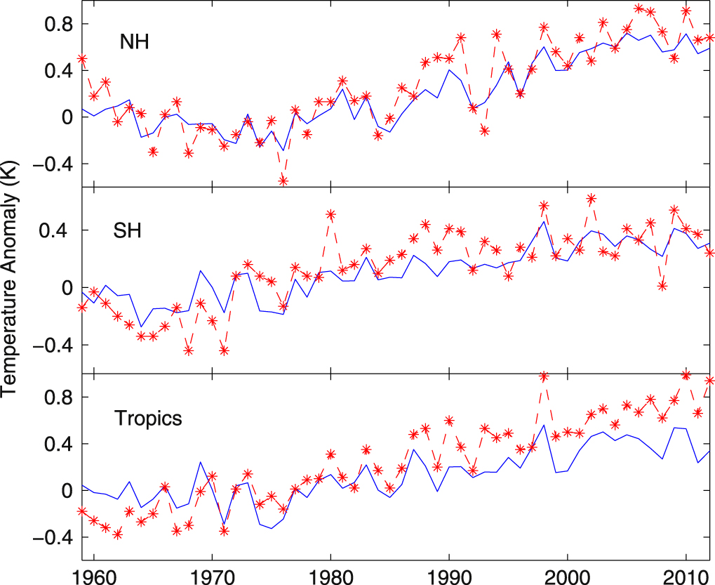
Figure 2 - evolution of tropospheric temperature (average of 850-300 hPa pressure levels) for the northern hemisphere (beyond 30N), southern hemisphere (beyond 30S) and tropics (30N-30S). The blue line is the average surface temperature trend from HADCRUT4. Image from Sherwood & Nishant (2015).
Not much Eureka!, more like meh.....
From a scientific perspective, the inability to measure the warming of the tropical troposphere has been no doubt frustrating for the research groups involved, but nothing more. In time it was likely to be resolved. For the spoof climate science blogs though, it didn't take long for this to become yet another zombie climate myth.
So confirmation of the existence of the hotspot in the tropical troposphere is not some startling revelation. It's just another ho-hum moment in climate science where the experts got it right yet again, and the spoof science blogs got it spectacularly wrong. Again.


Very clear summary of a very technical paper. Thank you.
And yes, it is not surprising to find the models once more got it right. The track record of the current models is pretty stunning. It is only shocking in a sad sort of way, in that it is a sobering reminder of the dire conditions we are causing.
I'm more fascinated with the blue lines in the bottom three graphs than the red lines. The blue lines show that the planet (at least the part of it where people actually live) has warmed by less than 0.4 degree in the past 50 years.
Does that surprise anyone here? Let's take a vote. Upvote this post if you are NOT surprised. Downvote if you ARE surprised, because based on all the rhetoric you naturally expected to see a "hockey stick."
And if you do not think people should be allowed to know this, then cast your vote by deleting this post.
[RH] Please note that posting comments here at SkS is a privilege, not a right. This privilege can be rescinded if the posting individual treats adherence to the Comments Policy as optional, rather than the mandatory condition of participating in this online forum.
Please take the time to review the policy and ensure future comments are in full compliance with it. Thanks for your understanding and compliance in this matter.
@2, the trend from mid 1965 on HadCRUT4 is 0.153 C/decade, for a total warming of 0.765 over the last 50 years, nearly double the increase that you claim. That you took the lower figure for the tropics only, which we expect to be lower, is no surprise.
Upvotes indicate a belief that the post is of particularly good quality, either because of the quality of the data presented and/or the quality of the argument. Downvotes, conversely, indicate that the post is considered of particularly poor quality due to inaccurate or misleading data and/or specious argument. I have downvoted your post for that reason. I am sure the other downvote (at time of writing) is also for that reason. Your attempt to coopt the thumbs up/down mechanism for specious rhetorical purposes is not appreciated.
Tom Curtis, the three graphs shown above clearly show that temperatures in both the Tropics and the Southern Hemisphere (SH) have risen by less than 0.4 degree since 1960, which is more than 50 years ago.
I failed to notice that the NH graph has a different y-scale than the SH (an extremely poor and generally misleading graphing practice) so I misread it. It shows that NH temperatures have risen by about 0.6 degrees in the past 55 years.
I don't know how to average two readings of 0.4 and one reading of 0.6 because I don't know how much territory the "Tropics" covers, but I know for sure the resulting average is far below the 0.765 degree you quoted. Are you suggesting that the graphs in this article are full of errors?
According to these graphs, Northern Hemisphere temperatures were clearly on a strong downward path during the period 1960-1975. This was, of course, a period of very rapid increase for CO2 emissions in the Northern Hemisphere.
The SH, which did not experience so much CO2 increase during this period, did not cool.
Thank you for drawing my attention back to the graph so I would have a second opportunity to notice this interesting cooling phenomenon.
[PS] Please see here for mid century cooling. Anyone wishing to respond to that point, then please do so on that thread. Reading the caption on the figure will tell you how much territory the tropic on the graph represents.
This@4,
(my emphasis)
The differences in scales on Fig.2 have to do with the bandwidth of data - i.e. data variability in SH case was smaller than in other cases, hence tha scaling of y-coord became smaller. Adjusting the y-scale to fit the data is a standard practice in most graphic software packages, so likely the software package used to generate Fig.2 did it automaticaly. You may want to opine that such standard is "extremely poor" and "misleading" but most of graphic artists and software engineers (including myself) do not take your opinion seriously.
This post is about te hot spot in troposphere. You want to derail the discussion to other topics (e.g. your baseless claim that CO2 increase is tied to hemispheric location, whereas in fact CO2 is well mixed gas), but I won't respond to those unrelated distractions. If you want to have serious discussion, find the appropriate thread for it or if you cannot find one, follow mod's suggestion.
[PS]@4,
By "cooling phenomenon" This@4 likely meant slower warming of SH as seen on the blue line of Fig2. His description of Fig.2 is certainly misleading - careful visual examination, as well as proper statistical analysis, reveal statistically signifficant warming rather than "cooling". I haven't found a specific thread directly addressing that issue. But the footnote to the stab The southern hemisphere hasn't warmed as much clearly explains it.
[PS] Pretty sure he means mid-century period of cooling in NH. (not seen in SH as not so affected by aerosols.
Anyway, TWFYSYWDI comprehension of comments policy is as bad as his comprehension of science if that is possible so I doubt he/she will be with us much longer.
Perhaps it's showing a fingerprint of Antarctic ozone depletion, which at mid alitudes results in LT warming.
Ozone recovery is also expected to partly offset warming until mid-century.
Tom Curtis @3.
The data relevant to the comment of This-Will-Frighten-You-so-You-Will-Deny-It @2&4, the places "where people actually live" - this is surely the land component of HadCRUT4 = CRUTEM4. On that count, the relevant average temperature rise is somewhat higher than the HadCRUT4 average and since the 1960s, well over twice the value of the increase denied @2.
Of course, the temperature increase that mainly drives the 'hotspot' is the one increasing ocean evaporation. The relevant HadSST3 data set shows not much more that 0.3ºC tropical warming over that period.
Art@8,
Perhaps.The primary fingerprint of ozone in in the stratosphere.
The stratospheric cooling trend as presented by Figure 4 of (Sherwood 2015), that I reproduced above, is only -0.55 K/decade at 50 hPa : ~ twice smaller than reported before. Note sudden reversal of cooling trend from mid-90s until today in tropics and NH - stratosphere started warming there despite steadily increasing CO2. How much of that signal can be attributted to ozone depletion and then its subsequent recovery following Montreal - on top of the obvious cooling from CO2 - is hard to say. Certainly the radiosonde data at 50hPa doesw not seem to be precise enough to allow any conclusions.
It's interesting that, while the trends cannot match, the local features (peaks and troughs) of the temperature anomaly graph have rather a good eyeballed match with the PDO index for the period. The NH seems to be an especially good match. I wonder whether a "corrected" temperature anomaly graph would show anything of use.
@Chriskoz (#10):
The lower stratosphere might have stopped cooling because of the beginning of the recovery of the ozone hole. But the middle stratosphere is still cooling, according to RSS analyses, about 0.5 K/decade from 1999 to 2013 (see AMSU channel C13), very close to the 0.55 K/decade you cited for 1960-2010.
Cf. http://www.remss.com/measurements/upper-air-temperature
Complements from previous comment (#12): To be fair, the 0.55 K/decade cooling trend given by Chriskoz concerns 50 hPa, which should be compared with the C10 channel centered at 20 km height. There, the 1999-2013 trend is still cooling but at a lower rate: 0.24 K/decade, cf. http://images.remss.com/msu/msu_time_series.html
But:
(1) considering the short period and the noise of both time series, this figure doesn't show unequivocally an inflexion of the previous trend;
(2) comparing the different channels (C10,11,12,13,14 at respectively 20,25,30,35 and 40 km heights), the 1999-2013 cooling trends are increasing with height from 0.24 to 0.76 K/decade. As for the synthetical C25 data which emulate the SSU time series, they show a 0.40 K/decade trend for the same period.