Climate Science Glossary

Term Lookup

Enter a term in the search box to find its definition.

Settings

Use the controls in the far right panel to increase or decrease the number of terms automatically displayed (or to completely turn that feature off).

Term Lookup

Settings


All IPCC definitions taken from Climate Change 2007: The Physical Science Basis. Working Group I Contribution to the Fourth Assessment Report of the Intergovernmental Panel on Climate Change, Annex I, Glossary, pp. 941-954. Cambridge University Press.

Home Arguments Software Resources Comments The Consensus Project Translations About Support

Bluesky Facebook LinkedIn Mastodon MeWe

Twitter YouTube RSS Posts RSS Comments Email Subscribe


Climate's changed before
It's the sun
It's not bad
There is no consensus
It's cooling
Models are unreliable
Temp record is unreliable
Animals and plants can adapt
It hasn't warmed since 1998
Antarctica is gaining ice
View All Arguments...


Username
Password
New? Register here
Forgot your password?

Latest Posts

Archives

NASA-GISS: July 2010-- What global warming looks like

Posted on 13 August 2010 by Doug Bostrom

"Where's the evidence" is the frequent demand of folks doubting what science tells us of climate change. This isn't surprising because we're looking at a system with enormous inertia and so climate shifts will generally show up as incremental creep over a long period of time. We can look at years of results nicely presented by such tools as NOAA's "Climate Indicators" visualization page but what we see there is nothing we'll notice happening on a day by day basis in our lives.

Weather effects of climate change are elusive when it comes to attribution; an unusual spate of hot weather simply can't be put down to a variation in climate without being viewed in a larger context. Indeed it's best for us laypersons to avoid attributing weather we may feel is unusual to any particular cause. Heavy snowfall last winter was frequently cited as evidence of a halt in global warming or evidence that anthropogenic climate change had been exaggerated; our personal feelings overrode what science told us we could expect of climate change.

There is however a means of separating our gut instinct about today's weather from more objective means of assessment. We can look at any day's weather from a statistical viewpoint. Compared to typical climatology, how does today's weather stack up? How does a sequence of days look? What does the frequency and magnitude of new weather records tell us?

Meehl 2009 looked at weather statistics from the perspective of the ratio of record high and low temperatures over the past few decades. In general we'd expect a large thermometer network of stations in operations for many decades to exhibit a more or less 1:1 relationship of new record highs versus lows. But the statistics clearly show otherwise:
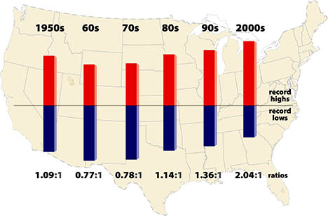
Meehl shows how a statistical look at weather events can tease out information about which way our climate is heading. But this is still not something that can be described as a notable phenomenon, an event that gives us an intuitive feel for the changing behavior of our climate.

Sometimes however unusual weather events and patterns can emerge from the statistical background as a noticeable cluster, a burst of dramatic activity that catches our notice. Our intuition may lead us to wonder if we we're witnessing something more significant than weather.

Weather around the planet so far this year has indeed included some unusual events, to put it mildly, occurrences that are notable from a statistical viewpoint and extend a remarkable recent  bulge in records. 75 countries or 33% of the nations on Earth have set historical high temperature temperature records in the past 10 years, versus 15 countries setting record lows. 17 countries have set all-time national high temperature records this year, with only a single country reaching a record low. This has happened in a year where global temperature for January through July of this year is the hottest on record. The 12-month running mean of global temperature is at a record high. Unprecedented monsoon flooding in Pakistan has left some 10% of citizens suffering from flood effects with river flows on the Indus exceeding any past measurements. Russia has seen prolonged temperature extremes far outside the historical record, leaving probability in the neighborhood of 1:1000 in terms of how often we'd expect to see such a phenomenon.

These statistics are in fact so startling that NASA-GISS was moved to title their July 2010 Surface Temperature Analysis "July 2010-- What global warming looks like." The report notes the "statistical loading of the dice" produced by climate change:

"The location of extreme events in any particular month depends on specific weather patterns, which are unpredictable except on short time scales. The weather patterns next summer will be different than this year. It could be a cooler than average summer in Moscow in 2011.

But note in Figure 1, and similar maps for other months, that the area warmer than climatology already (with global warming of 0.55°C relative to 1951-1980) is noticeably larger than the area cooler than climatology. Also the magnitude of warm anomalies now usually exceeds the magnitude of cool anomalies.

What we can say is that global warming has an effect on the probability and intensity of extreme events. This is true for precipitation as well as temperature, because the amount of water vapor that the air carries is a strong function of temperature. So the frequency of extremely heavy rain and floods increases as global warming increases. But at times and places of drought, global warming can increase the extremity of temperature and associated events such as forest fires."

As usual, graphics help us understand the data better. We can see the situation in Russia clearly indicated:
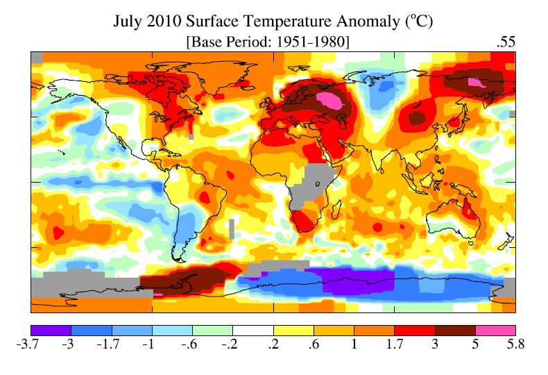
Figure 1 July 2010 NASA-GISS Surface Temperature Anomaly

As we can see from the following graph, the 12 month running mean temperature is at an all time high:
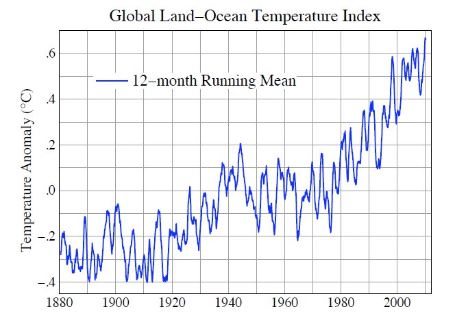
Figure 2 July 2010 NASA-GISS Surface Temperature Analysis

The World Meteorological Organization (WMO) looks at this year more from a weather perspective. In "Current Extreme Weather Sequence" the WMO takes note of the conspicuous nature of this year's weather in Russia:

"According to Roshydromet, the Russian Federal Service for Hydrometeorology and Environmental Monitoring, July 2010 is the warmest month ever in Moscow since the beginning of modern meteorological records, 130 years ago. Temperature has exceeded the long-term average by 7.8° C (compared to the previous record in July 1938 with 5.3° C above average). Record high temperatures varying between 35° C and 38.2° C were registered for more than 7 consecutive days end July, with the heatwave continuing into August. The daily temperature of 38.2° C on 29 July was the highest ever in Moscow (compared to a long-term average of approximately 23° C). The minimum temperature of nearly 25°C (recorded during the night before sunrise) also scored a significant increase compared to the historical average of about 14° C."

The WMO goes on to note events in Pakistan:

"The floods in Pakistan were caused by strong monsoon rains. According to the Pakistan Meteorological Department, the instant rain intensity reached 300 mm over a 36-hour period. The strong monsoon rains led to the highest water levels in 110 years in the Indus River in the northern part of the country, based on past records available from 1929. More areas in central and south Pakistan are affected by the floods. The death toll to date exceeds 1 600 and more than 6 million people have been displaced. Some reports indicate that 40 million citizens have been affected by the floods."

Similarly to NASA-GISS, while careful not to make a bald pronouncement about attribution of these events, neither does WMO avoid pointing out the congruence of unprecedented extreme weather with predictions from climate science:

"Several regions of the world are currently coping with severe weather-related events: flash floods and widespread flooding in large parts of Asia and parts of Central Europe while other regions are also affected: by heatwave and drought in Russian Federation, mudslides in China and severe droughts in sub-Saharan Africa. While a longer time range is required to establish whether an individual event is attributable to climate change, the sequence of current events matches IPCC projections of more frequent and more intense extreme weather events due to global warming. The Monsoon activity in Pakistan and other countries in South-East Asia is aggravated by the la Niña phenomenon, now well established in the Pacific Ocean"

The WMO has more to say on this in their update. It's conspicuous and of course admirable that neither NASA-GISS nor WMO attempt to say "Here's your proof of global warming." Equally it's important that both organizations continue to use their analytic resources to mark those occasions when observations coincide with predictions. 2010 has so far provided ample opportunities for such connections to be pointed out.

All of us live just a single human lifespan; nobody reading these words is likely to wake up 100 years from now and wax nostalgic for the way the weather used to be. As NASA-GISS' title implies, for those of us living in 2010 clusters of statistically extreme weather events are the best grip any of us as individuals will get on what global warming looks like.


0 0

Printable Version  |  Link to this page

Comments

Prev  1  2  3  Next

Comments 51 to 100 out of 130:

  1. Doug, thanks for the links. The Weber paper (last link) confirms what one forecaster alluded to here in DC in a July forecast discussion (actually the Sterling VA office) which was that the record high minimums are affected by urbanization in DC. The Weber paper says there is little effect on record high maximums. I see the Meehl paper used 1800 stations out of 11,000 or so. There's no discussion of that possible urban bias in the paper for station selection. As with the record high mins, an increasingly urbanized area is also less likely to reach new record low mins. RBW, for the record I am referring to urbanization (the process), not urban versus rural (static). Records, unlike averages, cannot be homogenized.
    0 0
  2. Interesting perspective there, Eric. The Weber paper was about the Alps in Europe, found minimum and maximum temperatures to be increasing at both low-lying stations in Central Europe as well as mountain tops. The mountain tops of the European Alps are not urbanized and of course are quite distant from Washington, D.C. which although a sprawl has not yet grown across the Atlantic. As to Meehl, can you show that the change in ratio is due to urbanization? Remember, when you convey the impression you know better than experts on a given topic, you incur a sort of debt against your credibility. You can't just create an argument out of thin air by implying you're more expert than Meehl and his coauthors, you have to show how, specifically by improving his results. That's how you pay for credibility, by doing the work necessary to back up assertions. Not an assertion? Simple doubt is not an argument.
    0 0
  3. I don't mind my comments being removed by moderators, and I was right-on-target wiuth mine. And I am on "your side" whatever that may be. But. If you are going to remove my post at least have the courtesy to send me an email which I use to register with your site so I b) know what it is I said that offended your moderator. I know what am talking about and I ave te shingle to prove it.
    0 0
    Moderator Response: We apologize for any unintended offense. It may be that your comment was one of several diverging into a discussion of the role of C02 as a GHG which were removed after the pointer to Miekol upthread. If you feel your comment was removed in error please feel free to post it again.
  4. I'm getting a distinct feeling this is not a science site. Its as its title says,"skeptical about global warming skepticism," and unless one is pro GWers its pointless posting because any negative posts to pro warming get deleted. [further thoughts off-topic for this thread deleted]
    0 0
    Moderator Response: To the contrary, Skeptical Science deals with a multitude of arguments and as long as they do not degrade into insults, accusations of dishonesty, hypotheses of general corruption of the entire scientific community or the like they are allowed to follow their natural course. However, in the interest of encouraging useful conversation, Skeptical Science does not entertain bundled collections of misconceptions but instead deals with each misconception individually. By using the "Search" function at upper left, you will most likely be able to find a suitable location to take your concerns. More information on expectations for comments may be found at the Comments Policy page.
  5. miekol at 17:35 PM on 14 August, 2010 I'm getting a distinct feeling this is not a science site. Its as its title says,"skeptical about global warming skepticism," This is a science site. When you have any concpt of science maybe you will be taken seriously. Until then, whatever.
    0 0
  6. Doug, am I not going to get any links about studies of the effect of urbanization on record high minimums? If not, why not? I can obviously see why higher *average* minimums might be interesting to some, and the Easterling links are convincing enough. But this thread is about records, not averages. Am I not going to get an answer to why Meehl did not have any discussion of urbanization in producing his chart in the head post, even just a sentence referring to Weber? It would not be directly relevant since Weber studied the effect of urbanization on a city by city basis with all of his available data (no selection bias), but at least it would be something. Appeals to authority only work if the authority has shown some thoroughness, otherwise you need a new authority.
    0 0
  7. michael sweet The average temperature on the Moon is fairly meaningless in this context given temperature swings that take minutes relative to daylight and night hours on Moon that last roughly 300 hours. Please check the curves here and see temperature transitions... in evacuated tubes... on the Earth. http://en.wikipedia.org/wiki/Solar_thermal_collector
    0 0
    Moderator Response: Your comments on this topic belong on the thread CO2 effect is weak.
  8. Eric, you're hypothesizing about Meehl's paper without doing any work to support your hypothesis. "I appeal to myself as an authority, take my word for it." Not persuasive. Rumor has it that Meehl replies to polite inquiries. Why not ask a real expert? As to record high minimums clearly you can type, you've got an Internet connection, you're capable of performing your own literature search. You'd nonetheless like to send somebody (me, for instance) beavering away to produce some references for you thereby supplying you with fresh opportunities for making lazy assertions. Forget it; I did a good faith effort for you once, not again on this topic. Do your own work.
    0 0
  9. I should add, Eric, that if you want to get calibrated against the level of effort required to mount a useful discussion here, look for examples by Berényi Péter. Péter puts a serious amount of hard work into teasing out quibbles he has with climatology. Meet or exceed the metric Péter provides when it comes to showing how a substantive argument against expert knowledge can be attempted and you're doing ok. Again, "I doubt it" is not an argument.
    0 0
  10. "WMO takes note of the conspicuous nature of this year's weather in Russia......." You state "Russia" and then go on to make a quote which refers only to Moscow. "July 2010 is the warmest month ever in Moscow....." According to NASA, only 43% of the land area extending from West Africa through to Japan is above average T a the time of Russia's hewatwave. This means that is cooler than average, overall, but you have managed to cheery-pick Moscow simply for the purposes of highlighting warm temperatures. So, you have convinced me, global warming looks like cooling. This site constantly states how skeptics cherry pick data while ignoring the bigger picture, well you have just done the same.
    0 0
  11. thingadonta wrote : "According to NASA, only 43% of the land area extending from West Africa through to Japan is above average T a the time of Russia's hewatwave. This means that is cooler than average, overall, but you have managed to cheery-pick Moscow simply for the purposes of highlighting warm temperatures." Is it really the case that there are no average temperatures at all, or are you saying that average temperatures are only present in 6% or less of that land area ?
    0 0
  12. Ok, here's a new argument I've never seen and they pertain to this topic: There is no warming, summers are cooling. It's milder winters that is increasing the average of the yearly mean to give the APPEARANCE of warming. How would this even work? BTW - ths guy also says that "there is no climatic event that is outside the normal" and expects that this is an argument of some type.
    0 0
  13. Thingodonta, In figure 1 above when I draw a line from west Africa to Japan there are only two small spots where the temperature is below normal and the vast majority of the area is red. One small spot near Kenya in the ocean and the low end of the cold area in Northern Asia. Where did you get the 43% figure? Can you explain to me from Figure 1 how you see July as cooling? The reddish colors are hot in the figure and the cold are blue.
    0 0
  14. #60: "only 43% of the land area extending from West Africa through to Japan is above average T. ... This means that is cooler than average, overall," Your conclusion is Utter Nonsense. Example: Take the integers 1 thru 10. Their average is 5.5; half are above and half below. Now take these integers: 1,2,3,3,4,5,7,9,10,12; their average is 5.6, which is higher than the prior average. Only 40% of the new integers are higher than either average, yet the average has gone up! If those were temperatures, would that be warming or cooling? No cherries picked here.
    0 0
  15. #62: "There is no warming, summers are cooling. It's milder winters that is increasing the average of the yearly mean " How about this response? That is just flat wrong. See the seasonal RSS temperature anomaly graph at the Has Global Warming Stopped? thread. Summer and winter anomalies are on the same upwards trend; but I agree, that does give the appearance of warming.
    0 0
  16. Hey thanks muon - appreciate it. Being a met means I've had some climatology training, but it takes some searching to find the data I need and often the deniers are already off and runnng with a totally new argument before I can rebutt the original. BTW - there's a new paper at WUWT that is causing quite a stir. I'd love to see a real analysis of it: http://wattsupwiththat.files.wordpress.com/2010/08/mcshane-and-wyner-2010.pdf
    0 0
  17. The reference to 43% below avergage temperature from ~West Africa to Japan is here, courtesy WUWT. http://wattsupwiththat.com/2010/08/14/more-of-the-moscow-heat-wave-satellite-analysis/#more-23439 Its still cooler than normal in SE Asia, and for the last several months.
    0 0
  18. Thingadonta, if you look at the map above, you can certainly see some areas that are anomalously low in temperature. Others are anomalously high, collectively more than are low and as well generally skewed more. Over time, that sort of disproportionate relationship is what produces a 12 month running mean such as is also visible above. W/regard to Moscow versus Russia, how large do you imagine Moscow to be? Now, keeping that thought in mind, take a look again at the map above. Is Moscow as large as the areas of the map covered by the largest positive temperature anomaly? Even if I should wish to do so there's no reason to "spin" this information, the plain truth is quite remarkable in itself.
    0 0
  19. Stormhunter - your friend should also note that warming by milder winters is a key AGW prediction - differentiating GHG warming from say solar warming.
    0 0
  20. CBW (#48): GISS is the only temperature record that has not 1998 as the hottest year. When we look at the averages of the various records (satelites and surface stations) the picture is as follows. This picture, taken from www.climate4you.com shows quite other things than you claim. The use of a 12-month running average is a convenient trick to show an intermediate all time high, when you expect that the annual average of the running year will not break records. Such an average has no climatological meaning for the long term trends. Dough-Bostrom (#29). Yes, you are right, Nasa used these words first. John, I apologize. But this makes things even worse. I should have written: 'Nasa has not learnt from the attribution errors that the IPCC made in 2005'.
    0 0
  21. Doug, if you look at the figure I have referenced (courtesy NASA and WUWT), you will see there is more land below average temperature (57%) from West Africa to Japan at the time of the Russian heatwave, than the proportion of land, which includes Moscow, above average temperature (43%). The 2 figures seem to be in contradiction, but where I am, I believe the locals, coldest year in 35 years, despite your Figure 1 above.
    0 0
  22. Thingadonta, The map on WUWT is only for July 20-27, although it was posted on August 14. The map in figure 1 above is for the entire month of July. WUWT has apparently cherrypicked one week in the past six weeks of hot weather in Russia to make their claim that Russia is not hot. Figure 1 is not cherrypicked and reflects what the temperatures in Russia really are. Read WUWT very carefully, they do this on purpose to catch people who do not pay attention.
    0 0
  23. @doug at 08:23 AM on 14 August, 2010 My understanding is that the deviation of last winter may be due to a recent La Niña, hence last winter could then be said to be within a perfectly normal event that is within a natural variation with in the predicted trend. Therefore I find it strange that this summer, just because it is such an media attention, is not attributed to the very same variation within the very same trend. Why do I care about this? Well, this is what a scientist writes in the Guardian: "For climate scientists, having to continually rein in extraordinary claims that the latest extreme is all due to climate change is, at best, hugely frustrating and, at worst, enormously distracting. Overplaying natural variations in the weather as climate change is just as much a distortion of the science as underplaying them to claim that climate change has stopped or is not happening. Both undermine the basic facts that the implications of climate change are profound and will be severe if greenhouse gas emissions are not cut drastically and swiftly over the coming decades." It makes at least me asking the question why someone would have any interest in overplaying these things in any direction.
    0 0
  24. "I believe the locals, coldest year in 35 years" Incidentally, the average age in Indonesia is 27. Anecdotal "evidence."
    0 0
  25. #73: "last winter could then be said to be within a perfectly normal event that is within a natural variation with in the predicted trend. Therefore I find it strange that this summer, just because it is such an media attention, is not attributed to the very same variation within the very same trend." Please look at the temperature anomaly vs. time graph at the top of the page (figure 2). When you strip away all the newspaper jabber and anecdotal stories, you are still left with rising annual average temperatures. Seasonal highs and lows, el Nino/la Ninas fade into the background. Unfortunately, climate science is an awkward position, similar to the dilemma of earthquake prediction. Few seismologists will go on record saying X marks the spot and H is the hour, but a consensus agree that an earthquake is coming on the San Andreas. Oh wait, if a scientific consensus exists, then it can't be right.
    0 0
  26. As a general remark I find it amusing how the figures in this article are "mine" and along those lines that NASA-GISS and WMO are "media." Nope, not mine, no more than photos of a Saturn V rocket lifting off suggest that a news photographer had constructed the rocket in the picture. As to "media", rather than refer to such a source instead it's of course better to go to the horse's mouth, in this case NASA-GISS and WMO, what's quoted from and linked to above. Laughter aside, let's not go down the path of imagining that the sources above are that darned liberal media, or that I've used a spreadsheet to make up some graphics friendly to a "case." What you see is what the best authorities have to say about this matter. Yes, that's right, authorities, they do exist, there are discernible differences in reliability between different sources of information, that difference being manifested in part by the actual amount of information conveyed to the public as well as an authority's relative honesty w/the public. The relative reliability of authority in part manifests itself by exhibiting characteristics of the formal sense of the word "circumspection," the trait of trying to take all things into account when making a judgment. Above, in the article and more particularly in the NASA-GISS and WMO articles linked there you can see a circumspect assessment of what weather today may tell us about climate. Conversely, at WUWT you may see an intentionally circumscribed picture in the form of an incomplete portrayal of temperature anomalies, this apparently conveyed as an attempt to sway public opinion. There's the difference between "media" and useful authority, in a nutshell; NASA-GISS and WMO try to convey as much information as possible, WUWT conveys only that which is suitable for making their case.
    0 0
  27. thingadonta at 00:07 AM, depending on where you are, yes, it can get very cold in Indonesia especially if you go into some of the mountain areas. Weather and climatic conditions in Indonesia are dependent on conditions in the Indian Ocean more so than the Pacific Ocean, the Indian Ocean based cycles affecting all the surrounding land masses, Indonesia, India, Africa and large parts of Australia. The Dutch compiled long term weather records, some of which show that droughts in areas close to the equator follow a similar pattern to droughts in south eastern Australia, Victoria included. Climatologists in Australia long rejected any connections, but the identification of the IOD (Indian Ocean Dipole) by Japanese researchers about a decade ago confirmed what many working independently of official bodies had long known.
    0 0
  28. fydijkstra, No, the use of a 12-month average helps reduce seasonal variability. I'm also unsure as to what you think the graph you link to demonstrates, other than you believe satellite data is somehow more accurate than ground readings. It isn't.
    0 0
  29. The map on WUWT is only for July 20-27, although it was posted on August 14. The map in figure 1 above is for the entire month of July. WUWT has apparently cherrypicked one week in the past six weeks of hot weather in Russia to make their claim that Russia is not hot.
    Without even looking at WUWT, I sniff the unmistakable odor of Steven Goddard ...
    0 0
  30. #31: batsvensson at 06:58 AM on 14 August, 2010: FYI, Scotland (or the UK for that matter) did not set a new record low temperature last winter. A low of just below -20C was recorded, but it did not approach the all-time record low of -27.2C, set jointly in 1895, 1982 and 1995. I found it unusual that, despite truly remarkable synoptic conditionas at just the right time of year, the record was not even threatened, or that -20 wasn't reached more widely. Very interesting spot on the WUWT cherry picking michael, yet another example of them using selected data to push the wrong message...
    0 0
  31. Dhogaza, It was of course a post from Goddard. I checked some weekly maps from NASA here and they show a lot more variation than the monthly data. It would be easy to show either more or less warming. As Doug said, it is important to have a reliable authority to explain the data. The overall pattern, of course, becomes more obvious as you average more and more data. In addition, Goddard counted pixels and weighted blue the same as red. A cursory scan of the data shows that the red is higher than the blue is low (note that the lowest anomaly is -3.7 while the highest is +5.8).
    0 0
  32. @muoncounter I dont understand your comment. What is the point you are trying to make?
    0 0
  33. @skywater at 07:04 AM on 16 August, 2010 Thank you for pointing that out, I stand corrected. And according to the MET office there seams to have been no extreme records broken at all.
    0 0
  34. michael sweet:
    In addition, Goddard counted pixels and weighted blue the same as red. A cursory scan of the data shows that the red is higher than the blue is low (note that the lowest anomaly is -3.7 while the highest is +5.8
    That's typical. He also never weights pixels at different latitudes to adjust for projection distortion.
    0 0
  35. @doug_bostrom "As to "media", rather than refer to such a source instead it's of course better to go to the horse's mouth" I am a bit confused to who this refer to, but since I posted a "media" quote just above I feel targeted. If it was nor directed to me then please ignore my question below. Why do you think a climate scientists opinion (in this case the head of climate change advice at the Met Office) in this matter if published in news media is not good enough?
    0 0
  36. batsvensson, Did I misunderstand your prior comment to suggest some sort of one-sidedness in emphasizing summer heat vs. not emphasizing winter cold? My reference to Figure 2 here was simply to reiterate the longer term trend that jumps off that graph and seems to be very similar in most measures, as Ned demonstrated a week or two ago. I suppose I find the use of el Nino/la Nina to explain all anomalies in at least one part of '' to be a distraction from the big picture.
    0 0
  37. Bat, not picking on you, the "media" thing has been mentioned a couple of times here. My general point is, the farther we go from the original source of information, the more ambiguity and even error is introduced. There are a number of hyperventilating media treatments of this year's weather available, best ignored. WUWT's own presentation is another kind of emotional response, for that matter. Sure, we might get a few quotes in a newspaper treatment, but why bother in this day and age when we can tap directly into an agency's own description, without the noise introduced by reporters and editors? It's probably fair to say I introduce my -own- slant here, but my objective in the post is centered on helping people see how short term weather fits into a statistical perspective and how it might -not- fit in an easy way when shoved by new influences. What moved me to do this post was in fact how the calm and collected people at NASA-GISS and WMO have responded to this year's weather, how the weather protrudes from statistics enough to warrant comment; it's a notable year in terms of weather statistics. What I can do to maintain some shred of objectivity is to stick w/"official" sources, publish quotes that include qualifiers such as the onset of La Nina, not select a week from July and use that as a way of imposing my own beliefs on readers.
    0 0
  38. @muoncounter I can not tell weather or not youmisunderstood, what I wrote. If you understand what happens when a trend is superimpose to a cyclic signal then I don't understand the point with rephrasing what I wrote and pointing out things to me I already understand. Your reference to figure 2 doesn't make sense to me as I don't understand what it is you are trying to clarify to me. I am wondering about the explanation for the anomaly last winter and its relation to the explanation of the anomaly this summer. This is the anomaly for this summer (fig. 1 OP): And this is the anomaly for last winter: I find it interesting to notice that the anomalies have a similar pattern in both pictures. Is it then to much to ask if there exists a causal relation between these two pictures/pattern? And if it happens to be so why are they then attributed to different causes? Anyway, then you continue with comparing climate science with seismologists and earthquakes, and at this point I am completely lost in what your comment wants to clarify to me. Finally you end your first post at me with a comment that suggest that I would deny "scientific consensus". Whatever you mean with this would you like to point at what I wrote that made you think so? In your second comment you mention that you think La Nina is a distraction from "the big picture", but if that was the reason, why didnt you say so in the first place then?
    0 0
  39. @doug, Thank you. Secondly, I dont know what WUWT refers to and from your description I dont think I would be particular interested in finding out either.
    0 0
  40. bats #88, Sorry for any confusion. My seismology reference was from personal experience with earthquake research. Predicting specifics from generalities is daunting in any field. I wasn't suggesting that you were denying consensus; that was a mild attempt at humor. Read any denialist site, they seem to find consensus threatening.
    0 0
  41. A couple of meteorologists in the commercial weather forecasting domain look at weather statistics for this year: Wunderground's Rob Carver Weather Channel's Stu Ostrow Ostrow makes some interesting remarks on the nature of our reliance on expertise.
    0 0
  42. Doug Bostrom posted national records beaten during this year on another thread, and has made a reference to them also on this thread. I have a reflection concerning national records. The source for those data is Dr. Jeff Masters' WunderBlog. The following claim is made in the blog: "These nations comprise 19% of the total land area of Earth. This is the largest area of Earth's surface to experience all-time record high temperatures in any single year in the historical record." The first quoted statement is right; the second is at best dubious. Is one national record really comparable to another? Is it correct to add areas of nations? Russia is the world's largest country. It now has a new national heat record. So far, so good. Cyprus (and also the minuscule nation of Ascension Island) also hit a new national heat record this year. Now, if you would divide Russia up into pieces as small as Cyprus, you would find that not all of these almost 2000 pieces have set new records. Maybe 10%, maybe more, but certainly not the total area of Russia. However, the whole area of Russia is counted in as part of the 19%. On the other hand, USA is also a large nation. No national (or state) heat record was set (so far) in 2010, so 0% of USA is counted. But some U.S. states are much larger than Cyprus. Maybe, if you divided up for instance Alaska or Texas into smaller pieces (like Cyprus), you would find a new local record somewhere? That would add to the total land area percentage figure. In short, to claim that a certain percentage of the total land area of Earth has experienced all-time record high temperatures, you would have to divide the total area into reasonably small parts (probably much smaller than Cyprus but bigger than Ascension Island's 88 km2). Then you would have to investigate the temperature history of each one. Nations are in this respect in most cases too big units (or in a few cases even too small), to form a valid base for a statement like the one quoted at the top.
    0 0
  43. Argus, Dr Masters tracks national records. By giving a % of land area he summarizes the data. I find that metric helpful. I recognize the units are not the same size and are not uniform. I think he has found a useful sumary of the data he has. If you don't find it helpful you are welcome to analyize the data and provide a better metric. Criticizing someone who has done the work without providing an alternate method of analysis does not advance understanding at all.
    0 0
  44. Argus wrote : "On the other hand, USA is also a large nation. No national (or state) heat record was set (so far) in 2010, so 0% of USA is counted." Are you sure ? I found this, just for July : It was the hottest July on record in both Rhode Island and Delaware. New Jersey just missed their hottest July, coming in at #2. Thirteen other states had their top 10 hottest July on record. This is indicated in the map above by those states with numbers higher than 106. July 2010: Records and Notables - Weather.com That led to the NOAA report for July : The persistence of this pattern over the last several months has resulted in the warmest May-July on record for several east coast states from South Carolina to New Hampshire. Then, I thought, rather than post anymore, perhaps I should ask you to post your evidence for that lack of "national (or state) heat record[s]". Do you have any ?
    0 0
  45. Thinking of this in comparison w/how the analysis at WUWT of snowfall records ignored the area circumscribed by state borders in the United States, I think Argus' remark on the danger of focusing on numbers as opposed to area of countries experiencing national records is correct. Really, the message is in the statistical bulge in new national high temperature records captured by individual thermometer networks running for many decades. Take away the boundaries and the message is the same, only the network becomes larger I can't read Masters' mind but I suspect he was simply alluding to the broad areal nature of unusual heat extremes this year. Maps transcending national boundaries are a better way to express the concept. Extended quibbling over inconsequential errors in summaries seems like a pointless distraction when the simple statistics are so surprising.
    0 0
  46. #95: Extended quibbling over inconsequential errors in summaries seems like a pointless distraction when the simple statistics are so surprising. That sounds like a good motto; perhaps John should put it across the top of every page! Or email it to WattsAndCo.
    0 0
  47. Perfect example of how researchers see their information completely mangled as it passes through the newsgrinder, only to have the blame thrown back in the wrong place (those darned alarmist scientists!): "There was a piece in the Telegraph, “Pakistan Floods: Climate change experts say global warming could be the cause.” The body of the story says, “Experts from the United Nations (UN) and universities around the world said the recent ‘extreme weather events’ prove global warming is already happening.” They didn’t say that, actually, the reporter did. The experts in the story actually were pretty clear that no weather event can be said to be caused by climate change, but rather that events like those we have witnessed are consistent with predicted changes." (emphasis mine) From the Knight Science Journalism Tracker, a fun site for keeping up w/science journalism including the "what" of science stories as well as the "how."
    0 0
  48. Nice new article, again in the Guardian: "Will this summer of extremes be a wake-up call?" Looking only at individual extreme events will not reveal their cause, just like watching a few scenes from a movie does not reveal the plot. But, viewed in a broader context, and using the logic of physics, important parts of the plot can be understood. ... We must face the facts: our emissions of greenhouse gases probably are at least partly to blame for this summer of extremes. Clinging to the hope that it is all chance, and all natural, seems naive. That sounds like it was actually written by (gasp) a scientist. Guess what: "Stefan Rahmstorf is Professor of physics of the oceans at Potsdam University, and a member of the German Advisory Council on Global Change."
    0 0
  49. michael sweet at 00:44 AM on 17 August, 2010: So you think it is OK to claim that 19% of the total land area of Earth has experienced all time heat records, when more than half of this land area (11.5%) is based on one record somewhere in Russia? You find that "helpful". I find it misleading. Criticizing someone who has done the work without providing an alternate method of analysis does not advance understanding at all. Read again! I did provide a possible alternate method of analysis.
    0 0
  50. JMurphy at 01:53 AM on 17 August, 2010, I am very open for the addition of possible new local (state) records within the U.S. (I did write 'so far'.) I just didn't find any such records where I looked (www.infoplease.com). Way to go, Delaware and Rhode Island! The problem is still that if there will be any new state records this year, USA will still contribute with just 0 km² to the total area, according to the metrics of Dr. Jeff Masters. Unless the national record from Death Valley is also beaten (unlikely), in which case all 9372614 km² will suddenly be added to the total land area that has experienced all-time high.
    0 0

Prev  1  2  3  Next

You need to be logged in to post a comment. Login via the left margin or if you're new, register here.


The Consensus Project Website

THE ESCALATOR

(free to republish)


© Copyright 2024 John Cook
Home | Translations | About Us | Privacy | Contact Us