


 Arguments


June was hot across most of North America, Europe, the Middle East, and parts of Asia. Antarctica and its sea ice regions were also well above what is typical for June.
Low temperatures occurred in South America, and record lows for June occurred in parts of Quebec. pic.twitter.com/H0QaG4oSVV
State of the climate: 2018 set to be fourth warmest year despite cooler start
Posted on 20 August 2018 by Zeke Hausfather
This is a re-post from Carbon Brief
Temperatures on the Earth’s surface in the first half of 2018 were lower than over the same period for the three previous years. This was due, in part, to a moderate La Niña event during late 2017 and the first half of 2018.
However, the world is quickly switching to El Niño conditions, which should contribute to a somewhat warmer finish to the year.
Sea ice has been at record or near-record lows in the Arctic for much of the year, but has recovered slightly over the past two months.
Antarctic sea ice extent has generally been on the low-end of normal for the first half of 2018.
With the data now in for the first half of the year, Carbon Brief estimates that 2018 is most likely to be the fourth warmest on record for the Earth’s surface. Depending on what happens in the remaining six months, it could be as high as the second warmest in some temperature datasets, or as low as the sixth warmest in others.
La Niña fading, El Niño growing
Global surface temperatures have warmed about 1.1C since 1850 – with 0.8C of that warming occurring since the 1970s. The best estimate provided by scientists is that almost all of this long-term warming is due to human emissions of greenhouse gases.
However, there is still a sizable amount of year-to-year variation on top of this warming trend. Short-term variations in the Earth’s climate are mainly associated with El Niño and La Niña events, fluctuations in temperature between the ocean and atmosphere in the tropical Pacific which help to make some years warmer and some cooler. (Large volcanic eruptions can also lead to a run of relatively cooler years, though there has been no eruption with a major climate impact since Mount Pinatubo in 1991.)
For example, 2016 was exceptionally warm with help from a strong El Niño event. In contrast, 2017 was largely “neutral”, having no strong El Niño or La Niña conditions. The first half of 2018 was cooled by a modest La Niña event, while the second half of 2018 will likely feature modest El Niño conditions.
The figure below shows a range of different El Niño forecast models produced by different scientific groups, with the average of all the models shown in blue. Nearly all El Niño forecast models expect modest El Niño conditions for the remainder of 2018, with sea surface temperatures in the tropical Pacific around 1C above the recent average.
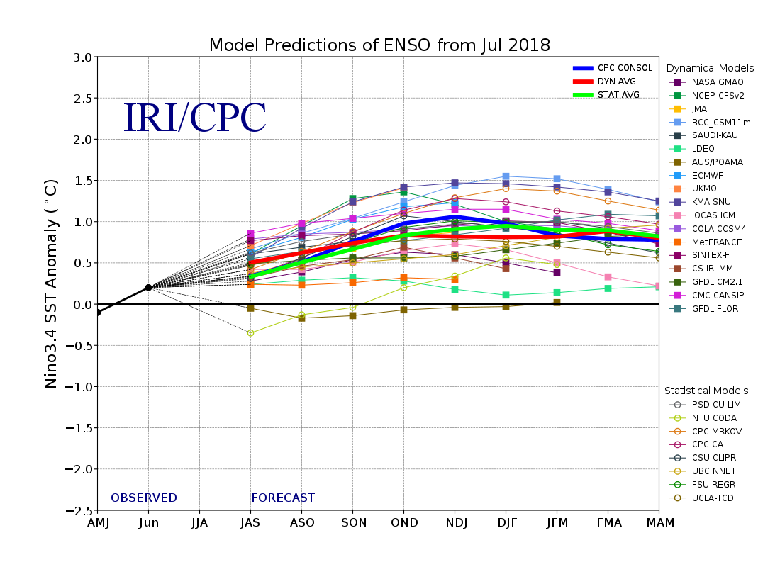
Ensemble of El Niño/La Niña (ENSO) forecast models as of July 2018 provided by the International Research Institute for Climate and Society (IRI) at Columbia University. Both physics-based dynamical models (squares) and statistical models (circles) are shown.
Typically, there is a lag of about three months between El Niño or La Niña conditions in the Pacific and their effects on global surface temperatures. This means that La Niña conditions in late 2017 and early 2018 may have a larger impact on 2018 temperatures than El Niño conditions in the latter part of the year.
Surface temperatures
Global surface temperatures are reported by a number of different international groups of scientists, including NASA, NOAA, Met Office Hadley Centre/UEA, Berkeley Earth, and Cowtan and Way. Copernicus/ECMWF also produces a surface temperature estimate based on a combination of measurements and a weather model – an approach known as reanalysis.
Carbon Brief’s figure below compares the annual global surface temperatures from these different groups since 1970 – or 1979 in the case of the Copernicus/ECMWFreanalysis. It shows the temperature for each year, as well as the 2018 to-date estimate – the January-June average – as coloured dots. Values are shown relative to the 1979-2016 average temperature for each record as a common baseline period.
Annual global mean surface temperatures from NASA GISTemp, NOAA GlobalTemp, Hadley/UEA HadCRUT4, Berkeley Earth, Cowtan and Way (lines), and Copernicus/ECMWF, along with 2018 temperatures to-date (January-June, coloured dots). Anomalies plotted with respect to a 1979-2016 baseline. Chart by Carbon Brief using Highcharts.
All the surface temperature records from the different groups agree quite well on the warming experienced over the past 40 years. However, there are growing differences over the past three years between the groups. For example Berkeley Earth, NASA and Copernicus/ECMWF had 2017 as the second warmest year on record after 2016, while NOAA, Hadley/UEA and Cowtan and Way had 2017 as the third warmest after 2016 and 2015.
The differences in recent years are more easily seen in the monthly data. The figure below shows monthly data from each record between January 2012 and June 2018. The 2015-16 El Niño event stands out as particularly warm, with temperatures having fallen modestly to around 2015 levels in the months since.
Monthly global mean surface temperatures from NASA GISTemp, NOAA GlobalTemp, Hadley/UEA HadCRUT4, Berkeley Earth, Cowtan and Way, and Copernicus/ECMWF. Anomalies plotted with respect to a 1979-2016 baseline. Chart by Carbon Brief using Highcharts.
Temperature records from the groups differ based on how much data from the Arctic and Antarctic that they include, as well as what sea surface temperature record they use. For example, in early 2018 records from NOAA and Hadley/UEA showed considerably cooler temperatures than other groups, as they did not fully account for unusually warm conditions in the Arctic. As the UK Met Office points out, when they are restricted to areas of common coverage, all of the records match up quite well.
The figure below shows the distribution of temperature anomalies – namely, differences from the 1979-2016 baseline period – in the Berkeley Earth record over the first six months of 2018.
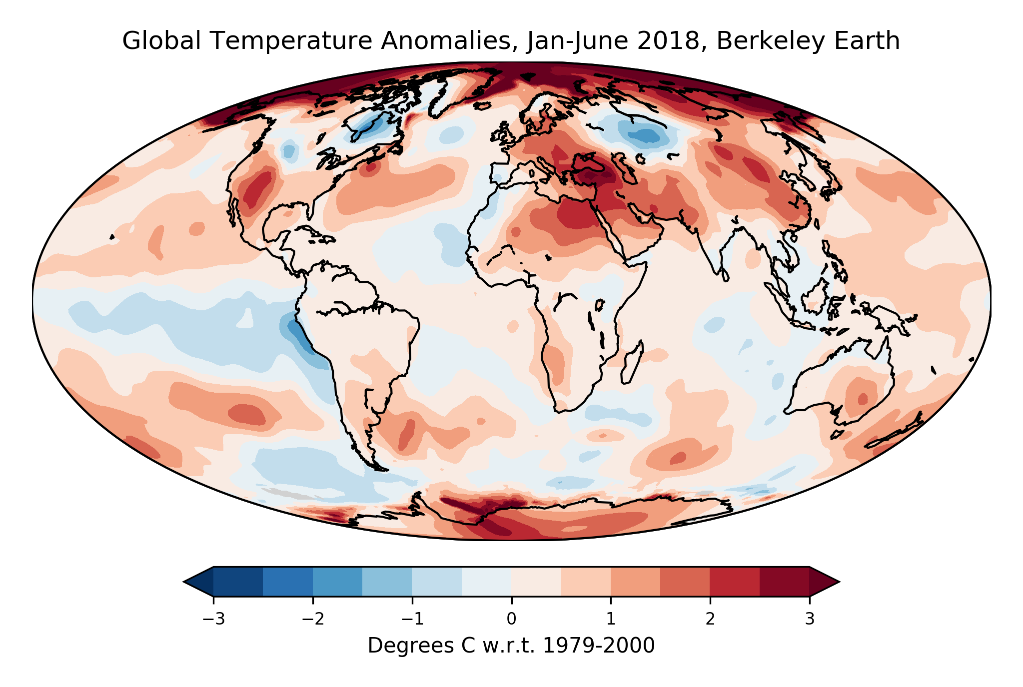
January-June 2018 average surface temperatures from Berkeley Earth. Anomalies plotted with respect to a 1979-2000 baseline.
The Arctic has been strikingly warm so far this year, with many areas 3C warmer than the global average. Turkey has also experienced unusual warmth of about 2C above average. Southwestern US and northern Mexico have experienced temperatures about 1.5C above average. And there has been a noticeable La Niña pattern in Pacific off the coast of South America, with its characteristic cold “tongue” of water.
Conditions have been a bit different in June (and July), with much of the Arctic experiencing cooler temperatures. At the same time there has been near-record warmthover many mid-latitude land areas. The figure below shows temperatures in June, also from Berkeley Earth.
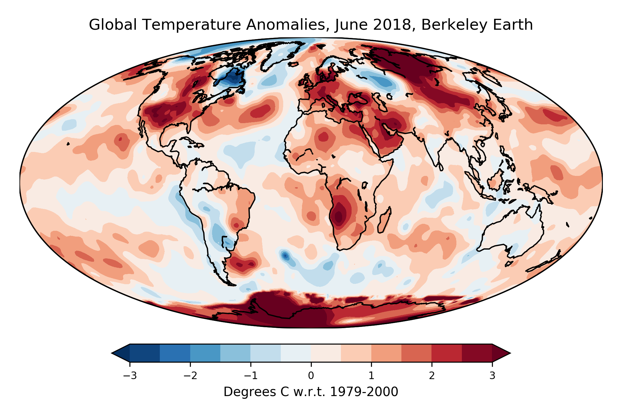
June 2018 average surface temperatures from Berkeley Earth. Anomalies plotted with respect to a 1979-2000 baseline.
La Niña had mostly faded in the Pacific by June and land temperatures were at least 2C above normal over much of the US, UK, northern Europe, Middle East and Siberia. Much of Antarctica was also experiencing warmer-than-usual winter temperatures. The heatwaves experienced in June and July across Europe were made “up to five times more likely” by the human-caused warming experienced over the past century.
High temperatures and heatwaves in the northern hemisphere were also likely driven, in part, by unusual behaviour of the jet stream. A split jet stream pattern has led to stagnant high-pressure and low-pressure systems sticking around for longer than usual. These persistent northern-hemisphere weather patterns may be linked to the rapid Arctic warming experienced over the last few decades, though this is still an area of active research among scientists.
Land warming faster than the ocean
In recent decades the Earth’s land areas have been warming twice as fast as the oceans. The figure below shows the two different ocean records most commonly used in global temperature estimates – Hadley’s HadSST3 and NOAA’s ERSSTv5 – as well as three different land-only records from Berkeley Earth, NOAA, and Hadley/UEA (CRUTEM4).
Annual ocean surface temperatures from Hadley’s HadSST3 and NOAA’s ERSSTv5. Land surface temperatures from Berkeley Earth, NOAA, and Hadley/UEA’s CRUTEM4. Anomalies plotted with respect to a 1979-2016 baseline. 2018 temperatures to-date (January-June) are shown by coloured dots. Chart by Carbon Brief using Highcharts.
Global oceans are a bit cooler in 2018 then over the past few years. Temperatures to-date would be the fifth warmest on record, below the annual values for 2016, 2015, 2017, and 2014.
Global land areas were relatively warmer. Values to-date would be the third warmest in Berkeley after 2016 and 2017 and the fourth warmest in NOAA and CRUTEM4 after 2016, 2017, and 2015.
Temperatures of lower atmosphere
In contrast to the surface-based measurements used by the groups mentioned above, satellite-based temperature records from microwave sounding units (MSU) have also been providing estimates of changing temperatures since such instruments were first launched into orbit in 1979. They measure the temperature of a broad part of the lower atmosphere rather than the surface. On average, their lowest atmosphere measurements come from a region around 5km above the surface.
Two groups provide estimates of temperatures of the lower troposphere (TLT), the part of the atmosphere closest to the surface. The TLT records from Remote Sensing Systems (RSS) and the University of Alabama, Huntsville (UAH) are shown in the figure below.
Global average annual lower troposphere temperatures from RSS version 4 (blue) and UAH version 6 (red) relative to a 1979-2000 baseline (lines), along with 2018 temperatures to-date (January-June, blue square for RSS and red triangle for UAH). Chart by Carbon Brief using Highcharts.
While these measurements have similarities to surface temperatures, they are not measuring the same thing. The region of the atmosphere that they measure tends to be influenced more strongly by El Niño and La Niña events than the surface. Therefore, satellite records show correspondingly larger warming or cooling spikes during these events. This is why, for example, 1998 shows up as one of the warmest years in satellites, but not in surface records.
There are also much larger disagreements between the two satellite records than between different surface temperature records. These disagreements become particularly pronounced after the year 2000, with the RSS record showing a rate of warming similar to surface records, whereas UAH shows considerably slower warming. These differences are largely due to choices in how each group handles corrections for the “orbital decay” of satellites changing the time of day over which different parts of the world are measured.
Estimating where 2018 will fall
With half the year’s data recorded and forecasts of El Nino development over the next six months now published, it is possible to estimate with reasonable accuracy where 2018 annual temperatures will likely end up.
Carbon Brief has examined global temperature data from seven different climate centres around the world, both for the Earth’s surface and the lower troposphere. Temperatures for the full year of 2018 were estimated using the data available to-date for each dataset, along with projection of the El Niño Index for the remainder of 2018.
A multivariate linear regression model was used to forecast the best estimate of the annual temperature – and the uncertainties – based on the first six months of each year between 1950 and 2017, as well as the El Niño/La Niña index for the first and last six months of each year.
The results are shown in the figure below. Annual temperatures from 1979-2017 are shown in black for each record, while the likely range (95% confidence interval) of the 2018 annual temperature is shown by the red bar.
Annual global mean surface temperatures and 2018 estimates from NASA GISTemp, NOAA GlobalTemp, Hadley/UEA HadCRUT4, Berkeley Earth, Copernicus/ERA-Interim, RSS TLTv4, and UAH TLTv6. Anomalies plotted with respect to a 1979-2000 baseline. See methodological note below for details. Chart by Carbon Brief using Highcharts.
For all surface temperature records, 2018 will likely be in the top four warmest years. Carbon brief estimates that four groups – NASA, NOAA, Hadley/UEA and Berkeley Earth – will likely have 2018 as the fourth warmest year on record, after 2016, 2017 and 2015. The reanalysis-based Copernicus record will likely have 2018 as the third warmest year on record, after 2016 and 2017. The two satellite-based lower troposphere records will likely have 2018 as the 6th warmest year on record.
The probability of where 2018 will fall on the leaderboard of warmest years based on 2018 temperatures so far this year is shown in the table below.
Where will 2018 likely fall in the list of warmest years?
| NASA GISTEMP | Hadley/UEA HadCRUT4 | NOAA GlobalTemp | Berkeley Earth | Cowtan&Way | Copernicus | RSSv4 TLT | UAHv6 TLT | |
|---|---|---|---|---|---|---|---|---|
| 1st | 0% | 0% | 0% | 0% | 0% | 0% | 0% | |
| 2nd | 6% | 0% | 0% | 17% | 8% | 1% | 0% | |
| 3rd | 17% | 1% | 1% | 23% | 70% | 8% | 0% | |
| 4th | 76% | 71% | 83% | 60% | 21% | 4% | 2% | |
| 5th | 0% | 16% | 15% | 0% | 0% | 8% | 22% | |
| 6th | 0% | 7% | 1% | 0% | 0% | 74% | 38% | |
| 7th or below | 0% | 5% | 0% | 0% | 0% | 5% | 38% |
Estimated probabilities of 2018’s temperature rank for each dataset, with the most likely outcome highlighted. Note that this does not include measurement uncertainty for the records, just the likely best estimate for each group. See the methodological note at the end for details.
There is effectively zero chance that the temperature reported by any group will show 2018 to be the warmest year on record. There is a small chance that NASA, Berkeley, or Copernicus might show 2018 as the second warmest year on record, and a somewhat larger chance that those records might have 2018 as the third warmest. Similarly, NASA, Berkeley and Copernicus all suggest a near-zero chance that 2018 is the 5th warmest or below.
 Robert Rohde@rarohde
Robert Rohde@rarohdeWith 2018 half over, we still see a high probability that this year concludes as the fourth warmest year since 1850. Currently, we give that outcome a 77% likelihood.
This is consistent with the long-term global warming trend. pic.twitter.com/FW686lZsgH

Hadley/UEA and NOAA show somewhat different results due to less coverage of the Arctic than other surface temperature records. While both have 2018 as most likely being the fourth warmest year on record, they see almost no chance of it being 3rd or above – and a modest chance of it being the fifth warmest or below.
Satellite temperature records from UAH and RSS predict that 2018 will have a considerably lower rank, reflecting, in part, the larger impact of El Niño events on prior years in the satellite lower troposphere record. RSS and UAH both suggest that 2018 will most likely be the 6th warmest year on record for the lower troposphere, but could be as high as the 3rd (in RSS) or as low as the 10th (in UAH).
These show more uncertainty in their 2018 projections than the surface records, as there is a less clear historical relationship between the first six months of the year and the annual temperature in satellite records.
Low sea ice persists
Despite the slightly lower temperatures in 2018 compared to the past three years, sea ice has been at record lows in the Arctic and quite low in the Antarctic for much of the year. The figure below shows both Arctic and Antarctic sea ice in 2018 (solid red and blue lines), the historical range in the record between 1979 and 2010 (shaded areas), and the record lows (dotted black line). Unlike global temperature records, sea ice data is collected and updated on a daily basis, allowing sea ice extent to be viewed through to the end of July.
Arctic and Antarctic daily sea ice extent from the US National Snow and Ice Data Center. The bold lines show daily 2018 values, the shaded area indicates the two standard deviation range in historical values between 1979 and 2010. The dotted black lines show the record minima for each pole. Chart by Carbon Brief using Highcharts.
For the first four months of 2018, Arctic sea ice extent set a new record low nearly every day. It recovered slightly in June and July, though in recent days has fallen back close to the record low for this time of year. It is still likely to be too early to tell how low the summer minimum in the Arctic will be, as the size of the summer low will also depend on Arctic weather during the next two months.
2018 has also seen record low amounts of “multiyear ice” in the Arctic – ice that has survived without melting for multiple years. In 2018, multiyear ice comprised just 34 percent of sea ice, with only 2% at least five years old. Back in the 1980s, upwards of 60% of Arctic sea ice was multiyear ice.
Antarctic sea ice extent set new record lows for a brief period in February and has generally been on the low-end of normal for the first half of 2018.
Methodological note
A statistical multivariate regression model was used to estimate the range of likely 2018 annual temperatures for each group that provides a temperature record. This model used the average temperature over first six months of the year, the latest monthly temperature value combined, the average ENSO 3.4 region value during the first six months of the year and the ENSO 3.4 value during the last six months of the year to predict the annual temperatures over the period from 1950 through 2017 (or 1979 through 2017 for satellite TLT records). The model then uses this fit to predict both the most likely 2018 annual value for each group, as well as the 95% confidence interval. The predicted ENSO 3.4 region values for the last six months of 2018 are taken from the NMME model mean forecast.
The percent likelihood of different year ranks for 2018 is estimated by using the output of the regression model, assuming a normal distribution of results. This allows us to estimate what percent of possible 2018 annual values fall above and below the temperatures of prior years for each group.


The biggest difference seems to be between the UAH satellite temperature data and everything else particlualry the RSS data.
Its hard to see why there's such a difference between UAH and everything else. Why is Roy Spencer right and everyone else wrong? He would need a compelling reason, so what is it? Does anyone have technical knowledge on it?
According to wikipedia, Roy Spencer who compiles the UAH data is an agw climate change sceptic to some extent, and has strong religious fundamentalist views and has signed declarations that say our climate change is natural.
Well UAH, RSS and STAR use MSU to produce temperature records for lower troposphere (think averaging over lower 4km of atmosphere), whereas the surface records are well surface temperature records. Recent discussions of UAH versus RSS at Tamino.
RSS publish their methods with new release, Spencer and Christy, not so much plus a record of mistakes. See here for some history.
Their history and political leanings however is not a reason to reject UAH. Perhaps a better way is to compare temperatures from RSS and UAH against say radiosonde data (RATPAC). Difficult but doable. See here from David Piepgrass and draw your own conclusions.
Lengthy article.
I keep it simple for myself by following the Danish Met Institute (DMI) stuff. Their temperature of "North of 80" has been below the mean for most of the melt season. Their Surface Mass Balance of ice on Greenland has been well above the mean, and their chart of the rate of melt is shutting down fast. Well, this is on schedule.
The Canadian Cryogenic chart of NH and NA snow-cover extent for July and into August has been above the mean.
I think that these numbers are reliable, but my issue for the snow cover is that the charts are not updated every day. Seems to be every ten days.
[DB] "North of 80" is nowhere near a global metric. Further, Greenland Ice Sheet (GIS) surface mass balance (SMB) is only a metric pertaining to snowfall additions in the accumulation zone, and do not reflect losses at the lower perimeter edges, in the ablation zone of the ice sheet. So SMB is a misleading metric and should not be used, even for the GIS itself.
Per the DMI itself:
Mod.
Sorry did not wish to be obscure. Full Title:
Arctic Temperatures
Daily Mean Temperatures North of 80 degrees North
Archived, each year, back to 1958.
[DB] Again, Temperatures North of 80 degrees in the Arctic are not very representative of global temperatures. However, if you want to look at Arctic temperatures, then you need to compare modern temperatures in the Arctic to those of previous centuries for full context. From Shi et al 2012:
The above conclusions and results were confirmed by Werner et al 2018, which also found:
Bob Hoye,
The DMI 80N temperature reanalysis you are examining is not presented in a manner that allows a useful understanding of trends in high Arctic temperatures. Recently they have added a page showing the seasonal temperature record and you will note the summer temperatures show no rise. If the data through the year is plotted out as decadal averages (usually 2 clicks to 'download your attachment'), the increase in temperatures through autumn-winter-spring can be plainly seen as can a small reduction in summer temperatures, this due to the melt up in the high arctic now sucking energy out of the climate system.
Please can people get their facts right before they post stuff on the net (me included). I just feel I wasted a few minutes of my life readings Bobs post about one single unexceptional summer north of 80 degrees.
Having said that, the heatwave is causing big issues in the arctic sea ice right now
I am not sure quite information you think the DMI is giving you, but if that is the only temperature record you look at, then surely you should look at what DMI itself have to say about the record and what it is fit for. Ie it is not a climate data record. Furthermore, if you have watched over a no. of years you will notice that there is very low variability in the mid summer temperatures (generally stuck at just above zero) especially compared to the winter temperatures. Reason? Above 80N is mostly ice. The air temperature above ice is forced to close to 0C or below because the insolation goes into just melting the ice. While the ice persists, temperature will be nearly constant. Looks to me like you are looking for a record that makes you feel comfortable about doing nothing but unfortunately this isnt the one if you understand what it tells you. Did you find the more complete analysis of snow cover statistics that I pointed you to comfortable? Or did you choose not to follow the link because winter snow cover fits what you would like to believe whereas spring and summer are unconfortable?
Furthermore the extraordinary high temperatures in winter on DMI is by contrast a real cause for concern - linked to other unpleasant weather phenomena.
Cherry picking one aspect of Greenland ice balance while ignoring the larger picture is also not convincing. I dont suppose your opinions are being "informed" by Tony Heller aka Steve Goddard instead of science?
nigelj:
Well, Spencer signed An Evangelical Declaration on Global Warming, which states:
Ellipses represent arguments from consequences, boiling down to "mitigation will harm poor people."
IOW, evidence be damned: AGW can't be a threat because God wouldn't allow it. By signing this document, Spencer has publicly announced his determination to fool himself, and IMHO has forfeited all scientific credibility thereby.
Bob Hoye,
From the OP:
"The Arctic has been strikingly warm so far this year, with many areas 3C warmer than the global average."
But if you want to cherry pick only a tiny fraction (80 North) for only part of the year (summer only) than everything looks great!
Who gives you your cherries? I also suspect Steve Goddard.
And for further perspective on the what 80N means. The area north of 80N is ~4M sq kms (slightly less). The arctic region is 14.5M sq kms. The area of the arctic ocean is 15.5M sq km. Area of globe is 510M sq km.
Mal Adapted,
The likes of Roy Spencer could learn a lot from Sean Carroll's book "The Big Picture" published in 2016. It is an extensive presentation of the developed improved awareness and understanding of what is going on, including how the human mind works.
It was a NY Times Bestseller. However, it did have critics, mainly the angry group of evangelical purists that disliked the way that Carroll explains that our current understanding of what is going on in our Universe does not require an Intelligent Designer, and the way he effectively makes the case that it is unlikely that there is a God-being influencing what is going on.
So the likes of Spencer would not likely learn anything from reading Sean Carroll's book.
As you say, they have already decided not to be open to improved awareness and understanding. They deliberately limit their scientific methods and critical thinking to the defense of the limited worldview they have personally chosen to try to hold on to and defend.
Sadly, scientific investigation and critical thinking can be very harmful when it is applied by people who are not open to a holistic worldview (not liking the understanding presented by Sean Carroll), and who are focused on narrow-minded selfish interests (not interested in more altruistically helping to develop a sustainable better future for humanity).
More people need to develop improved awareness and understanding of what is really going on and strive to help develop a sustainable better future for all of humanity (all of the future generations), rather than seeking excuses for a sub-set of current day humanity getting away with an unsustainable activity that is undeniably harmful to future generations (and harmful to a significant portion of current day humanity).