


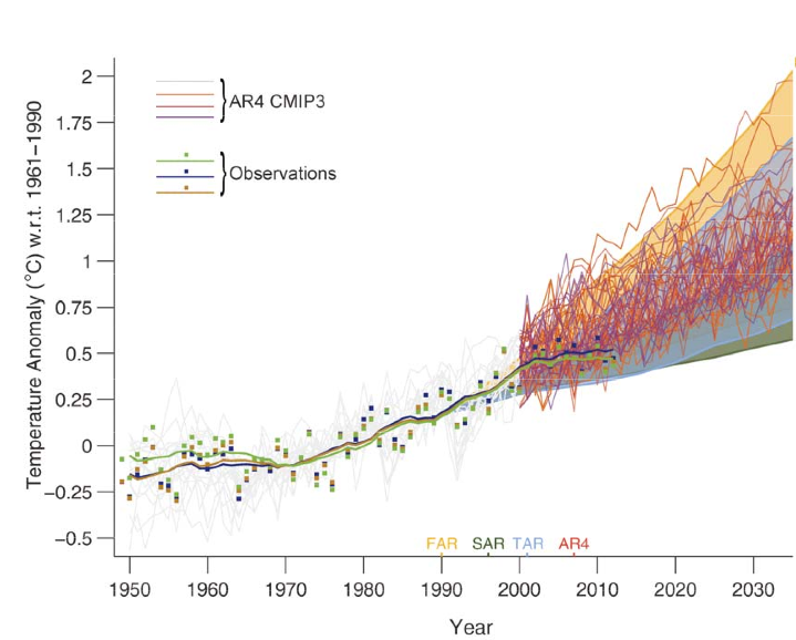
![]() The figure below from the 2013 Intergovernmental Panel on Climate Change (IPCC) report compares the global surface warming projections made in the 1990, 1995, 2001, and 2007 IPCC reports to the temperature measurements.
The figure below from the 2013 Intergovernmental Panel on Climate Change (IPCC) report compares the global surface warming projections made in the 1990, 1995, 2001, and 2007 IPCC reports to the temperature measurements.
Enter a term in the search box to find its definition.
Use the controls in the far right panel to increase or decrease the number of terms automatically displayed (or to completely turn that feature off).
|
|
||||
Home
 Arguments
Software
Resources
Comments
The Consensus Project
Translations
About
Support Arguments
Software
Resources
Comments
The Consensus Project
Translations
About
Support
|
||||
|


Latest Posts
|
IPCC model global warming projections have done much better than you thinkPosted on 1 October 2013 by dana1981
IPCC AR5 Figure 1.4. Solid lines and squares represent measured average global surface temperature changes by NASA (blue), NOAA (yellow), and the UK Hadley Centre (green). The colored shading shows the projected range of surface warming in the IPCC First Assessment Report (FAR; yellow), Second (SAR; green), Third (TAR; blue), and Fourth (AR4; red).
Since 1990, global surface temperatures have warmed at a rate of about 0.15°C per decade, within the range of model projections of about 0.10 to 0.35°C per decade. As the IPCC notes,
What about the Naysayers?In the weeks and months leading up to the publication of the final 2013 IPCC report, there has been a flood of opinion articles in blogs and the mainstream media claiming that the models used by the IPCC have dramatically over-predicted global warming and thus are a failure. This narrative clearly conflicts with the IPCC model-data comparison figure shown above, so what's going on? These mistaken climate contrarian articles have all suffered from some combination of the following errors. 1) Publicizing the flawed draft IPCC model-data comparison figureLate last year, an early draft of the IPCC report was leaked, including the first draft version of the figure shown above. The first version of the graph had some flaws, including a significant one immediately noted by statistician and climate blogger Tamino.
In the draft version of the IPCC figure, it was simply a visual illusion that the surface temperature data appeared to be warming less slowly than the model projections, even though the measured temperature trend fell within the range of model simulations. Obviously this mistake was subsequently corrected. This illustrates why it's a bad idea to publicize material in draft form, which by definition is a work in progress. That didn't stop Fox News, Ross McKitrick in the Financial Post, Roger Pielke Jr., the Heartland Institute, and Anthony Wattsfrom declaring premature and unwarranted victory on behalf of climate contrarians based on the faulty draft figure.2) Ignoring the range of model simulationsA single model run simulates just one possible future climate outcome. In reality, there are an infinite number of possible outcomes, depending on how various factors like greenhouse gas emissions and natural climate variability change. This is why climate modelers don't make predictions; they make projections, which say in scenario 'x', the climate will change in 'y' fashion. The shaded regions in the IPCC figure represent the range of outcomes from all of these individual climate model simulations. The IPCC also illustrates the "multi-model mean," which averages together all of the individual model simulation runs. This average makes for an easy comparison with the observational data; however, there's no reason to believe the climate will follow that average path, especially in the short-term. If natural factors act to amplify human-caused global surface warming, as they did in the 1990s, the climate is likely to warm faster than the model average in the short-term. If natural factors act to dampen global surface warming, as they have in the 2000s, the climate is likely to warm more slowly than the model average. When many model simulations are averaged together, the random natural variability in the individual model runs cancel out, and the steady human-caused global warming trend remains left over. But in reality the climate behaves like a single model simulation run, not like the average of all model runs. This is why it's important to retain the shaded range of individual model runs, unlike Bjorn Lomborg in The Australian, Judith Curry in The Australian, Benny Peiser at GWPF, Roger Pielke Jr., David Rose in the Mail on Sunday (copied by Hayley Dixon in The Telegraph), and Der Spiegel, all of whom only considered the model average. This group all made an additional related third error as well. 3) Cherry PickingMost claims that the IPCC models have failed are based on surface temperature changes over the past 15 years (1998–2012). During that period, temperatures have risen about 50 percent more slowly than the multi-model average, but have remained within the range of individual model simulation runs. However, 1998 represented an abnormally hot year at the Earth's surface due to one of the strongest El Niño events of the 20th century. Thus it represents a poor choice of a starting date to analyze the surface warming trend (selectively choosing convenient start and/or end points is also known as 'cherry picking'). For example, we can select a different 15-year period, 1992–2006, and find a surface warming trend nearly 50 percent faster than the multi-model average, as statistician Tamino helpfully illustrates in the figure below. 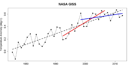 Global surface temperature data 1975–2012 from NASA with a linear trend (black), with trends for 1992–2006 (red) and 1998–2012 (blue).
In short, if David Rose wasn't declaring that global surface warming was accelerating out of control in 2006, then he has no business declaring that global surface warming has 'paused' in 2013. Both statements are equally wrong, based on cherry picking noisy short-term data. IPCC models have been accurateFor 1992–2006, the natural variability of the climate amplified human-caused global surface warming, while it dampened the surface warming for 1997–2012. Over the full period, the overall warming rate has remained within the range of IPCC model projections, as the 2013 IPCC report notes.
The IPCC also notes that climate models have accurately simulated trends in extreme cold and heat, large-scale precipitation pattern changes, and ocean heat content (where most global warming goes). Models also now better simulate the Arctic sea ice decline, which they had previously dramatically underestimated. All in all, the IPCC models do an impressive job accurately representing and projecting changes in the global climate, contrary to contrarian claims. In fact, the IPCC global surface warming projections have performed much better than predictions made by climate contrarians. It's important to remember that weather predictions and climate predictions are very different. It's harder to predict the weather further into the future. With climate predictions, it's short-term variability (like unpredictable ocean cycles) that makes predictions difficult. They actually do better predicting climate changes several decades into the future, during which time the short-term fluctuations average out. That's why climate models have a hard time predicting changes over 10–15 years, but do very well with predictions several decades into the future, as the IPCC illustrates. This is good news, because with climate change, it's these long-term changes we're worried about: 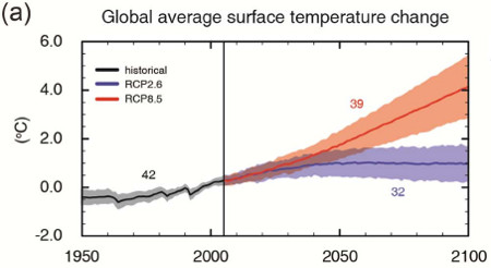 IPCC AR5 projected global average surface temperature changes in a high emissions scenario (RCP8.5; red) and low emissions scenario (RCP2.6; blue).
Note: this post has been incorporated to the rebuttal to the myth IPCC global warming projections were wrong and added to the SkS debunkings of the most popular myths about the IPCC (short URL http://sks.to/ipcc)
|
|


THE ESCALATOR |
|
| © Copyright 2024 John Cook | ||||
| Home | Translations | About Us | Privacy | Contact Us | ||||


sereniac @81 - I'm genuinely curious - when you asked the question
was there a reason why you didn't say "... to dampen or increase the warming trend ..."?
I have used multiple regression in the past (mostly on census data- which is inherently noisy) and something that is very apparent is how the degree of data aggregation can dramatically inflate correlations and subsequent R squared values. For example if data is at household level and is aggregated upward to say local council or even higher to city or state level, correlations steadily increase as the natural variability is removed.
When I saw the R squared values associated with climate models- in the order of 0.97 or so, I nearly fell off my chair. Obviously physical systems have less instrument error associated with their measurement but even so I wondered to what level data aggregation is done in climate models (I originally thought the opposite was happening i.e. smaller and smaller geographic grids were being applied) and whether it is potentially problematic in these analyses.
Thanks again
@sereniac #102 " climate models...smaller geographic grids" is discussed in one or more of some University of California Television climate modelling lectures by Prof Inez Fung inc. "Anatomy of a Climate Model: How Robust are Climate Projections?" per my #77. Good stuff. I've not had time yet to finish listening. 15-minute time slice used in climate simulation "model" (I used 0.1 second time slice in my elevator simulation Java software I wrote but don't need that fine dicing for climate). Was 1 degree latitude/longtitude grid but Prof Fung tells what it is now & vertical digitizing & hence total box count for the ecosystem simulation "model".
@sereniac #81 Yes. At least theoretically and trivially simple using plain logic. I don't know the practical odds because my knowledge of ocean circulation is minimal (I just started). If ocean depths absorb a chunk of heat from their upper part then surface temperature is decreased, reducing outgoing radiation to space and therefore "global warming" (the heat coming in) increases. In fact, that's almost what Balmaseda, Trenberth & Hallen ORAS4 reanalysis claims has happened ~10 years past, a significant increase in "global warming" due to surface temperature rise being reduced while the atmospheric conditions that "trap heat" pertain and even increase. Converse would pertain, if El Ninos were to boost surface temperatures then this would slow or stop "global warming" as you suggest. In general, provided that atmospheric conditions for "global warming" or "global cooling" remain essentially unchanged (aerosols, volcanoes and so having no big change) then any surface temperature sudden increase has reduced or stopped "global warming" and a sudden (in terms of the topic, just a few years) drop in surface temperature must imply an increase in "global warming".
Whatever knowledge we think we have accumulated in regard to inter-related chaotic systems is likely only "educated" guesswork. We project outcomes, and when they are wrong, we look backards to see what we missed, and introduce that into our next "educated guestimate". It. too, will almost certainly be "off the mark" as reality unfolds.
We all know what is happenning. The planet is warming and the biosphere is dying.
Tom Curtis @79
Your analysis of the hiatus vs ENSO is interesting and IMHO convincing. However, it doesn't seem to be the view of IPCC AR5 who don't mention ENSO specifically but say
and on which external forcings
Which basically reads as "mainly volcanoes and the sun, plus unattributable variability"
Your perspective on the AR5 conclusions would be interesing.
VeryTallGuy - "...from internal variability..." includes the ENSO, one of the primary and in fact easily identified internal variations of the climate. It's hardly unattributable.
KR, I think you misunderstand me. I wasn't trying to suggest that ENSO isn't part of natural variability.
Tom presents a view that ENSO explains most if not all of the hiatus (using IPCC terminology)
AR5 seems to focus on volcanoes and solar, and does not split out natural variability at all.
So I wonder if I'm missing something, and Tom seems well informed to comment.
VeryTallGuy, I would say Tom's arguments show that most if not all of the hiatus can be explained by ENSO, but cannot show that it is caused by ENSO. Thus both Tom and the IPCC are right AFAICS, looking for other causes of the hiatus is just part of normal science (keeping an open mind), however Tom is right in suggesting that there is no pressing need for an alternative explanation as it is already quite well explained by ENSO. This sort of thing is a limitation of science, it is very difficult to show that X caused Y, only that Y can be explained by X.
The way science works is that if you can't show that the existing explanation doesn't explain the observations, or that your hypothesis provides a better explanation, then you probably shouldn't put much confidence in it. At the moment ENSO (i.e. internal variability) is a sensible null hypothesis, and it explains the observations pretty well, without ruling out alternatives.
Personally as a statistician, I am still waiting for statistically significant evidence that there actually has been a hiatus (i.e. a change in the underlying rate of warming). It is possible that there is actually nothing that needs to be explained in the first place! ;o)
Perhaps the best way of showing the effect of removing *some* of the more or less known "internal variables" is... well, show it:
Foster and Rahmstorf (2011)
VeryTallGuy, first (and with all respect), Dikran Marsupial has misinterpreted me. I do say that ENSO is the dominant cause of the "hiatus" (better, slowdown), not that it could explain it. Of course, it is always possible that I am over interpreting the evidence, and that Dikran's claim is more accurate given the evidence. That would be the case if global warming would have accelerated absent all factors contributing to the slowdown. In that case, the contribution of ENSO could be sufficient to almost completely explain the reduction in short term observed trend relative to the long term observed trend, but changes of forcings could likewise explain a similar amount. In that case, temperatures without these short term influences would have accelerated to an approx 0.25 C per decade warming trend.
With respect to my actual claim, however, it is not inconsistent with that in the IPCC. To be specific, my claim is that, when compared to all other individual factors influencing the slow down in global temperature rise, ENSO has a significantly larger influence than any other individual factor; and that the influence of ENSO is not much smaller (if smaller at all) then the sum of all other factors. That is what is mean by "dominant". In contrast, the IPCC claims that the sum of the influence of natural variability is not much different from the sum of the influence of changes in forcing. Thus, there may exist natural variability of opposite sign to the ENSO influence, reducing the net impact of natural variability relative to the net impact of changes of forcings. Or the influence of ENSO based natural variability may be greater than the combined influence of changes in forcing, with the two individual factors contributing to change in forcing each individually being significantly smaller than the ENSO influence. In both these cases, both my claim and that of the IPCC would be correct.
A third possibility is that the IPCC understates the influence of natural variability. Given that the IPCC did not have access to Kosaka and Xie (published online in late Aug 2013, and not included in the IPCC references), that is plausible. Equally plausibly, a new study may come out showing Kosaka and Xie's result to not be reproducible, or to have overstated the influence of ENSO (in which case my opinion would revise back towards that of Dikran Marsupial and the IPCC).
So, to summarize:
1) My claim, which assumes a linear base trend in global temperatures, may be incorrect and the IPCC's correct because global temperatures would have shown an accelerating trend absent both the ENSO influence and the reduced forcings;
2) We could both be correct, with the ENSO influence on the lower end of what I expect based on the evidence but still the dominant influence (ie, greater than 50% and >> than any other individual influence);
3) Either I or the IPCC could be wrong, they because they present a snapshot of the science as it existed 6 months ago; or I because the most recent evidence (on which I rely) is overstated in some way.
Finally, I note that the IPCC discuss the influence of the PDO rather than ENSO. That is not a difference between us in that the two are closely related, with PDO states causing dominant influences of La Nina or El Nino (depending on whether the PDO is +ve or -ve) in ENSO; or because the PDO is just a filtered effect of ENSO on the north Pacific. (SFAIK, it is not as yet clear which of these is the case.)
Dikran, Tom,
thanks for the perspectives, very interesting and appreciated. I must admit, compared to much of the IPCC output the bit on the "hiatus" comes across as not particularly well thought through.
Conventional statistical regression cannot be used to make reliable caual inferences as they are based on correllations, and correllation is not causation. They can be use to show that X can explain Y, but we cannot say that X does explain Y as there may be some other cause that is not represented in the model, or there may be confounding variables, etc. If this were not the case, we could regress GMSTs on the surface area of ladies undergarments and conclude that CO2 does not cause climate change
Underwear (to some extent) can explain global warming, but that does not mean that to any extend underwear does cause global warming. Likewise, the fact that including ENSO in a regression model add explanatory power, that does not mean that ENSO is the cause of the variability it explains.
The use of models similarly shows that ENSO can explain the variability in GMSTs, but it doesn't establish that it actually has caused the hiatus. The reason it does not is because we cannot be absolutely sure that it explains it for the right reason (note constraining SSTs means that the transfer of energy between the air and ocean does not obey the laws of physics correctly).
Now the fact that we cannot obtain certain knowledge from observations means that in practice we need to use other criterion, such as theory, to arrive at the best explanation of the data. Thus I have no problem at all if someone finds the regression models sufficiently convincing to be sure that ENSO is the cause of the hiatus (which is actually fairly close to my position - I'm pretty confident that it is just ENSO), but the regression model itself does not establish a causal link.
VeryTallGuy - generally the IPCCs comments are well thought through, provided they are interpreted as clear statements of the scientific position, expressed by scientists who know the issues well, intended as statements for the record. They are not however generally well worded as statements intended to resolve misunderstandings in the blog debate on climate, nor are they expressed in terms that prevent any possibly (even willfull) misunderstanding. I think the IPCC are doing the right thing in expressing the science in a manner designed for a primarily scientific audience.
@VeryTallGuy #112:
Also keep in mind that non-scientists had a hand in crafting the final wording of the WG1 summary report.
John Hartz @114, the Summaries for Policy Makers are "approved" by the IPCC, ie, subject to line by line debate and voted on, line by line. In contrast, the reports themselves are only "accepted", ie, they are voted on to be accepted as a block. Consequently, while box 9.2 (the discussion of the hiatus) may have been composed with the comments of non-scientists in mind, it was composed by scientists and not subject to individual veto as to its wording. I am unsure as to whether the government representatives would have had to reject all of chapter nine, or all of the WG1 assessment in order to reject the wording in box 9.2, but their failure to do either cannot be regarded as constituting specific editorial control over the wording of the box.