


 Arguments
Software
Resources
Comments
The Consensus Project
Translations
About
Support
Arguments
Software
Resources
Comments
The Consensus Project
Translations
About
Support
![]()
![]()
![]()
![]()
![]()
![]()
![]()
![]()
![]()
![]()


![]()


Latest Posts
- Skeptical Science New Research for Week #43 2024
- Why widening highways doesn’t reduce traffic congestion
- Climate Risk
- Welcome to the world of personal air conditioning
- 2024 SkS Weekly Climate Change & Global Warming News Roundup #42
- Skeptical Science New Research for Week #42 2024
- Wanted: Better housing to help people stay cool on a hotter planet
- Life in the Appalachians once felt ‘untouchable.’ Then Helene struck.
- Why have hurricanes gone crazy?
- 2024 SkS Weekly Climate Change & Global Warming News Roundup #41
- Fact brief - Is more CO2 a good thing because it’s plant food?
- PONIT and PLAAT: The FLICC poster now also available in Russian and Romanian
- Skeptical Science New Research for Week #41 2024
- Climate change made Hurricane Helene and other 2024 disasters more damaging, scientists find
- Climate change made Helene's rainfall more severe
- You will not escape the climate crisis
- 2024 SkS Weekly Climate Change & Global Warming News Roundup #40
- Skeptical Science New Research for Week #40 2024
- The unsung heroes of India’s extreme weather disasters
- Four ways climate change likely made Hurricane Helene worse
- How many people did the Beryl blackout kill?
- 2024 SkS Weekly Climate Change & Global Warming News Roundup #39
- Remembering our friend John Mason
- Skeptical Science New Research for Week #39 2024
- Climate Adam: Turning the Tide on Climate Change
- Just have a think: Arctic Sea Ice minimum 2024. Three degrees Celsius warming now baked in?
- Correcting myths about the cost of clean energy
- 2024 SkS Weekly Climate Change & Global Warming News Roundup #38
- Skeptical Science New Research for Week #38 2024
- Doubling down?
Comment Search Results
Search for marcott
Comments matching the search marcott:
- John F. Clauser: the latest climate science-denying physicist
Rob Honeycutt at 02:09 AM on 29 October, 2023TWFA... "The climate would and will continue warming at this phase even if man never existed..."
Here, yet again, you literally have no clue what you're talking about but present something as if it were fact.
If you look at the paleo record it is very clear that the Earth was entering a cooling phase due to slow changes in orbital forcings. It's only when humans started burning fossil fuels and substantially altering surface albedo (deforestation, farming, etc) that the planet abruptly changed and entered a steep warming trend.
- Skeptical Science New Research for Week #9, 2020
nigelj at 06:30 AM on 7 March, 2020MAR, "More directly addressing your question, the ice cores do show a small increase in CO2 levels over the last 8,000 years..."
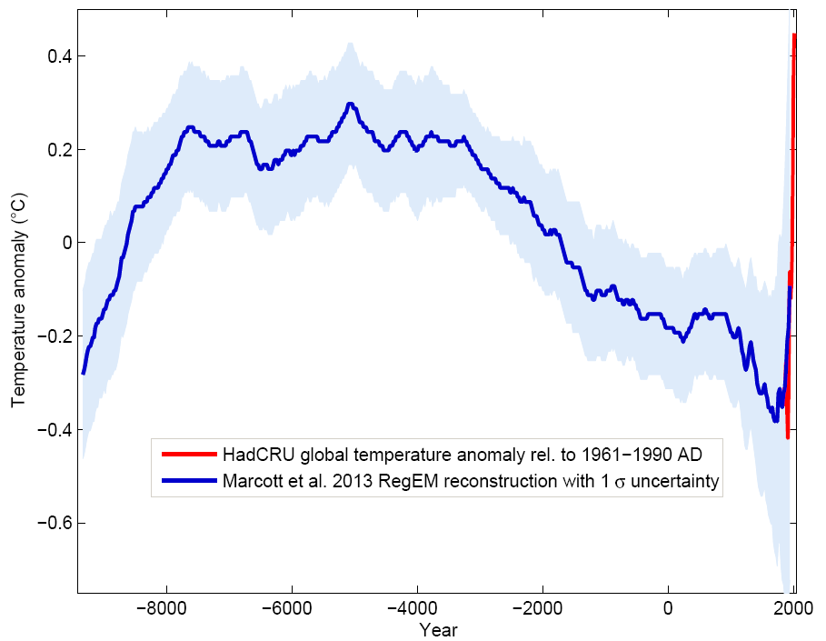
The Marcott study here shows global temperatures falling over about the last 3500 years until about 1900. So perhaps the milankovitch cycle cancelled out the slow low level rise of CO2 concentrations over the same period?
- Climate's changed before
MA Rodger at 19:35 PM on 23 July, 2019TVC15 @760/761,
It is a smorgasbord of denialist assertions you present.
☻ The "Antarctic was warmer 1,000 years ago" assertion looks a little difficult to uphold in any way. There are reconstructions from ice core data (for instance Ciais et al (1994) fig 7) which shows Antarctic temperatures over the last 10,000 years waggling about by a maximum of about a degree centigrade. (Note the Ciais et al graphic is sensibly using an 'average-over-the-last-5,000-years' as a datum.) The thermometer record (eg Berkeley Earth) shows recent warming of a similar amount (although there is a lot of variability in the warming depending where you are in Antarctica) so this evidence suggests it was colder in Antarctica 1,000 years ago. The image below is gleened from a posting on the planet Wattsupia and appears to be based on data from Marcott et al (2013). The 1,000 years ago temperature again is shown as being colder.
☻ The interglacial sea level has been discussed before, introduced up-thread @715. It was shown that only two of the last 8 interglacials had higher SLR than today, not all eight. The SLR will mainly depend on how much of Greenland & Antarctica melts out, a process that stopped in this present interglacial 8,000 yers ago, and AGW is the process that is doing that melting today.
☻ The "Earth is always warmer and wetter, never warmer and drier" assertion isn't correct. The missing word word is 'atmosphere' which will be, as scaddenp @765 points out, wetter under the CC relationship. So if we have more wet in the atmosphere, will that translate firstly into more rain always falling on the earth beneath. Globally apparently not. This NOAA graphic shows global temperature and global rainfall are not well aligned. (The graph is from here and is for precipitation over global land)

And secondly, as scaddenp @766 describes, even if rain and temperature were inexorably linked, that warmer atmosphere is demanding to be always wetter than it was when cooler and will thus be sucking more moisture right out of that very same land to re-charge its wetness.
- Climate's changed before
scaddenp at 06:13 AM on 4 April, 2019TVC15 - I would say likely it is from here. The graphic itself has the source references for its data. In denier space, this usually goes with arguments that CO2 isnt related temperature - ignoring all the other drivers of climate.
The NPR article was on the Marcott 2013 paper, extensively discussed here. Put Marcott into the search box on top right. A criticism is that the methodology may not capture high frequency temperature change. The usual denier take is to point major spikes in the NH temperature record (eg Younger Dryas) associated with exit from glacials. There is some evidence of similar, anti-phased events, in SH record. These proxies to indeed indicate very rapid temperature change but I am not aware of evidence for a global temperature change of that speed as opposed to regional change. Mechanism is disputed, but is associated with end of glacial periods so relevance to present climate is doubtful to say least.
- Welcome to the Pliocene
Daniel Bailey at 00:31 AM on 25 August, 2018
Orbital forcing peaked in the early Holocene and has declined since. Less energy went into melting ice, and into warming the oceans, slowing the rate of ice sheet mass losses and slowing the rising of sea levels.

Typically, when climate scientists try to understand some of the expected future effects of global warming and climate change, they first look to the past. And in looking to the past, we can use the example of the climate transition from the icy depths of the Last Glacial Maximum into our current Holocene Interglacial to guide us. From about 21,000 years Before Present (BP) to about 11,700 years BP, the Earth warmed about 4 degrees C and the oceans rose (with a slight lag after the onset of the warming) about 85 meters.
However, the sea level response continued to rise another 45 meters, to a total of 130 meters (from its initial level before warming began), reaching its modern level about 3,000 BP.
This means that, even after temperatures reached their maximum and leveled off, the ice sheets continued to melt for another 7,000-8,000 years until they reached an equilibrium with temperatures.
Stated another way, the ice sheet response to warming continued for 7,000-8,000 years after warming had already leveled off, with the meltwater contribution to global sea levels totaling 45 additional meters of SLR.
Which brings us to our modern era of today: over the past 100 years, global temperatures have risen about 1 degree C…with sea level response to that warming totaling about 150 mm.
Recently, accelerations in SLR and in ice sheet mass losses have been detected, which is what you’d expect to happen when the globe warms, based on our understanding of the previous history of the Earth and our understanding of the physics of climate.

Sources for my SLR commentary:
- Shakun et al 2012 - Global warming preceded by increasing carbon dioxide concentrations during the last deglaciation
- Marcott et al 2013 - A Reconstruction of Regional and Global Temperature for the Past 11,300 Years
- Shakun et al 2015 - Regional and global forcing of glacier retreat during the last deglaciation
- Clark et al 2016 - Consequences of twenty-first-century policy for multi-millennial climate and sea-level change
- Shakun et al 2012 - Global warming preceded by increasing carbon dioxide concentrations during the last deglaciation
- Sea level rise predictions are exaggerated
Bob Loblaw at 05:57 AM on 2 April, 2018NorrisM:
I will try to separate three aspects of scientific study: observations, interpretations, and conclusions. Most of what I wll be disagreeing with in your comments falls into the interpretation and conclusion categories.
I am not sure what gives you the idea that I am interested specifically in a lawyer's perspective - what I have been interested in seeing from you is a scientific argument that supports your position. That you tend to take a lawyerly approach to the discussion has been apparent, but I tend to see that as a bug, not a feature.
Michael Sweet has already pointed out how your argument seems to pick the low end of most available data. It has been pointed out to you in the past that this is not good risk management.
You comment on "the bump" from 1920-1950 in figure 3.14 of the Fifth Assessment. The figure shows results from three studies. The bump is particularly high in one of those studies: Jevrejeva et al. The RealClimate post comments on this, saying
"The only outlier set which shows high early rates of SLR is the Jevrejeva et al. (2008) data – and this uses a bizarre weighting scheme, as we have discussed here at Realclimate.
The RealClimate post's figure 3 provides both the sea level rise rates from the IPCC figure, and modelled values. The models tend to underestimate sea level rise, but have been improving (since previous assessment reports).

Please also note that in the IPCC report, figure 13.12, that different semi-empirical studies on sea level projections tend to give higher values if using the Jevrejeva data, and that even work by Jevrejeva gives results within the IPCC range. You need to have a scientific argument as to why you want to pay attention to the Jevrejeva bump, but discount the Jevrejeva projections. It looks like you are just choosing thw answers you like.
Even if the 1920-1950 "bump" is not well explained, that is not a scientific argument as to why future projections are therefore wrong. We know a good deal less about past inputs than current, and that limits our ability to be sure of what happened historically. This has been discussed with you in the past. Uncertainty in historical sea level rise itself occurs because of the reliance on tide gauges. You allude to this in your post when you discuss the mid-ocean data that comes available with sateliite monitoring.
A lengthly discussion on models, data, etc. is hand-waved away with the paragraph:
"What this tells me is that there is a “theoretical” danger but so far we do not have any evidence of an actual retreat or the time frame over which this could occur. We cannot base our rational responses to AGW based upon theories which have not been supported with observational evidence.
This is basically a wholesale rejection of science. You basically seem to be rejecting any projections because they haven't happened yet, as there is no observational evidence. I consider this to be irrational. You may wish to reword this or provide further explanation.
In quoting p1159 of the IPCC report, you neglect to include the closing statement that says:
From 1993, all contributions can be estimated from observations; for earlier periods, a combination of models and observations is needed. Second, when both models and observations are available, they are consistent within uncertainties. These two advances give confidence in the 21st century sea level projections. The ice-sheet contributions have the potential to increase substantially due to rapid dynamical change (Sections 13.1.4.1, 13.4.3.2 and 13.4.4.2) but have been relatively small up to the present (Sections 4.4 and 13.3.3.2). Therefore, the closure of the sea level budget to date does not test the reliability of ice-sheet models in projecting future rapid dynamical change; we have only medium confidence in these models, on the basis of theoretical and empirical understanding of the relevant processes and observations of changes up to the present (13.4.3.2, 13.4.4.2).
I have chosen to bold parts of the quote.
- Your interpretation that the "biump" in the 1920-1950 period is a game-ender is not in agreement with the IPCC.
- Your opinion that historical sea-level data are independent of models ("theory") and are purely observational is not in agreement with the IPCC.
- Your interpretation that there is too much uncertainty to make projections is not in agreement wiht the IPCC.
- Your opinion that the only reasonable choice it to linearly-extrapolate the historical trends is not in agreement with the IPCC.
You also comment about "...the average rate of 10 mm/yr during the deglaciation after the Last Glacial Maximum ...". You appear to think that this places some upper physcial limit on rates of sea level rise. The rate of sea level rise is not a function of ice volume, it is a function of the rate of change of ice volume, which depends on the rate of climate change. The temperature rise projected for the remainder of the 21st century is far higher than anything that occurred at the end of the last glacial maximum.

All-in-all, you present little more than an argument from incredulity.
(Note: in lawyer-speak, I reserve the right to ask further questions regardling NorrisM's posts. This comment is limited by time available today.)
- From the eMail Bag: A Deep Dive Into Polar Ice Cores
David Kirtley at 08:54 AM on 29 January, 2018Great comments/questions, qwertie. You said: "not a single climate scientist, including any of the contrarians (the 3%), has thought of any way that CO2 could disappear from the atmosphere as quickly as it has been added."
Exactly. Which is what Dr. Buizert was saying. A sudden spike in CO2 would leave a mark in the record because everything we know about the carbon cycle tells us that the spike wouldn't "quickly disappear". Also, a sudden CO2 spike would have other effects on the ice core records: they would show a spike in temperatures which are also measured in the ice cores.
Your skeptic, in your example, wants to just look at the ice core CO2 measurements in isolation, without taking into account what is known about the carbon cycle.
You said: "Unfortunately this article isn't clear enough to draw such a conclusion. One way it would be more clear is if it gave at least one example to demonstrate how to calculate the gas age distribution."
Finding the "age distribution" isn't a very straight-forward process. This is all rather complicated stuff and I confess not to have a complete grip on all of it...especially all of the math involved. But conceptually I think I understand it (mostly). I'll try to explain it, but you may want to check the papers yourself. I would suggest these (you can find the links to them above in my list of refs.): Etheridge et al. 1996, Trudinger et al. 1997, Marcott et al. 2014. Also this one not listed: Buizert et al 2015.
When I was corresponding with Dr. Buizert I asked him where I could find age distributions for the various ice cores. He said that they are better known for firn air but not for the older air trapped deeper and deeper in the ice core bubbles. However the Delta-ages of ice cores are easier to find (see Figure 6 in OP), hence his "short-cut" for finding the age distributions: Δ-age x 5% = age dist.
Here is how these various things are related:
ice age - gas age = Δ-age
"Ice age" is easy to find, it can be found simpy by counting the layers in the ice core, like counting tree rings. And it is possible to tie this count into our calendar years by noting specific points in the core, like a layer of volcanic ash from an especially large and known volcanic eruption.
For the "gas age", we know that the air in bubbles is younger than the surrounding ice (described in the OP). But how much younger? Well that depends on the conditions (amount of snow accumulation and temperature) at the ice core location, and how long it takes for the bubbles to get "locked in" through the lock in zone. So to find the "gas age" scientists work backwards from the equation above, they start by calculating the Δ-age.
They find the Δ-age by using mathematical models using the specific firn conditions of the ice core location. With the modelled Δ-age and the known ice age, they can then use the equation to find the gas age. Here is an example of this technique, as described in the Marcott et al. 2014 paper from my ref. list:
"Gas ages were obtained by subtracting a modelled ice-age/gas-age difference (Δ-age) from the ice-age timescale. Δ-age was calculated using a dynamical firn-densification model with heat diffusion. The modelling is constrained by measurements of δ15N of N2, a proxy for past firn column thickness."
Let's say, for example, that our firn model gave us a Δ-age for the Law Dome ice core of 30 years. That means there would be a 30 year difference between the ice age and the gas age. Look at Figure 4 of the firn cross-section. The 30 year Δ-age is basically the time it takes for the top snow layer to get buried and eventually reach the close-off depth. At that depth any air in the ice is locked into bubbles and is closed off from further contact with the air in the firn above which is open to the atmosphere.
Back to Law Dome, a 30 year Δ-age is the actual value found in Etheridge et al. 1996. Here is a table from that paper:
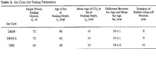 Notice the last column: "Duration of Bubble Close-off Process". This is another way of describing the "age distribution" of the gas within the bubbles. Look again at Figure 4 of the firn cross-section. The bubble close-off process takes place in the "lock in zone". The length of time it takes for the air to become finally trapped in bubbles in the lock in zone defines the "age distribution". This is different for every ice core location, again, depending on snow accumulation, temperature, firn density, etc.
The time in the lock-in zone is roughly 10% of the time span given by the Δ-age. (But, again, this rough approximation would be different for each different ice core location.) So yes, the age distribution of the gas is directly related to the Δ-age. Hence, the quote from the Mitchell paper:
"The bubbles are known to close off over a vertical ice age range [the Lock-in Zone] that corresponds to roughly 10% of the gas age-ice age difference, which intuitively should result in a gas age distribution width corresponding to 10% of the gas age-ice age difference [the Δ-age]. However, the observed smoothing of the trapped gas record often appears to be less than would be expected from this rate of gradual bubble closure."
And my further comment: "So rather than 10%, a good rule-of-thumb, according to Dr. Christo Buizert, is to take 5% of the Δ-age to find the age distribution."
Back to Law Dome, again. Ten percent of the 30 year Δ-age would give an age distribution of only 3 years, not the 8-15 years I alluded to from Figure 5. Well, like I said, these are rough approximations.
The main point is to simply realize that the date of the CO2 in ice core bubbles cannot be pinpointed to a single year in the past. There is an age distribution or range of years that the gas is dated to. It may be very difficult to determine the exact width of a given ice core's age distribution, i.e. the span of years in the distribution, but we can get in the right ballpark.
- Climate's changed before
michael sweet at 05:36 AM on 11 September, 2017Norrism,
This is the graph for the Northern Hemisphere from Mann et al 2008 :

There might be a more recent paper that I did not find. Mann has done the analysis with no tree ring data and it is the same as with the tree ring data.
It is usually possible to get free copies of papers if you Google them (I found this paper using Google). Apparently it is only for the Northern Hemisphere (as was the other graph I posted). More data is available for the Northern Hemisphere so Mann only did the Northern Hemisphere in 1998.
Here is a global analysis by Marcott et al (SkS article about Marcott)
Marcott is the red line. The small bump up is around 1000 years ago and is too early for the MWP. Current temperature is about 1.0 on this graph.
Keep in mind that we expect the temperature to decline after the Holocine maximum to a new ice age. This is the decline from 5000 bp to 150 bp. AGW then kicks in in earnest. AGW might have slowed the decline in temperature from 5000bp on from early farming releasing CO2.
I see no indication of a MWP in any of this data.
- Ivar Giaever - Nobel Winning Physicist and Climate Pseudoscientist
Daniel Bailey at 05:14 AM on 29 July, 2017Right here:

And Here:

"It is natural for climate to change as it has for millions of years"
So many fallacies, so little time...
FYI, the Earth's climate only changes in response to warming or cooling forcings. No known natural forcing fits the fingerprints of observed warming except anthropogenic greenhouse gases.
And this gem:
"There is less than a 1-in-27 million chance that Earth's record hot streak is natural"
Lol. Let's see what else you got:
"The theory of global warming is completely debunked by this chart"
Nope. You smear the difference between a scientific hypothesis and a scientific theory.
Indeed:
Below is a generalized sequence of steps taken to establish a scientific theory:
1. Choose and define the natural phenomenon that you want to figure out and explain.
2. Collect information (data) about this phenomena by going where the phenomena occur and making observations. Or, try to replicate this phenomena by means of a test (experiment) under controlled conditions (usually in a laboratory) that eliminates interference's from environmental conditions.
3. After collecting a lot of data, look for patterns in the data. Attempt to explain these patterns by making a provisional explanation, called a hypothesis.
4. Test the hypothesis by collecting more data to see if the hypothesis continues to show the assumed pattern. If the data does not support the hypothesis, it must be changed, or rejected in favor of a better one. In collecting data, one must NOT ignore data that contradicts the hypothesis in favor of only supportive data. (That is called "cherry-picking" and is commonly used by pseudo-scientists attempting to scam people unfamiliar with the scientific method. A good example of this fraud is shown by the so-called "creationists," who start out with a pre-conceived conclusion - a geologically young, 6,000 year old earth, and then cherry-pick only evidence that supports their views, while ignoring or rejecting overwhelming evidence of a much older earth.)
5. If a refined hypothesis survives all attacks on it and is the best existing explanation for a particular phenomenon, it is then elevated to the status of a theory.
6. A theory is subject to modification and even rejection if there is overwhelming evidence that disproves it and/or supports another, better theory. Therefore, a theory is not an eternal or perpetual truth.For a good discussion of science terminology (especially for the "Evidence, not Proof" bit), see here.
FYI: Anthropogenic climate change (ACC)/anthropogenic global warming (AGW) is not a hypothesis. It is a robust theory, referred to as "settled fact" by scientists.
Per the National Academies of Science, science advisors to Congress and the Office of the Presidency since Lincoln, in their 2010 publication Advancing The Science Of Climate Change (p. 22):
"Some scientific conclusions or theories have been so thoroughly examined and tested, and supported by so many independent observations and results, that their likelihood of subsequently being found to be wrong is vanishingly small.
Such conclusions and theories are then regarded as settled facts.
This is the case for the conclusions that the Earth system is warming and that much of this warming is very likely due to human activities."
And note that the above National Academies paper is available for free download after a free registration. No purchase necessary. And the quote is from page 22.
"Settled facts"... Just rollsssss off the tongue...
Back to you. Be warned, I'm just getting warmed up.
- Climate's changed before
ubrew12 at 07:38 AM on 8 July, 2017About a month ago, I took the Pages-2k graph (last 2000 years of global temperature using tree ring proxies) and roughly calculated the temperature change per century, last 20 centuries, and the standard deviation in this metric for this 2000 year period. I then took 5-century intervals from the Marcott graph (last 11,000 years, ocean sediment data), calculated the average temperature change per century (over 5 centuries), and imposed the standard deviation I'd gotten from Pages-2k to each of these to calculate my best estimate of the temperature change per century for the 100 centuries prior to Christs birth. I then applied this same technique to the Shakun graph (last 20,000 years). However, in that case I used 10-century intervals to get the average temperature change per century and imposed the Pages-2k standard deviation upon that average to get 10 data points representing the likely variance over them. At the end of all this activity, I had 219 data points representing the likely temperature change per century for the 220 centuries (22,000 years) before the 20th century. The average was 0.014 C/century, the standard deviation was 0.077 C/century, so the 3-sigma point is 0.24 C/century. Warming in the 20th century was 0.78 C/century. To me this proves, statistically, that modern warming is nothing like anything that has occurred in the previous 22,000 years. Its about 3 times what would be considered extremely unusual from the natural record. And warming in the last 25 years, if it continues, is about 3 times that again (2.2 C/century). My question is: does anybody know where this kind of analysis has been performed in the Science record? I'm sure it has, and to a much greater degree. I just want to know where to find it so I can refer to it whenever somebody claims 'Its all natural'.
- Why the Republican Party's climate policy obstruction is indefensible
Daniel Bailey at 03:40 AM on 8 July, 2017@too
Note that the next figure (Fig. 3) from your link is a complete fabrication/misrepresentation, as it uses Alley's GISP2 core data (last data point 1855), so it misses all the warming of the instrumental record.
- New research may resolve a climate ‘conundrum’ across the history of human civilization
chriskoz at 23:37 PM on 17 June, 2017Nigelj@1,
It's always better to look at the actual published source rather than dodgy 'skeptical' blog.
The 'conundrum' Dana is talking about likely comes from (Liu et al 2014) where they state:
A recent temperature reconstruction of global annual temperature shows Early Holocene warmth followed by a cooling trend through the Middle to Late Holocene [M13]. This global cooling is puzzling because it is opposite from the expected and simulated global warming trend due to the retreating ice sheets and rising atmospheric greenhouse gases. Our critical reexamination of this contradiction between the reconstructed cooling and the simulated warming points to potentially significant biases in both the seasonality of the proxy reconstruction and the climate sensitivity of current climate models.
So L14 has already pointed out the possible M13 sesonal and hemispheric bias. They, hower, looked at SST reconstructon biases only. Look at Figure3 in L14: it has been known that N hemisphere models (3B) do match Marcott (3A) at least in sign.
However, note that the total cooling shown by M13 from the peak of Holocene (ca 7ka BP) to the LIA dip, is some 0.5-0.6 degC only. Not 1.4C as the 'skeptical' blog clearly exaggerated. BTW, that latter graph is hardly readable with 4 plots superposed. The obliquity plot has nothing to do with the rest of the plots because Milankovic forcings do not have direct effect on global temperature, they only produce variations in Arctic temperatures. However 'skeptics' have superimposed and scaled the obliquity plot only to suggest to uninformed that obliquity is in direct correlation with temperature shown by M13, maybe to justify the bogus 'neo-glacial' label there. My 'uninformed' question would be then: why the obliquity is so different than T in the very first section of it labeled 'pre-boreal' (whatever that mysterious term means)? Logical answer: because the obliquity has nothing to do with this picture and does not belong there.
- New research may resolve a climate ‘conundrum’ across the history of human civilization
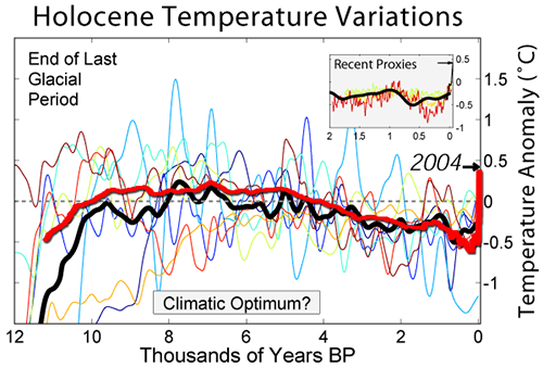
nigelj at 07:40 AM on 15 June, 2017Good article, that resolves a long standing mystery. It shows the considerable power of climate models, but this message will be lost on the sceptics.
The following graph may be useful, and was posted on RC some time ago. It covers the last 12,000 years and includes the temperature data from Marcott, plus various model temperature estimates, plus CO2 levels, all on the same graph, so the divergence is clear. Be warned, it appears to be from a sceptics blog, but does appear accurate.
- Over 31,000 scientists signed the OISM Petition Project
Tom Curtis at 10:06 AM on 26 February, 2017Deaner @38, and Kirdee @ 37, you may be waiting a long time for a detailed rebutal of the accompanying paper to the OISM petition. That is because the paper constitutes a Gish gallop. It is so dense with cherry picks, data taken out of context and other errors that it would take a paper just as long simply to provide links to related rebutals. Given that all of the claims can be (and have been rebutted on SkS) in relation to other issues, the time that would be involved in tracing down all the references, and composing a rebutal is not sufficiently well rewarded.
To give you an idea of what I mean, I will consider just a few claims made by the paper.
The paper leads with a Sargossa Sea proxy from Keigwin (1996):
It is a real proxy, and I do not know of any problems with Keigwin (1996). What I do know (and which should be obvious) is that no proxy from a single location is a proxy of global temperature. To think it is is as absurd as thinking that temperatures in Darwin, Australia must vary in sync with those of Boston, Massachussets. Because temperatures in different regions do not vary in sync, when taking a global average they will regress towards the mean. Large variations will be evened out, and global mean temperature peaks (and troughs) are unlikely to coincided with peaks (and troughs) of individual regions.
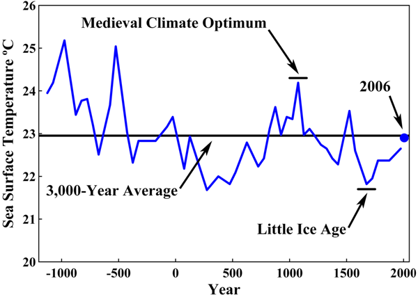
Robinson, Robinson and Soon (hereafter RRS) will have nothing of that, and conclude from a single proxy that:
"The average temperature of the Earth has varied within a range of about 3°C during the past 3,000 years. It is currently increasing as the Earth recovers from a period that is known as the Little Ice Age, as shown in Figure 1. George Washington and his army were at Valley Forge during the coldest era in 1,500 years, but even then the temperature was only about 1° Centigrade below the 3,000-year average."
In contrast to their finding, if you look at a genuine multi-proxy reconstruction of Holocene temperatures (in this case 73 proxies from diverse regions), you see that global temperatures have varied within a 1 to 1.5 C temperature range, and that "Current global temperatures of the past decade have not yet exceeded peak interglacial values but are warmer than during ~75% of the Holocene temperature history", including, as it happens, the MWP:
RRS have created an entirely false impression by using clearly inadequate, and cherry picked, data.
Next consider their use of Oelermanns (2005) regarding glacer length, which RRS show as follows:
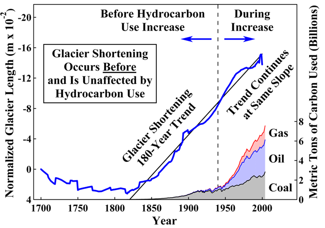
For comparison, here is the actual figure (2 B) from Oerlermans (2005):

You will notice that RRS show the figure inverted. You will also notice that while the all glaciers figure (in red) jogs down towards the end, it is only the "Alps excluded" figure that jogs up at the end, as shown (once allowing for the inversion) by RSS. From that evidence, they have deliberately chosen the more restricted data, and chosen it because it better fits their narrative (because it is smoother).
What is worse, they know and neglected the fact that a Oerlermans (2005) used the data to reconstruct global temperatures. The result is very different from the impression they are trying to create:

Temperatures are seen to be more or less stable from 1600, with the slight rise starting around 1850 in keeping with what has gone before. The 20th century, however, is marked by an unprecedented, rapid, rise in temperature. That has lead to an unprecedented and rapid retreat of glaciers.
Once again RRS create a false impression by cherry picking the data, and by forcing us to rely on an intuitive, but false understanding of the relationship between glacier length and temperatures (which are modulated by slope and precipitation, factors Oerlermans takes into account but for which we have no information). Worse, they portray the data from approximately 70 glaciers (ie, the total number of glaciers used excluding those from the Alps) as though it were the full 169 glaciers considered.
I could go on, but you will already see from my brief treatment of just two points how extensive a full treatment of RSS would be. You will also have noted the dishonest tactics used repeatedly by RSS in their paper.
- CO2 lags temperature
Tom Curtis at 00:24 AM on 22 February, 2017Adri Norse Fire @549, your discussion is becoming increasingly wide ranging, and off topic. I am sure the moderators would appreciate your taking the various points to their most appropriate threads. In particular, where you say,
"The theory is essentially that solar observations are increasingly recording fewer sunspots and it is thought that solar cycle 25 or 26 will practically have no stains, a event that has precedents +200 years ago where especially the Maunder Minimum coincided with the colder phase of the Little Ice Age."
You should read, and take further discussion to this article.
Discussion of the MWP should be taken to one of numerous threads devoted to it, or that on Pages 2k. That includes discussion of farming in Greenland, although this thread would be more apt. Discussion of Holocene temperatures should probably be taken to a thread on Marcott et al.
- NOAA was right: we have been underestimating warming
Tom Dayton at 05:34 AM on 7 January, 2017Echo, for global temperatures extending far earlier than the previous 2,000 years, see the post on "the wheelchair" graph.
- Climate change in 2016: the good, the bad, and the ugly
nigelj at 08:44 AM on 4 January, 2017Michael Sweet, 1.5 degrees Celsius could well be true if you take it wider from 1750 right to this year. I personally have no argument with that.
However regardless of exact numbers and start and end points, studies like Marcott going back over 10,000 years show just how unprecedented recent temperatures are. I remain optimistic that if the public are made aware numerous studies keep duplicating the original hockey stick the facts will eventually sink in.
Debates are eventually won on the facts. Even Trump is going to find that out the hard way because right now all his policies (climate change, foreign policy, and economic etc) are all based on fallacies of various kinds, and are therefore very foolish policies. They are foolish for other reasons as well.
- Oceans heating up faster now than in the past 10,000 years, says new study
rugbyguy59 at 14:11 PM on 6 December, 2016jzk,
While the paper summary says the findings support the idea of a global MWP, this only means the data here is consistent with it. This isn't real evidence of a global anything because it is simply of one area. There are many valid studies in that list of "Studies supporting a MWP" on that other website of ill repute, which say their findings support the idea of a global MWP. However, those studies are not put together by anyone I'm aware of. When people do put all the data together (PAGES2K for example) there doesn't seem to be one. Even the MWP that seems to appear in the Northern Hemisphere studies is a pale shadow of what deniers want it to be.
When I look at the graph of OHC this study presents, it seems to be quite analogous to the same period in Marcott. Although the beginning of the lang slow cool down begins earlier. Granted I'm no scientist but that seems to me to not really support a global MWP or LIA as described by denialists. There is no sudden or pronounced warming or cooling in either period there is just the long term trend (Milankovitch Cycles?) plus noise.
- Tracking the 2°C Limit - November 2015
Tom Curtis at 12:24 PM on 22 January, 2016As per the moderators suggestion, I have responded to angusmac across three posts elsewhere. I will make one point in response here, however, because it gets to the core of why angusmac raised HCO temperatures on this thread in the first place. To recap, angusmac argues that the MWP temperature should be used as the "preindustrial temperatures" for reasons sufficiently refuted above. His reason for doing so comes down to his opinion that, "...“1.669 °C” above the 1961-1990 mean [and MWP temperatures] ... does not sound nearly as bad as 2 °C". This in turn is related to his belief that "... many parts of the world exceeded the 2 °C limit [in the HCO] without any dangerous consequences and that these temperatures occurred when CO2 was at ≈ 280 ppm". The idea is that if 1.67 C above the 1961-1990 mean is not bad, then neither is 0.75 C (2015 average, HadCRUT4) and neither is 2 C above the preindustrial average. Ergo, rebaselining the 2 C guidline is justified to make that intuitively obvious.
Marcott 2013 allows us to see how flawed that intuition is.
Specifically, Marcott adds random variability to the stack of reconstructions used in the paper to make the annual scale variability of the reconstructions match actual annual scale variability. The result is an increase of 0.13 C to the standard error. It follows, that if we add 0.13 C to the standard deviation of the mean of the stack for each 20 year period in the full reconstruction, we get a good approximate measure of the potential range of annual temperatures for that 20 year period. Note that due to autocorrelation, if temperatures are low for a given year in a 20 year period (or century), in a specific member of the stack, they will not be high within that 20 year period (or with slight qualification, within that century). But because we do not know which member of the stack most closely approximate reality, the statistical data form all stacks gives us our best approximation of the temperature range. From that in turn we can calculate an approximate probability of a particular temperature in any given year:

The chart shows the probability of a given temperature (specified by year) in any given year over the Holocene. The green line shows the probabilty of 1.5 C over the 1961-1990 mean. It is consistently zero. Even 2015 tempertures are shown to be relatively rare in the HCO, though 2000-2009 temperatures were commonplace.
More interestingly, we can calculate the probability of those temperatures being reached at least once, in any year over a given period. For the period 5500-9500 BP, it is a near certainty that even 2015 temperataures will have been reached at least once. There is, however, only a 2% chance that temperatures reached 1.5 C above the 1961-1990 at any time in the HCO. The chance that it reached 2 C above preindustrial for even a single year is negligible.
It can therefore be seen that angusmac's assumption that high temperatures were commonplace in the HCO is simply false. We are very nearly at the upper limit of HCO temperatures. Nor is his assumption that HCO temperatures were always beneficial justified. Indeed, given that almost all agriculture was invented between 30 degrees North and 30 degrees South (and all was invented between 40 north and 30 south), and given that temperatures in that latitude zone have actually increased since the HCO, his assumption of beneficial effect is very shaky indeed.
Finally, for completeness, the probability of 1990-2009 twenty year average temperatures of the 950-1900 preindustrial baseline is 0.6%. The probability of 1996-2015 twenty year average temperatures of the 950-1900 baseline is just 0.03%. So much for natural variability being the cause.
- Real Skepticism About the New Marcott 'Hockey Stick'
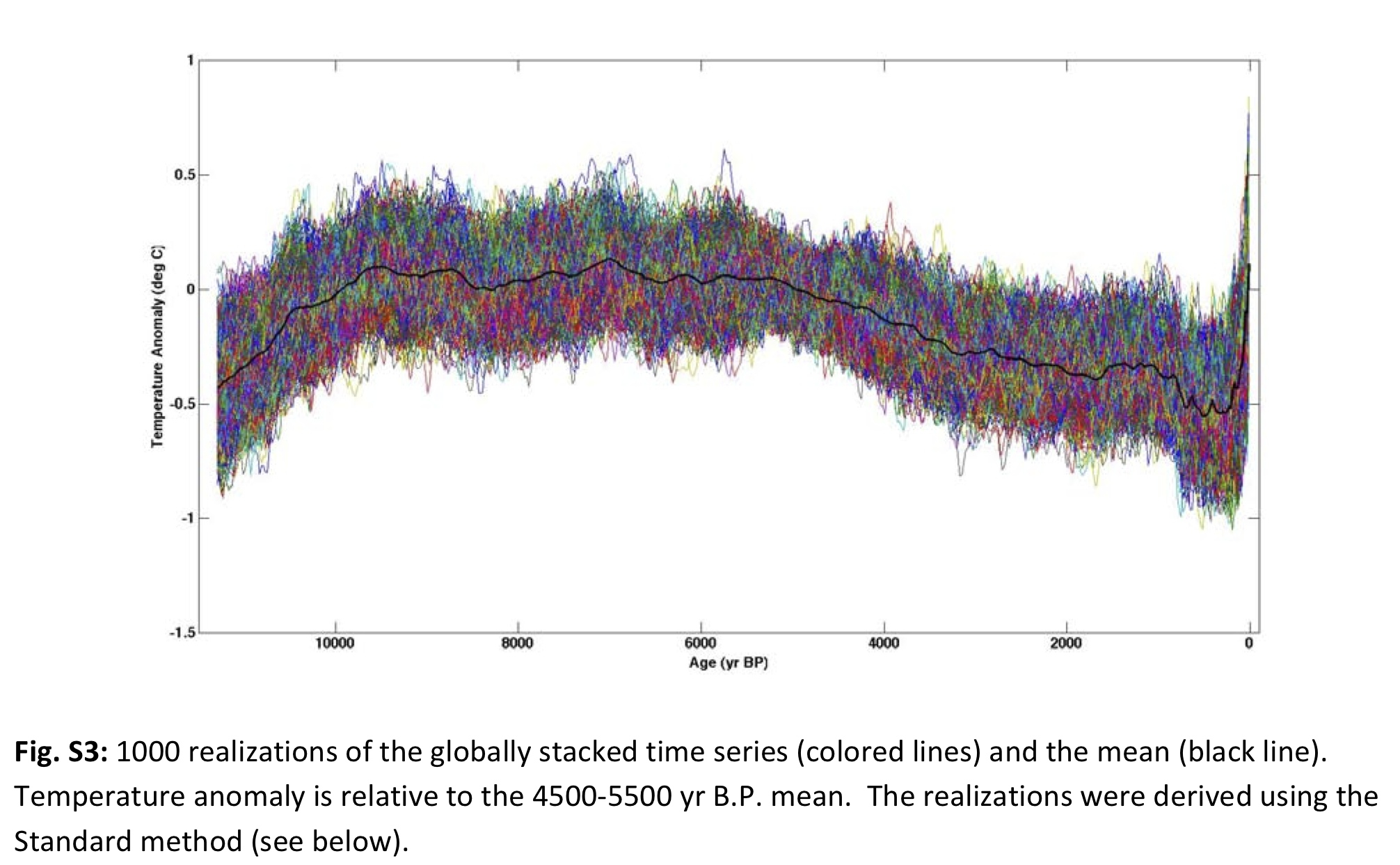
Tom Curtis at 11:33 AM on 22 January, 2016This is my final response on this page to angusmac's comment here. In that comment, in addition to the three points addressed above he draws attention to the fact that the 19th and 20th century spike in the Marcott standard mean of reconstructions is not robust (something pointed out by Marcott et al in the original paper). He reinforces the argument by comparing the final stages of Figure S3 to the equivalent Figure C8 from Marcott's thesis:
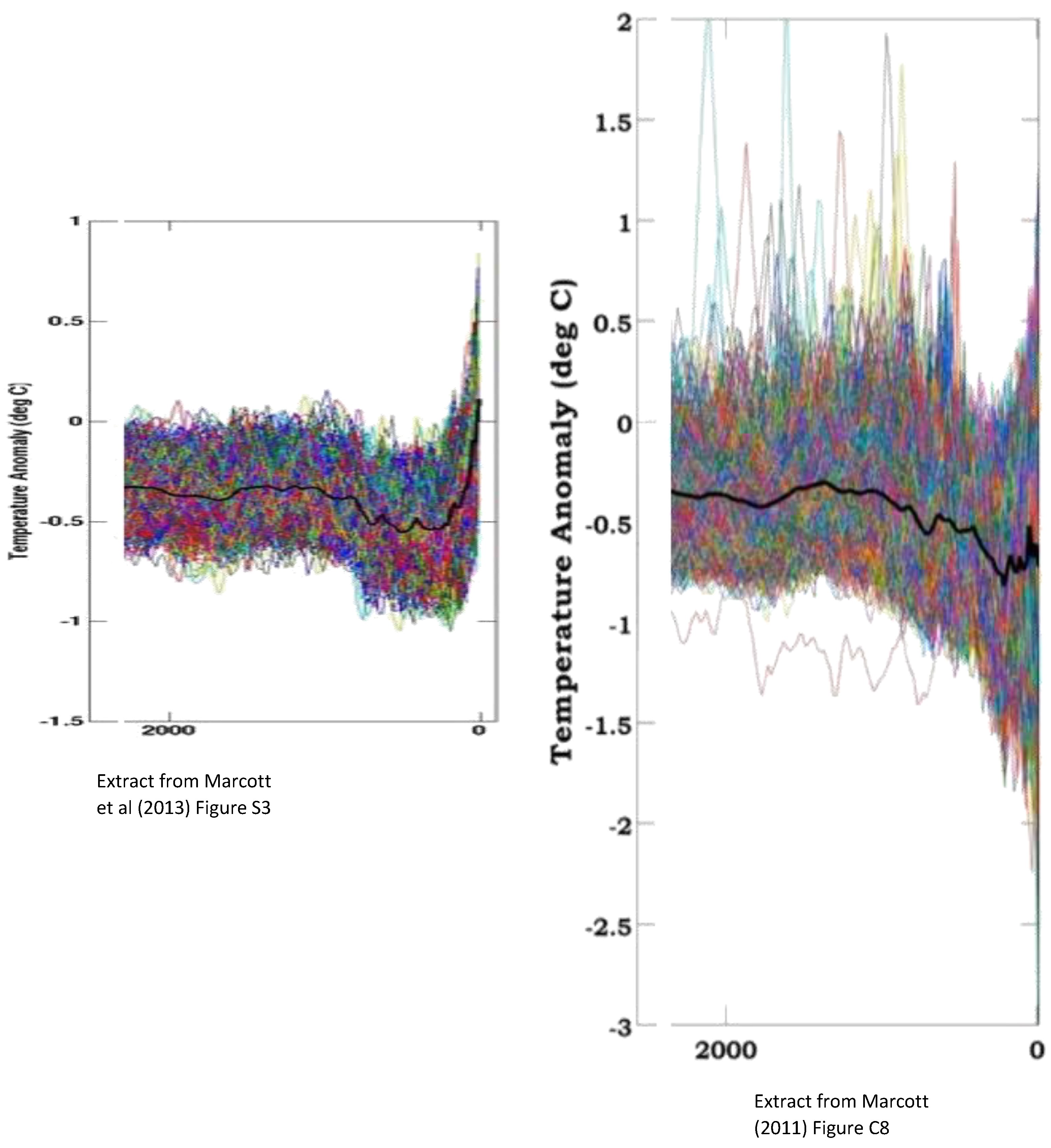
He writes:
"A difference of approximately 0.8 °C in the two versions of the reconstruction is presented in Figure 1 – yet they use the same proxies. Marcott et al do not address this significant difference by their “not robust” statement.
...
In light of the above discrepancies in Marcott et al (2013), I would not recommend it as a reasonable paleo reconstruction."
In the elided section, he adds the further, hypocritical criticism that Marcott's response to blog criticisms on a blog rather than formally through an corrigendum or explanandum published in the journal "...casts doubt on the robustness of the last 500 years of the reconstruction and perhaps even the entire paper". The double standard in not assuming that the failure of critics to formally publish their criticisms "casts doubt on the robustness" of those criticisms is breath taking. I will treat that "argument" with the contempt it disserves, and give it no further dicussion.
With regard to robustness, Tamino explained it first and best. It is entirely an artifact of the method of taking a simple average combined with the drop out of proxies towards the end of the record. Using other methods such as the method of difference (see Tamino's post), or the RegEM method used as an alternative method in Marcott et al, results in a much smaller, but robuts uptick occuring in the 20th century only:
Comparison of simple averages to the method of difference (or the RegEm method) shows the problem has little effect anywhere else in the reconstruction, and a scarcely discernible effect in the crucial years of the Holocene Climactic Optimum:

Given that angusmac is familiar with Marcott's Q&A at Realclimate, and even with Marcott's thesis, he must be familiar with this explanation of the problem, and ergo that it makes no relevant difference to the reconstruction in the HCO. Given that, I am surprised (to say the least) that he should raise this issue.
This, of course, does not explain the difference in the terminal section of the stacks generated for the paper (S3) and the thesis (C8). What angusmac does not show is the difference between Figure C8 and Figure C9 of the thesis:


As can be seen, calibration issues in just one proxy were able to make a significant difference to the robustness of the reconstructions through the HCO. Those issues were resolved in the paper, and the proxy consequently is used in the paper without problems. While that proxy (ODP 984) terminates around 1400 AD, and therefore does not contribute to the lack of robustness of the terminal period, it is likely that similar improvements in calibration and/or terminal dates explains the difference between C9 of the thesis and S3 of the paper with regard to the final two centuries.
Comparison of C9 and S3 shows the problem to only relate to the final two centuries which are not the point of the reconstruction, and which are not used to calibrate reconstruction temperatures to modern temperatures (which is done indirectly via the Mann 2008 reconstruction of temperatures over the last 2000 years). From this it follows that there is no basis in this data to doubt the HCO reconstruction from Marcott et al.
Nor is any substantive reason advanced to show the changes in data handling with regard to calibration and possibly terminal dates between the two does not represent an improvement. As it makes no difference to the substance of the reconstruction that is sufficient answer IMO. If it does not satisfy angusmac, he can do the necessary leg work by enquiring of Marcott re all the precise differences between thesis and paper among which the full explanation must be found.
- Real Skepticism About the New Marcott 'Hockey Stick'
Tom Curtis at 10:08 AM on 22 January, 2016Continuing my discussion of Angusmac's comment here:
Point (3) clearly misunderstands the nature of the Marcott reconstructions. (The misunderstanding is quite common among people who discuss climate science on the internet.) Specifically, while the mean of the stack of reconstructions has a resolution of approximately 300 years, the reconstructions themselves (as shown in figure S3, see Comment 101 above) have a resolution of 20 years. They are therefore quite appropriately compared to decadal temperatures. Further, in generating Figure 3 (see comment 101 above), which is the crux of Marcott et al, Marcott et al added noise to the reconstructions so that their variability matched the annually resolved Mann 2008 reconstruction. The statistical distribution is, therefore, quite appropriately compared to annual temperatures.
Given this, it is reasonable to criticize graphs that show only the stack mean vs modern temperatures. The falsely give the impression that we are experiencing temperatures never experienced before since the invention of agriculture. Rather, modern twenty year averages should be compared to the individual reconstructions in the stack, like this:

As you can see, even the 1996-2015 average was probably experience many times (if briefly) in the Holocene, but we are pushing towards the upper temperature limit of the Holocene. More significantly, the rate of increase of temperature over the last century is certainly in the highest 5% of holocene temperature trends, and may well be unprecedented. It is also ongoing.
More later.
- Real Skepticism About the New Marcott 'Hockey Stick'
Tom Curtis at 15:26 PM on 21 January, 2016Angusmac criticizes the Marcott reconstruction here, saying (in part):
"Rob, I agree that the conversation has veered off course for this comment thread but I do wish to make the following comments regarding Marcott et al (2013) that are relevant to baselining preindustrial temperatures:
- Marcott et al state that their results indicate that “global mean temperature for the decade 2000–2009 [HadCRUT3] has not yet exceeded the warmest temperatures of the early Holocene (5000 to 10,000 yr B.P.).” Therefore, if we were to use their reconstruction, we would be near to the Holocene peak.
- 80% of the Marcott et al proxies are derived from marine archives and consequently would underestimate global land-ocean temperatures. Consequently, the Marcott et al results should be adjusted upwards for an apples-for-apples comparison with land-ocean temperatures, as suggested by Glenn Tamblyn@9.
- Proxies tend to have multi-decadal to centennial resolutions and should not be compared directly with annual instrumental temperatures. Kaufman et al (2013) consider this by presenting the most recent 30-year period (1983-2012) from HadCRUT4 as shown by the star in Figure 2. However, a good case could be made for using a longer period for the instrumental mean when comparing it with proxies that are of centennial resolution e.g., Marcott et al (2013)."
Point (1) should be commonplace, although due to a common misinterpretation of Marcott et al, it is not. The misinterpretation is that the bold line in the center of the 1 sigma uncertainty interval in Marcott et al is the "reconstruction", whereas it is just the mean of an ensemble of reconstructions. Marcott et al state no preference among that ensemble as to which is the "real" value, so therefore all members of the ensemble must be given equal weight. All, or nearly all members of the ensemble frequently lie higher than the ensemble mean, and often much higher. It follows that temperatures greater than even 2015 are far more likely than not to have occured in the Holocene Climactic Optimum, and indeed may have occurred close to 1 in every 20 years over the period 5500 to 9500 BP.
Point (2), on the other hand is at best ill informed nitpicking. Ill informed because it assumes the differential rate of heating between land and ocean which leads to cooler oceans in a warming climate (and warmer oceans in a cooler climate) will be a significant factor over multi-centenial periods. For the Marcott mean value, the time resolution is 300 years, at which resolution the difference between land and ocean would be effectively nil. (This contrasts with the case for the much smaller resolution of reconstructions of the MWP.)
Nitpicking because while sea temperature proxies are 80% all proxies, the sea surface is 70% of global surface area. That is, sea surface temperatures are only overrepresented by 14.3%. This evidently creates a problem for somebody prepared to overlook that sea surface temperatures were underrepresented by 45.7% in the Lundqvist analysis that he prefers. Further, nitpicking because again in Marcott et al, NH proxies are again overrepresented (as is typically the case in reconstructions). Marcott el al write:
"The Southern Hemisphere is represented by fewer data sets (n = 11) than the equatorial (n = 33) and Northern Hemisphere (n = 29) regions, providing fewer constraints on characterizing the variability in our reconstruction for this region."
Despite Marcott's phrasing, the SH extratropics is well represented, with 15.1% of proxies for 18.3% of the surface area (17.5% under representation), but the NH extratropics has 39.7% of the proxies for 18.5% of the area (a massive 114.6% over representiation). Meanwhile tropical regions, with 45.2% of proxies for 63.7% of the area, are also under represented (29.1% under representation).
As can be seen below, NH temperatures rose much higher in the Holocene Climatic Optimum relative to tropical or SH temperatures:

As it turns out, the most under represented area relative to the proportion of the Earth's surface shows lower temperatures over the Holocene Climactic Optimum, while the area with the greatest early holocene warmth is massively over represented.
These biases are far more likely to impact the final reconstruction than are the relatively minor land/sea bias pointed to by Angusmac. Further, they bias in the opposite direction to his presumption regarding the land/sea bias, and so would surely cancel the effect (at least).
Finally, as it happens Marcott et al checked for the effect of biases against a simple model:
Clearly their methodology was sufficiently robust to eliminate all but a small part of the warm bias we would expect from looking at proxie locations alone.
I am currently short of time, and will discuss point three and further criticisms later.
- Tracking the 2°C Limit - November 2015
Tom Curtis at 21:34 PM on 18 January, 2016angusmac @41, I am not going to respond formally to your post until it is clear that it will not be deleted for its rather egregious posting under the wrong topic. If it is so deleted, by all means repost in on the correct thread. If you feel there is some part of the discussion that asolutely belongs on this thread, you can then link to that repost and highlight briefly only what is relevant, and why it is relevant to the OP here.
I will note that it is extraordinary in science to only make criticism on weblogs (which is where you will find the criticism of Marcott et al), and to expect a more formal response by Marcott without demanding a more formal critique by the science assassins "climate auditors" represents a stunning hypocrissy.
- Tracking the 2°C Limit - November 2015
angusmac at 19:15 PM on 18 January, 2016Rob Honeycutt@39 & Tom Curtis@32
Rob, I agree that the conversation has veered off course for this comment thread but I do wish to make the following comments regarding Marcott et al (2013) that are relevant to baselining preindustrial temperatures:
- Marcott et al state that their results indicate that “global mean temperature for the decade 2000–2009 [HadCRUT3] has not yet exceeded the warmest temperatures of the early Holocene (5000 to 10,000 yr B.P.).” Therefore, if we were to use their reconstruction, we would be near to the Holocene peak.
- 80% of the Marcott et al proxies are derived from marine archives and consequently would underestimate global land-ocean temperatures. Consequently, the Marcott et al results should be adjusted upwards for an apples-for-apples comparison with land-ocean temperatures, as suggested by Glenn Tamblyn@9.
- Proxies tend to have multi-decadal to centennial resolutions and should not be compared directly with annual instrumental temperatures. Kaufman et al (2013) consider this by presenting the most recent 30-year period (1983-2012) from HadCRUT4 as shown by the star in Figure 2. However, a good case could be made for using a longer period for the instrumental mean when comparing it with proxies that are of centennial resolution e.g., Marcott et al (2013).
 Figure 2 (Kaufman et al, 2013)
Tom, I had thought that the uptick at the end of the Marcott et al reconstruction would provide a good correlation with instrumental temperatures but Marcott et al stated that their 1890-1950 warming was “probably not robust.” If it is not robust then why show it?
Further research indicated that there had been criticism of the paper, which resulted in a Q&A blog by Marcott et al in RealClimate which stated that, “the 20th century portion of our paleotemperature stack is not statistically robust, cannot be considered representative of global temperature changes, and therefore is not the basis of any of our conclusions.”
“Not robust” is an understatement when you compare Figure S3 from Marcott et al (2013) with Figure C8 in Marcott’s PhD thesis (2011). This comparison shows that there are differences in the two reconstructions in general and, in particular, the last 500 years shows completely different results. For example, there is an uptick in Figure S3 in the 2103 version and no uptick in Figure C8 in the 2011 versions (see Figure 1).
Figure 1: Extracts from Figure S3 (Marcott et al, 2013) and Figure C8 (Marcott, 2011)
A difference of approximately 0.8 °C in the two versions of the reconstruction is presented in Figure 1 – yet they use the same proxies. Marcott et al do not address this significant difference by their “not robust” statement.
Regarding the criticism of their paper, it is very unusual to address such criticism in a weblog, as done by Marcott et al. It is normal scientific practice to address criticism in clarifications/corrigenda to the original paper in the pertinent journal because this allows a technical audit on the veracity of the paper. Not having done so certainly casts doubt on the robustness of the last 500 years of the reconstruction and perhaps even the entire paper.
In light of the above discrepancies in Marcott et al (2013), I would not recommend it as a reasonable paleo reconstruction.
- Tracking the 2°C Limit - November 2015
Tom Curtis at 23:06 PM on 13 January, 2016Angusmac @29 (2), I am disappointed that you drew my attention to Ljungqvist 2011 for I had come to expect higher standards from that scientist. Instead of the standards I have expected, however, I found a shoddy paper reminiscent of Soon and Baliunas (2003) (S&B03). Specifically, like S&B03, Ljungqvist 2011 gathers data from a significant number (60) of proxies, but does not generate a temperature reconstruction from them. Rather, they are each categorized for different time periods as to whether they are more than 1 C below the preindustrial average, withing 1 C of that average, more than 1 C but less than 2 C, or more than 2 C above the preindustrial average. The primary reasoning is then presented by a simple head count of proxies in each category over different periods, shown in Figure 3, with figure 3 a showing land based proxies, and figure 3 b showing marine proxies:

(As an aside, C3 Headlines found the above graph too confronting. They found it necessary to modify the graph by removing Fig 3b, suggesting that the thus truncated graph was "terrestial and marine temperature proxies".)
If the proxies were spatially representative, the above crude method might be suitable to draw interesting conclusions. But they are not spatially representative. Starting at the simplest level, the 70% of the Earth's surface covered by oceans are represented by just 38% (23/60) of the proxie series. As the ocean proxie series, particularly in the tropics, are cooler than the land series, this is a major distortion. Worse, the 6.7% of the Earth's surface North of 60 latitude is represented by 25% of the data (15/60 proxies). The 18.3% of the Earth's surface between 30 and 60 degrees North is represented by another 43% of the data (26/60 proxies). In the meantime the 50% of the Earth's surface between 30 North and 30 South is represented by just 23% of the data (14/60 proxies), and the 50% of the Earth's surface below the equator is represented by just 15% of the data (9/60 proxies).
This extreme mismatch between surface area and number of proxies means no simple eyeballing of Fig 3 will give you any idea as to Global Mean Surface Temperatures in the Holocene Thermal Maximum. Further, there are substantial temperature variations between proxies in similar latitude bands, at least in the NH where that can be checked. That means in the SH, where it cannot be checked due the extremely small number of proxies, it cannot be assumed that the 2 to 4 proxies in each latitude band are in fact representative of that latitude band at all. Put simply, knowing it was warm in NZ tells us nothing about temperatures in Australia, let alone South America or Africa. This problem is exacerbated because (as Ljungqvist notes with regard to Southern Europe, data is absent from some areas known to have been cool HTM.
The upshot is that the only reliable claims that can be made from this data is that it was very warm North of 60 North, and North of 30 North on land in the HTM. The data is too sparse and too poorly presented to draw any conclusions about other latitude bands and about Ocean temperatures, or Land/Ocean temperatures from 30-60 North.
Given the problems with Ljungqvist 2011 outlined above, I see no reason to prefer it to Marcott et al (2013):
More illustrative is his Figure 3:

Note that the statistical distribution of potential holocene temperatures tails out at 1.5 C above the 1961-1990 baseline, or 1.86 C above a 1880-1909 baseline. Unlike the reconstruction, the statistical distribution of realizations does not have a low resolution. Ergo, we can be confident from Marcott et al that it is extremely unlikely that the Earth has faced temperatures exceeding 2 C above the preindustrial average in the last 100 thousand years.
- Tracking the 2°C Limit - November 2015
angusmac at 18:12 PM on 13 January, 2016Tom Curtis@24 Regarding your assertion of my “abuse of data” and being “fraudulent”, regarding the use of the Renssen et al (2012) HTM temperature anomalies, I can only assume that you are stating that I portrayed Renssen et al as global average temperatures. You are incorrect. I did not state that they were global average temperatures; I only stated that, “...many parts of the world exceeded the 2 °C limit” in my comment on Renssen et al. I fail to see anything fraudulent in this statement.
Referring to global average temperatures, I do not know why Renssen et al did not present global averages because they obviously have the data to do so. However, if you wished to obtain an early Holocene global average from Renssen et al, it is a simple matter to inspect one their references, e.g., Ljungqvist (2011) offers the following conclusions on global temperatures:
 Figure 1: Extract from Conclusions by Ljungqvist (2011) [my emphasis]
I agree that with you regarding temperatures during earlier warm periods that it could be, “…plausibly argued that in some areas of the world those conditions were very beneficial” but I will stick to what you call my “faith” that they were beneficial to humanity overall. I will leave it to the proponents of 2°C-is-dangerous scenario to prove that temperatures of 1 °C or “possibly even more” were harmful to humanity as a whole.
Finally, you state that I frequently cite Marcott et al but, once again, you are incorrect. I only cited Kaufman et al (2013) which shows Marcott et al as one of their temperature simulations in their diagram. The Marcott et al Climate Optimum was only mentioned once by me in angusmac@17
- Tracking the 2°C Limit - November 2015
Tom Curtis at 13:55 PM on 10 January, 2016angusmac @21, the map you show from Renssen (2012) does not represent any specific time period. Renssen states:
"To address the questions raised in the introduction, we analyzed the monthly mean simulation results to establish for each grid cell the maximum positive temperature anomaly relative to the preindustrial mean (see example in Fig. 2). The analysis resulted in global maps of this anomaly (Fig. 3aeb), which we consider to represent peak HTM conditions in the model. It is important to note that the anomalies on this map do not represent “real” climatic conditions, as they originate from different months in the year and from different times within the last 9000 years. In addition, we also mapped the timing of this anomaly in ka BP (Fig. 4a-b) and the month of the year in which this anomaly occurred (Fig. 5). This was done for both ORBGHG and OGMELTICE. The latter experiment is used here as the standard simulation, as it contains the impact of all considered forcings."
(My emphasis)
In fact, consulting figure 5, we see that the maximum temperatures are drawn from every month except May, and the consulting figure 4a, that while most occure in the three millenium span, 6-9 kya (with approximately equal portions from each of those three millenia), some occur as recently as the last millenia.
Further, consulting Figure 2, we see that temperature trends in different seasons may be exactly opposite each other. Indeed, given the insolation history in high NH lattitudes, that is exactly what we would expect. It follows that the maximum temperatures shown by Renssen are not annual averages for any year.
Given these strictures on the data, your use of it can only be called an abuse of data. If I had any confidence you knew what you are talking about, I would call it fraudulent. That is because the rise in temperatures for the 2 C guideline is a 2 C rise in the annually averaged Global Mean Surface Temperature (GMST). It is expected that:
- The increase in land temperature will be greater than the increase in sea surface temperature;
- The increase at higher latitudes, particularly higher northern latitudes, will be greater than in tropical regions; and
- The increase in winter will be greater than the increase in summer.
All these features have already been observed. The consequence is that a map of temperature maximums on the same line as that in Jenssen (2012) at a 2 C increase, even if constrained to the same year, would show significantly greater than a 2 C increase in temperature. In fact, from Marcott et al, which you frequently cite, we know the increase in annually averaged GMST in the Holocene Thermal Maximum to have been approximately 0.5 C relative to preindustrial values. Consequently, your argument @21 amounts to the claim that, because we surived temperatures 0.5 C above the GMST it is patently clear that temperatures 2 C above the preindustrial average will be without "any dangerous consequence".
I will further note that your assumption that the HTM was "without any dangerious consequence" is as faith based as your prior, similar assumption about the MWP. It is plausibly argued that in some areas of the world those conditions were very beneficial, as evidenced by the invention of agriculture. Agriculture, however, was invented in low latitude regions close to water (The middle east, the Indus delta, southern China, and Central America). Those are regions with low temperature increases, even on Jenssen's map. They are not the regions which you highlight.
Finally, here are model projected temperature anomalies for the 2050s (approximately 2 C warming) relative to the 1971-2000 mean:

Please note the archaic units to avoid confusion. As you can see, regionally in that situation, we will be facing temperatures as high as 10 C above the 1971-2000 average. Clearly even if Jenssen 2012 was an annually averaged map, it would be considerably cooler than what we are facing with BAU.
- Hockey stick is broken
KR at 08:58 AM on 9 November, 2015dvaytw - Dr. Muller seens to have the view that if he has not personally done the work, personally checked the evidence, then it is in doubt. And he will thus blithely dismiss solid work, take as gospel tripe like M&M, etc. So I would take his pronouncements with large blocks of salt.
The 2006 NAS report states in its conclusions:
- It can be said with a high level of confidence that global mean surface temperature was higher during the last few decades of the 20th century than during any comparable period during the preceding four centuries. This statement is justified by the consistency of the evidence from a wide variety of geographically diverse proxies.
- Less confidence can be placed in large-scale surface temperature reconstructions for the period from A.D. 900 to 1600. Presently available proxy evidence indicates that temperatures at many, but not all, individual locations were higher during the past 25 years than during any period of comparable length since A.D. 900. The uncertainties associated with reconstructing hemispheric mean or global mean temperatures from these data increase substantially backward in time through this period and are not yet fully quantified.
- Very little confidence can be assigned to statements concerning the hemispheric mean or global mean surface temperature prior to about A.D. 900 because of sparse data coverage and because the uncertainties associated with proxy data and the methods used to analyze and combine them are larger than during more recent time periods.
So the work he signed off on indicates high confidence in the last 400 years, less confidence in the previous 600, and reasonable uncertainty about 1000 years and greater ago, based on the evidence available at that time.
In the intervening decade additional proxies have been located, producing work up to and including Marcott et al 2013, which concludes that recent temperatures represent a reversal of a cooling trend that started 5000 years ago, with current temps warmer than the mean temperatures over 82% of the Holocene (going back 11,500 years).
Muller's statements regarding paleotemperature reconstructions were reasonable a decade ago, but are now sadly out of date. And his assertions about MBH/M&M simply indicate that he hasn't looked into the M&M work - it's nonsense, multiply debunked, most notably by Wahl and Ammann 2007. M&M's failure to apply PCA selection rules alone invalidates the work, let alone their many other errors and misstatements. Muller is (once more) talking through his hat.
- Climate's changed before
Tom Curtis at 10:07 AM on 31 October, 2015A Real Skeptic would know, having examined the issues, that Mann Bradley and Hughes 1999 (MBH99), aka, the Hockey Stick, has not been debunked despite strenuous efforts by McIntyre and McKittrick. Rather, McIntyre and McKittrick have used a statistical measure that calls a straight line plus white noise a Hockey Stick to argue that random noise generates Hockey Sticks in an attempt to debunk MBH99.
This is not to say MBH99 is without flaws (many first pointed out by Mann himself in later publications). Rather, it is a reasonably accurate first attempt to generate a multi proxy paleo temperature index with a calculated uncertainty. Because it was a first attempt, Mann, Bradely and Hughes had things to learn and made some mistakes, but the mistakes do not undermine the fundamental conclusions. This is seen by comparing MBH98 to later resonstructions that have eliminated some of those mistakes. Of those, the PAGES consortium reconstruction has used the most data and robust methods, and hence represents the best global reconstruction over recent times:
Please note the green dots (ie the PAGES reconstruction) all represent 30 year averages, so that the graph is not smoothed at a different rate for the recent period, yet the 20th century still stands out for the rapidity and magnitude of the temperature rise, not mention the reversal of the long term cooling trend and the magnitude of the final value (1971-2000) which exceeds all others. There is, of course, a qualification on that final result:
"Many of the proxy records used in the reconstructions were generated some years ago and end before the year 2000. The reconstruction for North America, Asia and South America do not extend to the 21st century. The instrumental record shows that the last several decades have generally been warmer than previous decades. Therefore, the most recent 30-year period in our analysis (1971-2000) underestimates the actual temperature of the last 30 years."
(From the PAGES FAQ, my emphasis)
Finally, it is my instinctive reaction to treat "persuasive names" such as "A Real Skeptic Says" as indicating that the person choosing the name doesn't think their real skepcism will come across without their first telling us their presumed status. That instinctive reaction is rarely wrong. So rather than flagging the uncommon skepticism of the person involved, it tends to flag the opposite. Just a word to the wise.
- Skeptical Science honoured by the Committee for Skeptical Inquiry
Tom Curtis at 13:15 PM on 18 October, 2015fletch92131 @3, for myself, I am highly skeptical that an increase in Global Mean Surface Temperature (GMST) of 1 degree C in a century is "normal". Indeed, Marcott et al (2013) show a 1000 possible temperature histories given uncertainties with regard to time and temperature across a range of proxies:
In very few instances over periods of 100 years or less is there a gap of 1 degree C between the minimum and maximum value in any realization over that period - let alone the same one. From this data, any centenial temperature increase greater than 0.66 C is a very low probability event. That is, it is not normal.
Suggestions to the contrary seem universally to be based on either proxies for single regions (such as GISP 2), or hemispheric or sub-hemispheric reconstructions. That is, they are not based on global temperatures at all. Often they are not even based on such misinterpreted evidence, but on mere anecdote.
Yet here you are, apparently so confident in this unsupported claim that you are prepared to use it as a foundation for a "knock down argument" against AGW.
That strongly suggests to me that you are a denier. For what characterizes deniers is not what they disagree with, but with their employment of selective standards of evidence to support their claims. In short, on their reliance on pseudoscience rather than science to reject scientific claims.
By all means, if you have actual evidence that global means surfact temperatures normally vary by 1 C in a century, please present it. Or alternatively, acknowledge your lack of evidence in support of your key premise, and withdraw your argument as unfounded. But if you are unwilling to do either, then you merely demonstrate that the term "denier" applied to you is no insult, but mere description.
- CO2 measurements are suspect
Tom Curtis at 01:11 AM on 26 June, 2015APT @78, Kohler et al reference Marcott et al 2014 as being a high resolution ice core CO2 concentration record. Marcott et al in turn say:
"The West Antarctic Ice Sheet Divide ice core (WDC) (79.467u S, 112.085u W, 1,766 m above sea level) was drilled to a depth of 3,405 m in 2011 and spans the past,68 kyr.At present, the site has amean annual snow accumulation of 22 cm ice equivalent per year and a surface temperature of 230 uC. Annual layer counting to 2,800 m depth (,30 kyr ago) provides a very accurate timescale for comparison with data from other archives11. The difference in age (Dage) between the ice and the gas trapped within it, which is critical for developing a gas-age chronology, is 205 6 10 yr at present and was 525 6 100 yr at the last glacial maximum (LGM) (Extended Data Fig. 1).Given the high accumulation at the site, minimal smoothing due to gas transport and gradual occlusion, and precise chronological constraints, WDC is the best Antarctic
analogue to central Greenlandic deep ice cores, with a substantially better-dated gas chronology during the glacial period, and is able to resolve atmospheric CO2 at sub-centennial resolution."(My emphasis)
What that means in practise is seen by considering Figure 3, where temporal resolution is indicated to be +/- 20 to 40 years at various time intervals:

Even at +/- 40 years, that is too good a time resolution to not have captured Steinthorsdottir's peak in CO2 at the Younger Dryas if it in fact existed. More importantly, the the +/- 1 ppm resolution of CO2 concentration at all ages shows the fluctuations in CO2 content to not be measurement error. They are fluctuations in the CO2 concentration in the ice. That is significant because the sharp variations in CO2 concentration shown are inconsistent with the record being more heavilly smoothed than shown. Smoothing through diffusion will reduces peaks, fill troughs, and turn "cliffs" into slopes. If the peaks, troughs and cliffs persist in the ice, the CO2 has not significantly diffused after the firn has closed.
In fact, it is definitely below par for Steinthorsdottir to simply wave her hand at possible high diffusion rates as an "explanation" of discrepancy between ice core and stomatal records. If diffusion is a problem, she ought to be able to (and ought to have) created a smoothed model of the stomatal record that reproduces the ice core record. Marcott et al did exactly that when comparing the higher reolution West Antarctic Divide data (WDC) with the lower resolution East Antarctic Divide data (EDC) in extended data figure 5:
"a, The red line is the Green’s function (smoothing function) produced by a firn model using an assumed EDC accumulation rate of 0.015 m yr−1 and a temperature of 209 K. b, CO2 data from WDC (dots) and EDC (dots) plotted against artificially smoothed CO2 data from WDC using the EDC firn smoothing function (red line in both plots). WDC data have been systematically lowered by 4 p.p.m. for direct comparison with EDC."
Given this, it appears to me that the stomata data Steinthorsdottir uses is an inaccurate proxy of CO2 concentrationin the Younger Dryas.
- CO2 measurements are suspect
Daniel Bailey at 01:30 AM on 24 June, 2015
It's not. Temperature measurements began in 1659. Stations were added throughout the centuries since then, becoming a truly global network beginning in 1880. Multiple proxy records extend that record literally millions of years into the past.
http://www.ncdc.noaa.gov/paleo/globalwarming/instrumental.html
http://www.ncdc.noaa.gov/oa/climate/research/1998/anomalies/anomalies.html
http://www.ncdc.noaa.gov/ghcnm/v3.php
http://www.ncdc.noaa.gov/data-access/paleoclimatology-data/datasets
http://www.realclimate.org/index.php/data-sources/
http://en.wikipedia.org/wiki/Instrumental_temperature_recordMultiproxy reconstructions are now commonplace. For example, per the PAGES 2000 reconstruction, current global surface temperatures are hotter than at ANY time in the past 1,400 years, and that while the Medieval Warm Period and Little Ice Age are clearly visible events in their reconstruction, they were not globally synchronized events.
http://www.skepticalscience.com/pages2k-confirms-hockey-stick.html
From the peak temps and CO2 at the height of the Holocene Climatic Optimum some 7,000 years ago, temps and CO2 went into a long, slow decline, until about 100 years ago. Global temperatures dropped about 0.8 degrees C.
Over the past 100 years we have entirely erased that 5,000+ years of natural cooling (Marcott et al 2013), with global temperatures rising a full degree C:
http://www.realclimate.org/images//Marcott.png
http://climatedesk.org/wp-content/uploads/2013/03/marcott-B-1000.jpg
http://www.realclimate.org/index.php/archives/2013/09/paleoclimate-the-end-of-the-holocene/
http://www.sciencemag.org/content/339/6124/1198Given that orbital forcing is still negative, and will continue to be negative for the next several thousand years, natural forcings are not responsible for this current warming period.
Please place relevant comments and questions on the pertinent thread.
- 2015 SkS Weekly Digest #19
rocketeer at 02:21 AM on 12 May, 2015I find it amusing that deniers (recently) admit the climate is changing but claim it has "always changed". Of course, the climate has changed in the past, but it has not "always changed" in the sense that there have been long periods of relative stability/very slow change in the recent and distant past. But the really telling thing about this argument is the implicit acceptance of the paleoclimate research that identified dramatic climate change events going back as far as hundreds of millions of years. Of course, these are bona fide research results which should be accepted in the absence of convincing evidence to the contrary. But these same deniers will scoff at paleoclimate reconstructions going back only a few thousand years and showing that the recent onset of global warming is highly unusual, unexpected and unexplainable in the absence of AGW theory.
So I put the question to Newsel: Is paleoclimatology a legitimate science or not? If not, quit claiming that the climate "has always changed" because there is no evidence for that outside of paleoclimatology. If it is legitimate, then you must accept the work of Mann, Marcott and many others who have proven that the recent GW event does not look like a natural event and can only be explained by human GHG emissions.
- Climate's changed before
Tom Curtis at 08:04 AM on 11 May, 2015skeptic123 @428, last and most offensive first! The GISP2 ice core data represents a regional record only, not a global record. Are you seriously trying to suggest that global temperatures vary as rapidly as do regional temperatures (and regional temperatures with one of the most rapid rates of change of temperature found on the planet)? Further, are you seriously trying to suggest that the magnitude of temperature change from a regional record is also to be found in the global record? If so, you have largely disqualified yourself from the conversation on the basis of complete ignorance of basic relevant facts. If not, you have certainly disqualified yourself from the conversation on the basis of deliberately presenting evidence in a form you know to be misleading.
Taking the former, more generous interpretation, consider this graph of eight full holocene regional temperature proxies:

Individual proxies show rapid variation in temperature of considerable amplitude. Of those, GISP2 (light blue) shows the greatest variation, having the highest peak holocene temperature anomaly, and the lowest most recent temperature anomaly. Because peaks in various records rarely coincide, and some records are always out of phase with others (ie, have troughs where the others have peaks), the arithmetic mean of all 8 proxies shows both much less absolute temperature variation, and much lower rates of temperature change than do individual proxies. Consequently, presenting a single proxy (let alone the most variable proxy) as representative of either absolute magnitude of global temperature change or of rates of temperature change over the holocene is fundamentally misleading (whether from ignorance of the effects of regression to the mean, or intent to decieve).
(As an aside, the overall decrease in the mean temperature over the holocene is largely an artifact of a NH bias in the individual proxies (ie, there are more NH than SH proxies presented), a problem also with Marcott et al. An unbiased sample is likely to show much less, or possibly no decline over that period.)
The same basic problems afflict the Vostock proxy record (blue in the above graph). The absolute temperature magnitude shown in the Vostock record is approximately twice the absolute variation in the global record. Further, periods of rapid decline rarely coincide with other regional proxies so that periods of rapid decline in the Vostock record will coincide with much slower decline (or sometimes even increases) in a global record. Further, your quote from the caption of the Vostock graph that you show is misleading out of context, and not supported by the evidence in any event.
In particular, while rapid temperature changes can occur over only a few decades, the trend over successive decades will often greatly slow or reverse direction. The consequence is that multi-century temperaturetrends are typically very slow. This can be seen in a scatter plot of time intervals vs temperature change in the Vostock record:

While there are some very rapid short duration changes, they are seen to quickly reverse themselves. The result is that changes over a century or more are at rates of -1C per century or less. Typically much less. As the transition from inter-glacial to glacial in the Vostock record requires a temperature change of approximately -6C, that means transitions from interglacial to glacial cannot occure in less than 500 years or more. Indeed, based on a pixel count of the graph of the vostock record, the most rapid interglacial to glacial transition (taken as the interval between 0C and the bottom of the first trough below -4C, or to -6 C, which ever is shorter) takes 6250 years (approx 240 thousand years ago). The next most rapid, and most recent took thirteen thousand years.
Finally, the TAR quote references Alley 93, which analysed early icecore data from Greenland. The rapid transition it found was the Younger Dryas, which was primarilly a North Atlantic phenomenon, and which involved much slower transitions in temperature when averaged across a number of diverse locations. (In 1993, only Greenland proxies were available back so far in time.) It is, therefore, obsolete, having been disproved by more recent data.
(I've run out of time, and will return to the CO2 issue later.)
- Medieval Warm Period was warmer
DSL at 03:13 AM on 26 April, 2015I'd say it's less about trust than cherry-picking on the part of the "people." People for whom critical thinking is not a matter of habit are going to cherry-pick the field of information according to what makes them comfortable. These people aren't trying to put together an understanding of the situation. I talk regularly with people who claim, all at the same time, that 1) climate has changed before, 2) it's been much hotter in the past, and 3) climate science is a fraud. (and how do we know about the past? Climate scientists — the same ones who are telling you that AGW is, in fact, quite real.) The information is not being put together into a coherent picture, and there's no desire to do so. The desire is to surround oneself with claims that block responsibility--responsibility for current activity and for future activity. Trust means going to sources that tell you what you want to hear (in the name of freedom).
When people hear that the MWP exists, they have a range of possible responses.
1. Those climate scientists are hiding stuff.
2. How warm was the MWP?
3. What was the cause of the MWP?
4. Really? I think I'll go check it out on Wiki and google scholar.
5. So? Stop talking to me about stupid crap. I'm trying to get into the game.
It would be less easy to automatically go with no. 1 if climate science communication wasn't primarily defensive. Sources that misrepresent the science are not legally bound in the US to represent the science accurately. Thus, we have some very good, very well-paid rhetoricians who frame the message in the most effective way. The sources don't simply point to Al Gore not talking about the MWP; instead, they create a narrative of persistent deceit, and they can do that because very few sources put together the actual science into a narrative, the narrative that scientists see. It's simply too complex for the general public. There will always be little bits of information that don't get included, bits that can be re-framed and blown out of proportion by experts. The so-called "climategate" is an excellent example, and it revealed the willingness of the "people" to jump all over anything that suited their interests, even while just a tiny effort toward critical thinking would have revealed the absurdity of the whispered claims.
The MWP is a good example for another reason. All due respect to Mike Mann, but his multi-proxy record of the last 1000 years of surface temperature is not fundamental to the theory of anthropogenic global warming. It's important, but one cannot work backward from it to confirm or refute the basic physical foundation of the theory, regardless of the accuracy of the work. Yet that is precisely what "denier" opinion shapers claim. At every step, they push the logic that one alleged inaccuracy causes a breakdown of the entire theory. The details are irrelevant; the logic is the message. It is the logic of doubt, the logic that says "You're right: you don't need to try to understand this, because everyone has an agenda, and you're never going to get good information."In this sense, people "trust" Rush Limbaugh, but not blindly. They trust him until he rubs up against their own expertise and experience. And if he's just plain dumb where their expertise goes, it doesn't transfer to the stuff they don't know anything about. As long as his message is about not being responsible for the woes of others, everything is all good.
Any why was Mann attacked so ferociously? Because he scored a rhetorical home run with his graphed results. Easy to understand. No one puts an attack on Lacis et al. 2012 in front of the general public. It's a fine publication, and works through the fundamentals in a readable way, but it didn't produce any easy-to-get visuals. Once you see the 'hockey stick' graph, it can't be unseen, and so denierville's experts have to attack, attack, attack. Same thing happened to Marcott et al. 2013. They shape public opinion, and, given the enormous amount of money going into the opinion shaping campaign, it's a credit to the people of the US that perhaps only a third of them have fallen for it hook, line, and sinker.
- 2015 SkS Weekly News Roundup #16B
WheelsOC at 03:21 AM on 20 April, 2015RE: Climate plans put world on track for warming above agreed limits
The Climate Action Tracker (CAT), compiled by scientists, said pledges so far put the world on track for average temperatures in the year 2100 three to four degrees Celsius (5.4 to 7.2 degrees Fahrenheit) higher than they were in pre-industrial time. That is well above a U.N. goal of a maximum 2 degrees C (3.6F) rise.
All I can think of is Marcott's Wheelchair.

- The history of emissions and the Great Acceleration
sidd at 14:47 PM on 15 April, 2015To keep Ruddiman's view in perspective:
"The best-justified alignment of stages 11 and 1 indicates that the current interglaciation should have ended ~2000 years ago (or could end in the near future)."
from DOI: 10.1177/0959683610387172
and
" ... net early anthropogenic warming contribution of between 0.7°C and 1.2°C. This proposed early anthropogenic warming is comparable with, and likely larger than, the measured 0.85°C warming during the last 150 years. If the simulations based on the early anthropogenic hypothesis are correct, total anthropogenic warming has been twice or more the industrial amount registered to date."
and
"As summarized in Figure 3 (inset histograms) the net early anthropogenic warming of 1.2K is slightly larger than the instrumentally observed 0.85K warming of the industrial era to date. The total anthropogenic warming to date of ~2K is more than double the observed instrumental warming during the industrial era."
"These two phases of warming occurred within different contexts. The industrial-era warming has rapidly driven global temperature to a level that is poised to escape the top of its natural range over the last several hundred thousand years. In contrast, the early anthropogenic warming acted to offset part of a natural cooling but kept climate within the high end of its natural range. This natural cooling, most clearly evident at high northern latitudes, is generally ascribed to reduced summer insolation. The net effect of the natural Holocene cooling and the partially offsetting early anthropogenic warming was a small global cooling (Marcott et al., 2013)."
from
DOI: 10.1177/2053019614529263
So but for us, we would be in the beginning of a glaciation, but now we further force the climate into regimes unseen in at least a few hundred millennia well into the warm greenhouse of Kidder and Worsley described in
DOI: 10.1130/G131A.1
- Just when did humans first start affecting the climate?
MA Rodger at 20:48 PM on 24 January, 2015Posthocpropterhoc @7.
The origin of the proxy data is referenced in the caption of the figure your ask about. It is even titled "Marcott 2013" although it should properly be Marcott et al. (2013) as Marcott had three co-authors. The full paper is available here.
Concerning the graphical representation itself, the period you describe as "...it represents a what ? 25 year period on a graph representing 10,000 years" scales at either 100 years long (to the lowest point on of the HadCRUT4 data) or 270 years (to the lowest point on the Marcott proxy data). You are way off with 25 years.
I'm always myself amused by pseudonyms deriving from Latin. Without the "ergo", doesn't the meaning of "Post hoc, propter hoc" translate to something like 'learn from past events'?
- CO2 lags temperature
Tom Curtis at 13:10 PM on 15 January, 2015:And here is the CO2 reconstruction we should be using:

The immediate thing to notice is that the CO2 rises by 20 ppmv from 260 ppmv, leading to an expected temperature increase of 0.3 C. Instead we get a temperature decrease of about the same amount. Why?
Well, here is the temperatures over the last 800,000 years:

You will notice that after each large peak, the temperatures plummet rapidly, as we would expect with the rapidly declining NH summer insolation (which drives the timing of glacials). There is one exception, that doesn't fall rapidly, that that is the last 10 thousand years.
It is a natural supposition that the rise in CO2 levels (itself something we would not expect naturally) has counteracted the natural fall in temperatures we would expect from the declining NH summer insolation and greatly reduced the natural decline in temperatures.
- There is no consensus
Composer99 at 02:37 AM on 19 December, 2014Peter Lloyd:
You are essentially admitting to arguing from ignorance. Please desist (arguing from ignorance, that is).
Maybe you don't know much about paleoclimate, but that doesn't mean nobody knows. (See chapter 5 of the IPCC AR5 WG1, or any paleoclimate articles at this website.)
Maybe you don't know much about the sum of radiative forcings, or findings from paleoclimate, that allow climatologists to calculate that human emissions of greenhouse gases are responsible for 100+% of recent warming, but that doesn't mean nobody does.
Regarding paleoclimate findings supporting "global warming is happening and we are the cause", see Tom Curtis' comment here regarding Marcott et al 2013; in which Tom notes that Marcott et al found:
Global temperature, therefore, has risen from near the coldest to the warmest levels of the Holocene within the past century, reversing the long-term cooling trend that began ~5000 yr B.P.
In other words, little temperature wiggles up-and-down notwithstanding, human emissions are the only cause of the current sustained warming trend.
Maybe you don't know about the enormous evidence base that undergirds the consensus position, but that doesn't mean nobody does - in fact, the consensus position exists as a result of the evidence base (Like in any other field of science with a strong consensus position (*)).
As just a tiny example, consider this Skeptical Science post discussing the basics of the greenhouse effect. Note the final image presented in the article, taken from Conrath et al 1970 in which they ran an experiment, comparing theoretically calculated vs. empirically measured infrared radiance.
Kindly also provide actual documentation that the mainstream position among doctors and medical researchers regarding stomach ulcers was an "unshakeable consensus" as you assert.
(*) Unless you care to suggest that, say, plate tectonics, quantum electrodynamics, gravity-as-distortion-of-spacetime, and evolution of biological organisms are also "guesswork".
- More research confirming large methane leakage from shale boom
jja at 05:43 AM on 12 November, 2014Equally unsurprising is the front group's repeated attack on the seminal publication by Howarth, Santoro and Ingraffea, as if the claimed refutation of its results somehow invalidates all subsequent findings of high methane emissions. The parallels to Global Warming denial are all too obvious.
This technique is called a "dog whistle" where the heavily indoctrinated key into an entire litany of misrepresentative arguments upon hearing key terms like "Mann" or "hockey stick". It is a dog whislte, because only the heavily indoctrinated have the pavlovian response to a signal that is not heard by rational, interested parties.
If they could marshall enough propaganda dissemination outlets to besmirch the name of "Howarth" as they have Michael Mann, they would be very, very happy about that. Because all later analyses would be jumbled into the first (e.g. Marcott). - Antarctica is gaining ice
Tom Curtis at 11:46 AM on 1 November, 2014duncansteel @305 Cont.
TC: "Berger (1978), from whom he draws his algorithms"
DS: "False statement. I did not draw my algorithms from Berger's wonderful papers. I derived the algorithms from first principles. It was only after the fact, when I saw what my results must imply, that I turned to Berger's FORTRAN program to do check calculations, as I have described in some detail. It is noteworthy that, as I discuss in my essay, essentially the only parameters needed in order to derive a good-enough calculation of the insolation changes are the lengths of the mean tropical year and the anomalistic year. The difference between those indicates the circa 58 years it takes perihelion to shift by one day closer to the vernal equinox. The use of the changing orbital eccentricity and obliquity of the ecliptic is nice, for completeness, but over only a century or two those slowly-altering values have little effect. Just the comparative values of the two year lengths are all that is required, to first-order."
(My emphasis)
First, sorry for my mistaken impression of your reliance on Berger.
Second, I wish I had twigged to the significance of the section on anomalistic and tropical years in your blog post a little earlier. While I had read it, I had not noted its significance. However, yesterday, I realized the possibility and set up the calculations in a spread sheet. On that basis I accept that there has been a drift of the equinox relative to the perihelion of approximately 4.3 days over the last 250 years, and 17.3 days over the last 1000 years. That drift has been to a very close approximation, linear with time. Further, the change in average spring insolation has also been linear over time to a close approximation:
 The change in Autumn insolation has been also very nearly linear, and opposite in sign, while those of summer and winter have a detectable curve, but are opposite in sign and neglibible relative to the changes in spring and autumn.
Based on this, I withdraw any suggestion that you may have made an error in your calculations of the orbital effects. I do not accept that climate scientists have made the mistake you attribute to them. Climate models do not in general, simply look up Berger's table of values, but independently calculate insolation based on orbital mechanics. To show that they have made an error, you would need to show the error in the code.
Returning to the linear change shown, here are temperature reconstructions for the Northern Hemisphere over the last two thousand years:
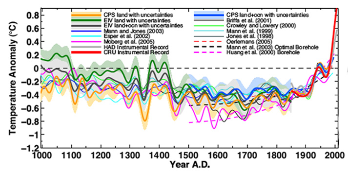
And for the entire Earth:
Here are sea levels for the last 3000 years:
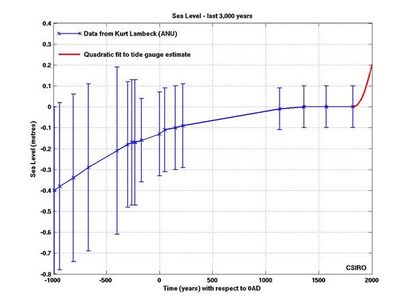
Ninety percent of the total increase in heat content at the Earth's surface goes into the oceans, so that any significant increase in that heat content should be reflected in rising sea levels due to thermal expansion in addition to ice melt.
And speaking of ice melt:

No measure of historical temperatures or proxies of heat content show the linear increase over the last thousand, or the last 250 years that is required by your theory. So, even allowing my error in criticizing you on the orbital mechanics, your theory stands refuted by empirical evidence. (As I said before, this is the crux of the issue.)
- Medieval Warm Period was warmer
DSL at 23:57 PM on 22 October, 2014bvangerven--
1. "The earth is now definitely cooler than during the Roman Warm Period"
It's fairly clear from global Marcott et al. 2013 that the Roman Warming Period was not globally warmer than the present.
2. "There are passes in the Alps that the Romans used, today they are covered in ice. The tree line was hundreds of meters higher 3000 years ago, we still find remnants of trees under glaciers."
Note regional Marcott. The Northern hemisphere (north of 30) was likely warmer than present (though Marcott's uncertainty for 20th c. temps is large). It may be that the Alps were responding to a greater forcing during the RWP. How about the rest of the globe? Take a look at Funder et al. 2011 and see if the RWP is noticeable (note that Funder ends in 2000).
Regardless, what's the point? Even if the RWP were warmer than present, what would it mean, other than the possibility that climate sensitivty is greater than the current mainstream range? If the RWP was warmer, does it mean that global warming is going to stop?
- The Wall Street Journal downplays global warming risks once again
KR at 03:45 AM on 27 September, 2014JoeT - Thank you, that explains much about Koonin's statements.
Koonin expressing anthropogenic forcings as "1 to 2%" of insolation is akin to graphing the 0.9C warming over the last 150-200 years as Kelvin degrees with a baseline of oK - which has been done by denialists multiple times, appallingly enough. See Denial Depot for a rather amusing explanation of how this is done. He might as well have characterized the height difference between basketball player Yao Ming and a lawn gnome using a percentage of the height of the Empire State building.
In doing so Koomin is rather deceptively minimizing the extent of the changes, which at this time have increased temperatures to or beyond the peak value at any time in the Holocene, at any time during human civilization (Marcott et al 2013) - with more unrealized warming to come. That's a more realistic scale, one that more clearly describes how these changes will affect us.
- The 97% v the 3% – just how much global warming are humans causing?
MA Rodger at 21:25 PM on 23 September, 2014The zig-zagging that jwalsh continues to practice down this thread would be enough to provide an honest man with symptoms of psychiactric disorder. I am particularly impressed with his insistance that there is a significant 1200-year wobble in global climate. Thus @94 we are told:-
"That the climate has varied wildly in the past is not "out of left field". It is considered to be more established scientific fact than most IPCC statements. The Minoan, Roman, and Medieval warm periods occurred at roughly 1200 year intervals" and on this ground it is not silly to argue that "
While I assume this "established scientific fact" extends only to a significant wobble and not to a wild wobble, I was of the understanding that such "established scientific fact" would comprise some considerable evidential basis. Yet such a basis remains absent. jwalsh instead presents here argument after argument defending his thesis by asserting that the evidence which dis-establishes any 1200-year wobble is not admissible.
Marcott et al (2013), the place were such a wobble would surely feature is dismissed with an in-thread comment from Gavin Schmidt (although the comment was actually to do with MWP/modern comparisons, thus not entirely of relevance to 1200-year wobble detection).
We are emphatically assured @86 that there is other evidence but it is never advanced.
"Evidence of the Minoan, Roman, and Medieval warm periods from either historical records and other proxies? Hell yes."
Now, here's the thing. Both these quotes that together demonstrate a determined promotion by jwalsh of this alleged 1200-year wobble sit juxaposed to comment on Greenland ice core temperature reconstructions, things like Kobashi et al (2011) whose 4,000 temperature reconstruction from their Figure 1 is here. (Note the "Current Temperature Line" is the decadal temperature 2001-10. In a graph of the last 120-year reconstruction also within the full Figure 1, the paper puts the comparable annual temperature AD2010 at -27.3ºC.)

The reconstruction shows some pretty wild swings. But are there any wild 1200-year swings? Are there any significant 1200-year swings? Perhaps with his incomparable analytical skills jwalsh can help us out here, coz I see is a 4,000-year falling trend of 0.05ºC/century (which recent temperatures have already reversed within a single century) and a lot of wobbling but I do not see any wild or significant 1200-year wobble anywhere.
- The 97% v the 3% – just how much global warming are humans causing?
Tom Curtis at 15:14 PM on 23 September, 2014jwalsh @101:
"Taking an average as was done is of limited scientific utility. The criticism of picking one proxy over another is a valid one. I mentioned that as an issue straight away. Here's why it isn't that useful. They vary too much to do that. Say I give two people a tape measure to go measure an object, and one comes back and says it's 2.25 metres, and the second says 4.60 metres. If I actually need to know, would I take the average and proceed? No. I would know that one, or both measurements is flat-out wrong. The same is the case with data like the multi-proxies. You know one or more "must" be wrong"
Actually, with multiple proxies you do not know that any of them are wrong. What you know is that they are all regional proxies, and that regional temperatures differ from each other over time. You also know that the Global Mean Surface Temperature is the mean of all the regional temperatures across the globe.
So, the correct analogy is, suppose you send one person out to measure the height of a random individual in the city, and they tell you the height was 1.68 meters. Do you now know the average adult height? No. Suppose you send out eight people and they return with measured heights of 1.68, 1.82, 1.59, 1.76, 1.72, 1.64, 1.81, and 1.73. Do you now know that at least seven of them are wrong? Absolutely not. Do you now know that the average height is 1.719. No. But you do know that it is a much better estimate than the estimate from a single sample.
And if you take the mean of 73 samples (as with Marcott et al, without the bells and whistles), you know the result better still.
- The 97% v the 3% – just how much global warming are humans causing?
jwalsh at 14:48 PM on 23 September, 2014Tom Curtis @99
1) I criticized you for using a regional proxy (GISP2) as though it were a global proxy. You implied your use was justified on the basis that tropical ice cores did not exist "they don't last so long". You now claim that you knew about them all along, which makes your original use of GISP2 simply dishonest.
The ice at closer to the equators is much, much rarer, and incidentally only exists at extreme altitudes. Similar criticisms to regional differences apply really. However, in signal quality the arctic and antarctic cores provide much less noisy data. I honestly can't look at your 6-core data and say there was, or was not a Minoan, Roman, or MWP. It just is simply too noisy. Anyone making that claim (and the authors did not) would find it difficult to defend. Not believing in the above periods of warmth is certainly an opinion. I don't share it, and I am hardly alone. Maybe there wasn't. So the reason for the clear Greenland curves is?
We could discuss the Marcott paper all day long. But the simple fact is, it is based on very low resolution data. It is going to be significantly "smoother" by method. Useful to discuss on a centennial scale, maybe, but not decadal. Whereas ALL of the GISP2 data is high resolution. And Greenland temperatures correlate well enough today to global. To endorse the Marcott paper as telling us useful information on the LIA and MWP is not something I, and G. Schmidt it would seem, would do, for those reasons. And how is Gavin Schmidt's thoughts on using the Marcott paper for that reason "out of context"? I can't think of a way for it to be more in context.
I criticized you for (in effect) taking the average of just one proxy as an indicator of changes in global mean surface temperature. You now respond by arguing that taking the average of eight such proxies is of dubious "scientific utility" and that it is a premise that is itself " itself is too absurd to bother" checking the maths.
Taking an average as was done is of limited scientific utility. The criticism of picking one proxy over another is a valid one. I mentioned that as an issue straight away. Here's why it isn't that useful. They vary too much to do that. Say I give two people a tape measure to go measure an object, and one comes back and says it's 2.25 metres, and the second says 4.60 metres. If I actually need to know, would I take the average and proceed? No. I would know that one, or both measurements is flat-out wrong. The same is the case with data like the multi-proxies. You know one or more "must" be wrong. So you dig in a little bit to try and figure out which. Or you throw the whole mess out and start over. The use of proxies like tree-rings and such and whether they are truly accurate enough is a point of contention. There is also the issue that they yield lower resolution data.
- The 97% v the 3% – just how much global warming are humans causing?
Tom Curtis at 13:47 PM on 23 September, 2014jwalsh @95:
1) I criticized you for using a regional proxy (GISP2) as though it were a global proxy. You implied your use was justified on the basis that tropical ice cores did not exist "they don't last so long". You now claim that you knew about them all along, which makes your original use of GISP2 simply dishonest.
2) I do not discuss the MWP or LIA with reference to those ice cores. Rather, I discuss the absense of evidence of evidence for a RWP or Minoan WP, which you claimed exist on the basis of GISP2. Clearly from the ice core data they were not global events - and changing the topic does not make them so.
3) From Marcott et al, we learn:
"The results suggest that at longer periods, more variability is preserved, with essentially no variability preserved at periods shorter than 300 years, ~50% preserved at 1000-year periods, and nearly all of the variability preserved for periods longer than 2000 years (figs. S17 and S18)."
If approx 50% of variability is preserved at 1000-year periods, >50% of a 1,200 year cycle would show up in the reconstruction. It is, however, not there. No amount of quoting Gavin Schmidt out of context will change that.
4) I criticized you for (in effect) taking the average of just one proxy as an indicator of changes in global mean surface temperature. You now respond by arguing that taking the average of eight such proxies is of dubious "scientific utility" and that it is a premise that is itself " itself is too absurd to bother" checking the maths. That you so argue in order to maintain that the data from the once proxy is a reliable guide to the timing and direction of trends in GMST (if not their magnitude) shows how absurd your position is, and how completely lacking in scientific merit.
As an aside, I did not credit the graph to wikipedia regardless of your misrepresentation. I sourced from wikipedia, and acknowledged the source as is required by copyright law (as they wave their copyright on condition that you credit the source). However, I cited Robert Rhode, the author of the graph. That you ignore that to play your empty rhetorical games is only to be expected from a troll.
- The 97% v the 3% – just how much global warming are humans causing?
jwalsh at 12:59 PM on 23 September, 2014Tom Curtis @92
It goes tiresome correcting the errors, lack of evidence and outright falsehoods on which you base your "expert opinion". Never-the-less, here are the results of six near equatorial ice cores from high altitudes:
Then don't? You made the choice to reply to me at all or not. But if it's your job to do so, there are worse things to be doing, and every job can get tiresome at times. The six ice-cores mentioned come from Lonnie Thompson's paper. Interestingly, it's referenced as often by those wishing to show evidence of a LIA and MWP as often as it is to try to show a lack of both. Most that have looked at that the data have deemed it too noisy to say anything about either, which allows people to interpret it however they like. It's also trotted out as corroboration of a particular set of reconstructions, that seem to be moderated if mentioned, or critiqued in any way. I mentioned that I didn't want to delve too deeply into paleo reconstructions for the same reason. The existence or not of the LIA/WMP is a point of contention. Due to inconvenience, there are many trying to suggest that they were only European, or Northern Hemisphere, or didn't happen at all... etc. etc. There is evidence that both were global. And there is evidence that it wasn't. Part of the problem is that most studying it over the years seem to do so in the north. The NCDC of NOAA thinks the Greenland, Antarctic and other Arctic cores suggets both well enough. I wish we truly did have a great source of data spanning the globe and time with high precision.
As for Marcott 2013? I think Gavin Schmidt summed it up well.
http://www.realclimate.org/index.php/archives/2013/03/response-by-marcott-et-al/
"This is not the paper you should be interested in to discuss the details of medieval/modern differences. Given the resolution and smoothing implied by the age model uncertainties, you are only going to get an approximation."
And the vaunted academic source for all things climate "Wikipedia" (does Wm. Connolly still babysit it like a hawk on methamphetamines?) .... Hmmm. Not sure what the scientific utility is of averaging multi-proxy studies together. It gives rise to interesting features though. Such as it being cooler in 2004 than it was 8,000 years ago. I'd check the math myself, but the premise itself is too absurd to bother.
However, back to attribution. Nothing to say about the IPCC experts on attribution downshifting estimates of future temperatures, setting aside temperatures at the mean or above from climate model projections as being unlikely? That would seem to be pretty relevant.
- The 97% v the 3% – just how much global warming are humans causing?
Tom Curtis at 07:38 AM on 23 September, 2014jwalsh @86:
"Yes, there's a tricky limitation with ice cores. The ones at the equator don't last nearly as long. I didn't say they were a perfect match to NH temps (or global). Evidence that the Greenland temperature swings were localized for some reason? None provided. Evidence of the Minoan, Roman, and Medieval warm periods from either historical records and other proxies? Hell yes. But sure, might not be as extreme in swing. Do you have a good explanation for the approximately 1200 year cycles?"
It goes tiresome correcting the errors, lack of evidence and outright falsehoods on which you base your "expert opinion". Never-the-less, here are the results of six near equatorial ice cores from high altitudes:

Here are three of the tropical or subtropical icecores along with three polar icecores:

And here the equivalent ice core (in blue, dO18) from Mount Kilimanjaro, which at 3 degrees, 3.5 minutes south, I think counts as being "at the equator":

You will notice that only Sajama has, what might be considered to be, your 1,200 year cycles. You will further notice the distinct hockey stick in the 6 ice core composite.
Further, I refer you again to the Marcott et al (2013) reconstruction of holocene temperatures, as displayed above along with eight temperature proxies and their arithmetic mean as constructed by Robert Rohde for wikipedia:

Again, the Roman Warm Period and the Minoan Warm Period, not to mention the 1,200 year cycles are only present in GISP2, and is distinctly not present in the global reconstructions.
The RWP and MWP are distinctly North Atlantic phenomenon, and have significant impact over European temperatures. That they do not have any discernible impact on global temperatures is a spear in the side of any theory that modulation of North Atlantic Temperatures is a significant, let alone a major cause of variance in global temperatures.
So:
"Evidence that the Greenland temperature swings were localized for some reason? None provided."
Evidence the sky is blue? None provided either, and none needed because it is assumed to be well known by anyone well informed on the topic as you claim to be.
"Evidence of the Minoan, Roman, and Medieval warm periods from either historical records and other proxies? Hell yes."
But exclusively restricted to NA (and immediately neigbouring land) proxies showing beyond doubt that they are regional, not global variations in temperature. As we are discussing impacts on global temperatures, your introduction of a known regional temperature proxy with poor correlation with other regional temperature proxies counts as a red herring at best - and is either proof that you are not well informed on the topic, or that you are intent on deception (if you are indeed well informed).
- The 97% v the 3% – just how much global warming are humans causing?
Tom Curtis at 23:07 PM on 19 September, 2014jwalsh @63, like MA Rodger, I am curious as to which longer term trend you have found in the Paleostudies. The Paleostudies I am aware of show virtually no trend between 1730 and the commencement of the (GISS) instrumental period in 1880:
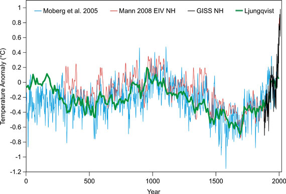
The overall NH temperature trend over that period amounts to 0.003 C per decade. It is likely that the global trend is less. Assuming that global trend is the same, and that it represents a natural cycle of internal variability rather than a consequence of forcing (which is already accounted for) gives a 0.018 C of 0.65 C temperature increase over 2.7% of the 1951-2010 warming. Both assumptions (ie, that global temperatures increased at the same rate, and that the increase is a consequence of internal variability rather than forcing) stretch credulity.
I suspect you want to include the period from the greatest temperature resonse associated with the maunder minimum (approx 1700). That, however, sill only gives a NH trend of 0.018 C per decade, for a total 1951-2010 warming of 0.11 C, or 16.8% of warming. Further, the trough in temperatures at 1700 is known to be a forced response both to solar variations (from sun spots) and especially to the volcanic record. Both factors are already included in the IPCC attribution, such that counting them again would be double dipping.
The data in that image can be discussed here.
All of this furhter begs the point as to why the long term cooling trend visible in the paleo record only (slightly) reversed itself in the early eighteenth century, ie, after the invention of the steam engine and the widespread use of coal for domestic heating:

- An externally-valid approach to consensus messaging
MA Rodger at 21:09 PM on 22 June, 2014likeitnot (presently)@16 wishes to see "a clear correlation between the beginning of human CO2 emissions and evidence of warming" as proof that AGW is real, as the basis for such a "belief." Interestingly, such a 'clear correlation' can be discerned even though CO2 is not the sole agent of AGW.
Scripps Institute present an excellent graphic of CO2 levels for various time intervsals. This shows the present CO2 increases can be traced back to the early 1800s.
It then just requires a short trip to the UN IPCC AR5 WG1 report to examine Figure 5.7 and note that the start of the present trend in rising temperatures also began in the early 1800s. Further, the recent rising temperature trend is not just unique in scale over the last millenium or two, but also unique over the entire Holocene era.
I would consider that to be pretty clear.
- We're coming out of the Little Ice Age
Tom Curtis at 07:25 AM on 7 February, 2014TD47 @63, the poster uses just three temperature poxies for the holocene. Two (Agassiz/Renland and GISP2, ie, Alley et al, 2000) are from the north Atlantic region. The former is a composite of four ice cores from the Agassize Ice Cap on Ellesmere Island (just west of the northern end of Greenland) and one ice core from Renland (on the south east coast of Greenland, more or less north of Iceland). They represent the regional signal, therefore, of just one region on Earth, and one of the most variable temperature wise. The author mis-cites the source of the Agassiz/Renland data as Vinther et al (2009), whereas it is in fact Vinther et al (2008).
The third core is the Vostock core from Petit et al (2001). That means all three cores are from polar regions, and exhibit polar amplification. They are therefore not representative of global temperatures. In addition, they represent just two regions, and consequently show the typically large regional fluctuations in temperature which cancel out when averaged across the globe. As a result, they significantly overstate temperature change when compared to global figures.
To compound this problem, there are two errors in the presentation of the proxies. First (unsurprisingly), the GISP2 data is plotted to end in 1905 (determined by pixel count). In fact it terminated in 1855, as discussed here. You should note that Richard Alley has confirmed that the that 1855 is the correct termination of the data. More troubling is the extended, uniform plateau at the end of the Vostok period. Checking the data, I find the last data point is for a gas age of 724 BP (=774 B2K), or 1226 AD. The extended plateau at the end of the data shown in the poster must be samples taken from the firn, ie, the upper region of the ice core where pressure has not yet sealed air gaps, allowing free exhange with the atmosphere. The consequence is that it represents an average temperature over the last few centuries rather than modern temperatures, and completely conceals all variation over that period. Coupling these facts with the fact that the final data point for the Agassiz/Renland composite core is 1960, and there are no proxy data points that actually show recent temperatures.
These flaws (regional, polar amplified proxies PLUS incorrect terminations of ice cores with no modern, regional comparisons) tend to reinforce Andy May's false claim that "...we have not seen unusual warming in the present warm period, relative to other warming events in the last 18,000 years...". In fact recent warming is unusual relative to the past 18,000 years, as is shown by Marcott et al (see second link by the moderator); and may be unprecedented in that period.
I also note that May has relied on the very obsolete, and obvsiously schematic temperature reconstruction by Scotese rather than an actual, modern reconstruction of temperatures over the Phanerozoic, such as this one by Dana Royer:
The preference May shows for obsolete data, inaccurately presented suggests the poster is of dubious value as an information source.
- Real Skepticism About the New Marcott 'Hockey Stick'
Tom Curtis at 08:16 AM on 29 January, 2014Joe T @100, you have picked up on one of the most interesting and innovative features of Marcott's reconstruction. Instead of just making a central estimate of the temperature, and showing error bars, they varied the data based on the error margins of the original proxies. By doing this, they get statistical data on all the ways that the reconstruction could be wrong. From among all those variations, only 18% of ten year intervals are warmer than 2000-2009. Allowing for some inherent smoothing in the method, that becomes 28%. That does not mean that there were any decades warmer than 2000-2009 in the Holocene. The actual temperature record will approximate to one of their statistical variations of the data, their "realizations". It is, however, as likely to be a cold realization as a warm one. Because reconstructions can be wrong by being to warm, or to cold, with equal probability, the mean does not vary as much as the realizations can, and does not show the potential warmest years.
This explanation will be easier to understand if you actually see the realizations plotted with the mean:

The idea is that current temperatures, while much higher than the mean (black line), are not higher than about the warmest of the realizations in for any given decade about 18% of the time.
The net effect from this can be seen in Marcott's Fig 3:

The 2000-2009 temperatures, with an anomaly of about 0.4 C lies in the upper end of the distribution of realizaitons (solid black curve). These can then be compared with the expected temperatures from various IPCC AR4 scenarios. (The coloured curves represent alternative means of reconstruction, and can be ignored for this discussion.)
- Real Skepticism About the New Marcott 'Hockey Stick'
JoeT at 03:49 AM on 29 January, 2014Sorry to break into the discussion. I have a fairly simple question that I'm hoping someone can straighten out for me. I just read the Marcott paper for the first time. If I look at Figure 2 of the original post or figure 1b of the Marcott paper, it looks to me like the peak of the instrumental temperature data is higher than the previous 11,300 years, even including the 1 sigma uncertainty. How do I reconcile that with the statement in the abstract that, "Current global temperatures of the past decade have not yet exceeded peak interglacial values but are warmer than during ~75% of the Holocene temerpature history." What am I missing?
- It's cooling
KR at 13:27 PM on 27 January, 2014tkman0 - It's global. Here's a video demonstrating that. And here's Marcott et al 2013, who show that recent climate changes are unprecedented in the Holocene despite any possible Bond events.
I would suggest giving him a link to the Most Used Myths, and having him tell you what doesn't answer his questions and hypotheses. If he has to keep changing his argument he didn't have a solid one to start with.
- 2014 SkS Weekly Digest #3
Tom Curtis at 14:12 PM on 21 January, 2014Poster:
1) Steve Goddard shows that there is a temperature difference between USHCN v1 and USHCN v2. As both use essentiall the same raw dataset, it follows that the difference is due to come change in adjustments. Steve Goddard then asserts an explanation for the change in adjustments, ie, fraud. He did not survey the literature on the subject. He did not itemize the differences in adjustments between the two. He did not examine the difference between raw and adjusted records at sample sites to identify the reason for the difference. In fact, he presented no evidence whatsoever in support of his hypothesis beyond the original fact it was intended to explain.
As a PhD scientist, you therefore know that he has not supported his opinion in any relevant way. So why are you presenting his opinion as interesting? And given that he has not supported his opinion, pointing out that he has a history of unsupported and ridiculous hypotheses is a relevant rebutal. There is no need to rebut his detailed arguments because he has not made any.2) I find Steve McIntyre's article interesting, in that I once raised with him the issue as to why his "audit" of climate science was so one sided. Why he audited Mann, and Jones, and Briffa, and Marcott etc in such obsessive detail, but never bothered auditing the Salby's, the Morner's, the Easterbrooks, etc. His reponse was that he only auditted things that were likely to make it into the IPCC. His article on Turney, therefore interests me in that it gives the lie to his excuse. Or do you claim that the trapping of the Akademik Shokalskiy in ice is likely to merit a paragraph in the next IPCC report?
- Hockey sticks to huge methane burps: Five papers that shaped climate science in 2013
KR at 02:48 AM on 17 January, 2014Hank_Stoney - I suspect because, in part, there is considerable confusion between resolution and detection - a confusion I have encountered more than once in the realm of signal processing.
A band-limit of 300 years, as per the Marcott et al analysis, means that their methodology won't be able to resolve or separate discrete events (warming or cooling) less than perhaps 600 years apart, as they would be blurred together. Detecting that something happened, however, is another story entirely. You can look through a telescope at a distant pulsar or supernova, sized far below the resolution of your telescope - and yet detect it as a bright spot that clearly tells you that something is present. In much the same fashion the 'unicorn spike' so beloved of the 'skeptics' would add 0.9*100 or 90 Cyr to the Marcott data, and even the blurring of the Marcott processing would still show this as a clearly detectable bump in the mean.
You don't need to resolve something to detect it.
I agree, it's important to distinguish between peer-reviewed science and unfiltered (so to speak) opinions on blogs. Which is but one reason I found your description of the blog based discussion of 'unicorns' as a dust-up a bit odd; that seems to be giving more credence to blogged objections than to the replies.
- Hockey sticks to huge methane burps: Five papers that shaped climate science in 2013
Hank_Stoney at 14:02 PM on 16 January, 2014@KR - Fair enough but then why did Marcott et al not explicitly state this? Even after having been given the opportunity to respond to this issue in the FAQ, they chosenot to make such a claim. Given the significance of such a result, I'd like to think they would have made their case if it were at all justified.
So I reiterate: in order to avoid confusion when discussing this (or any other) study, I personally think that it would be wise to carefully distinguish between the actual peer-reviewed conclusions that the authors intended and those inferred and written about in the blogosphere after the fact by those such as Tamino and yourself, in this instance.
In any case, the Marcott et al paper was a great contribution to paleoclimate studies from last year and certainly deserves mention in this post.
- Real Skepticism About the New Marcott 'Hockey Stick'
Tom Curtis at 09:22 AM on 16 January, 2014KR @97, thankyou for analyzing the doubly perturbed case. Fairly clearly, I was correct that the additional perturbation would further smooth the spike, but you were correct that it would not smooth it sufficiently to make it indistiguishable within the Marcott reconstruction. Indeed, my estimate @72 of the likely magnitude of the effect of that additional smoothing is shown to have overstated the effect.
Comparison with the Marcott reconstruction shows the largest hillock in that reconstruction to be just 0.8 C (around 5 kya), ie, about 1/3rd of the magnitude produced by smoothing the "unicorn spike" of 0.9 C. Assuming the effect scales linearly, that suggests "unicorn spikes" do not exceed 0.3 C if they exist at all in the Holocene.
- Real Skepticism About the New Marcott 'Hockey Stick'
KR at 10:57 AM on 14 January, 2014Tom Curtis - As I understand your argument, you feel that the first randomization of the proxies, that of errors in actual age, is added to the filtering performed by the Marcot et al analysis. A reasonable point (if I am interpreting it correctly), which would argue that the impact of a 'unicorn spike' would be smoothed twice by those date/temperature errors - the sampling, time jittering, and temperature uncertainties reducing such a spike prior to the Marcott processing.
Let's test it, with the math. Here is the result of a spike Fourier filtered with the Marcott et al gain function both once and twice:
Once and twice Marcott filtered spike
The original spike has a height of 0.9C, with a full-width half max (FWHM) of 100 years. That spike filtered by the Marcott et al analysis has a height of 0.3C, with a FWHM of 280 years. Filtering twice, however, the effect of randomizing time and temperature uncertainties both on acquisition and on Monte Carlo, results in a remaining peak of height 0.23C, with a FWHM of 360 years - significantly less change. Once the highest frequencies have been reduced, repeating the filtering with the Marcott gain function has less of an effect on the remainder. This is a 0.23C peak in the mean line, not in individual realizations, mind you, and no such spike appears in the Marcott data.
I feel that we do indeed have sufficient information from Marcott to show that such 'unicorns' with very high certainty do not exist. This is why I like to do the math, run the numbers, to see if intuition matches the data.
[Note: I find your statement "I consider his insistence on seeing the math as bluster" both insulting and nonsense. I gave what I consider a clear explanation of my calculations and the results. From the discussion those are quite clearly non-intuitive; hence my insistence on math rather than intuition to test said results. "Bluster" and incredulity are the province of spoken/written language, not of computation.]
- Real Skepticism About the New Marcott 'Hockey Stick'
Tom Curtis at 23:23 PM on 13 January, 2014Michael Sweet @95, it is likely that the realization with that single spike I drew attention to lies near the mean either shortly before or after the spike, giving it an amplitude of 0.7 C, large enough to be a candidate "unicorn spike". Potentially it is even larger. Of course, we do not know that that is the case. But nor do we know that the realization in question had values above the mean for several centuries before or after the visible spike.
With respect to your MWP analogy, here are two of the Marcott proxies and their mean over the period 7950-8990 BP:

Clearly both show temperature fluctuations significantly greater than 1 C over periods of a centurly or less. GISP2 likewise shows very large short term temperature fluctuations, although it was not used by Marcot.
However, your assumption of the existence of proxies which show excursions higher than the actual signal is not warranted. Most of Marcott et al's proxies have a low resolution. So much so that the mean resolution of all 73 proxies is 160 years, despite the existence of several annually resolved proxies. Marcott et al made the reconstruction by taking the existing values of the proxies, and linearly interpolating them into 20 year bins. Such linearly interpolated will not show the full spike. Using the mean resolution, even if by chance (1 in 10) one data point happens to coincide with the peak of a "unicorn spike", the proxy will show a peak of the same magnitude, but with a 320 year period rather than a 200 year period. Most proxies will show much smaller peaks, with half showing peak magnitudes 50% or less of the "unicorn spike" magnitude. This graph gives an idea of the effect:
Note, I have used a small number of proxies, all but one of which show 50% or greater magnitude the "unicorn spike". Consequently the "reconstruction" shows a much greater magnitude (less smoothing) then a full array of 73 proxies would show. Further the initial random temporal displacement due to dating error, plus the temporal displacement from the monte carlo reconstruction will further reduce the magnitude of the reconstruction.
The important point here, however, is that the areas of above average temperatures during a "unicorn spike" need not coincide with regions that provided high resolution proxies; so a "unicorn spike" can exist and have no proxies showing temperatures greater than the peak temperature of the spike.
Finally, I do not claim that high local spikes in fact exist. I suspect, in fact, that they do not. What I claim is that nobody has shown we have sufficient information from Marcott et al to show they do not exist. Given that Marcott et al certainly do not claim they have shown they do not exist, and caution against claiming that they do not exist; anybody wanting to claim otherwise requires a very rigorous proof. Both Tamino and KR have neglected an essential aspect of that proof (using their respective methods), which is a shame because in other respects their approaches are both interesting and informative.
- Real Skepticism About the New Marcott 'Hockey Stick'
Tom Curtis at 11:14 AM on 13 January, 2014Michael Sweet @91, here are Marcott's reconstruction plus all thousand "realizations" created by perturbing the proxies:
If you look at about 5.8 kyr BP, you will see a purple spike that rises about 0.2 C above the mass of realizations, and about 0.7 C above the mean. It is certainly possible that this is a "unicorn spike" similar to, of slightly smaller in magnitude to those of which KR speaks. It is impossible to tell for sure, as once the realization falls back into the mass, it is impossible to track. All that spike, and similar spikes above and below the mass, show is that very rapid changes in global temperature are possible given the Marcott data. It does not show the potential magnitude of such changes, nor their potential duration, other than that the magnitude cannot be greater than about 1.2 C (the width of the mass of realizations).
One thing the individual spikes do not show is that their is a reasonable probability of such spikes above the mass. Given that there are 1000 realizations, over circa 10,000 years of relatively stable temperatures, those few visible spikes are significantly less than 5% of occurences. Whether or not there are high magnitude spikes, we can be reasonably certain global temperatures over the last 12 thousand years are constrained within the mass of realizations except on the shortest of time scales.
The one thing that is required to close the argument is an analysis of all 100 year trends within all one thousand realizations to determine what percentage have a 100 year trend close to 0.1 C per decade. I in fact requested the data on his realizations from Marcott at the original time of those discussions, but he replied that he was too busy at the time, and I have not renewed the request.
Finally, with regard to KR's response to you @92, clearly we disagree about what is at issue (100 year trends, vs unicorn spikes). I also disagree with his characterization of my position. I am not arguing that such high 100 year trends are possible, given Marcott; but only that it has not yet been shown that they are not possible given Marcott. Finally, I consider his insistence on seeing the math as bluster. My argument is that he has not shown me the relevant math to support his position. The relevance of the maths he has shown can be shown without bringing in more maths.
- Real Skepticism About the New Marcott 'Hockey Stick'
Tom Curtis at 10:27 AM on 13 January, 2014KR @90, I believe that you have misinterpreted the quoted passage. Following the passage through in detail, we see that:
1) They generate 73 identical pseudo proxies;
2) Each proxy is perturbed 100 times to generate 100 pseudo-proxy stacks;
3) The power spectra of the stacks is examined, and compared to the power spectra of the white noise proxies to determine the resolution of the technique.
Now, by your interpretation, the generation of the 100 pseudo-proxies for each proxy perturbation of the signal by error in the proxies. In that case, however, there is no additional step corresponding to the monte carlo method using 1000 pseudo-proxy stacks generated by perturbing the actual proxies. On that interpretation, it follows that Marcott et al never got around to testing the resolution of their procedure.
Alternatively, the 100 perturbations are the analog of the perturbations of the proxies in the full Marcott proceedure. On that interpretation, however, the test of resolution starts with 73 identical proxies. That differs from the real life situation where regional proxies will vary due to regional differences (the result of which being that limited proxy numbers can enhance variability in the record); and in which proxies records contain noise, both with regard to dating and signal strength, both of which tend to smooth the record.
That is, either my criticism is valid (on my interpretation of the quote), or the test does not even test the effect of Marcott's proceedure on resolution (on yours).
While discussing your method, I will further note that the original issue was whether or not, consistent with Marcott's reconstruction, there could have been periods of 100 years or more with global temperature trends equivalent to those over the twentieth century (0.1 C per decade). There is no basis to assume that such trends would be part of a single spike. They could have been part of a rise to a plateau, or a short sine pulse (ie, a spike followed by a trough of similar magnitude and duration). Therefore your test, although based on Marcott's estimate of resolution, does not properly test the original hypothesis, but only a subset of instances of that hypothesis.
I have more to add in direct response to Michael Sweet, but that response may be delayed untill this afternoon (about 5 hours).
- Real Skepticism About the New Marcott 'Hockey Stick'
KR at 10:25 AM on 13 January, 2014michael sweet - As the Marcott et al authors themselves stated, their Monte Carlo method, including perturbation of proxy dating and temperature value, will blur high frequency (fast) changes. With a cut-off around 300 years, a signal that varied at <300 years won't come through at all.
However, a single unphysical 0.9Cx200yr 'unicorn' spike such as hypothesized by skeptics is a complex signal, from the 0.9x100yr addition to the average, to the very fast changes at the inflection points of the spike - and much of the <300yr signal survives the Marcott processing leaving a diminished but noticeable 600yr peak. Tom Curtis and I disagree on the possibility of Marcott style processing being able to detect such a short spike - but the frequency space math I've run, as well as Tamino's Monte Carlo tests, indicate that it shows clearly. A point that I will insist upon until I see math indicating otherwise.
- Real Skepticism About the New Marcott 'Hockey Stick'
KR at 08:34 AM on 13 January, 2014Tom Curtis - "...neither Tamino nor your tests allow for the innate smoothing implicit in any reconstruction from the fact that the measured age of each proxy will differ from the actual age of the proxy by some random amount"
I would wholly disagree, as they tested that effect as well. From the Marcott et al supplemental:
We modeled each of the 73 proxy records as an identical annually-resolved white noise time series spanning the Holocene (i.e., the true signal), and then subsampled each synthetic record at 120-year resolution (the median of the proxy records) and perturbed it according to the temperature and age model uncertainties of the proxy record it represents in 100 Monte Carlo simulations. (emphasis added)
As they stated, their 'white-noise' test explicitly includes the random uncertainties in proxy age you are concerned with. As per the prior discussion on this thread, I feel that their frequency response fully characterizes the effects of their analysis, and that correspondingly a 200-year duration 0.9C spike would be reduced and blurred by a factor of roughly three - leaving a signal that would be clearly visible in the Marcott reconstruction. Tamino found results consistent with mine by performing the Monte Carlo analysis himself, which again indicates that a 'spike' of that nature would be visible in the Marcott analysis - evidence that such a spike did not in fact occur.
For such a signal to be missed, for the frequency response to have far less of a high frequency response, would require that Marcott et al significantly underestimated proxy age uncertainties - that they mischaracterized their proxies. I believe the burden of proof for such a claim would rest with the claimant.
As to my characterization of such spikes, I consider them fantastical unicorns because there has been _no_ postulation of _any_ physically plausible mechanism for such a short-lived global temperature excursion. It is my personal opinion that at least some of the emphasis on 'spikes' (such as the many many posts on the subject at WUWT, ClimateAudit, and the like) has been for the purpose of rhetorically downplaying the Marcott et al paper and its evidence of the unusual nature of current climate change, an extended claim of it's not us. I would take the entire matter far more seriously if there was _any_ physical possibility involved.
- Hockey sticks to huge methane burps: Five papers that shaped climate science in 2013
Tom Curtis at 14:10 PM on 12 January, 2014KR @19, as I contributed in a small way to the 'dust-up', I should probably feel insulted that you have included me among the 'skeptics'. As I have noted elsewhere, neither Tamino nor your tests allow for the innate smoothing implicit in any reconstruction from the fact that the measured age of each proxy will differ from the actual age of the proxy by some random amount. I have discussed this in detail here, where interested readers can find your response, and my response to your response. My argument was, of course, not that the Marcott et al algorithm would not show rapid changes in temperature occuring over a short period, but that neither you nor Tamino had shown that it would.
- Hockey sticks to huge methane burps: Five papers that shaped climate science in 2013
KR at 16:04 PM on 11 January, 2014Hank_Stoney - Regarding Marcott et al 2013, Tamino tested a theoretic 0.9 spike (100 years up, 100 years down) against their Monte Carlo testing, and found they were clearly visible in the resulting analysis. I personally repeated that with a separate technique, using the frequency transform Marcott et al described in their supplemental data, and found that such a spike would leave a 0.2-0.3C spike in the final data.
No such spike appears anywhere in the Holocene data Marcott et al analyzed. And that doesn't even include the physics indicating a CO2-driven spike of the kind we are currently experiencing cannot just vanish over 100 years - rather, 1-10Ky would be required (Archer et al 2008); there is just no physical mechanism for such a spike.
The entire 'dust-up' you mention arose from fantasy hypotheticals created by 'skeptics', hypotheticals which simply do not hold up under analysis. Hypotheticals, I'll note, which are certainly not peer-reviewed...
- Hockey sticks to huge methane burps: Five papers that shaped climate science in 2013
Hank_Stoney at 15:10 PM on 11 January, 2014Not trying to be make any waves but wasn't there a big dust-up at the time of publication regarding statements similar to the following (quoted from above):
1. What hockey stick graphs tell us about recent climate change
. . . Shaun Marcott and colleagues showed global temperature rose faster in the past century than it has since the end of the last ice age, more than 11,000 years ago. . .
And the actual language in the paper that was expanded upon in the FAQ at realclimate.org (my emphasis):
Q: Is the rate of global temperature rise over the last 100 years faster than at any time during the past 11,300 years?
A: Our study did not directly address this question because the paleotemperature records used in our study have a temporal resolution of ~120 years on average, which precludes us from examining variations in rates of change occurring within a century. Other factors also contribute to smoothing the proxy temperature signals contained in many of the records we used, such as organisms burrowing through deep-sea mud, and chronological uncertainties in the proxy records that tend to smooth the signals when compositing them into a globally averaged reconstruction. We showed that no temperature variability is preserved in our reconstruction at cycles shorter than 300 years, 50% is preserved at 1000-year time scales, and nearly all is preserved at 2000-year periods and longer. Our Monte-Carlo analysis accounts for these sources of uncertainty to yield a robust (albeit smoothed) global record. Any small “upticks” or “downticks” in temperature that last less than several hundred years in our compilation of paleoclimate data are probably not robust, as stated in the paper. (link)
In my mind, that's a pretty clear contradiction. Maybe others disagree?
If not, I think we should offer proper caveats about the results of the study rather than open ourselves up to such easy criticisms.
Just my $.02.
P.S. I know that Tamino made a blog post defending those types of claims so maybe reference that as well even though it was neither peer-reviewed nor included in the Marcott analysis.
- We're heading into an ice age
HK at 08:52 AM on 1 December, 2013jhnplmr:
I used data from the files bein1.dat and bein11.dat and created this graph showing the July insolation for 60oN and 70oN between 25,000 years ago and 25,000 years into the future. As you see, the insolation will decrease only marginally during the next 2-3000 years before it start increasing again.
AGW has not only stopped the long-term cooling trend that culminated with the Little Ice Age, but has already brought the global temperature back to the level of Holocene optimum 5-8000 years ago. A popular denier argument is that northern Europe and Arctic was considerably warmer at that time than today, but that only proves that the reason for the warming was regional, not global, although some of the feedbacks had a global impact. As this graph on RealClimate shows, the global difference between Holocene optimum and LIA was not more than 0.6-0.7oC while the Medieval warm period was just a speed bump on the long-term cooling trend.
So, the next ice age has been postponed for at least some tens of millennia, maybe several hundreds!
- Global warming since 1997 more than twice as fast as previously estimated, new study shows
chriskoz at 12:32 PM on 15 November, 2013jdixon1980@27,
I concur,
While congratulating Kevin & Robert (I need to note here that Kevin C recently mentioned few times of working busily on one important publication - now we can assume what publication it was :)
I have to warn the authors that thisk work falls into the area of "inconvenient science" where results are simple to undesrtand and likely to be denied by contrarians with encumbered agenda. I mean here, that your work, guys, falls into the same implicative category as e.g. the work of Mike Mann of Shaun Marcott, so expect lot of scientific scrutiny and denialist attacks. The former maybe a rewarding challenge, as I hope your results wthstand (i cannot be certain until I have time to read it) but the later may be unpleasant.
- SkS social experiment: using comment ratings to help moderation
DSL at 04:47 AM on 9 October, 2013Have the whole range of policy targets turned into buttons:
> unsupported by evidence
> sloganeering
> repetition
> sounds suspiciously like Doug Cotton
> read the friggin' OP
> funny, but doesn't add to the discussion
> John Tyndall and millions of graduate students
> No. See Marcott et al. 2013
- Why Curry, McIntyre, and Co. are Still Wrong about IPCC Climate Model Accuracy
Albatross at 07:11 AM on 7 October, 2013Klapper @36,
Following your posts is like playing a game of find the pea under the thimble. Talk about obfuscation ;)
You agree though that the observations lie within the envelope of possible model outcomes. Good. So I'm not sure why you wish to keep arguing moot points.
That said, there is obviously something wrong with your calculated trend in your post. The maximum rate of warming for TAR for 1990-2012 comes in at near 0.29C/decade. But that rate is for CMIP3 not CMIP5. Anyhow, your rate is clearly way too high. If one's calculation is an outlier it is time to consider that your result is the one that is most likely in error. You also say you have calculated the rate through 2013, a little odd given that the year is not done yet ;)
Regardless, you and McIntyre are not evaluating the model output correctly. First, and foremost you should be only comparing those gridpoints at which one has both observations and model output. Then one should be using a common baseline; a term and concept that McIntyre does not appear to understand except when attack scientists Marcott et al., ironically the choice of baseline period was then central to his whole uncertainty argument ;) Also, ideally you evaluate the models when they have been driven using the best estimates of the observed forcings.
Last, but not least, the ensemble mean model estimate can be misleading and is not necessarily the best metric to use for evaluating the models.
Oh well, at least while Steve McIntyre is very busy trying to figure out what a baseline is (allegedly) he is not attacking, smearing and stalking climate scientists :) Small blessings.
- An accurately informed public is necessary for climate policy
DSL at 23:35 PM on 31 July, 2013And it's a simple representation of what's going on. No interpretation necessary. Like MBH98 and Marcott et al. 2013, it's a single figure that is not easily re-contextualized. When Watts et al. try to spin it, they end up creating the kind of confusion that scientists typically create when they try to communicate the details to the public. In other words, there's no countermove. They've actually started to pull the Mann Maneuver on Cook: cast doubt on the source if you can't attack the work (funny how no one goes after the "et al."). Now that the Levitus 0-2000m OHC plot is getting some length to it, it's beginning to come under attack for the same reason (less so, though, because the professional spinners know that OHC vs. temp can be confusing to the general public). Watts has already tried to stir confusion re Levitus with his goofy attempt to diminish the level of energy going into the oceans.
Nothing at all to do with scientific progress. Everything to do with the power of the piece in the game of shaping public opinion, a game that is difficult for scientists and their communicators to play. The professional spinners are allowed to play by one set of rules (every trick in the book), and if science communication comes anywhere near any move that even causes a single hair on Ethical Cat's back to tremble, the spinners launch a full "exposure" of it. It must be quite intoxicating (in a Mad Dog 20/20 sort of way) to have no accountability re science and to have an audience that simply laps it up without question, cheering wildly at the ongoing argument for their own willful ignorance. The postmodern condition is alive and well.
- The Economist Screws Up on the Draft IPCC AR5 Report and Climate Sensitivity
Tom Curtis at 17:37 PM on 25 July, 2013ianW01 & jdixon1980,
1) I modified the graph in question so that all three red circles align with 2100, and added a trend line from the end of the observational data to 2100 for each. Here is the result:

You may think there is a gain in visual clarity, but I do not.
2) The original graph does not cause any confusion if you do not assume graphs can be interpreted independently of their accompanying text. In the case, the accompanying text, ie, the legend, clearly states:
"Measured and Projected temperature to 2100"
That legend precludes interpretations in which the red dots are considered to indicate temperatures other than at 2100.
3) In that regard, ianWO1's interpretation of the graph (@16) as showing the time to equilibrium temperature is entirely unwarranted. In fact, in scenario RCP 6.0, forcings do not peak until about 2150 and temperatures are still rising at 2300. Beyond 2300, whether or not temperatures will reach, exceed or fall short of the equilibrium for the Charney Climate Sensitivity depends on a number of factors outside the scope of the scenario. Further, depending on those factors temperatures may be unstable for millenia, although rates of change are unlikely to match those in the twentieth century, much less the twenty-first.
4) I also like jdixon1980's suggestion for an animated gif and think it would be a superior presentation. On the other hand, I am not prepared to prepare it myself, and therefore am disqualified from criticizing other people who have voluntarilly surrendered their own time to prepare the original graph for not spending more of their own time to make the superior product. Perhaps jdixon would volunteer?
- Climate change science: what’s in a name?
KR at 09:01 AM on 5 July, 2013skymccain - "...why we have not entered the cooling part of this glacial/interglacial cycle yet."
We were starting the cooling portion of this cycle, with Holocene temperatures starting to decline, until the Industrial Revolution. Now, apparently, Milankovitch cycle cooling is off the table for many thousands of years.

- Climate change science: what’s in a name?
ajki at 01:28 AM on 4 July, 2013I've said it before and I say it again: that one phrase I'd like to see above all other nice&true facts and figures is "AGW".
Global: it's NOT about weather, it's not about your hometown or the hometowns of your beloved ones, it's not about your country or continent - it's about the whole blue Marble. Go see a nice picture of it - there are legions out there.
Warming: it's NOT about models that you can endlessly quibble about, it's not about plant food, it's not about more greening in the north or deep south. It's about measuring of temperatures just everywhere and finding one clear trend: upwards - hence warming.Anthropogenic caused: it's not about your or mine moral guiltyness, it's not about your nice car and house, it's not about your really perfect energy consuming footprint. It's about keeping warm little fires burning by 7 Billion of you and me.
And the one figure I'd like to see is
but without any model projection.
The title should be: Rise of ManThere should be two points in it with a legend: one before the rise named "1 Billion of you and me" and the second at the momentary end of the measured data points named "You and me and the other 7 Billion are here!"
- A Looming Climate Shift: Will Ocean Heat Come Back to Haunt us?
DSL at 10:42 AM on 28 June, 2013Again, the pattern of targets is the message. These people have absolutely no interest in scientific progress or learning. They recognize that OHC is a simple and powerful (in the general public eye) counter to any of their simplistic "global warming stopped in XXXX" claims, and so they hammer at it, trying to find a way to break public confidence in it. Marcott = simple, powerful - kill it. Mann = simple, powerful - kill it. Arctic sea ice loss = simple, powerful - kill it. Transient climate response = confusing, hard to interpret - ignore it.
- UK Secretary of State for the Environment reveals his depth of knowledge of climate change (not!)
DSL at 05:37 AM on 13 June, 2013HJones, I think misunderstand me. I'm saying that his claim that his claim is not exaggerated. It is quite relevant. However, he left it at that. He put a simple piece of evidence out there without providing any context for understanding, other than the general bent of his other comments. You erased his claim as exaggerated. Why? You provided no reasons for doing so, probably because you were thinking of his statements in terms of their rhetorical value. When read in the scientific context, Funder et al. 2013 is quite important, because it gives us further secondary evidence that we're warming the climate system with extreme rapidity. What Marcott et al. 2013 found makes sense alongside Funder et al., and the news ain't pretty.
Others have commented on your clinging to "individually correct" statements. As the main post points out, there are several of Patterson's claims that are so bizarre I have to question the man's training: "the climate has not changed - the temperature has not changed in the last seventeen years."
Eh? The climate has changed quite significantly. A poleward shift of the Hadley circulation by 5 degrees in two decades is not climate change? An 80% reduction in Arctic sea ice volume at summer minimum (-33% at winter max) in just 35 years is not climate change?
And if there's anything that gets my goat more than representing the system with the surface/lower troposphere, I don't know what it is. Phil Jones was careless with this point, and he hasn't heard the end of it. Now you're giving Patterson a free pass on it. No. Patterson deserves to be ripped for that claim. The system is warming as expected. The surface/lower troposphere (all of how much of the thermal capacity of the system?) has gone through a longish positive excursion (97-07 roughly) followed by a multi-year negative excursion. Would you say that .172C per decade over 40 years is significant? That's the trend up to present, including this alleged "hiatus."
NODC OHC during the alleged "hiatus". Positive trend? Yah. Significant? Yah. Last value? Ouch. It's all good. It'll drop down to 0 next year. Snort. - Skeptical Science Study Finds 97% Consensus on Human-Caused Global Warming in the Peer-Reviewed Literature
DSL at 00:02 AM on 29 May, 2013What gets me about this whole rigmarole is that in publication, almost no one actually questions the attribution studies that have been done. There aren't actually a large number of people working on this question. As CBD points out on another thread, "Actually, I am not aware of any 'legitimate scientists' who disagree that a doubling of atmospheric CO2 levels would (by itself without feedbacks) cause a little over 1 C of warming." Solar studies are virtually uniform in their pointing out that solar variation is either an insignificant and/or negative forcing for the trend of the last fifty years. Those two pieces of evidence alone should be enough to convince any scientist working in or near climate that anthro is the primary forcing behind the trend of the last fifty years.
The range of responses to the Cook study is telling. The un-engaged mainstream either accept it or don't, without investigation. Few of those aware of the attribution research quibble with the presentation of the study, because they know the above: the dominance of the human factor is pretty obvious. Now, who are these people who quibble? Why do they quibble? For some, it's obviously the same reason they quibble over Mann's "hockey stick" and the Marcott reconstruction. The message is simple and rhetorically powerful in the public domain, and undermining that message is job no. 1 (literally for some--Watts, Singer, Monckton, et al.). For others, I don't know . . . follow the leader, I guess. It's rather obvious, though, that if this level of scrutiny were applied to Soon & Baliunas (2003), Scafetta's work, or Chilingar et al., then there'd be fewer in the ranks of doubters and many more angry at the publication standards of petro journals (e.g. Energy & Environment). - Real Skepticism About the New Marcott 'Hockey Stick'
Tom Curtis at 15:57 PM on 18 April, 2013It appears I owe Brandon Shollenberger an apology. I mistook him as having a legitimate (if overblown) concern that the Romm graph spliced the MIT predictions directly to the Marcott uptick, thereby temporally displacing one or the other by 50 years. That splice misrepresents the data and hence should not have been done. The difference it makes in the graphic is so slight, however, that it is unlikely to decieve anybody.
It turns out that Shollenberger's actual objection to the graph is that when it says it shows Marcott's reconstruction, it actually shows Marcott's reconstruction rather than some truncated version of it. That is not a legitimate criticism. If you say that you show the Marcott reconstrution, then you must show the reconstruction shown by Marcott et al in their paper, ie, the one shown by Romm. Uptick and all. Doing otherwise would be dishonest. You should then note that the uptick in the reconstruction is not robust - but there is no basis for not showing it.
Indeed, the final value in the uptick in the main reconstruction shows a positive anomaly of 0.05 C, compared to the 0.19 C of the 1981-2000 average in the instrumental record. If the vertical component of the uptick is Shollenberger's concern, that fact shows him to be indulging in shere obfustication. The instrumental records shows very robustly that the twentieth century uptick is larger than that shown by Marcott. Marcott's reconstructed uptick is not robust, and is rises too rapidly too soon, but when showing a continuous period through to 2100, it is the displacement on the x-axis, not the y-axis which is the concern.
In any event, I do apologize to Brandon for incorrectly understanding him as making a valid though trivial point rather than, as apparently he now inists, demanding that Romm act unethically in preparing his graph.
I note that Shollenberger says:
"Removing the spurious uptick from Romm's graph creates a glaringly visible gap where the two lines no longer meet. That's a huge change."
Bullshit!

The only way it would have made a "glaringly visible gap" is if all temperatures post 1850 had been excized to create a denier special, ie, by hiding the incline. If the robust uptick (as shown by the RegEM or Tamino's difference method) is shown the gap is visible, and clearly inconsequential. Either that is what Shollenberger tried, or (more likely) he in fact did not check his claim at all prior to making it.
- Real Skepticism About the New Marcott 'Hockey Stick'
KR at 13:51 PM on 18 April, 2013Furthermore, Brandon, if you feel that the Mann 2008 data is significantly different than the last 150 years of the Marcott data (a difficult argument given the scaling in the opening post graph) - show it.
Thou doth protest too much, methinks...
- Real Skepticism About the New Marcott 'Hockey Stick'
KR at 13:48 PM on 18 April, 2013Brandon Shollenberger - You have complained repeatedly about the "uptick". but Marcott et al 2013 does not use the last 150 years of their reconstruction for alignment with instrumental temperatures in any way - they align with 1000 years of overlap with Mann 2008, which is then itself aligned with overlapping instrumental data - three steps, not two, those 150 years are not in play.
So your various complaints about alignment over that 150 year period are nothing but a strawman argument, completely ignoring the interim step. Furthermore, your repeated assertions of that argument indicate that you have indeed not read (or perhaps understood?) the Marcott paper.
And as I pointed out above, the Marcott, Mann, and instrumental data can all be correctly referred to as "Reconstructed" - as stated in the graph. You have, quite frankly, no grounds for your complaints.
- Real Skepticism About the New Marcott 'Hockey Stick'
KR at 11:58 AM on 18 April, 2013Relative to Tom Curtis's post, the terminology used in the graph is a split between "Reconstructed" and "Predicted" temperatures.
I would have to say that the Marcott et al 2013 Holocene reconstruction, Mann 2008 paleo work (which as stated in Marcott joins that reconstruction to the present via a 1000 year overlap - not the last 150 years over which there has been some controversy), and recent instrumental records all meet the definition of "Reconstructed" temperatures.
As noted before, Brandon's complaints about "...a graph that relies upon the uptick..." could best be addressed by simply reading the Marcott et al paper, since the graph does not rely on that feature of the Marcott data.
- Real Skepticism About the New Marcott 'Hockey Stick'
Tom Curtis at 11:44 AM on 18 April, 2013Brandon Shollenberger @78 & 81,
First, for everybody's convenience, here is the graph in question:
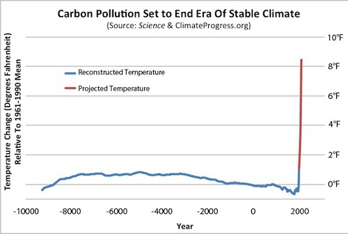
A brief examination shows that there are two flaws in the graph. The first is that, as noted by Brandon, the reconstruction should not lead directly into the projection. That is because the terminal point of the reconstruction is 1940 (or technically, the 1930-1950 mean), whereas the the initial point of the reconstrution is 1990. That time seperation represents about one pixel on the graph. It is an important pixel, however, and the one pixel seperation should be there. Further, the modern instrumental record should probably have been shown.
Personally I am not going to fault Romm for that because, at the date when the graph was created (March 8th) preceded extensive discussion of the cause of the uptick by a week. That missing pixel represents an error of interpretation rather than the misrepresentation of common knowledge Shollenberger presents it to be. In light of that discussion, however, Romm should have included an update pointing out that issue; and his nearest thing, the follow on post has far more problems in the title than in the graph.
Confining ourselves to the graph, however, the second problem is the projections. Romm identifies the projections as being those of the MIT "No Policy" case. Romm significantly misrepresents that case. Specifically, he shows a projection of 8.5 F increase relative to the 1960-1990 mean temperature. As it happens, the MIT median projection is for a 9.2 F increase relative to 1990. Romm understates the projection by more than 0.7 F. (More, of course, because the "1990" temperature, more accurately the 1981-2000 mean, is higher than the 1960-1990 mean.)
This second error makes a 15 pixel difference to the graph. Now, what I am wondering is what sort of though process was behing Shollenberger's decision that the one pixel difference was worthy of comment and makes a significant difference, whereas the 15 pixel difference is not even worthy of note?
- Real Skepticism About the New Marcott 'Hockey Stick'
Brandon Shollenberger at 09:30 AM on 18 April, 2013scaddenp @79, I think the graph John Cook praised is a bad graph. I think comparing it to the lead graph of this post shows it is a bad graph. I think the lead graph of this post is a reasonable depiction of Marcott et al's results. I haven't examined Shakun et al's results, but I assume the same is true for them.
You say "the graph very obviously needs 3 parts." I don't disagree. And like you, I'd have been fine if the graph had a gap rather than relying on the (at least largely) spurious uptick. If John Cook had praised this post's graph instead of the one from Joe Romm, I wouldn't have said anything. But he praised a bad graph that is incongruous with this post's.
The issue I raised wasn't whether or not Marcott et al's results are right (though multiple users argued against that strawman). The only part of their part that matters for what I said is the uptick which pretty much everyone agrees is faulty.
Rob Honeycutt @80, given everything you responded to in your comment @57 addressed total strawman arguments, I can't say I care much about how my comments strike you.
- Real Skepticism About the New Marcott 'Hockey Stick'
KR at 12:38 PM on 15 April, 2013The radiocarbon dating error (applying to most of the proxies) in Marcott et al is modeled as a random walk, with a 'jitter' value of 150 years applied to each anchor point. For the Antarctic ice cores, a 2% error range is assumed, for Greenland, 1%. The measured Marcott et al transer function includes perturbing the samples by those date uncertainties through Monte Carlo perturbation analysis - if I am reading the paper correctly, the frequency response is indeed a full characterization of the smearing effects of the processing including date errors, 1000 perturbation realizations, temperature variations, time averaging of proxy sampling (linear interpolation between sample times, not higher frequencies), etc. The date errors, I'll point out, are significantly smaller than the 600 year result of filtering a 200 year spike - and they are incorporated in that transfer function.
Once properly measured, the Marcott et al processing can be treated as a black box, and the modification of any input determined by that transfer function, as I did above.
Again, I must respectfully consider your objections sincere, but not supported by the maths. And again, maths, or it didn't happen. I'm willing to be shown in error, but that means demonstrating it, not just arguing it from what might seem reasonable.
- Real Skepticism About the New Marcott 'Hockey Stick'
Tom Curtis at 11:42 AM on 15 April, 2013KR @73, you are missing the point. Marcott et al's analysis of signal retention analyzes the effects of their method on the proxies themselves. It does not analyse the effects of the natural smoothing that occurs beause the original proxies are not temporally aligned. They state:
"Cross-spectral analysis of the input white noise and output synthetic stack shows that the time series are coherent and in phase at all frequencies (Fig. S17b,c), indicating that our Monte Carlo error-perturbation procedure does not artificially shift the amplitude or phase of input series."
(My emphasis)
The input series are not the actual temperatures, but the proxies. Ergo any smoothing inherent in the proxies or inter-proxy comparison are not tested by Marcott et al. Consequently your analysis is a reasonable test for whether a Tamino spike would be eliminated by the first three forms of smoothing I discussed; but it does not test the impacts of the other "natural" forms of smoothing. In particular it does not test the most important of these, the smoothing due to lack of synchronicity in "measured age" in the proxies for events which were in fact synchronous in reality.
Further, your use of the central limit theorem is misleading. It indicates, as you say, "the results of perturbed data with random errors should include the correct answer as a maximum likelihood" but it give no indication of the magnitude of that maximum likilihood response relative to noise in the data. Put simply, given a noise free environment, and the central limit theorem, we know that a Tamino spike will show up at the correct location as a peak in the smoothed data. We do not know, however, that the peak will be large relative to other noise in the data. The assumption that it will be is simply an assumption that temperatures throughout the holocene have been relatively flat on a decadal time scale, so that any variation other than the introduce Tamino spike will be smoothed away. In effect, you are assuming what you purport to test.
You can eliminate that assumption by introducing white noise with the same SD as the variation in the full Marcot reconstruction after you have applied your filter. That noise then provides a natural scale of the significance of the peak. That step is redundant in your current analysis, given the size of the spike after smoothing. However, your current spike is exagerated because while it accounts for all methodological smoothing, it does not allow for natural smoothing.
- Real Skepticism About the New Marcott 'Hockey Stick'
KR at 11:22 AM on 15 April, 2013A side note on this discussion: Transfer functions and frequency responses.
If you can run white noise (all frequencies with a random but known distribution) or a delta function (a spike containing correlated representatives of all frequencies) through a system and examine the output, you have completely characterized its behavior, its point spread function (PSF). You can then take a known signal, any signal, run its frequencies through the transfer function, and see what happens on the output side of the system. The system can be treated as a "black box" regardless of internal processing, as the transfer function entirely characterizes how it will treat any incoming data.
Marcott et al did just that, characterizing the frequency response of their processing to white noise and examining the transfer function. Which is what I have applied in my previous post, showing that a 0.9 C spike (as discussed in this and other threads) would indeed survive, and be visible, after Marcott et al processing.
If you disagree - show the math.
- Real Skepticism About the New Marcott 'Hockey Stick'
KR at 11:12 AM on 15 April, 2013Tom Curtis - I'm afraid I'm going to have to disagree with you.
Marcott et al ran white noise through their reconstruction technique, including sampling, multple perturbations, etc., and established the frequency gain function noted in their supplemental data. That includes all of the smoothing and blurring implicit in their process, unless I have completely misunderstood their processing. That is a measure of data in/data out frequency response for their full analysis, the entire frequency transfer function, including 20-year resampling. The lower frequencies (with the average contribution to the entire timeline, and the ~1000 yr curves) will carry through the Marcott et al Monte Carlo analysis, their frequency transfer function - and no such spike is seen in their data.
WRT imperfect knowledge - the perturbations of the proxies should account for this, as (given the Central Limit Theorem) the results of perturbed data with random errors should include the correct answer as a maximum likelihood.And radiocarbon dating does not have a large spread over the 11.5 Kya extent of this data - dating errors will not be an overwhelming error. And if there was a consistent bias, it would only stretch or compress the timeline.
If you disagree, I would ask that you show it - with the maths, as I have done. Until or unless you do, I'm going to hold to my analysis of the effects of the sampling and Monte Carlo analysis effects. Without maths, I will have to (with reluctance) consider your objections to be well meant, but mathematically unsupported.
I will note that my results are in agreement with Taminos - he shows a ~0.2 C spike remaining after Marcott processing, consistent with my 0.3 C results plus some phase smearing. Again, if you disagree - show it, show the math, don't just assert it.
- Real Skepticism About the New Marcott 'Hockey Stick'
Tom Curtis at 10:20 AM on 15 April, 2013KR @71, almost there.
The Marcott et al reconstruction contains at least four levels of smoothing. Three are features of the method itself.
First, the linear interpolation of missing values at 20 year resolution imposes an artificial smoothing that will be present not just in the full reconstruction, but also in individual realizations. This shows up in Tamino's first, unperturbed reconstruction in which the amplitude of the introduced spikes is approximately halved from 0.9 C to about 0.45 C by this feature alone:

Second, the age model perturbation applies a further smoothing. In the supplementary material, Marcott et al identify this as the largest source of smoothing. In their words:
"The largest increases in gain occur through reductions in age model uncertainty – shifting the 0.5 gain value to 1200-year periods by doubling age model errors and 800-year periods by halving age model errors – as would occur through decreasing radiocarbon measurement errors or increasing the density of radiocarbon dates."
The effect of this smoothing shows up as a further halving of the spikes in Tamino's analysis, although the effect is much smaller between 1 and 2 Kya where the age uncertainty is much smaller:

A third form of smoothing comes from the temperature perturbations, which Tamino did not model. Marcott et al (supplementary material) note in the supplementary material that:
"Results suggest that gain is negligibly influenced by temperature uncertainties, presumably because these errors largely cancel out in the large-scale stack."
That shows in their figure S18, with the differences gain function between 0.1 C and 1 C perturbations being impercetible, and that between 1 C and 2 C being imperceptible up to 800 years resolution, and negligible thereafter.
This result may understate the smoothing from the temperature perturbations, or more correctly, the temperature perturbations as influenced by the temporal perturbations. Specifically, in their model used to test the effects of different factors on signal retention, Marcott et al varied one factor at a time, and used the same perturbation for all pseudo-proxies. In the actual reconstruction, different proxies had different temperature errors (and hence magnitude of perturbation), and different temporal errors. Because of this, the alignment of cancelling perturbations will not be perfect resulting in some residual smoothing. This effect may account for the greater smoothing of the Marcott et al reconstruction relative to the Tamino reconstruction even when the latter includes 1000 realizations with temporal perturbation.
If I am incorrect in this surmise, there remains some additional smoothing in the Marcott et al reconstruction as yet unaccounted for.
In addition to the three smoothing mechanisms implicit in Marcott et al's methods, there are natural sources of smoothing which are the result of how proxies are formed, and of not having perfect knowledge of the past. Some of these are the consequences of how proxies are formed. For example, silt deposited on a shallow sea floor will have ongoing biological activity, particularly by worms. This activity will rework the silt, resulting in a partial mixing of annual layers, in effect smoothing the data. This sort of smoothing will be specific to different proxy types, and even to different proxy locations.
If a proxy has a natural 200 year resolution (ie, events over the full 200 years effect its value), even if the mean of time interval of a particular sample coincides with the peak of a Tamino style spike, it will only shows elevated values of 0.45 C, rather than the full 0.9 C. Without detailed knowledge of all the proxy types used in Marcott et al, however, it is difficult to say how influential this style of smoothing will be; and for some, possibly all poxies used it may not be a factor. Further, estimates of the effect of this smoothing may be incorporated into error estimates for the proxies, and hence be accounted for already. Therefore I will merely note this factor, and that anybody who wishes to argue that it is a relevant factor needs to do the actual leg work for each proxy they think it effects, and show how it effects that proxy. (This sort of factor has been mentioned in comments at Climate Audit, but without, to my knowledge, any of the leg work. Consequently it amounts to mere hand waving in those comments.)
Finally, there is a form of smoothing resulting from our imperfect knowledge. We do not have absolute dates of formation of samples of various proxies; and nor do those samples give an absolute record of temperature. Each of these measurements comes with an inherent error margin. The error margin shows the range of dates (or temperatures) which, given our knowledge, could have been the date (temperature) of formation of the sample. Given this error, most proxies will not have formed at their dated age. Nor will the the majority have formed at their estimated temperature. Their estimated age and temperatures are the estimates which, averaged across all samples will minimize the dating error.
Because not all proxies dated to a particular time will have formed at that time, the mean "temperature" estimated from those proxies will represent a weighted average of the temperatures within the error range of date. That is it will be a smoothed function of temperature. The magnitude of this effect is shown by Tamino's comparison of his reconstruction plus spikes to his singly perturbed reconstruction:
Using the Marcott et al proxies and dating error, this effect halves the magnitude of a Tamino style spike over most of the range. During the recent past (0-2 Kya) the reduction is much less due to the much reduced dating error, and for proxies that extend into the 20th century the reduction is almost non-existent due to the almost zero dating error. This is a very important fact to not. The high resolution spike in the early 20th century in the Marcott reconstruction should not be compared to the lack of such spikes early in the reconstruction. That spike is real, or at least the 0.2 C spike shown by using Tamino's method of difference is real, but similar spikes in prior centuries, particularly prior to 2 Kya would simply not show against the background variation. This is particularly the case as proxies are not extended past their last data point, so the smoothing from interpolated values is greatly minimized in the twentieth century data, and does not exist at all for the final value. The smoothing may be greater than that due to imperfect temperature measurement, but probably not by very much.
In any event, from the singly perturbed case, it can be estimated that any Tamino style spike would be halved in amplitude in the proxy data set simply because peaks even in high resolution proxies would not coincide. Importantly, Marcott et al's estimte of gain is based on the smoothing their method applies to the proxies, and does not account for this smoothing from imperfect knowledge.
Taking this to KR's interesting experiment, to close the case he needs to show the smoothed peak from a 0.45 C spike is distinguishable from a line with white noise having the same SD as the Marcott reconstruction; or better, he should first perturb 73 realizations of his spike by 120 years (the mean perturbation in Marcott et al), take the mean of the realizations and then apply his filter. If the result shows clearly against the background of white noise, he has established his case.
As a further note, Tamino to establish his case also needs to singly perturb the proxies after introducing his spike before generating his 100 realization reconstruction. If the spikes still show, his case is established.
- Real Skepticism About the New Marcott 'Hockey Stick'
KR at 06:05 AM on 15 April, 2013I have attempted to check the various "spike" claims in another fashion entirely - the frequency response Marcott et al found for white noise (all frequency) inputs, as described in the Supplement Fig. S17(a). Here they found the frequency gain to be zero for 300 years or less variations, 50% for 1000 years, 100% for 2000 years.
Hence a sinusoidal variation with a period of 300 years would entirely vanish during the Marcott et al processing. However - a 200 year spike contains many frequencies out to the 'infinite' frequency addition to the average. Not all of such a spike would be removed by that frequency gain filtering.
Here is a 200 year spike filtered as per the Marcott et al gain function described in the supplement, 0 gain at 300 years, 100% at 2000 years, linear slope between those frequencies:
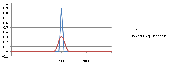
Marcott spike and resulting filtered values
This was Fourier filtered out of a 10240 year expanse, with the central 4000 shown here for clarity. Note that the 0.9C spike of 200 years has, after filtering, become a 0.3C spike of 600 years duration. This makes complete sense - the average value added by the spike (which will not be removed by the Marcott et al transfer function) has been broadened and reduced by a factor of 3x, retaining the average value under the spike.
This is to some extent an overestimate, as I did not include the phase term (which I would have had to digitize from their graph) from the Marcott transfer function - I expect that would blur the results and reduce the peak slightly more than shown here. However, I feel that based upon the Marcott et al measured transfer function in the frequency domain, a 0.9 C/200 year spike would certainly show in their results as a 0.2-0.3 C / 600-700 year spike after their Monte Carlo perturbation and averaging.
While I will not be presenting this in peer-reviewed literature (without significant cross-checking), I believe this clearly demonstrates that global spikes of the type raised by 'skeptics' would have been seen in the Marcott et al data.
- Real Skepticism About the New Marcott 'Hockey Stick'
chris at 19:27 PM on 14 April, 2013Tom, my point is very simple. You can’t use as a test for whether a contemporary style 100 year warming (converted into a spike with an additional 100 year cooling) might have existed in the Holocene but missed in the Marcott reconstruction…. an event for which the evidence indicates was faster and probably much smaller in amplitude when globally averaged.
There are some other points:
1. In my opinion Marcott et al (2013) has been over-interpreted. It’s value lies in the fact that it provides a continuous record of global surface temperature throughout virtually the entire Holocene. It captures the broad temperature excursion forced largely by orbital insolation effects and supports expectations based on the latitudinal response to those. That’s an excellent advance.
2. However the nature of the reconstruction means that moderately high resolution temperature variability is sacrificed. It’s simply not a suitable reconstruction for assessing this.
3. How do we deal with this if we want to address questions about amplitudes and time scales of potential temperature excursions in the Holocene? I would say that we approach this in exactly the way it has been approached. We look at high resolution records (ice cores mostly and maybe tree rings for isotopic signatures of solar variability) in which evidence of virtually any climatic perturbation (and its likely origins) is very likely to be recorded. We then make a focussed effort to address the amplitude and timescale by examining pre-existing proxy series and finding new ones that cover the period of the climatic excursion.
4. That's been done with the 8.2 kYr event. The evidence is pretty strong (it seems to me) that the event (the last great delayed gasp of the glacial to Holocene climatic transition) is the stand-out event in the Holocene ice core record, and that there isn’t evidence for other marked and rapid climatic excursions records (although there is plenty of evidence of smaller scale temperature variability). Focussed attention on proxies encompassing the 8.2 kYr event supports the interpretations about its origins and its local and globally averaged temperature impacts that we discussed above.
5. But pretty much none of that comes out of inspection of Marcott et al which was addressing a different set of questions.
- Real Skepticism About the New Marcott 'Hockey Stick'
chriskoz at 18:18 PM on 14 April, 2013Rob@67,
Depending what you want to do with it.
As slide aid for science presentation, it's indeed bad: too much text. The text should be converted to graphics. Presenter would not be able to fit that information in one slide anyway.
As a poster about implications of Marcott 2013, it is good. Viewers like yours, who "be able to grasp the key points in 1 or 2 seconds, almost without thinking" does so by looking at the graphic only, inquisitive viewers may want to read the text which enhances the graphic quite well.
The only simplification that I'd do (without loss of information) is to remove the first bullet point in the first frame (±1ºC band of temperatures) because the same can be read from the graphic. The frame title can also be removed, so maybe somehow combining two frames would be good idea (they are talking about emissions rather than T). The small print (credits) can be made even smaller and tenser, esp. long link to the blog. Marcott 2012 is a typo (unless you mean Shaun's dissertation from a y ago - you probably do not).
Enhancement of the graphic caption is possible to match the graphic:
Shakun et al - make it green
Marcott et al - blue
A1B - red
HadCRUT 4 - brown
I like the horizontal arrows tied to dates when emissions must fall. Year 2012 should be stressed with a comment "(we missed it)". Maybe a shortened version (graphics + horizontal lines & dates + just one line of credits) would suit SkS. It would suit my slide show, if you asked me.
- Real Skepticism About the New Marcott 'Hockey Stick'
Tom Curtis at 10:09 AM on 14 April, 2013Chriskoz @55, I would not be so confident of what Chris has shown.
Consider Tamino's comparison of Marcott's Regem reconstruction (with temporal and temperature perturbation; black) with his unperturbed reconstruction by the difference method (red):
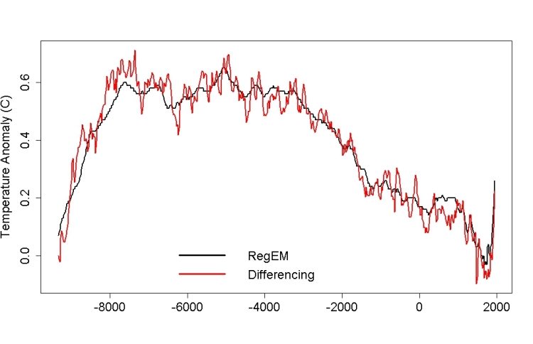
You will notice, very prominently in Tamino's reconstruction, a down spike of about 0.15 C at 8.2 Kya. You will also notice its entire absence from Marcott et al's RegEm reconstruction (as also, of course, from their Standard5x5 reconstruction). So, clearly the full Marcott method will smooth away an 8.2 K event, even if the record of it exists inthe proxies.
Based on the 73 Marcott proxies (or at least those which extend to 8,2 Kya), the 8.2 K event was an event that significantly altered the global mean surface temperature if not an event experienced as a negative temperature excursion everywhere globaly. In fact, again based on those proxies, it probably altered NH extra-tropical temperatures:

It also probably altered NH tropical temperatures, although by how much it is hard to say given the two large, flanking warming spikes:
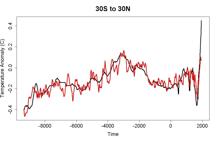
You will note that Marcott et al do not even show the 8.2 Kya spike in regional reconstructions, and oddly, shows a slight positive spike in the tropical reconstruction at the location of the downward spike in the unperturbed difference reconstruction. Also of interest, the tropical 8.2 K event shows as about 50% larger at maximum than the NH extra-tropical event, as near as I can estimate it.
Finally, the 8.2 K event is not identifiable in the SH extra-tropics:

I will respond to Chris's specific criticism in a later post. For now it is sufficient to point out that the 8.2 K event was sufficiently large and wide spread to appear clearly in a global network of proxies, and that Marcot et al's reconstruction does not show it, even though based on that reconstruction. More importantly to this specific discussion, even though Marcott et al's reconstruction does not show it, Tamino's reconstruction does even taken as the mean of 1000 temporally perturbed reconstructions:
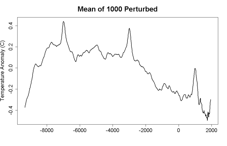
And this comes to the point. I am not arguing that the 8.2 K event was as large as a Tamino spike, or that it was a globally extensive negative temperature excursion. I am arguing that if the Marcott et al reconstruction were sensitive enough to show a Tamino spike, then it is surprising that it does not show the 8.2 K event. Citing Tamino's analysis does not undercut this point, as his reconstruction clearly shows the 8.2 K event. Ergo Marcott et al did something different that resulted in a lower temporal resolution than Tamino shows, and until his emulation shows sufficiently low a resolution as to not show the 8.2 K event, but still shows Tamino spikes, he has not established his point.
As a secondary point, I am also arguing that the 8.2 K event could, with low but significant probability have been the equivalent of a negative Tamino spike. Arguments to the contrary persist in ignoring temporal error in proxies.
- Real Skepticism About the New Marcott 'Hockey Stick'
Tom Curtis at 08:01 AM on 14 April, 2013Brandon Shollenberger @53:
1) Jonathon Koomey's graph should have included the instrumental record to link the robust section of Marcott's reconstruction to the temperature projections with a robust record of temperatures over the last 130 years; but
2) Had he done so, as Jos Hagelaars did above, it would have made no difference in visual impact, as can be easilly seen above. This is true even if the "blade" is omitted and the instrumental record is shown. It follows that you are quibbling.
3) Tamino has shown that using the difference rather than simple averages, the uptick is still there (and is robust), but that it is not as large. Further, he has shown the uptick using the method of difference to be well represented by Marcott et al's RegEm reconstruction. So, here is Tamino's replication of the RegEm reconstruction from Marcott plus the HadCRUT4 temperature record:
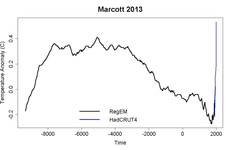
When you can point out a visually significant difference from including that graph instead of Marcott et al's 5x5 reconstrution in Koomey's graph, then you will show you have a point.
- Real Skepticism About the New Marcott 'Hockey Stick'
Paul R Price at 07:06 AM on 14 April, 2013@chriskoz Thanks again for the format tips, much better quality and more downloadable now.
@Tom Curtis Graphic adapted as per your corrections (I think).
This is the poster version revise since @20 (base graphic as above, derived from Marcott via Hagelaars, and then annotated). Does need to be downloaded to see it well. Any suggestions/corrections from SkS readers welcome.
- Real Skepticism About the New Marcott 'Hockey Stick'
KR at 02:36 AM on 14 April, 2013Brandon Shollenberger - If Marcott et al had aligned their reconstruction with modern instrumental temperatures on just the last 150 years of their reconstruction, which they state "...is probably not robust", you might have a point.
They did not, this is a strawman argument. As clearly stated in the paper:
To compare our Standard5×5 reconstruction with modern climatology, we aligned the stack’s mean for the interval 510 to 1450 yr B.P. (where yr B.P. is years before 1950 CE) with the same interval’s mean of the global Climate Research Unit error-in-variables (CRU-EIV) composite temperature record, which is, in turn, referenced to the 1961–1990 CE instrumental mean.
They used 1000 years of overlapping data to align and reference to a paleotemperature reconstruction, which itself is aligned and referenced to overlapping data in the instrumental record. The last 150 years of the Marcott et al reconstruction during the instrumental period (the 'uptick') are interesting to consider, but have no impact on alignment. Your objection therefore has no grounds - I would strongly suggest reading the paper.
- Real Skepticism About the New Marcott 'Hockey Stick'
Rob Honeycutt at 02:12 AM on 14 April, 2013Brandon... "Robust" in reference to the Marcott paper is not the same thing as "reliable." You're conflating the two terms. In fact, the modern warming data is extremely robust and reliable. So, the modern uptick, irrespective of Marcott, is something that should shock you out of your shorts!
As has been continually pointed, you're making arguments that support high climate sensitivity. So, you can't do that, then turn around again and claim that CS is low in another conversation.
- Real Skepticism About the New Marcott 'Hockey Stick'
Brandon Shollenberger at 01:57 AM on 14 April, 2013chriskoz, I'm afraid the link you provided doesn't answer my question at all. The graph I'm referring to showed "Reconstructed Temperature" from Marcott et al cleanly flowing into "Projected Temperature." The part where the two join is at the end of the uptick you say is "not reliable."
I'm not asking about Marcott et al's work. I'm saying, given the uptick isn't reliable, why is John Cook praising a graph that relies upon the uptick? Erase the uptick from that graph, and there would be a large gap between the two lines. It wouldn't be a "powerful" graph anymore.
More than 100 comments found. Only the most recent 100 have been displayed.
More than 100 comments found. Only the most recent 100 have been displayed.


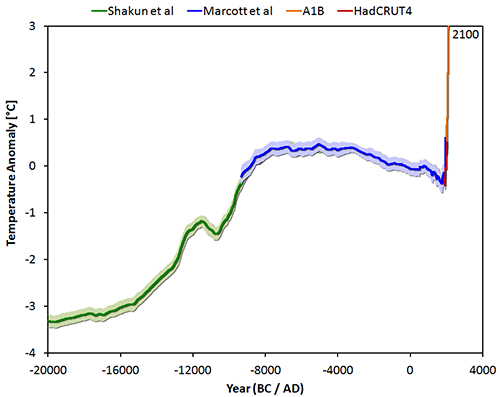
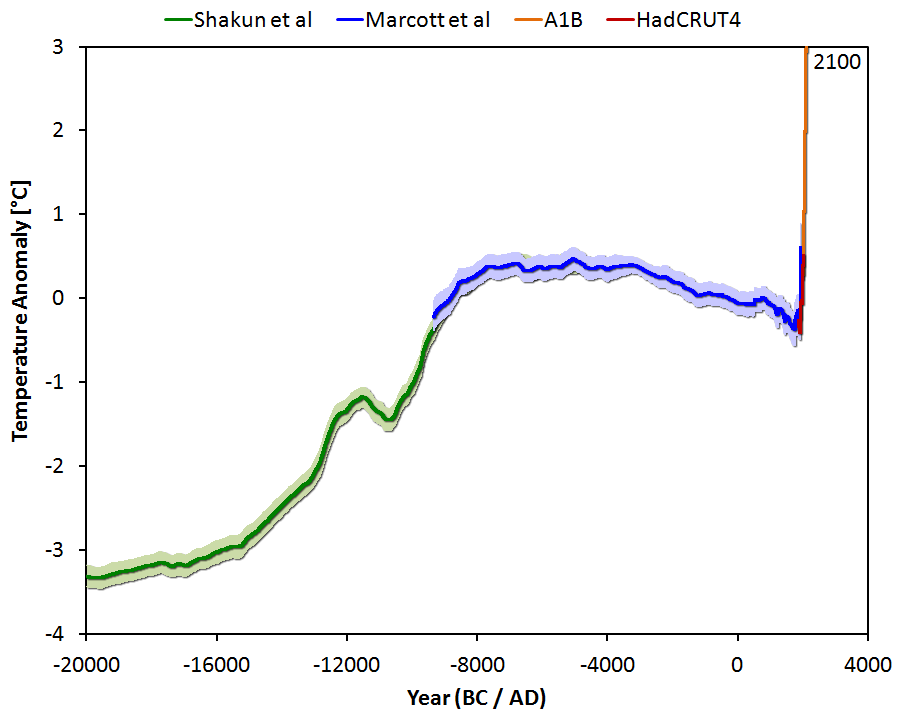
THE ESCALATOR

(free to republish)