Climate Science Glossary

Term Lookup

Enter a term in the search box to find its definition.

Settings

Use the controls in the far right panel to increase or decrease the number of terms automatically displayed (or to completely turn that feature off).

Term Lookup

Settings


All IPCC definitions taken from Climate Change 2007: The Physical Science Basis. Working Group I Contribution to the Fourth Assessment Report of the Intergovernmental Panel on Climate Change, Annex I, Glossary, pp. 941-954. Cambridge University Press.

Home Arguments Software Resources Comments The Consensus Project Translations About Support

Twitter Facebook YouTube Mastodon MeWe

RSS Posts RSS Comments Email Subscribe


Climate's changed before
It's the sun
It's not bad
There is no consensus
It's cooling
Models are unreliable
Temp record is unreliable
Animals and plants can adapt
It hasn't warmed since 1998
Antarctica is gaining ice
View All Arguments...


Username
Password
New? Register here
Forgot your password?

Latest Posts

Archives

2010: A Year of Record Warmth and Weird Weather

Posted on 27 January 2011 by James Wight

Last year’s global temperatures are in, and the result is that 2010 is statistically tied with 2005 for the title of the warmest year since records began in 1880.

According to the US National Oceanic and Atmospheric Administration’s National Climatic Data Center (NOAA NCDC), the global temperature for both years was 0.62°C above the 20th-century average 13.9°C; 2010 came second by a thousandth of a degree. (Climatologists usually give temperatures as anomalies relative to an average, because they are easier to compare than absolute temperatures. The last month with a temperature below average was February 1985.)

2010 set new records for the warmest March, April, May, and June. Indeed, when the seasonal cycle is removed March 2010 was the third warmest month of all time (April, May, and November 2010 were also among the top 20). The ten warmest years according to NCDC are 2005/2010, 1998, 2003/2002, 2006/2009, 2007, 2004, and 2001. The 15 warmest years have all occurred since 1995; every year since 1976 has been above average. The 2000s are the warmest decade on record, followed by the 1990s and 1980s.

2010 was the Northern Hemisphere’s warmest year and the Southern Hemisphere’s sixth warmest. The former had its warmest April, May, June, July, August, and November in 2010, while the latter had its warmest February. There was particularly strong warmth in Greenland, Canada, northern Africa, and the Middle East; as well as warmer than average temperatures in southern Africa, eastern Europe, eastern Russia, and southern Asia; and cooler than average temperatures in central Russia and northern Europe. Except for the eastern Pacific, most of the oceans were warmer than average; the North Atlantic was particularly warm.

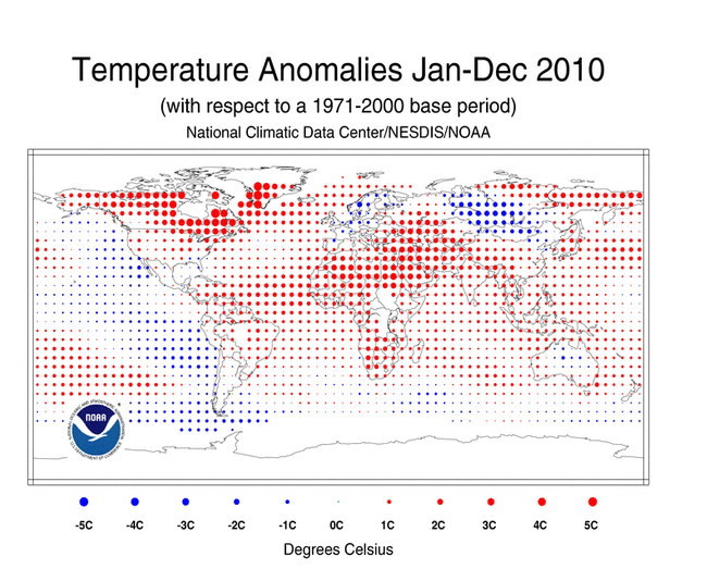
Figure 1: Global map of regional temperature anomalies in 2010. Red dots are warm anomalies and blue dots are cool; notice there is considerably more red than blue. (Source: NOAA National Climatic Data Center.)

A year of weird weather

2010 was the world’s wettest year as well as tying for warmest, and many regions suffered devastating floods as well as terrible heatwaves. We also saw the fourth largest swing in the Southern Oscillation during a single year, beginning with a moderate-to-strong El Niño but ending with a moderate-to-strong La Niña. The latter tends to mean cooler global temperatures, yet the Earth remained hot as late as November. And all of this occurred despite the Sun being in an unusually low minimum.

The year began with an unusually cold winter in Europe, Russia, and the United States. The cold snaps were caused by the most negative Arctic Oscillation on record – basically, the continents were cold but the Arctic was hot. Meanwhile, Canada had its warmest winter, Australia had its warmest summer, and the globe had its fourth warmest January and sixth warmest February.

While conservative commentators chattered about the cold winter, global temperatures soared even higher, breaking four monthly temperature records in a row. As noted above, March 2010 not only broke the record for March but also chalked up the third warmest anomaly ever recorded. Despite the onset of La Niña around the middle of the year, we still experienced the second warmest July and third warmest August globally. The 12 months ending in July 2010 were the second warmest of the 1,561 such periods on record, and the 12 months ending in August 2010 came third.

The northern spring and summer were both the warmest on record, and many parts of Asia suffered extreme heat (in fact the year as a whole had a record number of national extreme heat records). On 26 May the town of Mohenjo-Daro in Pakistan recorded a maximum temperature of 53.5°C, the warmest temperature on the entire continent since 1942.

Russia and its neighbours suffered a record-shattering multi-month heatwave which caused 15,000 deaths, wildfires, drought, and crop failures. The daytime heat was much more intense than in the deadly European heatwave of 2003, and Moscow broke its nine-decade-old temperature record twice in a few days. Naturally it would have been a 1,000-year event, but global warming has made it eight times more likely. It’s sobering to remember that so far we’ve only had a fraction of the amount of warming we would see in a business-as-usual emissions scenario.

In a related event, the Asian monsoon occurred further west than usual, creating devastating floods which submerged 20% of Pakistan, killing 1,600 people and displacing millions – more than were affected by the 2004 tsunami.

All this was followed by the tenth warmest September. Although a cool month relative to the last decade, it would have been a near-record-breaking anomaly as recent as 1989. Arctic sea ice reached its third lowest minimum extent on record (the last four have been the four lowest) and its all-time lowest volume. This opened both Arctic shipping routes for the third consecutive time and third time in recorded history. Two expeditions successfully circumnavigated the Arctic Ocean in a single summer, something that would have been impossible just a few years earlier.

Next came the eighth warmest October. In Brazil, which suffered a severe drought throughout 2010, an important tributary of the Amazon River fell to its lowest level on record, making the Amazon itself three metres below average. And despite what was by then a strong La Niña, November 2010 was still the second warmest November globally.

December was the coolest month of 2010 (seasonally adjusted) and the seventeenth warmest December. In the Northern Hemisphere, the year ended as it began, with a strongly negative Arctic Oscillation causing more extreme cold in Europe (particularly on some insignificant island north of France whose weather has a disproportionate influence on public opinion). It’s been speculated that this unusual weather pattern might be connected to Arctic sea ice melt.

Meanwhile in the Southern Hemisphere, La Niña brought record rainfall in Queensland, Australia, flooding an area the size of France and Germany combined and capping Australia’s third wettest year on record. In January 2011, the flooding spread to capital city Brisbane, inundating over 10,000 homes and killing at least 33 people in what may be the most expensive natural disaster in Australia’s history.

The correlation of extreme heat with extreme rainfall and flooding is no surprise. As climatologist Kevin Trenberth said in June:

[T]here is a systematic influence on all of these weather events now-a-days because of the fact that there is this extra water vapor lurking around in the atmosphere than there used to be say 30 years ago. It’s about a 4% extra amount, it invigorates the storms and it’s unfortunate that the public is not associating these with the fact that this is one manifestation of climate change. And the prospects are that these kinds of things will only get bigger and worse in the future.

Independent analyses agree global warming is continuing

The NCDC results are confirmed by NASA’s Goddard Institute for Space Studies (GISS), who also found 2010 tied with 2005 as the warmest year (only in their analysis 2010 came first by a hundredth of a degree). The ten warmest years in the GISS analysis are 2010, 2005, 2009/2007, 2002/1998, 2006/2003, 2004, and 2001. Also, according to GISS the 12-month mean record was broken several times during 2010.

All the major analyses of global temperature – by NCDC, GISS, and the British Met Office’s Hadley Centre – are in close agreement with each other. The rankings of individual years may differ, but usually within the error bars (a few hundredths of a degree). And of course, far more important than any individual year is the long-term trend, which is about 0.17°C/decade in the last 30 years. To quote a recent GISS press release:

All three records show peaks and valleys that vary in virtual sync with each other since 1880. All three show particularly rapid warming in the last few decades. And all three show the last decade is the warmest in the instrumental record.

Figure 2: Global temperature anomalies since 1880 (in one case, 1890) according to four independent analyses. (Source: NASA Goddard Institute for Space Studies.)

One of the main differences between these analyses is how they extrapolate temperatures in the Arctic where there are few measurements. NCDC and Hadley implicitly assume the Arctic is warming at the same rate as the global average, while GISS assume it is warming several times faster, as is being measured by the available stations. The latter assumption makes more sense given the rapid melting of Arctic sea ice, which is making the Arctic surface less reflective. Presumably we can expect GISTEMP to continue growing warmer than NCDC and HadCRUT as Arctic sea ice continues to melt, particularly in years when it hits a record low.

Another issue is recently identified biases due to changing methods of measuring sea surface temperatures, causing global warming in the last decade to be underestimated and temperature swings in the 1940s to be overestimated. Climatologists are currently awaiting the release of a revised Hadley Centre analysis correcting for those errors. It will be interesting to see how much of a difference the corrections make.

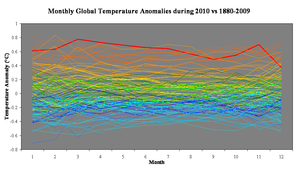
Observed temperatures are consistent with models

This graph from RealClimate compares the observed temperatures to the IPCC AR4 model projections for a business-as-usual emissions scenario. As you can see, observations are entirely consistent with continued global warming:

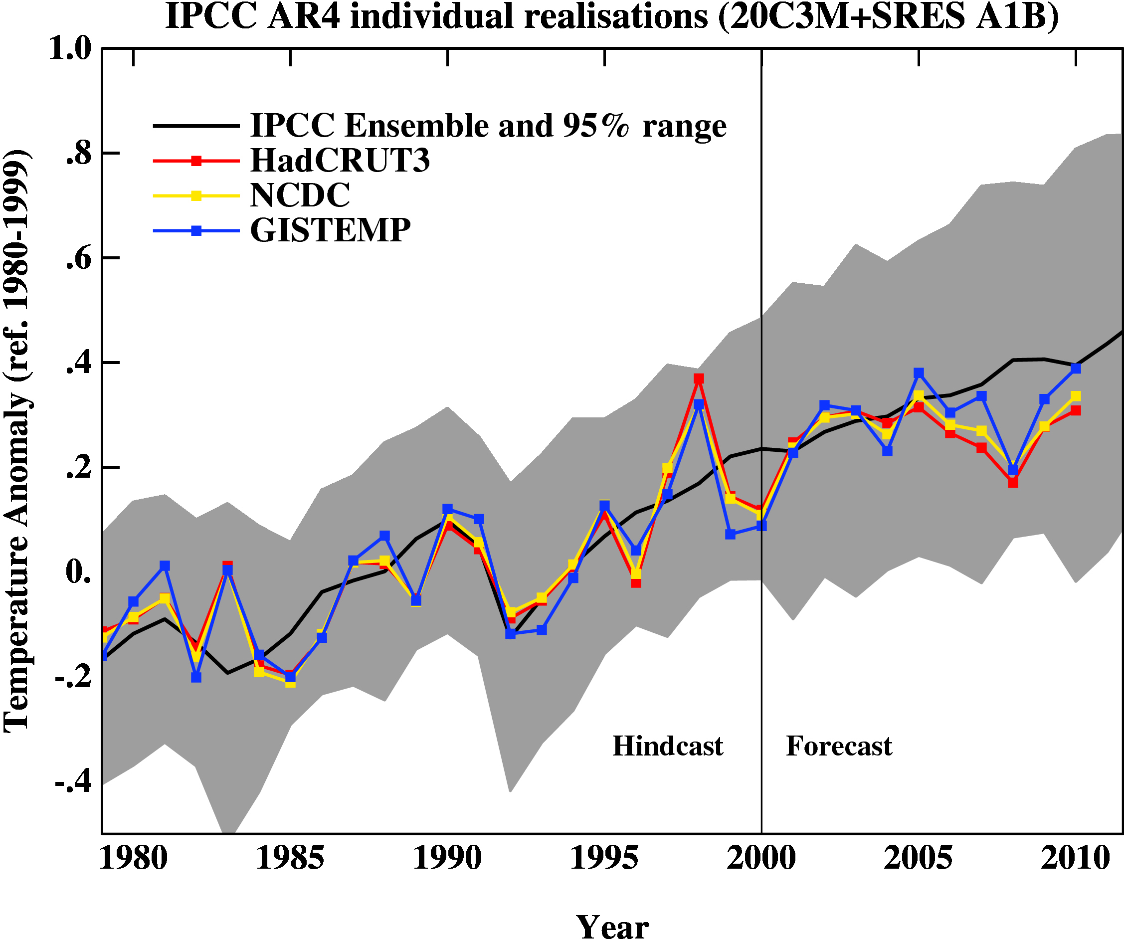
Figure 3: Observed global temperatures since 1980 compared to IPCC AR4 model projections for the business-as-usual A1B scenario. (Source: RealClimate.)

What does the future hold? In the long run the planet will continue to get warmer as it responds to skyrocketing greenhouse gas levels, by far the dominant influence on climate. The global energy imbalance varies periodically with the 11-year solar cycle, and right now the Sun is coming out of its lowest minimum for decades; but even if solar activity fell to Maunder Minimum levels, the effect would be offset by just seven years of greenhouse gas emissions. However, the global climate does vary chaotically from year to year as heat moves between the atmosphere and ocean. A few months ago, GISS predicted that with the short-term cooling influence of La Niña (expected to last into the southern autumn and maybe the southern winter), 2011 probably would not break the record of warmest year; but assuming La Niña does not last another year, it’s likely that 2012 will.

And finally, for a visual representation of how 2010 compares to other years, here is a neat graph that I made from NCDC monthly data (click to enlarge). Each line represents monthly global temperature anomalies throughout a single year, and each year is color-coded by decade. The bluer lines are years from earlier decades while the redder lines are years from later decades. The line in bold is 2010. This should give you an idea of how hot 2010 was:

This post was written by James Wight and first appeared on his blog Planet James.

0 0

Printable Version  |  Link to this page

Comments

1  2  Next

Comments 1 to 50 out of 59:

  1. It's been speculated that this unusual weather pattern might be connected to Arctic sea ice melt. Thanks for being honest about that. There are natural precedents for the blocking and negative AO patterns (e.g. the 70's). It could be that the effects of the pattern could be exacerbated by sea ice loss, but we are in new territory and it will take time to see if the pattern holds and if the effects are worse.
    0 0
  2. I like the last graph. That sort of graphic has impact.
    0 0
  3. Hopefully with the La Nina this year will be milder. The cost, both economic and in human lives, of extreme weather events is too high.
    0 0
  4. A Mohenjo-Daro sighting! One of the world's oldest settlements in an SkS post! Sorry, geeked on that a bit. Nice summary, James. The Yooper
    0 0
  5. I too like that last Figure. And note too how well the model projections are tracking. Wild weather indeed, it certainly seems that we are shifting the probability distribution functions (and tails) for temperature and precipitation into new territory. It is shifts in the tails of the distributions that are going to hurt. I wonder whether or not the general public are finally getting the message that the planet is very likely experiencing more extreme weather events? The media in the USA is slowly picking up on all this weather weirdness. Just to make maters worse for Queensland, after a brief reprieve, ECMWF is indicating that a tropical storm could make landfall near 20 S (coastline near Townsville) on Sunday evening into Monday, with a much stronger tropical cyclone projected to make landfall in the the same region next Thursday. This one-two punch could be devastating, especially given the saturated soils and full dams. Also on Sunday, Perth could be affected by the much weakened remnants of tropical cyclone Bianca currently located near the northwestern tip of Oz. And let us not forget the north island of New Zealand, which could be in the path of post tropical cyclone (i.e., undergoing extra-tropical transition) Wilma late on Friday night into Saturday. Fingers crossed that ECMWF is wrong....
    0 0
  6. (1) Eric (skeptic): Thanks for being honest about that. That's a common trait of the vast majority of "actual" climate scientists, which conversely is quite questionable for the vast majority of climate change skeptics deniers. At least the ones I've encountered. Also note that the statement you quoted concerning speculation is also linked to a NASA news release which is here. The speculation is not without merit.
    0 0
  7. Another weird aspect was the record snowmelt in the Northern Hemisphere. We went from nearly the most extensive snowcover in February to the least extensive snowcover in May.
    0 0
  8. Albatross @ 5 - And let us not forget the north island of New Zealand, which could be in the path of post tropical cyclone Yup, looks like we're going to take a direct hit!.
    0 0
  9. John Brookes - Hopefully with the La Nina this year will be milder. Well, that depends here you live. Here, Downunder, La Nina means warm conditions and lots of rain and cyclones.
    0 0
  10. #6 RickG, good point, I should not have implied there was dishonesty in other circumstances. Thanks for the link, I see the speculation is clearly labeled in that article.
    0 0
  11. There are natural precedents for the blocking and negative AO patterns (e.g. the 70's). It could be that the effects of the pattern could be exacerbated by sea ice loss, but we are in new territory and it will take time to see if the pattern holds and if the effects are worse." Do you realize the irony of saying that we are in new territory?
    0 0
  12. "...eastern Russia, and southern Asia; and cooler than average temperatures in central Russia..." Shouldn't that be eastern Siberia and west Siberia?
    0 0
  13. "We also saw the fourth largest swing in the Southern Oscillation during a single year, beginning with a moderate-to-strong El Niño but ending with a moderate-to-strong La Niña." Isn't it possible that this fact could account for some of the phenomenon you describe here? For example the Queensland floods and the fact that the mid 2010 months broke records. There is some evidence that increased temperature leads to increased water vapour but there is conflicting evidence as to whether this is translating into increased precipitation (try the recorded presentation here.) I'm not denying that 2010 is at the end of a long term warming trend so there is an obvious reason why the impressive final figure looks the way it does but there seems to be an awful lot of speculation (and unfortunately opportunism) in connecting many of last years natural disasters to AGW. I also just wanted to raise something about the effect of El Nino and La Nina on the 2010 global temp. It worried me with NASA GISS interpretation of this earlier last year and I've got the same problem with the way it's presented here. Here's what you say "We also saw the fourth largest swing in the Southern Oscillation during a single year, beginning with a moderate-to-strong El Niño but ending with a moderate-to-strong La Niña. The latter tends to mean cooler global temperatures, yet the Earth remained hot as late as November." Just like NASA GISS you speculate about what should be the impact of La Nina towards the end of the year while not expanding on the real impact of ElNino in the first 2/3's of the year. What should have been the impact of the La Nina in 2010? I'm going to speculate almost nothing. The lag between Nino3.4 and global temp is generally described as 3 months but this is not set in stone. Below you can see the lag after the 1998/1999 El Nino/La Nina transition is fairly large (~6 month's) whereas there appears to be little lag in the 2008 La Nina (this is closer to the 3 months). What do we see with the 2009/2010 transition? It looks a lot like the 1998/1999 transition. That's 5-6 month's. The La Nina didn't kick in until June/July 2010 so it wouldn't be surprising if this didn't impact on global temp until December 2010. And that is probably what we are seeing. Meanwhile it's obvious to see the short term effect of the 2009/2010 El Nino in the 2010 record in the form of the final blue peak on the graph. Why not dwell on this fact a while in your article? It seems like an important feature of the 2010 record. It would help to explain the record breaking temps in the mid month's. (Larger version here. NINO3.4 and CRUTEM3+HadSST2) As I said earlier all this doesn't take away the fact that 2010 is at the end of a long term warming trend and nothing of the basic facts you present are incorrect. This is an error of omission, that has an impact on the implications and attribution of the phenomena you describe. I'm left with a few issues. How do we attribute the extreme precipitation events when over the passed few decades when there may have been no trend in global precipitation despite the water vapour trend. 2010 is here presented as wierd, the CO2 atmospheric concentration isn't that weird compared with the past two decades. Trying to pin all this on CO2 in the atmospere seems like a stretch. I know John's favorite analogy in this regard is that AGW is training the weather to punch harder. To extend the analogy I just want to know what is the evidence the training has been effective?
    0 0
  14. Great graph the last one. Have you done further analysis on that? F.e. checked regular legnth periods to see whether the amount of record temps vs. low temps have been increasing? I planned to do that once for monthly data but I guess there should be some correction for the differing legnhts of prior data that I couldn't figure out, plus it's a process that could be programmed to be automatic and I do not do analyses like that, all too easy to get something wrong.
    0 0
  15. Humanity Rules @13, comparing 1998 to 2010, I notice that both switched from positive to negative values at approximately the same time of year (aprox April). I also notice 1998 had much stronger positive values than did 2010, while 2010 had appreciably stronger negative values than did 1998. Therefore, absent a long term warming trend, we would expect 1998 to have been warmer than 2010 even with the same lag between the NINO3.4 index and global temperatures. Given that 1998 was several years into a solar cycle, while 2010 was at the start of a new solar cycle following the lowest solar minimum in almost a century, we would again expect 1998 to be warmer than 2010. How strong the trend has been can be seen by comparing 1973 and 2010, both of which had very similar patterns on the NINO3.4 index. That 2010 is 0.69 degrees warmer than 1973 (Hadcrut3 global)shows that there is an ongoing warming trend of about 1.8 degrees C per century, ie, spot on IPCC predictions. As to the analogy, it is very plain nature has been throwing some very strong punches lately. The Moscow heat wave is well known to be a "1 in 1,000" year event in the absence of Global Warming, and the Pakistani floods as a 1 in 100 year event. The recent floods in Brisbane are on various indicators greater than a 1 in 200 year event, and probably at least a 1 in 400 year event. Perhaps we might attribute this to a few lucky punches if they were isolated incidents. But they are not, they are part of a flurry of bone crunching blows.
    0 0
  16. "In a related event, the Asian monsoon occurred further west than usual, creating devastating floods which submerged 20% of Pakistan, killing 1,600 people and displacing millions – more than were affected by the 2004 tsunami." Is flooding in Pakistan unusal? Some recent flood history in Pakistan.
    0 0
  17. Norman, no one said floods don't occur in Pakistan, its just this one was unusual in its strength-due in no small part to the involvement of Monsoon Rain-which is clearly unusual for that part of the Sub-Continent.
    0 0
  18. From this article: “Indeed, when the seasonal cycle is removed March 2010 was the third warmest month of all time …” Doesn’t the use of anomalies automatically eliminate any seasonal cycle? If March 2010 had an anomaly of +0.85°C, my understanding is this means March was +0.85°C higher than the average of all the March anomalies during the anomaly base period, 1951-1980 (in the case of GISTemp). Right? There does not appear to be any consistent seasonal cycle in the years shown in the graph at the end of this article (a great graph, BTW).
    0 0
    Moderator Response: That's what I meant. It was just another way of saying March 2010 was the third warmest monthly anomaly of all time. - James
  19. Norman had a look at the link you provided and it has a list of years with floods in Pakistan. I calculated the intervals in years between each flood. I notice that the average interval for the first 6 floods in the list (1928-1976) was 8 years, the average interval for the last 6 floods (1976-2010) is 5.7 years.
    0 0
  20. #11 villabolo, no irony at all. The 1970's had some strongly negative AO, but lots of sea ice. So lack of sea ice did not cause negative AO in that case. Now we have negative AO again most likely a natural cycle, plus lack of sea ice (unnatural), but both of those are recent. We simply don't know how lack of sea ice affects the patterns like AO or NAO yet, that's the new territory. "Weird" weather (however one might define it) is not new territory.
    0 0
  21. 17 Marcus The unusual nature of the Pakistan floods was indeed the place where the rain fell. From memory the whole process began in the mountainous regions rather than the plains. This lead to fast run off into the river systems and devastating surges as the water made it's way downstream. The explanation for these more northern rains was monsoon rains strengthened in a La Nina region begin allowed to move northward by a 'frozen' jet stream. While it's worth considering how much this may have been exasperated by a warming world it doesn't seem to require that warming world for a plausible explanation of the event.
    0 0
  22. 15 Tom Curtis We could argue about the absolute impact of El Nino on the 2010 temperature but that wasn't really my point. In my opinion James has choosen to ignore the impact of El Nino on 2010's temperature record in order to tell a simple story about a warmer world and climate disasters. As highlighted in #21 there are other physical explanations for many of these events which have also been neglected by James. This has the overall effect of telling an unmuddied story about global warming and extreme climate events. I'm sure that soon after the Moscow heatwave the 'frozen' jet stream was also implicated in this event. Did a warming globe contribute 1oC or all 10oC to the Moscow anomoly? It seems unnecessary to contemplate these other physical causes to focus on a consistent story about global warming. Which is what we have here from James. Just on the Brisbane flood. A 1 in 400 year event? Are you sure?
    0 0
  23. James includes a quote from Trenberth about extreme weather events and global warming. It's worth considering just how much further he has now gone six months down the line. I know this has got a lot of coverage on WUWT but his planned speech at AMS is laid out here. I'll give you the relevant quote. "It is worth considering whether the odds of the particular event have changed sufficiently that one can make the alternative statement “It is unlikely that this event would have occurred without global warming.” For instance, this probably applies to the extremes that occurred in the summer of 2010: the floods in Pakistan, India, and China and the drought, heat waves and wild fires in Russia. It likely also applies to the flooding in Queensland, Australia In January 2011." He seems to be making rather exaggerated claims about events that happened 2 weeks ago, we probably don't even yet have all the relevant data collated never mind any serious analysis made. Maybe things have progressed so much that the normal course of science is no longer necessary? This is opportunism not science.
    0 0
  24. HumanityRules @22, it is undoubtedly true that other factors has an impact on the extreme weather events of 2010. It is also clear that their frequency and intensity would not have been as great without global warming. As this is a blog, not a scholarly analysis, the presumption thta we should list every additional factor is without warrant. With regard to the 2011 floods in Brisbane, several factors are relevant. First, in 2011 there was significantly more rainfall in the Brisbane River catchment than in 1893 (the worst prior floods with a rainfall record. Second, more water flowed down the river in the 2011 floods than in the 1974 floods (despite the lower level), even though more water was held back by Wivenhoe then flowed down the river in 1974. In other words, the total amount of water involved was around twice as much as that which caused the 1974 floods. Third, based on hydrological evidence, the 2011 floods would have been around a meter higher than the highest flood since European settlement in Brisbane (1841) where it not for the effect of Wivenhoe and Somerset dams. On top of this, Wivenhoe was upgraded in 2005 from its ability to hold back a 1 in 400 year flood as a result of predictons of increased flood intensity as a result of global warming. As part of the upgrade, an auxilliary spillway was installed, whose first fuse plug was designed to only be overtopped by a 1 in 3,000 year flood. On the week of the flood, water levels came within 100 mm of overtopping that fuse plug. On this basis, the 2011 flood was at least a 1 in 200 year flood, but probably significantly greater. It was probably not a 1 in 2,000 year flood. Any figure in between at this stage involves significant guess work. But as Wivenhoe's capacity exceded that of the pre-expansion (ie, 1 in 400 year flood level) capacity by around 330 thousand megaliters (or 2/3rds of the size of Sydney Harbour) it seems very probable it was at least a 1 in 400 year event. All these odds assume no global warming. Given Global Warming, I would expect floods of similar or greater intensity at least four or five times over the remainder of the century.
    0 0
  25. Humanity Rules: If you want to claim that Trenberth is "exaggerating" you need to provide some data and or cite a reference to back up your claim . You saying "I doubt it" is not reasonable. If you want to convice anyone that what you say is worth listening to you need to start citing data. According to the NCDC, 2010 was the wettest year globaly on record (since 1900). Just eyeballing this graph wet is increasing, although there is a lot of noise. AGW theory predicts that the rain will fall more in the wet places and the dry places will get drier. that is what is being observed. Why do you keep harping on El Nino causing the heat during 2010? All the record years are El Nino years.
    0 0
  26. HR @23, I'm sorry to hear that you read WUWT. That site is the very anti-thesis of science. I second Michael, you have provided nothing but some musings (probably reinforced by the propaganda at WUWT). Do you and Watts deny that precipitable water vapour (PWV) content has increased by about 5% in the last 30-40 years? Do you deny that PWV is a necessary condition for precipitation, and source of latent energy? Research has repeatedly shown the importance of moisture in modulating storm intensity and rainfall rates (e.g., Crook 2006, MWR; Lenderink and Meijgaard (2008, Nature). Trenberth has many observations and papers which support his statements concerning the frequency of droughts and extreme rainfall (some examples here and here), heat waves (e.g., here) and the acceleration of the hydrological cycle (e.g., here). Trenberth has worked extensively in this area (see list here). I am in a rush so this is by no stretch of the imagination a comprehensive list. As much as Anthony Watts et al's disinformation machine would like to have you believe, Trenberth is not talking out of his hat HR. Tamino has also had a look at the data here and here. Now I do agree with you that these events need to be studied and I will bet my house that real scientists are already hard at work doing just that, while the likes of Watts do nothing but pontificate and talk out of their hats. And don't come back with "but blocking is natural". That is a red herring. the 2003 European heat wave was also caused by a naturally blocking event (surprise surprise) but this is what subsequent research by Stott et al.(2004, Nature)found: "...we estimate it is very likely (confidence level >90%) that human influence has at least doubled the risk of a heatwave exceeding this threshold magnitude." That is what happens when warming from an extreme blocking event is superimposed on an underlying warming trend. The European event was also a beautiful example of the impact of positive feedback cycle (here and here). Time to for you and Watts to finally accept that were are disrupting the climate system HR.
    0 0
  27. I hope people recognize that it takes a lot of time for Albatross to link all those studies. In addition to reading them he has to find them for this reference. It is clear that Trenberth is qualified to discuss the probability of recent floods being due to AGW and not natural variation. On the other hand, WUWT and Humanity Rules are speaking from a complete lack of knowledge. They have not even read the background but they are willing to speculate about things they have not thought about in depth. Choose who you believe.
    0 0
  28. Michael @27, Thanks Michael-- you are probably speaking from experience :) You are right, it did take a while to pull it all together, over an hour in fact.
    0 0
  29. #23: "seems to be making rather exaggerated claims" Hardly. The same cogent assessment of the changing probabilities of weird weather events was made here . It's worth quoting over and over until the message sinks in: Was global warming the cause of the 2010 heat wave in Moscow, the 2003 heat wave in Europe, the all-time record high temperatures reached in many Asian nations in 2010, the incredible Pakistan flood in 2010? The standard scientist answer is "you cannot blame a specific weather/climate event on global warming." That answer, to the public, translates as "no". However, if the question were posed as "would these events have occurred if atmospheric carbon dioxide had remained at its pre-industrial level of 280 ppm?", an appropriate answer in that case is "almost certainly not." That answer, to the public, translates as "yes", i.e., humans probably bear a responsibility for the extreme event. ... Although either answer can be defended as "correct", we suggest that leading with the standard caveat "you cannot blame..." is misleading and allows a misinterpretation about the danger of increasing extreme events. Extreme events, by definition, are on the tail of the probability distribution. Events in the tail of the distribution are the ones that change most in frequency of occurrence as the distribution shifts due to global warming. Weird ... its the new normal.
    0 0
  30. It's more like the new abnormal normal. Abnormal in the sense that events are not only shifting in frequency of occurrence as the distribution shifts, they are also more intense.
    0 0
  31. #29 I asked Trenberth that question you posed. His response: “Without global warming these extremes are unlikely to have occurred." He went on to confirm that: "Changes in extreme weather events are the main way climate change is manifested.”
    0 0
  32. opps here's the link
    0 0
  33. Tom Curtis #26, you said "In other words, the total amount of water involved was around twice as much as that which caused the 1974 floods". The report here http://www.bom.gov.au/climate/current/statements/scs24b.pdf says "Over the Brisbane River catchment as a whole, average three-day rainfall in the 1974 event was 348.5 mm, compared with 286.4 mm in 2011, and all four major sub-catchments were also wetter in 1974 than in 2011, although by small margins in the cases of the Bremer (1974 442.1 mm; 2011 417.1 mm) and Lockyer (1974 331.3 mm; 2011 292.0 mm) sub-catchments" But the sentence before says "The weeks prior to the 1974 event, whilst wetter than normal, were also less wet than the equivalent weeks prior to the 2011 event." Sounds to me like the water flowing down the rivers (twice as much as 1974) came from a less extreme event, but was preceded by a more protracted wet pattern starting before December.
    0 0
  34. Eric (skeptic) at 06:11 AM on 30 January, 2011, Eric, you are exactly right. These matters must be put into their true perspective by examining the bigger picture, not focusing narrowly on a single aspect. With rainfall, not necessarily referencing floods, whilst it is the most recent rains that can cause a situation to go from manageable to unmanageable, the seeds for such a transition have generally been sown much earlier. Perhaps it is easier for some to understand how it is the bigger picture that is most relevant by referring to drought. With drought, the severity is judged by the cumulative effects of extended periods of below average rain, cumulative being the operative word. Thus, the cumulative effects of two dry years preceded by two wet years is totally different than if they were preceded by two dry years. The ground reservoir is able to absorb and hold vast amounts of moisture and this is a relevant and important factor in both droughts and floods. Whilst flash flooding can occur before the soil is saturated, most major flooding events come about only after the ground reservoir has become fully saturated, as well as all the water courses, dams etc having neared their capacity to contain further inflows. Thus it does not necessarily take an extreme event to turn a situation from manageable to unmanageable, as you have shown. If such events are to be deemed to be once in 100 year events, then it is ridiculous to restrict evaluation to one or two days only when it most likely that it has been the preceding period where the determining factors are to be found.
    0 0
  35. #34: "most major flooding events come about only after the ground reservoir has become fully saturated" That seems to be the case for the recent Queensland flooding. From The Australian: Super storm was brewing for a while "The thing which really stood out was the very regular falls of heavy rain in the southeast quarter of Queensland, with some areas recording their highest rainfall on record," says Karl Braganza, manager of climate monitoring at the National Climate Centre in Melbourne. That was before the arrival of cyclone Tasha -- another relatively weak storm, no doubt relatively low on the ACE scale, that was capable of substantial devastation. From the BOM Dec 2010 Queensland report: Many significant weather systems affected the state, bringing torrential rainfall at times, and severe thunderstorms battered the southeast coast between the 15th and 18th. A weak category one tropical cyclone, Tasha, crossed the coast south of Cairns early on Christmas morning and continuing active monsoonal activity led to a wet Christmas period that culminated in some of the most widespread and significant flooding in Queensland's history. "it most likely that it has been the preceding period where the determining factors are to be found." It seems that is correct. But what are the determining factors? From the same article in The Australian: Queensland climate services manager Jeff Sabburg says the high sea surface temperatures off the eastern Australian seaboard and northern Australia "produced record vapour pressure, which relates to how much moisture is in the atmosphere. There is extra moisture around and that translates obviously to a higher probability of rainfall." There's the same refrain: high temperatures (here, sea surface), higher probability of extreme weather events follow.
    0 0
  36. muoncounter at 10:18 AM on 30 January, 2011, whilst the article referenced from "The Australian" focuses in on how the events leading to the flooding developed in the more recent months, perhaps the stage was being set even further back, back during the preceding El-Nino which was identified by some as a variation of the normal El-Nino pattern, and labeled an El-Nino Modoki. A few accepted truths are perhaps relevant here, one being that a period of below average rain always ends with a period of above average rain. Another is that generally in Australia, by virtue of the regions it covers, there is nearly always a drought somewhere, even when there are may be floods elsewhere. One other is that what a La-Nina means to Australia, is what an El-Nino means to those on the other side of the system and vice versa, so when any analysis is being done on the effects on any such event, before it can be evaluated with reference to longer term climate trends, the bigger picture,it should be the nett effect of what occurred on BOTH sides of the system that are relevant rather than what may have been experienced on just one side. For me the big picture is not complete yet merely by looking at both sides of such events, but also looking at many such events over a longer time frame. With systems that operate in the various oceans and oscillate through identified positive and negative phases that perhaps seem to be 6 decades, more or less, then I am more interested in what can be observed over multiple such cycles, only then can any analysis have any real value above what essentially relies a lot on the making of assumptions and guess work.
    0 0
    Moderator Response: [Daniel Bailey] As far as the AMO is concerned, Tamino says the 60-year cycle doesn't exist. He has since followed up that comment with a full blog post further detailing his reasoning.
  37. #36: "it should be the nett effect of what occurred on BOTH sides of the system" Yes, I think that's an excellent point. Not only do oscillations average temporally to zero, but as you suggest, they average spatially to zero as well. That reinforces the point that these cyclic events can only be insignificant factors in the long term trend. The thread Global warming and the El Niño Southern Oscillation is an excellent place for discussion of this topic. To look at long term changes to the character of el Niño from its Eastern Pacific (EP) to Central Pacific (CP) phases, see Yeh et al 2009: Using calculations based on historical El Niño indices, we find that projections of anthropogenic climate change are associated with an increased frequency of the CP-El Niño compared to the EP-El Niño. When restricted to the six climate models with the best representation of the twentieth-century ratio of CP-El Niño to EP-El Niño, the occurrence ratio of CP-El Niño/EP-El Niño is projected to increase as much as five times under global warming. -- emphasis added Now that's a change that does not average out.
    0 0
  38. muoncounter at 13:35 PM on 30 January, 2011, whilst the study referenced, Yeh et al, may help better understand the shorter term events relevant to 2010, for 2010 itself to understood in a longer time frame, then perhaps it is the El-Nino/ La Nina occurrence ratio that must also be considered when new records are compared to past record events, and whether or not that ratio averages out, especially given the connection of the various record Brisbane floodings and La-Nina events.
    0 0
  39. Eric @33, you also left out the interesting comment that: "However, in 1974 the heaviest rains were close to the coast, whereas in 2011 heavy falls spread further inland, and on the western fringe of the Brisbane River catchment and on the Great Dividing Range 2011 was the wetter of the two events (Figure 5, right)." That western fringe is, of course, the catchment of the Wivenhoe Dam. I am uncertain how to interpret BOM's comment about the four major subcatchments as the Brisbane River has six major subcatchments (Upper Middle and Metropolitan Brisbane, Bremer, Lockyer and Stanley). It his, however, clear from BOM's statement that what made 2011 unusual was the very high run off rather than the very high rainfall per se. As land use is essentially unchanged in the relevant areas, that is not a significant factor. There are probably two significant factors. First is the generally wetter preceding period. Second is the very high intensity of rainfall on Monday the 10th. Higher rainfalls were recorded in coastal areas in 1974, but the much of that fell out of the Brisbane River catchment, or onto short catchments that joined the Brisbane only in its lower reachs (Ennogra and Breakfast Creeks). I have been struggling to get data on the relative intensity in the Wivenhoe catchment of the rainfall on Monday 10th. I know it was higher in the Wivenhoe catchment than in Toowoomba or the Lockyer valley, but how much higher I cannot say. As rainfall on Tuesday was heavy, but not unusually so, and relatively light on Wednesday (ceasing altogether by evening) I am not sure the three day comparison is the best way to look at the data. You have raised reasonable doubts about my claims about the rainfall. But I do not think you have raised any doubt about the unusual nature of the flood. The fact remains that total river flows were of the scale compared to previous floods since European settlement, with the 2011 flood likely to have been a meter higher than the 1893 flood were it not for the flood mitigation provided by Somerset and Wivenhoe Dams. River flows were still greater than 1974, but with a lower peak due to improved storm drainage, and the absence of a storm surge. Whatever the contributors to that mass of water, whether exceptionally wet soil, or freak storms at the wrong locations, the net result is still an exceptional flood.
    0 0
  40. John D, @36, you have twice stated that, "a period of below average rain always ends with a period of above average rain". That is simply not true, and would not be an explanation even if it were. In fact, the recent drought in South East Queensland was broken in 2008, and was followed with a year of near average rain. Of course, the following year (2010) had far above average rain, but that is neither explained by the preceding drought, nor followed directly after it.
    0 0
  41. #38: "perhaps it is the El-Nino/ La Nina occurrence ratio that must also be considered" Those data are available; have at it. Evidence that long term changes are underway continues to mount. Where is the published science that counters observations such as those of Allan and Soden 2008? ... observations reveal a distinct link between rainfall extremes and temperature, with heavy rain events increasing during warm periods and decreasing during cold periods. Furthermore, the observed amplification of rainfall extremes is found to be larger than predicted by models, implying that projections of future changes in rainfall extremes due to anthropogenic global warming may be underestimated. It's high time to hold any claim that these extreme events are just part of the 'natural cycle' to a higher standard. That sort of thinking breeds popular complacency, which in turns leads to inaction in the face of danger. The water rises, people die. After the flood, out come the lies excuses: 'no one could have predicted this' and 'why didn't you warn us?', etc.
    0 0
  42. #35 muoncounter said "There's the same refrain: high temperatures (here, sea surface), higher probability of extreme weather events follow." That may be true in general but the "extreme weather events" needs to be better defined to include the protracted pattern of flow, excessive rain over time, rain on saturation ground, and everything else can be measured and trended. IOW, use measurements of effects instead of the "weird weather" notion. #37 (the Yeh paper) the nonzero elements being flattening of the thermocline depth with longitude and the weakening of the Walker. That's a change that doesn't average out like you said, but we need to see what the long and short term trends are ftp://ftp.gfdl.gov/pub/gav/PAPERS/VSWHLH_06.final.pdf because some of the long term trend in the flattening of the thermocline depth (fig 4 lower left block) looks to me to be natural. Looking at the lower right block, I should add some discussion to the natural cycles thread. #39 Tom Curtis, the more I look at 1974 and 2011, the more I see apples and oranges, especially in the rainfall distribution maps. The two events are hard to compare in those maps. But an easier way to gain historical perspective may be the river gauges (thus defining "weird" as the broadest effect on land). Some historical events are listed here http://www.bom.gov.au/hydro/flood/qld/brochures/brisbane_lower/brisbane_lower.shtml (the table with flood gauge heights). So far I have only found the Gatton gauge on a blog at 18.92, higher than all prior events in the table. It would be very interesting to add a column in that table for the 2011 event and then figure out the geographical impact of the flood both in terms of where the water came from and where it piled up the most. I know next to nothing about Australian geography but I am very familiar with the Potomac basin. Essentially, rainfall or meltwater on the Blue Ridge feeds the Shenandoah and the same on the Potomac highlands feeds the Potomac directly both ending up at Harper's Ferry but with different delays. It is easy to look at the flood gauges and see where the water came from.
    0 0
  43. Tom Curtis at 23:36 PM on 30 January, 2011, Tom, how long lasting was the recent drought in South East Queensland? Certainly longer than one year. A long lasting drought is not broken by one year of near average rain, instead only considered broken when rain replenishes the depleted soil moisture reservoir, returning it to "normal".
    0 0
  44. Eric @42, unfortunately gauge information kept by the Bureau of Meteorology is only make available to the public for 2 days after the record is tracked, while those maintained by the Queensland Department of Environment and Resource Management are only made available for 14 days. However, it is known is that the Bremer River peaked at about 1 meter below the 1974 level. That makes 2011 the third largest flood in the Bremer River since settlement (1824), behind 1893 and 1974. However, in 1974 the Bremer River had a discharge of only 220 cumsecs (cubic meters per second)(DERM Walloon gauge), which is significantly less than its peak recorded discharge of 900 cumsecs. That indicates that a large part of the height of the Bremer River was from back flow from the Brisbane River. Further, it is known that Lockyer Creek peaked 60 cm higher than in 1974. In 1974 Lockyer Creek had a flow rate of 2,320 cumsecs, its highest recorded (DERM Rifle Range Road gauge). It is probable given events at Murphy's Creek and Grantham, that the peak flow was higher in 2011, but I cannot say by how much. At Wivenhoe on the Brisbane River it is difficult to say what the effective natural flows were because of the effect of the dam. However, at the dam's peak discharge rate, it was discharging 7500 cumsecs while still retaining water. For comapison, the peak flow at Savages Crossing on the Brisbane River below the confluence of Lockyer Creek in 1974 was 7400 cumsecs, and that would have included a sizable flow (ie, over 2000 cumsecs) from Lockyer Creek. Over 48 hour period of Tuesday and Wednesday, Wivenhoe Dam averaged inflows of around 8,500 cumsecs. Its peak inflow would have been significantly higher than that, but I do not know what it was. The entire flow at the port office (city center) in 1974 9,000 cumsecs, so over the 48 hour period, Wivenhoe swallowed two 1974 floods. Over the weekend prior (Saturday, Sunday and Monday) it swallowed enough water for a third 1974 flood, although, dispersed as it was the water would not have reached 1974 peaks over those days. Having taken on so herculean a task, it is no surprise the dam had to surrender enough water so that we are talking about Brisbane's 2011 flood. Without the dam, we would have been talking about the floods of 2010 long before this. Wivenhoe swallowed a 1974 style flood without any disruption in October of 2010, and a near 1974 level flood in the last week of December 2010, and a fortnight before the flood of 2011. It also swallowed a smaller flood the week before that with minor disruption because of concurrent king tides. Information about 1974 river flows from http://www.derm.qld.gov.au/water/monitoring/current_data/map_details.php?group=brisbane Information about Wivenhoe dam levels from http://www.seqwater.com.au/public/catch-store-treat/dams/wivenhoe-dam
    0 0
  45. muoncounter at 00:46 AM on 31 January, 2011, the ENSO Index you linked to only goes back to 1949, insufficient to determine any trends given the length of time it takes for those longer termed ocean based indexes to cycle through both their positive and negative phases. Example, the IPO only entered a new negative phase in 1945, changing to a positive phase in 1978, it requires a big leap of faith to see any longer term trend there. Quinn reconstructed El-Nino occurrences back to 1525, it is those time frames that provide real insights into longer term trends. In relation to the discussion about the Brisbane floods, it would thus be appropriate to provide the ENSO index that covers the period back to the earliest floods, then perhaps some serious comparisons can be made.
    0 0
  46. John D, 2008/9 rains restored Wivenhoe dam levels from near 15% to 80%. That's more than enough rain for agriculture to procede without problems. The drought was broken at the latest by April/May of 2009 when there was sufficient rain to raise Wivenhoe's level by over 30% over the two months. I would say it was broken in February 2008, when rain started refilling the dam, and more rain always came to fill it further before it got back down to the previous low level. Further, using your definition of "ending a drought" reduces your claim to a tautology. If you do not accept a drought as being ended by average rain, even if farmers are getting their crops in and dam levels are rising, well then of course the "drought" only ends when the rain is above average - but that is simply because you have chosen to call nothing but above average rain the end of a drought.
    0 0
  47. Eric, as a matter of interest, you may want to check out the graph of Brisbane River flood heights here (7th page, PDF). The graph is from a 1990 hydrological study and shows the probably flood heights of various historical floods with and without the effects of Somerset and Wivenhoe Dam. You will notice that if Somerset Dam had existed in 1893, the largest 1893 flood would have been lower than the 1974 flood; but if Somerset dam had not existed in 1974, the 1974 flood would still have been (just) lower than the 1893 flood. This is because of the different rainfall patterns, with the heaviest rain in 1893 falling in the Somerset catchment, while the heaviest rain in 1974 was over the city. It is not possible to compare directly the size the 2011 flood would have been without any dams because of this variability. But we can compare its actual size to the modeled sizes of the historical floods given the presence of both Somerset and Wivenhoe. If you do, you find that the first 1893 flood (and Brisbane's second highest since settlement) would have been 0.12 meters shallower than the 1974 flood, which in turn would have 0.98 meters shallower than the 2011 flood. No major flood would have surpassed the 3.5 meter threshold to be considered a major flood. An educated guess as to the size of 2011 flood without dams is that it would have been over 9 meters. This is still less than the highest known flood (from geological evidence) in Brisbane, which was 11 meters deep, but still far surpasses any flood since settlement (ie, for nearly 200 years). I refered to this information in my post 24. I bring it up in more detail because I notice a number of people play the silly game of saying the 2011 flood was smaller than the 1893 or 1974 flood at the gauge, therefore it was not a big flood. That is a very silly game, IMO, indeed a dishonest game, because it assumes that the dams on the Brisbane River have absolutely no effect in terms of flood mitigation. It's like comparing athlete's top speed to see who is the best, while ignoring the fact that some of them are on bikes.
    0 0
  48. Tom Curtis at 03:47 AM on 31 January, 2011, Tom, it is not a tautology, but a physical fact of life. Perhaps if you can list all the examples of droughts, extended periods of below average rain, and those that were NOT followed by a similar period of above average rains, then we can pass judgement as to whether my original statement stands or not. Aside from the above, declaring whether a drought has ended or not is not an easy exercise at the time, especially when so much rides on having to know whether the changes occurring are real or transient, and is not decided by rainfall alone. Droughts are not completely devoid of any rain over their duration, it's the timing as well as the volume that decides.
    0 0
  49. #45: "ENSO Index you linked to only goes back to 1949, insufficient to determine any trends" What are these long terms trends? Is there any published literature supporting their significance? "reconstructed El-Nino occurrences back to 1525" OK, what does that show? Instead of talking about 'providing insights,' show what those insights are. Take further discussion of specific ENSO issues to the appropriate thread. It is not the topic here.
    0 0
  50. #42: "use measurements of effects instead of the "weird weather" notion." Oddly enough, the insurance industry has an index for that, although they've only been publishing the 'Climate Risk Index' since 2006. Here is a summary based on a wider variety of measurements. Graphs on pp 5-7 are particularly interesting, as are the summary points on p. 11. Wouldn't you know they'd figure out how to make a profit off climate change?
    0 0

1  2  Next

You need to be logged in to post a comment. Login via the left margin or if you're new, register here.


The Consensus Project Website

THE ESCALATOR

(free to republish)


© Copyright 2024 John Cook
Home | Translations | About Us | Privacy | Contact Us