Climate Science Glossary

Term Lookup

Enter a term in the search box to find its definition.

Settings

Use the controls in the far right panel to increase or decrease the number of terms automatically displayed (or to completely turn that feature off).

Term Lookup

Settings


All IPCC definitions taken from Climate Change 2007: The Physical Science Basis. Working Group I Contribution to the Fourth Assessment Report of the Intergovernmental Panel on Climate Change, Annex I, Glossary, pp. 941-954. Cambridge University Press.

Home Arguments Software Resources Comments The Consensus Project Translations About Support

Twitter Facebook YouTube Mastodon MeWe

RSS Posts RSS Comments Email Subscribe


Climate's changed before
It's the sun
It's not bad
There is no consensus
It's cooling
Models are unreliable
Temp record is unreliable
Animals and plants can adapt
It hasn't warmed since 1998
Antarctica is gaining ice
View All Arguments...


Username
Password
New? Register here
Forgot your password?

Latest Posts

Archives

3 levels of cherry picking in a single argument

Posted on 21 July 2010 by John Cook

To properly understand what's happening to our climate, you have to consider the full body of evidence. Most arguments that support climate skepticism have one thing in common - they neglect the full body of evidence and cherry pick just the select pieces of data that support a particular point of view. There is one argument that is so misleading - it requires 3 separate levels of cherry picking. This argument is "global warming stopped in 1998". Let's look at the 3 ways it cherry picks the data:

Cherry Pick #1: Select one particular temperature record

This argument is based on a temperature record from the Hadley Centre in the UK, often referred to as HadCRUT (Hadley Climatic Research Unit Temperature). This dataset shows unusually warm temperatures, leading to 1998 being the hottest year in the HadCRUT record. These unusually warm conditions were due to the strongest El Niño on record occurring at the time (more on this later).


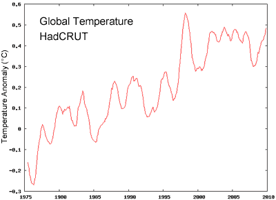
Figure 1: 12 month average of global temperature anomaly from the Hadley Centre (HadCRUT).

The important point to realise is that the HadCRUT record is not a truly global temperature record. Their record doesn’t include many regions, some of which happen to be the regions where the fastest warming is occurring. An analysis by the European Centre for Medium-Range Weather Forecasts (ECMWF) calculated global temperature, utilising a range of sources including surface temperature measurements, satellites, radiosondes, ships and buoys. They found recent warming has been higher than that shown by HadCRUT as the HadCRUT record misses out on the parts of the world of greatest warming.


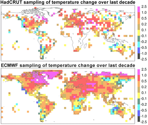
Figure 2: Increase in mean near-surface temperature (°C) from (1989-98) to (1999-2008). Top figure shows HadCRUT sampling regions, lower figure shows ECMWF analysis (ECMWF 2009).

This is confirmed by NASA GISS who found a major contributor to recent warming is extreme Arctic warming (Hansen 2006). As there are few meterological stations in the Arctic, NASA extrapolated temperature anomalies from the nearest measurement stations. They found the estimated strong Arctic warmth was consistent with infrared satellite measurements and record low sea ice concentrations. According to the NASA GISS global temperature record, the hottest year on record is 2005. Of course, nature isn’t bound by calendar years. The actual hottest 12 months on record are from June 2009 to May 2010.

NASA GISS global temperature - hottest 12 months on record June 2009 to May 2010
Figure 3: 12 month average of global temperature anomaly from NASA GISS.

Cherry Pick #2: ignore what's happening to the rest of the climate

Even NASA's global temperature record doesn’t give you the full picture. The surface temperature record tells us about air temperature at the Earth’s surface. However, this is only a small part of global warming. Because of increased greenhouse gases, the planet is building up heat. More energy is coming in than going out. Did this energy imbalance stop in 1998? To determine this, one study measured the Earth’s total heat content since 1950. The authors used measurements of ocean heat content down to 3000 metres depth. The amount of heat in the atmosphere was calculated using the surface temperature record and the heat capacity of the lower atmosphere. Warming land and the energy required to melt ice were also included.


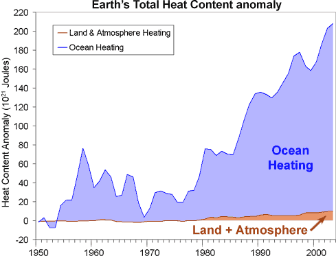
Figure 4: Total Earth Heat Content from 1950 to 2003 (Murphy 2009).

What they find is the planet has clearly continued to build up heat past 1998. Global warming has not stopped. It also shows that most of global warming is going into the oceans. This is because the heat capacity of the land and atmosphere is small compared to the ocean. This leads us to our third cherry pick.

Cherry Pick #3: Comparing single years rather than statistical trends

The ocean holds significantly more heat than the atmosphere. Consequently, relatively small exchanges of heat between the atmosphere and ocean can cause large changes in surface temperature. In 1998, we experienced the strongest El Niño on record. This moved massive amounts of heat from the Pacific Ocean into the atmosphere, leading to an abnormally warm year. Conversely, 2007 saw the strongest La Niña conditions in over 20 years which had a cooling effect on global temperatures. In 2010, the Pacific transitioned back to El Nino conditions although not as strong as in 1998. Nevertheless, this resulted in the warmest 12 months on record from June 2009 to May 2010.

This internal variation where heat shuffles around our climate is the main reason why surface temperature is such a noisy signal. With so much internal variability, it can be misleading to make conclusions about climate trends merely by comparing one point of a noisy signal (eg – 1998) to other years. This is why scientists employ statistical methods to discern long-term trends – this is a way of including all the data rather than a few cherry picked years. A common method to remove short-term variations, revealing any underlying trend, is to plot a moving average.

Figure 5 shows the 11 year moving average - the average temperature anomaly calculated over the year itself and five years either side. Three temperature records are examined: the Hadley Centre at the University of East Anglia (HadCRUT3), a branch of NASA called the Goddard Institute of Space Studies (NASA GISS) and the National Climatic Data Center which is part of the US government’s National Oceanographic and Atmospheric Administration (NCDC). For all three records, the moving average shows no sign that the warming trend has reversed.


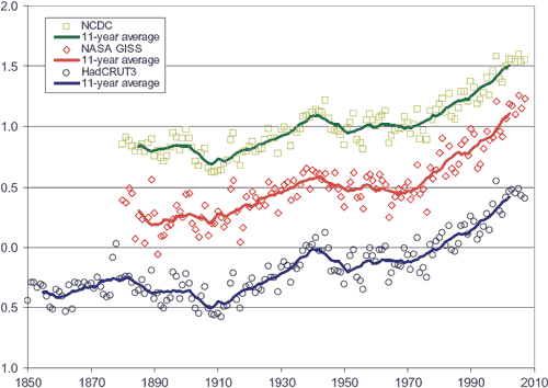
Figure 5: Yearly global temperature anomalies, together with 11-year moving averages (solid lines). Blue circles from the Hadley Centre. Red diamonds from NASA GISS. Green squares from NOAA NCDC. NASA GISS and NOAA NCDC are offset in vertical direction by increments of 0.5°C for visual clarity (Fawcett & Jones 2008).

Note: a short version of this post was used as the debunk of the week in the Irregular Climate Podcast #8. Here's a transcript of the debunk showing how all the above information was boiled down into 4 short paragraphs.

0 0

Printable Version  |  Link to this page

Comments

Comments 1 to 36:

  1. Besides the cherry picking, there is the completely blind eye to consilience. We have multiple independent inferences pointing to the same thing. There is a chance that errors exist construction of the surface temperature records. Maybe there is a calibration issue with sealevel records. Satellite MSU records have a long line on known issues. Glacial data has sampling problems going back in time. Ice-loss records are too short. The upper stratospheric is somewhat under-observed. Multiple measurement issues trouble ocean heat content. Yes to all, but the data we have with all its issues is remarkably consistent with each other and all point the same way. For us to be wrong about warming is to imply a major problem in ALL the evidence. The probabilities here are too small for me to feel like gambling. I am amazed at what straws deniers will grasp. There must be a lot of people with shares in fossil fuel industry.
    0 0
  2. scaddenp: Well said. This is one of the things I find most troubling about climate change -- the more you study it, the more connections you make (like your point about all the data pointing in the same direction), and the more urgency you feel about our situation. Unless, of course, you've decided before looking at the data what the answer is, then you can save yourself a lot of time and effort and just leap to the preferred conclusion.
    0 0
  3. I have often thought, since the deniaworld sprang into action, that the reason they can be so successful in misleading people is that the average punter can't read graphs. We in science tend o think of graphs as a perfectly normal way of presenting information, and we understand the conventions and implications. The non-scientist rarely if ever sees a graph, and when they do, as in the global temp graphs, what they see is not a trend, but a wiggly line. So when someone says to them "no warming since 98" they look at the wiggly line and say, oh yes, those temps are all about the same. They cannot, it seems, because of unfamiliarity, cast an eye along the graph and recognise that those wiggles, including the last 12 years, form a trend. And of course they have absolutely no idea of regression analysis. It is difficult, as graphically literate scientists, to put ourselves in the mind set of those to who graphs mean nothing. We might therefore be better to keep pointing out that all the evidence, from all kinds of sources, points in the same direction, rather than relying on graphs as a self-evident presentation of data.
    0 0
  4. #1 ECMWF in Fig2 seems to be global LAND record from the image, so maybe not truely global? Also deniers criticize GISS for the way it extrapolates(?) the polar regions and for having a land biased. So it seems many records exist, all with pros and cons. It seems that this fact allows for multiple interpretations. #2 Josh Willis said on Roger Pielkes snr’s website “However, I personally belive that there is not a long enough common period between the satellite observations and the RELIABLE ocean heat content record to make any strong claims about the energy budget.” That aside it seems that Murphy vastly exaggerates deep ocean energy content compared with others such as Purkey and Johnson. #3 I am confused why the HADCRUT appears to showing a flattening on the year to year basis since 1998 while the 11 year averaging doesn't. It strikes me that in the averaging process the final years become under reprecedented compared with earlier time points. Won't the flattening of the HADCRUT data only show through over the next few years using this sort of averaging? I'm truely confused by this.
    0 0
  5. Hi David , as a average punter I dont mind the graphs , I sorta understand trend lines and smoothing but I would like to learn more so if there a not to technical resource out Id be interested . Anomaly graphs ? how do you set zero line ? is like a base line of what normal varience should be ? . there just an example of my ignorance . :-)
    0 0
  6. The sparsity of Arctic data requiring considerable extrapolation juxtaposed with comments as to extreme Arctic warming warrant some caution in the light of the DMI temperature record over the last two years. Of course, two years represent weather rather than climate. Sea ice is doing some interesting things this year (again, weather rather than climate) both in the Arctic and Antarctic notwithstanding the real possibility that land ice sheets may be the more important metric. It's going to be an interesting couple of years as current weather morphs into climate.
    0 0
  7. HRules "#3 I am confused why the HADCRUT appears to showing a flattening..." I thought it was commonly accepted that HADCRUT's lack of data from the regions that are known to be warming fastest - NH polar and near regions - reliably show lower warming trends than other series.
    0 0
  8. HumanityRules, in answer to your numbered points; #1 - The readings shown in Fig2 are clearly land based, but HADCRUT (like GISS & NCDC) combines those with sea surface temperature readings to get the global anomaly. The land vs sea vs combined results can be seen here. It is accurate to say that none of the temperature trend methodologies are perfect... for that we'd need to somehow measure the temperature of every cubic inch of the atmosphere and oceans every second. However, given that they all have DIFFERENT liabilities yet all show similar results it seems difficult to argue that those results are incorrect. Basically, it's down to disputing the margin of error within a POSSIBLE range of about +/- 0.03 C per decade. #2 The planet's energy budget can be determined either by measuring incoming and outgoing energy (via satellites) OR by measuring energy accumulating within the planetary system (mostly ocean heat content). Willis is an ocean researcher and largely correct that there isn't enough solid data there to make definitive statements. However, the satellite record is longer and more certain. Having agreement between both (as we now do for a short timeframe) increases the certainty of the results, but the satellite values alone also make a strong case. BTW, Murphy's 'exaggerated' results are more consistent with the satellite record and current OHC data. #3 This is just math. Look at the values BEFORE 1998 in Fig1. They were clearly lower. Thus, in the running average graph those values 'drag down' the 1998 result... but the 1999 result has one fewer year of those low values averaged in, the 2000 result has two fewer years, et cetera. In Fig1 every value AFTER the 1998 peak is higher than every value BEFORE the 1998 peak... thus a running average is perforce going to show continued increases. Fig5 was released in 2008 and thus the average line doesn't show results after 2002 (though the circles for 2003-2007 are given). If it did there'd be a flattening out in 2003 & 2004. The 2005 value won't be computable until 2010 is over, but if temperatures continue the way they have been thus far this year the 11 year average would then start rising again.
    0 0
  9. In principle I agree with the analysis that global warming is continuing to happen. Still, I feel that there is something to explain about the hadcrut graph. When you stare at it, you cannot escape the impression that it does look like the temperature has stopped rising. I do understand that the graph represents a rather small area, and that if you extend your coverage to include among other things the Arctic and the sea, that picture changes. But do we understand why the global warming is not visible in the last decade of the hadcrut sample? Is there some known mechanism that at least temporarily steals heat from the populated part of the globe and deposites it elsewhere?
    0 0
  10. 8 CBDunkerson #1 I guess I'm not looking for perfection just pointing out there is a lot of products to choose from. The fact that people make their point using one or another product is as you say playing with the margins. WUWT will argue to the death that post-1998 is flat, John will do the opposite. I wonder if it would be fair to suggest the rate of increase has slowed? #2 I was surprised that Murphy's paper assumes 40% of the ocean heat is 'hidden' in the deep ocean. It's that sort of assumption that allows them to match the satellite and OHC data. I'm not sure everybody would agree with that assumption. #3 "In Fig1 every value AFTER the 1998 peak is higher than every value BEFORE the 1998 peak". Agreed but nobody is arguing a decline relative to pre-1998 temperatures. I was looking at the HADCRUT data in Fig5. There you can see the dots for each year and it's not the case that every years is hgiher than the previous. Yet the 11-yr average is still going up. That must mean those final years are not yet properly represented by the 11-yr moving average. In fact the 11-yr averaging stops before the point where the year-on-year temperature shows the flattening phase. I take the point that a moving average will smooth things out to reveal the long term situation but we're not talking about the long term situation. John is specifcally countering deniers post-1998 temperature claims. I don't see that an 11-yr moving average is the right tool for disucussing that particular data.
    0 0
  11. Bokstedt, Global Warming is Visible in the last decade. It is the warmest decade on record for Hadcrut for example. Global warming does not mean each year or 2-3 year period will be warmer but it does mean that one would expect increasingly warmer longer time periods.
    0 0
  12. Way> Yes, it's true that we don't necessarily have that each year is warmer than the previous one. Even if we do have global warming, it could be that the global temperature stagnates or falls over a period of a few years. But the claim of this post is not that this is what has been happening over the last decade. The claim of the post is that global warming has continued, but that it has occured in somewhat hidden places. So my question is 'if global warming has been happening throughout the last decades, why can't we see it as a continuation ot the temperatures increase in the hadCRUT record?'
    0 0
  13. They'll soon have this 'skeptic' argument recycled: "It hasn't warmed since 2010" or "GW stopped in 2018" This global warming never stops stopping!
    0 0
  14. #10 HumanityRules, I suggest you get a calculator and a table of numbers and check it yourself. It is not complicated (add 11 numbers and divide the sum by 11). Every year is equally represented in the moving average. The moving average is doing exactly what it should, and stops exactly where it should given the data in the figure. You are not doing yourself any favors by suggesting otherwise.... As for your comment #1, certainly it is true that WUWT and actual scientists have different interpretations of the recent record, but we will know in a few years how that turns out. My money is not on WUWT in that bet. But I am sure WUWT will simply move on to other claims by that time. Given that the last 12 months have been the hottest 12 month period on record, I predict that WUWT and others will be dropping the "no warming since 1998" claim within a couple of years at most, because even the cherry-picked version will be untenable. But you are correct that an 11-year moving average is not the right tool to evaluate a claim that the temperature trend has changed. For that, you would need to use a 20-30 year average so that you could average out more of the natural variability. The other point about this denier argument not addressed here is that the post-1998 record is too short for a statistically significant trend given known variability in climate. I'm sure John left it out because he chose to focus on the cherry picking x3 aspect of the argument here. But you can see simply by averaging over the solar cycle that there is no radical change in trend at 1998.
    0 0
  15. Here is a 2008 version of ocean heat content. If you fast forward down to fig 9 on p. 13 of the pdf and fig 12 (p. 16), you get a very clear picture (graph) of the results. Very consistent with the ocean heat content that John shows above. Arguing why one interpretation is 0.1C higher or lower than another, or why temperature profile X is flat for 5 years while temperature profile Y is increasing? That's fine when it comes to working out the details, but it obscures the overall story (which is exactly what the denialists want). As CBD says (#8) "it's down to disputing the margin of error", a far cry from HR (#4) "many records exist, all with pros and cons. It seems that this fact allows for multiple interpretations." We can't allow a reasonable discussion over margin of error to be turned into 'there's no consensus' or 'the science isn't settled'.
    0 0
  16. #12 Marcel, the post is not claiming that the warming is continuing but is in hidden places. Living (almost) in the Arctic myself, I can assure you that very large areas of the Arctic are indeed warming, whether or not there are weather stations there. There is plenty of non-instrumental evidence that the weather station observations are representative. But I don't see how you can make your argument looking at Figure 3. Clearly, even with something as simple as averaging over the solar cycle, there is no substantial (visual) change in trend going back as far as the 1970s. I think the same would be true if you updated the figure to 2010. If you want to do a real statistical test, that's a better way to test whether the trend has changed since year X, but to do that you need to base the trend on more than a decade -- more like 20-30 years.
    0 0
  17. #12 Marcel, I should have added in my response that that what the post is really about is the multiple levels of cherry-picking required to even make this particular argument. That's the central point.
    0 0
  18. Jeff> I don't doubt that the Arctic is warming. And I'm not trying to argue that global warming has stopped. But you have two sets of data (like figure 2 and figure 3), you usually don't claim that one set disproves the other. Preferably you want to have some understanding of both sets simultaneously. So I'm wondering about what has been going on in the last decade, and if there is some understanding of why the different measurements seem to give different trends (in the last decade).
    0 0
  19. @HumanityRules
    "Also deniers criticize GISS for the way it extrapolates(?)"
    As skeptics seem to prefer the UAH satellite record above all others (it is compiled by John Christie and Roy Spencer, whose work is published regularly at WUWT), it's worthwhile pointing out that they derive a North Pole temperature trend of +0.47C per decade over the last 30 years. http://vortex.nsstc.uah.edu/public/msu/t2lt/uahncdc.lt (Decadal trends are given at the bottom of the page at the UAH link above) That's right - nearly half a degree Celsius every ten years. At 3 times greater than the global trend, UAH NP data corroborates GISS and ECMWF finding accelerated heating in the Arctic.
    0 0
  20. Some great examples of cherry picking in the posts above, as if to prove John's point. Yes, HadCRU shows limited warming (though still warming) over the past 12 years, but this is not exactly unusual for this dataset: [ergh, not sure the woodfortrees graph is going to show, shortened link with a tinyurl. It showd HadCRU 1977 to present, with relatively flat streches between 1977-1987, 1987-1997 and 1998-present - ie decades of relatively flat temperature, but of course the climatologically significant upward trend is strongly and significantly positive.] You can pick out several relatively flat regions in the Hadley dataset, but the long-term trend is still upwards, just as in all the other datasets. The analyses such as ECMWF and GISS explain the reasons for some of the discrepancies, with the missing of remote regions, while also showing that the warming is not "hidden" - it is present and observed, just not in the Hadley dataset of the past decade. Quite why the regions in the Hadley dataset show a more pronounced 'stepping' pattern over the past few decades is perhaps an interesting question in itself, but it is clear from observations the global temperatures and global heat content show a much steadier upwards trend. There is absolutely no reason to suggest we're anywhere other than on one of Hadley's 'steps' on it's upward progression.
    0 0
  21. David Horton @ 3, I agree that many people have trouble with graphs (and statistics). That's why I think it is important to relate to people's experience and to present the information in a way that is accessible to them (not just to other scientists). Below is one of my favorite plots from GISS because I think people can grasp it intuitively (blue=cool, red=warm): It's hard to look at that and not see a warming trend.
    0 0
  22. #18 Marcel, I don't see how Figures 2 and 3 disprove each other, and I didn't see anything in the post that claims they did. Figure 2 just emphasizes how HadCRUT undersamples some areas of the most rapid warming. That's relevant to the point that 1998 was the hottest calendar year in HadCRUT but not in some other temp series, but I don't think John was trying to claim anything more about Figure 2.
    0 0
  23. David Horton @ 3... I'll toss myself into the fray with the common punters on this one. But what I think is interesting is that, because of people becoming more interested in this complex issue, they are learning a thing or two along the way. Two years ago most outside of science didn't know the definition of the term "statistical significance." The flap over the Phil Jones interview threw that term into the main stream. People had to learn what "p-value" is, how it is calculated and how it works. Okay, maybe it went right over the heads of a lot of punters but it stuck with others. Climate involves a lot of charts. The charts, I think, are slowly making people just a little smarter. Slowly. That's a good thing.
    0 0
  24. #19: 0.47C per decade is the straight line trend over the entire 30+ years of the UAH North Polar LT dataset. Data shown below . But the smoothed curve(purple) shows a higher rate of increase from '92 on, as high as 0.9 degC per decade or a more modest 0.7 deg/dec if you prefer a straight line from Jan92 to Jan2010. Either way, the Arctic region has the highest rate of temperature increase on the planet.
    0 0
  25. Hi Marcel 1998 was a huge step wise increase in temperature from prior years. Note that 1987-1995 looks like a plateau as well. The el nino in 1998 was a 2-sigma event (it was the strongest el nino on record) so very rare and not likely to be matched if the temperature was not rising, yet it was closely matched nearly every year even in figure 1. You might want to think about it this way: that the temperature never recovered from the extremely high level reached in 1998 (its highest level in the record) and now it is going even higher. Yes, ocean and atmospheric circulation move heat around from lower latitudes to higher latitudes but it is not temporary. It is ongoing since solar insolation is strongest at lower elevations. Lower elevations tend to be where the people are. :+) Tony
    0 0
  26. Tony Noerpel> Yes, the pacific oscillation could be part of the explanation. In the 1998 el Nino event there was certainly energy transfered from the sea to the atmosphere, which hasn't happend to the same extent later. But a complete explanation might involve a precise description of the global energy budget, and it seems that people can't do that yet. Jeff> I agree with what you write, but that does not explain why the areas sampled by hadcrut have not warmed much during this decade. I would like to have some mechanism for this on the table.
    0 0
  27. #26: "areas sampled by hadcrut have not warmed much during this decade. I would like to have some mechanism for this on the table. " There are a variety of consistent observations to be made here: Look at the LOTI records, which are broken into bands of latitude roughly 20 degrees wide. As you move north from the equator, there is consistently more warming. Look at CO2 for a variety of locations, as you move closer to the north pole, the difference between seasonal high and low is much larger than it is in the lower latitudes. Look at the ocean heating paper I referenced in #15; there are considerable differences in heat content between the various oceans. Whatever the mechanism, it seems to be consistently stronger as you move closer to the north pole.
    0 0
  28. #26 Marcel, it is my impression that the warming in the Arctic is always amplified relative to the more equatorial latitudes (presently it shows 3-4x the average global warming). There is some evidence that this may be true even for episodes of warming millions of years ago. (And presumably a similar factor applies for cooling episodes). I'm not sure its fully understood why this is so (my impression is that it is not fully understood). I see what you are getting at in asking for an explanation for the pattern of the last decade, but I am not certain whether or not anything other than the usual Arctic amplification is involved. Maybe somebody else here can answer that. The one thing that is pretty clear is that many of the real "hotspots" are in remote places where few people live, and thus there are few weather stations. Even here in Alaska, there are very few weather stations in the mountains where the glaciers are, mostly they are in or near towns or roads because that is easier and cheaper.
    0 0
  29. muoncounter> It seems to me that the differences in CO2 levels between latitudes is rather small. There is an annual variation which presumably is caused by the biosphere. this variation gets larger closer to the poles, which fits well with that the differences between seasons is bigger there. Jeff> Polar (Arctic) amplification is often attributed to the albedo changed caused by less ice and snow. As I understand it, it is an additional warming. It could also be part of the explanation, but now we are really guessing wildly, and we are not even on WUWT.
    0 0
  30. Here's a fun one. Over at WUWTF they're crowing that the satellite record only broke the 1998 record briefly. A rather subtle cherry pick. Here's my response there; let's see if it makes it through the moderator gateway.
    This is a bit silly. 1998 Was the strongest El Niño ever recorded. It's quite clear that the satellite measurements overestimate temperature compared to the instrumental record during El Niño events. However, as we are now approaching a LaNiña event, and the satellite record is approaching record levels, while the surface record is breaking records, your analysis appears to fail to take account of the complexity needed to interpret this data.
    0 0
  31. And according to me we have more to do with global warming. However - the third point is a typical incomplete information: “The Climate Prediction Center recently released its equatorial upper ocean heat content for April 2010. One of the primary areas that they focus on is the equatorial heat content averaged over the area from 180-100W. The decrease in upper ocean heat content from March to April was 1C, which is the largest decrease in equatorial upper ocean heat content in this area since the CPC began keeping records of this in 1979. [...]” Of course, El Nino, but if only? Scary-looking figure 4 shows primarily the effect of AMO. In the initial phase of positive, followed by accumulation of energy (although some parts of the ocean - sometimes most - losing it slightly). Then (a measure of positive phase of the AMO), we have a very slow passing of energy (1.), until the sudden acceleration (possibly sudden reversal of meridional transport of energy - balance of energy -2.). 1. Widely discussed papers: Heat capacity, time constant, and sensitivity of Earth's climate system, Schwartz, 2007: “Also, recent studies with coupled ocean atmosphere GCMs have shown that the thermal signal from even a short-duration volcanic event is transported into the deep ocean and can persist for decades [Delworth et al ., 2005; Gleckler et al ., 2006 a , b ]; such penetration of the thermal signal from a short- duration forcing would suggest that the autocorrelation of GMST over a decade or more would be representative of the longer time constant associated with the coupling to the deep ocean and not reflective simply of a short time constant associated with the ocean mixed layer.” 2. Changes in net flow of ocean heat correlate with past climate anomalies, I chose a more accessible information: ScienceDaily (Aug. 17, 2009): "These shifts happened relatively abruptly," says David Douglass, professor of physics at the University of Rochester, and co-author of the paper.” “Douglass says the last oceanic shift occurred about 10 years ago, and that the oceans are currently emitting slightly more radiation than they are receiving.” “The team believes that the oceans may change how much they absorb and radiate depending on factors such as shifts in ocean currents that might change how the deep water and surface waters exchange heat. In addition to the correlation with strange global effects that some scientists suspect were caused by climate shifts, the team says their data shows the oceans are not continuously warming—a conclusion not consistent with the idea that the oceans may be harboring "warming in the pipeline."
    0 0
  32. #29 Marcel, polar amplification (at least in the Arctic) is certainly happening -- it's observed, and not just in the present but also in paleoclimate. The explanation of why is much more speculative -- like you, I doubt that albedo is all of the story.
    0 0
  33. #29 "this variation gets larger closer to the poles, which fits well with that the differences between seasons is bigger there." The annual average CO2 concentrations are indeed comparable. However, Mauna Loa CO2 averages ~4ppm from spring (March-April-May) high to Sept-Oct-Nov low. In the arctic, that range expands to 15 ppm and is increasing. Annual arctic temperature range is about 30C; global average about 4C; Mauna Loa 9C. Sure is a nice fit. All a part of the polar amplification picture, no doubt. There was a recent thread on that subject here.
    0 0
  34. Scaddenp writes (first comment), apropos of why there is so much climate denial, "There must be a lot of people with shares in fossil fuel industry." We _all_ have shares in the fossil fuel industry. Not necessarily stock, but a frightening, radical dependency. Coal and oil feed us, light us, clothe us, entertain us, truck and ship all our crap and necessities around the planet, move us back and forth to our jobs and vacations, build our homes -- keep the whole industrial circus from collapsing into apocalyptic chaos and mass death. Denialism's reassurance that all is basically well, that all will continue to be well, that we can all continue to do our familiar things and burn our familiar fuels and live our familiar way and be safe forever, that there is nothing fundamentally, fearfully wrong with the planet or with our dream of technology-driven prosperity and progress . . . it's very tempting.
    0 0
  35. #34, I agree. David #3 wonders if the problem with deniers is they can't read charts. Probably they can't - but they can read tea leaves, and they tell what most scientists won't say outright - fixing this problem (it's no longer fixable) would have required radical sacrifice in lifestyle on the part of every citizen of developed countries, and a universal one-child (or less) policy. The scientists and climate change activists who promise that we can convert to clean energy and restore the economy without giving up our fuel-gobbling toys are making a huge mistake. The deniers know instinctively that isn't true. You don't need charts or graphs to see where how this movie is going to end. Scientists should stop pussyfooting around and demand that fuel be rationed on a per-person basis, and restricted to only the most essential purposes until it is replaced with sustainable sources for electricity. Don't you have kids too?
    0 0
  36. No Antarctica shown in either HADCRUT or ECMWF maps? Are _both_leaving out the intense warming in the West Antarctic peninsula?
    0 0

You need to be logged in to post a comment. Login via the left margin or if you're new, register here.


The Consensus Project Website

THE ESCALATOR

(free to republish)


© Copyright 2024 John Cook
Home | Translations | About Us | Privacy | Contact Us