


 Arguments


Those 80 graphs that got used for climate myths
Posted on 11 July 2017 by Ari Jokimäki
Recent attack on the so-called hockey stick graph is a compilation of 80 graphs from 2017 which consists of 76 graphs that describe local or regional situations, one graph that describes Northern Hemisphere situation, one graph that describes NH extratropics situation, and two graphs that describe global situation. As the hockey stick graph describes the situation in Northern Hemisphere, 80 graphs become 4 graphs, because local/regional graphs are meaningless in comparison to hemispheric/global situation.
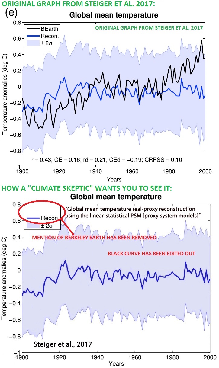
Furthermore, two of the four remaining graphs have originally been published before 2017. We are left with two graphs from 2017. Both of them have been published in the same study, Steiger et al. 2017. The two graphs are indeed interesting as they don't show any sign of recent global warming. But see the figure below. Apparently, the graphs in Steiger et al. weren't good enough for the author of the 80 graphs article, but the graphs needed some editing (both graphs were edited in the same manner). There are also some other problems with these 80 graphs as shown below.
 It is well known that there have been changes in the Earth's climate in the past. We are fairly certain that there have been warmer times and colder times than the present at least some time in the past.
The bad thing about climate changes in general is not the thermometer reading during or after the change but the change itself. The faster the change the worse are the impacts to nature and mankind.
There are many factors which can cause climate to change. Those who have followed climate science are well aware that changes in the Sun's activity, volcanic activity, Earth's orbital parameters, aerosols, clouds, and greenhouse gases, among other things can cause climate to change. One change of the climate can happen due to changes in solar activity and the next change can happen due to greenhouse gases, or the climate can change due to many factors acting at the same time.
So, if solar activity has caused climate changes in the past, that doesn't mean that carbon dioxide cannot cause climate change now. Also, climate change can have bad impacts even if climate has changed before (and we actually have evidence for bad impacts of past climate changes).
Despite of all this, so-called "climate skeptics" spend a lot of time arguing that climate has changed before. In fact, that argument is currently listed as number one in Skeptical Science's Most Used Climate Myths.
Lately, yet another chapter has been written to the continuing saga of climate-changed-before myths. An article about 80 graphs allegedly showing something interesting has been making rounds. The article shows 80 graphs from different research articles and gives some selected quotes here and there. The article has been debunked already in Climate Feedback by the authors of the studies from where the graphs were used for this 80 graphs article. I also took a peek at the issue. I looked at each graph and also clicked the links to the studies behind the graphs to see how the graphs were originally presented. I didn't read the studies in full, though (it seems that neither did the author of the 80 graphs article). I recorded my findings for each graph, and then looked the results as a whole.
Creating a straw man: Local, hemispheric, and global climate changes
When climate changes, it does so at different paces at different regions. For example, current climate change has proceeded faster in some regions and slower in some regions, as can be seen from this global surface temperature trend map (from NASA GISS):
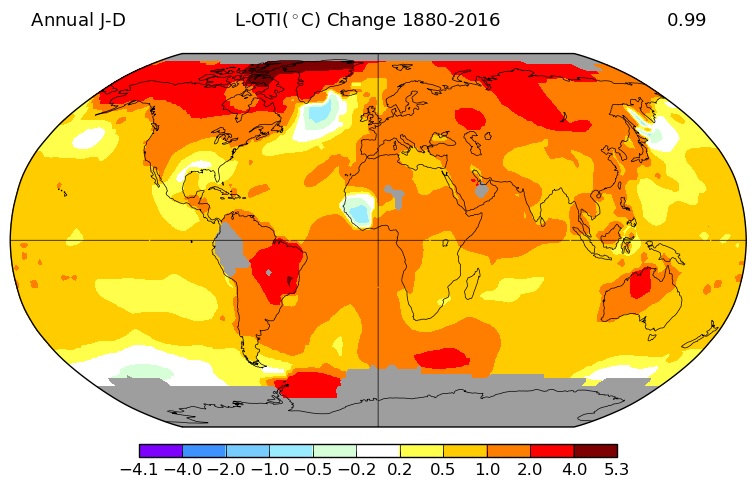
If we want to compare the current climate change to past climate changes, we need to look at global, or at least hemispheric situation. Similarly, if we want to debunk the hockey stick graph, which describes the climate evolution in Northern Hemisphere, we need to look at the Northern Hemisphere situation.
In this sense, it was strange to find out that almost all of the graphs in the 80 graphs thing were local or regional graphs. Of the 80 graphs, 76 are local or regional (so 95% of the graphs are not comparable to the hockey stick graph, or are not important for current global climate change). One of the graphs was about Northern Hemisphere but it turned out to be a 2005 graph from Moberg et al. (2005), so no news there. One of the graphs was claimed to be Northern Hemispheric, but consulting the study in question (Büntgen et al. 2017) showed that it actually was only extra-tropical Northern Hemisphere, and the graph in question actually shows 20th century warming, so it's close but no cigar. Two of the graphs were global, but for these there were some graph trickery involved, as was shown above.
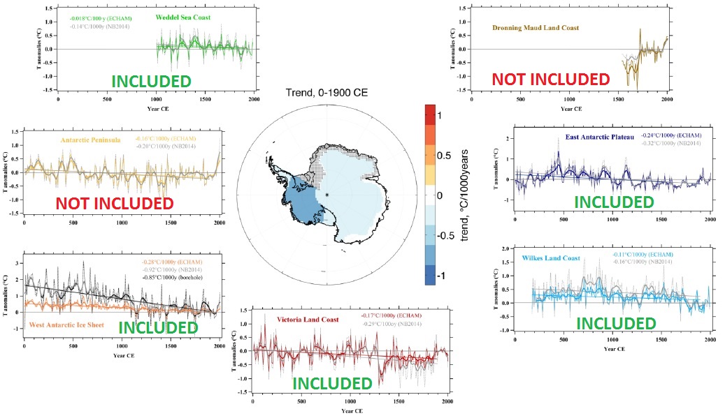
This is what Nathan Steiger wrote about this issue in the Climate Feedback article: "The blog post maliciously tampered with figures from my paper, removing lines from the figures. My paper is just not relevant to the arguments about global warming." Aside from graph trickery, the two graphs from Steiger et al. are interesting. They have been cut out from Steiger et al. figures 12 and 14, which both contain three panels where temperature reconstructions from ice cores are compared to real temperature evolution in Greenland, British Isles, and globally. The result from this comparison is that reconstructions match real temperature best in Greenland, and in British Isles and globally match is not so good. Steiger et al. emhasize in the paper that the ice core reconstructions work best as local reconstructions. The 80 graphs article only included the global graphs. Furthermore, elsewhere in the paper there were other graphs where reconstructions also showed warming globally, which obviously is good enough reason not to include the graphs to the non-warming-showing-graphs collection such as the 80 graphs article.
Basically, we could stop here and conclude that there's not much to see here, but actually I did find some climate mythology related things I would like to show you.
Before present means 1950, not actual present
The 80 graphs article contains 36 graphs which stop at 1950 or before that. In other words, almost half of the graphs don't even show the modern times, when current climate change has occurred.
The author of the 80 graphs article apparently does not know that in palaeoclimatology, one of the standard methods to describe time is setting zero point to 1950 and call that point of time the "present". This is usually abbreviated as "BP". The author of 80 graphs article has included lot of graphs that end at 0 BP or even before that, which in standard palaeoclimatology means that they end at 1950 or before.
Perhaps worst of these is a graph from Markle et al. This graph shows temporal evolution during an idealized Dansgaard-Oeschger event, so the time shown in the x-axis doesn't even show real time but time from the start of such event to the end of the event. The data used in the study in question runs from 70000 to 10000 years ago, so the most modern data-point available in the study is from 10000 years ago.
Cherry-picking graphs and doing tricks on them
Only parts of the graphs have been cut out from these Wilson et al. figures:
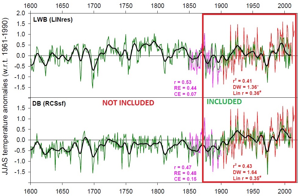
One of the graphs in this Rydval et al. figure was not good enough to be included to the article:

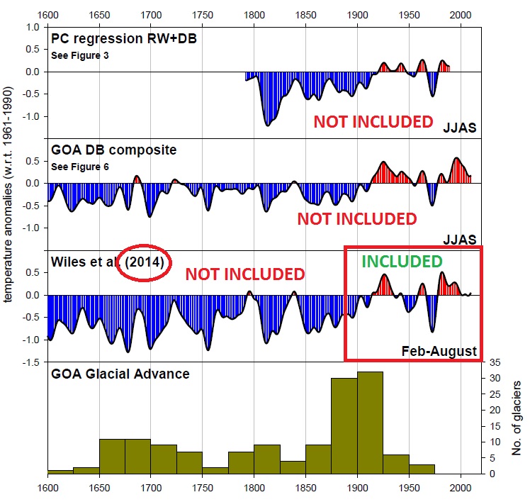
This Stenni et al. figure has two graphs that didn't make it:
Tejedor et al. have a figure in their methods section that contains a temperature graph from instrumental measurements of the study region. While including instrumental measurements to a collection of reconstruction graphs is rather odd, how strange is not including reconstruction graphs from the same study? Yes, Tejedor et al. also have reconstruction graphs, in their results section:
Only the juiciest bits were cut out from this Li et al. figure:
Other problems
With increased greenhouse effect, we expect to see winters warming faster than summers. If you want to find graphs that show the least warming during the last few decades, you should use graphs that show only summer months. For example, in Finland, where I live, annual mean temperature has increased by about one degree of Celsius, but the month of June hasn't warmed at all yet. In the 80 graphs article, at least 15 graphs show only summer months.
Few of the papers haven't been peer-reviewed yet. EGU has these open access journals from where one can access papers which are only going through peer-review and haven't yet been officially published. Sometimes it happens, that during peer-review some problems are found from the paper and it is possible that the whole paper is rejected from the publication. Therefore, it would be good to wait for the peer-review result before using such papers in the public. Of the 80 graphs, 14 are from such papers.
Some of the graphs are noisy and scaled so that long-term trends are difficult to determine from the graph. Such is the case for example with Chapanov et al. graph. Guillet et al. 2017 graph also suffers from the same thing and the graph also doesn't have temperature in its y axis (it's grape harvest date). Graph of Luoto and Nevalainen, 2017, also doesn't show temperature in its y axis (it's temperature/precipitation). Some graphs are detrended.
Some of the papers in question have other graphs that show warming.
At least seven of the 80 graphs actually show warming during the last few decades.
See the Climate Feedback article for more curiosities with the 80 graphs article. There the authors themselves describe the problems with the graphs, of which some have also been noted here.
Discussion and conclusions
I didn't look at the quotes selected for the 80 graphs article, but I concentrated only on the graphs. Even this produced more than enough findings, as you can see above.
For some of the papers I didn't have access to full texts, so it is likely that the results shown above will be even worse than shown here. For example, from the Climate Feedback article it can be seen that there are at least few more graphs that have been originally published before 2017 than I counted here.
In my opinion I have shown that the 80 graphs article doesn't come even close to debunking hockey stick graph or showing that global warming does not exist or is not man-made. Instead the 80 graphs article only shows evidence of cherry-picking, straw-man argumentation, graph distortions, misunderstanding of the science, etc. In other words, it shows just the things we have become so used to see from "climate skeptics."
Appendix. The table of problems by graph
The table below show the main findings for each paper. Columns are: "graph" = number of the graph from top to bottom of the 80 graphs article, "paper 1st author" = identification of the paper using the first author's name, "summer" = 1 if graph shows only summer months, "loc/reg" = graphs shows only local/regional situation, "0 BP" = graph's time axis ends before modern global warming starts, "<2017" = graph has originally been published before 2017 in some other study, and "other problems" = for describing some other problems, containing following problem types: noisy graph (long-term trend difficult to estimate), cherry-picked (graph has been cut-out from a figure containing many graphs and graphs showing warming have been ignored), Y-axis not T (Y axis shows something other than temperature), not a reconstruction (graph shows instrumental measurements or similar), detrended (long-term trend has been removed from the graph), only part of graph shown (part of graph has been cut out for showing or parts of the graph have been edited out).
| Graph | Paper 1st author | Summer | Loc/Reg | 0 BP | <2017 | Other problems |
| 1 | Büntgen | 1 | 1 | - | - | - |
| 2 | Büntgen | 1 | 1 | - | - | - |
| 3 | Büntgen | 1 | - | - | 2015 | - |
| 4 | Abrantes | - | 1 | - | 2016 | - |
| 5 | Abrantes | - | - | - | 2005 | - |
| 6 | Abrantes | - | 1 | - | 2011 | - |
| 7 | Abrantes | - | 1 | - | - | - |
| 8 | Werner | 1 | 1 | - | - | - |
| 9 | Deng | - | 1 | - | - | - |
| 10 | Chapanov | - | 1 | - | - | noisy graph |
| 11 | Williams | - | 1 | - | - | - |
| 12 | Stenni | - | 1 | - | - | - |
| 13 | Stenni | - | 1 | - | - | cherry-picked |
| 14 | Stenni | - | 1 | - | - | cherry-picked |
| 15 | Stenni | - | 1 | - | - | cherry-picked |
| 16 | Stenni | - | 1 | - | - | cherry-picked |
| 17 | Stenni | - | 1 | - | - | cherry-picked |
| 18 | Li | - | 1 | - | - | - |
| 19 | Demezhko | - | 1 | 1 | - | - |
| 20 | Luoto | - | 1 | - | - | Y-axis not T |
| 21 | Li | - | 1 | 1 | - | - |
| 22 | Mayewski | - | 1 | - | - | not a reconstruction |
| 23 | Rydval | 1 | 1 | - | - | cherry-picked |
| 24 | Rydval | 1 | 1 | - | 2006 | cherry-picked |
| 25 | Rydval | 1 | 1 | - | 2012 | cherry-picked |
| 26 | Rydval | 1 | 1 | - | 2015 | cherry-picked |
| 27 | Rydval | 1 | 1 | - | 2014 | cherry-picked |
| 28 | Reynolds | - | 1 | - | - | detrended |
| 29 | Rosenthal | - | 1 | 1 | - | - |
| 30 | Rosenthal | - | 1 | 1 | - | - |
| 31 | Rosenthal | - | 1 | 1 | - | - |
| 32 | Rosenthal | - | 1 | 1 | - | - |
| 33 | Rosenthal | - | 1 | 1 | - | - |
| 34 | Rosenthal | - | 1 | 1 | - | - |
| 35 | Li | - | 1 | - | - | detrended |
| 36 | Goursaud | - | 1 | - | - | not a reconstruction |
| 37 | Guillet | - | 1 | - | - | Y-axis not T |
| 38 | Wilson | - | 1 | - | - | Only part of graph shown |
| 39 | Wilson | - | 1 | - | - | Only part of graph shown |
| 40 | Tegzes | - | 1 | - | - | - |
| 41 | Tegzes | - | 1 | - | - | - |
| 42 | Tejedor | - | 1 | - | - | not a reconstruction |
| 43 | Fernández-Fernández | - | 1 | - | - | not a reconstruction |
| 44 | Cai | 1 | 1 | - | - | - |
| 45 | Köse | - | 1 | - | - | - |
| 46 | Köse | - | 1 | - | - | - |
| 47 | Flannery | - | 1 | - | - | - |
| 48 | Steiger | - | - | - | - | Only part of graph shown |
| 49 | Steiger | - | - | - | - | Only part of graph shown |
| 50 | Krossa | - | 1 | 1 | - | - |
| 51 | Albot | - | 1 | 1 | - | - |
| 52 | Zhang | 1 | 1 | 1 | - | - |
| 53 | Zhang | - | 1 | 1 | 2005 | - |
| 54 | Zhang | - | 1 | 1 | 2000 | - |
| 55 | Kotthoff | - | 1 | 1 | - | - |
| 56 | Li | - | 1 | 1 | - | - |
| 57 | Jones | - | 1 | 1 | 2016 | - |
| 58 | Vachula | - | 1 | 1 | - | - |
| 59 | Fischel | - | 1 | 1 | - | - |
| 60 | Li | - | 1 | 1 | - | - |
| 61 | Anderson | - | 1 | - | - | - |
| 62 | Woodson | - | 1 | 1 | - | - |
| 63 | Koutsodendris | 1 | 1 | 1 | 2005 | - |
| 64 | Browne | - | 1 | 1 | 2011 | - |
| 65 | Per?oiu | - | 1 | 1 | 2000 | - |
| 66 | Kawahata | - | 1 | 1 | - | - |
| 67 | Saini | - | 1 | 1 | 2016 | - |
| 68 | Dechnik | - | 1 | 1 | 2010 | - |
| 69 | Wu | - | 1 | 1 | - | - |
| 70 | Sun | - | 1 | 1 | - | - |
| 71 | Wu | - | 1 | 1 | - | - |
| 72 | Park | - | 1 | 1 | 2009 | - |
| 73 | Markle | - | 1 | 1 | - | - |
| 74 | Dong | - | 1 | - | - | - |
| 75 | Nazarova | 1 | 1 | 1 | - | - |
| 76 | Samartin | 1 | 1 | 1 | - | - |
| 77 | Thienemann | - | 1 | 1 | - | - |
| 78 | Li | - | 1 | - | - | cherry-picked |
| 79 | Krawczyk | 1 | 1 | 1 | 2004 | - |
| 80 | Krawczyk | - | 1 | 1 | 2009 | - |


More very unreliable, unrepresentative 80 studies research, with giant cherrypicks and manipulations and time frame problems.
The following link is a list of published research studies on past climate histories as at 2014. I did a rough count and there appear to be about 500 studies! They also say its far from a complete list.
So 80 studies proves nothing, and they have not demonstrated it is representative. Plenty of studies show a hockey stick eg Briffa, Esper, and they are proper, relevant studies
www.c3headlines.com/list-climate-history-studies-research-peer-reviewed.html
Can "the scientists" sue these people for defamation ? Is there perhaps a class action that can be taken ordering them to cease lying or pay the penalty for it?
Yet lying in public is "protected free speech" and the only answer to it is more speech.
I don't know if the study tells lies, but in my view it certainly tells lies by omission, misleading claims, and manipulated graphs. It would be interesting to know if its possible to take some sort of legal action against climate denialists for all this. Misleading claims are the basis of false advertising laws, so some precedent is there.
You would at least need to prove both misleading claims, and that real harm was caused, as that's how the law basically works. I'm no lawyer, and would be interested in expert comment.
Maybe a solar power company could bring a claim that the denialists misleading nonsense is causing them harm. Maybe governments should take a case that denialist misleading nonsense is undermining efforts to combat climate change, and thus causing harm to the public good.
Make the denialists sweat, and realise they cant get away with everything.
If its not possible under existing laws, pass laws making it illegal to mislead people with lies by omission in science reports. The IPCC is upfront about the full picture, and uncertainties, so why shouldn't everyone be expected to do the same?
The "80-graph table" should really be put into an expandable small database or table here at SkS for future expansion, and with links to the REAL tables/articles!
PS:
Allways tag links to fake science or denial-articles with attribute rel="nofollow":
This is important to avoid search crawlers to Google and others to elevate their hit rank!!
More leftist lies to propagate their ideological nonsense.
[JH] Blatant sloganeering snipped.
[PS]
Please note that posting comments here at SkS is a privilege, not a right. This privilege can be rescinded if the posting individual treats adherence to the Comments Policy as optional, rather than the mandatory condition of participating in this online forum.
Please take the time to review the policy and ensure future comments are in full compliance with it. Thanks for your understanding and compliance in this matter.
I remember being directed to a website purporting to show all the different studies, around the World, that supported the 'Medieval Warm Period' (WMP) as a global phenomenon. It was certainly impressive: a large compendium of studies (most of them anecdotal). First thing I thought was: who has the time to compile such an impressive array of studies and yet doesn't have the time to properly integrate those studies for year and location? My answer is someone whose purpose is to cast shadow and not light. They're betting that most people will be blinded by the sheer number and give up and just accept the conclusion of the web-site.
Ubrew @12, yes exactly.
Some years ago I saw a collection of about 100 studies claiming the mpw is hotter than recently, similar to the article. I checked the first page of 12 studies, just the graphs and abstracts. Many were on specific cities, some were so long term the wiggles in the graphs were meaningless, some were on parts of oceans so they werent a convincing selection, and I had no way of knowing if it included all studies on the MWP. It certainly didn't prove anything to me or add genuine clarity.
The IPCC reviews "all" the studies. I have more trust in their findings, than some suspiciously selective list by some sceptic.
The 80 studies in the article above sounds formidable, but I was immediately interested how many studies are there on northern hemisphere historical temperatures? As per the link I posted there are many hundreds and hundreds, so 80 is not so impressive, and we cannot be sure it is representative of the true weight of evidence.
kar@4
very good point, although I don't think blogs like this offer the visual tools to the ir authors and commenters gto do so. Maybe make it a task to an admin or to Bob to add it in the "Insert" tab.
By the same token, contrarian studies when debunked for their errors and mistakes, are obviously oridinarily cited by the debunking authors. So, the contrarian authors, commonly producing shonky studies and succeeding in publishing them in the journal where editing/reviewing standards are not so high, receive the credits for each citation. They in fact, should have received "anti-credit" for demonstrated poor quality of their work. There should be an "anti-citation" choice available to the citing party for such cases.
Can someone explain why the blue line in the first graph (with reconstruction) does not show warming?
I cant access the full paper but since the subject about methodology for reconstructing the temperature records from water isotope proxies, I am guessing the original graph showed one methodology compared to "actual" data (the BEST global record from of weather stations worldwide). I would suspect from conclusions, that this was showing the that methodology has limited skill in global reconstructions of temperature.
The denier arguments obviously believes that an inferred temperature scale based on water isotopes from a very limited no. of ice cores with poor spatial resolution is a better record for temperatures than actual thermometers from 1000s of weather stations.
anticorncob6 @9
The answer you want is in the fourth paragraph after the heading "Creating a straw man".
Digby Scorgie @11, I do not currently have access to Steig et al due to its being paywalled (and budgetary constraints). On the assumption that its content largely matches the second half of Steig's PhD thesis, then paragraph four of the section of the OP, "Creating a straw man" is not a full response to anticorncobb@66. Specifically, the "other graphs [which] where reconstructions [that] also showed warming globally" in the PhD thesis were reconstructions using pseudo-proxies rather than actual proxies, and therefore evidence of the adequacy of a statistical technique rather than evidence of global warming.
The reason the pseudo-proxy reconstructions showed, while the genuine reconstructions did not show warming appears to come down to two factors. First, ice core proxies are effected not just by temperature. The PhD thesis shows that pseudo-proxies reflecting all factors (Figure 2.6) do not reproduce the global temperature record as well as those reflecting temperature differences only (Fig 2.12). With real proxies, it is not possible to isolate the temperature influence from other influences is a similar way, leading to a significant amount of noise. Second, while pseudo-proxies can be generated anywhere that feels convenient, genuine proxies must actually be obtained by drilling in available ice. In this case that means that the pseudo-proxies came from 105 locations scattered across the Arctic, Antarctica, Himalayas, Andes and the Rockies. In contrast, the actual proxies are restricted to just 40, from 7 locations within Greenland, 5 locations from the rest of the Arctic, 23 locations from Antarctica, and just one from the Himalayas and no others from outside of polar regions (Fig 2.1). The highly biased distribution of proxies means the proxy network poorly captures global temperature trends - a feature reinforced by the dominance of Antarctic sources, with the majority of Antarctic experiencing little warming over the 20th century (with the exception being the West Antarctic Pensinsula).
The problem of noise generated by other influences can be combated by having a large number of proxies, prefferably of different types, such that the noise tends to cancel out. The limited number of proxies, and geographic bias of proxy locations can be combatted by using a wide variety of proxies from different parts of the world. At least one proxy based reconstruction of 20th century temperatures have bas been done using a greater number of proxies of different types, and it does in fact show global warming over the 20th century. But, as it turns out, the limited number of ice core only proxies used by Steiger et al does not.
Tom Curtis @12
I hope anticorncob6 is satisfied with your comprehensive explanation. In my case I concluded from the paragraph I referred to that there was indeed an explanation but that the details were complicated. That was enough for me.