


 Arguments


Climate Carbon Bookkeeping
Posted on 20 December 2018 by Evan, jg
The question often arises as to how we know that the current year-to-year buildup of CO2 is due to human activities. One way is to do simple bookkeeping of how much of each of the major types of fossil fuels we burn each year, and the predicted CO2 buildup implied by the known yearly combustion rate. Burning fossil fuels produce two major products: CO2 and H2O. As long as we know the carbon and hydrogen content of each of the major types of fossil fuels, it is relatively straightforward to calculate the amount of CO2 released each year. The point of this article is to demonstrate how we do such a calculation, and to demonstrate that such a calculation clearly shows that the measured annual rise of CO2 is due to human activities.
Climate Carbon Bookkeeping
CO2 emissions occur primarily due to burning coal, oil, natural gas, and through deforestation. Because the consumption rates of coal, oil, and natural gas are known, and because other groups monitor the state of forests, it is easy to estimate the CO2 emissions from these sources. Part of the CO2 emitted accumulates in the atmosphere and remains there for centuries to millennia, but part of the CO2 emitted is quickly reabsorbed back into the biosphere (water, soil, and rocks). By using a rough estimate that about 50% of emissions are reabsorbed into the biosphere, it is possible to estimate the atmospheric CO2 accumulation due to human emissions.
Before the Industrial Revolution (which started about 1800 AD) CO2 natural emissions were roughly in balance with CO2 natural sinks, for no net accumulation. This is demonstrated by CO2 estimated from ice-core samples for the period 1000 AD to present, shown in Figure 1. From the dawn of the Industrial Revolution until now atmospheric CO2 concentrations have been steadily increasing. It is easy to show that the atmospheric accumulation of CO2 since the dawn of the Industrial Revolution is due mostly to the burning of fossil fuels, because we know from year to year how much oil, natural gas, coal, and forest trees we are burning, and we know how many molecules are in the atmosphere. Given this data, we can calculate the expected annual increase in CO2 and compare it to the measured annual increase.
CO2 concentrations in Earth’s atmosphere are tracked as the number of CO2 molecules per million molecules [parts per million: ppm]. Figure 1 indicates that 200 years ago this value was about 280 ppm, whereas today it is close to 410 ppm, and from 2005 - 2014 it increased an average of about 2.1 ppm/year. To see that this increase is due primarily to burning fossil fuels and deforestation, we simply divide the number of carbon atoms emitted from Anthropogenic sources by the number of molecules in the atmosphere. It requires a little math, but no computer models.
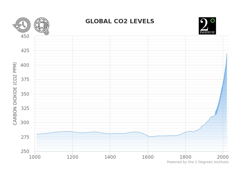 Figure 1. Atmospheric CO2 estimated from ice-core samples, combined with measurements that started in 1958 (represented by the dark blue line). This graph is available at https://www.co2levels.org/
The information for each carbon source is available in slightly different form, so we have to do calculations to convert from the reported data for each source to kg CO2 emitted from each of the sources. The reported emissions for each are barrels of oil, cubic feet of natural gas, kg of coal, and kg of CO2 for deforestation. In the following table we summarize the consumption for each of these sources and show how to convert each source to annual kg’s of CO2 emitted.
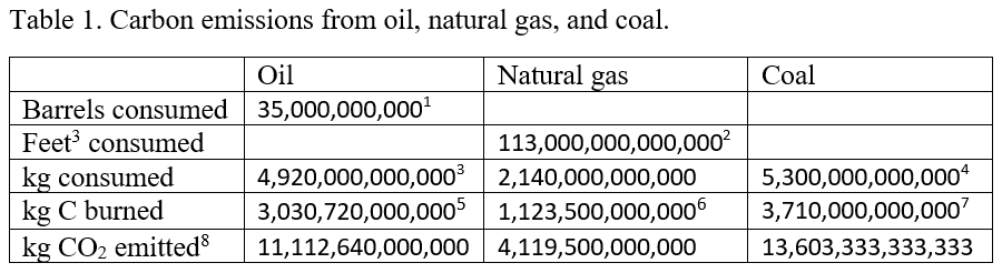
In addition, CO2 emissions from deforestation have been estimated at about 3,000,000,000,000 kg/year.9
These numbers are summarized in Table 2 10 and further manipulated to estimate the annual CO2 increase. In Table 2, Row 1 gives the sum of all CO2 sources from the last line of Table 1, Row 2 shows the weight of a single CO2 molecule, and Row 3 divides the total mass of CO2 emitted by the weight of a single CO2 molecule to estimate the number of CO2 molecules emitted. Because about half of the emitted CO2 is reabsorbed into the biosphere, Row 4 shows the net CO2 remaining in the atmosphere, where we've assumed that about 50% is reabsorbed into the biosphere, leaving 50% in the atmosphere. Row 5 gives the total number of air molecules in Earth’s atmosphere (see Appendix A for methods for calculating this number), and finally Row 6 shows the estimated annual increase of CO2, expressed as ppm CO2. Row 7 shows the measured, average increase from 2005 - 2014.
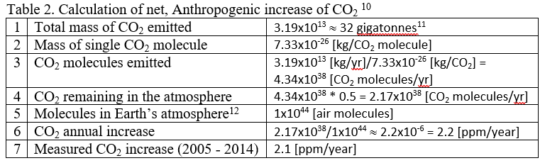
Detailed calculations include other sources, both natural and Anthropogenic, but the purpose of this simple example is to show how the measured increase of 2.1 ppm/year can easily be tracked back to a handful of major sources producing the estimate in Table 2 of 2.2 ppm/year. The point here is not to try to exactly reproduce the measured value, but rather to show that the Anthropogenic contribution is not a mere 0.2 ppm, nor is it 20 ppm, but that the Anthropogenic contribution is very, very close to the measured increase. In short, there is no question that the annual buildup of CO2 in the atmosphere is due to Anthropogenic emissions and is not due to natural sources.
Appendix A. Calculating the number of molecules in Earth’s atmosphere
We need to know about how many molecules are in Earth’s atmosphere. There are two ways to calculate this. We either accept a previous calculation of the mass of Earth’s atmosphere as about 5x10¹⁸ kg, together with the weight of an average air molecule of about 5x10-26 kg13 to calculate that there are about 5x10¹⁸/5x10-26 = 1x1044 molecules in the atmosphere, or we can estimate the number of molecules in Earth’s atmosphere by using atmospheric pressure.
To do that, we start with the pressure at sea level, which is about 14.7 pounds/square inch. Or we can express this in MKS units as about 10,400 kg/m2.
Think of this in the following manner. Above each square meter, stretching from the surface of the earth all the way up to space, there are enough molecules being pulled towards earth by gravity to equal a weight of 10,400 kg. Knowing the weight of air and the weight of an average air molecule, we can calculate the number of molecules in this column of air as follows.
Air is about 23% O2 and 77% N2 (we can forget about the contribution of other gases for this approximate calculation). O2 weighs about 5.3x10⁻²⁶ kg/molecule and N2 weighs about 4.6x10⁻²⁶ kg/molecule, for an average weight of air of about 4.8x10⁻²⁶ kg/molecule. This means that in each column of air pushing down on each square meter there are about 10,400/4.8x10-26 = 2.16x1029 molecules/m2.
To determine the total number of molecules in the atmosphere, we need to know the surface area of the earth. Noting that the diameter of the earth is about 12,800 km = 12,800,000 m, from this we can calculate the total surface area, which for a sphere is
Surface area = 3.14159 * diameter * diameter
The surface area of the earth in m2 is, therefore
Surface area of earth = 3.14159 * 12,800,000 * 12,800,000 = 5.1x10¹⁴ m2
We can now determine the total number of molecules in earth’s atmosphere by multiplying the total surface area of the earth times the number of molecules above each square meter as
Molecules in earth’s atmosphere = 2.16x1029 molecules/m2 * 5.1x1014 m2 ≈ 1x1044 molecules.
Footnotes
1. The global daily oil consumption is available here.
2. According to the IEA the global consumption of natural gas is about 113 trillion cubic feet.
3. A barrel of oil weighs about 140 kg.
4. Estimate from the International Energy Agency.
5. About 88% of oil is carbon, and most of the rest is hydrogen. Not all oil consumed is burned. Some is converted to plastics, lubricants, and other products. We assumed that only about 70% of the oil consumed is burned. So we assumed that only about 60% (i.e., 0.88*0.7) of the weight of oil consumed represents C that is burned.
6. About 75% of natural gas is carbon, and most of the rest is hydrogen. Not all of the natural gas is burned. Much of it is used to make plastics. So we assumed that only about 50% (i.e., 0.75*0.7) of the weight of natural gas consumed represents C that is burned.
7. Only about 70% of the weight of coal is carbon.
8. To calculate the weight of CO2 emitted we simply multiply the weight of the carbon burned times the ratio of the weight of CO2 to the weight of carbon (i.e., 44/12).
9. Estimates from https://www.ucsusa.org/global-warming/solutions/stop-deforestation/deforestation-global-warming-carbon-emissions.html
10. In scientific notation a number like 1x106 = 1,000,000 = 1 million. That is, the exponent "6" represents the number of "0's" in a number like 1 million.
11.This is the sum of the four values in the last row of Table 1. Compare this to the more accurate annual estimate of 36 gigatonnes.
12.See Appendix A for how this number is calculated.
13. Air is composed of many types of molecules, each weighing a different amount, but for a mixture of 77% N2, 21% O2, and other trace gases, the average weight of an air molecule is about 5x10-26 kg.


This guy has done an extremely useful graph from 1900 - 2008 plotting all source of emissions including volcanoes, coal, oil, gas and deforestation along with listing his source material, so it looks credible.
Indeed. Credible references. Here it is.
See Nigel's link to see the source references.
nigelj and scaddenp, thanks for the useful graph and link.
I'm not a scientist but I am an accountant and I look at and prepare a lot of graphs. My focus is not so much on the article as a whole (because it's way over my head) but on the graph included that is based on ice core samples. So, as I tell my college age children, always think of three questions the author or journalist didn't ask. Here are mine:
1. The graph is virtually flat for much of the thousand years. It seems to me that there had to be a few naturally occuring events that would create even a small blip (i.e. a major volcanic event even under the oceans or maybe unusually massive fires in Indonesia). Why don't we see a spike somewhere? I'm sorry it's just too conveniently flat.
2. I would like to think that the authors of the graph compared graphs from core samples in multiple locations around the globe and found that they all showed the same results. How many locations are necessary to confirm the results and how many did they use from what sources? If the answer is that there was only one, I would think that scientific skepticism would say that it's a pretty graph but not good science the same way that my auditor skepticism would not accept such a result as adequate proof.
3. In geological time this graph represents a blink of the eye. The core samples had to provide samples that go back many thousands of years. What would the graph show if it went back 5,000 years? 10,000 years?
Again, I'm not a scientist, but has anybody come up with an alternate explantion for the jump over the last couple centuries. After all, from 1800 to 1900 there were very few people on the earth to the point that no matter how many fires they made or, later in the 1800's, trains that spewed carbon and soot. Certainly not enough to explain the early rise. And even where that occurred it was localized (New York, London, etc.) and would not have caused Antarctic changes on this level, in my opinion.
Maybe the graph flatlines for extended periods for some other reason. I'll leave the answer to smarter people than me but this site is called "Skeptical Science", not "I got the answer I was looking for so I can move on Science". I'm not saying that there isn't more CO2 now, I'm just looking at the flat line and wondering why?
Hard to believe that in all that I missed an obvious question -
4. If you superimposed a graph of global temperature data over the same period on top of this CO2 data, why don't they track? And related, does this graph prove that CO2 and global average temperatures are not related?
[JH] Global temperature and CO2 do indeed correlate...
Source: Greenhouse Gas Concentrations, Climate Central, Nov 20, 2018
Dan Joppich,
Just yesterday I posted this graph which shows CO2 variations going back over 800,000 years.
source
Most posters at this site follow the comments link at the top of the page so they can see everything that is posted as it comes on.
To answer your other questions
1) We do not see spikes because volcanos and fires in Indonesia produce too little CO2 to be detected. Massive CO2 emissions like present time fossil fuels are required. (Although farmers have caused CO2 to increase for the past 8,000 years).
2) Obviously there was data from many cores collected to produce this graph. Follow the link on the graph in the OP to find out how the graph was made. Thousands of cores have been drilled.
3) The data I linked is from the core that goes furthest back in time (a single core). Data back to at least 400,000 years can be cross-checked with other cores but Dome C is believed to have the oldest ice on the planet so the best you could do to check the oldest data would be to drill another core at the same location. For cores going back only 1000 years even relatively small glaciers would go back that far.
Data beyond 800,000 years is available from other sources. These sources are not as accurate as ice cores.
4) Here is the correlation for the past 400,000 years.
source As you can see, temperature and CO2 concentration correlate very closely. There is no need for statistical analysis.
":Skeptics" provide a number of hare-brained excuses for the increase besides fossil fuel burning. They have all been shown to be incorrect. It is also not the sun. See the arguments in the upper left if you have questions.
Natural changes in CO2 concentrations are very slow. Current changes in CO2 are faster than any known for at least 50 million years (and probably much longer, perhaps the fastest ever in the history of the Earth). Looking at only 1000 years they are usually fairly flat, even during periods of glacial change. Note that the greatest change in the 800,000 year graph is only about 80 ppm in 10,000 years. The recent graph in the OP shows about 200 ppm in 200 years, approximately two orders of magnitude faster than any natural change. The Mauna Loa record shows 100 ppm change since 1960 or 58 years.
CO2 change is not localized. While CO2 is often higher in cities, scientists measure CO2 in remote locations so that only global chnges are measured. Your opinion is incorrect.
Read more background material before you challenge established science.
Dan @4:
1) "had to be...", "I'm sorry it's just too conveniently flat". Perhaps your expectations are unrealistic. Consider that human yearly emissions of CO2 are roughly 100 times greater than the avg. total of yearly volcanic emissions. Volcanic activity would have to increase over 100 times to be comparable to human emissions, which "only" move CO2 up about 2 ppm per year. There just aren't any natural sources which move fast enough to increase or decrease the amount of atmospheric CO2. What the "flat" levels of CO2 over most of the last millennium tell us is that the sources and sinks of CO2 into and out of the atmosphere were mostly in balance.
2) If you click on the source link below the graph you will see this graph:
This shows the CO2 reading for each sample taken from three ice cores on Law Dome in Antarctica. The data in this graph is used to form the smoothed curve in the graph you are asking about. Note that the most recent readings are right in line with the direct atmospheric readings we have of the recent spike in CO2, as in the Keeling Curve. More info on Law Dome, Data.
Unfortunately, there aren't ice cores from "multiple locations around the globe". Thick sheets of ice only form in certain areas so we have to do with what we can get. We have many cores from Greenland and Antarctica and some from alpine glacier regions. The cores from Greenland can't be used for CO2 measurements because of high levels of contamination. So we have to do with the Antarctic cores. Here is a map of those:
I'm not sure if there are any other cores besides the Law Dome cores which give CO2 readings over the last millennium which we can compare. But the Law Dome cores alone are "adequate proof" of atmospheric CO2 concentrations simply because they track the known concentrations measured by the Keeling Curve. The Law Dome cores may be only one "tool" for measuring CO2, but we know the tool works.
3) Indeed, we have cores that reach back 800,000 years into the past. (And some even further, past the 1 million years mark.) (Now I see that michael sweet has also answered your questions!) I'll just point out that over this 800,000 year period CO2 rose and fell naturally by about ~100 ppm as we went from ice ages to warm interglacial periods, and back again.
Thanks. This is very cool stuff. I haven't had a chance to read it thoughtfully due to my day job demands but I was curious about how this graph plotting temp data since the last glacial period (sorry, I couldn't figure out how to insert it here) . Scientists have concluded that over the last 10,000 years, the temp is relatively flat. Here's the link:
https://commons.wikimedia.org/wiki/File:Holocene_Temperature_Variations.png
The graph was created based on Greenland ice core data by the late paleoclimatologist, Professor Bob Carter.
It seems that over the past 10,000 years, we've seen warming and cooling oscillate within a range of +/- 2.5 degrees Celsius (D.C.). The rate today using satellite data (if you're familiar with Anthony Watts's other website, you know that nothing else will do) is 1.5 D.C./century, which is right within the Holocene averages.
And, although looking at the past 2,000 years, we see several warming periods (Roman, Medieval), overall, cooling occurred at an even faster rate. Significantly, the last 700 years, which includes the historically colder Little Ice Age (LIA), brought even faster cooling and then warming coming out of the LIA into the Modern Late 20th-Century Warm Period.
Of course, this data needs to be superimposed onto the CO2 data to be truly comparable to the conversation here, but it does narrow down our range to a possibly more relevant period in human history.
Dan, you do realize that multi-decade temperature oscillations occur because of changes to net forcing? They are not internal variability. The forcings at work during previous warm and cold periods are not at play now. You must look at all the factors affecting climate (solar, albedo, aerosols and GHG) when attempting attribution.
Let's look at the global temperatures reconstructed from proxies over that interval:
Why would you think that a temperature reconstruction from Greenland, a regional-to-local record, would have any meaning for the rest of the globe?
Let's look at the global temperatures reconstructed from proxies over the past 20,000 years, for context:
For fun, here's the same over the past 800,000 years:
For more on Bob Carter, see here.
Dan Joppich @8 is cutting-&-pasting comment from this denialist web-page which is why the Wikipedia holocene temperature graphic he provides link-to is being wrongly attributed to Bob Carter. Also the cutting-&-pasting failed to transfer a link within the comment, the link to Willard Watts's other website. Apparently, familiarity with this other website is assumed @AmericanThinker.com.
[PS] One of the most ironically named websites out there.
First, the graph was created and presented by Professor Carter from his scientific research and not blog fodder. Second, I couldn't get a good link to the graph so I found it there in a 10 second Google search. I didn't even read whatever the article was on the page, have never been there before, and will never go there again since I will have no reason to ever go there anyway. Thank you for following up on it for me, though. With that said, It doesn't change the scientific data results. Third, why is data take from core samples in Greenland any different from a graph of core sample data taken from Antarctica? Neither presents worldwide data but that doesn't make one right and one wrong. Data can't be right or wrong. It's just data. In reality, if superimposed, I think that the data from both might aline pretty closely so it seems that they each back up the other's results. Fourth, linking your evaluation of Professor Carter to a blog post on your own website is bad form. Don't bother finding other sites unless it makes you feel good. Fifth, based on my research of this site - created by somebody who is "not a climatologist or a scientist but a self employed cartoonist and web programmer by trade" who watched An Inconvenient Truth and was inspired - I don't think anybody here is in a position to criticize any websites. Lastly, taking a 20,000 year graph and drawing a red line straight up into the near future to prove some point, doesn't seem like skeptical or any other kind of science to me. I was interested in having a conversation about the data and this is supposed to be a safe place to have a dialogue. I never in anything I posted here made any presuppositions about anybody's position on the subject. It was only about the data.
[DB] "why is data take from core samples in Greenland any different from a graph of core sample data taken from Antarctica? Neither presents worldwide data"
The graphic below is taken from multiple proxies with global coverage, not just ice cores from Antarctica. Note the sources cited on the graphic.
As you noted yourself ("It's just data"), data is data. The instrumental temperature record is data. The proxy records are data. If you have a legitimate reason to question the inclusion of data from being considered, bring your reasoning and credible sources for support of them. Simply not liking the implications is not a reason.
Actually, your graphic is a product of the work of Robert Rohde, not Bob Carter. This is easily revealed by the use of TinEye and the like.
Inflammatory snipped.
Dan Joppich @12,
You are entirely wrong to suggest that the graphic you linked to (below) was the work of Bob Carter. (Even an image he does use is attributed to others & not his work. See image here of graph photographed at a Bob Carter talk which is derived from Davis & Bohling (2001).)
You are rather naive in believing that a google search will yield a Bob-Carter-created graphic of Holocene ice-core tempoerature records. And if you had bothered to read the description of the graph on the web-page you linked-to, you would know it is not a plot reconstructed from Greenland ice-core data and has zero Bob Carter authorship.
And your naivity must be ridiculously great to think any would believe that you "didn't even read whatever the article was on the page" when @8 you have reproduced two (almost) full paragraphs from that very page word-for-word.
[PS] I find that MA Rodgers is correct and Dan is both copy/pasting without acknowledgement and denying that he read the artcle that he was pasting from. If Dan is not prepared to comment here in good faith, then posting rights will be rescinded.
Furthermore, this discussion is offtopic for this article. If Dan wishes to defend his statement, then "Climate's changed before" myth would be more appropriate.