Climate Science Glossary

Term Lookup

Enter a term in the search box to find its definition.

Settings

Use the controls in the far right panel to increase or decrease the number of terms automatically displayed (or to completely turn that feature off).

Term Lookup

Settings


All IPCC definitions taken from Climate Change 2007: The Physical Science Basis. Working Group I Contribution to the Fourth Assessment Report of the Intergovernmental Panel on Climate Change, Annex I, Glossary, pp. 941-954. Cambridge University Press.

Home Arguments Software Resources Comments The Consensus Project Translations About Support

Twitter Facebook YouTube Mastodon MeWe

RSS Posts RSS Comments Email Subscribe


Climate's changed before
It's the sun
It's not bad
There is no consensus
It's cooling
Models are unreliable
Temp record is unreliable
Animals and plants can adapt
It hasn't warmed since 1998
Antarctica is gaining ice
View All Arguments...


Username
Password
New? Register here
Forgot your password?

Latest Posts

Archives

A Quick and Dirty Analysis of GHCN Surface Temperature Data

Posted on 16 January 2011 by caerbannog


Over the holiday break here in San Diego, I had the rare experience of having a good bit of spare time combined with lousy weather. As a result, I had the time to try out something that I had been thinking about for awhile: If I were to code up the most brain-dead simple implementation of NASA's global-temperature anomaly algorithm, how would my results compare with NASA's? In addition, how much of an impact would all of those evil temperature data *adjustments* have on global-scale averages?

So I rolled up my sleeves and got to work. Getting a crude app up and running didn't take all that long (and I'm not the fastest coder around, not by a long-shot!). The trickiest part was dealing with the varying-length data-gaps in the GHCN (Global Historical Climatology Network) temperature data (but the C++ Standard Template Library made that task much easier).

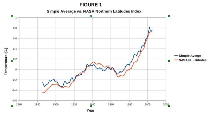
The app I wrote reads in GHCN v2 temperature data files and computes simple "straight averages" of all the individual temperature station anomalies. I follow a procedure pretty similar to NASA's: For each station, I calculate the average temperature for each month over the period 1951-1980. I then compute individual station temperature anomalies relative to the baseline values, NASA-style. Then I just average them together. No fancy gridding or geospatial weighting – I use a simple brain-dead averaging procedure. Finally, I run the output anomaly data through a moving-average filter to smooth the results. (I applied an 11-year moving-average filter to all the results shown below.)

Well, this very simple procedure ended up giving me results that were pretty similar to NASA's "Northern Latitudes" temperature index, as seen in Figure 1 below. (The NASA results were smoothed with the same 11-year moving-average filter that I applied to my own results). Given that a lion's share of the GHCN stations are located in the temperate latitudes of the Northern Hemisphere, it shouldn't be too surprising that my “simple-average” procedure produced results similar to NASA's “Northern Latitudes” index.

In fact, my results showed considerably *more* warming than all of the global-scale temperature index results shown on the NASA/GISS web-site *except* for NASA's "Northern Latitudes" index. So it turns out that all the effort that the NASA folks put into "cooking their temperature books", if anything, *reduces* their warming estimates. If they wanted to exaggerate the global-warming threat, they could have saved themselves a lot of trouble by computing simple averages. Go figure!

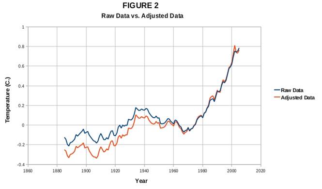
I also found that the differences between my results for raw vs. adjusted GHCN data were quite modest, as seen in figure 2 below. My raw and adjusted temperature results were nearly identical for the most recent 40 years or so. As you go back further in time, the differences become more apparent, with the adjusted data showing overall lower temperatures than the raw data earlier in the 20th century. I haven't really investigated the reasons for this bias, but I suspect that temperature-station equipment change-outs/upgrades over the past century may be a major factor. But the bottom line here is that for the most rapid period of warming (the past 40 years or so), the adjusted and raw temperature data generate remarkably consistent results.

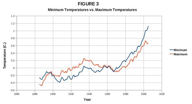
I also noted a couple of interesting things when I looked at my results for the GHCN monthly-minimum and monthly-maximum data. Figure 3 (below) shows my minimum vs. maximum temperature results (using GHCN adjusted data). My results turned out to be entirely consistent with what we know about climate forcings over the past century or so. My results show monthly-maximum temperatures rising at least as fast as the monthly-minimum temperatures during the 1910-1940 warming period. But my post-1970 results show monthly-minimum temperatures rising faster than monthly maximum temperatures. These results are entirely consistent with greater CO2 forcing later in the century than earlier. My results also show that during the mid-20th-century cooling period, maximum temperatures declined more rapidly than did minimum temperatures – these results are consistent with the aerosol-forced cooling as a plausible contributor to that cooling trend.

Now, my little project didn't produce any exciting or groundbreaking results. But it *did* show how easy it is for an average layperson with very run-of-the-mill programming skills to perform some simple validation checks of NASA/NOAA/CRU's global temperature estimates.

And one final note regarding the temperature data: NASA does not compute temperature anomalies prior to 1880 for a good reason. Data coverage and quality fall off drastically prior to the late 19th century, and just can't be used to compute meaningful global averages.

One of the important take-home lessons here is that all of the temperature data and software tools are available **for free** to anyone who wants to test the basic validity of the global surface temperature record. That includes you, WUWT partisans!

In fact, what I find remarkable is that in spite of the incredible concern that the surfacestations folks have expressed about the quality of the surface temperature data, how little effort they have put forth to analyze any of the data that they have so vocally criticized! The surfacestations project has been existence for, what, close to four years now? And as far as I can tell, I crunched a lot more temperature data over my holiday break than the surfacestations project has in its entire existence!

To the global-warming "skeptics", I have this to say: Never in history has science been more accessible to the general public than it is now. And of all the scientific disciplines, climate-science is perhaps the most open and accessible of all. There is a treasure-trove of *free* software development and data analysis tools out there on the web, along with more *free* climate-science data than you could analyze in a hundred lifetimes!

So instead of sniping from the sidelines, why don't you guys roll up your sleeves, get to work and start crunching some data? Don't know how to program? With all the free software, tutorials and sample code out there, you can teach yourselves! Computing simple large-scale temperature averages from the freely-available surface temperature data is closer to book-keeping than rocket-science. It just isn't that hard.

I spent some time cleaning up and commenting my code in the hope that others might find it useful, and I'm making it available along with this post. ( A valgrind run turned up a couple of real bonehead errors, which I fixed – note to myself: code *first*, and *then* drink beer).

The code isn't really very useful for serious analysis work, but I think that it might make a good teaching/demonstration tool. With it, you can do simple number-crunching runs right in front of skeptical friends/family and show them how the results stack up with NASA's. (NASA's “Northern Latitudes” temperature index is the best one to use as a comparison). It might help you to convince skeptical friends/family that there's no “black magic” involved in global temperature calculations – this really is all very straightforward math.

Instructions for compiling/running the code are in the GHCNcsv.hpp file, and are summarized here (Assuming Linux/Unix/Cygwin environments here).

  1. Download my code ghcn_app.tar.gz
  2. Go to ftp://ftp.ncdc.noaa.gov/pub/data/ghcn/v2 and grab the compressed data files (v2.min.Z, v2.mean.Z, etc).
  3. Uncompress them with the Unix utility “uncompress”:  i.e. uncompress v2.whatever.Z
  4. Copy the .cpp and .hpp files to the same directory and compile as follows: g++ -o ghcn.exe GHCNcsv.cpp
  5. Run it as follows (redirecting console output into a csv file):
    ./ghcn.exe v2.min v2.min_adj … > data.csv
  6. Read the data.csv file into your favorite spreadsheet program and plot up the results!


UPDATE: 2011/01/25

Due to my failure to RTF GHCN documentation carefully, I implemented an incorrect algorithm. It turns out that multiple stations can share a single WMO identification number. Having failed to read the documentation carefully, I charged ahead and coded up my routine assuming that each temperature station had a unique WMO number.

So what happened was that in the cases where multiple stations share a WMO id number, my program used temperature data from just the last station associated with that WMO number with valid data for a given year/month.

However, that goof actually *improved* the results over what you would get with a true "dumb average", as Kevin C discovered when he went to reimplement my routine in Python.

It turns out that many temperature stations have random data gaps. So what happened is in cases where multiple stations share a single WMO id, my routine quite accidentally "filled in" missing data from one station with valid data from other stations. That had the effect of crudely merging data from very-closely-spaced clusters of stations, reducing the overweighting problem associated with dumb-averaging, and reducing the impact of big data gaps in single-station data on baseline and anomaly computations.

Kevin C demonstrated that a true "dumb average" gives significantly worse results that what I computed.

So I went back and tried a little experiment. I changed my code so that the temperature data for all stations sharing a single WMO id were properly averaged together to produce a single temperature time-series for each WMO id.

When I did that, my results improved significantly! The differences in the results for raw vs. "adjusted" GHCN were reduced noticeably, showing an even better match between raw and adjusted temperature data.

So quite by accident, I stumbled on a method considerably simpler than proper gridding that still gives pretty decent results!

This turned out to be a quite accidental demonstration of the robustness of the surface temperature record! I misinterpreted the GHCN data format and still got results darned close to NASA's "Northern Latitudes" index.

I'd like to say, "I meant to do that", but instead I should say thanks to Kevin C for uncovering my dumb mistake. 


UPDATE 2 (2011/01/28)

Here's the code for the fixed ReadTemps() method.  Replace the existing ReadTemps() code in GHCNcsv.cpp with this version (indentation is messed up -- but a smart editor can fix that automatically):

Oh, $#@! The html parser keeps munching the template declarations.  Here's a link to the corrected code instead:   http://forums.signonsandiego.com/attachment.php?attachmentid=8100&d=1296101320  (copy and paste into your browser's URL window.)


UPDATE 3: (2011/02/11)

There's an embarrassing "off-by-one" hiccup in the ComputeMovingAvg and ComputeMovingAvgEnsemble routines.  Eliminating the first "iyy_trailing++" statement in each routine should fix the problems.

The latest code (with a simple gridded-averaging implementation in addition to fixes for the above bugs) can be downloaded from here: http://forums.signonsandiego.com/attachment.php?attachmentid=8142&d=1297529025

 UPDATE 4 (2011/02/16)

New software version here: http://www.filefactory.com/file/b571355/n/ghcncsv4.zip

Now allows users to test the denier "dropped stations" claim (-Y command-line option)

-Y -1:1995:2005 means process data excluding no stations, then process data excluding stations that stop reporting data before 1995, then process data excluding stations that stop reporting data before 2005 -- each result is put into a separate csv column.

0 0

Printable Version  |  Link to this page

Comments

Comments 1 to 23:

  1. Nice work, Caerbannog! There is a lot of fuzz about climate data, bad ground stations and so on. Your analysis not only shows that a layman (your words, I'm not sure...) with avarage programming skills can get matching results, but also shows that cooking the data does not lead to higher temperatures, on the contrary. The title 'quick and dirty analyses' should be changed, however: 'quick and clean' would be better.
    0 0
  2. Maybe "quick & simple" would be even better.
    0 0
  3. "why don't you guys roll up your sleeves, get to work and start crunching some data?" - because they have absolutely no interest in the result!
    0 0
  4. Or maybe some have done the work but don't like the results so are keeping quiet.
    0 0
  5. "The code isn't really very useful for serious analysis work, but I think that it might make a good teaching/demonstration tool." Good idea. With emphasis that it is for demonstration purposes. Perhaps make it available on say Freshmeat or SourceForge. That way if you should make refinements to the code you can offer updates.
    0 0
  6. "why don't you guys roll up your sleeves, get to work and start crunching some data?" Same reason WUWT never analyzed what happens if you remove all their "bad" stations from the analysis: The results wouldn't be what they want. So much better to just say, "These stations are bad and they're skewing the results to show warming that doesn't really exist" without ever demonstrating that that is what it actually does. This is the difference between the "skeptics" and the scientists.
    0 0
  7. For the record NASA uses a different station combination method than the one you outline above. NASA uses the reference station method rather than combining anomalies based upon a base period. The reference station method uses a weighted mean to adjust stations to have temperature sets line up with an initial reference station in their overlapping period. Your method demonstrated here is more similar to what hadley does which is the anomaly method.
    0 0
  8. Robert- So what IS the implication of the different choice of methods, anomaly versus reference station?
    0 0
  9. Ed @4, "Or maybe some have done the work but don't like the results so are keeping quiet." Probably. Also, note the absence of contrarians/"skeptics" on this thread.
    0 0
  10. @ Albatross (9) Facts are so inconvenient to contrarians...they can never get enough of them to line up with the curves they've already plotted. Much easier to be economical with the truth, peddle pedantic sophistry's or to simply make things up... The Yooper
    0 0
  11. Dan @10, I agree completely with what you say-- but your last sentence might have been a little over the top ;)
    0 0
  12. @ Albatross (11) Agreed. Took the link out of the last sentence. Pushed the envelope a bit there. Apropos that a whole comment dealing with untruths can yet be completely true. :) The Yooper
    0 0
  13. Daniel, just to be pedantic, sophistry's doesn't have an apostrophe! I doubt that "pedantic sophistries" does either!
    0 0
    Moderator Response: [Daniel Bailey] Thanks for the heads-up! Shows you my irritation at the continual stream of zombie arguments from the usual "skeptics"...
  14. What's the best source for documentation of the baseline method as you have implemented it? I'd like to try it for myself with a view to setting it as a python programming project for my students. (I could try it from just your description, but I imagine there are gotchas. The one I see immediately is how to deal with stations where the baseline period is incomplete.)
    0 0
  15. Tamino had a good string of blog posts about a slightly more sophisticated version of this game, using area weighting. I think he also did some sort of baseline adjustment but I'm not sure. Regrettably, these seem to be from just before the Great Blackout but not to have made it to the wayback machine. In case they're useful to anybody here are a few 404ing links from my feed reader: http://tamino.wordpress.com/2010/02/13/prime-meridian/ http://tamino.wordpress.com/2010/02/15/dropouts/ http://tamino.wordpress.com/2010/02/23/ghcn-preliminary-results/ http://tamino.wordpress.com/2010/02/25/show-and-tell/ http://tamino.wordpress.com/2010/02/26/thanks/ http://tamino.wordpress.com/2010/02/28/update/ and two tail-enders which are still there: http://tamino.wordpress.com/2010/03/01/replication-not-repetition/ http://tamino.wordpress.com/2010/03/05/global-update/
    0 0
  16. Great work and I guess the article is here mainly as an example but do you mind a quick and dirty criticism? It's about the text describing Fig 3, I think I won't describe it quite the way you do. I agree with you on the period 1910-1940 but I think the post 1970 description is lacking some detail which would have an impact on your interpretation of the data. You say "post-1970 results show monthly-minimum temperatures rising faster than monthly maximum temperatures". The way I see it that's not quite right. Upto about 2000 the max and min are rising at an equal rate, just like 1910-1940. You can most clearly see that if you look at the 1980 and 2000 years, the grey graph lines help with the eyeballing. In those two years the difference is about 0.2oC. It's only after 2000 that the two lines begin to diverge dramatically. Your conclusion was "These results are entirely consistent with greater CO2 forcing later in the century than earlier." Well the CO2 increase has been a steadily increasing phenomenon while your data (based on my interpretation of the data) shows at best a step change after 2000 (let's say post the 1998-2001 El Nino/La Nina). This seems less consistent with a steadily increasing forcing from CO2. I'm not really interested in who's interpretation is correct, this is a 'quick and dirty analysis' after all. My point would be that large parts of climate science are interpretative. And in some instances interpretations are passed off as fact.
    0 0
    Moderator Response: [muoncounter] Reversal of seasonal warming patterns as a sign of CO2-driven warming was discussed in detail on the Human fingerprint in the seasons thread.
  17. (7), (8), (14): 7: Mea-Culpa -- I used an imperfect recollection of what NASA did when I coded up my app. Didn't check into the details before coding. Just went from (incorrect) memory. So I ended up implementing something considerably simpler than what NASA does. 8: As for the implications for global-scale averages, this should attest to the robustness of the global temperature record. There are multiple ways to skin the "global temperature" cat, and they all give you pretty close to the same answer. There are significant differences between NASA's algorithm and my much simpler one, but both approaches gave very consistent results. That attests to the robustness of the data *and* the averaging methods. 14: My algorithm would quite simple if it weren't for the "data gap" issue. The programming "complications" that could really trip up students have to do with those gaps. Not all stations have data for all years/months. The gaps/missing-data vary randomly from station to station. As a result, when calculating baseline temperatures, you have to keep track of the number of valid temperature samples per station and month. The map template in the C++ Standard Template Library (STL) makes this chore much easier, but C++ isn't exactly a "student-friendly" language. Plus, code with STL templates isn't the easiest to debug -- step into an STL container with a debugger, and you'll see mostly incomprehensible gobbledygook. I presume that Python contains a "map" container similar to the STL map (but I haven't done any Python programming, so I can't say for sure). You will definitely want to use a higher-level "data container" function (like a map) that will help keep you "out of the weeds" with respect to data-gap bookkeeping. Depending on how advanced your students are, you may want to write your own Python "extensions" that hide the uglier coding details, and have your students use those. Anyway, here's a description of the algorithm (I just "coded it up from memory", so I don't have a nice reference document that I can point you to): 1) Read in the data into a structure that allows you to access any particular temperature sample by [WMO-ID][YEAR][MONTH]. (WMO-ID is the unique identification number given to each temperature station). The advantage of the STL map container (over simple arrays) is that if there are data gaps for, say, years 1920, 1930-1935, etc. for a given temperature station, the map container will make it much easier to avoid averaging in "missing" data by mistake. Unlike a plain array, map indices don't have to be sequential. The map container will take care of jumping over discontinuities in the index values for you. 2) For each station, calculate the average temperature for each month over the period 1951-1980. I.e. Calculate the average Jan temp for each station, the average Feb temp for each station, etc. Put all these averages into a 2-d map/array/whatever so that you can index each station/month average by [station-id][month]. The tricky part (for students) here is that not all stations will have data for the entire baseline period. There may be missing years of data, and missing months within years. This will vary randomly from station to station. So you'll want to keep track of the number of valid temperature values for each station and month. (I do this in a separate [station-id][temperature] "sample counter" map). In my code, I define a "minimum valid number of samples" value. For a station to be included in the baseline calculation for a particular month, it must have at least that many valid samples to be included. Otherwise I throw it out. The default value is 15. That means that unless a station contains at least 15 valid temperature readings (i.e. 15 years out of 30 for the 1951-1980 baseline period) for a given month during the baseline period, I exclude that station from the global-anomaly calculations for that particular month. I have found my results to be highly insensitive to that value, however. If I use 1 as the minimum number, I get similar results. Likewise, if I use 30 (the maximum number for the 1951-1980 baseline period), I get similar results. 3) Then you go back to the original temperature data, and for each [station][year][month], subtract the corresponding [station][month] baseline value to get the anomaly value. The anomaly value is simply the difference between the temperature for each [station][year][month] and its corresponding [station][month] 1951-1980 baseline temperature. 4) Then for each year/month, you calculate the average of all anomalies for all the stations. Once again, the number of stations reporting valid temperatures for each year/month will vary, so to compute the averages correctly, you will have to keep count of the number of valid reporting stations for each [year][month]. 5) To get an single average anomaly value for each year, calculate the average anomaly value for all the months in that year (i.e. average over months in the [year][month] array/map generated in step 4). Once again, the number of months reporting valid data for each year may vary, so you'll want to keep track of the number of valid "month" temperature samples for each year. In the GHCN temperature files, missing temperature values are assigned the value -9999, so they are easy to identify and code around. Definitely a challenging project for students, but if it's broken up into digestible "pieces" so that students don't get stuck/frustrated (a common programming teaching challenge), it would be a terrific learning experience. Anyway, I hope that this is "clearer than mud" -- putting something like this together as a digestible "lesson plan" for students would be a great thing to do. I would imagine that having students see that their own independently-generated global-temperature results agree nicely with NASA's would be a mountain of "icing on the cake"
    0 0
  18. Thanks, that's very helpful indeed, especially with respect to missing data. Python indeed has a hashmap data structure - dict. It's a built-in and the students tend to use it extensively, for things which never occur to me with my C++ background! I'd already used it to read in the GHCNv3 data using pretty much the data structure you suggest: So far my only difference is to introduce a class at the station level with lat/long info for later use.
    0 0
  19. A very nice post, caerbannog. Thanks
    0 0
  20. I will be pleased if someone could tell me how to the read the GHCN-data using the R-program. Could not find it on the internet !
    0 0
  21. I'm afraid I think I found a mistake. I was trying to reproduce your result in python and failing. Eventually I had to instrument your code and mine, and eventually I found out the mistake. You use characters 3-7 of the station id as a key, I use 0-10. The documentation isn't very clear, but here's what I get from it and from various blogs: - The first 3 characters a country code, irrelevent for our case because it can be deduced from the rest of the station ID. So omitting this is fine. - The next 5 chars are the WMO station code. - The final 3 are the imod code. IIUC this is used for stations which so not have a WMO code. The station is given the code of the nearest WMO station, which may be a substantial distance away, plus a non-zero imod code to distinguish it. The problem is that the imod!=0 stations are separate stations. By ignoring the imod code, you merge all of these stations into the single WMO station. In the case of disjoint records, the resulting record contains both (but only gets a single baseline), in the case of overlapping records, the last overwrites the others. Examples include: 68262: 14168262000 14168262001 44373: 21544373000 21544373002 72211: 42572211001 42572211002 42572211003 72214: 42572214000 42572214001 72217: 42572217001 42572217002 42572217004 72672: 42572672000 42572672001 42572672002 42572672003 72671: 42572671001 42572671002 42572671003 42572671004 42572671005 42572671006 72670: 42572670001 42572670003 42572670004 42572670005 42572670006 42572670007 42572670008 42572670009 42572670010 42572670011 42572670012 So I changed this in my program and verified I could reproduce your results. Here's my 2 graphs plus yours: http://postimage.org/image/35hd6ufc4/ Note that with 5/8 char station IDs I match your results pretty well. With 11 char IDs the results are rather different. What threw me for a while is that the full ID gives apparently worse results, so I assumed at first that it was my mistake. In particular, it shows a much larger hump around 1935. But looking at the station IDs, it is clear that a lot of the imod codes are in the US (country=425). I think what your code is doing is merging a lot of US stations, and thus reducing the overweighting of US data arising from the over-representation of US stations in the data. The correct solution of course is geographical binning (or some equivalent method) to deal with this over-representation. So I implemented that in my version. Here's what I get, along with NASA's resutls: http://postimage.org/image/2f5tftz9g/ Note that the difference between the 5 and 11 char versions is now reduced, and apart from the sparse early data the curves follow the gistemp data quite well, including the 1935 period. I'm still not 100% certain, so I'm hoping someone more knowledgeable will comment, but at the moment it seems to me that the 11 character approach is the correct one.
    0 0
  22. Ouch! My bad -- I just assumed that each GHCN station had a unique WMO id (5-digit id number sufficient to give all stations unique id's). That's what I get when I don't RTFM very carefully! So it looks like I may have implemented -- quite by accident -- a very crude geospatial weighting routine (or at least a routine that "fills in" temperature station data gaps with data from nearby stations)! Will follow up with updates/corrections when I have some spare time.
    0 0
  23. I know this is an old article, but does anyone know where to find the raw+adjusted GHCN data today to repeat the exercise done by Caerbannof and KevinC back in 2011?

    0 0

You need to be logged in to post a comment. Login via the left margin or if you're new, register here.


The Consensus Project Website

THE ESCALATOR

(free to republish)


© Copyright 2024 John Cook
Home | Translations | About Us | Privacy | Contact Us