


 Arguments


The Keeling Curve: Part I
Posted on 1 November 2021 by Evan
Reality Check
Scientifically, the Keeling Curve is a plot of atmospheric CO2 concentrations. Sociologically, the Keeling Curve represents our ability (or lack thereof) to live in balance with nature.
Direct-air CO2 measurements were started by Charles David Keeling in 1958, and in honor of his work, plots of CO2 concentration from 1958 to the present are called Keeling Curves (see Fig. 1). The Keeling Curve has two features: rising and falling intra-annual CO2 concentrations, and steadily rising inter-annual CO2 concentrations. The intra-annual trends represent natural up-down cycling of the seasons: when CO2 is drawn from the atmosphere to make leaves on plants and trees, CO2 concentrations decrease. When leaves fall to the ground and decompose, CO2 concentrations increase, because rotting vegetation releases CO2 back into the atmosphere.
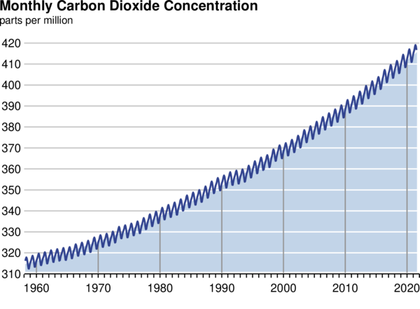
Figure 1. The Keeling Curve, plotted as monthly-averaged values from 1958 to 2020. (Scripps)
Although the main cause for the inter-annual increase is currently human GHG emissions, the Keeling Curve shows the net effect of all CO2 emissions and sinks, both human and natural. In this sense the Keeling Curve is a better indicator of how well we’re stabilizing the climate than just looking at human emissions, because decreasing human GHG emissions does not guarantee similar changes in the Keeling Curve. If human emissions decrease, but either natural emissions increase or natural sinks decrease, the Keeling Curve will respond less than expected based on changes to human GHG emissions alone.
A central question of climate talks is how to stabilize and then reduce atmospheric CO2 concentrations to a level that correspond to a particular, target temperature, such as 1.5 or 2°C. There are many commitments by many countries around the world, articulating how they will reduce carbon emissions. Lots of promises, plans, and politics. How do we track how well we’re doing to achieve the goals established by these climate negotiators?
There are three points to consider about what climate negotiators are recommending.
- There is a 1:1 relationship between CO2 levels and expected warming.1
- There is a 30-year delay2 between achieving a CO2 level and achieving the warming corresponding to that CO2 level. Scientists are not just concerned about current temperatures, but the temperature to which the current CO2 concentration commits us, should we fail to reduce CO2.
- As of 2020, the Keeling Curve is accelerating upwards: on average, each year CO2 concentrations increase more than the previous year.3 This upward, accelerating characteristic of the Keeling Curve adds urgency to reducing our CO2 emissions.
The delay between when we achieve a particular CO2 concentration and when we achieve the associated warming can be illustrated by noting that we achieved 350 ppm CO2 in 1988. Although 350 ppm CO2 corresponds to 1°C warming, 1°C warming wasn’t achieved until 2018. As of 2020, CO2 concentrations had already surpassed 410 ppm, a level corresponding to 1.6°C warming, should we fail to reduce CO2 concentrations. Even though CO2 concentrations have already reached a level corresponding to 1.6 C, there is a delay of 30 years or so until we achieve the corresponding level of warming.4 So what can we expect and when?
An ambitious question based on goals set forth by the 2015 Paris Accord is,
“Can we reduce CO2 to below 2020 levels to limit warming to 1.5°C?”
A less ambitious question is,
“Can we stabilize CO2 levels to limit warming to 2.0°C?”
And a much less ambitious question is,
“Can we stabilize CO2 at any level?”
The Keeling Curve helps us understand past trends, which can be used to inform us of the challenges that lay ahead. This is because simply quoting CO2 concentrations in a particular year or even GHG emission trends gives us no sense of the overall CO2 accumulation trend, how the trend is evolving, or what is controlling the trend. We can get some hint of the challenges that lay ahead, and monitor our progress at achieving a particular goal, by plotting Fig. 1 as a trend line through yearly-averaged CO2 concentrations from 1958 to the present, as shown in Fig. 2. We plot the data for 2020, the year of the Covid lockdown, to show that even in the midst of a pandemic, when global transportation was severely restricted, when CO2 emissions apparently declined, that there is no indication yet of an effect on CO2 accumulation in the atmosphere.4
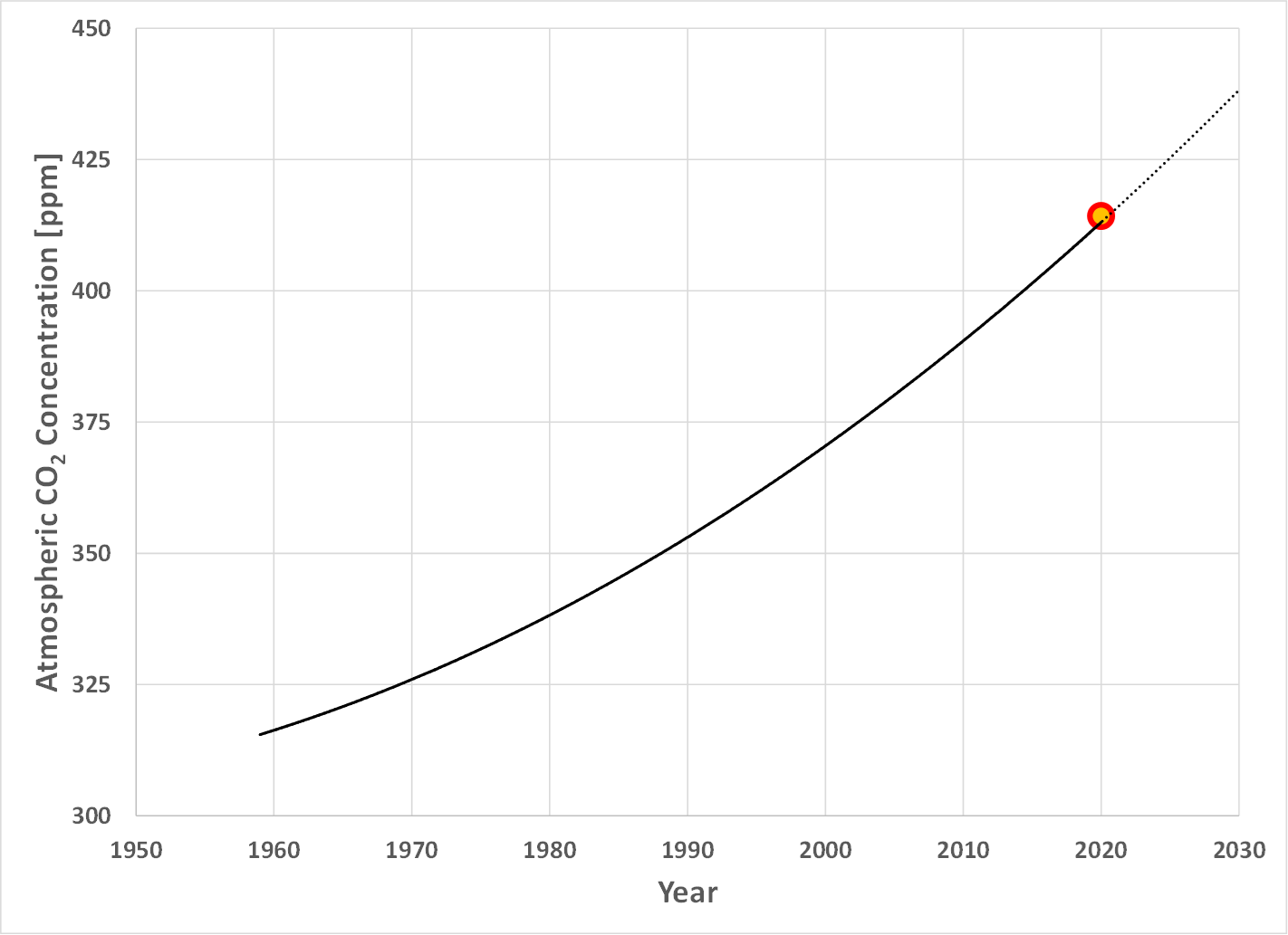
Figure 2. Trend line representing the Keeling Curve as yearly averaged atmospheric CO2 concentrations (solid line), projection into the future (dotted line), and 2020 average CO2 concentration (data point).
What is driving the Keeling Curve upward? What forces must we overcome to bring it down? Some of the factors driving the Keeling Curve upwards are the burning of fossil fuels, methane emissions (which are converted to CO2 in the atmosphere), and carbon released when trees are cut down and burned (i.e., deforestation). If we emitted the same quantity of GHG’s each year, and if natural sources/sinks were unchanged, the Keeling Curve should increase upward as a straight line. This upward curvature indicates that on average, each year we emitted more GHG’s than the previous year. Why is this happening?
A good way to visualize the forces driving up CO2 is to plot Global World Product together with CO2, as shown in Fig. 3. It is as though Global World Product is pulling the Keeling Curve upwards.
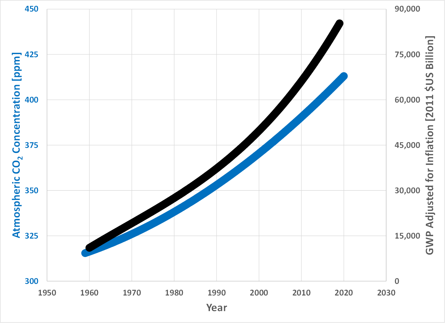
Figure 3.Global World Product adjusted for inflation (right y-axis) compared to the Keeling Curve (left y-axis). Data from. (OurWorldInData)
The positive talk about ramping up the use of renewable energy, one car company after another announcing plans to move to EV’s, fast-food restaurants announcing plant-based alternatives, putting a price on carbon to lower CO2 emissions, etc. gives us hope that we will easily bend the Keeling Curve downwards. When the Keeling curve is shown using a thin line (see Fig. 2) it seems that it should be easy to bend it downwards. However, when plotted as in Fig. 3, suggesting that strong economic forces are pulling the Keeling Curve upward, a better way to represent the difficulty of bending the Keeling curve downward is to view it not as a thin line on a graph, but rather as a thick, curved, tree trunk. Bending the Keeling curve downwards will require more than just replacing old light bulbs with newer LED’s, or trading in our gas guzzlers for EVs.
A big factor driving up atmospheric CO2 concentrations is that for over 50 years the global population has been increasing by about 80,000,000 people each year. If global population remained constant, the Keeling curve would likely rise as a straight line. But each additional person increases carbon emissions, which get added to the emissions from the other people, so that the Keeling curve not only increases from year to year, but the rate of increase, increases each year, along with population growth.3
With our current systems, it is impossible to live without emitting carbon. We’ve adapted ourselves to a lifestyle where just about everything we do has an associated carbon footprint, even when we’re locked at home during a pandemic. Our collective global lifestyle is driving CO2 emissions upward. Transitioning to renewable energy, EV’s, and moving towards plant-based diets are ways to reduce our GHG emissions, but the fact that the Keeling Curve continues to accelerate upwards at a time of rapidly rising deployment of solar, wind, and EV's suggests it will likely be much more difficult to stabilize climate than many expect.
Our progress towards meeting the objectives of the Paris Accord cannot be assessed only in terms of our emissions reductions. The only thing that matters for stabilizing the climate is how well we stabilize the Keeling Curve, one component of which are human emissions. Natural emissions and natural sinks are the other factors, over which we have little control, for how rapidly we can expect to stabilize the Keeling Curve.
However we do it, to stabilize the climate we must first stabilize the Keeling Curve to a horizontal line. We cannot let up until that first objective is reached. The Keeling Curve is our reality check on how well we're doing.
Footnotes
1. The IPCC 6th Assessment Report (AR6) states the likely Equilibrium Climate Sensitivity (ECS) range between 2.5 – 4°C/doubling CO2, with a best estimate of 3°C. Observed temperature increases from 1970 to 2020 fit well with the assumption of an ECS of 3°C. Assuming an ECS of 3°C, the following table shows the 1:1 relationship between CO2 concentration and expected warming. Note that an ECS of 3°C/doubling CO2 means that doubling the pre-industrial CO2 concentration from 280 to 560 ppm would cause a 3°C temperature rise. In the following table I show this value as 550 ppm, so that the overall progression is easier to remember. That is, although the concept of a 1:1 correspondence between atmospheric CO2 concentration and the expected warming is sound, we do not know the numbers to any better precision than shown in this table.
Correlation between atmospheric CO2 concentrations and expected warming.
| CO2 Concentration [ppm] | Expected Warming [°C] |
| 350 (1988 level) | 1.0 |
| 400 (2015 level) | 1.5 (IPCC Goal) |
| 450 | 2.0 (IPCC Threshold) |
| 550 | 3.0 |
| 650 | 4.0 |
2. Although the delay between achieving a given atmospheric CO2 concentration and the associated warming is currently about 30 years, this could change in the future, depending on our emissions trajectories and how the natural systems respond.
3. Because of natural variability, from one year to the next the "increase of CO2" may not increase. But when we look at the trend for a sufficiently long period, the average increase each year is increasing. Figure 4 shows measured, annual changes in atmospheric CO2 concentration measured by NOAA. Whereas Fig. 4 shows large year-to-year variability in CO2 changes, the overall trend is that each year the increase of CO2 relative to the previous year, is increasing.
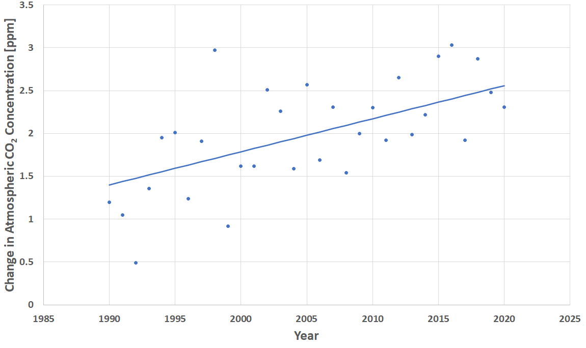
Figure 4. Changes in atmospheric CO2 concentration measured by NOAA. The data points show the measured change in CO2 concentration each year, and the trend line shows that the average yearly increase, is increasing.
4. As with atmospheric temperature trends, we cannot infer an effect on the overall trend of the Keeling Curve from the data for a single year, because natural variability may mask the underlying trend. The point of this comment, therefore, is simply that the Keeling Curve gives no indication that the Covid lockdown had any net effect on the Keeling Curve trend: the data from a single year cannot be used to infer a trend.


Well AGW advocates, I'm back! But don't worry, I'm not here to challenge the wisdom of the infallible "experts". I just want to let you know there is no way the USA can possibly come even close to meeting the financial commitment to the "climate change" cause that the Democratic Party has supported for over a decade. At the COP26 summit now in progress in Glasgow, Scotland, it seems that Joe Biden has lost much credibility among the AGW community for lack of action on certain items promised by Obama in the Paris Agreement. This is because most Americans know full-well what Biden is up to in his "infra-structure" package, and our Congress persons aren't falling for it. In fact, we knew what he stood for well before the election, which is why it took the most massive election fraud in history to put him in office.
Aside from the climate change issue, however, there is another "crisis" in progess for which Biden is spending trillions of dollars, and that is the COVID 19 "pandemic". With what is being spent on vaccines that are neither safe nor effective and making them mandatory for more and more people as a condition for holding their jobs, our economy is sinking already. I'm afraid this is one time the AGW community will need to find funding resources other than generous "Uncle Sam". Otherwise, I guess we all roast!
[BL] As this appears to be the first post by user Taurus, the claim to be back suggests a new account by a previous user. If this is the case, it violates the comments policy (no multiple identities).
In addition, the comment violates the policy that responses be on topic, and the policy against rants on politics.
[DB] Sock puppet confirmed.
Taurus @1 ,
welcome back! [ Er . . . are you Schwarzenegger ? ]
And thank you for the useful information you have freshly exposed.
Though it is disappointing that you omitted other similar vital information — such as the Queen of England being one of the shape-shifting Lizard People. Also the Chinese bamboo fibers in the Arizona 2020 voting papers.
Nor did you mention (for the sake of making an on-topic posting) that the annual up-tick in the Keeling Curve is caused by covert wildfires ignited by secret circumcised space lasers. (Did you see what I did there?..... mentioned the Keeling Curve!)
[BL] Please refrain from responding to this user until we have had a chance to apply any necessary moderation. In this case, this includes checking for a sock puppet of any previously-banned users.
The above article uses source references 1,2,3 etc. But I have been unable to find the sources these refer to. Am I missing something or did the author forget these?
Oh, now I see it. They are footnotes. Not references to sources. I wrote to early for my own good.
The moderator is free to delete my three posts if the moderator finds it useful. I recommend it, because it is otherwise a waste of time for people to read them.
[BL] Others may make the same mistake, so we'll let them learn from you. :-)
Although I've been aware of the Keeling Curve for a few years, this article has given me a much better appreciation of its value. For example, I did not realize the strong relationship between atmospheric CO2 concentration and the temperature increase in 30 years time.
Of particular interest to me was the observation that this measure is the ultimate indication of the effectiveness of our efforts to reduce GHG emissions. I love the simplicity but I'm not clear on how the Keeling Curve which is a measure of CO2 can allow for methane emissions. Methane takes years to resolve into CO2 but in the meantime is a very potent GHG.