


 Arguments


Recent Comments
Prev 1574 1575 1576 1577 1578 1579 1580 1581 1582 1583 1584 1585 1586 1587 1588 1589 Next
Comments 79051 to 79100:
-
Norman at 13:45 PM on 17 July 20112010 - 2011: Earth's most extreme weather since 1816?
Rob Honeycutt @ 333 Here is one presentation of effects of Global Warming. " Warmer temperature more moisture can exist in air Condensation of water vapor causes a huge amount of heating Moisture causes lapse rate to be smaller In other words: latent heating causes temperatures to cool less quickly with height" Source for above quote. The difference between an air parcel's lapse rate and the environmental lapse rate is how CAPE is determined. If the environmental lapse rate is getting smaller because of the heating caused by latent heat of condensed water vapor, why would storms intensify under global warming? From Trapp et al. (2009) "[18] The severe-thunderstorm forcing increases in time in spite of the decreases in vertical wind shear (Figure 1d), and because of compensating increases in CAPE (Figure 1e). Potential contributors to CAPE include the temperature lapse rate in the middle troposphere, the boundary-layer temperature, and the boundary-layer water vapor [e.g., Brooks et al., 2003]. For the current experiments, these are listed in increasing order of importance, with essentially no longterm trend indicated in the temperature lapse rates over a 3–5 km AGL layer (not shown), and a statistically significant positive trend in specific humidity q (Figure 1f). Considerable linear correlation between changes in CAPE and changes in q (Table 1) reinforces this attribution." If you check up on negative lapse rate because of Global warming, the results all seem to move in the direction that the upper atmosphere will warm and the environmental lapse rate overall will be less (currently at around -7 C per 1000 meters). Yet in the Trapp et. al (2009) article the models they are using show no change in the longterm lapse rate. -
Tom Curtis at 13:39 PM on 17 July 2011Carter Confusion #3: Surface Temperature Record Cherries
Camburn, the "innuendo started right away" as you put it because you lead of with a link to a cherry picked graph from woodfortrees. When called to justify that, you responded with two statements which are easily recognized as false. You do not get to do that and at the same time pretend to be an innocent enquirer after knowledge. -
Rob Honeycutt at 13:39 PM on 17 July 2011Carter Confusion #3: Surface Temperature Record Cherries
FYI, that chart comes directly from Spencer himself. -
Rob Honeycutt at 13:36 PM on 17 July 2011Carter Confusion #3: Surface Temperature Record Cherries
Carter also seems to have missed the most recent UAH data points...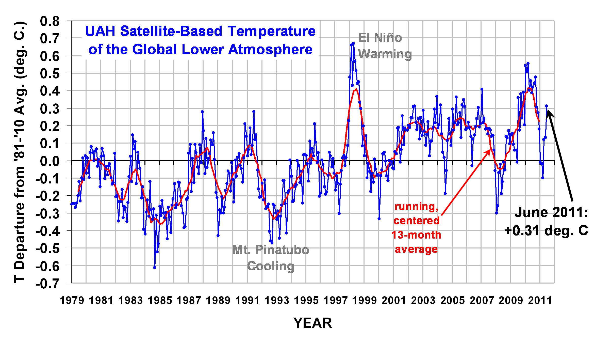 That calls for a Homer-style, "DOH!"
-
Camburn at 13:16 PM on 17 July 2011Carter Confusion #3: Surface Temperature Record Cherries
Tom: Call it a mental block as I readily admit I should have been able to discern this. But I didn't.....and I got frustrated. I didn't read your total response at 13 because of the inuendo that started right away. I do get a bit tired of that. I posted the question because I did not discern something that should have been obvious to me. I always try to be a gentleman when posting as I do not know all the answers to climate science. I do have an excellent understanding of it, and recognize the error bars, the certainty and also the uncertainty. I glean what I can when I can that adds to that knowledge base. -
Tom Curtis at 13:07 PM on 17 July 2011Carter Confusion #3: Surface Temperature Record Cherries
Camburn, from my 13:"There is no question about the difference between the first two and later graphs as the only difference between them is the difference between annual averages and monthly averages, and can be determined by counting the number of data points per year."
With regard 19, the image I displayed was the first image overlaid on the second image. That you thought it was just the third image is telling. For completeness, here is Tamino's fifth image overlaid on his third (ie Carter's). In this case it is monthly plot overlaid on monthly plot so there is no need to re-zero the mean: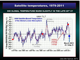 If you can tell the difference at 500 pixel width, you are doing better than I. I cannot distinguish them at 2000 pixel width.
Finally, I find it very hard to credit that somebody who has been in this debate as long as you have cannot pick that data presented as annual and means have the same basic shape, nor see through the very slight differences introduced by differences of scale.
If you can tell the difference at 500 pixel width, you are doing better than I. I cannot distinguish them at 2000 pixel width.
Finally, I find it very hard to credit that somebody who has been in this debate as long as you have cannot pick that data presented as annual and means have the same basic shape, nor see through the very slight differences introduced by differences of scale.
-
Camburn at 12:41 PM on 17 July 2011Carter Confusion #3: Surface Temperature Record Cherries
Thank you Dave123 for noteing my question, and also the answer that Tamino was kind enough to present. -
Dave123 at 12:38 PM on 17 July 2011Carter Confusion #3: Surface Temperature Record Cherries
ah... I see you have an answer..and the difference is as I noted the baseline adjustment. -
Dave123 at 12:36 PM on 17 July 2011Carter Confusion #3: Surface Temperature Record Cherries
If Tom and Camburn would forgive an intervention here- In order for figure one and three to be the same, I have to do two things- 1 is conventional rescale...stretching and shrinking the x and y axes to line up. But the second thing I have to do is "re-zero" the y-axis from Tamino's plot in figure 1 to Carter's "After Spencer" plot in figure 3. ( about -0.35 degrees). If I do that, I get what Tom says and shows in his figure in 18. If I don't do that, I see the point Camburn is making.... that the graphs don't seem to be showing the same data. I suspect that there is a good reason for the re-zeroing, or "correcting an offset', but it would help the interests of civil discourse to have it explained. -
Camburn at 12:32 PM on 17 July 2011Carter Confusion #3: Surface Temperature Record Cherries
Tamino understood my question. Thank you for the recomendation DB. The answer is, which I should have been able to figure out, is that the 1st graph is annual temperatures. The 2nd graph is also annual temperatures. The 3rd graph is monthly averages. The baselines for the anomolies has been adjusted accordingly.Moderator Response: Ah, but it wasn't DB. Many a mystery moderator lurks here.... -
Camburn at 12:04 PM on 17 July 2011Carter Confusion #3: Surface Temperature Record Cherries
Tom: That is the 3RD image. Come on man......look at the 1ST image please, and compare it to the 3rd image. And better yet, compare it to the UAH 5.3 anomoly further down. I give up. You apparantly don't understand my question at all, or don't want to understand it. -
Tom Curtis at 11:55 AM on 17 July 2011Carter Confusion #3: Surface Temperature Record Cherries
Camburn @15, below is the first image from Tamino's post, overlaid on the third (ie Carter's). If you look very closely you will see the black line of Tamino's annual average of UAH overlaid on the 13 month running average plotted by Carter. You do have to look very close. The only alteration made was to adjust both to the same scale. They are the same curve, and your questions are not legitimate.
-
Camburn at 11:52 AM on 17 July 2011Carter Confusion #3: Surface Temperature Record Cherries
Tom@13: Where do you see a description of the baseline for the anomolies? I just re-read this and can find no source for the baselines. In any graph presented, there should be no difference in the UAH anomoly...yet there is. That is my question. I know that version 5.3 is different than version 5.4 as far as UAH as the baseline for the anomoly is now more extended as the time series of the data has increased. You are correct, I have been around for quit some time. Most of the time I can figure out what is being presented in a non-biased way. Concerning my question.....I can't. DB: I am going to post on the blog. Thank you. -
Camburn at 11:28 AM on 17 July 2011Carter Confusion #3: Surface Temperature Record Cherries
DB: Thank you for the link. I understand entirely what Tamino is trying to portray. One of the shortcomings of his type of trend analysis is failure to detect a turn in trend. This is a common failure in marketing of grains, which I won't go into in detail, but one area that I am very familiar with. However, with the above said, I still can't find the source of his graphs in fig 1 and 2 concerning UAH. A UAH anomoly graph is presented in figure three which just does not match the anomoly of fig 1 nor fig 2. When I see this being done in regards to any type of analysis it raises red flags to me. Maybe no one will ever figure the answer to my question out, but I would like to know an answer. I take it that some of the mods etc may be able to email him and ask him. Thank you in advance.Moderator Response: You should post a comment on his site, asking him. -
Camburn at 11:17 AM on 17 July 2011Carter Confusion #3: Surface Temperature Record Cherries
First Off: Thank you DB 2nd off: Tom...if you can't see that the first graph shows UAH and GISS as almost identical then you need glasses. Then the 2nd graph is presented, which is about the same as the 1st graph. Then.....the 3rd graph is presented of UAH alone....and it is not even close to the first two graphs that are suppose to be UAH temps. So, yes, I have legitimate questions as to the basis of said graphs. As far as Mr. Carter, my comment of what I think of him has been snipped twice. And appropriately so on consideration. In a more gentle tone..let's just say that in my humble opinion he has no validity. Good enough? Once again thank you DB. I look forward to reading tamino's post you posted. -
Daniel Bailey at 10:58 AM on 17 July 2011Carter Confusion #3: Surface Temperature Record Cherries
Tamino has a new post up on trends & noise: http://tamino.wordpress.com/2011/07/16/trend-and-noise/ Very timely and related to the ongoing understanding issues present. -
Tom Curtis at 10:51 AM on 17 July 2011Carter Confusion #3: Surface Temperature Record Cherries
Camburn, you give the game away, as if we did not already know it, when you write "Too many questions here to make a good analysis so far". Really? In what way can there be any doubt that simply picking three points at the same temperature instead of analyzing the linear trend is a bad analysis? In what way can there be any doubt that simply drawing in flat lines as a substitute for the actual linear trends is a bad analysis? Your questions of Tamino's analysis are clearly a desperate attempt to find a gnat to strain at so that we do not notice that Carter want's us to swallow camels. It will not work, and try as you might, you will not escape they fact that you have been caught blatantly cherry picking! You say, "He used a short baseline as well......remember? 1997 or such". No he did not! Every graph shown by Tamino above, including those by Carter show at least three decades. You say, "Another reason I used the shorter version is that the graph shows UAH and GISS extremely close. Yet when looking at the graphs further in the piece....they don't match the UAH graph in the first illustration." On the contrary, the match is very similar both before and post 1998. Indeed, the match is almost exact in all years except strong El Nino and La Nina years which are known to have a much larger effect on space born temperature measurements than on surface data (and has the same effect on the RSS index). There is no question about the difference between the first two and later graphs as the only difference between them is the difference between annual averages and monthly averages, and can be determined by counting the number of data points per year. There is no question about the difference between the UAH lower troposphere data as Tamino clearly labels it and the TLT 5.3 except that WoodforTrees (not Tamino) may be using the very slightly different version 5.3 of the UAH data rather than the current version 5.4. There is no question about the baseline of the anomalies, which is clearly identical. And there is no question that you have been around the woods long enough to pick up these things for yourself. So there is no legitimacy to your questions. -
Daniel Bailey at 10:51 AM on 17 July 2011Arctic sea ice has recovered
Courtesy of Lord Soth, a reader and contributor on Neven's Arctic Sea Ice blog, the field markers (stadias) viewable from North Pole webcam 2 have gone from 4 markers: Down to 3:
 Apparently they don't float.
-
Camburn at 10:26 AM on 17 July 2011Carter Confusion #3: Surface Temperature Record Cherries
Albatross: Maybe calling Carter an (-Snip-) is a bit strong. I can't figure out his conclusions either.Response:[DB] Inflammatory snipped.
-
Camburn at 10:24 AM on 17 July 2011Carter Confusion #3: Surface Temperature Record Cherries
DB: But even with those removed.....what is he using? GISS and UAH.....it is obvious.......the graphs don't match and I don't know why, nor can figure out why. I thought someone might know.Response:[DB] Much of this analysis done by Tamino is based on work he had originally done earlier this year:
http://tamino.wordpress.com/2011/01/06/sharper-focus/
http://tamino.wordpress.com/2011/01/20/how-fast-is-earth-warming/
-
Camburn at 10:23 AM on 17 July 2011Carter Confusion #3: Surface Temperature Record Cherries
Albatross: Carter is an (-Snip-). I am trying to do an analysis of Tamino's post but without more information it may be impossible.Response:[DB] Carter is many things, but that adjective applied to him is not correct, nor nice. Tamino makes it clear that Carter, from a scientific and statistical standpoint, is being deceitful.
-
villabolo at 10:04 AM on 17 July 2011Carter Confusion #3: Surface Temperature Record Cherries
Trivial question. Would filtering out Mt. Pinatubo, which should have been El Nino years, make much of a difference on the trend line?Response:[DB] Tamino's second figure has El Nino and volcanic effects removed.
-
Albatross at 09:50 AM on 17 July 2011Carter Confusion #3: Surface Temperature Record Cherries
So Camburn, are you here to defend Carter's scientific misconduct or what? It sadly certainly seems so. -
Tom Curtis at 09:41 AM on 17 July 2011It's the sun
Eric (skeptic) @872: 1) While the change in UV radiation absorbed in the stratosphere may change weather patterns because of its effect on jet streams and the Hadley circulation. It will not result in a different level of energy absorbed than that predicted by Line By Line models for that change. It certainly does not result in no effective change in the energy balance at either the top of the troposphere or the surface as you are implying. 2) The change in TSI associated with the solar cycle has been shown to have small effect on the solar cycle. The best prediction of the lag involved is 2 months (see discussion for Dikran's link). For large changes in solar output, as for example between 1910 and 1950, the lag is ten years. The reason for the difference is that the rate of change in surface temperature depends on the difference between the current temperature and the equilibrium temperature. For small changes as with the solar cycle, a small change in surface temperature will bring the surface close to equilibrium and slow further changes beneath the level of statistical detectability. For large continuous changes the disequilibrium is long lasting and hence the change in temperature detectable for a long time. 3) There is a difference between a change that induces a change in equilibrium, and a change that counters a previous change that effects equilibrium. If there is a forcing of +1 W/m^2 at the top of the atmosphere, the surface needs to warm to bring OLR and solar radiation back into balance. The heat required to bring the temperature back to balance is large compared to the additional heat gained each year due to the imbalance, hence thermal lag. But if there is a temporary reduction in TOA forcing by 1 W/m^2, the surface is already at the right temperature for the new, but temporary TOA balance. As no change of temperature is required, not lag will be present. This is the circumstance when a solar minimum is superimposed on a background of rising temperatures due to a rising GHG concentration. The rising GHG concentration requires a higher surface temperature to re-establish equilibrium. But the solar minimum reduces the surface temperature required for the temporary equilibrium, thereby immediately reducing rates of warming. -
Camburn at 09:29 AM on 17 July 2011Carter Confusion #3: Surface Temperature Record Cherries
The next question is: What are the base years for the anomolies in the first temp graph? The base years would have to match or the illustration is not credible. Too many questions here to make a good analysis so far.Response:[DB] The obvious question at this point is:
- What statistical methodology is needed for a good "Camburn analysis"?
-
Camburn at 09:26 AM on 17 July 2011Carter Confusion #3: Surface Temperature Record Cherries
Same thing in the 2nd graph......hence my question. -
Camburn at 09:25 AM on 17 July 2011Carter Confusion #3: Surface Temperature Record Cherries
Tom: Look at your longer version. Another reason I used the shorter version is that the graph shows UAH and GISS extremely close. Yet when looking at the graphs further in the piece....they don't match the UAH graph in the first illustration. Tamino is no dummy....so there must be a logical explanation, which I don't see. -
Camburn at 09:21 AM on 17 July 2011Carter Confusion #3: Surface Temperature Record Cherries
Tom: He used a short baseline as well......remember? 1997 or such. I am talking about the difference in the graphs. The first graph says it is UAH Mid Trop temps. Ok, the following graphs should be the same then...right? That is my first question....and you didn't answer it. The wood for trees analysis shows that you can do different things by cherry picking. My main question still is.....why the difference in the graphs? Aren't they suppose to be the same thing? And instead of being accusatory....this is a ligitimate question. -
Tom Curtis at 09:15 AM on 17 July 2011Carter Confusion #3: Surface Temperature Record Cherries
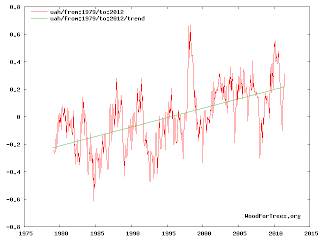
Camburn@2, it is odd, for when I follow your link I find this:But when I stop blatantly cherry picking, and use 1979 as the start date instead of 1998, I find this, which is obviously the same data as is being used by Tamino and Carter:
 So you have some explaining to do. Why did you post a link to such a blatantly cherry picked range of years when it is clear from Tamino's graphs that he is using the data from 1979 to present?
-
hfranzen at 08:54 AM on 17 July 2011OA not OK part 2: Thermodynamic duo
What I meant to say above is: Please know that I understand thoroughly that the ocean is not at equilibrium. I also know that all spontaneous processes proceed in the direction of equilibrium. Therefore as a starting point for considering the direction of chemical processes it is useful to start with a determination of the equilibrium of a model system. That is what I thought you were doing. My point is that the correct approach to considering the equilibrium state of a model system is to list the chemical species present,find all constarints on the system (one equilibrium constant for each independent net reaction and charge balance) and then solve the resultant equations for the equilibrium concentrations of the species. To say, as you do, that thermodynamics tells us the reaction 1 is spontaneous in the surface oceans is incorrect. What is correct is to say that on average the surface oceans are, so long as the partial pressure of carbon dioxide increases, continously perturbed by the addition of carbon dioxide from the vapor phase and that this pertubation results in an increase in the concentration of dissolved carbon dioxide, dissolved bicarbonate ion, dissolved hydrogen ion and, unless the ion product equals the solubity product, carbonate ion. If the local ion product equals or exceeds the solubity product of calcium carbonate then solid calcium carbonate sponateously precipitates. Your equation 1 implies a spontaneity without providing the perturbation driving it. Eq.1, in fact, implies that the precipitation of calcium carbonate drives an increase in the amount of carbon dioxide in the vapor hase whereas the opposite is the case. -
Rob Painting at 08:44 AM on 17 July 2011Why Wasn't The Hottest Decade Hotter?
David Lewis - The linear trend in the IPCC graph totally obscures the recent 'slow-down'. Again - the point of the article is not that long-term global warming is happening (shucks, we know that), it's examining short-term variability. -
Camburn at 07:52 AM on 17 July 2011Carter Confusion #3: Surface Temperature Record Cherries
I looked at Woodfortrees to see if I could find a similiar UAH temperature record. This is what I found: UAH temperature record -
Camburn at 07:43 AM on 17 July 2011Carter Confusion #3: Surface Temperature Record Cherries
I have a question: The first graph supposedly shows UAH and GISS temp data. Then the UAH LT 5.3 shows something different. Which graph is the correct one? They can't both be as the data is different. Or am I reading this wrong? -
scaddenp at 07:03 AM on 17 July 2011Climate's changed before
Doug, the heat flux through the earth is of enormous importance to the oil industry since it is a critical component for calculating when sediments with an organic components will produce oil and gas. As a result, it is measured. The heat flux from the core around 0.04W/m2 - 0.06W/m2. Compare this with 300+/W/m2 from sun. -
David Lewis at 06:49 AM on 17 July 2011Why Wasn't The Hottest Decade Hotter?
Kevin Trenberth led the IPCC group that produced this chart: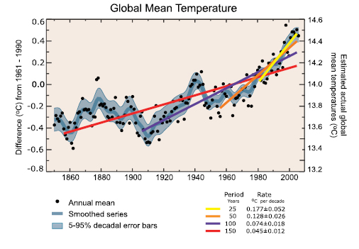
He says: "We used 25 years in Chapter 3 of IPCC as the lowest trend we provided that was meaningful…."
All the denier noise about "trends" with shorter time periods is much ado about nothing.Moderator Response: [RH] Rescaled image to 450. -
BaerbelW at 06:46 AM on 17 July 2011Citizen Science: Climatology for Everyone
Climate Progress has a recent post about citizen science as well: "Tapping Social Media To Muster a Vast Green Army". -
Dawei at 05:34 AM on 17 July 2011Citizen Science: Climatology for Everyone
I understand that people are surprised that I included surfacestations.org to the list. The fact is that it does fit the definition of citizen climate science. Although some people contribute to the project with a bias in mind, it doesn't mean it isn't still a useful project, whose efforts the NCDC has already expressed appreciation for. To remove from the list what is surely the most popular citizen climate science project in the US simply because we disagree with the views of its participants would be a pretty biased action in my opinion. -
Dikran Marsupial at 04:48 AM on 17 July 2011It's the sun
Eric (skeptic) The physics of transmission of radiation as a function of wavelength is pretty solid (e.g. MODTRAN); it really isn't a source of significant uncertainty. The comment regarding thermal inertia of the oceans is also misguided. The thermal inertia of the oceans is a large part of the reason that there is unrealised warming to come due to the CO2 emissions made so far. However that doesn't mean there is not also an "instantaneous" response to a change in forcings. To demonstrate that is the case, the aerosols from volcanic eruptions cause an immediate drop in temperatures for a couple of years. If thermal inertia of the oceans buffers use from changes in solar forcing, you need to explain why it doesn't also buffer us from the negative forcing from volcanos. If you think that the comment that the solar minimum should have an effect is unsubstantiated, then again you are incorrect. Tamino has shown that solar activity has a small, but non-zero effect on temperature, see this post for details, the plot of the effect of solar activity on temperatures is below The peak-to-trough difference is about 0.1-0.2 degrees C, depending on which dataset you look at.
-
Bob Lacatena at 04:16 AM on 17 July 2011OA not OK part 6: Always take the weathering
Doug:The oceans are not full of salts (NaCl and/or carbonate species etc).
Is the word "not" supposed to be there?Moderator Response: The 'not' is correct. You can take seawater and add more salt to it. Therefore seawater is not full or saturated with salts. But good point about language use and that bullet point changed. Thanks. Doug. -
Composer99 at 02:35 AM on 17 July 2011OA not OK part 6: Always take the weathering
Thanks for clearing that up, Patrick. -
Eric (skeptic) at 00:20 AM on 17 July 2011It's the sun
Tom, I don't think we can measure all the effects of TSI completely even if we can measure it accurately outside the earth's atmosphere. For starters the spectral changes can make a big difference (e.g. solar UV dropped a lot more by %age than TSI and although solar UV is less energetic, it has a large effect on the stratosphere). Second, the effects of TSI or any other energy changes are subject to the same constraint as GHG energy equivalents, namely that there is a thermal lag caused by the ocean. That lag is very difficult to measure since OHC is a difficult measurement especially over the short run. To reiterate my basic point, the comment that the solar minimum since 2008 should have caused cooling but didn't (or words to that effect) is unsubstantiated. It shows up a lot on other threads. -
Eric (skeptic) at 00:08 AM on 17 July 2011Climate's changed before
Oddly enough, the theory that most heat comes from within the earth does not contradict GH theory since outgoing LW would still be absorbed by GHGs. -
skywatcher at 23:54 PM on 16 July 2011Climate's changed before
Wow, Doug #184 I would like to see one of your physics classes if that is what you teach! It sounds like you are suggesting that planet Earth would be pretty much just fine without the Sun, among other things. Yours is a great comment for any resident skeptics to debunk (good start Eric), as I think they could safely do it without causing damage to their own understandings of the climate system, even if they are not too close to the truth about climate. A starter for 10 - how does Doug's hypothesis account for the poles being markedly cooler than the equator, if most heat comes from within Earth? I might even have to come up with a new term for DougCotton's understanding of climate! -
dhogaza at 23:48 PM on 16 July 2011Citizen Science: Climatology for Everyone
Yes, the surface stations project doesn't really belong. Real citizen science projects (such as the christmas bird count) are unbiased attempts to gather data, because, as mspelto says, citizens can provide much greater data density than researchers alone. Typically such projects make use of citizen expertise in an area, for instance count organizers and team leaders in the christmas bird count are typically expert amateur birders. The surface stations project set out to "prove" an ideologically-driven belief that the global temperature record has been manipulated, and was organized and the "data" (photos) presented with that in mind. There was no effort to train or recruit volunteers to classify stations other than via photographs. It turns out that slicing and dicing the dataset via the surface station project's site categorization doesn't affect the trend, but the person who started the project continues to insist that they've proven the data's been manipulated to show warming that doesn't exist. It's citizen pseudo-science, and listing it alongside real citizen science efforts is an insult to the latter. -
RMCPiper at 23:20 PM on 16 July 2011Citizen Science: Climatology for Everyone
My participation is a website http://climateinsight.wordpress.com, exploring issues in sustainability, energy efficiency and climate change. I have a B.Sc. (Mathematics & Physics) from Canada's Royal Military College, have served in our RCAF and am now retired after a 45-year career with a focus on emergency response and public safety. I kept up my interest on science throughout my career and am now trying to act as an ambassador between scientists, their studies with the lay public who have been misled by the "Merchants of Doubt", primarily by mainstream media commentary. This site is one of my favorite citations. Alan Burke Ottawa, Ontario, Canada -
Eric (skeptic) at 23:07 PM on 16 July 2011Climate's changed before
DougCotton, it looks like your featured evidence for "global cooling", comparing 2003 to 2011 is cherry-picked. For example in your chart http://earth-climate.com/2003-2011.jpg you show that 'the mean for the first half of 2011 was less than the mean for the first half of 2003" and "the mean for the second half of 2010 was less than the mean for the second half of 2003". In your graph linked above there is more support for saying "the mean for the first half of 2010 was significantly higher than the mean for the first half of 2003 and considering that those were both El Nino years, it suggests warming". Your comparison of 2011 to 2003 is not useful since 2003 was El Nino and 2011 was La Nina. You use AMSU sea surface temperatures which are only representative of part of the planet (missing all land) and heavily reflect SST which fluctuates due to ENSO. In fact the AMSU sensor that you use tracks closely to the ICOADS values of actual SST measurements, see http://news.cisc.gmu.edu/doc/publications/Jackson%20et%20al_2010.pdf figure 1. -
skywatcher at 21:18 PM on 16 July 2011Citizen Science: Climatology for Everyone
Hve to agree with Tom about the surfacestations project. It's hard to imagine a project that has a greater initial conceptual bias toward hoped-for results. And their results have already been shown to have no significant effect on the global temperature record by Menne et al. -
skywatcher at 21:14 PM on 16 July 2011Monckton at odds with the very scientists he cites
#18 - a very good point. Changes in glacier snowlines are now occurring so rapidly that most glaciers are far out of equilibrium (of their mass balance). Consequently, glaciers around the world will continue retreating for years, and for most larger glaciers, many decades, before reaching equilibrium, even if temperature/precipitation regimes were held at today's levels. The Tasman Glacier has obviously retreated far in the past years (you pretty much need binoculars from the tourist viewpoint now), but it's going to continue retreating considerably further, just like comparable glaciers in Iceland, unless the climate cools a lot. Most past changes happened slowly enough that small glaciers (valley / corrie glaciers) could reach some sort of equilibrium with prevailing climate. Modern changes are much faster than the equilibrium response rates of nearly all glaciers, and so comparting their present terminus position to their past positions is not telling you much about how today's climate compares to previous warm episodes. It just tells you it's warming quickly! -
mspelto at 21:13 PM on 16 July 2011Citizen Science: Climatology for Everyone
An excellent climate project that I participate in with my college classes is Project Budburst, which uses Plant Phenology as climate indicators. Citizens can provide much greater data density than researchers alone. -
Rob Painting at 20:31 PM on 16 July 2011Why Wasn't The Hottest Decade Hotter?
It's been interesting reading the comments. I thought the "skeptics" were the only ones who 'can't see the woods for the trees', apparently not so. Some "warmists" are gonna have conniptions reading the comments from studies I'm writing about now!
Prev 1574 1575 1576 1577 1578 1579 1580 1581 1582 1583 1584 1585 1586 1587 1588 1589 Next


