


 Arguments


Recent Comments
Prev 1947 1948 1949 1950 1951 1952 1953 1954 1955 1956 1957 1958 1959 1960 1961 1962 Next
Comments 97701 to 97750:
-
Daniel Bailey at 05:13 AM on 22 January 2011The Climate Show #5: Green roofs and Brisbane floods
@ Albatross (4) Not a global study, but here's a regional study done in the NE US in 2010: Trends in Extreme Precipitation Events for the Northeastern United States 1948-2007 The source notes cite several other pub's between 2006 and 2009. The Yooper -
MattJ at 05:10 AM on 22 January 2011Spanish translation of The Scientific Guide to Global Warming Skepticism
I had to chuckle when I saw the name of the translator: "la mentira" means, "the liar";) -
Albatross at 04:23 AM on 22 January 2011The Climate Show #5: Green roofs and Brisbane floods
Yay, another episode :) On a more technical note though, John thanks for the Groisman (2006) and Alexander (2006) papers, I have been looking for something like that. Does anyone know if there are more recent papers on trends in heavy precipitation event around the globe? Yes, I'm being lazy, sorry. -
Alexandre at 04:23 AM on 22 January 2011Monckton Myth #5: Dangerous Warming
JMurphy #28 That´s an interesting speculation, but well, I think 600 million years is already way beyond any creationist callendar... -
muoncounter at 04:21 AM on 22 January 2011Oceans are cooling
#33: "No warming imbalance for 7-8 years is a terminal inconsistency in the whole theory of AGW" Looking at the graph in #34, I would have to agree; The current 7 year flat spot, if real, is terminal. Just like the flat spot from 1982-1988 was terminal. Guess AGW stopped then, too. Or like it stopped in the late '60s on the graph in #25. Or maybe OHC does have an upward trend, with some more complex behavior that gives rise to these occasional residuals. Funny how one can argue that there's no warming based on a shoulder in the upward trend, all the while ignoring the upward trend itself. -
michael sweet at 04:11 AM on 22 January 2011Monckton Myth #1: Cooling oceans
Ken, Data is never useless. As John says: you need to look at the whole picture. There is not a "recognized standard of reliability" for data. Have you ever worked with real data?The data needs to be evaluated carefully and the reliability has to be assessed by people who know what they are doing. That is why professionals get paid to do their work. Bloggers who try to over evaluate the data, especially over short periods like the time the Argo floats have been established, contribute little to knowledge. See Yoopers graph for the most recent data. The trend is up in OHC. That data is still not the final word, more work is being done to pin down the OHC. -
Daniel Bailey at 02:34 AM on 22 January 2011Oceans are cooling
Kinda sez it all: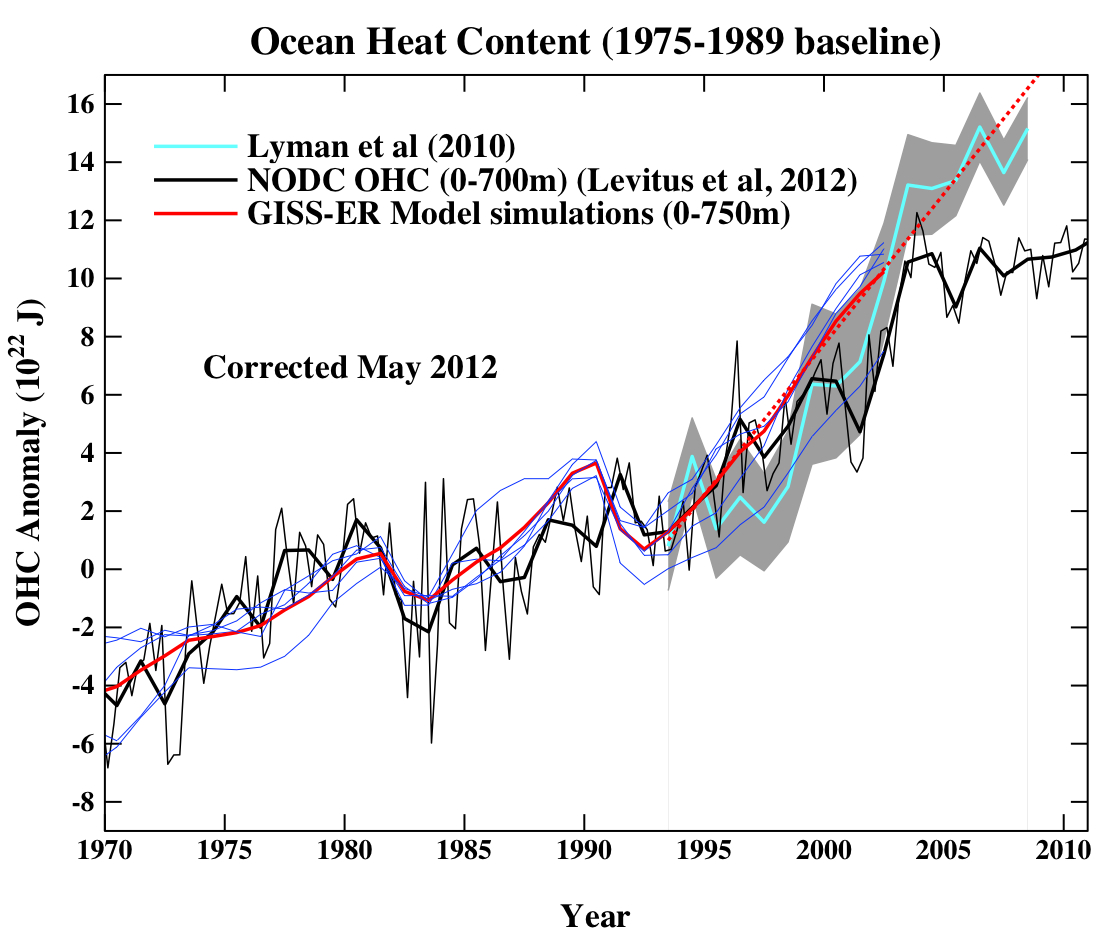 Source here
RC commentary on Lyman et al 2010 here
The Yooper
Source here
RC commentary on Lyman et al 2010 here
The Yooper
-
Ken Lambert at 01:37 AM on 22 January 2011Monckton Myth #1: Cooling oceans
Albatros #60 "The fact is both the ARGO and XBT data have issues. But do not presume that the researchers and experts in the field are not aware of this and that they are not working incredibly hard to address the issues." So what does that mean Albatros? The data is useless from both Argo and XBT, or XBT only, or Argo only? I would have thought the proper scientific method (peer reviewed of course) would be to disclose the reliability of the measurement and not use it if not meeting a recognized standard of reliability. Surely the greater the coverage and numbers the more accurate the measurement unless there is systemic fault which applies to all the instruments. -
HumanityRules at 01:30 AM on 22 January 2011OK global warming, this time it's personal!
John, I'd sort of assumed your observation that increasing SST is acting as an engine for these extreme rainfall events was correct, the basic premise sounds good. But it's one thing to put forward a plausible physical process and another to show that it has any significant impact in the real world. The BOM data (see #6) doesn't seem to show any simple relationship between SST and rainfall. There's still a better relationship between rainfall and variations in the Pacific Ocean that amount to far more than just SST changes. But we can save this argument for when you produce your more sciencey article. Hopefully you can show then not just a plausible physical process but that that process is working it's self out in the real world. (I'll try back up my own vague comments then as well) -
Ken Lambert at 01:21 AM on 22 January 2011Monckton Myth #1: Cooling oceans
Anne-Marie Blackburn, Marcus, Albatros http://www.skepticalscience.com/cooling-oceans.htm#comments Why don't you pop across to the 'correct' thread for some more good banging about. -
Ken Lambert at 01:09 AM on 22 January 2011Oceans are cooling
Albatros, KR, Asteel Is BP's OHC chart posted here at comment #69 wrong?? viz: http://www.skepticalscience.com/news.php?n=519&p=2#37765 Well indeed why don't we invite Palmer, Lyman, Trenberth, Levitus, Domingues, von Schuckmann, Good,Gouretski, Ishii, Komoto, Johnson, Smith, Haines, Murphy, Reseghetti, Antonov, Mishonov, Garcia, Locarnini, Boyer and Willis to comment on BP's analysis. Surely John Cook has some contacts with some of these scientists who could be asked to comment. The nub of BP's argument is simple: Satellite measurements of absolute TOA imbalance is poor to useless (not even the sign is sure), but month on month and year on year precision is good (ie the deltas). The jumps in the OHC charts published 1993-2009 (Trenberth 2010 above) and Lyman composite show OHC gains 2001-03 of about 7E22 Joules (700E20 Joules) which is a rate of about 350E20 Joules/yr. Trenberth's 0.9W/sq.m TOA imbalance equates to 145E20 Joules/yr. To get a 350E20 Joules/yr increase in OHC, the TOA imbalance must have leapt from 0.9 to 2.2W/sq.m in the period 2001-03. Satellite measurement shows no such change in that period. The period coincides with the XBT to Argo transition, so which is right? - high precision delta measurement by established satellites or XBT-Argo in transition?? I would plug for the Satellites. The conclusion is that the step jumps in OHC Charts in this period are an artifact of the transition, and the greater deployment of Argo shows flat OHC since ARO 2003. Therefore, drawing a linear curve fit (the red line on Trenberth 2010) from 1993-2009 and calling it a 0.64W/sq.m (or 103E20 Joules/yr) rate of TOA warming imbalance is bogus if the step jump is incorrect. The blue line (o.54W/sq.m) looks like a dodgy fit as well as it should terminate somewhere near the end of the red line I would have thought. Arguing that BP's 7-8 year period is ridicuously short, is ridiculous itself in the context of OHC Charts which only span 16-17 years (1993-2009). BP's Chart referenced above shows flat OHC with seasonal variations 2003-2010. This means no TOA warming imbalance; because a linear OHC increase has to result from a constant positive warming imbalance (positive net forcing). No warming imbalance for 7-8 years is a terminal inconsistency in the whole theory of AGW by CO2GHG forcing and positive feedbacks. -
muoncounter at 00:43 AM on 22 January 2011The Climate Show #5: Green roofs and Brisbane floods
#2: Yooper, The image of 'its raining Lake Erie' is too ghastly to consider. -
Daniel Bailey at 23:40 PM on 21 January 2011The Climate Show #5: Green roofs and Brisbane floods
@ Steve Meacher (1) I had read that CP thread & remembered Leif's analogy as well. Some time back, I mentioned it to Lou Grinzo on his blog & between us we came up with this:Volume of water in the atmosphere = 1.27 x 10¹⁶kg Volume of water in Lake Superior = 1.21 x 10¹⁶kg
Too close for Lake Superior to equal a 4% increase, as it was roughly equal to the volume of moisture in the air itself. However, Lake Erie is 4% of Lake Superior (119 3 miles vs that of Lake Superior at 2,900 3 miles). Interestingly, that is about equal to the volume of ice Greenland lost last summer (500 gigatons)...Lake Erie, a useful metric? Whodathunkit? Thus, the 4% increase in humidity can be said to equal the volume of Lake Erie raining down on you...hardly an encouraging thought, in more ways than one. The Yooper -
JMurphy at 23:01 PM on 21 January 2011Monckton Myth #5: Dangerous Warming
Why did Monckton stop at the "past 600 million years" ? Surely he would have achieved a far more dramatic effect by stating "Since far greater temperatures than this have been the rule on Earth for most of the past four and a half billion years..." ? Or is it something to do with not wanting to upset his Creationist followers by saying the Earth is too old ? -
Steve Meacher at 22:54 PM on 21 January 2011The Climate Show #5: Green roofs and Brisbane floods
Thanks John, I picked up on the "900 Sydney Harbours" comment as I recently read a similar calculation stating the additional global precipitation in "Lake Superiors" (here). The most authoritative source I can find for the volume of Sydney Harbour (other than Wikipedia, which gives approximately 500 gigalitres ) is this - "An informal unit of storage capacity commonly used in Australia is the “Sydharb”, which is the amount of water in Sydney Harbour, about 530 000 megalitres or roughly half a cubic kilometre of water", (in Water History - Lessons for the Future) Also, The Honourable Craig Wallace, in a media release, December 13, 2007 says, "A sydharb is used as a unit of volume of water in Australia. One sydharb is the amount of water in Sydney Harbour - approximately 562,000 megalitres at high tide". The Encyclopedia of Earth figure used in the Lake Superior calculation (13,000 cubic km water in the atmosphere) came from an article on the Hydrologic Cycle and is consistent with the 1970 figure you used. I'd be interested if anybody can refine your calculation. -
Mighty Drunken at 21:40 PM on 21 January 2011Monckton Myth #5: Dangerous Warming
I am thinking what a poor argument Monckton makes when he say, "Since far greater temperatures than this have been the rule on Earth for most of the past 600 million years, there is no sound scientific basis for the assumption that “significant environmental and economic damage” would result from so small an additional warming. " Six hundred million years! Think how epically different Earth was then compared to now, it is just not comparable. From eye balling some graphs for temperature over the last millions of years, 2C warming from pre-industrial times seems to be the upper bound for interglacials over the last 500 thousand years. It is not till about 3 million years ago that it was that warm for any length of (geological) time. Our species has existed only since then! How can Monckton put human civilisation at such risk? -
JMurphy at 21:40 PM on 21 January 2011Could global warming be caused by natural cycles?
A link in the latest thread from John Cook (which is very informative, as usual) led me to this : The SOI values confirm that we are in the middle of either the strongest La Niña event on record, or the second strongest. The SOI values for October 2010 and December 2010 were each the largest positive values on record for those months, as was the three-month average October-December 2010. If we take a longer perspective (July-December) then 1917 was stronger than 2010, but 2010 was still the second strongest in the historical record. Using either the October-December or the longer July-December periods, the strong La Niña events on 1973 and 1975 were both ranked as weaker than the 2010 event. AMOS -
MarkR at 21:18 PM on 21 January 2011Monckton Myth #5: Dangerous Warming
#22 thingadonta: Like dhogaza said. We can use climate changes in the past to model what might happen physically, but we can't directly model economically because there was no human economy back then. So we can estimate things like how high sea levels or temperatures will rise. You can't say that 'well, GDP damage back then was 0 so it will be 0 now', that's stupid. You can estimate future damages based on knowing what the economy is like today and the damages you can expect (which you calculate from observations, models and palaeoclimate data). Imagine we had an meteor coming to hit us. Monckton would tell us not to worry, over the Earth's history meteor strikes are the norm rather than the rule. 65 million years ago when a meteor hit us, economic losses were 0%! But a scientist would use the impact evidence from 65 million years ago to work out what would happen today. -
dhogaza at 15:58 PM on 21 January 2011Monckton Myth #5: Dangerous Warming
thingadonta:"We cannot infer the amount of environmental and economic damage we will experience based on the state of the climate 600 million years ago. " Then how do you justify using climate changes in the past to model what is happening/will happen in the next 100 years?
Probably because 600 million years ago there were no economic damages due to climate change because humans hadn't evolved yet. While some of us hope that, despite the denialism-driven obstacles to action, that humans will still exist 100 years ago. If you can't understand the fact that climate change today, when humans exist, will have more impact on humans than climate change 600 million years ago, when humans didn't exist, did ... Lord help us. -
Albatross at 15:15 PM on 21 January 2011Oceans are cooling
BP @85, "Of course I am the person responsible for radically decreasing MBT coverage in 1991 and XBT coverage soon after it while restarting measurements in 2003 by ARGO..." Come on, you are arguing a strawman.... Do you deny saying this @53? "Except there's no "planetary energy imbalance" there for the last eight years." Do do deny saying this @69? "In fact there's no heat accumulation in the system even from mid-2007 to mid-2010. Given you insist on posting on this thread, and insist on focusing on short periods of time, please allow me to post this: Caption: Changing heat content of the global ocean. Black curve is changes in upper ocean heat content (0 to 700 metres). Pink line is trend in upper ocean heat content. Blue line is trend in ocean heat content down to 2000 metres (Trenberth 2010).
But then again it seems that you think that you know more about OHC than Palmer, Lyman, Trenberth, Levitus, Domingues, von Schuckmann, Good,Gouretski, Ishii, Komoto, Johnson, Smith, Haines, Murphy, Reseghetti, Antonov, Mishonov, Garcia, Locarnini, Boyer and Willis.
You are railing against an awful lot of grey matter, experience, expertise and training BP. Something else to consider, according to Palmer et al. (2009):
"Deep ocean warming may account for some of the missing energy (Johnson and Doney 2006; Johnson et al. 2007; Johnson et al. 2008a). Only with a truly global ocean observing system can we close fully the global energy and sea level budgets, so we must improve our observations of the ocean below 2000 m where Argo floats currently do not reach."
Moderator Response: This is Albatross's reply to BP's comment on a different (and inappropriate) thread.
Caption: Changing heat content of the global ocean. Black curve is changes in upper ocean heat content (0 to 700 metres). Pink line is trend in upper ocean heat content. Blue line is trend in ocean heat content down to 2000 metres (Trenberth 2010).
But then again it seems that you think that you know more about OHC than Palmer, Lyman, Trenberth, Levitus, Domingues, von Schuckmann, Good,Gouretski, Ishii, Komoto, Johnson, Smith, Haines, Murphy, Reseghetti, Antonov, Mishonov, Garcia, Locarnini, Boyer and Willis.
You are railing against an awful lot of grey matter, experience, expertise and training BP. Something else to consider, according to Palmer et al. (2009):
"Deep ocean warming may account for some of the missing energy (Johnson and Doney 2006; Johnson et al. 2007; Johnson et al. 2008a). Only with a truly global ocean observing system can we close fully the global energy and sea level budgets, so we must improve our observations of the ocean below 2000 m where Argo floats currently do not reach."
Moderator Response: This is Albatross's reply to BP's comment on a different (and inappropriate) thread. -
skywatcher at 14:52 PM on 21 January 2011Monckton Myth #5: Dangerous Warming
(O/T) rpauli #21: Canute was not a British king, but was king of England (but a Danish prince), who then unified the Danish and English crowns and subsequently claimed the Norwegian one. Don't think he ever ruled north of the border, where Malcolm II was in charge of the early Scottish kingdom. You're dead right about the wiseness of his actions though - commonly misinterpreted to this day! -
Could global warming be caused by natural cycles?
whatdoweknow - I would have to agree, the MEI is not perfect. However, as a general index for the strength of the ENSO, it appears to correlate very well to the temperature forcing, as Tamino shows. So - regardless of whether you feel the SST alone is the most important, Tamino shows that the total index of sea-level pressure, zonal and meridional components of the surface wind, sea surface temperature, surface air temperature, and total cloudiness fraction correlates well to actual global temps. That's not really surprising - SST, SAT, and cloudiness are major factors, and winds spread energy around. The only factors I could think of as less correlated would be sea level pressure (due to location dependencies) and possibly winds, so 3-5/6 factors have a distinct influence. I think that your "apples and oranges" analogy doesn't hold up under statistical analysis. The MEI shows an excellent correlation with short term (<5 year) temperature variations, and as such MEI is a reasonable metric for ENSO. -
skywatcher at 14:38 PM on 21 January 2011Monckton Myth #5: Dangerous Warming
#22: The models the IPCC uses are based on the physics of the atmosphere and scenarios of emissions, combined with constraints established from palaeoclimate and supported by further physics. Monckton uses... the climate of the Earth before multicellular life was widespread (even before the Ediacaran fauna), when the Sun was sugnificantly fainter, the composition of the atmosphere was different, and the continents were in a completely different configuration. That's a great analogy with which to gamble the stability of agriculture and modern human life isn't it? This year we've seen ruined harvests due to flood in Pakistan (and Queensland), and due to heat/drought in Russia, with the latter responsible for a record and ongoing spike in the FAO food price index. And given how much higher sea levels were in the last few million years with temperatures just a degree or two warmer, it's safe to say that significant sea level rise is very likely. I forget off the top of my head the proportion of human population that live within 5m of sea level or has marginal food security... -
thingadonta at 14:05 PM on 21 January 2011Monckton Myth #5: Dangerous Warming
"We cannot infer the amount of environmental and economic damage we will experience based on the state of the climate 600 million years ago. " Then how do you justify using climate changes in the past to model what is happening/will happen in the next 100 years? In other words, the IPCC does exactly what you say Monckton is doing, but you say he cant do it, but the IPCC can. Double standards. Your starting time point ('pre industrial levels') about which 'safe T' is assumed, is the coldest point in the last 10,000 years to make the assumption of what is 'safe' 'average T'. How convenient. The climate has been higher than pre industrial levels (ie Little Ice Age) for much of the Holocene, no adverse effects. Any scientists can show that these estimates of what is safe and what isnt choosing as a starting point the coldest period in the last 10,000 years, are ludicrous. -
muoncounter at 13:48 PM on 21 January 2011Hurricanes aren't linked to global warming
#25: "Explicate"? What's to explain? Your own words, #23: "If anything, there's a weak ..." The 'if' and 'weak' loom large indeed when one looks at the graph in #23. But here's how the folks who gather the Accumulated Cyclone Energy data forecast the 2010 storm season: The lower caption states expected ACE range is mainly above 175% of median, which reflects the high likelihood of a very active season (also called hyperactive). Note that a 'high-activity era' started in 1995 and now the bars are red.
And that brings us back to Masters' review of the 2010 season, cited in #22 above. Even better, here's link to a video retrospective: The Hyperactive Hurricane Season.
The lower caption states expected ACE range is mainly above 175% of median, which reflects the high likelihood of a very active season (also called hyperactive). Note that a 'high-activity era' started in 1995 and now the bars are red.
And that brings us back to Masters' review of the 2010 season, cited in #22 above. Even better, here's link to a video retrospective: The Hyperactive Hurricane Season.
-
r.pauli at 13:29 PM on 21 January 2011Monckton Myth #5: Dangerous Warming
It is shocking that a British citizen would so mangle the history of King Canute. Perhaps the first British king - ruling about a thousand years ago. He is the one who is pictured as commanding the tides not to rise. King Canute did this purely as a show to instruct his minions not to expect a king to perform miracles or stand in the way of nature. Pretty wise for a leader - even now. Monkton has it completely wrong on that point. Not sure I can read much more of him after that. -
muoncounter at 13:28 PM on 21 January 2011It's Pacific Decadal Oscillation
#68: "tops become bottoms and vice versa" Ah-ha. That's much clearer now. We heard this way back here. For those who might not know, GPTC is "greatest perturbation in the torque cycle," a concept based on solar angular momentum from the writings of Theodor Landscheidt, "author, astrologer and amateur climatologist". Disciples of Landscheidt have us already in a new ice age. There is a host of interesting stuff there: Over the past several million years the planet has spent around 80% of its time under ice. ... The outer planets over long periods influence the shape of the earth’s orbit via gravitation perturbations. ... changing the way heat is received from the Sun which leads to a gradual build up of snow/ice that does not melt during summer in the northern hemisphere. ... The two oscillations combining to achieve the largest amplitude of modulation for over a hundred years that also corresponds to the large temperature increase between 1970 and 2000. The IPCC determines this as an AGW forcing but perhaps they have been riding a wave driven by celestial forces that is now crashing down around them? What can be said that is large enough for all this? -
Berényi Péter at 13:26 PM on 21 January 2011Monckton Myth #3: Linear Warming
#86 Albatross at 12:24 PM on 21 January, 2011 For the record BP, you chose the ridiculously short time frame, not anyone else, you. Of course I am the person responsible for radically decreasing MBT coverage in 1991 and XBT coverage soon after it while restarting measurements in 2003 by ARGO, leaving a gaping chasm in between. Who else? It was in this barely measured period when intercalibration of different measurement systems was utterly impossible that OHC increased like crazy. As soon as I was not able to withhold ARGO any more, OHC miraculously stopped increasing. Bad luck, for the record. You can read the full story here.
Moderator Response: Albatross has replied on the correct thread: "Oceans are cooling."
You can read the full story here.
Moderator Response: Albatross has replied on the correct thread: "Oceans are cooling." -
Eric (skeptic) at 13:13 PM on 21 January 2011Infographic on where global warming is going
Ken, I was just stating what seems obvious which is that the OHC went down and the global average temperature went up. But I would also expand your comment about evaporation and other energy transfers, namely that these El Ninos tend to peak in the winter. I think one reason is that OHC spikes up in the winter (something I just noticed). So given an El Nino wind pattern, the evaporation increases and the latent heat transfer to the atmosphere increases all fed by the normal annual spike in OHC (perhaps supplemented by fewer clouds - more sunlight absorbed). -
Ken Lambert at 12:56 PM on 21 January 2011Infographic on where global warming is going
ChrisG #26 and AG.W #27 Very good comments ChrisG and AG.W - described the situation better than I did. The essential adjectives are 'global' and 'over time'. ENSO and La Nina are supposed to be 'internal effects' which redistribute heat energy already there within the land/atmosphere/ocean system. Eric #24 is also correct in describing the action of ENSO where large regional net release can spike global average surface temperatures, although the energy balance of ocean heat release should equal evaporation and land/air temperature rise energy equivalents. If not, then ENSO would become an 'external' forcing event -which changes the ballgame completely. It should then join the Table of forcings for the whole globe. MarkR seems to suggest this. -
Eric (skeptic) at 12:52 PM on 21 January 2011Oceans are cooling
BP, I will also reply in the correct thread with a quantified followup to your claim: "Heat content anomaly of the upper 700 m of oceans in the fourth quarter of 2003 is 11.655±0.975×10²² J, while in the third quarter of 2010 it is 9.589±0.690×10²² J,....a net heat loss (of at least 4×10²¹ J)." The Loehle paper http://www.ncasi.org/publications/Detail.aspx?id=3152 shows about a 5×10²² J annual cycle of OHC. From the third to fourth quarter every year the rise is about 2×10²² J or a loss of 2×10²² J when picking a fourth quarter as a starting point and a third quarter as an ending point. or about 5 times the loss you stated in the other thread. The reason is simply that the earth gets closer to the sun during that interval each year. -
AlanW at 12:48 PM on 21 January 2011Infographic on where global warming is going
25 Sphaerica. Confirming you point about the ocean being warmer at the surface than the air. The decadal mean sea surface temperature, Ts, is typically slightly warmer (0.6 to 1 degC on average globally) than the mean near-surface air temperature, Ta, at the same location. There are plots in section 2.2 of doi:10.1016/j.marsys.2008.01.009 (PDF). To me the surprising part of this result was how consistent these maps are (one from ship observations and the others from numerical weather predication reanalysis products, which use observed Ts as a boundary condition) and how well correlated mean Ta and mean Ts are over the entire range of observed values. In the short term Ta and Ts can be very different, but not in the long term. -
WHATDOWEKNOW at 12:40 PM on 21 January 2011Could global warming be caused by natural cycles?
#175. KR thanks for the link; It's been posted under different topics on this website earlier (I think). I have one problem with the MEI: it's a ranking based upon 6 variables, most of which not temperature related. It's neither a measurement, just a multivariate composite index, in which strength of an ENSO event depends on all 6 variables and not on sea surface temperature (anomaly). Thus a strong el nino or la nina, not necessarily means it also exhibits very high or low SST anomalies (as is the case with the current la nina, which has moderate to low SST of -1.4, but ranks high -apparently because several of the other variables are strong-) Hence, I am afraid it's comparing apples to oranges when comparing global temperature anomalies with unit less ranked values. I don't see how one can "correct" temperature with a ranked value. Imo it be more appropriate to use the ONI value, which is a SST anomaly too; unfortunately ONI only dates till 1950. -
WHATDOWEKNOW at 12:30 PM on 21 January 2011It's Pacific Decadal Oscillation
#65 muoncounter; In '68 there was a PHASE REVERSAL, meaning tops become bottoms and vice versa; prior '68 GPTCs were tops and are bottoms post '68 whereas prior '69 LPTCs were bottoms and are tops post '68. Hence, why ENSO events related to tops and/or bottoms depending on if they occurred pre- post '68. The fact then that ENSO events coincide EXACTLY with key PDO events thus proofs they are related. I suggest learning more about the PDO (and probably ENSO cycle too) so you better understand the intricacies of natural cycles, how they inter connect and how they play a role on climate. -
Albatross at 12:24 PM on 21 January 2011Monckton Myth #3: Linear Warming
My response will too appear at the appropriate thread when I have some time. For the record BP, you chose the ridiculously short time frame, not anyone else, you. So now we all have to march down that road, just like Monckton has forced us to do. -
Oceans are cooling
A question for the ocean experts out there: In (I believe) the Why are there fewer weather stations thread someone noted that the temperature anomalies (not temperatures, but anomalies) seen across the surface record have a high correlation over fairly large areas, and hence a reasonable surface temperature anomaly record could be obtained with just a few hundred stations. Is this the case with the Argo and XBT data? Do OHC measures display large area correlations in anomalies, or does the 3D current structure of the ocean prevent that? I'm wondering just how many Argo floats (or better yet, some deeper samples) are required to accurately measure ocean temperatures. -
Eric (skeptic) at 12:22 PM on 21 January 2011Monckton Myth #3: Linear Warming
#81 BP, you said "Heat content anomaly of the upper 700 m of oceans in the fourth quarter of 2003 is 11.655±0.975×10²² J, while in the third quarter of 2010 it is 9.589±0.690×10²² J,....a net heat loss (of at least 4×10²¹ J)." With a mass of 5×10²¹ grams and 1 J per gram per degree C, 0.2 degrees rise in the atmosphere means 1×10²¹ J went into the atmosphere. That accounts for 1/4 of the missing heat. Also OHC rises from the third to the fourth quarter every year (part of the annual cycle, see Climate-cherry-pickers-cooling-oceans.html) So that explains another part of the loss (you picked the 4th quarter in your starting year and the 3rd quarter in your ending year). -
Monckton Myth #3: Linear Warming
Berényi - Replied over on Does ocean cooling prove global warming has ended -
Oceans are cooling
Berényi - Referring to your post here: The Argo network is quite new, expanding rapidly over the last few years, and proper calibration methods are apparently still being developed. The current Argo data (not the badly calibrated 2006 data), along with currently calibrated XBT data from the past, is shown and linked to here. While the last few years (Argo only data) are not increasing at a high rate, they are showing some increase in ocean heat content over that period. Given the inherent variability of the measurements, I don't think that any "decline" can be statistically justified using just the last 7 years of data. Incidentally, you stated that you weren't making any claims about trends? Isn't stating that OHC content "...has got definitely smaller in seven years" a trend statement? I think it's only reasonable to use statistical analysis on a noisy sample - making claims without statistics is, well, not convincing. -
Berényi Péter at 12:05 PM on 21 January 2011Hurricanes aren't linked to global warming
#24 muoncounter at 05:12 AM on 21 January, 2011 But your 'scatterplot' is meaningful? Hardly. What do you mean? Explicate, please. -
Berényi Péter at 11:45 AM on 21 January 2011Monckton Myth #3: Linear Warming
#77 Albatross at 04:22 AM on 21 January, 2011 You continue to focus on ridiculously short periods, as you state in your post @69, to obfuscate and confuse people. You come dangerously close to an ad hominem attack by attributing evil intentions to me. Unfortunately it is you who got confused, and only because you failed to put the necessary effort into trying to understand what actually was said. And what makes it even more shameful on your part is that I know that you know deductions made about trends in these data over such short periods are meaningless, both scientifically and statistically. There was neither statistics nor trends in my line of arguments. Just have a look at the NOAA NODC Global Ocean Heat Content site. Heat content anomaly of the upper 700 m of oceans in the fourth quarter of 2003 is 11.655±0.975×10²² J, while in the third quarter of 2010 it is 9.589±0.690×10²² J, that is, it has got definitely smaller in seven years. It is not a trend, it is a net heat loss (of at least 4×10²¹ J). As Earth is losing heat instead of gaining it during this period, it gets pretty hard to claim a mysterious "pipeline" is still filling. What is more, I have also said we have no valid, reliable OHC data before mass deployment of ARGO floats started in mid-2003. I can support this statement by net TOA radiation balance measurements performed by satellites. There's simply no drop in this quantity in 2003 that could decrease the slope of its integral (which should be proportional to OHC). It means the statement "OHC is flat" is not contradicted by data even before 2003. Therefore you can't even claim some heat was put into the "pipeline" before 2003 which didn't have a chance to come out yet but it can haunt us any time in the future. Anyway, it would be nice to know what physical processes do you think are supposed to constitute said pipeline. Heat capacity of the upper 700 m of oceans is more than two hundred times that of the atmosphere. Latent heat absorbed by melting ice is negligible. If there were a 0.6 W/m2 radiative imbalance at TOA as proposed, that would mean an annual heat gain of 0.97×10²² J. That could melt 2.9×10¹⁶ kg ice, which would increase global sea level by 80 mm in each year. Annual sea level rise during this period as measured by Jason is 2 mm and only a fraction of it could come from ice melting. Effective heat capacity of land is also negligible, as it is only the upper 1 m or so of soil that follows atmospheric temperatures. Of course the deep ocean (below 700 m) remains as a last resort. However, to sequester heat there without increasing heat content of the upper layers one would need a teleport mechanism which is described nowhere. And once again, choosing properly measured intervals or regions instead of ones that are not is hardly cherry picking. Of course I can see the tendency as much as anyone in mainstream climate science to pick far away places or ancient times with very sparse or nonexistent measurement networks as examples for scary processes, but that is surely no way to go. First you have to understand what is given. As soon as it is done, you can venture further, but never sooner. Besides, your post if off topic, so I am surprised your post @69 was even permitted. It is not off topic. dana1981 happened to deploy the "warming in the pipeline" meme. I could see no other way to refute it than to show the pipeline was empty. In order to do that I needed both OHC & net TOA imbalance. However, if it is not advisable to challenge opinions expressed in articles at this site, that's entirely another matter. In that case I'm surprised too. -
Chris G at 10:50 AM on 21 January 2011Monckton Myth #5: Dangerous Warming
OT I was organising my climate change links and I found (again) this jewel of a lecture series. "Global Warming: Understanding the Forecast" by David Archer http://geoflop.uchicago.edu/forecast/docs/lectures.html I thought it might deserve a link from this site, possibly under Resources, but neither site is mine; so, leaving it to you to decide. From what I sampled it contains much of the same material as his book, but I read the book and haven't watched the whole series.Response: Thanks for the URL. Have added it to the Resources page. All the videos are in mp4 format too - very convenient for me to download straight onto my iPad for easy viewing. -
Chemware at 10:08 AM on 21 January 2011Monckton Myth #5: Dangerous Warming
The focus of this article is on temperature changes (global and local) caused by climate change, and on the deniers attitude of "Oh, 2°C isn't that bad - it is even good". While we know these temperature changes can directly cause great "economic damage" (eg: Moscow's summer), they pale into comparison with the secondary effects: greater storm and rainfall intensity leading to flooding, and in the future rising sea levels leading to flooding of the world's major cities (Brisbane is facing another king tide today). So while the man in the street might think "2°C isn't that bad - it will make winter nicer", his attitude may well change when you (or rather his insurance company) explain the secondary consequences of that change. -
dana1981 at 09:54 AM on 21 January 2011Monckton Myth #5: Dangerous Warming
That's a good point, Bodo. -
JMurphy at 09:34 AM on 21 January 2011It's Pacific Decadal Oscillation
thepoodlebites wrote : "Jan. 2008, not 2009, See UAH. Notice the dip below -0.2 C." Let me try again then : So, you're saying that the anomaly you are predicting for Jan 2011 ("near or below zero") will be similar to that for "Jan. 2008...below -0.2 C" - a couple of years before 2010, which UAH list as the 2nd warmest in their records, i.e. warmer than 2008 - and that this will subsequently "wipe out" the UAH positive trend of roughly 0.4C seen over the last 30 years ? I still can't see it so maybe you should show how you work that out ? -
muoncounter at 09:21 AM on 21 January 2011Could global warming be caused by natural cycles?
#174: "I don't believe it is only AGW. That simply makes no sense" And so we reach the inevitable goal line stand. I show you peer-reviewed research that suggests changes to el Nino are based on AGW; that confirms that human activity can and does alter global phenomena. And you can only say 'I don't believe', 'that makes no sense'. "if a model predicts/says it's because of AGW" Models are tests of hypotheses. They do not merely reproduce the input parameters; there is always a free variable. If you want to take issue with the techniques of climate modeling, see the thread Models are unreliable. But if you don't believe models in general, I strongly suggest you refrain from flying, driving, crossing bridges, etc. "We should then be even more vigilant to not contribute (attribute?) the wrong cause to an observed trend." Come on. If someone says your house is on fire, is your first thought to water your lawn? Mountains of scientific evidence point in the same direction, but nope, 'we need to be even more vigilant'. More vigilant about what? Do you apply the same 'vigilance' to unproven ideas about PDOs and solar cycles and the phases of the moon? I'd like to see that in action: one 'skeptic' saying no to another. -
Bodo at 09:20 AM on 21 January 2011Monckton Myth #5: Dangerous Warming
Thank you for the article! You could add, that its the speed of climate change what really matters. Perhaps a warmer climate has advantages for species, but the rate of change is too high that they can adapt. I think thats the main point and Monckton fails to see that. -
Could global warming be caused by natural cycles?
whatdoweknow - I would suggest looking at this thread at Open Mind. Tamino (a very skilled time series analyst) has examined the temperature record against the MEI, sunspot numbers, volcanic aerosols, the annual cycle, and a linear trend, since 1975. These factors separate very clearly, back to the records of the input forcings, leaving a slightly noisy linear trend behind, with excellent agreement from all temperature records. ENSO and PDO push energy around - they don't create or destroy it. What changes they make in cloud cover, water vapor, and other radiative forcings is cyclic - and it cancels over a few cycles to no change.
CO2 forcings, based on our emissions, quite sadly do not cancel out.
ENSO and PDO push energy around - they don't create or destroy it. What changes they make in cloud cover, water vapor, and other radiative forcings is cyclic - and it cancels over a few cycles to no change.
CO2 forcings, based on our emissions, quite sadly do not cancel out.
-
Riccardo at 08:40 AM on 21 January 2011Monckton Myth #2: Temperature records, trends and El Nino
WHATDOWEKNOW i think it's unfair to call apple and orange comparison the use of the MEI index. As we all know the perfect index of a complex phenomenon does not exist. The choice of the index depends on what one is trying to do. Thei MEI index uses several variables which are supposed to describe the teleconnections related to ENSO and how its effect spreads over the globe. So for global comparisons it often is the index of choice. In other cases a different choice may be preferable. -
WHATDOWEKNOW at 08:19 AM on 21 January 2011Could global warming be caused by natural cycles?
#164 muoncounter. I don't know what has shifted this. I don't believe it is only AGW. That simply makes no sense (on a global scale the atmosphere responds to the oceans not the other way around, especially during ENSO events. So why all of sudden should that be the other way around?). If a model predicts/says it's because of AGW, it's simply based on the assumptions put in that model. If one of those assumptions is that AGW will influence ENSO than you have a self fulfilling prophecy. I am just afraid we're reaching that point in climate science and AGW. Clearly the PDO and ENSO are interconnected and we need to better understand that relationship and others (such as solar cycles and their relation to PDO and ENSO) before we say/think it's all AGW. Just because one thinks AGW plays a role, does not mean we should not be critical anymore. We should then be even more vigilant to not contribute the wrong cause to an observed trend.
Prev 1947 1948 1949 1950 1951 1952 1953 1954 1955 1956 1957 1958 1959 1960 1961 1962 Next


