


 Arguments


Recent Comments
Prev 2187 2188 2189 2190 2191 2192 2193 2194 2195 2196 2197 2198 2199 2200 2201 2202 Next
Comments 109701 to 109750:
-
GnDoty at 23:42 PM on 16 September 2010It's the sun
I find it interesting the only rebuttle to sun spots driving temperature is a 40 trend, which is a blink of the eye in geologic time. If you feel compelled to reveal further evidence, please do so as physical, and not computer modeling. -
mspelto at 22:27 PM on 16 September 2010What's happening to glaciers globally?
The mass balance of glaciers which in turn controls long term terminus behavior is not primarily the result of localized conditions. This is borne out by the consistency of mass balance response regionally and terminus behavior regionally. Localized conditions generate some differences from glacier to glacier, but withing a mountain range the responses tend to be dominantly similar. Note the graph that I used in the BAMS 2008 report on North American glacier mass balance or at Realclimate. Thus, we have found that in terms of year to year climate change it is regional, local, global in terms of order of importance. The high correlation North Cascades glacier mass balance-Table 3 exceeding 0.8 on all of the glaciers. -
Arkadiusz Semczyszak at 22:26 PM on 16 September 2010The Pacific Decadal Oscillation and global warming
Here CDIAC you can see as "powerful" smoothed CO2 data from ice cores - the Law Dome. -
CBDunkerson at 22:18 PM on 16 September 2010Video update on Arctic sea ice in 2010
HR, you concede that Barber's direct ice observations contradicted interpretations of the satellite data... but simultaneously claim that this is invalid because of the TERM he used to describe the difference? Seriously, this hangup on semantics seems to be an ongoing theme amongst many of the anti-science objections. The satellite analysis showed what was thought to be solid thick multi-year ice that would block ship travel through the region. Barber's direct examination found that this was instead actually small chunks of ice held together by a thin crust... and that these sections easily broke apart and posed no significant barrier to navigation at all. Is all that agreed? If so, then I really don't care WHAT the 'ice which does not block navigation' is called. It is a new scientific finding with significant implications. -
boba10960 at 22:09 PM on 16 September 2010What's happening to glaciers globally?
If this works then the inverted glacier mass balance (Cogley, 2009) overlain on the GISS temperature record, both since 1880, will appear below: Moderator Response: It almost worked ... you had an excess "/" at the end of your file name. I've edited it.
 -
The Pacific Decadal Oscillation and global warming
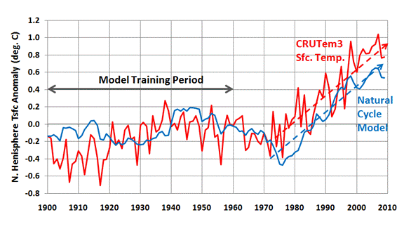
Here's a figure I posted in another thread not long ago. The red and brown lines are temperature (from satellites & met stations, respectively). The green lines are CO2 (ice core & atmospheric measurements). The blue line is PDO. The yellow line is solar irradiance. Presumably, the observed temperature trend is the result of the interactions of all forcings, including those shown here and others as well. But this graph makes it clear that neither ocean oscillations nor solar irradiance is the dominant cause of the observed temperature trend since the 1970s. CO2 provides a much better fit. Adding in the effects of other greenhouse gases, and subtracting the effects of volcanic and anthropogenic aerosols, would make this match even closer.
--------------
The fine print:
PDO data from University of Washington. Surface temperatures from GISS land+ocean. Satellite temperatures from RSS. Law Dome CO2 from NOAA NCDC. Mauna Loa CO2 from NOAA ESRL. PDO and temperature data shown in monthly and 120-month LOESS smoothed versions. Law Dome CO2 dating based on "air age" with 20-year smoothing. Mauna Loa CO2 (monthly) are seasonally adjusted. Both CO2 data sets were log-transformed (base 2). Data sets with differing units (PDO, temperature, log[CO2]) have been scaled to fit on the same graph. Solar irradiance data from University of Colorado, shown annually and with a 22-year LOESS smoothing function.
Presumably, the observed temperature trend is the result of the interactions of all forcings, including those shown here and others as well. But this graph makes it clear that neither ocean oscillations nor solar irradiance is the dominant cause of the observed temperature trend since the 1970s. CO2 provides a much better fit. Adding in the effects of other greenhouse gases, and subtracting the effects of volcanic and anthropogenic aerosols, would make this match even closer.
--------------
The fine print:
PDO data from University of Washington. Surface temperatures from GISS land+ocean. Satellite temperatures from RSS. Law Dome CO2 from NOAA NCDC. Mauna Loa CO2 from NOAA ESRL. PDO and temperature data shown in monthly and 120-month LOESS smoothed versions. Law Dome CO2 dating based on "air age" with 20-year smoothing. Mauna Loa CO2 (monthly) are seasonally adjusted. Both CO2 data sets were log-transformed (base 2). Data sets with differing units (PDO, temperature, log[CO2]) have been scaled to fit on the same graph. Solar irradiance data from University of Colorado, shown annually and with a 22-year LOESS smoothing function.
-
Arkadiusz Semczyszak at 22:02 PM on 16 September 2010What's happening to glaciers globally?
I would have just loved that it was only now (2006) for example, glaciers in the Alps 'release' houses from the eighteenth century, crushed by the glaciers. Probably around 171? -177? A.D. these glaciers have a similar or even less coverage, than they do now. -
Arkadiusz Semczyszak at 21:51 PM on 16 September 2010The Pacific Decadal Oscillation and global warming
The PDO is closely linked of SOI and ENSO. The relationship between Pacific Decadal and Southern Oscillations: Implications for the climate of northwestern Baja California., Pavia, 2009.: “These results confirm that El Niño-Southern Oscillation (ENSO) forces the PDO.” Professor Horst Malberg, analyzed ENSO and SOI in paper: La Niña - El Niño und der solare Einfluss, (Editor: Institut für Meteorologie - Berlin, 2009 - work is only available in German), write: “Any temperature variation demonstrates the weakness of the working hypothesis of a dominant influence of anthropogenic CO2 effect on climate change. For the voiced suspicion that the anthropogenic greenhouse effect would be, if not before 1950, significantly influence at least after 1950, climate change, there is no real climatological evidence. Everything indicates that it is also in the last six decades by the IPCC in the postulated dominant CO2 greenhouse effect on global temperature change (warming) just a sham causality.” -
boba10960 at 21:05 PM on 16 September 2010What's happening to glaciers globally?
Excellent post! Very clear and understandable to anyone. Maybe this is obvious to everyone, but I hadn't realized until seeing this post that the glacier mass balance is so closely linked to global temperature. For example, if you invert the graph of Cogley, 2009 from 1880-2010 and overlay it on the GISS Land-Ocean temperature relationship, the similarity is striking. (I just did that but am unable to post a graph). -
johnd at 19:26 PM on 16 September 2010Climate change: Water vapor makes for a wet argument
scaddenp at 11:08 AM, Phil, the thermometer used by BOM to measure terrestrial minimum temperature is not IN the ground, but "placed close to the horizontal and just above the surface of the ground" as described on the BOM site. This is a picture of such a thermometer in place. As can be seen the bulb is not in contact with anything, only the capillary tube being in contact with the wooden base. The reason I introduced the matter of the terrestrial minimum temperature is because it measures conditions that are closer to those that prevail at the point where evaporation takes place.
As Spencer's experiment shows, whether it is day or night, the ambient air temperature is not an indicator at all of what heat energy is made available at the surface to drive the evaporation process.
Whilst there may be sophisticated instruments to measure back radiation, it basically only measures what a simple thermometer on the ground measures, or what a bare-footed kid chasing the cows in on a frosty morning, and again at high noon, and that is that what his face feels 1.2m above the ground is not what the soles of his feet feel, if he lets them touch the ground long enough to register any sensation that is.
That is exactly where the energy that drives evaporation is inputted into the process.
If back radiation is any factor at all in driving the evaporation process, then consider this. The lowest overnight temperature at the surface is the baseline that determines what heat energy is left in the atmosphere once all that accumulated from the input of solar energy has been dissipated. Following the energy budget diagram posted earlier, it is clear that all the flows of heat energy are depending either directly or indirectly on the input of solar energy. After the terrestrial minimum temperatures have been reached any increase in energy that will manifest itself as radiation between the surface and the atmosphere can only have come from the solar energy absorbed either directly into the atmosphere, or after having first been absorbed by the land and oceans and then transferred by convection, evaporation or radiation into the atmosphere.
Apart from the energy being transferred by radiation and back radiation which indicates a nett transfer of 66 from the surface to the atmosphere, the single biggest form of nett heat transfer from the surface to the atmosphere is evaporation at 78.
As mentioned by someone earlier, the diagram is not a very good one at representing the true energy budget and flow of heat, but if anyone persists with using it simply because there is none better, then it has to be considered as a whole, and defended by correlating what it appears to illustrate with what actually occurs in the physical world.
So far I haven't seen that being the case.
I also think that Spencer gets some things wrong, though I do believe he is right regarding negative feedback.
I also agree he is doing things the right way, though from a different perspective. Instead of looking to add further confirmation to what many accept as a foregone conclusion, an easy thing to do, he applies some lateral thinking, an approach sadly lacking in a world ruled by the confines of logic, and challenges that perhaps of the two faces of a coin, the heads side is not the necessarily the defining side.
The reason I introduced the matter of the terrestrial minimum temperature is because it measures conditions that are closer to those that prevail at the point where evaporation takes place.
As Spencer's experiment shows, whether it is day or night, the ambient air temperature is not an indicator at all of what heat energy is made available at the surface to drive the evaporation process.
Whilst there may be sophisticated instruments to measure back radiation, it basically only measures what a simple thermometer on the ground measures, or what a bare-footed kid chasing the cows in on a frosty morning, and again at high noon, and that is that what his face feels 1.2m above the ground is not what the soles of his feet feel, if he lets them touch the ground long enough to register any sensation that is.
That is exactly where the energy that drives evaporation is inputted into the process.
If back radiation is any factor at all in driving the evaporation process, then consider this. The lowest overnight temperature at the surface is the baseline that determines what heat energy is left in the atmosphere once all that accumulated from the input of solar energy has been dissipated. Following the energy budget diagram posted earlier, it is clear that all the flows of heat energy are depending either directly or indirectly on the input of solar energy. After the terrestrial minimum temperatures have been reached any increase in energy that will manifest itself as radiation between the surface and the atmosphere can only have come from the solar energy absorbed either directly into the atmosphere, or after having first been absorbed by the land and oceans and then transferred by convection, evaporation or radiation into the atmosphere.
Apart from the energy being transferred by radiation and back radiation which indicates a nett transfer of 66 from the surface to the atmosphere, the single biggest form of nett heat transfer from the surface to the atmosphere is evaporation at 78.
As mentioned by someone earlier, the diagram is not a very good one at representing the true energy budget and flow of heat, but if anyone persists with using it simply because there is none better, then it has to be considered as a whole, and defended by correlating what it appears to illustrate with what actually occurs in the physical world.
So far I haven't seen that being the case.
I also think that Spencer gets some things wrong, though I do believe he is right regarding negative feedback.
I also agree he is doing things the right way, though from a different perspective. Instead of looking to add further confirmation to what many accept as a foregone conclusion, an easy thing to do, he applies some lateral thinking, an approach sadly lacking in a world ruled by the confines of logic, and challenges that perhaps of the two faces of a coin, the heads side is not the necessarily the defining side.
-
JMurphy at 19:17 PM on 16 September 2010Hurricanes And Climate Change: Boy Is This Science Not Settled!
Interesting report from Jeff Masters's Wunderblog : This morning's unexpected intensification of Hurricane Julia into a Category 4 storm with 135 mph winds has set a new record--Julia is now the strongest hurricane on record so far east. When one considers that earlier this year, Hurricane Earl became the fourth strongest hurricane so far north, it appears that this year's record SSTs have significantly expanded the area over which major hurricanes can exist over the Atlantic. This morning is just the second time in recorded history that two simultaneous Category 4 or stronger storms have occurred in the Atlantic. The only other occurrence was on 06 UTC September 16, 1926, when the Great Miami Hurricane and Hurricane Four were both Category 4 storms for a six-hour period. The were also two years, 1999 and 1958, when we missed having two simultaneous Category 4 hurricanes by six hours. Julia's ascension to Category 4 status makes it the 4th Category 4 storm of the year. Only two other seasons have had as many as five Category 4 or stronger storms (2005 and 1999), so 2010 ranks in 3rd place in this statistic. This year is also the earliest a fourth Category 4 or stronger storm has formed (though the fourth Category 4 of 1999, Hurricane Gert, formed just 3 hours later on today's date in 1999.) We've also had four Cat 4+ storms in just twenty days, which beats the previous record for shortest time span for four Cat 4+ storms to appear. The previous record was 1999, 24 days (thanks to Phil Klozbach of CSU for this stat.) -
adelady at 18:53 PM on 16 September 2010It's the sun
GnDoty You might find this USA site handy. This is for the global stats, but you can choose a selection of national and global reports at the top. I had a quick look at one of the USA and there didn't seem to be much difference, but you might be able to track down what you're after with more focused steps through the topics. Global anomalies to August -
JMurphy at 18:11 PM on 16 September 2010It's the sun
GnDoty wrote : "I feel it is important to mention many areas are cooler than normal. For example, parts of China and the Pacific Northwest of the US." It's only important if it's true, but your statement would only be true if you replaced the word "many" with "some". If you believe otherwise, please post some evidence. Meanwhile, here is the true state of affairs : 2010 Tied with 1998 as Warmest Global Temperature on Record (Have a look at the Temperature Anomalies graphic) GnDoty wrote : "In the 1920's, Russia had over 600,000 deaths due to malaria. Thought I would throw that out there before you mentioned anything about AGW spreading disease." That is simply a diversion and this is not the place to go into types of malaria and treatments available back in the 1920s. With regard to sunspots, look here. Also, a quick search found a page with this graph. Does the declining trend since the 60s correlate with the increasing temperatures we have been experiencing ? -
kdkd at 17:07 PM on 16 September 2010How much did aerosols contribute to mid-20th century cooling?
krab: I quite like the blue line - it shows the relationship to the smoth and the raw points quite nicely. It's possible the raw points shouldn't be joined though ;) -
GnDoty at 17:00 PM on 16 September 2010It's the sun
I feel it is important to mention many areas are cooler than normal. For example, parts of China and the Pacific Northwest of the US. In the 1920's, Russia had over 600,000 deaths due to malaria. Thought I would throw that out there before you mentioned anything about AGW spreading disease. Pre-industrial era, an increase in temperature first must happen for increased oceanic evaporation which increases greenhouse gases. I also would be interested in a response to my statement on the correlation of sun spot activity and temperature.Response: For the record, I wasn't talking about AGW spreading disease in Russia - the 15,000 deaths were directly heat related due to record hot temperatures.
To answer your question "can you really deny the fact that as sun spot activity increases, so do temperatures?", no, you cannot deny that. As the sun gets brighter (eg - more sunspots), the Earth receives more energy and warms. Conversely, as the sunspot activity falls, this equates to less energy reaching the Earth. Over the last 40 years while global temperatures have been rising, the sun has shown a slight cooling trend. This means the sun cannot be causing recent global warming and in fact, is slightly masking the global warming trend. -
krab at 16:56 PM on 16 September 2010How much did aerosols contribute to mid-20th century cooling?
@Daniel Bailey: I saw the post at Open Mind but neglected to respond. As Tamino and the present post state, the influences change smoothly, not discontinuously, so there is no warrant for drawing straight lines. Tamino says: "But it’s still a pretty good approximation to model global temperature as a piecewise-linear function." I say: "It's an unwarranted approximation." You may disagree. You may want to cherish the notion that Tamino is more qualified than I am. @kdkd: So now I'm a sceptic? My friends (and enemies) would find that hilarious. Try not to jump to conclusions. I am not disputing any of the results. I am complaining about the way they are communicated to non-scientists. Isn't such communication the main purpose of this blog? The blue lines hinder rather than help. -
Bern at 16:38 PM on 16 September 2010The Pacific Decadal Oscillation and global warming
Some good points there, CoalGeologist, but the real question is, what does the correlation represent? Is the "Mostly Cool" period lining up with the low rate of global warming due to the PDO driving temperatures globally, or global temperatures driving the PDO? Given what else we know about the forcings during the 20th century, particularly the variations in solar irradiance, aerosols (see the next blog post), and CO2 concentrations, I think we can say it's most likely the latter - the PDO is affected by global temperature changes, even though it's generally neutral overall. When you think about it, if the bulk of the extra heat is soaked up by the oceans, then it makes a lot of sense that this might result in significant changes in circulation patterns. -
GnDoty at 16:22 PM on 16 September 2010It's the sun
JMurphy, If you believe that we are experiencing record high temperatures this year, could you please explain two things. Why is Texas experiencing below average temperatures? Also, Texas experienced the fourth most rainfall for the month of July ever this year. Furthermore, how can you say CO2 drives temperature when ice core samples from Greenland show the opposite and an 800 year lag for the increase in CO2 for the last 12,000 years. In addition, can you really deny the fact that as sun spot activity increases, so do temperatures? I'll leave it there for now. I simply want to keep this discussion honest so people like Sun Tzu can form an un-biased opinion.Response: "Why is Texas experiencing below average temperatures?"
Some regions will experience cool conditions but a number of countries are experiencing record high temperatures this year. 15,000 Russians died in their record heat wave last month. A few months before that, thousands of Pakistanis and Indians died in record heat waves. When you average out the whole planet, we're currently experiencing record high global temperatures.
"how can you say CO2 drives temperature"
We know this because the increased greenhouse effect due to rising CO2 has been directly observed by satellites and confirmed by surface measurements. In other words, several independent measurements directly observe that CO2 is trapping heat.
"ice core samples from Greenland show the opposite and an 800 year lag for the increase in CO2 for the last 12,000 years"
This is discussed in detail on the "CO2 lags temperature" page. In short, warming causes CO2 rise and rising CO2 causes warming. This is a positive feedback and part of the reason that the planet is able to get out of an ice age. -
archiesteel at 15:32 PM on 16 September 2010Video update on Arctic sea ice in 2010
@HR: "While the debate remains tribal I'm going to look for words to describe one of the tribes." That seems like an unecessary mental shortcut, especially considering the motley crew of those who disbelieve part or all of AGW, many of which hold contradictory opinions. It's much more constructive to debate the science. "Haas has things relatively unchanged between 2007 and 2009." ...for *old* ice, not for arctic ice in general. The paper makes this quite clear. It also mentions the fact there's *less* old ice, though its thickness remains the same. This seems to go contrary to your argument. "It's interesting what you choose to leave out with your [....]. Is this evidence of your own bias?" Not at all. I edited that part for brevity only; it does not contradict my point, nor does it support yours. The only "interesting" thing about it is how you seem to think it does. It doesn't. The facts remain: both Barber's and Haas' mention loss of old ice, which leads to a simple conclusion: MYI is going down as a result of increased temperatures. Considering you cited the Haas paper, we have to assume you agree with the science in it, and therefore agree that MYI is decreasing. -
CoalGeologist at 15:30 PM on 16 September 2010The Pacific Decadal Oscillation and global warming
This is a bit confusing for non-experts (such as me). Having also read the comments from "It's Pacific Decadal Oscillation" and the limited number of other sources I could access, Bern has got it right, but there's something more to the story!. Confusion arises because of the difference between: 1) "Pacific Decadal Oscillation" (PDO), which is a generic term describing any multi-decadal cyclicity in temperature anywhere in the Pacific Ocean, and 2) "PDO Index", ("PDOI") which indicates the regionally averaged temperature of the Northern Pacific Ocean. The PDOI provides an indicator of the timing and cyclicity of the PDO. Within the Pacific, however, are smaller-scale temperature zones that show temperature cycles occurring on the same cyclicity as the PDO, but having opposite trends!!! PDO Index is defined as:"[...] the leading PC [principal component] of monthly SST anomalies in the North Pacific Ocean, poleward of 20N. The monthly mean global average SST anomalies are removed to separate this pattern of variability from any "global warming" signal that may be present in the data." (emphasis added).
(Source: http://jisao.washington.edu/pdo/PDO.latest) Thus, the PDO Index indicates the average temperature of the entire northern Pacific Ocean, normalized for the global increase in temperature. This trend (squiggly blue line) shows two broad cycles:1) 1890-1924: Mostly Cool Period 2) 1925-1946: Mostly Warm Period 3) 1947-1976: Mostly Cool Period 4) 1976- ~mid-1990s: Mostly Warm Period
It is important to note that these trends describe the average temperature across the entire northern Pacific. When the data are gridded into individual cells, then contoured, this produces the colored patterns shown in the map above. Two "snapshots" are depicted... one representing a "Warm" phase, the other reprenting a "Cool" phase. (It's hard to say exactly what time period each snapshot represents.) In any case, this is where it gets a bit more confusing. In the "Warm" phase, the predominant trend is that of cool water across most of the northern Pacific. And the "Cool" phase is dominated by an extensive tract of warm water in the northern Pacific. To understand the origin of the terms, you need to look at the water along the coasts of Alaska, extending downward into the Pacific Northwest (of the USA). You'll see that the water there is the opposite color of the predominant trend. Keep in mind that the point of the paper by Hare (1996) was to interpret the impact of the PDO on salmon fishery, so they were mostly considering the temperatures of the near-shore waters. The important aspect of the maps, noted by John Cook, is that the water sloshes this way and that. Areas that are warm in one cycle tend to be cool in the next, and vice versa. There's no net impact on global warming. Or is there?! The cool PDOI interval (My #3) corresponds to the broad decline in the rate of global warming seen in the red "Global Temperature Anomaly" trend, and the warm PDOI (My #4) coincides with the more rapid increase in the Global Temperature Anomaly... so while I don't believe that the PDO can account for the overall warming trend in the Global Anomaly, it's not inappropriate for skeptics to point out the correlation! -
Albatross at 15:29 PM on 16 September 2010Video update on Arctic sea ice in 2010
HR, could we please drop the rhetoric and stick to the science. I find this whole discussion of "tribes" rather juvenile and not constructive. Have you considered this? And the recent decline in Arctic sea is indeed significant. A paper just out by Polyak et al. (2010) which places the current loss of ice in context.
Specifically, Polyak et al. state:
"The current reduction in Arctic ice cover started in the late 19th century, consistent with the rapidly warming climate, and became very pronounced over the last three decades. This ice loss appears to be unmatched over at least the last few thousand years and unexplainable by any of the known natural variabilities."
And the recent decline in Arctic sea is indeed significant. A paper just out by Polyak et al. (2010) which places the current loss of ice in context.
Specifically, Polyak et al. state:
"The current reduction in Arctic ice cover started in the late 19th century, consistent with the rapidly warming climate, and became very pronounced over the last three decades. This ice loss appears to be unmatched over at least the last few thousand years and unexplainable by any of the known natural variabilities."
-
cruzn246 at 15:29 PM on 16 September 2010The Pacific Decadal Oscillation and global warming
Also note that that the rate of rise during the last positive phase, from the early 20s to the mid 40s, was almost the same as what we have had since the mid 70s. The latest was a bit more but so was the strength and length of the positive PDO. -
cruzn246 at 15:19 PM on 16 September 2010The Pacific Decadal Oscillation and global warming
And if you look at the charts you will see the shift to negative does not instantly cool things. Just look at the shift of the PDO in the early 40s. The temperature dip followed it by about 5 years. The Negative trend has to sustain a few years to affect temps. -
HumanityRules at 15:18 PM on 16 September 2010Video update on Arctic sea ice in 2010
48.archiesteel While the debate remains tribal I'm going to look for words to describe one of the tribes. I'd prefer that this was dropped though. You OK with everybody elses biases? Haas has things relatively unchanged between 2007 and 2009. I don't see how I'm wrong. It's interesting what you choose to leave out with your [....]. Is this evidence of your own bias? "It seems that consequences of strong melt and ice export during and after the summer record minimum 2007 may have been compensated for by weather patterns in 2008 that were not conducive to high melt and ice dispersal in summer and may have fostered enhanced thermodynamic ice growth during a colder winter 2008/09 with less snow accumulation, as suggested by anecdotal in-situ observations in spring 2009" The loss occured in 2007 where is the evidence 2009 measurements represent a continuation of a decline? Because Barber doesn't give use any historical perspective he seems to attribute what happened in 2007 to 2009. This is the point I've been making. 2009 does have lower MYI than early 2007 but is this a consequence of what is happening in 2009 (which is Barbers suggestion) or what happened in 2007? I still don't understand how Barber can make a statement such as "continuing to disappear at a very alarming rate" based on one data point. It doesn't make scientific sense to me, it's propaganda, it's alarmism. As I said I don't object to the true scientific content of his paper. Here are a couple of similar eye-witness ship board reports that seem to stick to the facts rather than go for the sensationalism (here and here. Enjoy). I don't understand why people don't accept the only thing that makes Barber's work stand out from the rest of the arctic ice data, and why it's been so newsworthy, is his "rotten ice" hyperbole. -
cruzn246 at 15:12 PM on 16 September 2010The Pacific Decadal Oscillation and global warming
Oh man, c'mon folks. The PDO doesn't just keep rising. It's either Positive or Negative or neutral. If you look at when it was mostly neutral or negative, in the periods from 1900 to 1920 and 1943-1977, temperatures didn't go up even though the trend for the whole period was up. this is about a silly comparison. -
Bern at 14:32 PM on 16 September 2010The Pacific Decadal Oscillation and global warming
angliss, I'm speaking as a non-expert layman here, but as I see it, the reason the PDO index is de-trended is so that it is a measure of short-term variability in sea surface temperatures. If we compare with ENSO, for example, the Southern Oscillation Index is based on a comparison of sea surface temperatures in the eastern and western waters of the south pacific - by it's very nature, it removes any long-term warming or cooling trends, as presumably both areas are subject to the same long-term shift. The PDO index, on the other hand, is defined as "average Pacific Ocean SST anomalies north of 20ºN". As there is no direct comparison with SST anomalies anywhere else, they define the "anywhere else" as the entirety of the world's oceans, so the PDO index is, in fact, a comparison of the north Pacific SST with the rest of the world's oceans. On that basis, it's not so much "removing the trend", as providing an index that gives an idea of how the north Pacific is behaving compared to the rest of the world's oceans. Otherwise, you'd have people arguing "See, the PDO is causing SST rise!", when the PDO would in fact be a measure of SST... or, in other words, "Global warming is caused by the oceans warming", which is an absurdly circular argument. -
dana1981 at 14:25 PM on 16 September 2010How much did aerosols contribute to mid-20th century cooling?
macoles - greater warming at night than day is on my list of anthropogenic global warming fingerprints, though the particular study I referenced only went back to 1951. -
Daniel Bailey at 14:21 PM on 16 September 2010The contradictory nature of global warming skepticism
Re: Berényi Péter (165) Sorry, was traveling when you posted this. Just wanted to credit you with a deft, understated touch that resonated well with a superb choice of graphic. Very apropos. Bravo, Sir. The Yooper -
Albatross at 14:17 PM on 16 September 2010How much did aerosols contribute to mid-20th century cooling?
Hi John, Fascinating post, this is something that I have often pondered. I was wondering, is there any evidence form observatories which indicate/suggest that the luminosity of certain stars decreased during the time in question? If so, that would be another confirmation that a contributing factor to the cooling was increased aerosol loading. I know incredibly little about astronomy, so apologies in advance if this is a daft question. -
archiesteel at 14:12 PM on 16 September 2010Video update on Arctic sea ice in 2010
@HumanityRules: ok, first your use of the expression "warmist" clearly indicates your strong bias. You probably want to avoid that. Second, you make a misleading statement in your post: "There are better post-2007 direct observations which suggest little has changed in the quality of the arctic sea ice" That's not what the paper claims. It says that little has changed in the thickness of *old* ice, not Arctic ice in general: From the Abstract: "Comparison with previous EM surveys shows that modal thicknesses of old ice had changed little since 2007, and remained within the expected range of natural variability." From the Conclusion: "We conclude that older sea ice in much of the Arctic Ocean was of similar or even slightly larger thickness in April 2009 relative to conditions in 2007, but within the expected range of interannual variability. However, the volume of older ice may have been less overall due to a lower areal coverage, and because our surveys were still spatially limited. [...] The balance between high melt rates and import of old ice into the Beaufort and Chukchi Seas will be an important variable in determining potential recovery or further Arctic ice mass loss [Barber et al., 2009]." Less older ice means the old ice is disappearing, which means that this paper (which clearly recognize the ice loss) supports Barber (or is at least consistent with - makes sense, since they cite him). Perhaps the next time you should actually read the research paper, with an open mind, and not simply peruse it in order to find ammunition. -
Daniel Bailey at 13:35 PM on 16 September 2010The contradictory nature of global warming skepticism
Re: muoncounter (230) Dude, everyone knows that in the darkness of the mirror the true heart of skepticism darkly lies. Speaking of skepticism, if it walks like a duck... The Yooper -
angliss at 13:25 PM on 16 September 2010The Pacific Decadal Oscillation and global warming
Agreed, dana1981. But the graph and explanation as shown above doesn't work as an explanation of why the PDO can't cause long-term global temperature change. This one tripped me up so bad a while back that I emailed Nathan Mantua about it a year or so ago. It's unfortunately a common error, but it's still an error that should be corrected here. -
HumanityRules at 13:13 PM on 16 September 2010Video update on Arctic sea ice in 2010
10.Trueofvoice Its not that I don't like the way the image looks. It's that it exaggerates the thinness of the FYI in order to re-inforce the "rotten ice" meme. It's appears to be scientifically inaccurate. -
chris1204 at 12:47 PM on 16 September 2010How much did aerosols contribute to mid-20th century cooling?
A silly question: The 1940s coincided with some historically cataclysmic events - lots of oil spills from sunken ships, lots of dust from high explosive devices, cities burned up by conflagrations, industrial production soaring to meet the demands of the military world wide, aircraft flying in vast armadas across European skies, and so the list goes on. Any chance this might have had some climatic impacts? -
muoncounter at 12:23 PM on 16 September 2010The contradictory nature of global warming skepticism
#229: But we all know the reliability of those temperature records. Hey, I know: warming is really cooling when you look at these things in the mirror. -
macoles at 12:20 PM on 16 September 2010How much did aerosols contribute to mid-20th century cooling?
That was an interesting point in the section "Days cooled, but nights warmed". Can anyone point to a global anomaly graph that tracks the night time temperature minimums and C02 since the industrial revolution? It would make an excellent centrepiece for debunking CO2 scepticism. -
scaddenp at 12:18 PM on 16 September 2010It's El Niño
Erl - for a warming trend, you have to increase the net energy on the planet. Where is the evidence of this in ANY ocean cycle. While the initiation point of an ENSO event remains tricky, (is it wholly a dynamical phenomena?), I would say that other aspects are now pretty well understood. I also note that "ENSO" emerges in climate models, and yet these models do not create temperature trends unless there is a forcing (like CO2 or solar) applied. -
muoncounter at 12:17 PM on 16 September 2010How much did aerosols contribute to mid-20th century cooling?
#10: "during the mid-century cooling period, PDO was negative essentially the whole time" So I looked at a PDO data file and graphed it with global LOTI for the same period (1900-current). The mid-century negative certainly looks like the mid-century cooling, but the PDO seems to be touching negative territory since the late '90s: with no sign of any cooling. PDO: Pink is summer 3 month average; light blue is winter. LOTI (dark blue) on the right-hand scale.
You can't have it both ways. Perhaps there is no real coupling between PDO and temp and the mid-century was mere correlation without you-know-what? Or perhaps any such coupling was faint and is now swamped by CO2?
In either case, its now PDO 0, aerosols 1.
Response: Note: added "width=450" to your image. I get a little grumpy when people break my web design. Just letting you know for future reference :-)
PDO: Pink is summer 3 month average; light blue is winter. LOTI (dark blue) on the right-hand scale.
You can't have it both ways. Perhaps there is no real coupling between PDO and temp and the mid-century was mere correlation without you-know-what? Or perhaps any such coupling was faint and is now swamped by CO2?
In either case, its now PDO 0, aerosols 1.
Response: Note: added "width=450" to your image. I get a little grumpy when people break my web design. Just letting you know for future reference :-) -
scaddenp at 12:13 PM on 16 September 2010How we know the sun isn't causing global warming
Moved discussion to there... -
kdkd at 12:10 PM on 16 September 2010How much did aerosols contribute to mid-20th century cooling?
Daniel #6 (in reply to Rab #5 Thanks for the coherent explanation of that particular piece of erroneous thinking. You made me realise that this was another example of so-called climate sceptics (sub-consciously?) using the often uninformative technique of philosophical solipsism in an attempt to maximise perceived uncertainty. -
Daniel Bailey at 12:08 PM on 16 September 2010The contradictory nature of global warming skepticism
Stop the presses, this just in: NOAA reports 2010 hottest year on record so far. And the warming continues, anon. The Yooper -
dana1981 at 11:57 AM on 16 September 2010The Pacific Decadal Oscillation and global warming
The point still stands that PDO physically cannot cause a long-term global temperature trend, certainly not in both surface air and ocean temperatures. -
dana1981 at 11:53 AM on 16 September 2010How much did aerosols contribute to mid-20th century cooling?
It's valid to point out that during the mid-century cooling period, PDO was negative essentially the whole time (though still a relatively small impact on average global temperature). But PDO does not cause long-term temperature trends, as discussed in the rebuttal linked by muoncounter in #9. Nor can negative PDO explain the nighttime warming trend discussed above. -
Erl Happ at 11:39 AM on 16 September 2010How we know the sun isn't causing global warming
Ken, If we are to be sure that the sun is not responsible for recent climate change we that we fully comprehend all the possible linkages. Therefore, with all due respect to a man who is obviously very sophisticated, I urge you to consider the atmospheric dynamics described at http://climatechange1.wordpress.com/2010/08/17/is-enso-rather-than-a-%E2%80%98greenhouse-effect%E2%80%99-the-origin-of-%E2%80%98climate-change%E2%80%99-by-erl-happ/ It is generally acknowledged that the ENSO phenomenon is not understood. It is my belief that when it is understood, we will understand the the nature of the sun-climate link.Response: I suggest moving any discussion of ENSO to the "It's El Nino" page -
muoncounter at 11:36 AM on 16 September 2010How much did aerosols contribute to mid-20th century cooling?
And here's someone answering my question on a related thread. Gotta love skepticalscience! -
muoncounter at 11:28 AM on 16 September 2010How much did aerosols contribute to mid-20th century cooling?
#1: "Aerosols 0. PDO 2. " I'm mystified why so many people throw around these ocean cycles as an explanation for just about everything. Clearly I do not understand enough about ocean dynamics. But it is apparent just by inspection that there is no long term trend to these cycles: From The PDO
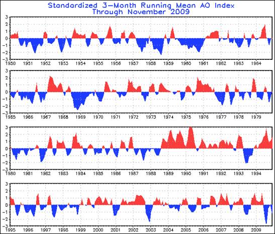 From The AO and the NAO
So I have to ask: How can cycles with no long term coherency be the causes for an effect (increasing global temperatures) that has a long term trend? Wouldn't those cycles more likely be the causes of the short-term low-amplitude variations?
From The AO and the NAO
So I have to ask: How can cycles with no long term coherency be the causes for an effect (increasing global temperatures) that has a long term trend? Wouldn't those cycles more likely be the causes of the short-term low-amplitude variations?
-
nealjking at 11:28 AM on 16 September 2010Positive feedback means runaway warming
5, John Brookes: The carbon-cycle aspect has a positive feedback, because the increase in T => increase in CO2 => increase in greenhouse effect => increase in T. The T^4 radiated power has a kind of negative feedback, because the increase in T => increase in cooling => reduction of the increase in T. (But actually, T^4 behavior is not really the way the system works: If it did, we wouldn't be talking about the greenhouse effect.) -
nealjking at 11:18 AM on 16 September 2010Positive feedback means runaway warming
4, Lazy Teenager: - I don't quite get your point: The solubility of CO2 in water declines with increasing temperature. Last I heard, the uptake of CO2 has dropped in recent years, although up til now it has absorbed about half the CO2 produced by fossil fuels. - I don't understand the issue regarding equilibrium. -
Phila at 11:16 AM on 16 September 2010How much did aerosols contribute to mid-20th century cooling?
#! Thingadonta Aerosols are currently increasing in SE Asia significantly, but this doesnt correspond to any cooling (?). Please stop indulging in argument by assertion, and start providing credible evidence for your claims. Thanks! -
Daniel Bailey at 11:16 AM on 16 September 2010How much did aerosols contribute to mid-20th century cooling?
Re: Rab (5)"Drawing the blue lines in the top curve is not helpful. I realize this is often done to "guide the eye", but I think especially to non-scientists, it looks like you are trying to make more of the data than is there: nothing happened up to 1920, then something happened, linearly, changed completely all at once in 1940, and again in 1975."
Are you referring to Figure 1? If so, this is from a post by Tamino over at Open Mind. Tamino is a professional time-series analyst. He used this figure to illustrate how a time-series dataset can show natural "break points" in the data where a "tipping point" can be demonstrated to have occurred. The purpose of the blue line is not to "guide the eye". The red line is a loewess smooth to show the trend with less noise. I recommend following the link to Open Mind for further detail. The Yooper
Prev 2187 2188 2189 2190 2191 2192 2193 2194 2195 2196 2197 2198 2199 2200 2201 2202 Next


