


 Arguments


Cowtan and Way 2014: Hottest or not?
Posted on 2 February 2015 by Kevin C
2014 is over, and all the major temperature record providers have reported their annual temperatures, generating a lot of discussion as to whether the year was the hottest on record. Whether 2014 was hottest or not doesn’t really change our understanding of the science, but the media coverage should make it very clear that it is important for social reasons.
In 2014 we also released our version 2 temperature reconstructions based on separate treatment of land and oceans. The long infilled reconstruction, which covers the same period as the underlying HadCRUT4 data, is the most used. So how does 2014 compare in our infilled temperature reconstruction?
| C&W | Berkeley | GISTEMP | NOAA | HadCRUT | |
|---|---|---|---|---|---|
| 1 | 2010 | 2014 | 2014 | 2014 | 2014= |
| 2 | 2014 | 2010 | 2010 | 2010 | 2010= |
| 3 | 2005 | 2005 | 2005 | 2005 | 2005 |
| 4 | 2007 | 2007 | 2007 | 1998 | 1998 |
| 5 | 2009 | 2006 | 1998 | 2013 | 2003 |
| 6 | 2006 | 2013 | 2013 | 2003 | 2006 |
| 7 | 2013 | 2009 | 2002 | 2002 | 2009 |
| 8 | 1998 | 2002 | 2009 | 2006 | 2002 |
| 9 | 2003 | 1998 | 2006 | 2009 | 2013 |
| 10 | 2002 | 2003 | 2003 | 2007 | 2007 |
As has been anticipated, we show 2014 as the second hottest on record. And not by a close margin - the temperature anomaly for 2014 was 0.61°C, as compared to 0.63°C for 2010. Given that our work is motivated by the desire to understand why the different versions of the temperature record differ, the difference is interesting.
There is a possible pattern here: NOAA show 2014 warmer than 2010 by more than GISTEMP, and HadCRUT4 show a similar contrast with us. Also the two GHCN-based records show 2014 warmer relative to 2010 than the Climatic research Unit (CRU) based records. This suggests that both infilling and the use of the CRU data tend to reduce 2014 in comparison to 2010.
The comparison with Berkeley Earth is more interesting. Like Berkeley we show 1998 much further down the list than GISTEMP, NOAA or HadCRUT4. In our view this is because NASA, NOAA and HadCRUT4 are underestimating temperatures over the last decade. In the case of NOAA and HadCRUT4, this is primarily due to the omission of the rapidly warming Arctic, while GISTEMP is extrapolating from rather fewer Arctic stations, many of which feature downward adjustments.
The impact of coverage bias on the HadCRUT4 record can be estimated from the difference between our temperature reconstruction and HadCRUT4. But we can also obtain a simple independent estimate of the contribution of the Arctic to the total coverage bias by determining a temperature series for the Arctic (north of 70°N), and scaling by the fractional area of the missing region of the Arctic in HadCRUT4 (about 2.5% of the planet’s surface). The results are shown in Figure 1:
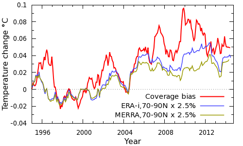
Figure 1: Arctic contribution to coverage bias
Both the ERA-interim and MERRA weather model reanalyses suggest that the Arctic contributes a little over half of the total bias, despite the small size of the affected region. The Arctic explains the dip in bias in 2004, and almost all of the bias in 2005. ERA-interim shows a peak in Arctic temperatures in 2010, whereas MERRA shows a plateau since 2005. The JRA-55 reanalysis and Berkeley Earth tend to support ERA-interim (Simmons and Poli 2014). The plateau in Arctic temperatures suggests that we should not necessarily expect runaway Arctic warming or a rapid loss of Arctic sea ice; and the rapid Arctic warming events we have looked at in the CMIP-5 models also tend to be of limited duration. The contribution of the Arctic to the warmth of 2010 can be seen in temperature anomaly maps for the two years (Figure 2).
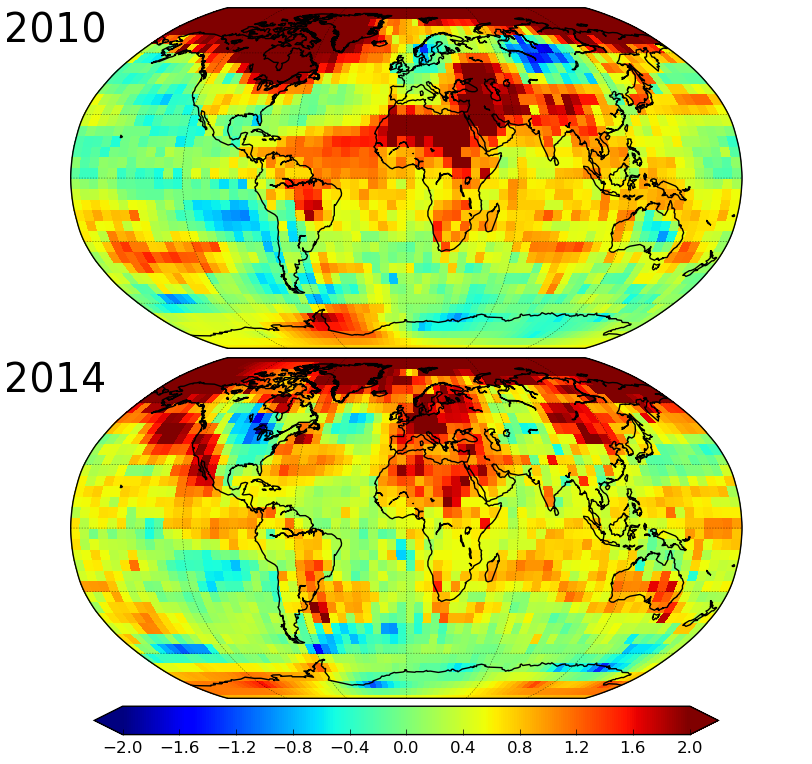
Figure 2: Comparison of temperature anomalies for 2010 and 2014
The rest of the bias comes from the remainder of the planet, and shows a peak in around 2010. How do the various global reconstructions compare over the rest of the planet? For this comparison we look at 3 latitude zones: the Arctic (60°N-90°N), the Antarctic (60°S-90°S), and the rest of the world (60°S-60°N). The polar zones each account for about 7% of the planet. Temperature comparisons for the last two decades are shown for these zones in Figure 3.
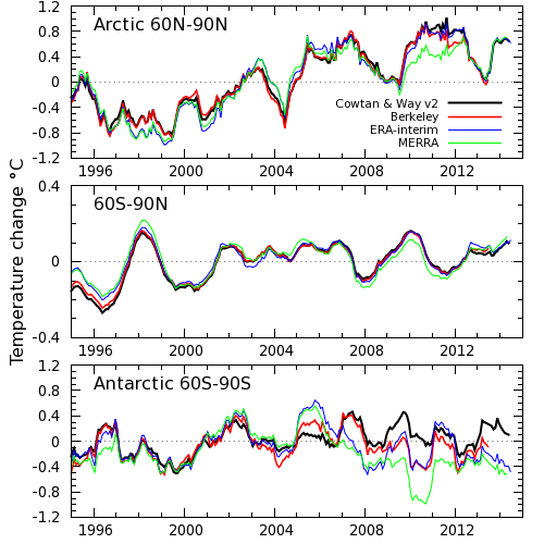
Figure 3: Zonal temperature comparison (CORRECTION: The middle panel should be labelled 60S-60N)
Most of the uncertainty in our temperature reconstruction comes from the Antarctic (and to a lesser extent Africa), because the stations are much sparser there than in the Arctic. As a result we expected significant disagreement in the Antarctic temperatures. The results however were a surprise: The agreement is reasonable from the mid 80’s to about 2005. After 2005 the records diverge, although Berkeley and ERA-interim are the closest. Our reconstruction is noticeably warmer than the others in 2009-2010. The difference between our reconstruction and Berkeley over that period is about 0.4°C for the Antarctic, which would correspond to a difference of 0.03°C in the global record. The low latitude differences also play a role, although these are geographically far more diffuse and thus harder to investigate.
The next step will be to find out why the disagreement occurs, although I suspect this will be more difficult than for the Arctic. Nonetheless, identifying the causes of differences between the different temperature reconstructions has proven very informative in our work so far. While it is not possible to draw a conclusion about which series is more realistic until the cause of the discrepancy is known, we can estimate the impact of different versions of the Antarctic record. If the Berkeley temperature data for the region south of 60°S were substituted for ours, then the global trend on our original study period of 1997-2012 would be reduced by 0.012°C/decade. This would bring the temperature trend in our current reconstruction to about 0.105°C/decade. In contrast to Berkeley, the GISTEMP data show very similar trends to us over the same region, however there are substantial year on year differences. This highlights the uncertainty in the Antarctic temperature record.
So was 2014 the hottest on record? We don't know yet, but we know one of the places where we need to look for the answer.
New developments
The provision of an ensemble of 100 temperature reconstructions is probably the most important innovation introduced in HadCRUT4, enabling users to estimate the impact of correlated uncertainties in the temperature record on their own work. In this respect HadCRUT4 represents the state-of-the art in the field. We have therefore started distributing temperature series for our reconstruction for each of the individual HadCRUT4 ensemble members.
Impact
A number of scientific papers have cited our work over the last year. Here are some which are of particular interest.
- Allan et al (2014) Geophysics Research Letters. Changes in global net radiative imbalance 1985–2012.
- Cohen et al (2014) Nature Geoscience. Recent Arctic amplification and extreme mid-latitude weather.
- Dodd et al (2014) Journal of Climate. An investigation into the Impact of using various techniques to estimate Arctic temperature anomalies.
- Huber and Knutti (2014) Nature Geoscience. Natural variability, radiative forcing and climate response in the recent hiatus reconciled.
- Kennedy et al (2014) Weather. Global and regional climate in 2013.
- Risbey et al (2014) Nature Climate Change. Well-estimated global surface warming in climate projections selected for ENSO phase.
- Santer et al (2014) Nature Geoscience. Volcanic contribution to decadal changes in tropospheric temperature.
- Schmidt et al (2014) Nature Geoscience. Reconciling warming trends.
- Shindell (2014) Nature Climate Change. Inhomogeneous forcing and transient climate sensitivity.
- Simmons and Poli (2014) Quarterly Journal of the Royal Meteorological Society. Arctic warming in ERA-Interim and other analyses.


It would have been informative to include RSS in the table as well.
Or perhaps a disclaimer that this is not a "temperature provider"?
This is about the surface temperature reconstructions and the reasons for the differences. RSS and UAH are measurements of tropospheric temperature. While surface and lower troposphere (lower 3000-4000m of atmosphere) have very similar trends, the satellite measurements react more extremely to ENSO (hotter in El Nino than surface record and colder in La Nina).
Kevin C.
Your posts are always easy to read and informative. They help the rest of us keep up to date on what is known about the temperature record. Thank you for posting again.
This is probably obvious to everybody but me, but February is the lowest month of 2014. The news in February was full of stories about the polar vortex. I was expecting Cowtan and Way to take a smaller February dip than it did. A bunch of arctic air, air that was up there in January, left the arctic and swept south, making Feruary very cold versus the rest of the year. What replaced that polar vortex arctic air, and how did it get so much colder than the arctic was in January?
JCH: ERA and MERRA show February as cold too, so I think it was genuine and global. Outlier months like that appear at other points in the record.
Micheal: Thanks!
In the January 17th post by Dana stating 2014 was the hottest year on record I commented that the UK Met Office said it wasn't possible to categorically make this assertion. This lead to some interesting discussions but it does seem from this study that stating 2014 is the hottest year ever may be premature. The comment by Kevin C "Whether 2014 was hottest or not doesn’t really change our understanding of the science, but the media coverage should make it very clear that it is important for social reasons" is somewhat disconcerting.
Ryland: Exactly. The public discourse is focussed on meaningless metrics which they demand scientists produce and discuss as if they are meaningful. Which puts scientists in an impossible position. Either we talk about what society wants us to talk about, which is a betrayal of the science, or we talk about the science, in which case the public draw the wrong conclusion based on the metric they are wrongly fixated on, i.e. we betray the public.
The major motivation behind our work was the fact that a big chunk; likely the majority of the difference between the major records is probably bias (which can be fixed) rather than uncertainty (which can't). And the differences are being used to promote confusion, like this:
Now no rational person would make the argument in that form. But our cognitive biases enable us to make precisely this kind of argument to ourselves without thinking about it, and we do it all the time on all sorts of issues.
Of course by creating a new version of the temperature record we have made things worse by increasing the scope for disagreement. That was a known risk, but I hope it will be offset in the long term by the biases being addressed. And projects like ISTI and UKMO's EUSTACE are doing exactly that.
Would it be possible to study with this dataset how much more accurate estimates of the global mean temperature would become with N additional stations in the Arctic, Antarctic and Africa? It would be nice to be able to put a price tag on better estimates that way.
Victor: Emma Dodd's paper does exactly that: Start from a reanalysis and create a list of pseudo-stations using the coordinates of the desired stations. Create a synthetic temperature record for each pseudo-station from the reanalysis data at that coordinate. Then do a temperature reconstruction from the pseudo-stations, and compare with the known global temperature field.
We do something similar (following Hadley) to get our uncertainties - the difference being that it is grid based rather than station based. It would be easy to answer the question 'how would the results improve if we had a station in this cell'? That's one possible approach to investigating the difference with Berkeley in Antarctica.
Kevin C thanks for your considered reply. I think your comment "Of course by creating a new version of the temperature record we have made things worse by increasing the scope for disagreement." does you a disservice. Not at all. As you say in the next sentence "I hope it will be offset in the long term by the biases being addressed. And projects like ISTI and UKMO's EUSTACE are doing exactly that." Exactly.
Kevin and Victor,
Robert Rohde published a white paper two years back doing something similar, sampling CMIP5 outputs at station locations and seeing how well different approaches do at reconstructing the correct field.
http://static.berkeleyearth.org/memos/robert-rohde-memo.pdf
[RH] Hotlinked URL.
cool, I think most people connect the word 'hot' with something that burns their skin in the childhood or some similar incident. Psychologically, it's then a question of discomfort. Discomfort in a hot car is one very commonly met occasion in the developed world, thus saying 'hottest year' connects to these uneasy feelings. Technically, we could say this was the 1st to 2nd least cold year, as the GW expresses itself better by raising the minimums first, but that would lead to a false sense of security since 'hot' is an expression associated with discomfort. 'Too hot' in turn associates with damage and is more a class of it's own. Thus speaking of 'too hot' or years should be reserved to discussions about agriculture, or health. Interesting. The year 2014 wasn't too hot but it was one of the least cold years, at least in here. Thanks Kevin C for keeping this record up to date.
In reference to JCHs question above: November also saw a drop in average temps (and the media over here (Norway) was all over it, as it meant a reduction in the chances of 2014 breaking the record). If I remember correctly, there was a major Arctic blast into North America, due to a major north Pacific cyclone pushing warm air into the Arctic and pushing cold air into NA.
It seems that we get a drop in the average global temp each time the cold Arctic air flows down into lower latitudes where we can properly measure temps, but we are unable to properly account for the heat that flows into the Arctic at the same time, causing a sizeable cool bias in the global average.
If I remember correctly, most of the much hyped ''pause'' was caused by colder winter NH temps, while summer NH temp as well as summer and winter SH temps have risen steadily, without much trace of a pause. It would not surprise me if most of the ''pause'' was caused by not yet perfect methods for measuring the results of the shuffling of NH air masses during the NH winter. C&W and HadCrut 4 was a big step in the right direction, but I have a strong feeling that there is still a rather big cool bias, as indicated by the November temps.
To expand on KevinC (#7 above)
One thing about how some trumpet how 2014 was only 38% likely most warmest, is they fail to follow up with which year was "warmest". Most imply 1998 is the big winner. I went looking for this information and found Brett Anderson's Climate blog on AccuWeather:
http://www.accuweather.com/en/weather-blogs/climatechange/expert-commentary-on-global-te/40988095
Where he shows that the other candidates for "warmest" fared even worse. 2010 was 23%, 2005 17%, 1998 4% and the remainder presumably single digit. So in the arena of "lies, damnable lies, and statistics", it seems 2014 remains the big dog in the fight.
[PS] Fixed link