


 Arguments


Why Curry, McIntyre, and Co. are Still Wrong about IPCC Climate Model Accuracy
Posted on 4 October 2013 by dana1981
Earlier this week, I explained why IPCC model global warming projections have done much better than you think. Given the popularity of the Models are unreliable myth (coming in at #6 on the list of most used climate myths), it's not surprising that the post met with substantial resistance from climate contrarians, particularly in the comments on its Guardian cross-post. Many of the commenters referenced a blog post published on the same day by blogger Steve McIntyre.
McIntyre is puzzled as to why the depiction of the climate model projections and observational data shifted between the draft and draft final versions (the AR5 report won't be final until approximately January 2014) of Figure 1.4 in the IPCC AR5 report. The draft and draft final versions are illustrated side-by-side below.
I explained the reason behind the change in my post. It's due to the fact that, as statistician and blogger Tamino noted 10 months ago when the draft was "leaked," the draft figure was improperly baselined.
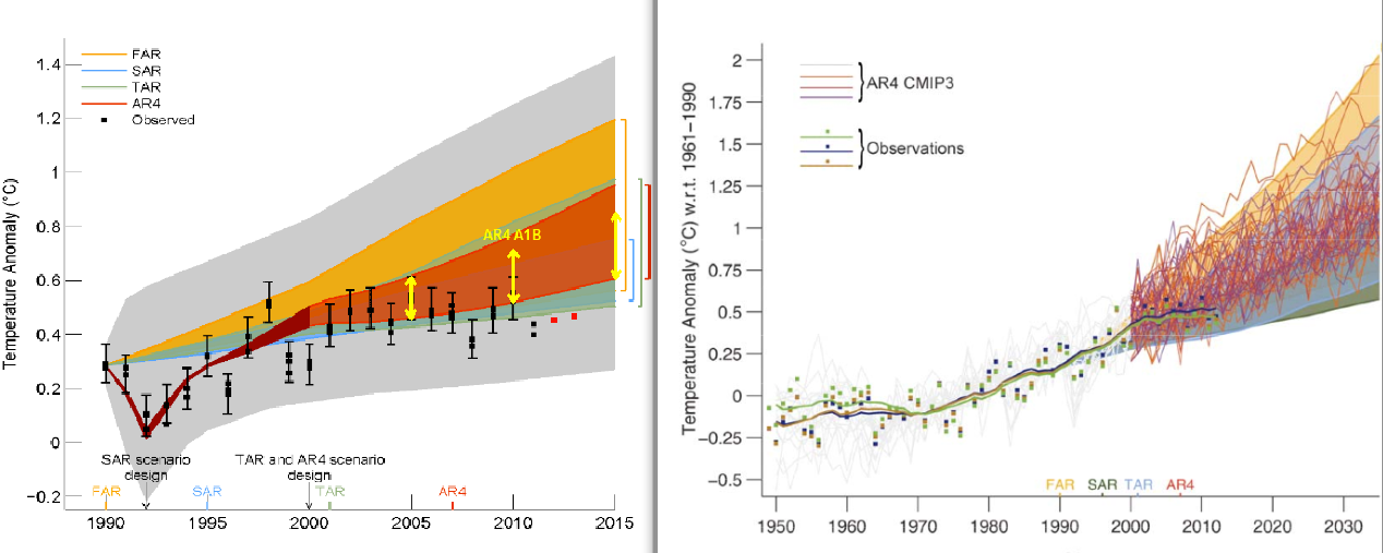
IPCC AR5 Figure 1.4 draft (left) and draft final (right) versions. In the draft final version, solid lines and squares represent measured average global surface temperature changes by NASA (blue), NOAA (yellow), and the UK Hadley Centre (green). The colored shading shows the projected range of surface warming in the IPCC First Assessment Report (FAR; yellow), Second (SAR; green), Third (TAR; blue), and Fourth (AR4; red).
What's Baselining and Why is it Important?
Global mean surface temperature data are plotted not in absolute temperatures, but rather as anomalies, which are the difference between each data point and some reference temperature. That reference temperature is determined by the 'baseline' period; for example, if we want to compare today's temperatures to those during the mid to late 20th century, our baseline period might be 1961–1990. For global surface temperatures, the baseline is usually calculated over a 30-year period in order to accurately reflect any long-term trends rather than being biased by short-term noise.
It appears that the draft version of Figure 1.4 did not use a 30-year baseline, but rather aligned the models and data to match at the year 1990. How do we know this is the case? Up to that date, 1990 was the hottest year on record, and remained the hottest on record until 1995. At the time, 1990 was an especially hot year. Consequently, if the models and data were properly baselined, the 1990 data point would be located toward the high end of the range of model simulations. In the draft IPCC figure, that wasn't the case – the models and data matched exactly in 1990, suggesting that they were likely baselined using just a single year.
Mistakes happen, especially in draft documents, and the IPCC report contributors subsequently corrected the error, now using 1961–1990 as the baseline. But Steve McIntyre just couldn't seem to figure out why the data were shifted between the draft and draft final versions, even though Tamino had pointed out that the figure should be corrected 10 months prior. How did McIntyre explain the change?
"The scale of the Second Draft showed the discrepancy between models and observations much more clearly. I do not believe that IPCC’s decision to use a more obscure scale was accidental."
No, it wasn't accidental. It was a correction of a rather obvious error in the draft figure. It's an important correction because improper baselining can make a graph visually deceiving, as was the case in the draft version of Figure 1.4.
Curry Chimes in – 'McIntyre Said So'
The fact that McIntyre failed to identify the baselining correction is itself not a big deal, although it doesn't reflect well on his math or analytical abilities. The fact that he defaulted to an implication of a conspiracy theory rather than actually doing any data analysis doesn't reflect particularly well on his analytical mindset, but a blogger is free to say what he likes on his blog.
The problem lies in the significant number of people who continued to believe that the modeled global surface temperature projections in the IPCC reports were inaccurate – despite my having shown they have been accurate and having explained the error in the draft figure – for no other reason than 'McIntyre said so.' This appeal to McIntyre's supposed authority extended to Judith Curry on Twitter, who asserted with a link to McIntyre's blog, in response to my post,
"No the models are still wrong, in spite of IPCC attempts to mislead."
In short, Curry seems to agree with McIntyre's conspiratorial implication that the IPCC had shifted the data in the figure because they were attempting to mislead the public. What was Curry's evidence for this accusation? She expanded on her blog.
"Steve McIntyre has a post IPCC: Fixing the Facts that discusses the metamorphosis of the two versions of Figure 1.4 ... Using different choices for this can be superficially misleading, but doesn’t really obscure the underlying important point, which is summarized by Ross McKitrick on the ClimateAudit thread"
Ross McKitrick (an economist and climate contrarian), it turns out, had also offered his opinion about Figure 1.4, with the same lack of analysis as McIntyre's (emphasis added).
"Playing with the starting value only determines whether the models and observations will appear to agree best in the early, middle or late portion of the graph. It doesn’t affect the discrepancy of trends, which is the main issue here. The trend discrepancy was quite visible in the 2nd draft Figure 1.4."
In short, Curry deferred to McIntyre's and McKitrick's "gut feelings." This is perhaps not surprising, since she has previously described the duo in glowing terms:
"Mr. McIntyre, unfortunately for his opponents, happens to combine mathematical genius with a Terminator-like relentlessness. He also found a brilliant partner in Ross McKitrick, an economics professor at the University of Guelph.
Brilliant or not, neither produced a shred of analysis or evidence to support his conspiratorial hypothesis.
Do as McKitrick Says, not as he Doesn't Do – Check the Trends
In his comment, McKitrick actually touched on the solution to the problem. Look at the trends! The trend is essentially the slope of the data, which is unaffected by the choice of baseline.
Unfortunately, McKitrick was satisfied to try and eyeball the trends in the draft version of Figure 1.4 rather than actually calculate them. That's a big no-no. Scientists don't rely on their senses for a reason – our senses can easily deceive us.
So what happens if we actually analyze the trends in both the observational data and model simulations? That's what I did in my original blog post. Tamino has helpfully compared the modeled and observed trends in the figure below.
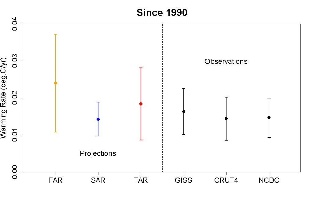
Global mean surface temperature warming rates and uncertainty ranges for 1990–2012 based on model projections used in the IPCC First Assessment Report (FAR; yellow), Second (SAR; blue), and Third (TAR; red) as compared to observational data (black). Created by Tamino.
The observed trends are entirely consistent with the projections made by the climate models in each IPCC report. Note that the warming trends are the same for both the draft and draft final versions of Figure 1.4 (I digitized the graphs and checked). The only difference in the data is the change in baselining.
This indicates that the draft final version of Figure 1.4 is more accurate, since consistent with the trends, the observational data falls within the model envelope.
Asking the Wrong (Cherry Picked) Question
Unlike weather models, climate models actually do better predicting climate changes several decades into the future, during which time the short-term fluctuations average out. Curry actually acknowledges this point.
This is good news, because with human-caused climate change, it's these long-term changes we're predominantly worried about. Unfortunately, Curry has a laser-like focus on the past 15 years.
"What is wrong is the failure of the IPCC to note the failure of nearly all climate model simulations to reproduce a pause of 15+ years."
This is an odd statement, given that Curry had earlier quoted the IPCC discussing this issue prominently in its Summary for Policymakers:
"Models do not generally reproduce the observed reduction in surface warming trend over the last 10 –15 years."
The observed trend for the period 1998–2012 is lower than most model simulations. But the observed trend for the period 1992–2006 is higher than most model simulations. Why weren't Curry and McIntyre decrying the models for underestimating global warming 6 years ago?
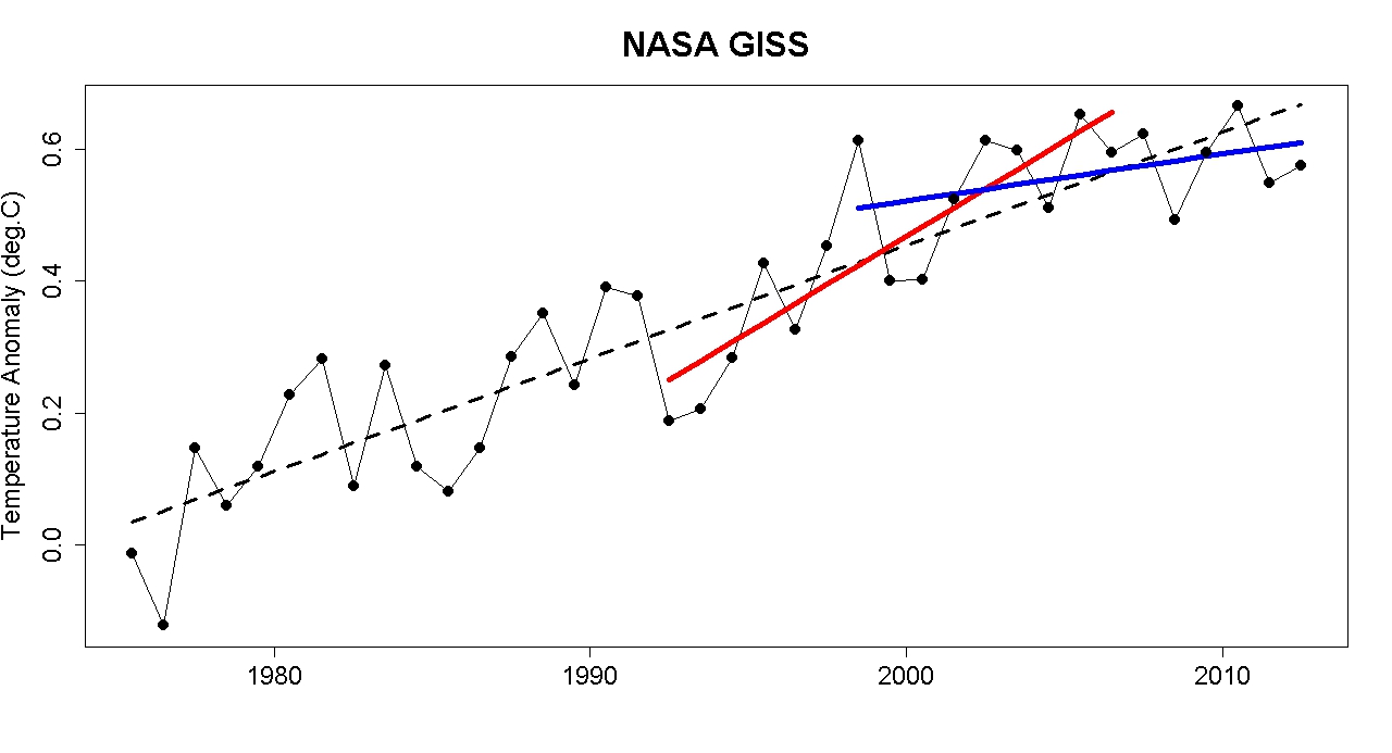
Global surface temperature data 1975–2012 from NASA with a linear trend (black), with trends for 1992–2006 (red) and 1998–2012 (blue). Created by Tamino.
This suggests that perhaps climate models underestimate the magnitude of the climate's short-term internal variability. Curry believes this is a critical point that justifies her conclusion "climate models are just as bad as we thought." But as the IPCC notes, the internal variability on which Curry focuses averages out over time.
"The contribution [to the 1951–2010 global surface warming trend] ... from internal variability is likely to be in the range of −0.1°C to 0.1°C."
While it would be nice to be able to predict ocean cycles in advance and better reproduce short-term climate changes, we're much more interested in long-term changes, which are dominated by human greenhouse gas emissions. And which, as Curry admits, climate models do a good job simulating.
It's also worth looking back at what climate scientists were saying about the rapid short-term warming trend in 2007. Rahmstorf et al. (2007), for example, said (emphasis added):
"The global mean surface temperature increase (land and ocean combined) in both the NASA GISS data set and the Hadley Centre/Climatic Research Unit data set is 0.33°C for the 16 years since 1990, which is in the upper part of the range projected by the IPCC ... The first candidate reason is intrinsic variability within the climate system."
Data vs. Guts
Curry and Co. deferred to McIntyre and McKitrick's gut feelings about Figure 1.4, and both of their guts were wrong. Curry has also defaulted to her gut feeling on issues like global warming attribution, climate risk management, and climate science uncertainties. Despite her lack of expertise on these subjects, she is often interviewed about them by journalists seeking to "balance" their articles with a "skeptic" perspective.
Here at Skeptical Science, we don't ask our readers to rely on our gut feelings. We strive to base all of our blog posts and myth rebuttals on peer-reviewed research and/or empirical data analysis. Curry, McIntyre, and McKitrick have failed to do the same.
When there's a conflict between two sides where one is based on empirical data, and the other is based on "Curry and McIntyre say so," the correct answer should be clear. The global climate models used by the IPCC have done a good job projecting the global mean surface temperature change since 1990.


Ross McKitrick brilliant? I do not think so.
1) I believe that figure 2 (the trend comparison) would be improved by also showing the AR4 trend, using observed data for the years 1990-2000 (as AR4 projections start in 2001).
2) McKittrick did worse than simply eyeballing the trends. Anybody with any experience in eyeballing trends could see from the draft figure that the trend for observations (and of AR4 plus observations from 1990-2000) would pass well below the 1990 point in the observations due to the large temperature excursion due to the Mount Pinatubo erruption. In fact, had the draft report baselined the graph by ensuring all trends passed through the same point in 1990 (a perfectly reasonable procedure), that would have lifted the observations relative to the FAR, SAR, and TAR projections. Indeed, sufficiently to place them in the upper half of TAR projections (from my eyeball estimate). It would not have significantly shifted the them relative to an observations to 2000 plus AR4 due to the shared initial data.
Because much of this shift would be due to the Mount Pinatubo erruption, that may seem like an unfair comparison. To avoid that, the proper method is to use an extended baseline, as above, or to set the data for a common origin of trends having adjusted the data for short term factors not expected effect the long term trend, ie, something like this:
It should be possible to statistically prove that the contrarians "conspire" to coordinate their "cross-selling". The tendency for them to mainly refer to claims made by each other could be evaluated statistically. This would then be evidence of their "conspiracy to misinform" by adding the evaluation of the validity of the claims they make and "cross-sell".
The scam of using one person to say something that is then referred to by others as "proof" of something is even used by media groups like Fox News which will have one of their "speculators" say something then have their "News People" repeat the claim but frame it as something that "people are saying", when the only ones saynig it are the ones inside their operation hopng to get "others to say it".
I am wondering, why are graphs always shown with temperature anomalies and not with the actual temperatures? That should remove any confusion with baselines.
Bouke, it is not about the vertical scaling, but about what point you use as a reference. 1990 as a single point is a bad reference, as it would be above the trendline. 1991 would be a bad point, too, as it is below the trendline. You should use a baseline *period*, which will eliminate much of the short-term noise. Whether you put that baseline as an absolute value or assing it to zero and put the other data as anomalies does not change any conclusions.
bouke, it is because the models do a much better job of modelling changes in response to forcings than in terms of absolute temperature (i.e. there are more or less constant offsets in absolute temperature between model runs). For climate change research it is the response to a change in the forcings that is of interest, so the simplest thing to do is to apply the baselining procedure to eliminate these meaningless offsets. Note also that if you want to perform a comparison involving both surface and satelite observations you have to look at the anomalies anyway as there is a big difference between absolute temperature at the surface and in the trophosphere due to the lapse rate.
This is something well known to any climatologist that has worked with model output and is essentially uncontraversial, so it is somewhat surprsing that Curry and McIntyre are making a fuss about it.
It's also worth noting that land-ocean surface temperature records work with anomalies rather than temperatures, and thus they don't provide an absolute temperature against which to compare the models.
BEST have addressed this, but their currently released data is land-only.
Wasn't her point that this quote did not appear in the WG1 report?
Thanks for the replies @5-7. Inspired by Kevins remark, I googled around some and found a nice explanation at the American Chemical Society.
OPatrick @8 - that may have been what she meant, but it's not what she said. The fact that the folks working on the SPM went out of their way to address this relatively trivial issue just because so many contrarians were making noise about it, and she's still complaining that they didn't adequately address it, says a lot.
On an issue so sensitive as this it would have been a whole lot better if the figure had been produced correctly in the first place. Mistakes get made and that's real life - but on this particular graph and in this particular way - there is a lesson to learn, surely?
Judith Curry exposed
Dana very nicely covered just how wrong Curry et al. are in their (biased) opinions. However, believe-it-or-not the reality is actually much worse for Curry.
Curry is of the opinion that climate models do not help her understand climate. A bizarre thing to claim for three reasons:
1) William Connolley calls out Curry on her double standard. He notes:
"...if you write a paper in which “the model simulations … were the main source of data used in the analysis” and yet you don’t think the models help, you’re not really going to write anything sane".
Exactly. Well, why does she bother using them for her research then? The truth, as we know, is that all models are wrong, but they are still incredibly useful tools. Curry is being disingenuous.
2) It gets worse though. Curry and her husband Peter Webster run a consulting company called "Climate Forecast Applications Network (CFAN)". Think about that name, what it indicates they do and then try and reconcile it with Curry's musings about climate models. From the CFAN web-site (my bolding):
"CFAN can transform future climate scenarios into meaningful information for your organization."
Those "future climate scnerious" are undoubtably based (at some level) on output from climate models developed and run by agencies that also provided their model output for inclusion in the IPCC assessment reports.
Curry also assures their clients that:
"CFAN's approach to developing future climate scenarios provides the basis for assessing future risk to your organization, as well as for identifying future opportunities."
So Curry is promising all kinds of deliverables based on the very climate models that she claims are "wrong". How bizarre.
3) Now for the pièce de résistance. This one is more subtle but every bit as egregious.
Again from the CFAN web site (my bolding):
"CFAN's weather and climate predictions, spanning time scales from days to decades, are based upon a sophisticated statistical/dynamical system that utilizes ensemble forecasts from multiple weather and climate modeling centers."
Producing decadal forecasts is notoriously difficult. As Dana mentioned above and as Curry also concedes, current climate models struggle on the decadal scale (for reasons that I won't go into here). But riddle me this. Curry is entrusting her business (and income) on the very models that she claims are wrong. What is more, she is trying to claim the models are wrong period by using data on a decadal time frame (full well knowing that they struggle on such time scales), but at the same time is informing CFAN clients that they can provide forecasts on a decadal time scale. Her duplicity is just astounding!
Curry wants to have it both ways. She wants to play rhetorical denier games in the public eye, and she also wants to derive income from the very models that she alledges are wrong.
CFAN clients and graduate students (present and prospective) should find these revelations more than a little disconcerting. She is misleading more than one group of people here.
Hi Chris @11,
Well yes of course, but you seem to be missing couple of key points:
1) Generating thes complex graphics takes time and to get it right almost always requires several iterations. To expect otherwise is just not being reasonable.
2) Keeping #1 in mind, note that the draft figure was stolen/leaked (probably by fake skeptic) almost a year before the release of AR5. So it is not surpring that it had a glitch.
The lesson to be learned here Chris is that one simply cannot trust fake skeptics to act in good faith or with good intentions. They will mislead and misinform at every opportunity. As a case in point, ompare for example how statistician Tamino dealt with the situation when it was brought to his attention, compared to say how McKitrick and McIntyre and Curry dealt with the situation.
Lucia just destroyed your post and clearly demonstrated why Tamino is wrong.
http://rankexploits.com/musings/2013/taminos-take-on-figure-1-5/
Bob @14 - you appear to have a different understanding of the meanings of the words 'destroy' and 'clear' from me, at least.
Opatrick, have you read Lucia's post, or was yours just a knee jerk reaction.
[RH] Bob, please note that this is not WUWT or Lucia's place or Curry's blog. There are clear standards for posting here. Please read them before continuing on. Everyone here is willing to discuss the issue but you're going to have to conduct yourself in a professional manner.
Bob @14 - I hope your comment was intended as a joke. If not, you either didn't read or didn't understand the above post. As I said, IPCC Figure 1.4 is baselined using the period 1961–1990. Lucia is just being anal (which is what she does best) about the language Tamino used in his post, and her criticisms are not remotely applicable to AR5 Figure 1.4.
Nor, by the way, is Lucia's anal semantics nitpicking applicable to anything in the above post, by the way.
dana @10 - Curry's claim was:
It seems to be true that the wording has changed from the Final Draft to the Approved SPM. The first paragraph of the final draft section on Evaluation of Climate Models begins with:
Whilst the Approved version has
The highlighted sentences (my bold) do not seem far enough apart to justify her implication of a lack of honesty.
Bob @14,
Oh shame, the spinmeister fake skeptics are upset. Who is "Lucia"? Oh right, another contrarian who likes to argue and nit pick to distract while missing the bigger picture. I doubt very much that Tamio is wrong-- let me see, Tamino who is professional statistician (who has actually pubished peer-reviewed climate papers) versus a "skeptic" mechanical engineer.
Lucia is arguing semantics, white noise. Before you get too excited please also read my post @12, Curry et al. are wrong on sooo many levels ;)
Could it be that Curry just wants publicity? Thinks the more she's in the news, the better for her consulting business? And, since she can't get much press attention as a climate scientist -- not bright enough -- she'll get it as a contrarian? Could it be, in short, that Judy is all about the Almighty Dollah?
Bob @16 - yes I read it, but having done so fairly quickly I am far from clear of the point she is making. Her ability to communicate her points clearly, other than her opinion of Tamino, is not fantastic.
However, she does say that Tamino is correct to have criticised the draft AR5 WG1 SPM report for incorrectly aligning projections to observations in a single year and then rants about Dana who is quoted having credited Tamino for pointing out what she has just said he was correct about.
Opatrick @19,
The following claim by Curry is demonstrably false:
"Nowhere in the final WG1 Report do we see the honest statement that appeared...."
Please read AR5 WG1 that was released this past Monday. They say, and I quote:
"Most simulations of the historical period do not reproduce the observed reduction in global-mean surface warming trend over the last 10–15 years (see Box TS.3). There is medium confidence that the trend difference between models and observations during 1998–2012 is to a substantial degree caused by internal variability, with possible contributions from forcing inadequacies in models and some models overestimating the response to increasing greenhouse-gas forcing."
Now do you still buy Curry's claim as being correct? I hope not.
You also seem to be missing the point (I noted another problem with Curry's comment in my post @12 above).
Albatross @23 - I never bought it as such in the first place, I just thought that Dana was mistaken to have said Curry had quoted the IPCC discussing the issue in the SPM, when she was actually quoting something which she felt (to be generous) had been left out of the Approved version. As we have both shown the replacement wording is not different enough to justify her criticisms.
Hi OPatrick,
No worries, we seem to have had a miscommunication. I think that we are on the same page now :)
Dana, Bob Tisdale comments on your post:
http://wattsupwiththat.com/2013/10/04/no-matter-how-the-cmip5-ipcc-ar5-models-are-presented-they-still-look-bad/
Bob... Tisdale randomly dismisses Tamino's point, that was clearly accepted by the IPCC as being correct, that it is not proper to baseline on a single anomalous year.
This is exactly the problem with "leaked" versions of a draft paper. Those who are so mentally inclined, like Tisdale, McIntyre and others, are going to divine nafarious intent where there is none.
Tisdale also lacks the capacity to do actual statistical analysis to show his point, something that Tamino is capable of doing and, in fact, did.
Let's look at Tisdales opening complaint where he states,
Really? The only imaginable reason? Do you start to wonder why Lewandowski is publishing on conspiracy ideation amoung climate denialists?
So, Tisdale starts off with the assumption that there are no other possible explanations for including FAR, SAR and TAR data. I can offer a simple explanation. How about the idea that they would be criticized if they didn't include them?
I have a hard time fathoming why any half way intelligent person would read beyond this one statement in Tisdale's post, other that just morbid curiosity.
If that's what Tisdale comes up with as an "only imaginable reason", then I submit that he is admitting to having a very stunted imagination.
Which would be selling himself short: like most "pro/semi-pro" contrarians/deniers, Tisdale actually has a very fertile imagination. (Unfortunately, he has the bad habit of mistaking (or misrepresenting) the fruits thereof for reality.)
Ugh, well I just wated 5 minutes of my life reading Tisdale's post. If Tisdale ever actually says anything intelligent, then let me know. Until then I prefer not to waste my time reading his drivel.
Re: OPatrick @19, quoting the draft report:
"Models do not generally reproduce the observed reduction in surface warming trend over the last 10–15 years."
You said: " the replacement wording is not different enough to justify her criticisms."
I think we are in broad agreement, but I would go further... It was appropriate to remove the bolded statement, because it was ambiguous, propping up a contrarian talking point that should not be an issue in the first place. Ensemble means do not reproduce the recent "hiatus" (and are not expected to), whereas as individual model runs do reproduce a pattern of randomly distributed hiatus decades (some individual runs would even - by chance - roughly put the "pause" in the historically correct place). The distinction is not well covered in the removed statement.
Curry should know this. She is engaged in a disinformation exercise, not science.
The comments policy states:
(My underlining)
My understanding is that the purpose of this section of the comments policy is to ensure posters actually engage in the discussion by showing the relevance of their linked material to the discussion. If they do not so engage, readers are left to guess as to whether the link is in fact worth following; and if followed, what part (if any) of the linked material is relevant to the discussion on SkS.
IMO, Bob does not follow the letter of this requirement, and blatantly fails to follow the spirit.
In other words, Bob, you can't just post a comment from Lucia. She can come here and make the comment herself if she likes. If you want to have your comment not moderated you need to provide your own substantive points.
Out of interest, here is the procedure for making figure 1.5 from the second order draft (I do not include the discussion of the uncertainty band):
And here is the equivalent discussion from the draft report:
As can be seen:
1) In both figures observational data is baselined to a common 1961-1990 mean. The difference between them lies in the addition of the smoothed observational data sets in the final (Draft) version.
2) In both figures, projections from the First, Second and Third Assessment Reports are baselined to the single year of 1990. The difference lies that in the final (Draft) version, they are baselined to the mean of the smoothed observational data sets in 1990 rather than the mean of the 1990 values. This has the effect of raising the projections with respect to observations by 0.13 C.
3) AR4 projections are treated entirely differently between the two versions. In the 2nd Order Draft, they are treated in the same way as the projections from the other assessment reports. In the final (Draft) version, the individual model runs are shown, all baselined to the 1961-1990 period.
It is important to note that in the earlier version, and the final (Draft) version, observations and models (other than AR4 in the final version) are baselined differently - something Dana did not pick up in the article above.
Turning from what was done to whether it was appropriate, I first note that in the final (Draft) version, AR4 model runs and observations are all baselined on the same period, where that period is not the period we are comparing. That means it represents a perfectly valid comparison. That the baselining period (1961-1990) is different to that actually used in AR4 (1980-1999 according to Lucia) is of little consequence. The effect of the earlier baselining is to allow a slightly greater spread in the models, which is matched by allowing a slightly greater divergence between models and observations. Using the later baseline period would have (conversely) both reduced the spread and the divergence. The net effect of the choice should be negligible.
Second, the baselining of model mean projections on the smoothed observational data in a single year is also appropriate. Because short term variations (other than from volcanism) do not appear at the same time in model runs, model means are smoothed data. Consequently the final (Draft) method for comparisons with the First through Third Assessement Reports is also appropriate. (It should be remembered that none of the three earlier Assessment Reports included historical forcings after 1990.)
Finally, as Lucia agrees, baselining the model data against a single unsmoothed years data, as done in the Second Order Draft version is inappropriate. Unless you are very fortunate, it will introduce artifacts into the comparison, and in this case tended to show the observations as falling further behind the projections than was actually the case.
Extending a bit on the leaked and draft figure, the uncertainty bands are actually rather interesting. The caption for that figure states "The 90% uncertainty estimate due to observational uncertainty and internal variability based on the HadCRUT4 temperature data for 1951-1980 is depicted by the grey shading."
Most depictions of the variability, such as the yearly updates at RealClimate, display a 95% range of the model results. This figure instead shows the projected trend ranges +/- variation of observations, and should in fact be a more accurate range. Models vary considerably in how well they deal with internal variability (ENSO and weather, for example), but the observations themselves should encompass all sources of variation from the trends. And, with or without proper baselining, observations fall well within that envelope.
While not the most common depiction of potential variations around the energy bounded trends of climate change, I would (personally) consider it a very useful view to consider.
I downloaded the CMIP5 model ensemble mean for the RCP4.5 scenario and checked the projected warming rate 1990 to 2013 to compare with your graph above of projection warming since 1990. The warming rate of the model mean is 0.29C/decade over the 24 years the trend was calculated. That's pretty much double the actual SAT warming rate.
You might be right the observations are still "within the error bars" but it seems pretty clear the models are running too hot.
Klapper - there is no reason why observed temperatures - equivalent to one climate model run - should match the multi-model mean. Climate models cannot predict tropical volcanic eruptions, the wholesale shift of global manufacturing to China, and any effects it may have had on sulfate burden in the atmosphere, nor changes in the phase of the wind-driven ocean circulation.
There may be something amiss, only a handful of the climate models accurately simulate the changes in winds which alter the wind-driven ocean circulation for instance, but it's bit early to make that call. The observed temperatures are still within the envelope and may move upwards sharply with a shift in the ocean oscillation. Time will tell.
KR - although only a short period of observation, the ARGO network does show that heat is stored in the subsurface ocean during La Nina, and rises to the surface during El Nino - hence the effects on global surface air temperatures. Image from Roemmich & Gilson (2011) - The Global Ocean Imprint of ENSO.
In the comparison of the draft version (the left chart) and the final version (the right chart), why did the IPCC change the scale of the chart? The dates along the X axis on the left chart range from ~1990 to 2015, or a span of 25 years; the dates on the right chart range from ~1950 to 2035, or a span of 85 years. The temperature scale on the Y axis on the left chart spans 1.6 deg C; on the right it spans 2.5 deg C. The really interesting part of the information that would show recent model accuracy in the final version is only 1/5th the area of the draft chart, making it much harder to examine ((1.6/2.5)*(25/85)=.188, which about 20%, which is 1/5th). Most of the final IPCC chart is uninformative empty white space. Furthermore, what does the spaghetti add to the information? It doesn’t appear to add much, but it certainly clutters up the chart, making it nearly impossible to see the actual temperature plot. The simple banded range of model projections in the draft image make it easier read the chart. Can some here redraw the IPCC final chart clearer, properly baselined, without the spaghetti lines, and zoomed in around the last 25 years (i.e., about the scale of the draft chart)?
[DB] Try reading the OP again.
@ #37 Rob Painting:
The CMIP5 models use actual inputs up until 2005 as far as I know.These model experiments only started 2009 so the RCP runs had no reason not to use actual data up until 2005. There have not been any major volcanoes since Pinatubo so I don't think that is a relevant issue to the "hiatus".
Steve McIntyre graphed some CMIP5 model trends of SAT from 1979 to 2013 with a box plot (against the HadCRUT4 trend over the same period). Considering the lower bound error bar on the box with all model runs (109 in all) barely overlaps the HadCRUT4 trend, it seems the models are biased warm and this is over a period where the main warming took place and the models are using mostly actual inputs for aerosols and CO2.
"Men argue, nature acts" Voltaire
Klapper - there is large uncertainty over the negative forcing by aerosols. Indeed, there is evidence that the observations imply a stronger negative forcing than that adopted in the CMIP5 simulations - see Shindell (2013). Other researchers may disagree, however that merely underlines how uncertain the negative aerosol forcing is.
And your comment about Pinatubo is misplaced. SkS has frequently mentioned research indicating an increase in emissions from moderate tropical volcanic activity through the 21st century - Solomon (2011), Vernier (2012).
Bob @ 26, Tamino shreds Tisdale's underlying assumption here tamino.wordpress.com/2013/10/05/bob-tisdale-pisses-on-leg-claims-its-raining/
Ok Bob (@26),
Now that you've been shown Tisdale was completely wrong (yet still being published as a reliable voice by The Australian, a hot-bed of misleading climate drivel if ever I saw one), could you please acknowledge this before posting any further points? And moderators, can you hold him to this?..
(this is what really gets me about pseudo-skeptics and the nonsense they expound)
[DB] "And moderators, can you hold him to this?"
Affirmative.
@ #42 Rob Painting
From the Solomon et al 2011 paper the negative forcing from volcanic stratospheric aerosols in the period post 2005 is maybe -0.1W/m2 compared to the baseline forcing from stratospheric aerosols. These eruptions had maybe 1/20 the impact of Pinatubo. Pinatubo's effect maybe lasted 3 years, and didn't impede warming much in the period 1975 to 2000.
I don't think a negative forcing of 0.1W/m2 over 4 or so years at the end of an analysis period is enough to explain the large errors in the model trends over the last 20 to 30 years compared to observations.
You're arguing the effect of aerosols is much stronger than the modelling demonstrates but I have a hard time believing that since the models already overcool during big volcanic episodes like Pinatubo.
bouke @ #4
While this "anomaly" scaling is a trivial issue, it is a precious gift to those who would muddy the waters. This whole thread is really nothing more than arguing about the global cooling that took place when temperatures moved from fahrenheit to celsius!
I understand that it makes good sense to report in units of anomaly but it is just adding another layer of complexity to the communication task where you can't buy a thermometer with the "anomaly" scale and minor errors are quickly exploited.
I agree its a nice explanation of "Taking the Earth's Temperature" at the American Chemical Society, also Berkeley Earth but some simple examples could well illustrate the process and the arithmetic for primary school level scientists (hopefully already been done?).
A better explanation of these steps is preferable to "trust us, we're scientists" or other irrelevant appeals to authority or consensus.
I'd just like to add my own view: Nice post Dana...
That is all...
Stealth@39
I have no dispute with the text of this post, but I agree that the colour bands of the right-hand graphic in the original post are not particularly clear. I suspected that the graph had been truncated to allow the two graphs to be placed side-by-side, and found a more complete version at Climate Audit:
climateaudit.files.wordpress.com/2013/09/figure-1-4-final-models-vs-observations.png
(The CA post has nothing else to commend it, by the way. McIntyre does not seem to understand the need for an appropriate baseline; he does not argue against the new choice of baseline, just skirts around the issue. Search his post for the word 'baseline' and you will not even find it.)
Dana, could the original post please be modified to include the right-most legend of the draft-final version, where the different projection bands are shown without the confusing overlap?
First of all I want to make it clear that I am not the Bob who has posted above. Is it possible for different users to have the same name or have I been hacked?
Second, I did actually come here to ask a question. I have seen a couple of comments from 'skeptics' to the effect that, while Tamino may have been technically correct, the corresponding comparisons of models vs observations in earlier ARs used the actual 1990 temperature as a baseline - i.e. had made the same mistake. The implication being that the adjustment in AR5 is moving the goalposts. I'm dubious about this but I don't know my way around the reports and have not been able to find out whether there is any truth in these assertions.
[DB] When users sign up to post comments, they are assigned unique user ID's. While externally some users may appear to be the same person if a commonly-used user name is selected, internally they are differentiated. You may wish to change your user name to something more unique.
Having unique user names is a feature being discussed.
Klapper - your reading skills are inadequate. Here's what Solomon et al (2011) state in their study abstract:
"Recent measurements demonstrate that the “background” stratospheric aerosol layer is persistently variable rather than constant, even in the absence of major volcanic eruptions. Several independent data sets show that stratospheric aerosols have increased in abundance since 2000. Near-global satellite aerosol data imply a negative radiative forcing due to stratospheric aerosol changes over this period of about –0.1 watt per square meter, reducing the recent global warming that would otherwise have occurred. Observations from earlier periods are limited but suggest an additional negative radiative forcing of about –0.1 watt per square meter from 1960 to 1990. Climate model projections neglecting these changes would continue to overestimate the radiative forcing and global warming in coming decades if these aerosols remain present at current values or increase."
The Mt Pinatubo eruption was (more or less) a single eruption which substantially lowered global temperature , whereas the changes in moderate volcanic activity shown by Solomon et al are persistent. Sulfate particles can remain in the upper atmospheric circulation for up to two years, but most of them fall back to Earth much sooner than that. Persistent volcanic activity, despite being smaller in intensity, provides an ongoing source of reflective sulfate particles to bounce incoming sunlight back out to space before it can warm the Earth.
These group of researchers, however, claim this small global dimming trend is the result of moderate tropical volcanic activity, rather than increased sulfate pollution from industrial growth in China & India. This is at odds with other research groups.
Even leaving aside a potential negative contribution by sulfate particles, there's no way that the models can successfully predict the switch in phase of the wind-driven ocean circulation - which buries heat into the subsurface ocean and therefore temporarily lowers global sea surface and air temperatures. It would be nice if they could.
Based on these considerations, it's not surprising that the observations are currently below the multi-model mean, but as the figure (above) from the final AR5 draft shows, they are still within the envelope. So the climate models still seem to be doing a reasonable job. The years ahead will be interesting.