


 Arguments


Dodgy Diagrams #1 - Misrepresenting IPCC Residence Time Estimates
Posted on 19 February 2014 by Dikran Marsupial, John Cook
There are a number of diagrams that frequently crop up in discussions of climate change in the blogsphere that are easily demonstrated to be, at best misleading, if not actually fundamentally wrong. A classic example is shown below, which suggests that the IPCC's estimate of residence time is at odds with those from a wide range of scientific studies.

In this case, the diagram was taken from an article at Watts Up With That, entitled "Apparently, 4 degrees spells climate doom"; Google's "search by image" shows it has also appeared on a range of other blogs.
So What is Dodgy About The Diagram?
The IPCC actually gives a residence time of about 4 years in the 2007 AR4 WG1 report (see page 948), which is completely in accordance with the other papers referenced in the diagram. The confusion arises because there are two definitions of "lifetime" that describe different aspects of the carbon cycle. These definitions are clearly stated on page 8 of the first (1990) WG1 IPCC report (on page 8):
The turnover [residence] time of CO2 in the atmosphere, measured as the ratio of the content to the fluxes through it, is about 4 years. This means that on average it takes only a few years before a CO2 molecule in the atmosphere is taken up by plants or dissolved in the ocean. This short timescale must not be confused with the time it takes for the atmospheric CO2 level to adjust to a new equilibrium if sources or sinks change. This adjustment time, corresponding to the lifetime in table 1.1 is of the order 50-200 years, determined mainly by the low exchange of of carbon between surface waters and deep the ocean, The adjustment time is important for the discussion on global warming potential, c.f. Section 2.2.7". [emphasis mine]
So clearly what has happened is that the author of the diagram has done exactly what the IPCC have warned against, which is to confuse residence (turnover) and adjustment time. As the IPCC WG1 report makes a point of clarifying this issue, the confusion would have been avoided if time was taken to actually read what was written in the IPCC report.
What is the Difference Between Residence Time and Adjustment Time?
The distinction between residence time and adjustment time is well illustrated by a simple analogy:
Consider a bathtub that is half full of water, where the plug has been taken out, but the hot tap set such that the rate of water entering the bath through the tap exactly matches the rate at which water leaves via the phug-hole. The residence time is the average length of time a molecule of water remains in the bath before leaving via the plug-hole, this is given by the ratio of the volume of the bath and the rate at which water is flowing out of the bath. For example, if the bath holds 280 litres and water dissapears down the plughole at a rate of 70 litres per mintue, then the mean residence time is four minutes. If we now pour a litre of red dye into the bath, the level of water in the bath will rise slightly, and the dye will soon disperse throughout the bath. The red colour of the bath water will rapidly fade, at a rate governed by the residence time.
The adjustment time, on the other hand, describes the rate at which the water level re-establishes itself in response to a change in the sources or sinks, or equivalently to the addition of a pulse of liquid (e,g. the red dye). As we have added a litre of dye to the bath, there will be a slight increase in pressure that will cause water to flow out of the plughole a little faster. As a result, the water level in the bath will start falling until it reaches the previous equilibrium level, where the rate at which water exits through the drain is exactly matched by the rate at which water is flowing in through the tap. The rate at which the water level drops will get slower and slower as it reaches the equilibrium level as the excess pressue also drops. The timescale over which the water level drops to its equilibrium value is governed by the adjustment time, which is largely independent of the residence time.
The diagram shown below (Figure 7.3 from the IPCC AR4 WG1 report) shows global carbon cycle for the 1990s, showing the main annual fluxes in GtC yr–1: pre-industrial ‘natural’ fluxes in black and ‘anthropogenic’ fluxes in red. The residence time of CO2 is very short because there are vast exchange fluxes that move large quantities of CO2 from one reservour to another. However, the pre-industrial exchange fluxes were approximately balanced and so had little effect on atmospheric CO2 levels. While the residence time depends on the total magnitude of the fluxes of CO2 out of the atmosphere, the rate at which atmospheric levels rise or falls depends on the difference betwen total emissions into the atmosphere and total uptake of CO2 from the atmosphere, hence the adjustment time is essentially independent of the residence time.
 The
The
So How Should the Diagram Appear?
If we plot the estimates again, this time using the correct IPCC estimate for the residence time of CO2 in the atmosphere of ``about four years'', we get this:
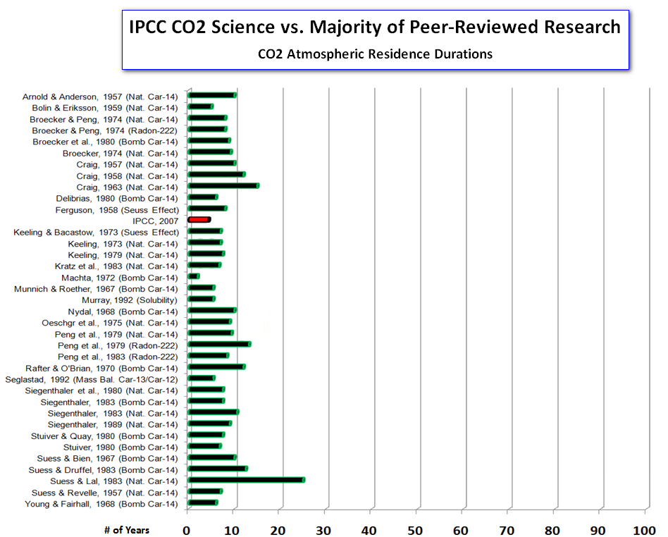
The correct version of the diagram shows that the IPCCs estimate of residence time is completely in accordance with those given in a range of peer-reviewed studies on this topic.
IPCC reports found to be consistent with mainstream scientific opinion- news at 11!
So How Could This Happen?
Now it could be argued that the use of different terminolgy, i.e. turnover rather than residence time, excuses the confusion, however the terms are clearly defined both in the IPCC report and in the papers mentioned in the diagram. For instance, on page 5, Craig (1957) gives tau (the residence time) as the ratio of two quantities, N and phi, where N is the number of molecules in a reservoir and phi is the flux into and out of the reservoir in molecules per year. Here Craig is clearly referring to the turnover time of the IPCC, rather than the adjustment time, which the IPCC report states to be about 4 years.
Interestingly, two of the primary authors of chapter 1 of the FAR WG1 report are Prof. Hans Oeschger and Prof Ulrich Siegenthaler, two names that crop up repeatedly as authors of the peer reviewed research mentioned in the diagram. Could it be that the IPCC report is wrong and gives an estimate of residence time that is clearly at odds with the peer reviewed research (including the work of some of the the authors of the IPCC report itself), or is it more likely that the author of the diagram simply didn't understand the distinction between residence time and adjustment time, and didn't bother to read the IPCC report to resolve the apparent disparity? I would venture to suggest the latter!
Sources of Further Information
The short residence time of carbon dioxide in the atmosphere has frequently been used to suggest that the rise in atmospheric CO2 cannot be of anthropogenic origin. This argument has appeared repeatedly on climate blogs, and even occasionally in the peer-reviewed litterature. One such paper, written by Prof. Robert Essenhigh, led me to write a rebuttal that explained the distinction between residence time and adjustment time, and demonstrated that the observations of the carbon cycle are completely consistent with the observed rise in atmospheric CO2 being anthropogenic:
- Gavin C. Cawley, On the atmospheric residence time of anthropogenically sourced carbon dioxide, Energy & Fuels, volume 25, number 11, pages 5503–5513, September 2011.(www)
This topic has also been covered in a number of articles at SkepticalScience:
- CO2 has a short residence time
- New study by Skeptical Science author finds 100% of atmospheric CO2 rise is man-made
The fact that the rise in atmospheric CO2 is anthropogenic has also been covered eslewhere, including at skeptic blogs, for example:
- Why the CO2 increase is man made, part 1
- Engelbeen on why he thinks the CO2 increase is man made (part 2)
- Engelbeen on why he thinks the CO2 increase is man made (part 3)
- Engelbeen on why he thinks the CO2 increase is man made (part 4)
- Some people claim, that there’s a human to blame …
Unfortunately, the discussion continues, even though the basic facts have been set out in considerable detail.
Summary
The bottom line is that whoever created this diagram either did not understand the distinction between residence time and adjustment time and/or didn't bother to adequately check what was actually written in the IPCC WG1 AR4 report. The same is essentially true for the blogs that have since used this diagram to suggest that the IPCC estimate of residence time is incorrect. So if this diagram is used in a discussion of climate change, considerable skepticism is warranted.


The birth of a meme...
"either did not understand the distinction between residence time and adjustment time and/or didn't bother to adequately check what was actually written"
Would love to get an ongoing list of the sites that will post and tweet and repeat until little meme is able to cross the street without holding anyones hand; soon little meme will be riding a bike and going off to university; they grow up so fast.
There are at least two important responses to this misunderstanding:
1) from a "communicating science to the public" point of view, consider the catastrophe that would result if CO2 really did have a residnce time of say, 10 years. There's currently about 400 ppm of CO2 in the atmosphere. We would have to ADD 40 ppm every year (about 80 GtC per year) just to maintain the habitability of the planet! This is about 8 times the current emissions from the entire global economy. The world would have ended lon ago when plants ran out of CO2. It's patently absurd, and the fact that we're here shows without a shadow of a doubt that it's not true.
2) More seriously, what we actually know about the fate of fossil CO2 is that the rate of removal depends sensitively on the size of the anthropogenic pulse. A small pulse will decay to 20% of its original size in 1000 years, but a large pulse will take many millennia to decay to that level. This has been especially pointed out by David Archer and colleagues.
Interesting article.
Do you think that in reality for the analogy that the sink hole should shrink as the ocean warms as well?
Considering the below and increasing forest fires, permafrost melt, increasing severe weather and nutrient limitations of the CO2 fertilizer effect.
"As the world's oceans warm, their massive stores of dissolved carbon dioxide may be quick to bubble back out into the atmosphere and amplify the greenhouse effect, according to a new study.
The oceans capture around 30 per cent of human carbon dioxide emissions and hide it in their depths. This slows the march of global warming somewhat. But climate records from the end of the last ice age show that as temperatures climb, the trend reverses and the oceans emit CO2, which exacerbates warming.
Previous studies have suggested that it takes between 400 and 1300 years for this to happen. But now the most precise analysis to date has whittled that figure down.
Quick response
"We now think the delay is more like 200 years, possibly even less," says Tas van Ommen from the Australian Antarctic Division, in Hobart, who led the study.
The new results come from Siple and Byrd ice cores in western Antarctica. Van Ommen and colleagues dated CO2 bubbles trapped in the ice, and then compared their measurements with records of atmospheric temperatures from the same time period.
As expected, when temperature increased, carbon dioxide followed, but at both Siple and Byrd the time lag was around 200 years – much shorter than previous studies found.
Rising temperatures make carbon dioxide leak from the oceans for two main reasons. First, melting sea ice increases the rate that the ocean mixes, which dredges up CO2-rich deep ocean waters. Second, "when you warm the ocean up, just like warming up a Coke bottle, it drives the gas out," says van Ommen.
Previous estimates used cores from regions with low snowfall, van Ommen says, leading to a very gradual trapping of the carbon dioxide in the ice. This increased uncertainty in timing. Also, many previous studies used only one ice core site."
Link:
Just with a smaller sink hole or even the sink hole becoming a source seems more akin to the reality of the situation.
How much more carbon can put in the atmosphere safely?
None?
??
Don't we need to remove CO2 to get the now widely advocated 350ppm by 2100?
Is this a well serious real situation right now or an abstract problem still??
Don't we need to adapt, stop carbon emissions asap, somehow remove CO2 from the atmosphere and doesn't that mean transforming everything we do?
Community Adaptation Transformation looks promising, it does mean sacrifices in many areas but does also allow the potential for a transformation of things in an inclusive way that brings people's together in such a way that well being of the environment is championed and an equitable, secure and sustainable future might be realised.
Worth having a look at, considering the extreme weather?
?
[PS] Fixed link and excessive white space. Please avoid too much block quoting - a link and you comment on it is better.
ranyl, like many analogies, the bathtub one only explains a basic concept and there is often little use in extending it. If you are happy with the basic idea, then the next step is to look into simple box models of the carbon cycle, but that is rather beyond the scope of the article.
While increasing ocean temperatures will result in some degassing, it isn't the only thing that determines the strengths of the oceanic source/sink. Another important factor is the difference in partial pressure of CO2 in the atmosphere and the surface oceans, if there is more CO2 in the air than the oceans, the oceans will take up more CO2 to balance the partial pressures. Fossil fuel use has increased the partial pressure in the atmosphere, and this has resulted in an increase in uptake of CO2 into the oceans, which greatly outweighs the effect of the increase in ocean temperatures.
In the ice core data, there is no external (to the carbon cycle) source of atmospheric CO2 causing a partial pressure difference, so CO2 was degassed from the oceans, so the situation isn't quite the same.
The IPCC diagram in the article shows the changes in the various fluxes into and out of the atmosphere since the pre-industrial equilibrium, which shows that both the oceanic source and sink have strengthened (but the sink more than the source).
Dear DM,
I quite like the shrinking sink hole analogy, quite tight, just need to think how to make it into a tap eventually, and do remember that CO2 has always risen as the world's temperature has risen.
And don’t more acidic oceans take up less CO2 eventually? And the partial pressure has already pushed 50% of man’s CO2 into sinks, but the other 50% is hanging around for some time, at least a 100 years and isn’t hat ~60% of total warming, keeping in mind total warming CS is double IPCC range…and what level of CO2e are we at?
Remove the SO2 and what happens to heating forcing?
Just saying let’s not think we actual have a carbon budget, we have a debt and huge one, and what we have to ask how much more CO2 is safe to gamble?
Not much I'd suggest looking at the weather, burn Oz burn, how hot is OZ going to be in the next EL Niño Phew!
And wasn't the southern ocean upwelling CO2 release due to southern shift in the polar winds effectively an external source of CO2 to the balanced carbon cycle system during the last ice age?
And when that was turned off effectively during the Bollinger warm period CO2 levels didn't fall much at all.
Also related it is starting to appear the climate sensitivity is probably more like 4C than 3C due to match observations, and more in keeping with geological records. Pliocene-mid most recent 270-/+55ppm, we are 400ppm and everyone knows that this over a 100years is only half the story to equilibrium, last time CO2 400ppm and above was the Miocene.
And yes the sinks have kept up with increasing emissions but please don't forget the fertilizer effects of industrial nitrogen enhancing both and the fact that acidic waters take up less CO2, and re-release it again as ppm in the atmosphere and that sink hole is going to tighten.
Of course CO2 release from permafrost etc, does shrink the hole, keeping CO2around for ages and if the climate sensitivity is 3C in the model CO2 doesn't fall for 200 years and if it is 4.5C is rises despite all the oceanic and plant life uptake, and more and more 4.5C is looking more likely.
MacDougall Nat.Geo 2012
Models are underestimating everything apart from temperature rise and then there is the report in PNAS about the underestimation of the albedo effect in the Arctic and then think of the models used to predict CS and how for RCP2.6 they have more sea ice in summer in 2070 than we do now, that’s all going melt that permafrost maybe quicker???
Now what else shall we add in, old tree die off, deforestation (storms blew done the last tree one Easter Island), the increasing extreme weather which increases CO2 emissions, ever increasing forest and peat fires, pine bark beetle, and not forgetting the SO2 umbrella which will be removed as fossil fuels emissions cease.
So lets go back to the analogy, filling up the bath, with millions of people emptying millions of buckets into it. Luckily the sink hole has increased in size so far, but aided and abetted by the not insignificant industrial nitrogen fertilizer effects and with many sinks now falling, European, Amazon, North Atlantic, Southern Ocean, the hole will shrink soon, especially as th CO2 fertilizer effect is getting to the C4 plant limit (lots of biomass in grasses), and the C3 fertilization effects will be checked by drought and nutrient deficiencies as ecosystem strain. The sink will block all to soon enough and as CO2 falls all that sinked up CO2 will be re-leased will it not?
Anyway.....
How much more CO2?
Don't we need to get 350ppm at least?
Isn't 1.5C looking quite dangerous considering the weather now at 0.7C?
Adaptation is necessary already and to get to 350ppm won't that need a transformational scale of change and a massive enhancement of the earth ecosystem?
??
[PS] fixed as requested; fixed link, removed excessive white space. Please watch this in future.
Dikran, John,
This simple sink analogy debunks the "short CO2 residence time" myth. But the analogy is not realistic with relation to the Crbon Cycle figure from AR4 that you've shown. Some people, like me, may even find the analogy confusing, because they don't know where this CO2 is coming and going (what those "faucet" and "sink" abstracts represent). For those paople, a boxed model is far more attractive.
airscottdenning@2 mentioned David Archer excelling in teaching those models. I want to second that and point to this classic video, IMO the best ever educational piece of its kind:
The Long CO₂ Tail (5:37)
where David expalains his "artwork". The "tubes" connecting the A O and L boxes represent what you call "adjustment" here. In reality, these are the CO2 flows until the system equilibrates as defined by Henry's law (in case of OA exchange). The CO2 exchanges at the equilibrium stage (not shown on David's graphic but represented, rather vaguely, by your flows from the tap and the sinkhole) are an order of 100 times faster and define the residence time of CO2 molecules in those reservoirs. Finaly, the small opening in David's art is the CaCO3 burial coming from rock weathering (0.2GtC/a on the AR4 graphic).
I've looked at images in Google and couldn't find anything like David's creation in this video. The teaching power of that art is so good that it should realy be put on paper (or electronic media nowadays) and preserved. Any graphic artists there wanting to contribute?
Sounds like the sort of comment I used to see written on my examination papers. I learned the value of this trick (actually reading the question) at school and it continued in my life in the software industry, encapsulaed as the time-honoured answer to most questions: RTFM - read the flamin' manual!
Sadly, it seems reading is one thing and comprehension is quite another, judging by the comments I see in the blogosphere.
I have a slightly different analogy. Firstly I half full the bath with cold water (I prefer my thought experiments to be as sustainable as possible), and set the cold water tap so that the level stays constant - so far the same as your analogy. Then I turn on the hot water tap just a little bit. Now the level in the bath will start rising. The amount of hot water in the bath at any time will be very small ("CO2 from fossil fuels only accounts for 0.x% of atmospheric CO2") but only an idiot would claim that the act of turning on the hot water tap was not the cause of the rising level. When the bath is nearly full you turn off the hot water tap. The level in the bath will go down, because of the extra pressure, but much more slowly than it rose and it will only asymtotically approach its original level.