 Arguments
 Software
 Resources
Comments
 The Consensus Project
 Translations
 About
Support


Latest Posts
- Fact brief - Were the 2022 whale deaths off the US East Coast caused by offshore wind development?
- 2026 SkS Weekly Climate Change & Global Warming News Roundup #18
- Our new research is published - but we're not done yet with the 'Experiment'
- Skeptical Science New Research for Week #18 2026
- Wildfires used to ‘go to sleep’ at night. Climate change has them burning overtime
- Transition risk: The human cost of net zero
- How strong can a hurricane get in a warming world?
- 2026 SkS Weekly Climate Change & Global Warming News Roundup #17
- The really big picture, in four pictures
- Skeptical Science New Research for Week #17 2026
- EGU2026 - My plans for attending virtually
- Global warming is making the strongest hurricanes stronger
- As Cuba’s grid fails, solar power becomes a lifeline
- 2026 SkS Weekly Climate Change & Global Warming News Roundup #16
- Skeptical Science New Research for Week #16 2026
- Don’t panic: A field guide to the runaway greenhouse
- Human-caused climate change is unmistakably distinct from Earth’s natural climate variability
- What’s cheaper: Fueling your car with gas or electricity?
- 2026 SkS Weekly Climate Change & Global Warming News Roundup #15
- Skeptical Science New Research for Week #15 2026
- What the Iran conflict means for gas prices, clean energy, and the climate
- Fact brief - Do wind turbines utilize land for electricity generation more efficiently than fossil fuels?
- 2026 SkS Weekly Climate Change & Global Warming News Roundup #14
- Skeptical Science New Research for Week #14 2026
- The ski industry is oddly quiet on climate change
- The controversy over deep-sea mining, explained
- Using a 20-year period for comparing methane to CO2 is a terrible idea
- 2026 SkS Weekly Climate Change & Global Warming News Roundup #13
- Skeptical Science New Research for Week #13 2026
- The El Niño cometh
Escalator 2022

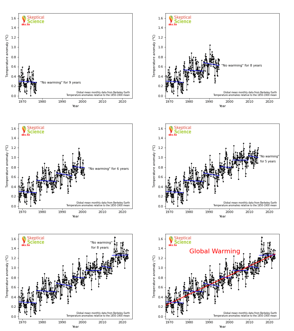
This version of the Escalator graphic is based on data including the year 2022. The previous versions are still available here with data including 2015 or as a video including 2016. When Robert Rohde updated the escalator and produced a staircase of denial in January 2023, it motivated us to follow suit and to update our escalator with the latest available data as well.
One of the most common misunderstandings amongst climate contrarians is the difference between short-term noise and long-term signal. This animation shows how the same temperature data (black) that is used to determine the long-term global surface air warming trend of 0.19°C per decade (red) can be used inappropriately to "cherrypick" short time periods that show a cooling trend simply because the endpoints are carefully chosen and the trend is dominated by short-term noise in the data (blue steps). Isn't it strange how six periods of cooling can add up to a clear warming trend over the last 4 decades? Several factors can have a large impact on short-term temperatures, such as oceanic cycles like the El Niño Southern Oscillation (ENSO) or the 11-year solar cycle. These short-term cycles don't have long-term effects on the Earth's temperature, unlike the continuing upward trend caused by global warming from human greenhouse gas emissions.
Source for data used in the graphic: Global mean monthly temperature anomalies, relative to the 1850-1900 mean, from Berkeley Earth.
Blog post introducing the 2022 version of the escalator graphic
Other versions
Printable Version | Back to Graphics by Skeptical Science
|
|
Skeptical Science Graphics by Skeptical Science is licensed under a Creative Commons Attribution 4.0 International License. |
THE ESCALATOR

(free to republish)


