


 Arguments


Monckton misuses IPCC equation
What the science says...
| Select a level... |
 Intermediate
|
 Advanced
| |||
|
Lord Monckton has taken a single equation from the IPCC, used it in an inappropriate manner, and then attributed his results to the IPCC. This is as if I borrowed your car, drove into a tree, and then blamed you. He uses a method that is clearly intended to examine the long-term response of temperature to changes in carbon dioxide, and which is never used by the IPCC (nor should it be) to make predictions about current temperature trends. A slight change in Lord Monckton’s methodology as of July 2010 still does not make his method or attribution remotely appropriate. |
|||||
Climate Myth...
IPCC overestimate temperature rise
"The IPCC’s predicted equilibrium warming path bears no relation to the far lesser rate of “global warming” that has been observed in the 21st century to date." (Christopher Monckton)
Monckton calculates his "predicted temperatures" using an equation found in the IPCC report (Working Group 3, Chapter 3) that is used to examine the long-term temperature response to carbon dioxide emissions: Teq = ECS × ln(CO2end / CO2start) / ln(2). This is essentially a ratio increase in CO2 multiplied by the equilibrium climate sensitivity (ECS), a value that represents how sensitive temperature is to changes in CO2. The IPCC gives the range for ECS of 2.0 to 4.5, with a "best estimate" of 3.0.
With this equation, Monckton uses the CO2 values from the IPCC’s A2 scenario: a CO2start value of 368 ppm in 2000 and a CO2end value of 836 ppm in 2100. He then examines the IPCC’s low- and high-end ECS values (2.0 and 4.5), but uses the "central estimate" of ECS = 3.25 instead of the IPCC’s "best estimate". Monckton has simplified the original equation by dividing ECS by ln(2) in order to provide a single multiplier. Here are the equations that produce the range of warming that Lord Monkton claims is predicted by the IPCC:
2.9 × ln(836/368) = 2.4 C
4.7 × ln(836/368) = 3.9 C
6.5 × ln(836/368) = 5.3 C

You can see that these values match up with the "IPCC predicts warming" values shown on Monckton’s figures.
There are four fundamental problems with using these values to "predict" temperatures and attributing them to the IPCC:
1. The IPCC does not "predict" anything on this matter – they make multiple projections assuming different future emissions scenarios. This may sound trivial, but it’s a very important distinction. Monckton narrows the analysis to a single scenario (A2) and labels it a prediction.
2. Temperature rise for the A2 scenario is very unlikely to be linear, and single values in °C / century are inappropriate when looking at temperatures for time periods of less than a century. This is particularly problematic when looking at very short time periods early in this century, which are likely to exhibit less warming than later in the century.
3. These equations predict the equilibrium temperature response, which is the final temperature change once the climate has fully adjusted to a change in CO2. It does not represent the temperature expected for the year that CO2 concentration reaches the value used in the equation (and will always be higher than this value). The IPCC is abundantly clear on this point.
4. The IPCC never uses or presents these values to project global temperatures in the first decade of the 21st century.
In his most recent figures from July 2010, Monckton has decided to address the fact that warming to equilibrium temperatures by 2100 is clearly wrong (fundamental problem #3). He does this by simply reducing equilibrium temperatures by one-fifth (or multiplying by 0.8) to convert to "transient warming", although it is unclear where he gets this conversion factor from. He has applied these changes to his "prediction zone" on the graph, but he has not changed the legend of the figure which still lists the incorrect equilibrium values after "IPCC predicts warming."
I was able to recreate Monckton’s July 2010 figure from scratch by plotting monthly temperatures as the average of the UAH and RSS satellite temperature values, and adjusting them like Monckton so that "the anomalies are zeroed to the least element in the dataset." I then plotted Monckton’s "transient" prediction zone using 3 lines with linear increases of 2.4 × 0.8 = 1.92 C/century, 3.9 × 0.8 = 3.12 C/century, and 5.3 × 0.8 = 4.24 C/century. I then zeroed the prediction zone "to the start-point of the least-squares linear-regression trend on the real-world data." Here is the result:
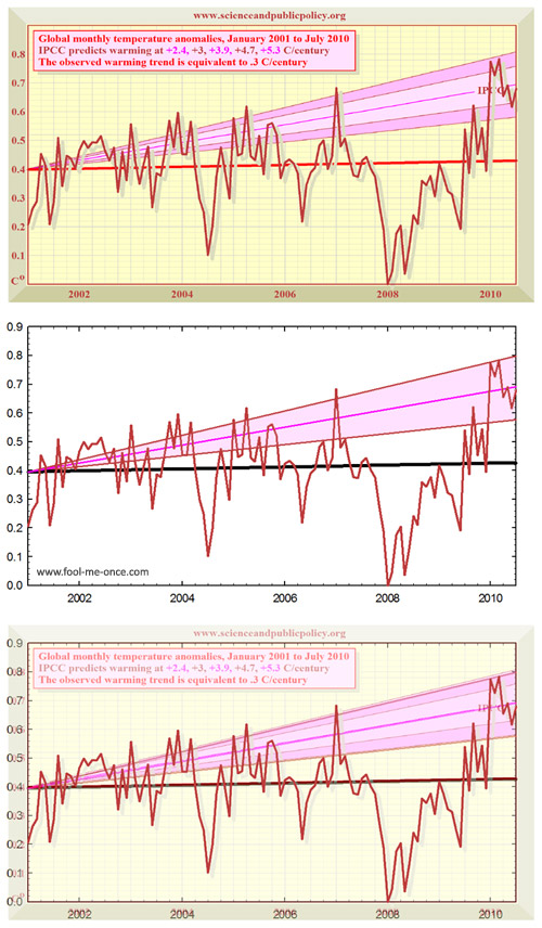
Figure 1: My reproduction and overlay of Monckton’s figure from his July 2010 SPPI report. (top) Monkton’s original figure; (middle) my reproduction; (bottom) overlay of the two. If anything, Monckton’s projection zones are slightly above the "transient" linear increases of 1.92 C/century, 3.12 C/century, and 4.24 C/century.
His prediction zones match up virtually perfectly to linear increases in temperature out to 2100 (highlighting fundamental problem #2). We can then extend these out to 2100 and examine whether Monckton’s warming rates in degrees per century match up with the actual IPCC projections:
![]()
Figure 2: Extensions of the "transient" linear warming paths from Figure 1, superimposed on the IPCC’s actual A2 temperature projection. Prediction zones were zeroed to the start of the Jan 2001 to July 2010 regression line of the UAH and RSS monthly average, using the base period of 1980-1999 to match the IPCC figure’s base period.
Monckton’s new transient warming zone aligns with the actual IPCC A2 projections quite well by 2100. However the problem with a linear temperature prediction is apparent (again, fundamental problem #2): Monckton’s transient warming path entirely excludes the bottom half of the IPCC projections until after 2030.
So as of his July 2010 report, Monckton’s prediction zones may have some relevance to temperatures at the end of the century (although they still suffer from fundamental problems #1 and #4 no matter what). However, they remain both inappropriate (fundamental problem #2) and deceptive (fundamental problems #1 and #4), when used for comparisons with recent observed temperatures. All of the prediction zones on his figures prior to July 2010 – including those shown in testimony to congress – suffer from all four fundamental problems. Just to highlight what a substantial issue fundamental problem #3 is, let’s examine the linear increase to 2100 based off of equilibrium warming:

Figure 3: The same as Figure 2, but using equilibrium linear warming paths.
Until Lord Monckton starts using the actual IPCC temperature projections and stops using climate sensitivity equations to "predict" temperatures from 2001 to 2010, his figures will be fundamentally flawed and unattributable to the IPCC.
- What about Monckton's CO2 predictions? -
Although, the primary topic here is Monckton’s "IPCC" temperature predictions, his "IPCC" CO2 predictions are also completely at odds with what is actually presented in the IPCC. Barry Bickmore from Brigham Young University has done an excellent bit of detective work to help elucidate the matter (see his RealClimate post here).
Dr. Bickmore compared Monckton’s "IPCC A2" CO2 values to the actual IPCC A2 CO2 values and found that, other than the start and end points, Monckton’s values are always higher. There is absolutely no justification for this. I’ve reproduced the same result by carefully scaling and overlaying Monckton’s graph onto the IPCC’s figure 10.20a (here’s an uncropped larger version):

Figure 4: Lord Monckton’s graph of the "IPCC’s predicted CO2" trend superimposed on the actual CO2 concentration trend from the IPCC’s figure 10.20a. Monckton’s "IPCC prediction" is clearly higher than the actual IPCC trend (which follows the observed values quite well).
- Additional figures -

Figure 5: The actual IPCC A2 temperature projection range (3-year running means) with observed global temperatures from the 5 major temperature analyses (36-month running means through June 2010).

Figure 6: Monckton’s "IPCC" temperature prediction from his July 2010 SPPI report compared to the actual IPCC A2 temperature projections.
Advanced rebuttal written by Alden Griffith
Update July 2015:
Here is a related lecture-video from Denial101x - Making Sense of Climate Science Denial
Last updated on 13 July 2015 by pattimer. View Archives


Just out of curiosity, how do you "adjust" the IPCC's predictions to reflect observed GHG forcings? Because it seems as though there's a big difference between doing that (which results in the images shown above) and not doing it (which results in images like the one below).
In other words, what's wrong with this picture?
Also, I hate to sound like a broken record (as I said this about the "Southern sea ice is increasing" page too), but I don't see why we need both this page and the one called "IPCC global warming projections were wrong," as they both seem to cover the same topic.
[Dikran Marsupial] Please can you limit your images to no more than 500 pixels wide. I have made the adjustment this time.
jsmith, the image you have shown there is not actually "unadjusted". The model projections used in the 1990 IPCC report do not all agree exactly on the temperature in 1990, and they definitely didn't predict the observations exactly either. The thing that is wrong with the picture is that they have used a baseline of year (whci happened to be a peak in the observations), rather than the proper procedure of a 30 year baseline. The problem with a single year baseline is that you can make it give any result you want, you can make it look like the models over-predict temperatures by baselining to a warm year, or you can make them look as if they are running cooler by baselining to a cold year. Sadly this sort of thing is done all the time, but that doesn't mean that it is correct - far from it.
Here is an example of what I mean (vai woodfortrees.org):
Here I've shown the HADCRUT4 datase, along with two lines representing completely accurate representations of the rate of warming, but only differing in the vertical offset introduced by the choice of baseline year.
The green line represents a "skeptics" presentation, where the observations and projection were baselined to a peak in the observations so that the observations are then generally below the projection. "IPCC models over predict warming" is the headline.
The blue line represents an "alarmist" presentation, where the observations and projections were baselined to a trough in the observations, so that the observations are generally higher than the projection. "IPCC models underpredict warming" is the headline.
The magenta line represents the scientific presentation (in this case it is just the OLS trend line), where the offset hasn't been cherry picked to support the desired argument.
Just to further clarify DM...
You can't do this (red circle):
That is a single year, cherry picked, baseline. It's something you see Chris Monckton constantly doing in his presentations.
BTW a later article by Monckton (2012) does another odd thing with IPCC projections, based purely on arithmetic. The final comment there is mine and intended to be read side-by-side with the article. It took some time to work out what Monckton was doing, which was back-projecting the same figures from the projections to obtain estimates for warming in 1960-2008, first assuming the CO₂-temp relationship was logarithmic, secondly that it was linear. Unsurprisingly he finds a discrepancy between those two results, but he assumes that is a flaw in the models (!).
I didn't start from an ad hominem premise, but can't help trying to understand what was driving Monckton in that article. In the Meet the Sceptics (2011) documentary, he claims to have cured himself of Graves' disease. As I understand it, mental confusion is an occasional symptom of hyperthyroidism. I don't mean that gives additional reason to dismiss his varied claims, but it might invite a more sympathetic response.
I don't know why this is not in the top ten. I hear this all the time.
If JSmith's methods were wrong can you not at least address his core concern? Your article doesn't show the actual IPCC first assessment predictions for temperature, but adjusts them prior to comparison to observed temperature. The IPCC first assessment summary states in Chapter 6 that for 2030 they see "a predicted rise trom 1990 of 0.7-1.5°C with a best estimate of 1.1C". If I'm not mistaken, we currently are very much on track to be under 1.1C warmer than 1990 in the next 15 years?
If JSmith made mistakes or inaccuracies in matching the observed temperatures to the 1990 IPCC predictions as they were published below, don't just settle for saying he did it wrong. Graph the actual observed temperatures against the actual published predictions of the IPCC from 1990 as shown below. I'm afraid all my efforts to match recorded observations to them only seem close to matching the very coldest 1990 predictions and I'd love to see a graph that can more clearly show me where I'm going wrong.
bcglrofindel - In short, short term variability. GCMs are intended to project (not predict) average climate over the long term, and there has never been a claim that they could accurately predict short term variations that cancel out over several decades.
See this post examining how recent short term variations have affected longer term projections. Or this thread comparing various projections (including 'skeptic' ones) against actual temperatures, although that only goes to 2011.
Quite frankly, even the earliest IPCC projections are quite good. Certainly when compared to those from people in denial of climate science...
KR,
You still aren't giving a simple apples to apples comparison. The claim I see people making is that the published IPCC trends from 1990 are too high compared to actual measured temperature. Isn't it trivial to plot actual temperature against the 3 projections the IPCC gave in Fig 6.11? That would easily do away with all the hedging and confusion and end the matter, no? Why can't I find such a simple plot anywhere? All the places I find such a plot, like JSmith's in thread, it's called out as inaccurate. Can't 3 simple plots done on excel in about a half hour clear this up and silence skeptics?
bcglrofindel:
I can't sort through just exactly what your issue is with the IPCC projections. To begin with, exactly which projection are you selecting, why are you selecting that one, and what data are you using to compare?
Each IPCC projection has some assumptions in it, with respect to the growth of atmospheric CO2 (emissions scenario) and the temperature response to that change in CO2 (climate sensitivity).
With four emissions scenarios and three climate sensitivty values, that gives 12 projections "on display". Note that these projections are not "predictions", because the IPCC is not claiming that one (or any) of these is "the one". When comparing to observations (i.e., testing the projections as if they were predictions), you have to do the following:
Note that the choice of an approriate scenario is based on the closeness of the assumptions, not the closeness of the temperature trend.
Let's take a trivial model as an example. Let's assume that we have a linear model that states:
where T is temperature at time t, as a function of the concentration of CO2 at time t (CO2(t)), and A and B are parameters. If I want to make a projection (not a prediction) of temperature into the future, I need three things:
I will have uncertainties in my CO2(t) values, and in my sensitivity B. As a good scientist, I will try several values of each, based on my understanding of what is reasonable or possible, and I will publish results of those several projections. This is what the IPCC did (with models a little more complex than the linear example here!).
Now, after several years, I want to compare the actual observed T to my model results. I need to determine:
...and, most importantly...
Once I have all that, I can start to compare the model to observations. I may need a new CO2(t) time series, and I may need to use different values of A and B from my earlier projections. Note that this does not mean that I'm changing my model: I'm just changing input parameters.
jsmith's graph has the mistake of choosing an inappropriate value for A. The observations contain a lot of "noise", which causes annual variation that is not a function of CO2 concentration. If jsmith's graph were repeated using 1992 as a starting point, the results would be very different. This lack of a robust result ("robust" means that the analysis is not highly dependent on a particular assumption) is an indication that the result is unreliable. This is what Dikran points out in comment #10.
By contrast, if you averaged observations over several years and matched that to the average of the model over the same years, and used that to determine the value of A, you would likely discover that the value of A did not change much if you chose different periods (near the start of the comparison). This would be a robust result, because you could say "I chose this period, but the results are pretty much the same if I choose another period".
I wa referring to the temperature projections from the IPCC first assessment report, Chapter 6. In Figure 6.11 they have 3 graphs for three different temperature sensitivities. It's also notably the ONLY temperature predictions posted in the first assessment report, isn't it? I'll post the image a second time below. What I am told is that actual instrumental temperatures are colder than all of the predictions in Fig 6.11 from the IPCC F(irst)AR. Can someone not simply graph instrumental temperatures against the IPCC projections below and demonstrate the truth? Shouldn't it be a simple enough task? Unfortunately the only examples I can find are like JSmith's that are declared inaccurate.
Maybe more simply, I want to add the red line below where the red line is actual instrumental temperature record:
bcglrofindel - You certainly can find such a plot. I would suggest looking at the AR5 Technical Summary, in particular Fig. TFE.3:
[Source]
JSmith's graph suffers from selecting a single timepoint offset, rather than a multi-year average that cancels out short-term variations, and hence is a misleading presentation.
Thanks KR, my trouble is still actually seeing what the FAR range actually is on that graph. I've hunted around for the actual underlying data for the graph but can't find it anywhere. Regrettably, the shading of all 4 AR onto the same graph leaves the FAR virtually completely hidden for the entire time the instrumental record is plotted :(.
bcglrofindel - I would have to agree that the chart is quite difficult to parse. But that's not uncommon when overlaying so much data, and frankly the TAR/SAR/FAR models and projections, while interesting as historical documents, are far from state of the art in resolution, in incorporated components of the climate, and perhaps most importantly in the more recent forcing histories.
Hence, while I personally would have preferred to have just the overlaid ranges and not individual model runs plotted there, I'm not surprised that AR5 spent very little time and graph space on the previous reports.
" Isn't it trivial to plot actual temperature against the 3 projections the IPCC gave in Fig 6.11?"
But doing that comparison would be falling for a straw man fallacy. The IPCC does NOT predict that actual measured temperatures will follow those lines. However, it would expect 30-year trends to follow those lines. It is interesting that skeptic make dance that actual temperature is below ensemble mean (its natural variation), but werent worried when in earlier decades suface temps were running hotter (also natural variation). Trends in surface temp shorter than 30 year are weather not climate.
bcglrofindel:
1) In the estimates made using the energy balance diffusive model, the IPCC assumed a radiative forcing for doubled CO2 of 4 W/m^2 rather than the actual 3.7 W/m^2. The more accurate value was determined by Myhre et al (1998), and included in IPCC reports since the Third Assessment Report (2001).
2) The radiative forcing for the BAU scenario in 2015 for the energy balance diffusive model of IPCC FAR was 4 W/m^2 (Figure 6, Policy Makers Summary, IPCC FAR). For comparison, the current radiative forcing is 3 W/m^2 (IPCC AR4 Technical Summary, Table TS.7), 25% less. To properly test the actual model used in making the predictions, you would need to run the model with accurate forcings. An approximation of the prediction can be made by simply scaling the values, so that the IPCC 2030 predictions would be 0.83 C (0.53-1.13 C).
3) The reasons for the high value of the projected BAU forcings are:
a) The high estimate of radiative forcing for a doubled CO2 concentration already mentioned;
b) The fact that the model did not project future temperature changes; but the effect on future temperature changes based on changes in GHGs alone; and
c) A failure to predict the break up of the former Soviet Union, and the consequent massive reduction in emissions growth.
Factors (a) and (c) explain the discrepancy between the projected BAU forcing for GHG alone (4 W/m^2 for 2015) and the current observed forcing for GHG alone (3.03 W/m^2). From that, it is easy to calculate that there is a 16.75% reduction in expected (BAU) forcing due to reduced industry in the former Soviet Block (plus unexpectedly rapid reduction in HFC's due to the Montreal Protocol).
Thus insisting on a comparison of the actual temperature trend to the actual BAU projections in order to determine the accuracy of the model used by IPCC FAR amounts to the assumption that:
A) The IPCC intended the projections as projections of actual temperature changes rather than projections of the expected influence of greenhouse gases, contrary to the explicity statement of the IPCC FAR;
B) The IPCC should be criticized based on their use of the best current science rather than the scientific knowledge gained 8 years after publication, and 16 years prior to the current criticism (Myhre et al, 98); and
C) The failure of the IPCC to project the break up of the Soviet Union invalidates its global climate models.
The last leaves me laughing. I look forward to your produceing quotes from the critics of the IPCC dated 1990 or earlier predicting both the break up of the Soviet Union and a huge reduction in CO2 emissions as a result to show that they were wise before the event. Better yet would be their statements to that effect in peer reviewed literature so that the IPCC can be shown to be negligent in not noting their opinion. I expect confidently zero evidence of either (due to their not existing).
I am also looking forward to your defence of those three assumptions, as you seem to consider the direct comparison (rather than a comparison with the forcings of the model adjusted to observed values) to be significant. Failing that defence, or your acknowledgement that the assumptions are not only invalid but unreasonable, I will consider you to be deliberately raising a strawman.
4) Despite those issues, the 30 year trend to 2013 of the GISS temperature series is 0.171 C per decade, just shy of the 0.175 C per decade for the lower value. That it is just shy is entirely due to short term variation due to ENSO. The 30 year trend to 2007, for example is 0.184 C per decade, just above the lower limit. Further, that is a misleading comparison in that it treats the trend as linear, wheras it the projection in fact accelerates (ie, we expect a lower than 0.175 C trend in the first half of the period). Ergo, not withstanding all the points raised above, the IPCC FAR projections have not in fact been falsified - even without adjustments to use historical forcing data, and even ignoring the fact that it was not intended as a projection of future temperatures (but only of the GHG impact on future temperatures).
Tom Curtis - Note that bcglrofindel didn't insist that modeling was invalidated by differences between past projections of climate versus emission expectations, but presented a query as to why a simple comparison might look off. While there are a lot of climate trollers who pass by, I would prefer to treat everyone as sincerely interested in a discussion unless/until proven otherwise.