Climate Science Glossary

Term Lookup

Enter a term in the search box to find its definition.

Settings

Use the controls in the far right panel to increase or decrease the number of terms automatically displayed (or to completely turn that feature off).

Term Lookup

Settings


All IPCC definitions taken from Climate Change 2007: The Physical Science Basis. Working Group I Contribution to the Fourth Assessment Report of the Intergovernmental Panel on Climate Change, Annex I, Glossary, pp. 941-954. Cambridge University Press.

Home Arguments Software Resources Comments The Consensus Project Translations About Support

Bluesky Facebook LinkedIn Mastodon MeWe

Twitter YouTube RSS Posts RSS Comments Email Subscribe


Climate's changed before
It's the sun
It's not bad
There is no consensus
It's cooling
Models are unreliable
Temp record is unreliable
Animals and plants can adapt
It hasn't warmed since 1998
Antarctica is gaining ice
View All Arguments...


Username
Password
New? Register here
Forgot your password?

Latest Posts

Archives

Extreme Events Increase With Global Warming

Posted on 11 November 2011 by Rob Painting

For a more basic version of this post, see here

That continued warming of the Earth will cause more frequent and intense heatwaves is hardly surprising, and has long been an anticipated outcome of global warming. Indeed the 1990 Intergovernmental Panel on Climate Change (IPCC) Policymakers Summary stated that: 

"with an increase in the mean temperature, episodes of high temperatures will most likely become more frequent in the future, and cold episodes less frequent."

One such "high temperature episode" was the monster summer heatwave centred near Moscow, Russia in 2010, where temperatures rocketed well above their normal summertime maximum and were so record-shattering they may have been the warmest in almost 1000 years.

Rahmstorf and Coumou (2011) developed a statistical model and found that record-breaking extremes depend on the ratio of trend (warming or cooling) to the year-to-year variability in the record of observations. They tested this model by analysing global temperatures and found that warming increased the odds of record-breaking. When applied to the July 2010 temperatures in Moscow, they estimated a 80% probability that the heat record would not have occurred without climate warming.
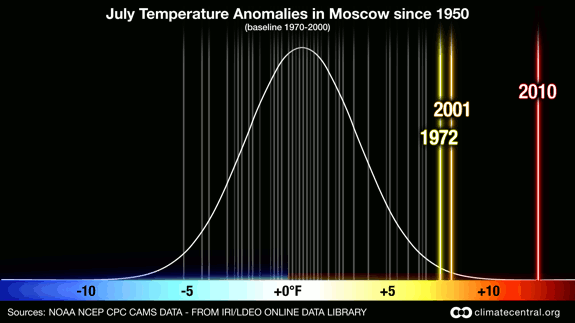
Figure 1 - Probability of July average temperature anomalies in Moscow, Russia since 1950. This image shows that the average temperature in Moscow for July 2010 was significantly hotter than in any year since 1950. Credit: Claudia Tebaldi and Remik Ziemlinski. From ClimateCentral.org

Some statistical background

Earlier statistical work on record-breaking events has shown that for any time series that is stationary (i.e. no trend), the probability of record-breaking falls with each subsequent observation. This is known as the 1/n rule, where n equals the previous number of data in the series. For example, the first observation has a 1-in-1 chance of being the record extreme (100%), the second has a 1-in-2 chance (50%), the third a 1-in-3 chance, and so on.

For climate heat records, the stationarity rule is not apparent, as one might expect in a warming world. Previous work in this area has shown that the slowly warming mean (average) temperature is responsible for this nonstationarity.   

Monte Carlo 

Following on from this earlier work, Rahmstorf and Coumou (2011) sought to disentagle the two effects of the mean change in temperature (climate warming), from the random fluctuations of weather, so as to find out the contribution of each to record-breaking. To do this, the study authors turned to Monte Carlo simulations. These are computer-generated calculations which use random numbers to obtain robust statistics. A useful analogy here is rolling a dice. Rolling once tells us nothing about the probability of a six turning up, but roll the dice 100,000 (as in this experiment) and you can calculate the odds of rolling a six. 

From the simulations the authors obtain 100 values which represent a 100 year period. Figure 2(A) - 2(C) are the "synthetic" time series, and 2(D), 2(E) are respectively, the 'synthetic' global mean and Moscow July temperature. In all panels the data have been put into a common reference frame (nomalized) for comparison. (See figure 1 for an example of a Gaussian or normal distribution. Noise represents the year-to-year variability). 
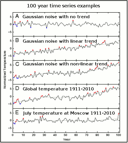
Figure 2 - examples of 100 year time series of temperature, with unprecedented hot and cold extremes marked in red and blue. A) uncorrelated Gaussian noise of unit standard deviation. B) Gaussian noise with added linear trend of 0.078 per year. C) Gaussian noise with non-linear trend added (smooth of GISS global temp data) D) GISS annual global temp for 1911-2010 with its non-linear trend E) July temp at Moscow for 1911-2010 with non-lnear trend. Temperatures are normailzed with the standard deviation of their short-term variability (i.e. put into a common frame of reference). Note: For the Moscow July temperature (2E) the long-term warming appears to be small, but this is only because the series has been normalized with the standard deviation of that records short-term variability. In other words it simply appears that way because of the statistical scaling approach - the large year-to-year variability in Moscow July temperatures makes the large long-term increase (1.8°C) look small when both are scaled. Adapted from Rahmstorf & Coumou (2011)

Follow steps one.....

Initially, the authors ran the Monte Carlo simulations under 3 different scenarios, the first is for no trend (2[A]), with a linear trend (2[B]) and a nonlinear trend (2[C]). The record-breaking trends agree with previous statistical studies of record-breaking namely that: with no trend the probability of record-breaking falls with each observation (the 1/n rule), and with a linear trend the probability of record-breaking gradually reduces until it too exhibits a linear trend. With a non-linear trend (2[C]), the simulations show behaviour characteristic of the no-trend and linear trend distibutions. Figures 2(D) and 2(E) are the actual GISS global and Moscow July temperatures respectively.   

.....two.....

Next, the authors then looked at both the GISS global and Moscow July temperature series to see whether they exhibited a gaussian-like distribution (as in the 'lump' in figure 1). They did, so this supports earlier studies  indicating that temperature deviations are fluctuating about, and shifting with a slowly moving mean (as in the warming climate). See figure 3 below.   

Figure 3 -Histogram of the deviations of temperatures of the past 100 years from the nonlinear climate trend lines shown in Fig. 2(D)  and (E) together with the Gaussian distributions with the same variance and integral. a) Global annual mean temperatures from NASA GISS, with a standard deviation of 0.088 ºC. (b) July mean temperature at Moscow station, with a standard deviation of 1.71 ºC. From Rahmstorf & Coumou (2011)

.....and three.

Although the authors calculate probabilities for a linear trend, the actual trend for both the global, and Moscow July temperature series is nonlinear. Therefore they separated out the long-term climate signal, and the weather-related annual temperature fluctuation, which gave them a climate 'template' on which to run Monte Carlo simulations with 'noise' of the same standard deviation (spread of annual variability from the average, or mean). This is a bit like giving the Earth the chance to roll the 'weather dice' over and over again.

From the simulations with, and without the long-term trend, the authors could then observe how many times a record-breaking extreme occurred.
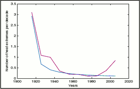
Figure 4 -Expected number of unprecedented july heat extremes in Moscow for the past 10 decades. Red is the expectation based on Monte Carlo simulations using the observed climate trend shown in Figure 2(E). Blue is the number expected in a stationary climate (1/n law). Warming in the 1920's and 1930's and again in the last two decades increases the expectation of extremes during those decades. From Rahmstorf and Coumou (2011)

Large year-to-year variability reduces probability of new records

A key finding of the paper was that if there are large year-to-year non-uniform fluctuations in a set of observations with a long-term trend, rather than increasing the odds of a record-breaking event, they act to reduce it because the new record is calculated by dividing the trend by the standard deviation  The larger the standard deviation the smaller the probability of a new extreme record.

This can be seen by comparing the standard deviation of the NASA GISS, and Moscow July temperature records (figure 3), plus figure 2(D) and [E]). As the GISS global temperature record has a smaller standard deviation (0.088°C) due to the smaller year-to-year fluctuations in temperature, you will note in figure 2(D) that it has a greater number of record-breaking extremes than the Moscow July temperature record over the same period (2[E]). So, although the long-term temperature trend for Moscow in July is larger (100 year trend=1.8°C), so too is the annual fluctuation in temperature (standard deviation=1.7°C), which results in lower probability of record-breaking warm events. 

Interestingly it's now plain to see why the  MSU satellite temperature record, which has a large annual variability (large standard deviation, possibly from being overly sensitive to La Niña & El Niño atmospheric water vapor fluctuations) still has 1998 as it warmest year, whereas GISS has 2005 as it's warmest year (2010 was tied with 2005, so is not a new record). Even though the trends are similar in both records, the standard deviation is larger in the satellite data and therefore the probability of record-breaking is smaller. 

That other Russian heatwave paper

The results of this paper directly contradict the findings of Dole (2011) who discounted a global warming connection with the 2010 Russian heatwave. Rahmstorf & Coumou (2011) demonstrate that the warming trend from 1980 onwards (figure 4) greatly increased the odds of a new record-breaking warm extreme, and in fact should have been anticipated.

It turns out that Dole (2011) failed to account for a quirk in the GISS Moscow station data which had wrongly applied the annual urban heat island (UHI) adjustment for the monthly July temperatures, when UHI is a winter phenomenon in Moscow. This meant that the large warming trend evident there in July had been erroneously removed. This was confirmed by looking at Remote Sensing Systems (RSS) satellite data over the last 30 years, which shows a strong warming trend in Moscow July temperatures. See Real Climate post "The Moscow Warming Hole" for detail, and note Figure 5 below.
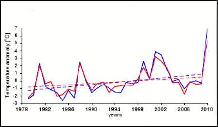
Figure 5 - Comparison of temperatues anomalies from RSS satellite data (in red) over the Moscow region versus Moscow station data (in blue). Solid lines shows the average July value for year, whereas the dashed lines show the linear trend for 1979-2009. Satellite data have a trend of 0.45°C per decade, as compared to 0.72°C per decade for the Moscow station data.

Whatchoo talkin' bout Willis?

Using the GISS data from 1911-2010 (a nonlinear trend), the authors calculate a 88% probability the extreme Russian heatwave (a record in the last decade of the series) was due to the warming trend. Clearly the summer temperatures for July 2010 in Moscow were a massive departure from normal, and including them would create bias, so the study authors exclude 2010 from their analysis, and re-calculate for 1910-2009. They found a 78% probability the freak heatwave was due to warming, and extending their analysis back to include the entire GISS temperature observations (1880 -2009), they found an 80% probability.

So to sum up:

  • Rahmstorf and Coumou (2011) is a statistical/analytical study, which does not look at the physical causes of the 2010 Russian heatwave. Instead they assess the likelihood of record-breaking extremes. 
  • Based on earlier work, and confirmed by the Monte Carlo simulations; in a climate with no trend (no long-term warming or cooling), the probability of record-breaking extremes falls over time (perhaps contrary to popular belief).
  • With a warming (linear) trend, the number of record-breaking warm extremes reduce until they eventually increase in a linear manner.
  • With a nonlinear trend (warm/stagnation intervals) the probability of record-breaking is a combination of the no trend/linear trend scenarios.
  • Larger annual fluctuations (larger standard deviation) reduce the number of records, whereas smaller fluctuations increase the number of record- breaking extremes.
  • This helps explain why the satellite temperature record (large annual fluctuation) has 1998 as it warm record, whereas GISS (small annual fluctuation) has 2005 - GISS has a greater likelihood of seeing record-breaking.
  • By seperating out the random (weather) component and the long-term (warming) component, the authors established there is a 80% probability that the 2010 July temperature record in Moscow would not have happened without climate warming from 1880-2009. 
  • The record-breaking extreme should have been anticipated, which contradicts earlier work on the Russian heatwave (Dole [2011]).
  • In a warming world expect to see more record-breaking warm temperatures. 

0 0

Printable Version  |  Link to this page

Comments

Prev  1  2  3  

Comments 101 to 108 out of 108:

  1. Norman - I have also ceased to respond to your postings, as they match a repeated pattern: * Focus on single sites, short time periods, etc. * Lack of any statistical basis. * Decrying actual statistics upon the "strength" of your tiny data focus. * Not understanding, reacting to, or incorporating any of the very good advice you have received from people with much better statistical backgrounds than you have evinced. It is clear to me that you are operating from a state of confirmation bias, dismissing willy-nilly any data contrary to your beliefs, and supporting your position with cherry-picked examples of such tiny extent and duration to be laughably irrelevant. A prime example was your search through the historic records for extreme weather events, not considering the statistics of how frequently these events occur - an entirely worthless argument when the statistics (frequency of occurrence) are what are being discussed. Until you recognize the need for statistics, and for proper consideration of the greater body of data, your postings will continue to be a rather pointless assertion of your beliefs, lacking numeric support. My apologies for the tone of this post - but you have not shown any ability to learn from the information you have been pointed to. And your postings represent errors that might take in those with no statistic backgrounds; perhaps the only relevance on this forum - they need to be properly dismissed.
    0 0
  2. I have a little extra time this week. I will see if I can help out Tom and Muoncounter. Please read their comments. Norman: You say "Unless you believe that the overall summer temps are much more variable in South Dakota than Texas, then the temp above average will indicate the standard deviations past the mean". With this comment you claim that Hansen has done the calculation wrong. You must provide data to support your wild claim that Hansen calculated the standard deviation wrong. Since Hansen has provided all his data on line, the procedure for making the calculation, and no-one else has claimed he has done the calculation wrong, I presume he did the calculation correctly. Hansen has posted his entire data set on the web at GISS. You say "I do not have enough time to generate 100 graphs to determine the summer standard deviations for Texas and South Dakota." If you are incapable of doing the calculations required to support your argument (which can be done on an excell spread sheet. If you are good with excell [like Hansen] you could do the entire USA at once.), you need to stop arguing. Your entire argument is that your eyeball is better than Hansens calculations. By my eyeball the very hot area is similar, which is confirmed by calculations. The Extremely Hot areas do not show up on the anomaly graph you are using so it is impossible to eyeball them as you attempt to do. To Tom and Muoncounter I will only add that Texas is much bigger than South Dakota and it is possible for most of the state to have a higher anomaly than SD and still have a lower average. Your claim to provide data on standard deviations by eyeballing anomalies is still absurd, even with state by state data (Hansen used a 250 km radius). I can eat watermellons forever and still not know what an orange tastes like.
    0 0
  3. "Would that not make SkS an echo chamber?" I would say that SkS is indeed proudly the echo chamber for published science as opposed to misinformation.
    0 0
  4. In another paper, Schaer et al 2004 demonstrate that long term warming results in an increased variability in temperature anomalies and that extreme events stand out. One expression of this warming is the observed increase in the occurrence of heatwaves. Conceptually this increase is understood as a shift of the statistical distribution towards warmer temperatures, while changes in the width of the distribution are often considered small. Here we show that this framework fails to explain the record-breaking central European summer temperatures in 2003, although it is consistent with observations from previous years. We find that an event like that of summer 2003 is statistically extremely unlikely, even when the observed warming is taken into account. We propose that a regime with an increased variability of temperatures (in addition to increases in mean temperature) may be able to account for summer 2003. And that was prior to the European heatwaves of 2006 and 2010. As they say, the hot just get hotter. Their distribution curves (figures 1 and 3) are remarkably similar to the ones shown here; their outlier graph (figure 4) is remarkably like the one posted by John Nielsen-Gammon for Texas 2011.
    0 0
  5. Muoncounter @104, Now that is interesting, from Schar et al's (2004) abstract: "We find that an event like that of summer 2003 is statistically extremely unlikely, even when the observed warming is taken into account. We propose that a regime with an increased variability of temperatures(in addition to increases in mean temperature) may be able to account for summer 2003. To test this proposal, we simulate possible future European climate with a regional climate model in a scenario with increased atmospheric greenhouse-gas concentrations, and find that temperature variability increases by up to 100%, with maximum changes in central and eastern Europe." Now this is the interesting part, Medvigya and Beaulieu (2011) just reported that global weather has become more variable since 1984, a period of relatively rapid warming. "The changes in high-frequency climate variability identified here have consequences for any process depending nonlinearly on climate, including solar energy production and terrestrial ecosystem photosynthesis." Medvigy and Beaulieu did not look into a connection with CO2 forcing, but Schar et al. (2004) did find a connection in their work between increased GHG forcing and temperature variability. So background warming plus increased variability could explain quite a bit of what is going on here in terms of the recent spate of exceptional temperature extremes.
    0 0
  6. Albatross @105, the results of Hansen et 2011 as shown by DB inline earlier on this thread also show greater variability of temperatures.
    0 0
  7. Tom C and Albatross: That makes three papers plus R and C verifying this statistical approach. It is interesting to read in Schaer: The dashed and full curves in Fig. 2 relate to the empirical and the fitted gaussian distributions, respectively, and their close agreement shows that the gaussian distribution is an excellent approximation to the data. ... an event like summer 2003 does not fit into the gaussian statistics spanned by the observations of the reference period, but might rather be associated with a transient change of the statistical distribution. This interpretation is consistent with the idea that small changes of the statistical distribution can yield pronounced changes in the incidence of extremes. -- emphasis added And of course, tamino's Extreme Heat post shows the same. This is called consilience of evidence. An excellent lesson in the power of statistical analysis of comprehensive datasets as opposed to back-of-the-envelope and cherrypicking.
    0 0
  8. muoncounter @100 Here is a link. for the graphs posted in #94. "If you cannot duplicate the work of an expert analysis on the back of an envelope, the experts must be wrong." I do not recall in any of my posts making the claim that the experts were wrong (In this case Dr. James Hansen). My original post in #78 read "I have looked into those graphs and I do not understand how they have 2011 for US about double 1936 for extremely hot. I will agree the eyeball is not the most accurate measuring tool but it can still easily distinguish areas that are twice the size of another." I am curious as to how a lack of understanding becomes a claim the experts are wrong. Then in Post #86 I reinterate "So I guess I still do not understand how the United States percentage graph, in your post at 30, was generated." Again I am not stating Dr. Hansen's research is wrong. I am claiming I do not know how he arrived at this graph. If I do not understand something I like to start researching and work to the best of my abilities to figure it out. Questioning a graph is not the same thing as claiming the author is wrong. It must be a flaw in my style of posting. Maybe I come off as an arrogant wanna-be climatologist. I assure you that is not who I am. I do like to learn and research and validate claims (which I attempted in other threads, perhaps poorly). I recognize Tamio has great ability in the field of statistics. I understand that Hansen has a far greater degree of knowledge than I do in the area of climate. It does not forbid me from questioning their conclusions. Questioning things is the way to learn. If one does not understand something question, research and learn. As you research new worlds open up and new ideas from in the process.
    0 0
  9. Tom Curtis @ 98, I am not convinced your point 1)"The variability in temperature increases with higher latitude, so yes, "verall summer temps are much more variable in South Dakota than Texas" is correct. I did generate 30 years of NOAA maps with a State-wide summer temperature. I collected data on South Dakota, Nebraska, Montana, Texas and Oklahoma. I started with year 1951 and went to 1980 (same used in GISS maps). 1951 to 1980 State temperatues. (I am using Fahrenheit as that is how the NOAA maps are set up in, it will not matter on standard deviation it will be the same proportion) Nebraska Temp average:.. 72.18... Standard Deviation: 1.57 South Dakota Temp Ave:.. 70.07.... Standard Deviation: 1.61 Montana Temp Ave: .......... 63.8...... Standard Deviation: 1.36 Texas Temp Ave: ............... 81.33... .Standard Deviation: 1.54 Oklahoma Temp Ave: ....... 79.96 .... Standard Deviation: 1.87 Your conclusion that northward states would have a greater degree of variablility in the 30 year period does not appear to be forgone conclusion. Texas is less than Nebraska or South Dakota but not a great amount but greater than Montana.
    0 0
    Response:

    [DB] You continue to ignore good advice in your eagerness to prosecute your agenda of "no it isn't".  The "statistics" you employ are woefully incomplete and inadequate to the task to which you set them.

    You must be able to grasp the figure I posted earlier in this thread here, or you will never comprehend the points made in the OP.  Or do your preconceptions keep you from comprehending them?

    Off-topic meanderings on regional temperatures struck out.

  10. 109, Norman, Please stop doing pretend kitchen statistics. It's misleading and just plain wrong to do.
    0 0
  11. 102 michael sweet, I was not intending to make a "wild claim" that Hansen calculated standard deviations incorrectly. (-snip-) I still want to point out that I am not making any claim that the Hansen data is not correct, valid or accurate. I am making the claim I do not understand how he developed his graphs. I did go to the GISS sight and did find long lists of temp data. Thanks for directing me to the source. I can't validate the graph with this information though. Not enough time in a day.
    0 0
    Response:

    [DB] If you do not understand how Dr. Hansen obtained his graphs then I suggest emailing him.  Endless speculations using regional temperature data are off topic on this thread.

    Future comments like this will be deleted outright.  OT temperature perambulations snipped, again.

  12. Norman, none of this amateur statistic information you've presented contradicts in any way the thorough quantitative analysis by R & C, Hansen et al, or the other papers linked here. Therefore, I take it you agree, like Hansen and others, that there is sound evidence that globally extreme events are increasing as the world warms.
    0 0
  13. Norman#108: Some examples, followed by some unsolicited advice. 1. Your comment:I know the current global warming is about 0.8 C. This would shift the distribution curve just slightly to the right. Not enough to really affect the 2010 Moscow anomaly either way or make it more likely. Here is Hansen, as quoted here by Albatross:Thus there is no need to equivocate about the summer heat waves in Texas in 2011 and Moscow in 2010, which exceeded 3σ – it is nearly certain that they would not have occurred in the absence of global warming. My reading of your comment is that you feel Hansen's statement is absolutely incorrect. 2. In spite of the images of temperature anomaly distributions taken from Hansen's paper posted here, you maintain here and here that the distribution shown in those graphs is incorrect. 3. This post, as well as tamino's Extreme Heat and the 3 papers discussed immediately above suggest that the warming drives distribution curves to the right making extreme events more likely. Yet you've repeatedly stated that 'blocking' is the reason for sweltering summer temperatures. You've repeatedly stated on other extreme weather threads that there is nothing extreme about these events. This makes it clear that you find all this published research incorrect. To summarize, your technique is to invent your own method of analyzing records, which not surprisingly cannot duplicate the published results. Various posters, myself included, suggest that you re-evaluate your methods; I have seen no indication that you have even considered that advice. In that context, repeated use of 'I do not understand how ... ' sounds a lot like you believe that the published work is wrong. So here is the advice: Start by assuming that the methods used by scientists are appropriate - and that if your methods do not duplicate their results, it may be your methods that are questionable. Do not assume that no one else knows what they are doing. Listen and learn from the folks here who know what they're talking about (and I don't include myself in that group). The quality of the discussion would improve enormously if more skeptics approached this complex subject with a desire to learn rather than a preconceived drive to refute.
    0 0
  14. Norman Please consider what is being discussed here - extreme events. By their very nature extreme events do not happen very often, nor in many places at once, or they would be common events. In order to characterize rare extrema events, you need a great deal of data. Not just a single city, not just a couple of states that are a tiny fraction of a country representing, what, 4% of the planets surface? Far less than 1% of the Earth's surface? You instead need to use every data point possible so that you can clearly examine whether extrema events are changing frequency. Over and over on this website you have looked at published papers, containing world data, and said (paraphrasing) "But I don't see that happening in X", where "X" is some limited area near you. And if it's not clearly happening in your backyard, it is (to you) not happening at all. This is myopia at its most severe, and a completely incorrect approach with respect to the larger set of data. Hansen and others publish their data, their methods, etc. If you disagree you need to either assemble and analyze a set of data with matching or greater extent, demonstrate different results, or point out some error in their analysis. You have done neither, despite repeated pointers to this fact. Backyard statistics simply do not, and can not, outweigh global data.
    0 0
  15. Norman, You continue to use anomaly data in an attempt to deduce what the standard deviation of a result is. This is impossible. Then you say, based on the anomaly summary graph of a single month (from Hansen), the standard deviations must be lower than Hansen calculated. You calculate that the standard deviations are approximately 1.5 degrees. Hansen (2011), figure 2, center graph shows standard deviations as 0.4-0.8 in Texas and about 1.0 in South Dakota. Your claim that they are the same is simply wrong. His numbers are lower than yours because he averages June, July and August. Hansen, figure 1, shows a large area of Texas (but not all Texas) with an anomaly over 3 degrees. You looked only at a single month in South Dakota, typical cherry picking. The anomaly data does not contradict the standard deviations as you claim. Your monthly state by state calcuations are simply wrong. You are claiming a problem that exists only because you are incapable of following Hansen's directions correctly. Did you read Hansen before you tried to replicate his data?? If you cannot do the calculation corrctly you should presume that trained scientists, who have been audited by the web, have done the calculation correctly. Don't compare apples and oranges. The key to Hansen's analysis is to use large amounts of data. That enables him to make broad claims that cannot be made with small data sets. You are using small data sets. That is why you get the incorrect answer.
    0 0
  16. michael sweet @ 115, I obtained my data from the NOAA maps generated from the sources found in post 94. I did not pick one state or one month but 5 states and 30 years of summer temps for the state. I linked muoncounter to the summary page of how NOAA calculated the state average summer temp.
    0 0
  17. muoncounter @ 113 I want to point out it is not my claims about the Moscow heat wave and its causes. NOAA scientists are the ones who come up with the explanation and support of their ideas. So it is not "Norman" vs the "Experts" and Norman receives a knockout with the first blow because of a total lack of knowledge, and experience in the field. It would be one group of experts with another explanation to another group of experts. NOAA and 2010 Heat Wave in Russia. From this article: "The strength of the height anomaly at 500mb during July/August 2010 was 4 times the standard deviation of July heights—a departure amplitude similar to that in the region's July surface temperatures. Typically, there is little persistence of the circulation pattern from July to August, although the current block that formed in early July continued with great strength through the middle of August. The extreme surface warmth over western Russia during July and early August is mostly a product of the strong and persistent blocking high. Surface temperatures soared as a result of the combination of clear skies, sinking motion within the environment of the high pressure causing compressional heating of air, the lack of any temporary relief owing to the blocking of the typical cold fronts that cool the region intermittently in summer. Add to this scenario the cumulative effect of drought that began in early summer which caused soils to dry and plants to desiccate to wilting point , thereby causing additional surface warming via land feedbacks as the blocking condition persisted. These are all well-known and studied physical processes that have accompanied summertime blocking and heat waves in the past."
    0 0
    Response:

    [DB] And with this you stand revealed as not having read the OP at top.  And thus continue to prosecute your agenda of contrarian for the sake of contention alone.

    Cease.

    Extensive quote that should have just been linked to struck out.

  18. It seems to me that the way to avoid excursions about the statistics of temperature is to avoid over-generalizations like figure 1. The time period is far too short (since 1950) for a depiction of extremes. The distribution of temperature depicted is not symmetric and the Gaussian curve drawn on top does not really match the data. However, the gaussian distribution for daily temperature is supported, e.g. http://journals.ametsoc.org/doi/full/10.1175/1520-0442%281999%29012%3C1796%3ALSWRAL%3E2.0.CO%3B2, "The distribution of daily temperature is approximately Gaussian (Dettinger and Cayan 1992)". From what I have read at http://climate.met.psu.edu/www_prod/features/rainextreme.php and http://onlinelibrary.wiley.com/doi/10.1002/joc.846/abstract, extremes in precip are best characterized with gamma distributions. In the same paper (first link) they say "Daily precipitation has a one-tailed distribution that is well approximated by the gamma distribution". My question is do the extremes follow the statistics of the regimes (large scale patterns)? E.g. fig7 in that paper. Since extreme heat is often driven by feedback (heat causing dryness causing heat and heat overcoming thermal inertia), then the regime or pattern has a great deal of importance and should be considered in the statistical analysis.
    0 0
  19. Norman, Reviewing yor post here, you do not say what months your calculations are for. You conclude the standard deviation is about 1.5 degrees for the areas you picked. Hansen (2011) calculates standard deviations of the same area that range from 0.5-1.0. See the figures I cited in my last post. Since you do not say what you calculated it is not certain why you are wrong, but it appears to me from your other posts that you have only calculated the standard deviation for June, rather than JJA. You need to give it up and conceed that you have done the calculation incorrectly. It does not make your argument look better when you insist you have done the calculation correctly after it is clear you are mistaken. When you do not know how to do statistical analysis you cannot make convincing statistical arguments.
    0 0
  20. Norman, I am sorry, you are using Farenheit which makes your error smaller. It may be more likely that the problem is that the anomaly map you are using groups 2-4C together. Three standard deviations is only 0.8C greater than 2 standard deviations. Read the Hansen paper to determine where your error is. Keep in mind his argument is valid for a Global analysis. The large data set is required to show statistical relevance.
    0 0
  21. Eric (skeptic) - You should read Tamino's Extreme Heat post. He examines the Moscow heat wave using extreme value theory, calculating that this was a 1/260 event under current conditions, about 8x more likely than it would be without global warming. The set of tests he applies clearly demonstrate a one-sided distribution. Given a one-sided non-normal distribution, heat waves like this aren't 1/10,000 year events - but they're still much more likely than before recent global warming, and becoming more likely all the time.
    0 0
  22. Norman @109: 1) As a technical point, your method of calculating standard deviations is flawed because you use whole of state averages. The smaller the area, the larger the potential variability because you are averaging fewer stations. Therefore it is no surprise that Texas and Montana have the lowest variability using your method. That is not, however, indicative of variability plotted over an equal area grid. 2) Again, as a technical point, if you were going to test the hypothesis that higher latitudes have greater variability you should use either an equal area grid mapped to show the data (as done by Hansen), or calculate variability for all stations in a region, in this case CONUS, and plot against latitude. The later would be preferable as a strict test of the hypothesis. 3) As noted, Hansen does plot the standard deviation for June-July-August in figure 2 of of his paper. I have reproduced a detail of the plot covering CONUS and adjacent regions below: Examination of the plot will show that the general hypothesis of greater variability with higher latitudes is correct. That is even more obvious on the plot for the whole globe. However, as you will certainly notice, my assumption that the general pattern would apply in Texas is false. Specifically, over large areas of Texas, variability is greater than that in more northerly states, presumably because Texas is at the boundary between arid hot lands to the West, and verdant, relatively cool lands to the East. Such geographically distinctive features can, of course, have a significantly greater effect than the effect of latitude, particularly in summer when the latitude effect is smallest. 4) It is, however, very worthwhile to compare Hansen's plot of Standard Deviations to the plots of the 1936 and 2011 heatwaves you provided in your post @94: When you do so you see that the effect of the 1936 heatwave is largely (though not exclusively) confined to regions having a SD between 0.8 and 1 degree C (1.44 and 1.8 degrees F). In contrast the 2011 heatwave extends over much of the South East of the United States in which SD are typically in the range of 0.4 to 0.8 degrees C (0.72 to 1.44 degrees F) and in some regions (notably Florida) are as low as 0.1 to 0.2 degrees C (0.18 to 0.36 degrees F). As a result of this, the area of Extreme Heat in 2011 extends well beyond the area of peak anomaly (Texas) along the Gulf coast and over Florida, even though the anomaly in those regions is a third or less of that in Texas. So, the 2011 heat wave showed a much larger area of extreme heat because it covered extensive areas with low variability in summer temperatures. In contrast, although the 1936 heat wave covered almost as great an area, it was largely confined to areas with large variability in summer temperatures, and so did not show as much extent of extreme heat. This reinforces the point that anomalies tell you nothing by themselves about how unusual a heat wave is.
    0 0
  23. KR, nice, thanks.
    0 0
  24. Tom Curtis @ 122 Thank you for your very thoughtful and interesting post. Good ideas in there to consider. I do appreciate the effort.
    0 0

Prev  1  2  3  

You need to be logged in to post a comment. Login via the left margin or if you're new, register here.


The Consensus Project Website

THE ESCALATOR

(free to republish)


© Copyright 2024 John Cook
Home | Translations | About Us | Privacy | Contact Us