Climate Science Glossary

Term Lookup

Enter a term in the search box to find its definition.

Settings

Use the controls in the far right panel to increase or decrease the number of terms automatically displayed (or to completely turn that feature off).

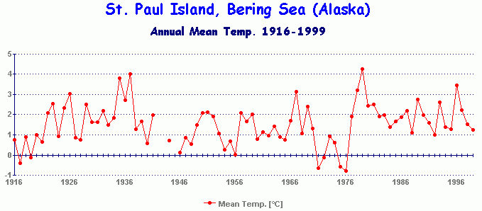
Term Lookup

Settings


All IPCC definitions taken from Climate Change 2007: The Physical Science Basis. Working Group I Contribution to the Fourth Assessment Report of the Intergovernmental Panel on Climate Change, Annex I, Glossary, pp. 941-954. Cambridge University Press.

Home Arguments Software Resources Comments The Consensus Project Translations About Support

Bluesky Facebook LinkedIn Mastodon MeWe

Twitter YouTube RSS Posts RSS Comments Email Subscribe


Climate's changed before
It's the sun
It's not bad
There is no consensus
It's cooling
Models are unreliable
Temp record is unreliable
Animals and plants can adapt
It hasn't warmed since 1998
Antarctica is gaining ice
View All Arguments...


Username
Password
New? Register here
Forgot your password?

Latest Posts

Archives

On the Question of Diminishing Arctic Ice Extent

Posted on 1 June 2010 by muoncounter

Guest post by muoncounter

How there can still be honest disagreement over whether a large body of ice is shrinking or increasing in areal extent over the long term is really quite remarkable.  Since the  reports don’t seem sufficiently convincing, let’s look at the question analytically. In the NOAA’s October, 2009 update to the Sea Ice Cover section of the “Arctic Report Card,” Figure S2 (reproduced below) shows the percentage change in the annual minimum (September) and maximum (March).

This graph is presented as percentage difference in ice extent (area in millions of sq km), relative to the mean for the period (1979-2009).  Both the maximum and minimum are shown with a linear fit; by the slopes of these lines, we see that the sea ice minimum is decreasing faster than the sea ice maximum.  Hence we expect the discrepancy between min and max to increase.

This change in areal extent is accompanied by a systematic change in ice thickness, resulting in an overall decrease in ice volume, as demonstrated in NOAA’s Figure S4 below.

The text accompanying this figure draws a distinction between “multi-year” ice and “first-year” ice, noting that it is the multi-year ice that is thinning.  NOAA’s conclusion is self-evident:  “These changes have resulted in seasonal ice becoming the dominant Arctic sea ice type, both in terms of area coverage and of volume” (Sea Ice Cover, cited above).

These data warrant a closer look.   Additional Arctic sea ice data was merged with the 1979-2009 data used above, allowing a more robust reconstruction of the ice extent, as shown in the graph below.
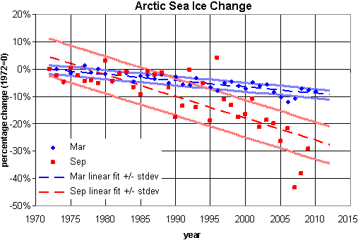
In this graph, areal extent is converted to percentage change from the starting value (areal extent in 1972).  Note that the September minimum ice extent (red) has a steeper slope than the March ice extent maximum (blue).  Each is shown with bands at +/- 1 standard deviation.

Aside from the noisy September data, there are two problems with this graph: 

  1. The two trendlines cross in 1980 (suggesting rather nonsensically that in years prior, the minimum ice extent was greater than the maximum).
  2. The two trends do not statistically clear one another (to one standard deviation) until 1995, more than halfway into the time series.

I suggest that presenting these data as functions of temperature, rather than time, may resolve these problems.

For temperature data, winter sea surface temperature (SST) anomalies recorded at the Pribiloff Islands were smoothed (using a 15 year moving average), producing the graph shown below.  This dataset ends in 2008.
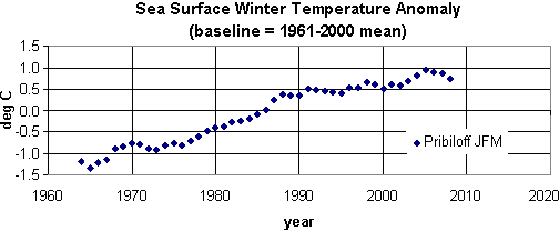
Note:  Additional Arctic summer time series data are available, but those were not analyzed here.  I’ll save that for another day.

In the following plots, the sea ice minima and maxima for the periods of 1972-2008 are shown as functions of this SST anomaly.  In each case, the functional fits, with bands at +/- 1 standard deviation, are clearly nonlinear.
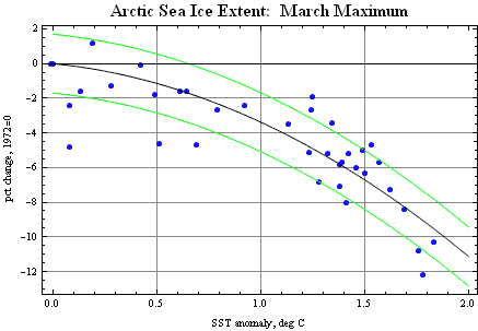
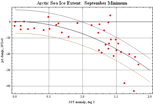
With y representing the percentage change in ice extent and x representing the SST, the function used were:
March maximum, y = -1.196 – 2.186 x2 ;
September minimum, y = 0.253 – 7.620 x2.

Using the 2008 value of the SST in this time series (1.62 deg C), the derivative of these functions provides rates of change in % per degree:
September minimum -0.247 (-24.7% / degree);
March maximum -8.3% / degree. 

Thus not only do we expect the annual loss of sea ice to accelerate, we expect the discrepancy between sea ice minimum and sea ice maximum to continue increasing – at least until the sea ice minimum reaches zero.  Further, because these temperature data are from the winter months, it may be reasonable to conclude that even a few cold winters just aren’t enough to compensate for the overall warming-induced ice loss.

0 0

Printable Version  |  Link to this page

Comments

1  2  Next

Comments 1 to 50 out of 87:

  1. "The two trendlines cross in 1980 (suggesting rather nonsensically that in years prior, the minimum ice extent was greater than the maximum)." Actually, no. Both of the curves are percent change from the 1970 values, so it just means that before 1980, the September data were, on average, a bit higher than Sep 1970, while the March data were a bit lower than March 1970. If you converted your two percentages back to actual extent, I'm sure you would find that Sep extent was always lower than Mar extent. The comparison of extent to winter SST anomaly is quite interesting, even though I am not sure how well the Pribilofs (southern Bering Sea) is a good proxy for the Arctic Ocean. I'm guessing it is the closest measurement you could find? Have you also tried air temperature at some of the Arctic weather stations? The obvious question is whether the extent vs. SST fits are more or less noisy than the extent vs. time plots. I can't tell because the scales are not the same. My eyeball says they are similar based on looking at the 1-sigma bounds, but it would be good to run the numbers.
    0 0
  2. Thanks for the overview. This all-season Arctic Sea Ice Volume graph (updated on a weekly basis) is also very compelling: Arctic Sea Ice Volume. Anomaly at an all-time low, and dropping at an increasing speed.
    0 0
  3. Arctic sea ice: the Albino Canary in our global coal (and oil) mine.
    0 0
  4. "we expect the annual loss of sea ice to accelerate" -- maybe, but not based on the data. A statistical model like this isn't supposed to be projected into the future. A mechanistic model would allow you to do it. Moreover, it's quite possible that the decline in March maximum might start catching up to the decline in Sept minimum before the Sept minimum reaches zero.
    0 0
  5. muoncounter, This page (from your link) shows some quite different temperature records for the Arctic. One ocean temperature in the Bering Sea Another (St Paul's Island) which is mentioned in the text on the NOAA page. Why go with the one's you have choosen? Secondly I've started to think that there is a regional aspect to the Arctic. What happens in the east isn't necessarily mirrored around Greenland. It seem possible to have a potitive ice anomaly in the east and negative in the west at the same time. It seems unlikely that one temp record in the Bering Sea is going to give insight into the whole Arctic ice extent.
    0 0
  6. Here is a longer St Paul's Island record upto 2000. From here
    0 0
  7. HR: I've started to think that there is a regional aspect to the Arctic. What happens in the east isn't necessarily mirrored around Greenland. It seem possible to have a potitive ice anomaly in the east and negative in the west at the same time. Exactly, which is why the professionals producing measurements don't make an elementary mistake of that kind when summarizing the total ice extent. They report total extent, they don't look at a region and extrapolate from that. By way of analogy, you may move money from your checking account to your savings account and vice versa, but if you are spending more than you are saving your total available funds will diminish. It seems unlikely that one temp record in the Bering Sea is going to give insight into the whole Arctic ice extent. But of course we have Arctic ice extent to give insight into Arctic ice extent.
    0 0
  8. Interesting clip of the experience of one researcher in the Beaufort Sea. Doctor David Barber
    0 0
  9. A few points regarding muoncounter’s analysis: Firstly, some readers might not realise that ice extent is different to ice area. This is explained on the NSIDC FAQ page. Basically, area is a measurement of exactly what area of ocean is covered with ice, while extent measurements count the area of every grid cell that is 15% covered by ice. Secondly (as I see Jeff Freymueller has already pointed out), the fact that, in the graph titled “Arctic Sea Ice Change”, the two trendlines cross, does not suggest that before 1980 the minimum extent was greater than the maximum. The September trend is relative to the initial September extent, the March trend is relative to the initial March extent, and the March extent is naturally a lot higher. Thirdly, I agree with Jeff Freymueller and HumanityRules that picking one temperature series from a bunch of islands in the Bering Sea seems a bit arbitrary. However, I’m not sure that HR’s graphs are any better. Fourthly, in Figure S2 the mean is actually 1979-2000, not 1979-2009.
    0 0
  10. I'm no expert, but I'd also noticed some of these issues (as outlined in the above comments). Perhaps a revision might be in order?
    0 0
  11. #5-HR: The question after your second graph (''Why go with the one's you have choosen?'') has a possible answer as follows: If you have data from two islands, and data from one supports the point you are making, whereas data from the other seems to disprove it - then you pick the data that agrees with your theory, and discard the other. Chances are most of your readers won't bother to look for other islands. Many debaters of climate seem to reason along those principles (on both sides). Another example of selective analysis: The first graph that you showed (Ocean temperatures in the Bering Sea at M2) has an interesting comment on the page where it is originally published: the NOAA author draws the conclusion that ''Ocean temperatures for the previous decade ... show a shift toward warmer temperature of 2 deg C around 2000''. When I look at the graph, I could just as easily get the idea that ocean temperatures for the previous decade show a dramatic shift toward *colder* temperatures after 2004.
    0 0
  12. HumanityRules at 16:27 PM on 1 June, 2010 and of course Muoncounter! Thought you might be interested in some more Pan-Arctic Ice extent correlations with temperature, which I’ve been looking at for an Arctic post: SST and summer ice extent: some of the SST grid reconstructions can be biased as they set grid cells to -1.8 degrees where the ice is, so you have to use an ice area mask, or avoid areas where there is ice (I think?). I believe other work on Polar Pathfinder satellite SST data (good “dense” spatial coverage) is ongoing. This chart uses the ICOADS series which is based on raw on-site measurements: I can’t say exactly where the measurements are taken as yet, but there are enough of them in recent decades to be moderately convincing. Maybe someone with more expertise can comment. The choice of scale is arbitrary but the correlation is high. Other reconstructed (ERSSTv3, HadISST etc) series also display this correlation if you select ice free grid cells. You could also correlate HadISST ice and SST all the way back to 1870 with lots of caveats and caution. It would be interesting to look at Atlantic side and Pacific side separately, but I haven’t found time for a complete comparison. Air temperature: This uses the same DMI 2m air temperature series that has been used on some blog sites to imply no significant temperature trends in Arctic. I've shown the seasonal values as well as min/max trends and zoomed in I averaged the seasonal temp data over 80 days to phase match the “peaks” with ice extent. I also extended the ice extent data using HadISST and NSIDC ESMR data, though extent uncertainty pre 1978 and then pre 1972 is higher. The correlation of fitted second order curves is remarkable, but slightly down to chance and selection of start/stop dates, other reconstructed temp series (NCEP, ERA-40) still show high correlation, as has been noted in various papers. The summer air temp runs just above melting point, but if you average this over a few preceding months the correlation with Summer ice extent is also reasonable. In short, air temperature, SST and ice extent appear coupled together seasonally and regionally, which is kind of what you’d expect. As to why it’s warming overall… I will post links to data if I get time and people are interested.
    0 0
  13. Thanks for the feedback. #1: "If you converted your two percentages back to actual extent, I'm sure you would find that Sep extent was always lower than Mar extent." Good point, I'll check. #4: annual loss of sea ice to accelerate "maybe, but not based on the data. A statistical model like this isn't supposed to be projected into the future. ... Moreover, it's quite possible that the decline in March maximum might start catching up to the decline in Sept minimum" Doesn't 'decline in March' catching up with 'decline in Sept' require acceleration? As for the crystal ball of statistics, these data end in 2008; Sept 2010 isn't that far off. #9 and #11: "picking one temperature series from a bunch of islands in the Bering Sea seems a bit arbitrary." ... " example of selective analysis" Oddly enough, I originally plotted the pct ice change against a trend extracted from the land ocean temp index for latitude 64N-90N that I found here. That graph shows up in a comment on a prior article here. But I thought that was painting with too broad a brush. #11:"get the idea that ocean temperatures for the previous decade show a dramatic shift toward *colder* temperatures after 2004." I read somewhere that 'climate' requires a much larger time frame than 2004 forward. Some folks use 30 year statistics? From the temperature data (some going back to the 1890s) I've looked at, a 15 year trailing average is a great way to extract an underlying trend. There are outliers that are both above and below the trends on the September min ice graph. #12: The long-term trends on the graph posted by Peter Hogarth also speak to increasing rates of ice loss.
    0 0
  14. It seems that in a recent article on this website that 2007 stands outside the 'normal' downward trend due to climate change. Don't you run the risk of this anomalous year contaminating your analysis. I guess what I'm asking is what would the conclusion be if you ended the analysis in 2006?
    0 0
  15. #13 : muoncounter prefers to be ironic and make fun of my remark concerning the ocean temperatures graph. My point was certainly not that you can draw any conclusions about the climate from just 5 years of data. Yet the NOAA author sees (in the graph) a prominent shift toward warmer temperature from about 2000 to about 2004, but fails to see (in the same graph) an even sharper shift toward colder temperature in the following 5 year period. You see what you want to see. Looking at the whole graph, from year 1995 to 2005, we see that there is absolutely no change in 'Depth averaged temperature' at at the Mooring 2 location in the Bering sea. That is good, but 20 years of weather is still not climate.
    0 0
  16. Or rather, 14 years, not 20. And from 1995 to 2009, not 2005. Sorry!
    0 0
  17. Something which appears to have been overlooked so far regarding the first graph which shows the sea ice minimum as decreasing faster than the sea ice maximum, and the expectation of the discrepancy between minimum and maximum to increase, is that for the gap to widen, the recovery rate, that is the amount of new ice each year, has to increase. Just to illustrate, the mean area for March ice for the period 1979-2009 is 15.8 million sq km, and the September mean is 6.7. This gives a mean recovery of 9.1 million sq km. The September 08 ice was 4.5, the March 09 ice 15.2, giving a recovery of 10.7. Hence, for the expectation that the discrepancy between the trends of min and max to increase to be fulfilled, the recovery rate of ice from the September lows to the March highs will also have to increase.
    0 0
  18. johnd - The recovery for extent is mostly bounded by land mass, and mostly occurs in an area where there is little or no sunlight in the winter. So I don't see a problem with the recovery of extent filling the Arctic ocean area each winter, even as the ice thins and mostly melts in summers. Even this last winter, extent recovered quite well for a short period. So it may be a number of years before winter maximum extent falls as quickly as the summer minimum extent. But it looks like it is heading in that direction to me.
    0 0
  19. johnd @#17 I believe the difference you're noting relates to the formation of annual ice during the Arctic winter, versus the summer melting of this (thin) ice, plus the older thicker ice during Arctic summer. There will likely always be a thin layer of winter ice in the Arctic (unless warming becomes really extreme), but we appear to be moving toward a time in the not-too-distant future when the Arctic will be ice-free in the summer. (Time for Superman to seek a Fortress of Solitude in the Amazon rainforest.... Oops... May soon be too late for that as well.)
    0 0
    Response: Wasn't the fortress of solitude at the south pole? :-)
  20. Well, the difference between Navy data and the rest is still not explained. My confidence in PIPS 2.0 is raised by this figure: There is a reasonable match between IJIS (IARC-JAXA Information System) sea ice curves and US Navy PIPS (Polar Ice Prediction System) data for the period IJIS has some as well. However, prior to 2003 PIPS differs from anyone else. On top of that the sea ice volume story told by PIPS is absolutely inconsistent with the current scare. Looks like PIPS end-of-May sea ice volume is a pretty good predictor for their minimum ice volume in September. If we go with this observation, PIPS sea ice volume must exceed their figures for 1998-2000 in September, this year. I try to pull March maps from PIPS to make comparison easier.
    0 0
  21. Some things to note: John, you're right. While winter extent is declining, that decline is slower than summer decline, and we are indeed seeing record extent increases in fall. That trend is likely to continue until summer extent basically hits zero. Then the extent increases will fall slowly as winter ice extent falls slowly. There will be winter ice for centuries unless we really screw up. Re SST vs ice extent. There is good (though not excellent) correlation between North Atlantic spring SST and summer ice extent. Sea current flow volumes between the Arctic and the Atlantic utterly dwarf those between the Arctic and the Pacific. A large factor in summer melt is ice export through the Fram Strait by the trans-arctic drift. When the drift is strong, the ice flows down the Greenland current to melt near Iceland where the water is warmer. As for whether to expect acceleration of the decrease in summer extent ... it depends what you think is more important and likely to come into play. If you believe the PIOMAS model will continue with the current linear trend, extent loss has to accelerate because volume will be zero by 2030. If on the other hand you think average summer latitude of the icepack boundary is linearly correlated with temperature anomaly, then the extent decline will decelerate. What physically happens depends on whether the ocean currents continue basically as they are, or change in response to overall warming.
    0 0
  22. Berényi Péter at 05:04 AM on 2 June, 2010 PIPS is a forecasting system, fed with SSMI data for predictions of extent, so difficult to figure why any discrepancy in area looking back in time. I agree March values would be better! "the Ice Concentration page has an archive comparing previous PIPS 2.0 forecasts with actual conditions plotted from SSM/I data" Note they regard SSMI as actual data. Out of interest, where does the PIPS system have numerical files of area, thickness or volume? I can only find polar plots?
    0 0
  23. Argus #15: Sorry, I didn't mean anything offensive, ironic or otherwise. John Cook: "fortress of solitude at the south pole?" Ha! Like everything else, there's disagreement on that. However, traditionalists go with the Action Comics June, 1958 original location: in the Arctic. #21: "Re SST vs ice extent. There is good (though not excellent) correlation between North Atlantic spring SST and summer ice extent." Now that's interesting: I've been looking at annual temperature averages; will go back at look at seasonals. "When the drift is strong, the ice flows down the Greenland current to melt near Iceland where the water is warmer." I assume that the Gulf Stream has a hand in that. The Gulf of Mexico and related tropics are unusually warm (and oily) this year. Is there any correlation between seasonal ice melt and temperature in those waters? "As for whether to expect acceleration of the decrease in summer extent ... it depends" Based on Hogarth's sea ice minimum graph, acceleration is not to be expected, its already happening.
    0 0
  24. Er, I'm not sure those PIPS graphs show anything important. Certainly the last one shows that PIPS in May is well correlated with PIPS in Sept - not too surprising. Plus, I don't think PIPS for extent is really a predictive model in the way we think of that term. I think it gets ongoing corrections from reality. If so, it's hardly surprising if it matches IJIS well. Yes, from an official description of PIPS
    Forecasts of ice conditions are produced by numer- ical ice-ocean models that use these observations to help specify an “initial” state and then run forward in time. The length of the ice forecasts depends on the atmospheric forcing that drives the model. Usually, the forcing is derived from an atmospheric forecast model, and extends about seven days into the future. Longer forecasts (to 30 days) are sometimes generated using persistent atmospheric conditions.
    So if you get to make extent predictions 7 days out, continually updating with new real data, of course you do pretty well.
    0 0
  25. #22 Peter Hogarth at 07:15 AM on 2 June, 2010 where does the PIPS system have numerical files of area, thickness or volume? I could not find any either. Just took plots and reverse engineered data from color codes with a quick-and-dirty perl script using Image::Magick. If they have got ice right, it would explain a lot about the scary downward trend seen in NOAA Arctic Report Card 2009. Divergence before 2003 is remarkable. It's unkikely PIPS 2.0 24 hour forecast have missed September ice by 1 million km2 in 1999. After all it is used for operational purposes.
    0 0
  26. I'm not an ocean current expert (someone go get Bob Grumbine :) ) but my understanding is that all the warm currents of the North Atlantic are fed by the Gulf Stream, so the temperature down by Cuba etc., and the speed of the Stream are factors in play. The Stream feeds at least three warm currents, one up the west side of Greenland, one aimed at Reykjavik, and what I think is the largest is just the continuation of the main stream direction north of Scandinavia. That last area is where the biggest negative ice anomaly is right now.
    0 0
  27. Pips is not principally intended for discussing trends since it is a forecasting system. They would't really care about consistency between older and newer data. I don't know if NOAH uses a reanalysis (reexamination of old data with newer methods) as PIOMAs does? A reanalysis would make no sense for forecasting, so PIPS would certainly not do this. Could those difference explain the discrepancies between PIPS and NOAH before 2003?
    0 0
  28. A recent study by Norwegian researchers as part of the Norwegian Component of the Ecosystem Studies of Sub-Arctic Seas (NESSAS) project, has found wind patterns contributing to the Arctic sea ice loss and help explain the recent steep loss. http://www.sciencedaily.com/releases/2010/04/100427111449.htm Interestingly fishing vessels in the Bering Sea have in recent seasons experienced pack ice pushing further south than normal and at times finding ports in the Aleutian Islands being blockaded by such ice.
    0 0
  29. #27 Marcel Bökstedt at 08:41 AM on 2 June, 2010 They would't really care about consistency between older and newer data Of course. But they do care about consistency between data and reality. Captains tend to get annoyed by running into one million km2 of ice missing from the map.
    0 0
  30. Hot link to johnd's article: Winds from Siberia Reduce Arctic Sea Ice Cover, Norwegian Researchers Find Conclusion of article, in concert w/recent emphasis on volume as opposed to area: However, [Dr. Sorteberg] emphasizes that he and his colleagues do not reject the assertion that climate change is affecting Arctic ice cover or that the IPCC is wrong when it states that the Arctic may be nearly ice free in summer towards the end of this century. "There is no doubt that the Arctic sea ice has become thinner in recent years. The thickness of the sea ice is a much better indicator than the extent of the ice cover if we want to study how climate change may affect the ice in the Arctic," says Mr Sorteberg.
    0 0
  31. #29 Berényi Péter, given that PIPS is a forecasting system (see #24), these plots are NOT DATA. I'm not sure why you seem to be interpreting the older forecasts as if they were data. Perhaps the reason that the PIPS forecasts track IJIS so well after 2003 is that the forecasts may have been initialized based on the same data that IJIS used? If the PIPS forecasts were not so accurate prior to 2003, that was a concern for the Navy at the time, but it doesn't matter now. (The captains will be happier now than they used to be).
    0 0
  32. The way I understand this, the PIPS system directly uses passive microwave satellite data, as discussed here. Then they run some algorithm to check if the ice is growing or shrinking. So the actual data on ice extent trends which powers PIPS is from the SSM/I satellite data. The PIPS forecast can't be better than those (but it could be worse). However, these data are subject to really great uncertainty, as explained the section of error sources here. I think it would be unwise if anyone seriously used the PIS maps directly to estimate ice trends, at the very least that would require a lengthy discussion of the possible error.
    0 0
  33. Lot of that PIPS going around. Berényi, I'm surprised, usually you don't go in for fads of this kind.
    0 0
  34. Humanity Rules If I'm not mistaken, St. Paul IS in the Pribiloff islands.
    0 0
  35. doug, i already noticed in a comment in the other post that more than ice extention it is critical thinking that is falling below the absolute low in human history. Indeed Goddard knows very well that his pixel counting technique is bogus, given the full retraction he was forced to make not so long ago (scroll down here to editor's note). Neverthless he used it again and some people followed suit, blindly I'd say. (Thanks to Phil Clarke in a comment here for reminding us).
    0 0
  36. #31 Jeff Freymueller at 10:54 AM on 2 June, 2010 these plots are NOT DATA. I'm not sure why you seem to be interpreting the older forecasts as if they were data They are not data, agreed. But these are 24 hour forecasts and for immediate physical reasons neither sea ice extent nor volume can change much in a day. Therefore the numbers depend on the realtime data assimilation procedure used and the very quality of data assimilated. If this system was faulty before 2003, gradually fixed from 1998 on, it would explain the divergence. However, at least some hint of a documentation is needed for this kind of reasoning to be satisfactory.
    0 0
  37. Riccardo, that note at the Register is quite remarkable, not the least for me because it was mostly Steven Goddard's thoughtless accusations of fraud and the like at "El Reg" that shifted me into prattling at RealClimate and (later) here. I'm married to a scientist, my dad was a scientist, many of my friends are as well. They all have in common regardless of other faults (my wife of course is faultless) a strongly inculcated attachment to following facts wherever they may lead, stacking bricks of information no matter the shape of building emerging from that work, indeed that appears largely the entire fascination of the process. Putting together a jigsaw puzzle is no fun if you trim the pieces to fit with scissors. Goddard's infamous articles at The Register irritated me in large part because of his strange belief that scientists are inclined to shape their work around ideology or some other distorting influence. I never knew Goddard and The Register published that retraction. For what it's worth, I corresponded with Goddard at the time and I actually concluded he was sincere in his odd way, not that it excused his departures into unfounded accusations. Perhaps he learned his lesson; I've largely avoided reading what he writes these days so I wouldn't know. Anyway thanks again for pointing out the retraction, it leaves me feeling as though The Register has some shred of integrity, nice because I'm fond of their over-the-top headlines and ledes.
    0 0
  38. Berenyi Peter> I agree, a forecast for tomorrow is probably not completely off from data for today. But this is a rather clumsy way to get at todays values. According to the NSIDC page I linked to before, they are continuously improving the quality of the microwave data. That could possibly account for the "gradual fix" you mention. But there are still huge error terms. I feel that there is so much uncertainty about these data, that the burden of documentation is on whoever wants to use them.
    0 0
  39. #36, I agree that my speculation about PIPS is speculation. But I'd say it is on you to demonstrate that the older part of the time series of PIPS forecasts tells us anything about anything other than the performance of their forecasts at that time.
    0 0
  40. Okay, I'm coming late to this thread, but it sounds like some people are downloading the PIPS output images and counting pixels to characterize changes in sea ice. What map projection are the PIPS output images in? It looks like polar stereographic to me. That projection doesn't preserve equal area, so you cannot simply use a count of pixels to determine ice-covered area. Pixels will have different areas depending on their proximity to the pole.
    0 0
  41. #40 Ned at 02:00 AM on 4 June, 2010 you cannot simply use a count of pixels to determine ice-covered area Do you want me to recalculate with multiplying pixel area by cos(45°-lat/2)? Inside 70N it does not make much difference.
    0 0
  42. Berényi Péter, there are several type of stereographic projections. Before doing any calculations you should know which one is used in that figure.
    0 0
  43. Maybe I missed something. Do we actually know what projection is used for those maps? It doesn't seem to say anything on the website. I was just speculating about polar stereographic, but it could be any azimuthal projection (orthographic, Lambert, ...?) The scale variation would depend on the specific projection parameters. More broadly, what metadata are available describing these data? Have the model results been validated, and if so, what is the structure of the error? I find it a bit disconcerting that the entire community of "skeptics" (here, at WUWT, etc.) seems to have suddenly latched onto this PIPS2 model with little to no examination of its suitability for the purposes to which they are enlisting it. Or perhaps I've missed something, and all these questions have been satisfactorily answered already.
    0 0
  44. Ned at 02:00 AM on 4 June, 2010, Walt Meier, research scientist at the NSIDC made the following statement is a response to an issue where Steve Goddard wrongly calculated an increase in ice extent due to a problem with the images used. Walt Meier" "The proper way to calculate a comparison of ice coverage is by actually weighting the pixels by their based on the map projection, which is exactly what NSIDC does." This is taken from the article at http://www.theregister.co.uk/2008/08/15/goddard_arctic_ice_mystery/ Clearly NSIDC also use pixel counting. If you think about, if weighting was not given to the pixels, any error would cause an UNDER estimation, not an OVER estimation.
    0 0
  45. johnd, "any error would cause an UNDER estimation, not an OVER estimation." not true, it depends on the projection. For example, you may have a projection that makes the area calculated at, say, 70° correct with opposite bias on the two sides. There's no way to come to any meaningful conclusion without knowing which projection has been used.
    0 0
  46. Riccardo at 07:32 AM on 5 June, 2010, I think the same principle still applies. The area represented by a pixel will still be larger as the distance from the focal point increases.
    0 0
  47. johnd, yes, but depending on where you put your zero and on the area sampled you may under or over estimate the total area and hence average ice thickness.
    0 0
  48. johnd writes: "Clearly NSIDC also use pixel counting. If you think about, if weighting was not given to the pixels, any error would cause an UNDER estimation, not an OVER estimation. " John, I work with projections of gridded geographic data every day. The problem here isn't with "counting pixels", it's with a failure to understand the scale variation associated with non-equal-area map projections. Apparently Steve Goddard made this mistake at WUWT, Berényi Péter makes it here, and no doubt lots of other people are doing the same thing elsewhere. Different projections will have different patterns of scale variation. I'm guessing that the PIPS2 images people have been grabbing are in a polar stereographic projection with the planar surface tangent to the earth at 90 north. But it could be secant ... or an orthographic projection rather than stereographic ... or something else entirely. This is why it's essential to have metadata describing the characteristics of the data you're working with. Maybe there are metadata for these images somewhere, though I haven't seen them. But unless you have the specific projection parameters used to create the images, you cannot simply count the pixels on date 1 and date 2 and draw any conclusion about whether ice area increased, decreased, or stayed the same.
    0 0
  49. Ned at 12:23 PM on 5 June, 2010, as I understand it the Goddard problem come about due to the older image used not representing the total ice extent. The reasons are not explained but apparently the data that created the image was sourced from NSIDC. I think all that was explained in the link I provided earlier, including the actual images in question. When the corrected image was processed by Goddard, his result was a close match for the NSIDC results even if there is some question over whether or not he gave the correct weighting to the pixels.
    0 0
  50. Looking for information on the PIPS forecasting system, I found an interesting albeit somewhat dated review paper, which took issue with some aspects of PIPS: “it was found that PIPS correctly made 24-h forecasts of decreasing sea ice concentration 10%–15% of the time (it also correctly forecast increasing sea ice concentration an additional 10%–15% of the time). However, PIPS correctly forecast melt-out conditions <5% of the time.” Presumably later versions of PIPS addressed those concerns? I also stumbled across a very smug group of denialists actually placing bets on monthly sea ice extent. Digression: I happened to be watching images of brown pelicans getting much browner at the time and wondered whether these same folks would bet on bird deaths or when oil reaches Pensacola, etc. And what was the arbiter of who wins these ice bets? The JAXA data, referenced above. Their publicly available ice extent data goes all the way back to June, 2002. Here is a graph, comparing JAXA to the data I originally used from NSIDC, showing the two are in exceedingly good agreement. Those last two years sure do look like a significant uptick. However, when you look at even a slightly longer term, the uptick pales beside the downtrend. And the trend of Sept minima is still accelerating downwards. So while the denialists wager (and Rome burns, err - the ice melts), we fret over pixel-counting. Yes, data quality control is indeed of the utmost importance. But we can't lose track of the point, as someone asked a few days ago, of the discussion. Because that's how we lose the argument.
    0 0

1  2  Next

You need to be logged in to post a comment. Login via the left margin or if you're new, register here.


The Consensus Project Website

THE ESCALATOR

(free to republish)


© Copyright 2024 John Cook
Home | Translations | About Us | Privacy | Contact Us