


 Arguments


The power of pie-charts to communicate consensus
Posted on 10 July 2014 by John Cook
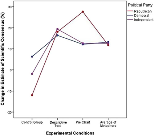
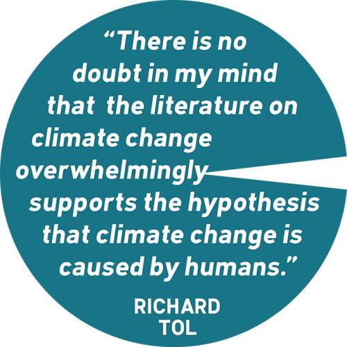
Yale University and George Mason University are conducting some of the pioneering research into the efficacy of consensus messaging. Their latest study in Climatic Change tested the effect of three different ways to communicate the scientific consensus: a simple text message, a pie-chart and metaphors (e.g., likening the 97% consensus on climate change to a 97% consensus among doctors). They found that the most effective messages in increasing awareness of consensus were the simple text message and pie-chart. The most interesting result was that pie-charts were most effective on Republicans:
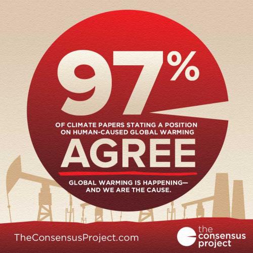
 Pie-charts get a bad rap among science communicators (and often not without reason), but in this particular instance, the pie-chart is quite effective in communicating the overwhelming agreement among climate scientists. When SJI Associates designed The Consensus Project website, they used the 97% pie-chart as the website logo. It seems they knew what they were doing (I also like the visual double-entendre of the pie-chart forming a C). They used the same imagery in the shareable infographics communicating the results of our 97% consensus paper:
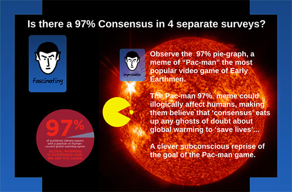
Climate deniers also understand the effectiveness of pie-charts in communicating the scientific consensus on human-caused global warming. Coincidentally, a slideshow by a climate denier group was released just days before the Yale/GMU study, attacking the use of pie-charts to communicate the consensus:
This denier pre-emption of social science research echoes Frank Luntz' infamous 2002 memo advising Republicans to attack the scientific consensus on climate change in order to erode public support for climate policies - long before social scientists began researching the link between perception of consensus and support for climate action.
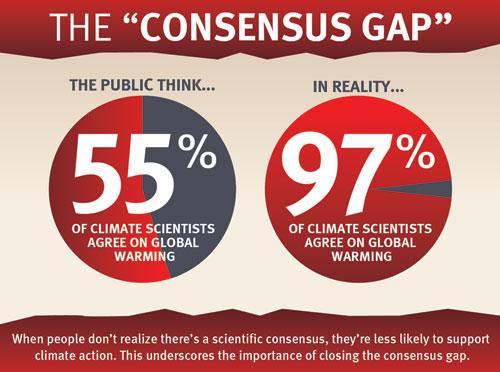
The take-home from this latest research is that simple and/or visual messages are effective in closing the consensus gap, which is one of the more important steps required to achieve climate action. Or as Chris Mooney puts it, "You keep it simple, and you show pretty pictures." This is why we offer a rich resource of simple visuals communicating the scientific consensus that are freely available for republishing. There are several variation on the pie-chart including this latest addition:


Edward Tufte in The Visual Display of Quantitative Information (p.178):
The effectiveness of these pie charts comes their big, red (or blue) in-your-face, single number or statement, almost like shouting it out loud.
The two side-by-side pass muster because they are of equal size. Whoever created the denier slide never read Tufte, who warns against asking a viewer to compare pies of different sizes. And who stuck the sun in there, and what does it mean?
The moral is when you use pie charts, use 'em mostly one at a time and Keep It Simple Stupid (KISS).
I forget to add: Good post, and thanks for the reminder about simple, direct visuals.
You can see the difference between professional and amateur communication in the graphics created for the Consensus Project website/sharing (clean, uncluttered, easy to read, simple language and message) compared to the hash of a slide created by the climate denier group (cluttered, sizing and backgrounds make it difficult to read, white text on black background!, complex language and message).
And that's before we get to the scurillous attempt to equate The Consensus Project with Pac-Man (my reaction, if you'll pardon the Internet slang, was definitely "lolwut") and the questionable vocabulary (I mean, "Early Earthmen"? What is this, Invasion of the Saucer-Men?).
I suppose that it really does show up the difference between attempting to properly communicate the science to the public, and attempting to obfuscate the science.
When looking at more than two options, a bar chart is better than a pie chart. But if you only have two options, a pie chart makes it quite plain who is 'winning' (the 'pac man' metaphor is apt here). A line chart is most useful if the x-axis represents the quantity of a single presumed causal factor (boundary condition). But if, in a line chart, the x-axis does NOT represent such, but instead represents several competing causal factors, then a line chart is the worst way to present that information (a bar chart is much better). Hence, the only 'crime' in this article is your first chart.
Amusing that the Republicans were most influenced by the pie chart. Apparently they were fuzzy on the meaning of 97% until it was shown graphically.
Pac-man was popular with "Early Earthmen"?
Yikes! Have they dropped the 'age of the Earth' from 6000 years to just 60?
CBDunkerson:
Yes, apparently only 3 centuries (the original Star Trek TV series, is, canonically, set in the 2260s) need to pass for humans of the mid-20th century to be "Early Earthmen": Paleolithic humans and previous members of genus Homo need not apply.
As explained in this piece, the graphics of the pie charts showing actual expert consensus or expert vs public consensus are great at showing these things. It seems to me though that the climate change-denier slide would be useful for its intended purpose too. To facilitate the chronic "skeptic's" avoidance of the reality of the seriousness of global warming. Although very busy, and probably needing a walkthrough by the “skeptic” presenter to get full benefit, the denier slide makes the valid point that "ghosts of doubt" will always be "in the game". And just speaking from my personal experience, I think many of the "skeptics" I know and love would place great weight on that fact. Their thinking process apparently approximates this: Ghosts of doubt = those scientists don't know everything = there could be factors they are completely unaware of = why, maybe there are huge unknowns = no need to act yet, what with the huge unknowns. In other words, they smoothly think themselves from a premise that is true (but oversimplified and without context – like most skeptic arguments themselves), to what they want to keep believing. It's a tough nut to crack but it seems a shift is hopefully underway. I appreciate SKS for their part.
Embedded in this post is an example of one of the troubling tendencies in popular climate science blogs. The graphic first indicates:
“97% of climate papers stating a position … agree ...”
Then just below that image:
“97% of climate scientists agree …”
Are these logically the same proposition? I think not. What scientist would defend such bastardization?
MThompson - Do you think there is any evidence supporting a drastically different opinion distribution for those scientists whose paper abstracts didn't mention the causes of recent climate change? Note that about the same percentages apply to the self-ratings by authors for their papers, including many whose abstracts were rated by Cook et al as neutral, indicating that the ~97% consensus carries through to all. Barring evidence to the contrary, such an objection is rather irrelevant.
Cook et al 2013 states their methods and the first assertion you quote; anyone interested in the topic can read the (open) paper themselves. Conversational shorthand descriptions (i.e., in common English) of the conclusions are just that - details get dropped, particularly when there is shared knowledge. I have seen 'skeptic' arguments along those lines, and they are just semantic quibbling.
MThompson: Other surveys producing 97% (± 1-2%) levels of agreement are surveys of scientists' opinions themselves. Indeed, Cook et al 2013 mentions Zimmerman & Doran 2009 and Anderegg et al 2010 as just such surveys.
And those surveys conclude, as Anderegg et al put it in their abstract:
In other words, your assertion that the infographics shown are "troubling" is shown to be incorrect: they both relate substantiated conclusions from the published literature.
@MThompson: The literature supports both claims. Doran & Zimmerman find, by direct poll, that 97% of the scientists who are most expert in climate science support the theory.
Now, bloggers and others (including both Obama and John Kerry) do go wrong when they say "97% of scientists agree." That is not true. The percentage is very high (e.g., 82% of Earth scientists, according to the D&Z survey), but it's not 97%.
The most accurate phrase is probably something like "97% of climate science experts."
Thanks for the other parries, but it is chrisd3 that exhibits integrity that builds solid science. We must not allow inaccurate renditions of key propositions to go unchallenged. Are we not rebutting global warming misinformation herein?
I hold the work of Cook et al. in higher esteem than published surveys of related propositions precisely because it is an analysis of data (i.e. published abstracts) rather than the shifting sands of surveys. Yes, such overwhelming consensus is notable, and whether it is 97 percent or 99.9 percent is unimportant. It is elimination of the all-important qualifiers on the proposition that justifiably incites our critics. A survey of scientists would likely provide a very high consensus that “Gravity is an attractive force between massive bodies.” Restrict that survey to physicists and there should be found strong disagreement.