


 Arguments


Climate Cherry Pickers: Falling sea levels in 2010
Posted on 3 October 2010 by John Cook
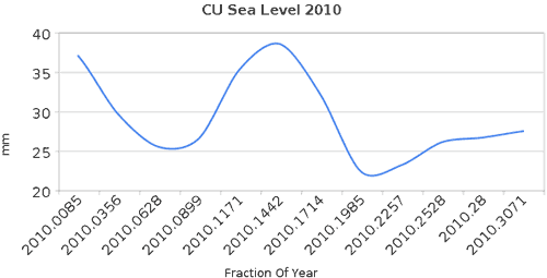
A proper understanding of climate requires we consider all the data, the full body of evidence. A common rhetorical technique used to portray a skewed picture is the technique of cherry picking. This involves choosing just the select pieces of data that paint a certain picture, even if the full body of evidence gives the completely opposite result. A vivid example of this is a recent post by Steve Goddard which casts doubt on the fact that we've experienced record hot temperatures over the last year, citing falling sea levels in 2010. This is based on the following graph showing satellite measurements of sea levels over 2010:
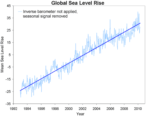
The satellite data comes from the University of Colorado - you can download the data directly. This data goes back to 1992. Here's what the full body of evidence looks like:
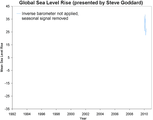
Early in 2010, global sea levels hit the highest levels on record. Realising this fact is not possible when the only data presented is the following:
Of course, there's a lot more that can be picked apart in Goddard's blog post (and readers are welcome to contribute to this process). There's no discussion of why sea levels might be dropping this year (I suspect it has something to do with the switch from El Nino conditions in early 2010 to La Nina conditions in the middle of the year). There is no exploration of what other factors besides air temperature contribute to glacier ice loss - Robert has explained the complexities of why glaciers loss mass here, here and here.
Instead all we are presented with is strong conclusions drawn from a very short piece of climate data. This is taken from a noisy signal showing many ups and downs throughout the long-term trend of sea level rise. A proper understanding of climate deserves much more than this.


 0
0  0
0 into an accelerating one, you know it as well as I do.
 As for the "scientific approach", University of Colorado at Boulder sea level data are next to useless. They lack error bars completely and the sampling interval is 9.9156 days (several samples missing). It is about one third of a synodic month, but not quite. The difference is 6230 sec (1 h 43' 50''). As the signal itself must contain strong components at multiples of lunar cycle frequency, it looks like an odd choice. The gradual phase shift makes up a full lunar cycle in about 11 years, so on timescales significantly shorter than that it can introduce false trends.
This is why Steve Goddard's four month sea level trend does not make sense, not because it is "cherry picking" (it is not, it's just some recent data).
It is actually a bit worse than that. He shows data with no inverted barometer correction. If correction is applied, there is no trend whatsoever. Of course in the long run barometric correction should not change the trend at all, because mass of atmosphere is given and there are limits to how uneven its distribution can get before strong winds restore uniformity. But this time span is not sufficiently long.
Otherwise there is nothing wrong with the idea that the ocean itself can be used as a global thermometer to check ocean temperature and heat content measurements. This is what Trenberth is trying to do, with not much success so far.
The main problems with this ocean thermometer idea is that as we have seen it is not reliable in the short term (neither its long term precision is good enough) and volumetric thermal expansion coefficient of seawater is highly dependent on both temperature and pressure while ocean mass also keeps changing.
As for the "scientific approach", University of Colorado at Boulder sea level data are next to useless. They lack error bars completely and the sampling interval is 9.9156 days (several samples missing). It is about one third of a synodic month, but not quite. The difference is 6230 sec (1 h 43' 50''). As the signal itself must contain strong components at multiples of lunar cycle frequency, it looks like an odd choice. The gradual phase shift makes up a full lunar cycle in about 11 years, so on timescales significantly shorter than that it can introduce false trends.
This is why Steve Goddard's four month sea level trend does not make sense, not because it is "cherry picking" (it is not, it's just some recent data).
It is actually a bit worse than that. He shows data with no inverted barometer correction. If correction is applied, there is no trend whatsoever. Of course in the long run barometric correction should not change the trend at all, because mass of atmosphere is given and there are limits to how uneven its distribution can get before strong winds restore uniformity. But this time span is not sufficiently long.
Otherwise there is nothing wrong with the idea that the ocean itself can be used as a global thermometer to check ocean temperature and heat content measurements. This is what Trenberth is trying to do, with not much success so far.
The main problems with this ocean thermometer idea is that as we have seen it is not reliable in the short term (neither its long term precision is good enough) and volumetric thermal expansion coefficient of seawater is highly dependent on both temperature and pressure while ocean mass also keeps changing.


Comments