


 Arguments


SkS Analogy 7 - Christmas Dinner and the Faux Pause
Posted on 25 July 2022 by Evan
This is a revised version of a previous analogy. The original version is here.
Tag Line
Saying “No warming” since the last El Nino is like
Saying “No weight gain” since the last Christmas dinner.
Elevator Statement
On Christmas eve you eat a big dinner, with lots of seconds, gravy, ooey gooey sweet potatoes with more sweet than potatoes. After the monster dinner, generous helping of pie, ice cream and lots more. You weigh yourself after the “dinner”. The next morning you find creative ways to get rid of the food you “ate” the night before, all of it (and more) ending up in the “waste” bin. You weigh yourself again, for comparison.
Hurrah, a new weight-loss technique. How to lose a couple lbs. in one delightful day. For the next month you note that you have not gained a single ounce since that gorging Christmas dinner. In fact, you’ve managed to keep your weight below the Christmas-eve measurement. Weight-loss is easy: just push your weight up momentarily to some unsustainably high weight, and then eat a more modest diet thereafter.
This tale would seem absurd, except this is exactly what educated, well-paid senators of the USA say on a regular basis. They substitute the year of a recent El-Niño for Christmas dinner, they substitute temperature for body weight, and then say “No warming in __ years”. This Zombie Myth keeps on walking, eating the brains of many, despite the fact that the long-term trend is continued warming at an alarming rate of about 0.2ºC/decade! This myth of a warming hiatus is so easily debunked, that one of the recent, well-known Climate contrarians, Pat Michaels, cautioned his viewers not to use this myth because it is so easily debunked (watch here for a video describing the warming-hiatus myth, and watch here for a segment in this video where Pat Michaels cautions his audience against repeating this myth).
Climate Science
Our bodies and the earth go through many cycles. We drink, we sweat. We eat, we burn calories. We eat a lot, we exercise a lot. Our bodies have cycles that last hours, days, weeks, months, and one of the longest cycles that lasts nine months. We have random cycles associated with illness. We know that the ups and downs of our weight due to these cycles has nothing to do with our average weight. In addition to all of these transient cycles, there may be an underlying, long-term weight gain or loss that requires long-term weight measurements to separate them from the “noise” of the other cycles.
The earth is the same, and there are many cycles that affect temperature. Daily cycles with the rising and setting of the sun, weekly cycles associated with weather, monthly cycles associated with seasons, yearly to decadal cycles associated with slowly changing ocean currents and the activity of the sun, etc. There are also random cycles that affect the temperature, such as volcanoes that periodically burp.
Some of the strongest cycles are associated with ocean currents, such as El Niño and La Niña cycles (watch here for an explanation). El Niño cycles bring warm water to the ocean surface, releasing large amounts of energy into the atmosphere, warming the air. La Niña cycles do the opposite, bringing cooler waters to the ocean surface, cooling the air. El Niño cycles can cause global average temperatures to “temporarily” spike by about 0.2ºC. When an El Niño cycle subsides, the air temperatures usually cool off by about the same amount they warmed. Typically neither the temperature increase during an El Niño cycle nor the temperature decrease after El Niño or during La Niña cycles are indicative of long-term trends, but simply represent a temporary increase or decrease of global average temperature.
The exception to this is that during extended periods between El Niño cycles ocean currents keep relatively cool water on the surface, allowing an increased amount of energy to enter the oceans. During subsequent El Niño cycles, much of the energy stored in the oceans during the cooler phases comes out, causing a sharp increase in global average temperature. El Niño cycles can therefore mark a sudden increase in temperature, but what they are doing is releasing energy from the oceans that has been stored continuously over many years. Therefore, the best way to look at long-term trends of atmospheric air temperatures is to plot data over many decades: looking at temperature data over time periods of 10 years or less can lead to erroneous conclusions, such as “global warming has stopped.” To see how this works, consider an annual plot of temperature anomalies, to show how embedded within a trend of rising temperature there are periods of apparent cooling.
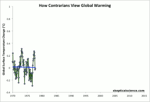
Figure 1. Down the Up-Escalator. Illustration of how a long-term warming trend can be cherry-picked to show short-term cooling trends.
The "Faux Pauses" result because of cherry picking the data. Just like weighing yourself after going to the bathroom and being concerned that you have lost weight.
Another view is to plot temperature data and to note the decadal high temperatures, as shown in Fig. 2. The circled data points represent the high temperatures within each decade (i.e., 1970-1979, 1980-1989, ...). What is interesting is that the trend line through the decadal maximum temperatures increases at the same rate as the trend line through the annual temperature anomalies. This is like recording your weight after Christmas Dinner every year, and then noting that your Post-Christmas-Dinner Weight tends to follow your true weight, but is shifted up by a few lbs. Whereas Christmas Dinners occur at the same time every year, the decadal maximum temperatures do not occur equally spaced (i.e., 10 years apart), because the random behavior of atmospheric and ocean currents, as well as solar cycles, means that the year within a decade when the maximum temperature occurs is somewhat random.
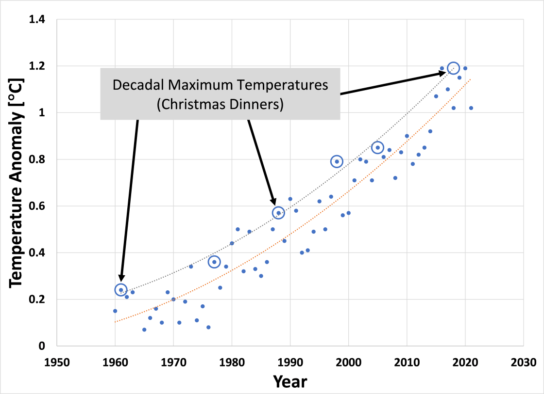
Figure 2. GISS Land-Ocean temperature anomalies (available here), showing annual temperature anomalies (solid symbols) and maximum temperature anomalies within each decade (open symbols). The point of this figure is that the warming trend shown by the decadal maximum temperatures is the same as the warming trend shown by the annual temperature anomalies.
Don't be fooled by statements like "No warming in ___ years." As long as atmospheric GHG concentrations are increasing, the Earth is warming.


Good point on the elevator graph. though it raises an interesting point coupled with the article a few weeks ago on the
https://skepticalscience.com/SkS_Analogy_04_Ocean_Time_Lag_2022.html
Good point on the elevator graph. though it raises an interesting point coupled with the article a few weeks ago on the ocean time lag and the recent knowledge gained from the research associated with the ocean time lag and how it can take 20-40 years for the warming to manifest in the atmosphere.
Total solar irradiance has increased since the late 1800's, and remains higher today than it was in the late 1800's . Granted TSI has dropped somewhat since the mid 1900 (circa 1950/1960) yet still remains higher than the early 1900's .
Scientists are just now getting a better understanding of the ocean time lag effect. It merits additional research into how much of the warming over the last few decades relates to warming from tsi and the long delay in tsi effect manifesting in the atmospheric temps
www.researchgate.net/figure/Shown-in-a-are-variations-in-the-total-solar-irradiance-arising-from-changes-in-solar_fig16_226227567
https://data.giss.nasa.gov/modelforce/solar.irradiance/
www.e-education.psu.edu/earth103/node/1004
data.giss.nasa.gov/modelforce/solar.irradiance/
David-acct @2
Changes in solar irradiance produce a much smaller warming effect than the anthropogenic greenhouse effect, so any solar heat energy thus sequestered in the oceans and later released, isn't going to be hugely significant. As follows:
"The Sun's overall brightness varies on timescales from minutes to millennia, and these changes are detectable in the global temperature record."
"During strong solar cycles, the Sun's total average brightness varies by up to 1 Watt per square meter; this variation affects global average temperature by 0.1 degrees Celsius or less. "
"Changes in the Sun's overall brightness since the pre-industrial period have been minimal, likely contributing no more than 0.01 degrees Celsius to the roughly 1 degree of warming that's occurred over the Industrial period."
"Projected warming due to increasing greenhouse gas levels in the coming decades will overpower even a very strong Grand Solar Minimum."
"Rising amounts of atmospheric carbon dioxide have postponed the next Milankovitch-driven ice age by at least tens of thousands of years."
www.climate.gov/news-features/understanding-climate/climate-change-incoming-sunlight
Let us not forget that when we look at the graphs for global average surface temperature of the Earth vs. time, we are in some sense looking at the wrong graph if we want to know if the world is warming up. The fact that more than 90 % of the heat energy that the Earth accrues do the climate forcing supplied by greenhouse gases means that the lower atmosphere is much more subject to fluctuations in average temperature than than the ocean.
David-acct@2, as nigelj pointed out, the variation due to solar fluctuations is small. We are currently warming about 0.2C/decade. I think it is difficult for most people to realize just how rapid that really is. Nature gave us cycles which, for the most part, slowly vary, such as TSI. The anthropogenic warming is currently swamping all other natural warming/cooling cycles.
plicoin24:
Air temperatures are strongly linked to ocean temperatures, so although they are more variable, they are useful. We also have air temperatures - especially over land - for much longer periods than we have good deep ocean data. As such, air temperature trends can be determined much further into the past than ocean temperatures.
Air temperatures are not "wrong", but it is correct to say that ocean data is better for global trends - if it is available. Climate science benefits from having both.