Climate Science Glossary

Term Lookup

Enter a term in the search box to find its definition.

Settings

Use the controls in the far right panel to increase or decrease the number of terms automatically displayed (or to completely turn that feature off).

Term Lookup

Settings


All IPCC definitions taken from Climate Change 2007: The Physical Science Basis. Working Group I Contribution to the Fourth Assessment Report of the Intergovernmental Panel on Climate Change, Annex I, Glossary, pp. 941-954. Cambridge University Press.

Home Arguments Software Resources Comments The Consensus Project Translations About Support

Bluesky Facebook LinkedIn Mastodon MeWe

Twitter YouTube RSS Posts RSS Comments Email Subscribe


Climate's changed before
It's the sun
It's not bad
There is no consensus
It's cooling
Models are unreliable
Temp record is unreliable
Animals and plants can adapt
It hasn't warmed since 1998
Antarctica is gaining ice
View All Arguments...


Username
Password
New? Register here
Forgot your password?

Latest Posts

Archives

Muller Misinformation #1: confusing Mike's trick with hide the decline

Posted on 29 March 2011 by John Cook

The most cited 'Climategate' email is one from Phil Jones discussing a graph he produced for a World Meteorological Organization (WMO) report, where he discusses "Mike's trick" and "hide the decline". A number of misconceptions have arisen concerning this email. Unfortunately a prominent source of 'hide the decline' misinformation Professor Richard Muller from Berkeley. One of Muller's errors is confusing several separate techniques, blurring them into a single "hide the decline". Muller commits this error in a public lecture (emphasis added):

"A quote came out of the emails, these leaked emails, that said "let's use Mike's trick to hide the decline". That's the words, "let's use Mike's trick to hide the decline". Mike is Michael Mann, said "hey, trick just means mathematical trick. That's all." My response is I'm not worried about the word trick. I'm worried about the decline."

Muller uses the phrase "Mike's nature trick to hide the decline" as if it's Phil Jones's actual words. In a lecture recorded last weekend at Berkeley, Muller continues to expound on how Michael Mann's trick was used to hide the decline (emphasis added):

"What they said is "how can we hide the decline?" And the suggestion came back from Phil Jones at the UK, "Let's use Mike's trick to hide the decline". Mike's trick consisted of erasing that data, calling it unreliable, and then substituting the temperature data from thereon."

However, the original text from Phil Jone's email indicates otherwise:

"I’ve just completed Mike’s Nature trick of adding in the real temps to each series for the last 20 years (ie from 1981 onwards) and from 1961 for Keith’s to hide the decline."

It's clear that "Mike's Nature trick" is quite separate to Keith Briffa's "hide the decline". Muller has taken different sections of Phil Jone's emails and morphed them into a single phrase. To understand how this is a misleading characterisation, it's helpful to examine exactly what "Mike's Nature trick" and "hide the decline" refer to.

What does "hide the decline" refer to?

Phil Jones' email is often cited as evidence of an attempt  to "hide the decline in global temperatures". This is incorrect. The decline actually refers to a decline in tree-ring density at certain high-latitude locations since 1960. However, Muller doesn't make this error - he clearly understands that global temperatures have been rising in recent decades as indicated by the instrumental record.

Tree-ring growth has been found to match well with temperature, and hence tree-ring width and density is used to plot temperature going back hundreds of years. However, tree-rings in some high-latitude locations diverge from modern instrumental temperature records after 1960. This is known as the "divergence problem". Consequently, tree-ring data in these high-latitude locations are not considered reliable after 1960 and should not be used to represent temperature in recent decades.

In Phil Jones' original email, he refers to a graph produced for the cover of a 2000 WMO report.

WMO graph by Phil Jones

Figure 1: Northern Hemisphere temperatures were reconstructed for the past 1000 years (up to 1999) using palaeoclimatic records (tree rings, corals, ice cores, lake sediments, etc.), along with historical and long instrumental records (WMO 2000).

To construct the green line, Jones took tree-ring density data from Annual climate variability in the Holocene: interpreting the message of ancient trees (Briffa 2000). Note - the reason the paper was eventually published in 2000, not 1999, was due to a publication delay. We can see the original tree-ring density data in the figure below, taken from Briffa 2000. The green line represents Low Frequency Density (LFD) and diverges from the instrumental temperature record (the thick black line), as noted by Briffa in the caption.
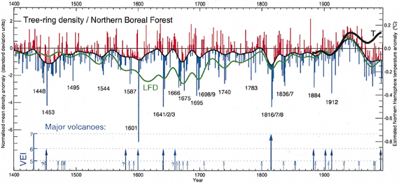
Briffa tree-ring density

Figure 2: An indication of growing season temperature changes across the whole of the northern boreal forest. The LFD curve indicates low-frequency density changes. Note the recent disparity in density and measured temperatures.

In creating the WMO graph, Jones cut off the tree-ring density curve around 1960 when it diverged from instrumental temperature and grafted the instrumental temperature onto the green line. This technique has been rightly criticised for failing to distinguish between reconstructed temperature and the instrumental temperature in a graph. However, the decline in tree-ring density is not a hidden phenomena - it's been openly discussed in the peer-reviewed literature since 1995 (Jacoby 1995) and was also discussed in the IPCC Third Assessment Report (TAR) and Fourth Assessment Report (AR4).

Lastly, it bears remembering that other research finds tree-ring density is reliable before 1960. Briffa 1998 finds that tree-ring width and density show close agreement with temperature back to 1880. The high-latitude tree-rings that show divergence after 1960 also match closely with other non-diverging proxies going back to the Medieval Warm Period (Cook 2004). This indicates the divergence problem is restricted to modern times.

What is "Mike's Nature trick"?

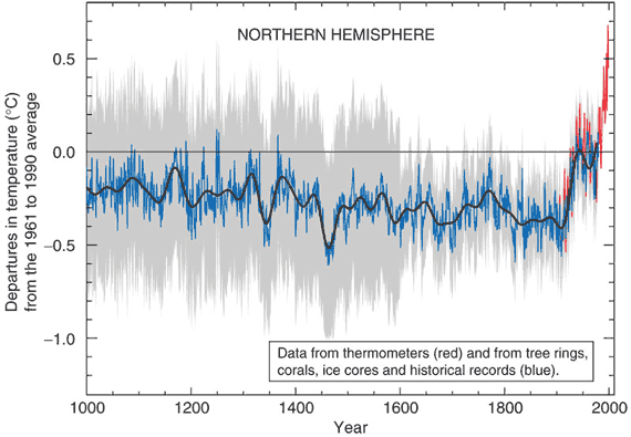
This refers to a technique (in other words, "trick of the trade") used in a paper published in the journal Nature by lead author Michael Mann (Mann et al 1998). The "trick" is the technique of plotting recent instrumental data along with the reconstructed data. This places recent global warming trends in the context of temperature changes over longer time scales. This graph is commonly known as the hockey stick.

Mann's 1998 paper in Nature plotted temperature back to 1400 AD. The temperature reconstruction was extended back to 1000 AD and published in Mann et al 1999 which was reproduced in the IPCC Third Assessment Report (TAR). The IPCC TAR version of Mann's hockey stick is shown below:
Hockey Stick

Figure 3: Northern Hemisphere mean temperature anomaly in °C (IPCC TAR).

There is nothing secret about "Mike's trick". Both the instrumental (red) and reconstructed temperature (blue) are clearly labelled in Mann's 1998 Nature article, the follow-up Mann et al 1999 and the IPCC Third Assessment Report.

A common and broadly held misconception is that Mann's hockey stick hides the decline. There is no "decline" in Mann's reconstructions. As we shall examine shortly, the source of "the decline" come from temperature reconstructions calculated from tree-ring density at high northern latitudes (Briffa 1998). There are very few of these in Mann's proxy data and hence his reconstructions never required removal of any declining tree-ring density.

Thus it's clear that "Mike's Nature trick" has nothing to do with Briffa's "decline". There is no "decline" in Mann et al 1998 and Mann et al 1999. To conflate two separate techniques via the phrase "Mike's Nature trick to hide the decline" is adding to the glut of 'Climategate' misinformation.

0 0

Printable Version  |  Link to this page

Comments

Prev  1  2  3  

Comments 101 to 110 out of 110:

  1. "Take out the smoothing and you know what the results show? Exactly the same thing, just with more bumpiness on the curve." Wrong. Take out the smoothing and the uptick at the end of the series in figure three (above) disappears. The temperature proxy should show a decline in temperatures as recorded by the tree rings. The broader implication of divergence to dendrochronology is that because divergence is not understood, tree rings cannot be relied upon to accurately reflect temperature. [ -SNIP!- ]
    0 0
    Moderator Response: [DB] Accusations of fraud and scientific misconduct snipped. This is not CA where anything goes. Commenting here is a privilege, one that can be rescinded. Be advised.
  2. I've posted my reply at Is the hockey stick broken Moderator, please delete from this thread if you wish.
    0 0
  3. Further to DBDunkerson @99, Michael Mann has commented on this issue at RealClimate. The most important point he makes is that the conclusions of the paper were made based on an analysis of the individual yearly records and decadal averages. Consequently the smoothing method makes no difference to the conclusions of the papers:
    "In some earlier work though (Mann et al, 1999), the boundary condition for the smoothed curve (at 1980) was determined by padding with the mean of the subsequent data (taken from the instrumental record). This does make a small difference near the end of the series. It doesn't effect any of the conclusions drawn in the paper though. These were based on comparisons of the individual reconstructed annual values (individual years and decadal averages over 10 consecutive years) from AD 1000-1980, with those from the recent instrumental record (1981-1998), and centered on the fact that the recent instrumental values were outside the error range of the reconstructed values over the past 1000 years and were not related to the smoothed curve."
    Astute readers will also notice that Mann padded with the mean of the instrumental period rather than with the intstrumental measurements themselves. That is an important point. First, it means that in splicing the instrumental record to the proxy record, Jones was not emulating Mann's procedure. Therefore, "Mann's nature trick", contrary to TTTM, is not the three step procedure described by him (which is not a procedure ever used by Michael Mann). In fact, in a post co-authored by Michael Mann at RealClimate, the "Nature Trick" is explicitly described:
    "The paper in question is the Mann, Bradley and Hughes (1998) Nature paper on the original multiproxy temperature reconstruction, and the ‘trick’ is just to plot the instrumental records along with reconstruction so that the context of the recent warming is clear. Scientists often use the term “trick” to refer to a “a good way to deal with a problem”, rather than something that is “secret”, and so there is nothing problematic in this at all."
    So, TTTM's contention about the nature of the trick is incorrect, and John Cook is correct. For those who are interested, the difference padding with the instrumental record (as TTTM claims Mann did) and padding with the mean of the instrumental record (as Mann actually did) can be seen by comparing figures 1 and 3 above. In figure 1, Jones did pad with the instrumental record. The result is a much larger slope on the end of the tail, even in the final years of the 70's (ie, the end of MBH 98 and 99's smooth) as the final value closes on the mean. The exact behaviour does depend on the smoothing function used, so this difference is probably not that significant. As a side note, TTTM's third about truncation is definitely false. In MBH 98, a 50 year smooth is used, and the smoothed function terminates in 1973 (see figure 5 (PDF), ie, 25 years before the padding data ends, and 7 years before the proxy data ends. In MBH 99 a 40 year smooth is used and the smoothed function ends in 1979 (see figure 3 above), ie, twenty years before the padding data ends and 1 year before the proxy data ends. Clearly the end of the smoothed function was simply a consequence of the algorithm used, not the result of a deliberate truncation. These errors in the "reconstruction" of MBH's methods are typical of the "climate auditors". They repeatedly think of methods to "reconstruct" climate scientists' procedures that sound suitably culpable to them (or can be spun that way) and then present that as though it was an actual reconstruction of the scientists methods without checking the fine details that distinguish between those methods and closely similar methods. They are so slack that, as seen above, they can describe a graph terminated in 1973 as being terminated in 1980, visually a very noticeable difference. In this case, even if Mann had used TTTM's methods 1 and 2, there would have been nothing wrong with it. To my mind, it would have been more defensible than using the 20 or 25 year mean of the last values in the proxy data (a common alternative). Any padding of a smoothing function constitutes a prediction of future values of the smoothed data. Using a 25 year mean of the proxy data would constitute a prediction that the data would have a negative trend after 1980 reaching a value equal to the mean of the 1955 to 1975 values in 2005. Given this is a temperatures proxy, which has tracked temperatures very well since 1880, it seems far more likely that the proxies would continue to track temperatures. Using the instrumental values to pad the series, ie, predicting the proxies would continue to track temperatures, therefore seems wholly defensible. In contrast, it would not be defensible as a method of padding Briffa's series which demonstrably does not track temperatures post 1960. That, or course, is not what Jones did in the WMO report. Rather, he created a hybrid temperature reconstruction from two sources of data, as he in fact informed us in that document.
    0 0
  4. TTTM @101, the smoothing had no effect on the scientific results in MBH 98 and 99 as noted above, so you are wrong. As regards the WMO document, Jones decided to create three hybrid temperature proxies. There is nothing wrong with this. Nobody rational objects to the satellite temperature data because it uses a series of different satellites using different instruments, and hence constitutes a hybrid series. Nor are there any serious objections to the SST series that have similar problems. The only requirement for integrity in creating hybrid series is that you are clear that you have done so, and that you leave a paper trail so that anybody who wants to check on possible problems can do so. Jones did both. He clearly documented the inclusion of instrumental data, and he clearly referenced the source papers of the data he used so that anybody who thought there was a problem could back track and check. The response of real scientists to this would have been to back track, and then question the use of tree rings as temperature proxies. For the faux auditors, such quiet academic work was not enough because it could not raise the rabble. Instead they make trumped up charges of fraudulent activity. They then condemn themselves to an ever increasing and unsupportable conspiracy theory to maintain their trumped up charges as independent panel after independent panel looks at the charges and correctly finds that there was not academic wrong doing, and no questionable integrity in the case of the scientists involved. The integrity of people who would rather make accusations of wrong doing than notice that a graph ends in 1973 rather than in 1980 I leave to the reader to decide.
    0 0
  5. Further to TTTM @101: The divergence problem does raise an issue about the ability of some tree rings to track temperature. It is, however, only some. Most tree rings do not show a divergence problem, and show the same long term pattern of temperature change in reconstructions. Further, non-tree ring proxies such as stalagmite data and coral data also show the same long term pattern of temperatures. This of itself implies the divergence problem is some unique problem due to modern industrial activity - and there are a host of potential candidates for the cause of the problem. The broader implications have been adequately discussed above. They show, not a rush to insert a "warming bias" by the scientists, but rather a rush to condemn on the basis of shoddy analysis by the "auditors".
    0 0
  6. Turn's out people who make unwarranted accusations of (what they believe to be) wrong doing without adequate basis make me angry too. The difference between me and TTTM is I am angry because somebody is trying to drag somebody elses name through the mud without reason, while he is angry because their name is not being dragged through the mud without reason. Anyway, here is the terminal portion of a modified version of the MBH 99 graph blown up by 358%: The black line is the annual values of the reconstruction. The red line is the instrumental data. The blue line is the original smooth, while the green line is a smooth using the padding technique currently favoured by Mann. That technique uses only proxy values for the smooth. TTTM claims using the instrumental values introduces a warming bias. However, quite plainly, the smooth using the instrumental mean terminates halfway between the last two values of the annual proxy data. In contrast, the proxy data only padding results in a smooth that terminates significantly below those values. So, and obviously, using proxy only data results in a cooling bias, as it inevitably must in a slope with a rapidly rising trend line. And that really is the point. Despite their high dudgeon, the "climate auditors" only care about the techniques of Mann (or Hansen, or Jones) because they record a rapid rise in temperatures in the twentieth century. Any technique that shows that rise they find objectionable, with consequent condemnation. It should also be noted that contrary to TTTM's claims, the annual data in MBH 99 shows no inclination to decline. Rather it shows a relatively level temperature over the period 1945 to 1980 (as indeed is shown by the instrumental record) although the last two values may be the start of the rapid post 1975 rise in global temperatures.
    0 0
  7. "So, TTTM's contention about the nature of the trick is incorrect, and John Cook is correct." I have simply described the facts about Mike's Nature Trick as determined by analysis and reproduction, you have described what Mike said about the "trick" Anyone who is genuinely interested can find out all the details for themselves and make their own opinion but one thing is certain... the facts cannot be found at sites like this one.
    0 0
    Moderator Response: [DB] You entitled to your own opinions, just not your own facts.
  8. TTTM @107 simply asserts that he has the facts correct without argument. In doing so, he ignores the clear demonstration that his purported analysis is false - specifically the claims about truncation. To be perfectly clear about this, he* claimed that the third step of Mike's method was "Discarding all values of the smooth after the end of the proxy period." But the smoothed plot ends in 1973 for MBH 98, and 1978 or 1979 for MBH 99. Clearly the truncation method claimed by TTTM was not used. You can see this clearly for your self below: MBH 98 fig 5 end plot magnified twentyfold. The red marks indicate 1900 and 1950. The large black dashed line (splodge) is the smoothed function. The thin continuous line is the annual data which clearly continues past the last value of the smoothed function by several years (in fact 7). MBH 99 (with alternate smoothing in green) magnified 10 fold. The blue line is the original MBH smoothing, the continuos black line is the year by year data, which clearly extends beyond the smoothed curve by at least one year, and probably two. The second step is also false, in that it claims the instrumental period beyond 1995 (MBH 98) and 1998 (MBH 1999) was padded by the instrumental mean of the calibration period, ie, zero. This step is necessary in UC's reconstuction because he reconstructs the smoothed lines as terminating in 1980, so the intstrumental period does not provide enough padding by itself. But Mann does not extend the smoothed period beyond any value which would require such padding, ie, 1973 for MBH 98 and a 50 year smooth; and 1978 for MBH 1999 and a 40 year smooth. So with steps 2 and 3 clearly refuted, all TTTM has to fall back on is the claim that Mann used the mean of the instrumental values to pad, as Mann claimes; or whether he uses the actual instrumental record itself as claimed by the "climate auditors". This subtle difference has been decided in the auditors favour by the auditors on the basis of eyeballing comparisons of unmagnified graphs which do not include any plots of a smooth padded with the mean of the values, ie, one of the two different methods at issue. Frankly, I have followed TTTM's claims back to there source and amongst all their efforts, there is no attempt to plot a smooth using the mean of the instrumental values (Mann's claimed method) and hence no possibility of their having critically analyzed and rebutted that alternative. Of course, had Steve McIntyre used Mann's actual method, he would not have had his apparent justification for slandering Michael Mann by saying: "UC, that’s an interesting find. At the time of this post, we hadn’t managed to pin down Mannian smoothing methods – bu we did so in Sept last year while considering Mann 2008. If you’re right about the splice, it places an interesting light on Mann’s outburst at rc:
    "No researchers in this field have ever, to our knowledge, “grafted the thermometer record onto” any reconstruction. It is somewhat disappointing to find this specious claim (which we usually find originating from industry-funded climate disinformation websites) appearing in this forum. Chu’s recent use of this graphic adds a little piquancy to this find."
    (post 6th May 2009) So, anyone really interested in the truth can indeed find out the details, and the details clearly refute TTTM's claims. Unfortunately for him, the truth is to be found on this site rather than from the slander pits from which he regurgitates. *TTTM's claims, I have discovered, are in fact a simple cut and paste of claims made by Steve McIntyre, which is why his references to links have no links attached. I believe this to be against forum policy, although I would prefer if the comment was not removed.
    0 0
    Moderator Response: [mc] Duplicate image replaced with blowup.
  9. Sorry, I included the lower magnification version of MBH 99 that I had already posted rather than this one: If a moderator could correct the error, I would be very thankful.
    0 0
  10. "I believe this to be against forum policy, although I would prefer if the comment was not removed." Climate Audit was clearly credited with the quote. I see I am again being censored on this site. This has now moved beyond poor form now, moderators.
    0 0
    Moderator Response: [muoncounter] Your last mention of CA was in comment #98, where there is no quote. Whining about censorship here is laughable; complaining about moderation is usually deleted under the Comments Policy.
  11. TTTM, you want to experience censorship? Go to CA or WUWT and try to challenge their views with the same freedom you have enjoyed here. Don't be shy, pretend to be a real warmist and go gung-ho. See what happens, then report back to us. That's a form of scientific experiment, should be OK with you right?
    0 0
  12. At the end of the day, word is getting out to scientists who understand and appreciate whats going on here. More detail is emerging regarding undisclosed truncations of the proxy data now at both ends of the reconstruction. Science always wins in the end.
    0 0
    Moderator Response: [DB] "Science always wins in the end." Something dissemblers and disinformationists would do well remembering.
  13. I seldom get my comments published at RC, in fact I can't even remember when was the last one I got one through. As for science winning, Muller is experiencing just how that goes at WUWT. After having found that the instrumental temperature data is really not so unreliable, he's getting the lynch mob at WUWT on his heels. Talk about going against the agenda. Let's keep it real. The moderation on this site is far superior and more flexible than anywhere else I know. Deltoid lets just about anything through and that has the inconvenient of degenerating into childish fights. Sks is exemplary. Check out the 2nd law of thermodynamics thread to see how much pure nonsense was allowed to trolls "going against the agenda" only for the sake of being open. Can you honestly say that you attributed every and each quote coming from CA? By the way, the accusation you make in 112 should be substantiated.
    0 0
  14. "By the way, the accusation you make in 112 should be substantiated. " All I can say is that genuinely interested readers should visit Climate Audit to see the other side of this story and then make their own minds up based on the evidence presented.
    0 0
  15. "Can you honestly say that you attributed every and each quote coming from CA?" I've only made one and yes, it was attributed.
    0 0
    Moderator Response: [muoncounter] See the prior moderation response at #110; there was no quote in #98.
  16. TTTM @115, on re-reading, yes it was attributed; but no it was not distinguished as being a quote. You should try placing quotes inside quotation marks, and preferably inside a block quote to distinguish it from the rest of the text. You should also attribute quotes to a person, not to an unlinked website.
    0 0
  17. TTTM @112, you have a pattern of making accusations without providing supporting arguments, or links to supporting evidence. This may be an effective way to avoid rebuttal, but that's OK, because by reducing yourself to unsubstantiated assertion, you remove any need for rebuttal. Considering the exchange we have just had, unsubstantiated assertion is probably the safest route for you, rather than having your baseless accusations again exposed to scrutiny.
    0 0
  18. "you have a pattern of making accusations without providing supporting arguments" I have provided the website that contains all the information needed for those who are interested beyond wanting to hear what they want to hear. I cant do more than that because experience has shown me that I will be censored and unable to make a consistent argument.
    0 0
    Moderator Response: (DB) Experience should have taught you that commiting repeated violations of the Comments Policy will force moderation. That is science in action: repeating failed behavior with differing expectations of results.
  19. Given Tim's insistence that we should believe his version of events (rather than logic or the evidence of our own senses) 'because Climate Audit says so' I have to wonder if there should be something along the lines of the politician quotations page for major 'skeptic' blogs. That is, collect the most obvious / most egregious disinformation they have put out to show exactly how little credibility they have. Consider that Muller, a physicist, raved about what a "hero" Watts was.. despite Watts promoting complete nonsense like 'the greenhouse effect violates the 2nd law of thermodynamics'. Likewise Muller has been spreading the fictional claim about Gore having been told 'not one polar bear has died due to receding ice' which the 'skeptic' blogs simply made up. I wonder if he'd have made such a mistake if there was an easily available resource to show just what sort of people he was getting in bed with... though I suspect he is starting to get an inkling now.
    0 0
  20. "Mike’s Nature Trick was originally diagnosed by CA reader UC . . ." If "UC" has discovered compelling evidence of scientific fraud, I'm sure he or she has published the results in a peer-reviewed journal. Perhaps Tim would provide a link.
    0 0
  21. TTTM@118 I recommend a website called Skeptical Science. it contains all the information you need to educate yourself on the subject of climate change. As for you accusation of censorship, complete nonsense. People here are allowed to present any evidence they like so long as it is on topic and not an accusation of fraud. Pick any thread you like as evidence of this. I recommend Meet the Denominator and The greenhouse effect and the 2nd law of thermodynamics to see just how accommodating the Moderation Policy is if followed. If you continually run afoul of it then the problem lies with you.
    0 0
  22. TTTM has quite some faith in CA I see. I wonder if he has read this and checked the CA version against the originals.
    0 0
  23. "Phil Jones' email is often cited as evidence of an attempt to "hide the decline in global temperatures". This is incorrect." This is a red herring. Skeptics don't argue that at all, they understand exactly what was meant by "hide the decline" and they understand why it is problematic. Giving a flaw in the method a formal name e.g. "divergence problem" and hiding the evidence of it does not excuse Phil/Manne et al, quite the contrary. Also Muller's alledged confusion now has no bearing on events which occurred in a past decade. The author commits the same sin he accuses Muller of when he conflates these unrelated matters.
    0 0
  24. Ryan Starr @123, it is a common conceit of deniers that any absurdity they do not adhere to is not promulgated by any denier. By ignoring the claptrap sprouted by their fellow deniers, they not only avoid disagreeing with those deniers, and recieving the blast of invective that normally accompanies such disagreement; but they also get to pretend that the supporters of AGW theory are arguing against a strawman. The pretence is disengenuious, and in fact many deniers do in fact claim that "hide the decline" refers to a fraudulent concealment of a decline in mean global surface temperatures as measured in the instrumental record. As to Starr's claim that Jones and Manne are "hiding the evidence", publishing the evidence, drawing attention to the discreprancy, and then discussing it in several papers, then citing those discussion in all other papers where the data is used is a funny way to hide something. In fact, in most circles that is considered drawing attention to the problem. But not, apparently, in denier circles, when the publishing, discussing, and citing is done by a climate scientists.
    0 0
  25. Tom I'm sure amongst the sea of skeptics you will find every conceivable view forwarded, a product of the large population. Just as there are believers who fear the earth is at risk of emulating Venus like conditions there are fringe kooks in both camps. However the quote in question refers to what is "often" cited. One doesn't need a PhD to understand a proxy is an approximation (redundant) and in this case it is contradicted by much more reliable instrumental readings. You suggest there are people who believe the declining proxy is accurate and the the instrumental record subject to a conspiracy to distort - do you "often" hear that cited? More often than the former understanding? You cast an even more spurious accusation than the article did and accuse others of disingenuity. Why do skeptics keep referring to attempts to "hide" evidence of flaws in the method? Maybe you should ask the authors of the papers in question why they used that terminology in their own private correspondance, rather odd terminology for people focused on transparency. And do take note of time lines and to what extent those admissions were reported in subsequent citations.
    0 0
  26. Actually, Ryan, I believe that there are many deniers who either falsely believe that instrumental temperatures have declined since 1998, or falsely believe that the 1930's and 1940's where hotter than the 1990's and 2000's; and who further falsely believe that the temperature record has been deliberately massaged to conceal this truth; and who believe that his is what "hide the decline" refers to. Deniers who make this sort of claim may be in the minority; but it only needs a minority of a very large group to result in the claim being made often. I don't particularly care why the authors chose a particular terminology in their private correspondence. What I care about is their actual practise. For example, in Assessment Report 4, the authors "hid the decline" by writing:
    "Several analyses of ring width and ring density chronologies, with otherwise well-established sensitivity to temperature, have shown that they do not emulate the general warming trend evident in instrumental temperature records over recent decades, although they do track the warming that occurred during the early part of the 20th century and they continue to maintain a good correlation with observed temperatures over the full instrumental period at the interannual time scale (Briffa et al., 2004; D’Arrigo, 2006). This ‘divergence’ is apparently restricted to some northern, high-latitude regions, but it is certainly not ubiquitous even there. In their large-scale reconstructions based on tree ring density data, Briffa et al. (2001) specifically excluded the post-1960 data in their calibration against instrumental records, to avoid biasing the estimation of the earlier reconstructions (hence they are not shown in Figure 6.10), implicitly assuming that the ‘divergence’ was a uniquely recent phenomenon, as has also been argued by Cook et al. (2004a). Others, however, argue for a breakdown in the assumed linear tree growth response to continued warming, invoking a possible threshold exceedance beyond which moisture stress now limits further growth (D’Arrigo et al., 2004). If true, this would imply a similar limit on the potential to reconstruct possible warm periods in earlier times at such sites. At this time there is no consensus on these issues (for further references see NRC, 2006) and the possibility of investigating them further is restricted by the lack of recent tree ring data at most of the sites from which tree ring data discussed in this chapter were acquired."
    In the Third Assessment Report, they "hid the decline" by writing:
    "There is evidence, for example, that high latitude tree-ring density variations have changed in their response to temperature in recent decades, associated with possible non-climatic factors (Briffa et al., 1998a). By contrast, Vaganov et al. (1999) have presented evidence that such changes may actually be climatic and result from the effects of increasing winter precipitation on the starting date of the growing season (see Section 2.7.2.2). Carbon dioxide fertilization may also have an influence, particularly on high-elevation drought-sensitive tree species, although attempts have been made to correct for this effect where appropriate (Mann et al., 1999). Thus climate reconstructions based entirely on tree-ring data are susceptible to several sources of contamination or non-stationarity of response."
    So in both, their method of hiding the decline was to explicitly mention it, discuss the potential problems involved, and cite more detailed discussions in the scientific literature. So as regards timelines, they publicly discussed the issue in the two most important policy documents twice before the issue was even brought up by the hacking of the emails. This is not an attempt to save face. This is just a simple policy of publicly discussing the issue. The only issue about "hide the decline" is, why do deniers repeatedly misreport the practice of the scientists involved so as to impute a concealment of data that never happened?
    0 0
  27. Tom Curtis at 18:16 PM, it's all very well to find justification now with the benefit of hindsight and the fact that most people have now seen the relevant graphs, but where are the graphs that accompanied the two extracts you provided? Without accompanying graphs or data of some form, anyone reading it at the time it was published would have had no way of quantifying or even visualising whether the divergence was rather minor, or significant. Certainly anyone reading the explanations cold could not be expected to understand just how dramatic the divergence actually was. Are you able to provide the graphs that accompanied the explanations in each of the assessment reports that allowed the readers to appreciate the scale of the divergence as they were reading about it for the first time?
    0 0
  28. johnd@127 That is what references are for. In scientific publications, you don't repeat information on issues that the reader ought to be familiar with every time a subject is discussed. Instead you give a reference, allowing the reader to look more deeply. Scientists (and the interested layman) shouldn't rely on looking at diagrams, you need to read the text and follow the references and do background reading.
    0 0
  29. What disclosure was made when Jones created this chart for the 'WMO Statement on the Status of the Global Climate' in 1999? This is the chart prior to having any tricks applied to it, So he didn't just fail to show the decline he actually substituted it with data from an entirely different source and left it labelled as a continuation of the same proxy. Not discussing motivations here.
    0 0
  30. Ryan Starr @129, the caption accompanying the WMO graph reads:
    "Front cover: Northern Hemisphere temperatures were reconstructed for the past 1000 years (up to 1999) using palaeoclimatic records (tree rings, corals, ice cores, lake sediments, etc.), along with historical and long instrumental records. The data are shown as 50-year smoothed differences from the 1961–1990 normal. Uncertainties are greater in the early part of the millennium (see page 4 for further information). For more details, readers are referred to the PAGES newsletter (Vol. 7, No. 1: March 1999, also available at http://www.pages.unibe.ch) and the National Geophysical Data Center (http://www.ngdc.noaa.gov). (Sources of data: P.D. Jones, K.R. Briffa and T.J. Osborn, University of East Anglia, UK; M.E. Mann, University of Virginia, USA; R.S. Bradley, University of Massachusetts, USA; M.K. Hughes, University of Arizona, USA; and the Hadley Centre, The Met. Office)
    (My emphasis) So: The use of instrumental data in developing the reconstructions is explicitly stated in the caption of the graph. That use must, logically, have been in the construction of each of the three curves shown as there is now fourth curve of instrumental data alone. The reader is directed to another source which purportedly discusses the construction of the graph. (Unfortunately that source is not archived on the internet so I cannot confirm that.) The reader is explicitly directed to the article from which Fig 2 above comes from. In that article fig 2 above is produced as figure 5, and the text immediately surrounding the figure is a discussion of the divergence problem, including further references to two other articles which also discuss it. Finally, the reader is also directed to five people and one institution from which further information could be obtained if desired. So, Jones made a clear disclosure of the use of the instrumental record; and made clear citations to an article discussing the divergence problem. Curiously, to my knowledge no denier discussion of this chart quotes the caption of the chart. Not so much "hide the decline" as "hide the disclosure".
    0 0
  31. Tom Curtis at 21:04 PM, re "The use of instrumental data in developing the reconstructions is explicitly stated in the caption of the graph." It is accepted that instrumental data is normally used as the means to validate the modeling of any proxy data used to create the reconstruction. Therefore how can it then logically become an extension to the reconstructed data, replacing the data it is supposed to validate, or worse, part of it? The charting of instrumental data alongside the reconstructed proxy data would allow the validation of the proxy data to be substantiated, adding it as an extension does not.
    0 0
  32. johnd@131 The instrumental data are also used to calibrate the proxies. Only a subset (the "hold-out" set) is used for validation. Personally I would have just truncated the proxy and put in the instrumental data in a different colour. Having said which, the whole thing is a storm in a tea cup. The plot was for the cover of a report, designed to make it look pretty and broadly convey the message that there has been rapid warming. The fine detail regarding the divergence problem is irrelevant at that level of abstraction. The fact that some can't let it go is just silly, where it matters the divergence problem has been discussed openly.
    0 0
  33. johnd @131, Dikran covers the answer pretty well. I would just add specifically, using the instrumental data rather than the proxy data over the instrumental period makes the reconstruction more accurate as a reconstruction, not less. It is not desirable in normal scientific literature because, as you point out it would make validation of the data difficult. You could work around that by validating the data with the proxy data over the part of the instrumental period, and then constructing the actual reconstruction using the instrumental data in the area of overlap. There is nothing intrinsically wrong about that practice, except that it obscures the method of validating the reconstruction. Where the nuts and bolts of the method are more important than the actual data, ie, in the scientific literature, that therefore makes the standard practice better. But that is not innately better, just better for the particular concerns of the publication. Outside of the standard scientific literature (ie, on a popular WMO publication as cover art), different concerns are involved so a different standard can rightly apply. In fact, Jones would have done nothing wrong if he had used instrumental data from 1850 forward in the WMO "reconstructions", so long as the trail is left for those who want to follow up the scientific details. The trail was left - therefore there is no issue. In short, Jones method would have been out of place in an actual scientific paper or an IPCC report. But in those contexts, his practice is appropriate and exemplary. But even in those places, his practice would have only been wrong because it was unconventional - although there are good reasons for the standard convention.
    0 0
  34. Despite the convolutions that need to be performed to justify the act, by definition, instrumental data is not reconstructed data.
    0 0
  35. johnd@134 The waves in the tea cup are getting up a bit. ;o) On a more serious note, yes, they are different, but not in a way that matters in the context of a pretty picture for the cover of a report, especially when the caption gives you the information you need to find out everything you want to know if you can be bothered to look.
    0 0
  36. johnd @134, actually they are. The temperature is a physical property at a variety of locations. An individual instrumental record is a number of readings of an instrument designed to measure temperature - but those reading also measure other things as well. They measure the level of inebriation of the record keeper, their aptness to make readings, their punctuality in taking readings. If you are interested in changes in the global mean temperature, they also measure other things as well. They measure the UHI effect, and the less mentioned urban particulate emission cooling effect. They measure changes in site location, and poor site location. They measure relative differences in distance between sites. And they measure changing capabilities and techniques of measurement over time. These are all measured because the instrumental record contains information about all these things, just as it contains the information about the global mean surface temperature. In principle, all of these factors could be predicted from a careful statistical analysis of the temperature record. In practice, most of them cannot be because the effects are too small relative to the background noise. But that makes all of these confounding factors when it comes to measuring the global mean surface temperature. It is because of these confounding factors that the various indices of GMST never quite agree on what it is. So, for both "reconstructions" and "instrumental record" you have a series of actual measurements of dO18 concentrations, or lengths of a column of mercury or alcohol, or of changes in resistance in a wire. All these measurements are highly correlated with temperature - some more so than others; but all have confounding factors. And all are given a statistical treatment to determine a target measure. For the instrumental record the measured values are much more highly correlated to temperature than is typical of historical reconstructions; and the locations of the records more numerous and more widely spread. That makes the resultant reconstruction far more accurate than those in historical reconstructions, but that is a practical difference, not an epistemological difference. So, John, you are wrong. Unless you where trying to make only an empty semantic point. (Even then you are wrong, but the point is so empty as to not be worth disputing.)
    0 0
  37. Tom @ 130. The chart clearly labels each series as a proxy only. A reader of that caption could be forgiven for thinking the bolded quote is an error because it conflicts with what the chart itself purports to show. "Along with" would usually mean in parallel with, next to each other, not spliced together with only one source indicated. Dikran @ 135. Lets say I want to know how accurately the proxies trace the instrument record. How do I get an estimation of that from what is provided? How could I receive any impression at all that there is such a thing as a "divergence problem" from what is provided? Chart plus caption. ("the caption gives you the information you need to find out everything you want to know if you can be bothered to look.")
    0 0
  38. Ryan Starr @137, I want to clearly note that there has now been a change in the logic of your argument. Whereas previously you were arguing that the chart together with accompanying information did not give the reader grounds to suspect who the chart was constructed, you are now arguing that some readers may over interpret the chart, and consequently discount relevant information provided by Jones along with the chart. Well certainly. Having debated creationists I know there is no limit to the bizzare ways in which people will interpret or neglect even the clearest statement. I will go further, Jones caption is not as clear as it could have been (with little extra effort) in explaining how the chart was formed. In other words, Jones did not follow best practice in developing the WMO chart and accompanying caption. But if that is the basis of your argument, the logic has shifted from "Jones withheld relevant information in a manner likely to deceive, and therefore his actions were deliberately deceptive" to "Jones did not follow best practice, and therefore his actions were deliberately deceptive." The latter is, of course, a complete non-sequaiter, but it is all that you have evidence to support.
    0 0
  39. Tom @ 138, I'm telling you that the chart misrepresents what is shown. It gives the viewer a false impression, that's what I've always argued. Any interpretation which is not the correct interpration is a misinterpretation, over or under or other. Even if the viewer bothered to read the caption which shouldn't be required because the series' are clearly labeled then at best they find a vague clue that the splicing was used. A clue isn't nearly good enough, detective work shouldn't be required to interpret a chart. The creator should make it clear what is shown not turn it into a sleuthing exercise. Charting shouldn't require a "best practice" guide, it's simple, you plot the data values as they are and label each series what it is. You call a proxy a proxy, and you call an instrument record an instrument record. You don't call an instrument record a proxy. God help us when researchers don't take that much for granted.
    0 0
  40. 139 RyanStarr - are you discussing science or marking a term paper? Do you, maybe, gave a full guide you give your students on hiw to present results?
    0 0
  41. Ryan Starr @138, no chart is self interpreting. Consequently, any body who attempts to interpret a chart without consulting at minimum, the caption is being foolish. This point can be amply illustrated from your own words. You say "you call a proxy a proxy", but in fact no data on the WMO chart is labeled as proxy data, either on the chart or in the caption. That is because no data series on the chart is uniquely and only proxy data. You say, "You don't call an instrument record a proxy", but in fact, no instrument record is called a proxy on the WMO chart, because no series on the chart is called proxy data. Your interpretation of the charted data as a "proxy record" is your misinterpretation which is not suggested by either the chart itself, nor the caption. You are imposing your interpretation onto the chart. What is more, if you do not impose it, your whole case against Jones evaporates and you know it. The chart itself references the data source for the "paleoclimactic records" (Jones' term) of each of the three reconstructions, and the caption indicates that the three reconstructions use "paleoclimactic records ... along with historical and long instrumental records". Your misinterpretation requires that you read additional information into the chart which is not on it, and that you ignore information about the chart which is in the caption. And yet you want to blame your misinterpretation on Jones. You are therefore imposing a ridiculous standard on the chart whose only merit is that it allows you to condemn Jones. Your preference to condemn scientists rather than understand them is, however, not a great virtue; so I'm afraid I'm going to reject the totality of your nonsense as what it is.
    0 0
  42. Somewhat off topic, but I just came across another scientist using "tricks" here. The point is, of course, that's us just how people discuss things.
    0 0
  43. Tom @ 141, no you're wrong Tom, many, many charts are self interpreting. In fact any chart with correct labels and axis will be self interpreting. You label the chart and the reader knows what's on the chart. Ipso facto. Jones applied Mike's "nature trick" to create new spliced versions of existing series. So the data shown is his data, his new spliced versions of the old series, and yet he labels them as though they are the old versions. He mislabeled them hence a reader is mislead. Again, very simple, your convolutions don't change any of that.
    0 0
  44. Les @ 140. I'm not a teacher but if I were and thought it necessary I would advise my students to provide correct labeling on any charts they create. In most cases that wouldn't be necessary as it would be a natural assumption.
    0 0
  45. 144 RyanStar - no, didn't think so. Personally, I'd go further than Tom/141: Graphs are part of a narrative explaining analysis and results. They should be read in the context of what is being explained and not by them selves... labels are only relative to that explanation. Basically graphs are there to give the reader an impression of what the data or analysis is like - but graphs are neither data nor analysis, in and of themselves. There is a broad propensity to use graphs in PowerPoint, news articles, blogs etc. Often, though not always, by folks trying to appear scientific for, worse, who are being sciency - and this, IMHO, gives folks who don't actually do science the impression that the graphs are all that's involved in an analysis. The result, as we see, is that when one person interprets a graph one way and someone else interprets is another - all there is to fall back on is "bad labeling" or such.
    0 0
  46. RyanStarr, if graphs can be self interpreting, interpret this one for me: The chart has correct labels and axis, so (according to you) you should require no more information (such as, for example, that in the caption) to interpret it. Your failure to interpret should be treated as a de facto refutation of your claims.
    0 0
  47. Logic isn't your strong suit is it Tom? Graphs can be self-interpreting, hence this one must be. { -snip - } You said "no chart is self interpreting." Really? { - snip -} Note that this contains less information than Jones had on his WMO chart.
    0 0
    Moderator Response: [muoncounter] Less attitude, more science. Read the Comments Policy.
  48. 147 - to easy. The answer is < fake French accent ON > "ze mean? over what time period ees dis mean calculated?" < fake French accent OFF > What do I win? Joking aside, it really is very very clear that graphs go with analysis. There really is no argument about that.
    0 0
  49. Les, you're right graphs are not data, they display data. That's obvious right? And they should be labeled such that the reader knows what is displayed. You guys might need to read the article above again, it isn't a total whitewash of what was done and does contain the following quote, "This technique has been rightly criticised for failing to distinguish between reconstructed temperature and the instrumental temperature in a graph." Or do you two disagree with John Cook that the criticism in that case was rightful?
    0 0
  50. 149 No one is saying that a graph shouldn't be clear, that's just silly; but they do have to be read in context to convey scientific content - as your example shows. Your second point is a non sequitur nil point.
    0 0

Prev  1  2  3  

You need to be logged in to post a comment. Login via the left margin or if you're new, register here.


The Consensus Project Website

THE ESCALATOR

(free to republish)


© Copyright 2024 John Cook
Home | Translations | About Us | Privacy | Contact Us